Showing posts with label art. Show all posts

January 21, 2026

News Round-Up

         It’s time for updates on a whole slew of recent projects…
        1. Back in December I participated in “Speed-Date a Book” with Strong Women-Strange Worlds, in which I made a fun two-minute pitch for Bittersweetness & Light in the form of a fantastical weather report.  Alas, the recording isn’t perfect: at the end it doesn’t show the whole panel of “contestants,” and even worse, during my pitch it shows only my slides and not me, which is in keeping with technology’s increasingly emphatic attempts to gaslight me.  I assure you I was there in front of the screen during the live event!  (Have I somehow become a ghost or a vampire?)  But at any rate, you can still enjoy my pitch, which you can watch here.
        2. Also back in December I had several art shows and was working on several blocks.  Here’s the progress I’ve reached: one had a test print and is ready for final tweaking and proper printing, one is probably about two thirds of the way finished, and the third is just barely begun.  I’ll need to start two more to use as sample blocks at upcoming workshops in the next month, but I’m certainly hoping to get back to more of my own sweet carving, as well.
        3. More recently I just spent the weekend at the Arisia sci fi/fantasy convention in Cambridge, MA and it was fantastic!  I was on the half-dozen panels listed in my last post,
plus two group readings.  I sold lots of books and a ton of art, and my piece “Symbiote City (Venusian Medusae)” won the Con Chair’s Choice Award!  You can read more about the piece at this prior post (which is also relevant for the panel I was on, about “Designing Things that Don’t Exist”).  And on top of all that, I had a lot of really nice conversations with people about art and writing and sharing the things that give us hope.  Really Good Stuff!
        4. Looking somewhat ahead, I am plunging into work on my next book, Beyond Pomegranate & Thorns, because it’s high time to get cracking on decisions about what to include, what order to put things in, what additional pieces of artwork I need to fill in gaps, and so on.  I just received marketing postcards in time to give them out at the conventions; I just received the enamel pins that are one of the Kickstarter backer rewards; and I just got a bunch of beta reader feedback that I need to digest and process and use for decision-making.  It’s all very daunting and very exciting!
        5. Meanwhile, there will need to be lots of matting and framing for Boskone in three weeks… not to mention all the other stuff I was complaining about in my Jan. 5 post!  (Also meanwhile, I’ve had to migrate to a new newsletter program and at the moment I cannot even express how intensely I’m hating it.  Ugh!  But there are plenty of other things to worry about, both more positive and more negative, so that’s a problem for another day.)
        6. Another fun tidbit is that I currently have artwork on display in public outdoor art galleries in two towns.  I absolutely love this format, in which the artwork of multiple artists beautifies otherwise boring or ugly fences around town, and the selection rotates to new locations at intervals so that it stays fresh and interesting to everyone going about their daily rounds.  It’s an honor to have my work accepted in these two projects, and between this and my successes at Arisia I’ve been feeling very affirmed in my art recently.
        All of which means that, as always, I do hope you know that if you’ve bought my work, read my books, left reviews, told your friends, or supported me in any one of  many ways either tangible or intangible, it really does make a difference to me and I do appreciate it very much.


[Pictures: Screen shots from my Speed-Date pitch for Bittersweetness & Light, all graphics by AEGNydam, 2025;

Rubber blocks plus test print of Needham cupolas by AEGNydam, 2026;

Photos from Arisia, (photo of me at Broad Universe Rapid Fire Reading by Randee Dawn), 2026;

Photos of assorted other projects and art by AEGNydam, 2026.]

February 12, 2025

Boskone Panel Signpost

         This weekend I’ll be off to Boskone, another sci fi/fantasy convention, at which I’ll be participating as an artist and an author in all the usual ways: art show, reading, and panels on art and writing.  So today is another signpost panel, to highlight links that may be of interest to attendees at any of the panels I’ll be on.
• Block Print Workshop
        Step-by-step - If you click here (or on the label in the sidebar), you’ll get to a whole bunch of posts that give instructions for specific projects or techniques, from mini tile blocks and Provincetown white line blocks to collagraphs and trace monotypes.
        Handout - If you need to see the handout of instructions and materials that I provide at workshops, it’s always posted here.


• Legends Reborn - Folklore is at the heart of so many fantasy stories, but each culture’s legends bring something new to the table. Why does folklore have such power over us? Why does it endure? And how do authors honor these stories while making them their own?
        The Mythical Creatures label in the sidebar links to over 200 posts about creatures from folklore all around the world and through history, but if you want to focus it slightly, you can start with Mythical A-Z, and How to Make a Fantastical Creature.
        Magical Botany - 26 posts featuring magical plants from folklore
        Mythical and Imaginary Places - 26 places of folklore from A to Z
        The Beast - A post showing how 10 different artists have portrayed Beauty’s Beast.
        Some Favorite Fairy Tales - A post about what I personally find so enchanting about some of the iconic fairy tales.
        Selkies - A post touching on why shape-shifter stories are so universally fascinating, and how I used elements of this folklore in one of my own books.
        Baba Yaga Village - A case study of my adapting folklore in a block print.
        Cold Iron - A case study of my struggle to figure out how to adapt some traditional folklore into the modern world.


• Broad Universe Rapid-Fire Reading (plus Autographing and Book Launch Party.)
        I’ll be reading from Bittersweetness & Light, which you can learn more about here, and in these posts: launch, some art, and some full stories and a poem.


• The Art of Creating Fantastical Creatures - Dragons, griffons, and mermaids. What does it take to create a lifelike being that only exists in the artist’s head? What does an artist have to keep in mind when drawing imaginary beasts? How do you choose the right color palette? And how do you put personality into creatures who have no analog in real life to draw from?
        Chimeras - A post related to the “Chimera Principle” of creating creatures from elements of other creatures.
        Symbiote City - A post related to the “Jabberwock Principle” of balancing alienness with familiarity.
        A Touch of Science and Dracopedia - Two posts listing some books that offer inspiration and lessons in drawing fictional creatures.
        Working from Photographs - A post with case studies in how I use reference photos.
        On the Virtues of Beasts - My own book of fantastical creatures, plus lots of images to be seen here and here, including some discussion of how I came up with my versions.


• Selling Art Without Selling Out - From executing commissions for clients to selling prints online or at conventions, there are a wide array of ways to sell one's art. There is no one perfect way that fits each artist, and it can be important to maintain your own personal vision. Our panel of creators will discuss the pros and cons of different approaches and answer your questions.
        The Price of Art - A post on how I think about my pricing.
        Limited Edition - A post on the history and practice of limited editions of original art.
        Art Show Checklist, Show Preparations, and Portrait of an Open Studio Weekend - Three posts on the nitty gritty of participating in weekend art fairs.


[Pictures: It Takes a Flock, rubber block print by AEGNydam, 2021 (originals sold out, Image from NydamPrints.com);

Pet Peeves, rubber block print by AEGNydam, 2023 (Image from NydamPrints.com).]

November 11, 2022

Here's Something Cool: Verny's Animals

         Here’s another amazing sculptor making amazing art out of spare parts.  Igor Verny creates creatures that are often articulated and moveable, with meticulous, masterful construction.  Unlike some of the other cool recycling sculptors I’ve featured before (such as Jeremy Mayer, Matt Wilson, Xu Bing, and Julie Alice Chappell, for example), I can’t always 
identify the parts that go into Verny’s pieces.  They’re so smoothly incorporated that they look like they were made for the parts instead of originally being made for some other purpose.  They are somewhat more like the work of Edouard Martinet, but even more “disguised.”  Somehow all these disparate pieces come together into a smooth, perfect whole.
        I don’t know much about Verny, nor do I have much to say about his artwork, except, of course, “This is so cool!”  After all, that’s the point of the “Here’s Something Cool” feature on this blog.  So I’m just sharing something I ran into on the internet and loved.  It’s worth mentioning the value of reusing items that are probably classified as trash, and how this fits in with a steampunk-adjacent aesthetic.  The wasp, in particular, has a steampunk vibe with the gold decorative elements giving it a Victorian flavor.  The adorable little robots, on the other hand, might fall under some sort of atomic“punk” category, with their mid-century futuristic optimism.
        Verny has posted several photos and short videos of work in progress, but they do little to sate my curiosity.  What are these bits and pieces he’s using?  Where does he get them?  How much does he manipulate them, as opposed to leaving them as they came?  On the dragonfly’s wings and the fish’s fins, for example, did he cut the shapes from sheet metal, or did he find some pieces that were just that shape?  What about adding the veining?  But whatever the method, I love these sculptures.  Not only would I love to own one (or more) myself, but these fill me with inspiration for things I will never be able to make.  If only I could wave a magic wand and have, just for a while, a fully-outfitted metal-working shop, and the materials and skills to play in it!


[Pictures: Goldfish, sculpture by Igor Verny, 2014;

Duck, sculpture by Verny, 2013;

Little robots, sculptures by Verny, 2019;

Dragonfly, sculpture by Verny, 2018;

Wasp, sculpture by Verny, 2015 (All images from Igor Verny on Facebook).]

October 5, 2022

Gallery Twist: Flights of Fancy

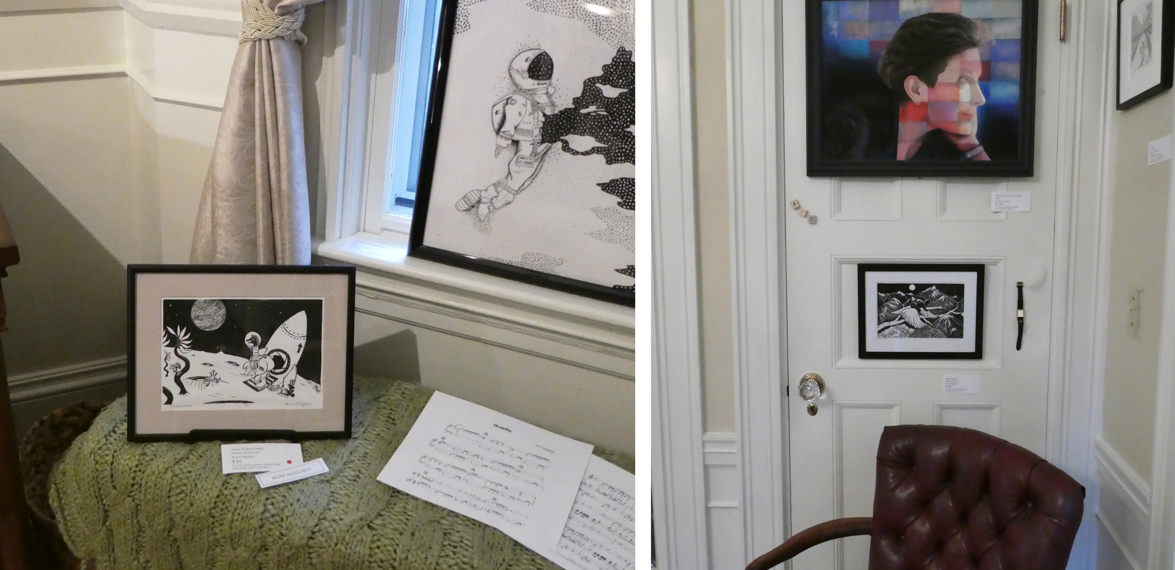
         Today I was able to get to Gallery Twist in Lexington and see their new show, back after a hiatus of three quarters of a year.  The show is called “Flights of Fancy,” which is a theme into which I could fit just about every piece I’ve ever done!  Not surprisingly, I particularly love this show, with its extra helpings of birds and other flying things, as well as lots of skies, and touches of light, bright colors.
        So yes, this post is to some extent an excuse for me to show off a few of my pieces on display there, and to advertise to those who may be in the general area of eastern Massachusetts that they should come see the show while it’s up (until October 16).  Also, however, I do want to share a few thoughts that this show is bringing to mind.
        1. Everyone should have art in their home.  Whether that’s the posters in the dorm room, the finger paintings by the preschooler, or framed art by “real” artists, art should not be too highbrow, too expensive, too pretentious, or too precious for anyone.  Or rather, while some art is certainly highbrow, and some is certainly expensive, don’t let that fool you into thinking that it all is.  Art, like nature, is something we may not think we truly need, and yet without it we just don’t thrive.  One of the things I like about Gallery Twist is that it is a home.  Yeah, it’s a dang fancy, beautiful home, and goodness knows we don’t all get to live in houses like that!  But nevertheless, the art is displayed in a way that reminds you you’re not in a museum; this is art that you can consider living with.
        2. Art should bring you joy.  Well, perhaps that’s obvious, especially given point 1, yet all those people who buy art as an investment, or as a status symbol, or who let the decorator buy some random fashionable thing that matches the carpet - they’re all missing the point.  Everyone should have art in their home, but it shouldn’t be just any art.  It should be art that makes them happy.  Another thing I like about Gallery Twist is how clearly the owners love the art they sell.  You can tell by the care, humor, and creativity with which the pieces are displayed that Gillian and John have enjoyed hanging each and every one.
        3. You can fall in love with individual pieces of art, but the magic can be magnified when there are more.  What are the common themes that draw little clusters and collections together: colors, subjects, memories, associations?  It’s always fun to see all the wonderfully diverse artwork at Gallery Twist, but what makes it even more fun is the arrangements.  What neighbors have my own pieces been given, and what elements get highlighted depending on how they’re rubbing shoulders?  Two different black and white astronauts; two people with their heads tipped ahead in the same posture; horses with wings, and funny birds, and shades of blue and green; swirls and doodles and touches of red…  It's a delightful chorus of art!
        If you want to know more about any of the pieces here, especially the work by other artists, you can find it all on the Gallery Twist web site.  What subjects, colors, mediums, or other themes are you especially drawn to?  What art do you most enjoy?


[Pictures: Between the Clouds, rubber block print by AEGN, 2010;

It Takes a Flock, rubber block print by AEGN, 2021;

One Giant Leap, rubber block print by AEGN, 2019;

Night Flight, rubber block print by AEGN, 2022;

Pandora Dreaming, wood block print with watercolor by AEGN, 2005, plus work by other artists in each view (Photos by AEGN, 2022 at Gallery Twist).]

September 21, 2022

International Peace Day

         Today is the International Day of Peace, and although (as with most such declared days), we’d be much better off with more than one a year, I do want to address how we think about peace.  In art it’s relatively straightforward: there are many works of art, small and large, famous and personal, that celebrate, explore, promote, or cry out for peace.  There are pieces that reproach us about the costs of war (Picasso’s “Guernica,” Nevinson’s “Paths of Glory,” Kollwitz’s “The Parents”) and pieces that call us into the benefits of love (Rockwell’s “Golden Rule,” Hicks’s “Peacable Kingdom” )  There are pieces that explore how we can reach across divides, and how we can better understand each other’s needs, hopes, and dreams.  There are pieces that simply invite us to sink down into beauty.  As for myself, many of my block prints include at least some element of the work of promoting peace: All In this Together, Out of Darkness, Keep Dancing, Tree of Life, Blessing, Behold, it is Good, The Enormous Turnip, Dancing with Animals, The Family Who Lived in a Shoe, Holy Mountain, Hope…  I enjoy portraying people of all sorts and creatures of all varieties living, working, and playing together in cooperation and love.  A picture can open new worlds in the mind, and can stick in the heart in a way that makes art an important tool for peace.
        What about stories about peace?  Well, in some ways that’s a lot harder because after all, plot equals conflict.  No conflict, no plot; no plot, no story.  So a description of a peaceful Utopia is unlikely to be much of a story, and since stories are so much more powerful to humans than philosophical musings (It’s All About Stories), no matter how much we may intellectually support peace, what we really get excited about are those gripping stories where our heroes keep slashing or shooting or punching until they kill all the bad guys.  And when those are the stories we cherish, it can be very hard to imagine peace.  So, what’s a story writer to do?
        Well, first of all, this is one of those places where speculative fiction could have a special edge in saving the world (How Juvenile Fantasy Will Save the Earth).  Certainly retelling true stories of peace is incredibly important, and it’s vital to be reminded that true stories of peace are indeed more common and more achievable than the news would have us believe.  In addition to these stories, speculative fiction can also help us imagine new and even more powerful visions of peace.  But how, without plots full of conflict?
        1. First of all, peace is not necessarily about the absence of conflict, but rather about how conflicts are dealt with.  Where there are people (and all sorts of organisms) encountering each other, there are inevitably going to be conflicts.  But do we tell stories in which the only way to “solve” conflicts is to slash, shoot, and punch until all the bad guys are dead?  Or can we tell each other different stories, in which creativity, respect, understanding, and love are brought to bear?  Stories in which, instead of winners and losers, there are comings-together?  Many of my books explore these themes, especially the Otherworld series, The Bad Advice of Grandma Hasenfuss, and the Kate and Sam Adventures.
        2. Might it be possible to imagine how our stories could change if we were able to avoid some of the needless conflicts we bring on each other?  What stories could still be told?  Struggles to solve other problems, such as diseases or natural disasters?  Quests to learn more about the depths of space, oceans, or history?  What else can you think of?  Now let go of your preconceptions, open your mind, ask “What if…?” and tell me now: What else can you think of?


[Pictures: Hope, rubber block print by AEGN, 2015;

Blessing, rubber block print by AEGN, 2021;

Keep Dancing, rubber block print by AEGN, 2022.]

June 10, 2022

Shining the Light through Block Prints

         I recently got a chance to look around Yale University’s beautiful Humanities Quadrangle building (formerly known as the Hall of Graduate Studies, built in 1932), and I suddenly recognized an old friend.  No, not one of my classmates at the reunion, but Jost Amman, the sixteenth century wood block artist and carver.  I’ve featured Amman’s self-portrait on this blog (as well as a number of his other pieces), and there he was on a stained glass window with the light coming through.  Further exploration revealed that many (if not all) of the windows were decorated with reproductions of wood block prints.  What fun to recognize some, and to meet new friends!
        The original wood block print from which this next window was adapted dates to 1493, and presumably was chosen because it depicts a theater, coming from a book of plays.  It’s a fantastic image with lots of great details, like the crowded audience and more people coming up the steps, and the elaborately decorated pillars and other architecture.  However, somewhere along the line someone decided to censor the label on the scroll above the ground floor - which was probably the right choice on a college campus, since the original block print says “Fornices,” revealing that the ground floor
 is a brothel.  Apparently a draftsman in the office of the building’s architect (James Gamble Rogers) picked for inclusion in the architecture the opening line of the 1921
popular novel Scaramouche, thinking it a bit of a prank to feature something so distinctly unscholarly.  Perhaps the artist of this window was following the same impulse!
        I was able to trace the ship back to a 1502 edition of a book of maritime law.  I like how the artist of the window has used a bit of license in changing the pattern in the sky, as well as completing the edges of the ship.
        The designers of the Yale buildings were presumably trying to represent a range of arts and sciences in their decor, and for the more modern steam engine they had to find a more recent image.  This window depicts a locomotive built in 1804 by Richard Trevithick.  It was the first locomotive to successfully run on rails, and was the grand kick-off of the age of trains.  This wood engraving of it comes from a book published in 1900.  Once again the stained glass artist has exercised artistry of his or her own in cropping the composition and adding a background glorifying the magnificent power of the steam engine.  This appeals to all my steampunk sensibilities.
        Finally, I include this Pegasus because I thought it made a wonderful motif on the window, however, I was unable to track down the original on which it was based.
        Ever since I was a child I have been a huge fan of Collegiate Gothic architecture (which should probably more accurately be called “collegiate Elizabethan,” but I’m not a historian of architecture, so I won’t quibble.)  And perhaps no one does it better than Yale!  The level of care that went into every detail of this building is spectacular.  You can also revisit a prior post featuring some of the stone creatures that decorate Yale buildings (including the griffin that decorates the heading of this very blog).
       I always like to say that making relief block prints is carving light into darkness, but how much more wonderful is that light when it’s really shining through in the form of windows!


[Pictures: Stained glass from Yale’s Humanities Quadrangle, 1932 (photos by AEGN, 2022);

Der Formschneider, wood block print by Jost Amman from Eygentliche Beschreibung aller Stände auff Erden, 1568 (Image from Yale University Library);

Theatrum, wood block print from Comoediae by Terence, 1493 (Image from National Gallery of Art);

Title Page, wood block print from Libre de consolat tractant dels fets maritims, 1502 (Image from Sotheby’s);

Trevithick’s Locomotive, wood engraving (by H.W. Benno?) from The Progress of Invention in the Nineteenth Century by Edward W. Byrn, 1900 (Image from Internet Archive).]

February 28, 2022

Words of the Month - Naked Babies with Wings

         This Valentine’s Day I got thinking about all those little naked babies flying around in Western art, so today we’re going to take a look at just who they are, and what the different words for them actually mean.


Cupid - Cupid is the Roman god of desire and erotic love.  His name derives from the Latin word for “desire,” and started being used in English writings in the late 14th century.  Allegedly Cupid is winged because lovers are flighty, and is portrayed as a child because love is irrational.  He carries arrows because love wounds, and in some Roman myths he actually had arrows of aversion with lead tips as well as arrows of desire with golden tips.  He is often shown as mischievous.  But somewhere along the line this one god began to multiply himself into various aspects of love.  Cicero said there were three Cupids, and during the renaissance writers imagined thousands of the little guys frolicking about 
and causing a certain amount of mayhem.
  Generally speaking, if you see a naked boy with wings and he’s got a bow and arrows, it’s a cupid.


Erotes - The Romans probably got their idea of multiple Cupids from the Greeks, who had the Erotes, a group of gods associated with love and sex, who usually hang out with Aphrodite.  In Greek mythology there are several names associated with distinct Erotes, but they are also often portrayed more generically.  The word is the plural of Eros, the singular Greek god of desire, and the Greek equivalent of Cupid.  As such, in art erotes is usually pretty much just a synonym for multiple cupids.  Yet another word for little love god babies is amoretti, entering English in the 16th century from the Italian diminutive of Amore, from Latin for "love."


cherub - Originally a cherub was an angel, arriving in English in the late fourteenth century by way of Latin and Greek, but originally from Hebrew kerubh meaning “winged angel,” which is why the angels have the Hebrew plural cherubim.   There is not a lot of agreement about the nature of the angels, how highly they’re ranked, their function in heaven, the number of their wings, or whether they’re even human-shaped…  There is a theory that the word cherub is cognate with the word griffin.  In the early eighteenth century, however, we 
begin to see the word used to mean “beautiful child,” and for reasons that I cannot explain, the word came to be conflated with the winged babies so beloved of art.  I guess it was just the mushing together of the connotations of “child” and “angel.”  When cherub is used in this way, the plural is the ordinary English form cherubs.  If you see a naked baby with wings clustering around the throne of God or adoring a saint, it’s a cherub.


putto - The proper term for gratuitous chubby tots in art is putto, and because they usually come in multiples, it’s more common to see the plural which, because the word derives from Italian, is putti.  The word arrived in English in the 1640s, well after the figures arrived in artwork, and derives ultimately from Latin for “young boy.”  (It shares its root with puerile, “childish.”)  Putti originated in classical art, but had a revival when Donatello (Florence, c.1386-1466) began using them in his work, blending the classical connotations of Cupid and the Christian connotations of cherubim, but using them primarily as decorative motifs rather than primarily for their symbolic meaning.  They are often shown around the edges of artworks and not taking part in the main action.  If you see a naked baby with wings (or sometimes without wings) peeking around the edge of an architectural element, or chilling on a cloud off to the side of the sky, it’s a putto.


        But keep in mind that these categories of naked babies with wings are far from distinct, and there are many contexts in which it’s not at all clear whether your winged tot is meant to be angelic or erotic, to symbolize love or innocence, or to be merely decorative.  What about when there’s no bow or arrow, but it’s clearly associated with lovers?  What about when it’s playing Cupid’s lyre but is clearly celebrating a Christian saint?  Who knows… probably even the artist wasn’t thinking all that clearly about it, and just liked the way it looked.  I’ve never done any pictures of them myself, but it’s very evident that artists enjoy depicting naked babies with wings no matter what word you use to describe them.
        (And if you still want more, to learn how money can buy you love, check out previous post Seller of Cupids, or see a few different styles of cherubim and other angels at Herald Angels.)


[Pictures: Terra, engraving by Michiel Mosijn after Cornelis Holsteyn, 1640-55 (Image from Rijksmuseum);
Illustration by Gustave Doré from Orlando Furioso by Ariosto, 1877 (Image from Wikimedia Commons);
Cupid, engraving by Jean Daullé after C. A. Coypel, 1755 (Image from Met Museum);
Love Minchiate card, hand-colored wood block print by A. Baragioli, 1860-90 (Image from Bibliotheque nationale de France);
A Token of Love,  chromolithograph postcard, anonymous artist, c. 1910 (Image from Missouri Historical Society);
The Triumph of Galatea, engraving by Hendrick Goltzius after Raphael, 1592 (Image from National Gallery of Art);
Title page of Missale Romanum, engraving by anonymous artist, 1639 (Image from Skoklosters Slott);
Adoration of Christ, painting by Lucas Cranach the Elder, 1545 (Image from Wikimedia Commons);
Detail from Assumption of the Virgin, painting by Andrea del Sarto, 1530 (Image from Wikimedia Commons);
Study for a painted wall decoration, drawing by Antonio de’Dominici, c.1730 (Image from Cooper Hewitt museum);
Detail of sea chart of the English Channel, hand-colored engraving, after 1681 (Image from Wikimedia Commons);
Detail of a panel of ornament, engraving by Master of the Die after Perino del Vaga, 1530-60 (Image from Met Museum);
Five putti blowing bubbles, engraving by Louis Fabritius Dubourg, ca. 1741 (Image from Rijksmuseum).]

October 13, 2021

She Moves! She Speaks!

         Today’s post is to share a number of recent videos featuring yours truly, star of words and pictures, and now moving pictures, too.  In truth, it’s always a little horrifying to see myself on video - the voice that sounds so strange, the hair that’s poking up all wrong - but I stand by my message, so I’m going to share.
        First up, the recording of my recent on-line author reading is now available on Strong Women-Strange Worlds’s YouTube channel.  The past three events are now available there, both in their entirety and each individual author’s reading as a separate snippet.  Here’s my snippet, in which I read three (very slightly abridged) creatures from On the Virtues of Beasts of the Realms of Imagination.  I hope you enjoy them!  And then by all means go enjoy some of the other readings.  (New videos will be added, both going forward and getting through our earlier events, so subscribe to the SWSW YouTube channel to be notified when new content is available.)
        Secondly, here’s a short video made last month by a group of local high school seniors for a school project highlighting a community organization.  They interviewed me about Needham Open Studios, as well as filming some scenes at our recent NOS Inside-Out art sale.
        While I’m at it, I’ll share some slightly less brand-new videos that are also available.  Here is the entirety of my talk about “The Fantastic Bestiary” as presented at Balticon 55 in May.  Unlike the other videos I’m sharing, it’s not a mere snippet, but it’s chock-full of fabulous medieval art - plus it also includes a reading of another creature from my bestiary at the 43:25 mark.  (Be sure to turn off the closed-captioning unless you actually need it, because it’s auto-generated and has some pretty bad inaccuracies!  Plus, it covers up some of the pictures.)
        Finally, I’ll include a video I may have linked before, made for the Medfield Holiday Art Show last December.  In it I talk mostly about making art, with just a little about writing.  (I’m hoping to take part in the Medfield Holiday Stroll in person this year, but we shall see what December brings…)
        And as a non-video bonus, an interview from the Boston Book Festival in June, in which I and fellow member of Broad Universe E.C. Ambrose discuss why speculative fiction by underrepresented voices is especially important (and fun).  You can read that here.
        Yeah, in all these interviews I’m hitting the same themes over and over: how art can remind us to appreciate and share the beauty all around us, how imagination can help us make the world a better place, how enjoying art and writing together can connect us…  But I think it’s worth repeating, and I hope you enjoy seeing at least some of these varied versions of the message!  (And please try to be tolerant of any bad hair you may witness.)


[Strong Women-Strange Worlds First Friday QuickReads, October 1, 2021;

Video made by K. Harris, N. Kelleher, and S. Cai for the Greater Boston Project, September 2021;

Balticon 55 presentation “The Fantastic Bestiary,” Baltimore Science Fiction Society, May 2021;

Medfield Holiday Stroll and Tree Lighting broadcast, December 2020.]

August 9, 2021

Wooden Trolls

         Here’s another cool thing I recently learned about from a friend.  These are huge wooden sculptures of trolls by Thomas Dambo (Denmark, b. 1979).  Made entirely of scrap and reclaimed wood, and built by teams of volunteers along with Dambo, the sculptures are placed so that they interact with their environments, as this one holding onto the tree trunk.  The sculptures are given names and little back stories, and often come in sets that go together in a theme.  The group I heard about from my friend is “The Guardians of the Seeds,” and consists of six trolls each representing a part of a tree.  Here is Roskva, who stands for the tree trunks.  These are at the Coastal Maine Botanical Garden.
        Sometimes the trolls are hidden away so that people have to search for them or come upon them unexpectedly, while other times they’re placed in more public areas.  Either way, people are encouraged to interact with them, from walking around to climbing on them.  You can see how this fierce troll is built so that people simply can’t resist the photo opportunity of being seized.  Unlike this one, though, the majority of Dambo’s trolls are friendly.  Another example holds a swing for children in a city in Denmark.  Although Dambo has built sculptures all over the world, not surprisingly the most trolls are in Dambo’s native Denmark.
          These trolls are basically humanoid, but occasionally have tails or other monstrous features.  They are often furred with shingles, or given crazy hair and beards with natural twigs and branches.  Their faces are wonderfully expressive, with faceted features built up out of 
hundreds of planes of wood.  Their hands and feet, too, are carefully built up like elaborate boxes complete with soles and finger- and toenails.  Like the stereotypical idea of trolls in English literature, they are often squat, with big noses, dragging arms, and big hands and feet — but not always.  Some of Dambo’s trolls are more gracefully-limbed or pert-nosed instead.  I really like this fishing troll, who has long legs, and ears more like an animal.  Still, I confess to a general preference for the more “traditional” trolls.
        Of course, how traditional is a troll made of wood, anyway?  Although they are denizens of forests, they are generally held to be creatures of stone rather than wood.  But Dambo has recast his trolls with a distinctly tree-hugging message!  With their recycled construction, they’re reminding us that we can salvage and reuse what we already have, rather than continually using up new resources.  With their placements in nature, they draw attention to the trees and parks around them.  And with their names and back-stories they often have an explicit environmental message, as well.  Some of Dambo’s trolls are quite angry at humans for their environmental destruction.  Still, I like the ones that are more willing to extend a hand to us humans, such as these two.  The first holds out cupped hands into which people can climb, and the second stretches out his arm to make a bridge over a little stream.
        I’m sorry I won’t be going up to Maine to see some of these trolls in person, but perhaps someday I will encounter one in the wild!


[Pictures: Roskva (Guardians of the Seeds), recycled wood sculpture by Thomas Dambo, 2021 (Image from Coastal Maine Botanical Gardens)

Snorra of Suwannee, sculpture by Dambo, 2015 (Image from Thomas Dambo);

Troels the Troll, sculpture by Dambo, 2015 (Image from Thomas Dambo);

Runde Rie (Den Kæmpestore Troldefolkefest), sculpture by Dambo, c. 2020;

Bjarka Cirkelsten (Den Kæmpestore Troldefolkefest), sculpture by Dambo, c. 2020 (Images from Thomas Dambo);

Teddy Friendly (The Six Forgotten Giants), sculpture by Dambo, 2016 (Image from Thomas Dambo).]


September 18, 2020

Dancing with Color

        Back in early May I had a craving for something bright, colorful, energetic, and cheerful.  Quite probably this grew out of sheltering-at-home and the oppressive grey feeling of so much of life these days.  At any rate, most of my block prints are black and white or maybe another dark color or two, and I wanted something brighter.  My mind turned to Matisse collages.
        When I used to teach middle school art full time, one of my favorite projects was Matisse collages.  We looked at the collages Henri Matisse (France, 1869-1954) made in his collection Jazz, and analyzed the color schemes and emotional impact, and the way Matisse used the colored paper.  He didn’t just cut out various shapes and glue them down, positive space on a background.  Rather, he cut out shapes and then used both those shapes and the leftover pieces of paper from around those shapes: negative space.  After we talked about all this, I let the kids loose on the Fadeless Art Paper, which is sheer artistic heaven.  Unlike the 5 or 6 coarse, dull colors of cheap construction paper, Fadeless Art Paper comes in 20 or more rich, intense, smooth, luscious colors, in large 18x12 inch sheets.  (Do I sound like an advertisement?  I promise, I’m getting nothing from Fadeless for saying this!)  It is absolutely impossible for any child and most adults to see an array of this paper and not want to get right to work.
        Now, every time I assign a project to my students, I do it first, and the samples I had made for this Matisse collage project particularly pleased me.  Further, I would always make mini-collages out of leftover bits and scraps of paper while the kids worked on their assignments, and these collages are almost certainly my favorite abstract art I’ve ever done.  So when I craved bright color, I thought about the collage designs I’d done and decided to turn one of them into a print.
        My first thought was to do a separate block for each color, but then I decided I would try something new, and I devised a scheme to make stencils for each color.  So essentially the concept of this print is like silkscreen (which is how Matisse’s collages were reproduced), except without a screen to hold the stencils in place.  Definitely a rough-and-ready poor-artist’s version of the concept.
        Step 1 was to adapt the design to an aspect ratio that would fit better in a standard frame size AND could fit on 8.5x11 paper.  
        Step 2 was to make the outlines of all the shapes on the computer and then print 5 copies on lightweight card stock.  (Hence the need to fit on standard sized paper that could go through my printer.)
      Step 3 was to cut out the shapes with an x-acto knife.  On each of the five sheets I cut out all the shapes of one color.  (I had also had to do some slight modification to the design to ensure that there would be no untethered bits of card: no islands of color anywhere.)
         Step 4, to print, I laid down the first stencil and pounced the first color of ink through the cut-out areas.  I did only one color each day, and it was quite laborious — not nearly as much fun as printing blocks with a brayer!
        This method made for the occasional messy place when ink got under the edge of the stencil, and it was enough of a pain that I do not have any plans to do any more, despite having another design prepared.  Still, as an experiment I think it was 
pretty successful, and I am quite pleased with the bright, colorful, energetic, and cheerful 
final piece, which is just what I had been needing.  I hope it brings a little cheer to others, as well!


[Pictures: Dancing, collage by AEGN, c 1993;
Dancing, stencil print by AEGN, 2020;
Untitled mini-collage by AEGN, c 2015.]