February 24, 2023

Words of the Month - Pollyanna to Paparazzi

         Not surprisingly, we have lots of words with their origins in stories, especially the names of characters.  Widely-known stories are cultural touchstones that offer us metaphors to describe all kinds of people, so they’re an obvious place to derive new words.  As an author you know you’ve arrived when your characters become words in their own right!
        Many of these words remain rooted to this day in their stories of origin.
romeo - (often capitalized) a handsome, passionate male lover.  Everyone knows this comes from Romeo Montague in William Shakespeare’s Romeo and Juliet written in the 1590’s.  The OED lists its first usage as a general word in 1766.  (As for me, I can’t hear it used as a common noun without starting to sing Deniece Williams’s “Let’s Hear It for the Boy.”  Get your ‘80s on with the video here.)
scrooge - miser and general sourpuss.  This is still widely recognized as hailing from Ebenezer Scrooge in Charles Dickens’s 1843 A Christmas Carol.  It was fully genericized by 1905.  (Prior post about this spec fic story here.)
grinch - curmudgeonly spoilsport.  The story of grinch is similar to scrooge - both inside and outside the covers of a book.  It comes straight from How the Grinch Stole Christmas by Dr. Seuss in 1957, and the animated television special from 1966.  (I see that there’s a sequel - by other authors of course - scheduled for release this fall, which strikes me as a hideous idea - but maybe I’m just being a grinch about it.)
Prince Charming - the perfect romantic partner to live happily every after with.  Everyone knows this comes from fairy tales… but what fairy tale exactly?  The most likely beginning is Madame d’Aulnoy’s literary fairy tale “The Blue Bird” (1697) featuring “Le roi Charmant,” which Andrew Lang translated as King Charming in 1892.  In Disney’s Snow White and the Seven Dwarfs (1937), Snow White says “the prince was charming,” but that’s never his name.  In short, it looks like by the time the term actually appeared, it was already being satirized as a stereotype.

        Other words come from fictional sources that might no longer be quite so widely read or recognized any more.
catch-22 - a dilemma in which one is trapped by contradictory conditions.  This comes from Joseph Heller’s novel Catch-22 (1961) and entered common usage after the 1970 movie based on the book.
malapropism - the ludicrous misuse of a big, learned word.  This one derives from Mrs. Malaprop in the play The Rivals by Richard Brinsley Sheridan (1775).  Sheridan derived the character’s name from mal à propos, French for “inappropriately,” or literally “badly for the purpose.”
lothario - seducer, womanizer.  “The gay Lothario” was a character in the play The Fair Penitent by Nicholas Rowe (1703).  We sure do seem to love our womanizing literary characters.  While we’re at it, let’s add Don Juan (popularized in English by Lord Byron’s poem in 1819) and even philanderer (from Philander, a stock character name for a lover, giving us the verb philander by 1737 and the noun by 1816).
paparazzi - freelance photographers who aggressively pursue celebrities.  The singular is paparazzo, which is the name of a photographer in Federico Fellini’s 1960 film La Dolce Vita.

        Obviously any story that gave the language a word must have been wildly famous at the time, but some of them have sunk much farther into obscurity than others.  Did you know the fictional origins of the following?  Or even if you knew their origins, how many of these stories have you actually read?
fedora - a type of hat.  This is named for the character Fédora from the play by the same name by Victorien Sardou.  In the 1882 performance Sarah Bernhardt wore such a hat, and by about 5 years later (with the play still running) the character had given her name to the headgear - which eventually became a men’s hat after the Prince of Wales began wearing them in 1924.
goody two-shoes
- an excessively virtuous person or do-gooder.  Published in 1765 by John Newbery (of Newbery Medal fame), The History of Little Goody Two-Shoes was a variation of a Cinderella story by an anonymous author, in which the virtue of a poor orphan girl is rewarded.  For over a hundred years it was one of the most widely circulated books for children in both Britain and America.  The thing I find most striking about the history of this word is how viciously we’ve turned a praise of virtue into a withering insult.  (And if you want to continue your ’80s binge, with another twist on the stereotype, you could try Adam Ant’s song here.)
pollyanna - excessively cheerful or optimistic person.  Pollyanna Whittier is the hero of Eleanor Hodgman Porter’s 1913 novel Pollyanna, and the word was being applied to optimists by 1921 after the book was adapted into a movie starring Mary Pickford.  In the novel Pollyanna uses her optimism as a way of coping with the difficulties in her life, but of course nowadays we’ve once again turned the positive negative, and the only place you’ll ever hear the word used is when someone declares, “I’m no pollyanna.”
milquetoast
- a weak, timid person (usually man).
  It can also be used as an adjective.  Caspar Milquetoast was a character in The Timid Soul, a cartoon created in 1924 by Harold T. Webster.  The cartoon ran for almost 30 years and was, according to Time magazine in 1945, as famous as Tom Sawyer.  Webster derived the character’s name from “milk toast,” which is bland, harmless invalid food.

        Although I’ve been referring to all these sources as literary, most of the authors didn’t manage to get their words into common usage through the printed page of books alone.  You’ll notice that most come from plays, or were popularized by movies or movie and television adaptations.  Scrooge and Milquetoast had popular newspapers and magazines to deliver them into every household.  It’s not just any fictional character who can become a household word.  It takes reach, as the marketers say, and an especially iconic personality.


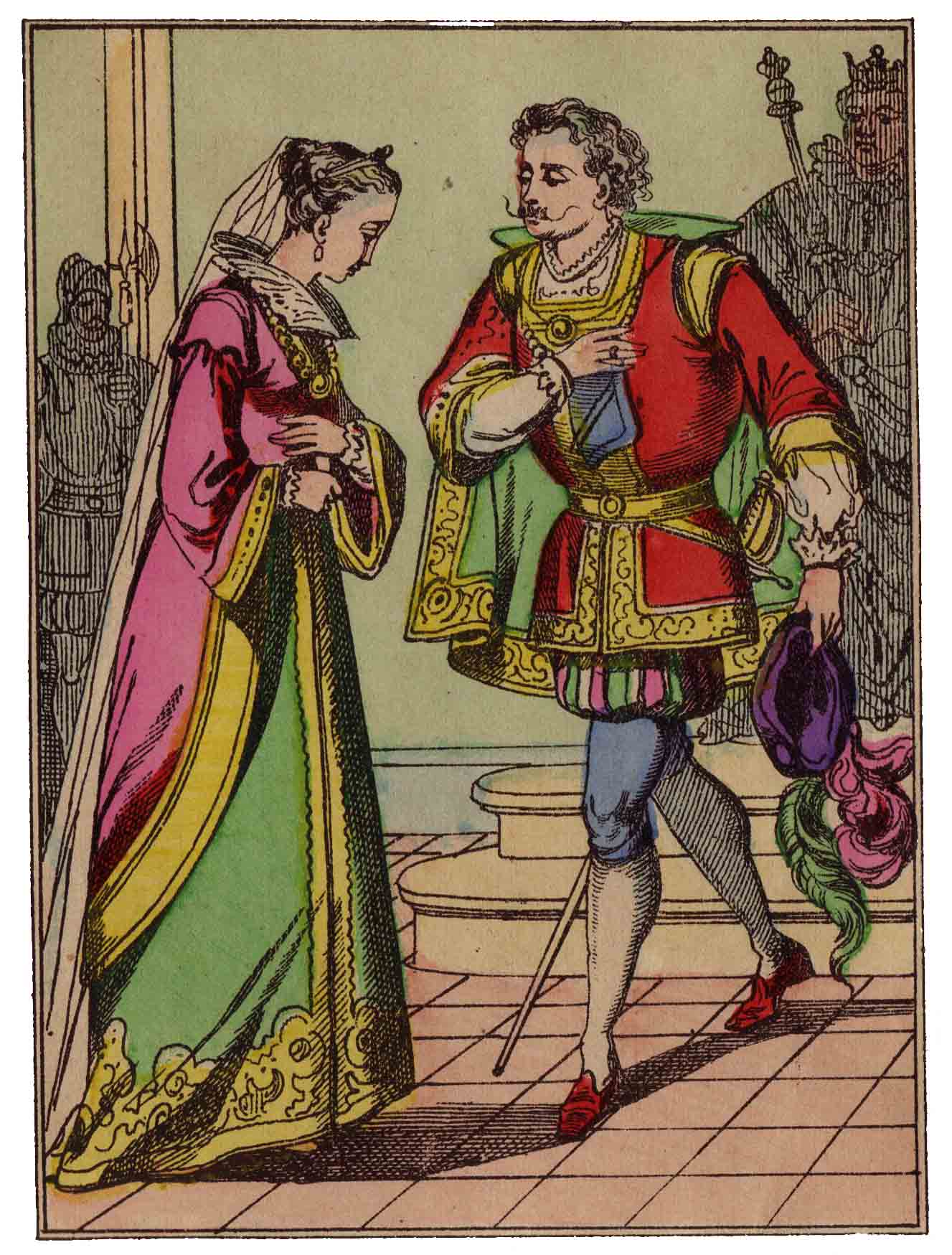
[Pictures: Romeo and Juliet, wood engraving by Bellenger after F. Dicksee, 1864-8 (Image from Victorian Illustrated Shakespeare Archive);

Le roi Charmant, hand-colored wood block print from L’Oiseau bleu, 19th century (Image from Wikimedia Commons);

Goody Two-Shoes, wood engraving from The History of Little Goody Two-Shoes, 1768 (Image from Wikimedia Commons);

Caspar Milquetoast, drawing by Harold T. Webster, first half 20th century (Image from Hairy Green Eyeball).]

February 20, 2023

Titian's Army

         I certainly don’t think of Titian (Tiziano Vecellio, Italy, 1488/90-1576) as a printmaker.  However, he was well aware of the value of prints as a means of marketing and expanding his reputation.  Relatively few people would ever see his paintings, let alone purchase them, but wood block prints could be mass-produced and sold more affordably.  So it turns out that Titian designed several woodcuts, as well as collaborating on adaptations of some of his paintings to be carved and printed by printmakers.
        Today I have for you his most famous woodcut, The Crossing of the Red Sea.  This was actually twelve wood blocks, and since each one was about 22x16 inches, the total picture once assembled would have been around 4 feet tall and over seven feet wide.  In short, it’s practically wallpaper, comparable to the grand history paintings he was doing for the palaces and government buildings of Venice.  That probably undercuts the whole idea of mass market appeal, and in fact no early impressions are known.  Although it was apparently made around 1515, the earliest impressions date to 1549.  I don’t know exactly what was going on to explain why it wasn’t printed in 1515 or why it was printed nearly 35 years later.
        At any rate, it’s an epic scene, showing Moses in the lower right stretching out his staff over the water and calling the waters back over the pursuing army of the Pharaoh.  It’s an interesting composition with all the action occurring in only about 4-6 of the 12 sheets.  The large areas of sea are presumably to emphasize just how formidable a barrier the Israelites have passed, and just how overwhelmed the Egyptians are now.  I have led off with the tenth panel because I find it the one with the most dramatic scene of action: lots going on, but not so much that it all blends into mush.  I like the details of the horse’s caparison of ribbons, as well as the rearing and confusion of all the animals.  A helmet is being swept away in one direction, possibly belonging to the man who has been thrown from his horse in the other direction.  Here you can see the skill and interest of the design in a way that sort of gets lost when you look at the whole thing.
        Speaking of the whole thing again, I have assembled the entire epic piece from the individual block prints that the Art Institute of Chicago lists only separately, and putting it together for the first time has revealed a few quirks.  The blocks don’t always actually fit together very well.  Perhaps the most glaring oddity is utter lack of transition between the city skyline in the second block and the ocean in block 6 directly below.  There are places with slight gaps, or not quite straight edges, or where you can’t quite make both sides of a pair of blocks line up at once.  Presumably these are artifacts of the method of carving.  It’s likely that the different squares in the grid were farmed out to different carvers, who didn’t check against each other as they each made their own block.
        One final detail to note is in some ways my favorite: the mother in the lower right corner nursing her child.  She’s completely ignoring all the epic drama behind her, of drowning enemies and jubilant allies, as she simply gazes at her baby.  Let’s never forget that the biggest events in history earn their importance for good or ill by their effect on the lives of ordinary families.


[Picture: The Submersion of Pharaoh’s Army in the Red Sea, woodcut in 12 sheets from a design by Titian, c. 1515, printed 1549;

Detail of block 10 (Images from Art Institute Chicago).]

February 15, 2023

Percival's Pictures

        Here’s a children’s book illustrator who’s practically a neighbor of mine here in eastern Massachusetts, although I only just discovered her.  Kari Percival is an environmental educator as well as an illustrator, and now an author, 
and her work is right up my alley.  She uses wood block prints for her illustrations, and she has a particular focus on nature and environmental issues, as well as folk tales.  All stuff I love!  (Her web site even has the same subtitle as this blog: “Words and Pictures!”)
        For today I had to pick just a few of her illustrations to share, so I’ll start with a couple of really fun ones illustrating one of many folk tales about Vassilissa and Baba Yaga.  In this particular tale, Vassilissa has help from a magic doll, who does chores for her.  I could use one of those!  (On the other hand, I suppose I really should leave the magic dolls for the people who actually have to deal with wicked witches, and not squander them on my own mere laziness in the chore department!)  I love all the patterns on the dishes, keeping us grounded in the time and place of the story.  I love the bubbles, and the swirls of steam.  This is done with three colors: pale lilac, medium violet, and orange-ish red.  Then the cabbage in the second picture is utterly gorgeous, with its curvy scalloped leaves, subtle shadows, and decorative veins.  Plus it’s just so whimsical to see the magic doll carrying it on her head.
        Next is a more serious, realistic picture, yet it still has just as much delightful whimsy.  Again, I’m so impressed by how the whimsy is not a substitute for genuine observation and skill in depicting realistic amphibians and complex patterns of light and shadow.  This piece comes from a book about amphibians crossing roads in the spring, which is not yet released.
        Another wonderful view of the natural world is this image of herring running upstream in the Mystic River.  This piece illustrates not only the fish themselves, but also Percival’s use of 
her art as a way to educate people, share messages, and promote important causes.  Again, an idea that resonates with me, although Percival’s pieces are often much more explicitly focused on a message than mine are, as in this cheerful monarch butterfly.  She makes lots of posters and similar art.  With the herring, though, it’s the beauty of the natural world in a sense speaking for itself, although the artist’s job is, perhaps, to amplify that voice and give it a platform.
        Returning to folk tales, I’ve included this wonderful Kokopilau.  Although I was somewhat familiar with Kokopelli and his role as traveller, flautist, storyteller, trickster, and fertility god, I had not been aware that some versions give him an origin as an insect.  I like this insect depiction, and I especially like how his music is composed of a stream of sun-bright flowers.
        There are lots of other pieces I like, but I’m running out of room, so I expect I’ll find ways to include more in future posts, especially since many hit my sweet spot of relief prints that depict fantasy subjects.  So I’ll conclude with a local scene of people happily reading on one of the swan boats in the Boston Public Garden.  I myself would suggest that if you ever get a chance to ride on one of the swan boats, you shouldn’t waste this iconic and beautiful activity with your nose in a book any more than you should be staring at your cell phone.  Look around, greet the ducks, wave to the turtles, admire the willows…  
And when you return to the shore, go sit on one of the benches in the Public Garden and then you can read.
        If you like these illustrations, be sure to look up Kari Percival in your local library and find her first book.

[Pictures: Vasalisa’s magic doll tidies up, wood block print by Kari Percival, c. 2017;
Vasalisa’s magic doll tends the cabbage, wood block print by Percival, c. 2017;
Amphibian migration, wood block print illustration from Safe Crossing coming out in 2025, c. 2018;
River herring, wood block print by Percival, c. 2022;
Leave the Leaves, wood block print by Percival, c. 2022;
Kokopilau led the people into a new land, wood block print by Percival, c. 2019;
Read Local, wood block print by Percival, c. 2019 (All images from KariPercival.com and Instagram @karipercival).]

February 10, 2023

Divine Love for Valentine's Day

         Valentine’s Day is coming up next week, so here is a pair of romantic woodcuts from nineteenth century India.  Since I’m no expert in Indian epics or Hinduism, I’ll just give a brief background that these pieces represent Krishna and Radha, major deities of Hinduism who are so closely linked that sometimes they’re considered to be paired aspects of a single divine.  Radha is the goddess of love, compassion, and devotion, and the love between Radha and Krishna is what their pairing is all about.  So here are two relief block prints celebrating that love.
        To begin with, I share both pieces because I like the way seeing them together makes us see the relationship as mutual, equal, and reciprocal.  In the first Krishna is rubbing Radha’s foot, and in the second Radha is rubbing Krishna’s.  The second thing I like about these pieces is all the interesting patterns.  Radha is wearing her traditional northern Indian garb consisting of skirt, blouse, and veil, and each one has a different detailed pattern and border.  Krishna’s cloak has another pattern, and the trees another.  Krishna and Radha both have peacock-feather crowns, which is one of Krishna’s attributes (and I believe that’s a bansuri flute he’s holding).  The border at the edge of the chair seat is particularly intricate.  Compared with the delicacy and precision of these patterns, some of the other aspects of the 
carving seem rather unsophisticated.  The hands are quite clunky, and there’s something very strange indeed about the perspective of the chair.  (I also think it’s kind of funny that although the seat of the chair in both pieces looks the same, it has a different leg, so I guess it isn’t really the same chair!)  Each piece also has a little bit of writing on the ground, but I don’t know what they say.
        Another thing I find particularly interesting about the carving of these pieces is that it looks as if some of the repeated geometric designs were made with a punch of some sort.  I’m particularly looking at the tiny flower shape that appears in the trees and on the gods’ arms, and the tiny circles of Krishna’s necklaces.  Compare the appearance of these areas with European metalcut prints here.  The reason this style usually appears in metalcuts is that it actually doesn’t usually work very well in wood.  I’ve tried it myself, and the stamps tend to break the woodgrain with a ragged edge.  I think for it to have worked on these pieces maybe the stamps were much sharper than what I tried, and/or the wood was very hard-grained.  (When carving rubber blocks the patterned punches just sort of bounce, but I have used small tubes to make tiny circles, and in fact my most recent piece actually has a necklace made of little punched circles just like Krishna’s!)
        As for the artist, the only information I have on him is that he was active in northeastern India in the late nineteenth century.  I hope you enjoy the glimpse of this devoted couple, whether as an image of beautiful love, or simply as an image of beautiful wood block printing.


[Pictures: Krishna Stroking Radha’s Feet, woodcut by Shri Gobinda Chandra Roy, c. 1890 (Image from Cleveland Museum of Art);

Radha Stroking Krishna’s Feet, woodcut by Shri Gobinda Chandra Roy, c. 1890 (Image from Cleveland Museum of Art).]

February 6, 2023

Woodruff's Block Prints

         Hale Aspacio Woodruff (USA, 1900-1980) was a painter whose most famous work is the set of Amistad Mutiny Murals at Talladega College library.  I, however, am here for his relief prints.  These are linoleum block prints, and most of them come from a series done while Woodruff was teaching at Atlanta University from 1931-1946.
        Woodruff mostly made images of people and buildings, and his pieces in the Atlanta series evoke ordinary working-class people in shabby houses, built for basics rather than fanciness.  Woodruff’s gouges, with no perfectly straight lines, give roofs a look of 
sagging and wood siding a look of warping.  The second piece takes it to an extreme, showing a barn that looks like a puff of wind would collapse the whole thing.  The puff of wind might also knock over the poor broken-backed, rib-showing mule.  While I fully acknowledge that no one actually wants this for their own house, I do like the way it looks in these block prints!  And I like the way Woodruff lets his strokes build these plank-sided shacks.
        I do like the buildings best, but I’ve included a couple of people as well.  First the head of an old woman, which is not part of the same Atlanta series.  In this one you can clearly see the influence of the carved geometry of African masks.  Woodruff spent several years in Paris where he was infected by the same bug for African art that was biting so many of the avant garde artists there.  And the fourth piece shows a woman coming home, presumably after a day’s work.  The hat looks like field work to me, 
but those shoes most definitely do not!  Again, though, I can’t help being more drawn to the buildings than the woman.  And again, although I’m sure these houses are far from the most luxurious accommodations, I just love the crooked edges and angles, the precarious porches, and the patterns of boards.  I will point out that the third house in the row actually does have some fancy touches in its architecture.
        A note on titles: many of these pieces seem to have multiple different titles according to different places on the web.  The fourth piece, for example, is variously called “Coming Home,” “Returning Home,” “Shantytown,” “Going Home,” and “View of Atlanta.”  I don’t know whether this means that Woodruff didn’t actually title them himself, or whether it means that he himself called them different things at different times.
        In addition to making art of his own, Woodruff taught in several different programs and also did a lot of work to support and promote African-American artists and their work.  If you want to see more of Woodruff’s people, you can look him up.  He’s depicted people coming from church, a guitarist, even a rather abstract girl jumping rope, among others.  There are also a couple of images of lynchings in the Atlanta series, which horrifically were also part of the experience of the people of Atlanta.  But I can’t help thinking that on the whole Woodruff was celebrating the communities that lived and worked and worshipped in these buildings, and he gave them a real beauty.
        I finish with two pieces from a series depicting the campus of Spelman College, where Woodruff also taught art classes.  These buildings are stately and beautiful.  No warping boards here, but I love the way Woodruff portrays them just as much.  The shadows, the textures, and the way you can see simple gouges becoming complex elements of the image are all extremely satisfying to me.

[Pictures: Old Church, linoleum cut by Hale Woodruff, c.1935 (Image from Cleveland Museum of Art);

Relics, linoleum cut by Hale Woodruff, c.1935 (Image from Cleveland Museum of Art);

Head of Old Woman, linoleum cut, c. 1930s (Image from Mutual Art);

Coming Home, linoleum cut by Woodruff, c.1935 (Image from Cleveland Museum of Art);

Oglethorpe, linocut by Woodruff, 1935 (Image from Spelman College);

Giles Hall, linocut by Woodruff, 1935 (Image from Spelman College).]

February 1, 2023

A Year of Rabbits

         Sure I’m a little late for the lunar New Year celebrations, but I’m happy to celebrate rabbits every year, and every time of year.  Evidence for this fact can be found in the large number of previous posts in which I’ve featured them.  This year we’ve got New Year’s rabbits, and previously I’ve had Valentine’s rabbits by Celia Hart, and Easter rabbits as well as other rabbits in fantasy.  You can also check these additional links to see rabbits and hares from

1865 Alphabet of Animals

Betsy Bowen

Raoul Dufy

John Lawrence

Howard Phipps

        Nevertheless, it wasn’t very difficult to find a few more wonderful wood block prints of rabbits to add to the mix.  First, a snowy one from 1999, a previous Year of the Rabbit.  This rabbit is not super detailed, 
but its essence is perfectly captured, and it looks gorgeous against the snowy black.  The little block of red is auspicious, as well.
        Next we have a print of two rabbits in the Japanese style that aims to emulate brush painting.  It uses grey with the black to mimic areas of more watery ink.  This one also has a little red detail, this time as the white rabbit’s eye.
        Depicting two rabbits together, one black and one white to set each other off, is a technique used by our next piece, as well.  This time the black is in front and both rabbits face the viewer.  This appears to have been inked with thinner 
ink on the top/background areas, which allows the wood grain to show through clearly and, also like the piece above, gives us grey as well as black and white.
        Finally, I’ll pin these rabbits back to Lunar New Year with a piece depicting a tiny rabbit figurine along with a New Year decoration.  I don’t have an exact date for this print, but presumably it, too, was made in a Year of the Rabbit.
        Wikipedia informs me that white is a color to be avoided in the year of the rabbit, which is difficult when the rabbits themselves are white, and is a good reason not to get too tangled up in such “rules.”  I trust these rabbits will bring nothing but good luck to everyone.  So how else could I end this post except by wishing everyone a Hoppy Year?


[Pictures: Year of the Rabbit, woodcut by Andrew Valko, 1999 (Image from AndrewValko.com); Rabbits from Bairei Gakan by Kono Bairei, (before 1895) 1913 edition (Image from rawpixel);
The Rabbits, woodcut by Henri Charles Guérard, 1893 (Image from Cleveland Museum of Art);
Rabbit and New Year decoration on a stand, woodblock print by Hada Gesshu, late 19th century (Image from The British Museum).]