July 28, 2023

Words of the Month - Arabic Origins

         The Arabic language has, over the centuries, been a rich source of words in English.  Like most linguistic borrowings, there are some patterns to be seen in which words make their way from one language into another, and those patterns have to do with where different cultures rub up against each other and influence each other.
        One category is words for foods.  When we discover and borrow new foods, we usually borrow the words to go with them.  This is quite obvious for a word such as hummus, which entered English around 1955 and comes from Arabic for “chickpea.”  But European languages have been influenced by Arabic for centuries, and some of our other food borrowings might be more of a surprise.
apricot - English started using this word around the 1550s, having borrowed it from Catalan, which got it from Arabic.  Arabic, in turn, got it from Byzantine Greek, which probably got it from Latin, so you can see that Arabic is really just one step in a long journey.  It is Arabic, however, that gave us the a- at the beginning, a residue of the definite article al-.  You’ll see this in a lot of English words that passed through Arabic.
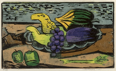
aubergine - This one is from French, but French got it from Catalan, which got it from Arabic.  It was the French who shifted the al- article to au-.  Arabic got the word from Persian, which got it from Sanskrit.  (Not being a big fan of eggplants, I don’t see why anyone at all wanted to adopt this food from its native home in Southeast Asia!)
candy - English adopted candy (specifically crystalized sugar) in the late 13th century, from Arabic by way of French.  Cane sugar was introduced to Europe from the Middle East.  
While you're on the subject, revisit the Arabic step in the etymology of sugar, as well as the sweet siblings syrupsherbet, and sorbet.
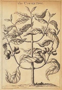
coffee - This plant is in fact native to Arabia and Abyssinia, so of course our word comes from Arabic - but it did pass through Turkish and then Dutch first.  (Earlier English forms in the late 16th century appear to have come straight from Arabic and/or Turkish, but the Dutch influence seems to have won out.)
lemon - This one is another fruit with a long journey, ultimately probably from the Malay archipelago, but with Arabic as an important step in bringing it from India to the edge of Europe in the 9th or 10th century.
You can also revisit artichoke (from Arabic al-hursufa, so you can see firstly, that we kept the article attached again, and secondly that we really mangled the sounds!)
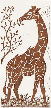
        In addition to foods, the introduction of other unfamiliar things often brings with it the introduction of their words.  Animals introduced to English (often by way of other European languages) from Arabic sources include fennec and gazelle, but also giraffe.  In 1486 the Sultan of Egypt gave Lorenzo de’Medici a giraffe which caused quite a sensation.
        Plants whose words grow from Arabic roots include alfalfa (in which you can once again see the article al-), carob, cotton (about which just a little more here), and jasmine.
        Languages also borrow words for objects and cultural ideas that are associated with foreign places and people.  That’s where we get caravan (during the Crusades) and harem (in the 1630s).  Also lute (from al-‘ud, in which we keep just the -l- of the article), mattress and sofa, mummy, sash (originally the strip of cloth used for a turban), alcove (another one with the article still attached) and even jar.


        Jar first came to English in the 15th century full of olive oil, and the word comes from the large containers used in Mediterranean trade - which brings us to another category of linguistic borrowings.  When we admire elements of another culture and aspire to their ways, we often borrow words, as well.  In English this has given us 
admiral - originally a Saracen commander, admired during the Crusades (It didn’t come to apply to a naval commander until around the 14th century.)
magazine - originally a warehouse, especially for storing ammunition and military equipment
ream - the measure of paper, which comes from Arabic because the Moors introduced the manufacture of cotton paper to Spain
        But what learned Europeans really admired and had to borrow from Arabic in the Middle Ages and Renaissance were words for mathematical and scientific concepts.  These include
alchemy - Arabic got the word from Greek, but of course it left its mark on our word with, once again, the redundantly attached article.
elixir - originally the Philosopher’s Stone.  Read all about it here.
alcohol - you can see more about this here
tariff - originally an arithmetical table
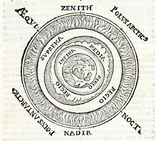
nadir
and zenith - late 14th century.  Nadir comes from nazir meaning “opposite” the zenith, while zenith comes from samt meaning “the way [overhead]”  The -m- was misread by Medieval scribes as -ni-, and to see why, read this.
cipher and zero - These words are doublets, both originating in the same Arabic word for zero, sifrCipher reached English in the late 14th century, along with Arabic numerals, from Old French.  Zero arrived about 1600 possibly from Italian.  (But both variants appear in Latin, and I don’t know why that is.)


        Finally, I can’t resist adding a few mythical creatures that we borrowed from Arabic:
almiraj - the unicorn hare, which you can read about (along with a few other Arabic creatures) here
ghoul - Arabic ghul, English learned of this evil, corpse-eating spirit from a French Orientalist novel called Vathek, translated into English in 1786.
jinni - Funnily enough, Arabic jinni is not the origin of genie, which comes from Latin genius, meaning “a tutelary spirit.”  Genie was used in the French translation of Arabian Nights, and was then borrowed into English.  But we had the legit Arabic word in the 1680s.


        There is one other major category of words borrowed from Arabic, but this post is already long enough, so you’ll have to wait for next month to find out about them!  In the meantime, did you learn anything new today?


[Pictures: Still Life with Eggplant, woodcut in colors on paper by Werner Drewes, 1954 (Image from MutualArt);

The Coffee Tree, woodcut from The Virtue and Use of Coffee by Richard Bradley, 1721 (Image from Project Gutenberg);

Just Browsing, rubber block print by AEGN, 1999 (Sold Out);

Zenith and Nadir, wood block print from book by Sacrobosco and Pifferi, 1604 (Image from IlPonte).]

July 24, 2023

Musings on Sales

         I’ve been thinking again recently about the delicate balance that artists of all sorts must find, dancing the tightrope between creation and commercialism.  I could wrestle with this for pages, but it’s summer and I’ve got lots of chores to do, as well as plenty of work for the next Strong Women-Strange Worlds author event, not to mention a backlog of no fewer than five carved blocks that need printing.  So instead I offer you a quotation from sculptor Anne Truitt, as well as just a few additional thoughts of my own.
        “Artists have to please whim to live on their art. They stand in fearful danger of looking to this taste to define their working decisions. Sometime during the course of their development, they have to forge a character subtle enough to nourish and protect and foster the growth of the part of themselves that makes art, and at the same time practical enough to deal with the world pragmatically. They have to maintain a position between care of themselves and care of their work in the world, just as they have to sustain the delicate tension between intuition and sensory information.
        “This leads to the uncomfortable conclusion that artists are, in this sense, special because they are intrinsically involved in a difficult balance not so blatantly precarious in other professions. The lawyer and the doctor practice their callings. The plumber and the carpenter know what they will be called upon to do. They do not have to spin their work out of themselves, discover its laws, and then present themselves turned inside out to the public gaze.”
        There are certainly some authors and artists who love making work tailored to the “popular” trends and who revel in marketing and publicity.  But I, along with the majority of authors and artists I know, find a deep and uncomfortable chasm between the love of creating things and the unpleasant necessity of trying to sell it.  I don’t want to play the publicity games of making sure everyone has heard of me, or attempt to perform the marketing goals of convincing people they “need” something they wouldn’t otherwise want.  Add to that the even deeper and more difficult divide between my sense that making art and writing are a calling, in which I attempt to offer up my gifts in the service of making the world a better place… and the fact that this is my job and I’m trying to make a decent income from it.
        This weekend I had a booth at an art festival, and that format usually feels pretty good to me.  I display my art, and people can look at it and decide for themselves whether or not it makes them happy and they want to buy something.  If they don’t care for it, they walk on by and we all go on with our lives.  If they enjoy it and feel some connection and delight in what I’ve created, they can spend time looking, we can talk, and maybe they’ll decide to take something home.  Certainly I appreciate all the people who stopped by this weekend, looked, and talked with me about block printing, speculative fiction, magical creatures, doors, carving, octopuses, Model T’s, and more!  I hope the pieces you bought bring you much joy.
        For others who walk that tightrope, how do you find the balance between nourishing the part of yourself that makes art and being practical enough to deal with the world pragmatically?


[Five blocks carved in July,

booth at Linda Plaut Newton Festival of the Arts, photos by AEGN, 2023;

Quotation from Daybook: The Journal of an Artist by Anne Truitt, 1974, by way of Maria Popova’s The Marginalian.]

July 19, 2023

Latham and Cook

         A couple of weeks ago I featured some block prints by Barbara Latham, which you can revisit here.  At the end of the post I foreshadowed another fun fact about Latham, and that’s the subject of today’s post.  Latham was married to Howard Norton Cook, another block print artist whose work you can revisit in two previous posts, here and here.  What’s especially fun about a couple who are both artists is that they can make portraits of each other, and that’s what I'm presenting today.
        Of the four examples I have, three are by Howard and depict Barbara, although the first one shows both of them.  I really love the self-deprecating humor of this one, showing the couple in a most un-artistic activity.  Although it’s rather rough in style, it’s still got lots of fun details, like the snake in the foreground and the rider looking on from the background.  I especially like the swirl of smoke, and the body postures are perfect.  This was made the same year they were married.
        Next, Howard depicts Barbara as a classic bathing beauty.  I love the lighting and shadows on this one, and how simplified shapes evoke the form and setting.  And although I suppose a classic painting would have made the woman nude, I actually think this seems more intimate, because a nude would have looked self-consciously posed for the art market, while this seems more like a snapshot of daily life.  Plus I really love the vintage bathing suit.
        Continuing in chronological order, next is another portrait of Barbara by Howard, and another casual daily moment.  Here Barbara is reading the newspaper, maybe in bed.  The lamp is suspended in space, its base or wall arm invisible behind its own light.  All the wrinkles of fabric are masterful, as are the panels on the door, but I’m not entirely convinced by the thin white outlines of the facial features, especially the mouth.
        Finally, we have a portrait of Barbara and Howard by Barbara, depicting the couple on Christmas Eve, for a holiday card.  I’m amused that Howard is playing the accordion - Christmas carols, no doubt.  Although Barbara’s back is to the viewer, her face is visible in the mirror over the table.  This one is not an engraving, and thus has less fine shading than the two above.  The Philadelphia Museum of Art dates this piece to 1926, but The Museum of New Mexico Press dates it to 1933.  I’m assuming the latter date must be 
correct, because the couple only met in 1926 and weren’t yet married, so I don’t think they’d call themselves “the Cooks.”
        Once before I featured another block printmaking power couple, William and Marguerite Zorach.  In that post I commented that I’m fascinated by what it would be like to be married to another artist (especially, in the Zorachs’ case, one who shared the same style).  I love to see Howard and Barbara featuring each other in their art, making it feel like this was something that they shared and supported each other in.


[Pictures: Barbara Latham, Howard Cook, woodcut by Howard Cook, 1927 (Image from Smithsonian American Art Museum);

Barbara in Bathing Suit, wood engraving by Cook, 1929 (Image from Smithsonian AAM);

Barbara at Home, wood engraving by Cook, 1930 (Image from Smithsonian AAM);

Greetings from the Cooks, woodcut, probably 1933 (Image from Philadelphia Museum of Art).]

July 14, 2023

Student Printmaking

         This week I taught printmaking to kids for the first time in four years, so it’s also been four years since I’ve been able to share kids’ creations.  This week’s group included students who will be entering grades 5-9, none of whom had done printmaking before.  Over the course of the week we got through quite a few projects, so today I’m sharing what I consider to be some of the highlights.  Of course, art is personal and a matter of taste, so the kids themselves might have other favorites, as might other adults.  But these are some of my favorites.
        The first grouping are examples of the “foreground and background” project, in which they carved sets of blocks intended to be printed together.  The deer and the mushrooms are both by one student, and I love the contrast between them and the way she was able to think so differently about the two pieces.
        Next are examples of patterns: mostly 1.25 inch squares carved and printed repeatedly.  The piece in the lower left, however, is by a student who filled most of her blocks with dense patterning.  You can see another of hers in the next grouping, and I’m sure you can guess which one it is!
        All the pieces in this third group are classic relief block printmaking: one block, one color ink, and let the bold, graphic effect carry it.  From simple to detailed, block prints always look great!  The piece in the lower right is an example of a happy accident.  The rubber turned out to have some sort of odd flaw which caused it to print with that craquelure effect, which just happens to work perfectly for the water in the koi pool.  (Although it happened to work great for this piece, however, I will say that I have been unhappy with recent orders of rubber.  I feel like the quality has gone down substantially since I began using this brand some 20 or more years ago.  More and more of 
the blocks are flawed these days.)
        And finally I have two pieces to share that came out particularly well.  In both cases the students used reference pictures in designing their sketches, so I wouldn’t call the designs 100% original.  However, they did both do such an excellent job in their execution that I’d say they really demonstrated full understanding of what they were trying to do and how to get there.  The sea arch was printed first on white paper, which was them given a watercolor sky.  Because we use water-based ink, this artist had to work very meticulously at the edges to avoid making the printing ink run, while still making a very painterly wash of color.  He also used watercolors on some of his other pieces with equally effective results.  
The final piece is an example of a Provincetown-style white line print.  It’s quite small and beautifully detailed.
        Did any of these inspire you to give printmaking a try?  Which project looks like the most fun to you?


[Pictures: Deer, rubber block print with two blocks by EV;

Mushrooms, rubber block print with two blocks by EV;

Dog, rubber block print with two blocks by KL;

Waterfall, rubber block print with two blocks by VM;

Little square, rubber block print by EV;

Little square (and the block), rubber block print by CZ;

Rubber block by SV;

Little square, rubber block print by CG;

Cow, rubber block print by LG;

Landscape, rubber block print by CG;

Vase, rubber block print by CZ;

Abstract music, rubber block print by SV;

Koi pond, rubber block print by VM;

Sea arch, rubber block print with watercolor by MW;

Provincetown-style rubber block print by KL, all 2023.]

July 10, 2023

Recent Reads of MG Magic

         MG, for those who don’t know, is Middle Grade, a category of books for kids in the age range of roughly 8-12 or sometimes 14 years old.  Of course the reading level and content taste of individual kids varies widely, but that’s the general ballpark.  (Plus of course there’s the fact that while I am well over 14 years old, I very much enjoy MG books.  Maybe I’ll explain why in another post, but for now, let’s get to the books!)  It’s been quite a while since I posted about books I’ve been reading, but I’m writing such a post now because I recently received an ARC (Advanced Review or Reading Copy) of a book that will be released this summer, and I wanted to do my part to help generate buzz!  So we’ll start with
        The Demon Sword Asperides by Sarah Jean Horwitz.  Asperides the demon sword is pinned through the heart of its late master, a supremely evil sorcerer knight, when someone (bored dark sorceress Cleoline, to be specific) resurrects the guy.  At the same time, Asperides just can’t help himself from inveigling naive, somewhat hapless would-be knight Nack from entering into a binding soul-contract to be the demon sword’s next master.  Meanwhile the young novitiate seer Therin foretells the return of the Missing Moon…  Each character with their various motivations and talents (and lack of talent, at times) struggles to follow their chosen path, as those paths begin to converge and intertwine.  What will happen when the Missing Moon returns and the evil sorcerer knight carves a hole into the demon realms in an attempt to retrieve the missing 80% of his soul?  I enjoyed this book very much, with its light, humorous tone, lovable characters, interesting world-building, and tons of heart.  Horwitz is a master at making “dark” characters with hearts of gold, as demonstrated in her previous book The Dark Lord Clementine.  (Horwitz joined me for an interview about 
it on this very blog three years ago, and I encourage you to read what she has to say about writing
 Middle Grade fantasy.)  But not all hearts are gold, and our heroes have their work cut out for them, discovering the true meaning of duty, honor, courage, and knighthood.  Curious?  Want to hear more?  Horwitz herself will be giving a live on-line reading from The Demon Sword Asperides on July 20.  Learn more about the event at Strong Women-Strange Worlds!
        Another MG book I read relatively recently and loved was Sal & Gabi Break the Universe by Carlos Hernandez (and its sequel Sal & Gabi Fix the Universe).  This is not a book that needs any extra buzz from me, because it’s won tons of awards and starred reviews since its release in 2019.  Sal Vidón is struggling at a new (but wonderfully wacky and innovative) school, as well as struggling with the loss of his mother.  Student council president Gabi Reál is doing everything she can to keep her friend Yasmany from being expelled for bullying after he picks a fight with Sal.  Another very funny book, which touches on all kinds of heart-wrenching issues without ever losing its light touch, this is another one that warmed me to the very cockles.  And this is one reason I love MG fantasy so much: it’s never ashamed to celebrate love and joy.  I won’t attempt a synopsis of the crazy, convoluted, multiverse-spanning plot, but I will say that the thing about these books that won me over utterly was their portrayal of happy families that come in some pretty unusual variations.  Sal may have lost his mother, whom he longs to bring back (from another universe), but he’s also got a wonderful father and stepmother.  Gabi has a mother who would embrace (and feed) the entire world if she could, plus a huge number of “dads” who include men, women, a robot, and more, all of whom love her, her critically ill baby brother, and each other fiercely.  Sometimes it seems like dysfunctional families are used by writers as just an easy shortcut to add conflict, so it’s really refreshing and satisfying to see a portrayal of healthy, happy, and delightfully diverse, loving families who work together to solve their problems.
        The Lock-Eater by Zack Loran Clark (2022) is another magical adventure with a wonderful message of love and acceptance.  Melanie Gate is an orphan in the capital city of the thaumacracy.  She has a strange talent for opening locks, which occasionally causes trouble, but most of all, she longs for adventure.  Then adventure finds her, in the form of a mage’s gearling who turns out, impossibly, to be sentient, alive… a person.  In fact, Traveler is an absolutely endearing person, and also (all too rare in stories) one whose desire to do no harm makes him work hard to be a pacifist.  This world (which is flavored like 19th-early 20th century Europe with 2 competing magical systems) is well-drawn, the adventure twists and turns with several surprising pivots, and there are many likeable characters.  Like the families in Sal & Gabi, Melanie’s orphanage family is loving and supportive, and they have her back when she needs them.  Although there were times when the theme of diversity and inclusion seemed a tad heavy-handed, it’s not a theme I’m going to object to (and it may seem less obvious to MG readers).  In addition to that I appreciated that the characters engaged seriously with issues of non-violence.  I enjoyed this one very much, and the ending was warm and satisfying.
        Each of these books has its own distinct flavor, and you can take your pick between light goth, madcap sci-fi, or political epic fantasy… but I would recommend any of them to anyone who needs a reminder that love is its own powerful kind of magic, and no matter who we are, we can all choose to wield it.

July 5, 2023

Block Prints by Latham

         Barbara Latham (USA, 1896-1989) was born in Massachusetts but ended up spending most of her adult life in New Mexico.  She was a painter and illustrator, but also made block prints and wood engravings.  I’ve selected a few that I particularly like.  Up first is one that I think shows Latham’s illustrator sensibilities.  The scene here hints at a story, and the pretzel woman definitely looks like a character.  I like the contrast between the crowd of baby carriages implying the presence of children, and the fact that we actually don’t see any babies or children anywhere.  There’s 
an affectionate humor in this scene.
         If you want to see children, how about this charming family of bears?  It’s adorable, but perhaps the most interesting thing is the textures of the rocks.  You can see clearly the distinctive marks made by the multi-line tools unique to wood engraving, but Latham has gone above and beyond the usual in the sorts of patterns and textures she’s created with these tools.  Although on the whole I really love my rubber block prints for myself, I do have a bit of envy when I see what’s possible with the medium and tools of wood engraving.
        These geraniums are a linoleum block print rather than a wood engraving, and although it still has plenty of fine lines and details, you can see that this piece doesn’t have that almost fuzzy appearance imparted by the engraving tools.  The thing I find most interesting about this piece is how the shadows 
on the wall and the shaded side of the window frame are printed much more lightly than the heavy blacks of the rest of the piece.  The most staightforward method would be simply to press more lightly on the areas where she didn’t want the ink as dark.  That’s hard to control, however, so she may also have used a mask of some sort to lift a bit of excess ink off the selected areas.  In any case, I love the depth it adds to the piece.
        I couldn’t find a clearer image of this last piece, but I wanted to include it anyway because I love the warmth and light of it.  The woman sits in the evening contentedly darning a sock in a cozy corner.  The lamplight glows, throwing the shadows 
around the woman like a dark blanket.  Here I’m envious once again because I think lighting is one of my weaknesses in my own pieces.  I always love to see it done beautifully.
        Latham may perhaps illustrate the fact that illustrators tend in general to get less acclaim than straight “Fine Artists,.”  Nevertheless, although hardly a household name these days, she had a long and successful career in her time.  There’s one more fun tidbit I want to share about Latham and her art — but you’ll have to wait for another post to see it!


[Pictures: In the Park, wood engraving by Barbara Latham, c. 1937 (Image from Old Print Gallery);

The Bear Family, wood engraving by Latham, 1937 (Image from Amon Carter Museum);

Geraniums, linocut by Latham, c. 1934 (Image from Philadelphia Museum of Art);

Lucy, wood engraving by Latham (Image from The Owings Gallery).]