June 30, 2023

Words of the Month - Kaput

         It’s been a while since I mentioned Proto-Indo-European, so here’s a quick refresher: it’s an ancient language that no longer exists, but which linguists can extensively reconstruct by tracing back from all the known languages which descended from it, which include most of the languages of Europe and India including Latin and Romance languages, Celtic languages, Germanic languages, Greek, Slavic languages, Persian, Sanskrit and the Indian languages descended from Sanskrit.  That’s a lot!  It also means that many Proto-Indo-European (PIE) roots have produced a whole plethora of modern English words, by coming down through various branches and twisting and turning in various ways over the approximately 5000 years since PIE was spoken as a single unified language.  I’m bringing it up today because I’m going to share just a few of the many English words that ultimately derive from the PIE root *kaput-.  (The asterisk, by the way, indicates that the form is reconstructed, as opposed to directly attested, since there was no writing to directly attest any part of PIE.)  *kaput- means head.
        Let’s start right off by tackling the obvious question: is this related to the English word kaput?  The answer is yes, but in a very indirect and convoluted way, so let’s take it step by step.  English borrowed kaput from German (around 1895, but popularized during World War I).  It means “destroyed, ruined,” but derived from a term that German had borrowed from French, faire capot, which referred to winning all the tricks in the card game piquet, which was popular in the 16th century.  That French phrase literally means “to make a bonnet/hood,” but was also marine jargon for a sailboat being overset in a squall - or capsized.  The capot which meant “bonnet or hood” in the phrase was also the name of a hooded cloak or cape (the word is, in fact, a diminutive of cape) worn by sailors and soldiers.  The capes in question are named for their hoods or caps, which come from Latin caput “head” because of course they’re worn on the head.  And the connection of Latin caput from PIE *kaput- is perfectly clear.
        From cap and cape we also have all kinds of English words from hubcaps and cap-guns, to the chapel that I discussed previously.  Then there’s escape, which literally meant “to get out of one’s cape,” presumably leaving it behind in the hands of the captor.  (Captor, however, is unrelated, despite appearances.)
        Other English words that derive from the Latin caput include biceps (c 1640, “two-headed,” because of the structure of the muscle), cadet (c 1610, from Gascon capdet, from Medieval Latin capitellum, a diminutive of caput), cad (c 1730, shortened slang of cadet), cape “promontory of land” ie “headland.”  And don’t forget captain.
        I need a whole paragraph just for capital in all its various meanings, but many of them involve a conflation of head with the meaning first.  “Head city,” “top of a column,” and “upper-case letter” are pretty straightforward.  Capital meaning “wealth” came from a distinction made in medieval Latin between the head or first sum of money and the subsequent interest added to it for a loan.  Medieval Latin capitalis meaning “property” also led, by way of two dialects of Old French, to both cattle, which originally meant property of any kind, and chattel.  Meanwhile, capital punishment involves a connection between the head and life itself, and of course sometimes meant decapitation.
        Chapter is a division of a book or other organization - a heading, in fact.  It’s another diminutive, and comes by way of Old French, which is where we also get the ch in the words chief, chieftain, kerchief (a cloth covering the head) and mischief (an event that comes to a head in a bad way), which is the opposite of achieve (literally “to come to a head”).  On the other hand chef, despite its ch, is from modern French (1842).  Capitulate comes from the idea of drawing up the terms of surrender in articles or chapters, but comes straight from Medieval Latin instead of going by way of French, and recapitulate means to go back over the main chapters or headings of discourse.
        Then there’s precipice, literally meaning “before or forth + head,” in other words, “headlong or headfirst,” which is how you might fall down it.  The verb precipitate came first by nearly a century, and precipitation was even earlier (late 15th century, of fallen angels and alchemical solutions - but rain didn’t fall into English with this word until the late 17th century).
        You can also revisit cappuccino and cabbage, discussed last month, and add the uncut gemstone cabochon which comes from the same Old French slang as cabbage.
        All the examples I’ve listed so far came into English by way of the Latin branch of PIE.  But English also gets the version that developed directly down through the Germanic branch, which is where we get head itself.  And of course head leads to a whole array of figurative uses, many of which we’ve already seen in the same ways the Latin version was used: top, first, most important, most prominent, individual, and so forth.
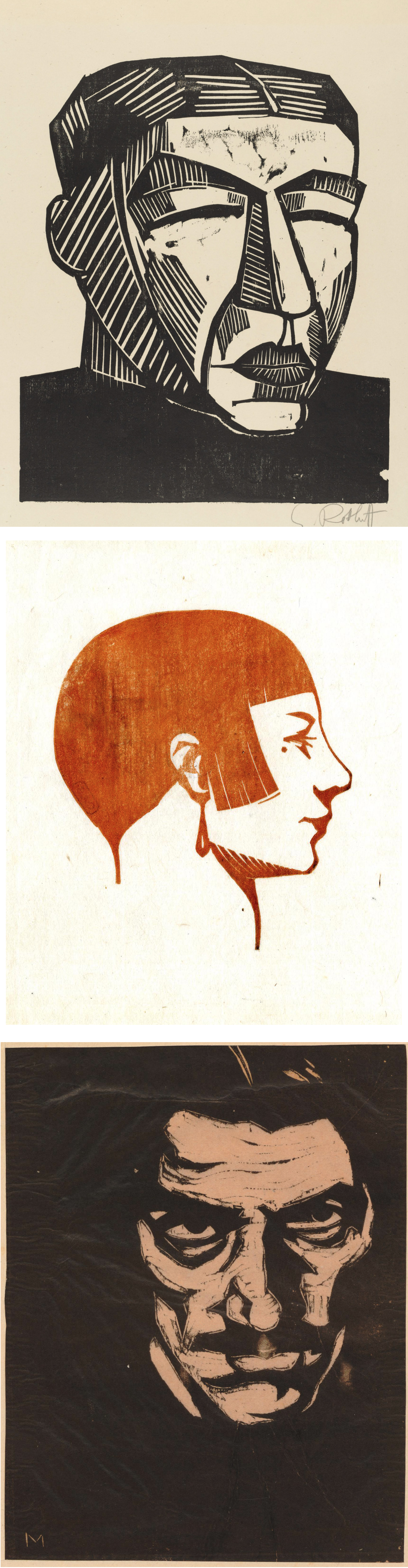
        Whew, that’s a lot of heads for one day, illustrated with a lot of wood block prints of heads, so that’s enough from me before we all lose our heads!


[Pictures: Head of an Awa Doll, colour woodblock print by Taniguchi Kunbi, 1948 (Image from The British Museum);

Portrait head, woodcut by Wiktoria Goryńska, 1931 (Image from The British Museum);

Head of a mountain peasant, woodcut by Władysław Skoczylas, 1927 (Image from The British Museum);

Mother, woodcut by Karl Schmidt-Rottluff, 1916 (Image from MoMA);

Tête, woodcut by Emile Charles Carlègle, 1932 (Image from The British Museum);

Self-portrait, woodcut by Emilio Mantelli, c 1911-18 (Image from The British Museum);

Head of an old man, woodcut by Hans Baldung, c 1518 (Image from The British Museum);

Grand tête de femme, woodcut by Marie Laurencin, 1910 (Image from The British Museum).]

June 26, 2023

Tiny Block Challenge Part II

         Blow the fanfare!  I completed 30 tiny rubber block prints in one month, thus accomplishing my own unofficial challenge to stay engaged - and use up some of the many little scraps of rubber I had accumulated.  I’m pretty pleased with the breadth of variety, making at least one print for each of the rough categories into which I divide my art on my web site (animals, plants, people, places, stories, and Interesting Things).  But the tiny format certainly lends itself better to simple single items than to sweeping vistas or complicated scenes.  At any rate, here are the tiny prints from the second half of the month:

16. Birdhouse

17. Vogelhuisje

18. birdhouse (Japanese)

19. Cementos, Quintana Roo

20. Dalahäst

21. birdhouse (Mayan)

22. birdhouse (Russian)

23. coy cat

24. Mudskipper

25. Venus Fly Trap

26. Lagopus

27. Llama calligraphy

28. Siren Song

29. Rocking Chair

30. Faithful Friend

        A few notes on the printing of some of these…  * The birdhouses were all printed together as a single piece, and I added to it a bird and a post, (which were bonus blocks as far as the challenge was concerned.  The bird is only about a half inch square).  * For the mudskipper and the Venus fly trap I started out printing in colors, but decided in the end that you really can’t beat black, so those are mixed editions with some in each color.  * The llama was inspired by Islamic calligraphy and was an attempt to make the word into the thing.  * The siren and the final little girl were both done with an eye to illustrating short stories, and they will probably end up as parts of larger scenes for those illustrations.  For the little girl I plan to do the extra bits on the computer, but I may fool around with collage for the siren.  We’ll see.
        So for now I’m declaring myself finished.  I still have plenty more items on my list of ideas, and I still have plenty more small scraps of rubber, but I also have plenty of other things that need doing.  If nothing else, it’s going to be an awful lot of work just to get a full selection of these matted and framed before my next sale, which is less than a month away!  I also need to finish scanning these and getting them up onto my web site.  (The page of Tiny Prints is here, and will be updated as time permits.)
        Then there’s all the other stuff… 
Remember how this challenge started because summer is supposed to be a slow season?  Well, of course I’m as busy as ever.  I’ll be teaching kids’ printmaking classes for the second week in July, and participating in the Linda Plaut Festival of the Arts on July 22.  I’m also working on writing and submitting a steady trickle of short stories and poetry, so I continue to find that I simply don’t possibly have the time to do a lot of housework!
        Back when I started working more on the short stories (instead of novels), I found the smaller bite-sized pieces very refreshing.  (Revisit a post about that here).  Well, if short stories and normal block prints are “bite-sized,” that must make these tiny prints no more than nibble-sized!  Amuse-bouche art.  I’ve definitely enjoyed my tiny challenge, and will try to do more of these tiny prints as part of the usual mix, without waiting to set myself a special assignment.
        What’s your favorite?  Or what would you have done instead?  Well, don’t just tell me - go give it a try for yourself!


[Pictures: All block prints and photos by AEGN, 2023.]

June 21, 2023

A Little Whimsy

         Here are a few relief block prints that are a little quirkier than your average piece of  Serious Art.  First up are two by Ed Haddaway, who is primarily a sculptor but does have a page of block prints on his web site.  His block prints are populated by these strange therianthropic people endowed with odd noses or rabbit ears.  What I particularly like about them is their appearance of going about their possibly magical lives with a general air of friendliness.  “Till the Wee Hours” shows two of these people floating in the night sky far above the dark trees.  One has wings, the other… a necktie?  Are they parent and child?  Guardian angel and protectee?  Two spirits in love?  A fairy granting a wish to a less magical being?  I love the mystery of this image, as well as its magic.
         It’s the title that raises the questions for this second piece: “Life is a Story Read to a Duck.”    My father always says “Life is a ___” in which the blank is filled by random words that strike his fancy at the time.  And I always reply, “Why?”  
What’s the metaphor here?  What’s the point we’re trying to make about the nature of existence?  In my father’s case, he generally doesn’t have a deep point to make; he just likes the sound of his phrases.  So, is that the case for Haddaway?  But setting aside all philosophy, what I actually like about this piece is just taking the scene at face value: here’s a duck enjoying a book read by some companionable rabbity figure who’s sharing quality time, love, and story.
        Today’s second artist is Nick Morley, aka Linocut Boy.  I think Morley must be doing something a little similar to me; he says “I seem to be making a lot of little cute prints at the moment.  I’m not sure why.”  What’s fun about them - and why I say they’re a little similar in spirit to what I’m doing with my tiny prints - is that they don’t have to have a reason or “make sense” or justify themselves or the effort to make them.  Some little idea pops into your head and it may not be worth a whole huge production, but is it worth a tiny block?  Why not!  Some little idea like, “I know, how about a potato cowboy!”  These definitely tickle my whimsy-bone.
        I hope these quirky prints give you a little smile today, too.


[Pictures: Till the Wee Hours, block print by Ed Haddaway, 1992;

Life is a Story Read to a Duck, block print by Haddaway, 2021 (Images from EdHaddaway.com);

Potato Cowboy, linocut by Nick Morley, 2023 (Image from linocutboy.com);

Juggler, linocut by Morley, 2023 (Image from linocutboy.com).]

June 16, 2023

Songs for the People

         This poem is by Frances Ellen Watkins Harper (US, 1825-1911), a remarkable woman who wrote poetry, short stories, a novel, and journalism, and was among the first African-American women to be published in the USA.  You should definitely look her up if you’re not familiar with her, as she really should be a household name.  For the purposes of this blog, however, let me go ahead and share Songs for the People without further ado.

Let me make the songs for the people,

     Songs for the old and young;

Songs to stir like a battle-cry

     Wherever they are sung.


Not for the clashing of sabres,

     For carnage nor for strife;

But songs to thrill the hearts of men

     With more abundant life.


Let me make the songs for the weary,

     Amid life’s fever and fret,

Till hearts shall relax their tension,

     And careworn brows forget.


Let me sing for little children,

     Before their footsteps stray,

Sweet anthems of love and duty,

     To float o’er life’s highway.


I would sing for the poor and aged,

     When shadows dim their sight;

Of the bright and restful mansions,

     Where there shall be no night.


Our world, so worn and weary,

     Needs music, pure and strong,

To hush the jangle and discords

     Of sorrow, pain, and wrong.


Music to soothe all its sorrow,

     Till war and crime shall cease; 

And the hearts of men grown tender

     Girdle the world with peace.


        A lovely sentiment, but What, you may ask, does this have to do with art or fantasy?  There are two ways that I think this poem warrants a place this blog.  For one thing, it is speculative in the sense that it attempts to imagine what it would take to create a world girdled with peace.  Quaker sociologist Elise Boulding studied and taught about the role of imagination in helping people work toward their visions of peace (mentioned in this previous post), and that’s exactly what Harper is doing in this poem.
        Then in addition to that speculative element, this poem describes what I hope to do with my own art and writing.  Harper uses a metaphor of music, but in my mediums of block prints and fiction I, too, hope to thrill the hearts of people with more abundant life, help hearts relax their tension, and touch hearts so that they grow tender.  (And a couple of previous poems and posts with a similar message: The Elfin Artist, and Where My Books Go.)  The more we are bombarded with a rising backlash of hatred - just as Harper saw in her country after the glorious promise of Emancipation - the more important it is that we stir ourselves with ardor for love and peace.


[Picture: Frances Ellen Watkins Harper, wood engraving by Bensell, Schell, or anonymous, from The Underground Rail Road by William Still, 1879 (Image from Library of Congress).]

June 12, 2023

Tiny Block Challenge Part I

         Because for me summers tend to be a slow season for art shows, etc., I decided to set myself a little challenge: to carve a tiny block a day for some number of days.  I actually never really specified the parameters for myself, seeing as it’s all arbitrary anyway.  Of course 30 is a standard number for such challenges, but I also believe in wiggle room, so I was thinking perhaps 25 tiny block prints over the course of a month.  On the other hand, so far I haven’t needed too much wiggle room, so perhaps I’ll get to 30 after all.  This post is the halfway progress report, as I have now done 15 tiny blocks in 16 days.
        Because these blocks are so small, it’s pretty quick and easy to carve them, but that is, in some sense, putting cause and effect in reverse.  These blocks are small because they’re actually the little scraps of rubber that get left behind for various reasons: the edges of the larger blocks if they don’t come out even when I cut them down into smaller pieces, the corners that get cut off if I’m trimming away background, the salvageable parts of blocks that get abandoned by students during classes…  Some of these scraps get used when I offer little free activities during which people get to carve their own mini block, but I still have lots of leftover bits.  So I decided to do the challenge because I had small bits of rubber, rather than using small bits of rubber because I decided to do a challenge.
        I had no intention of giving myself an assignment that would be more stressful than fun, so I brainstormed a list of possible subjects before I started, so that if I ever have a day when I don't feel any particular inspiration, I can easily pick something off my list.  Most of the items are specifically the sorts of things that make me happy, but which don’t seem to warrant a whole big full block print treatment.  See this prior post about Mini Prints, in which I mention how I think slightly differently about subjects that are going to be this small and this inexpensive.  (Although I have decided to raise my prices since 2016.)  This month’s “tiny prints” range from that same mini size which is up to about 3.5 inches, all the way down to a mere .75 inches.
         I’ve printed most of these with archival stamp pad ink rather than regular printing ink, as they’re too small to roll well with a brayer.  With a couple I’ve added a touch of additional color with colored pencil or marker, and with a few I’ve printed multiples per page.  One hasn’t had its official edition printed yet, because I’m planning to combine it with something still to come.  Here’s what I’ve done so far:
1.  Reading Glasses
2.  El Tenedor
3.  Giant Anteater
4.  Wasp
5.  adirondack chair (Summer Seats)
6.  border doodle (not yet printed)
7.  Peapods
8.  Dublin door
9.  Rubber Ducky (actually two blocks)
10. hummingbird and lily (Nectar)
11.  Little Cyclops
12.  Ladybugs
13.  Horseshoe Crab
14.  Race Point Light
15.  Kunchorn Waree
        Rather than post each of these separately on my web site, I’m putting together one page with all of them.  (The page isn’t finished yet, since I continue to make more and more, but here it is so far.)  I plan to bring a bunch of these tiny prints to my in-person shows, and I’ve ordered lots of new mini frames in various dimensions.  I look forward to seeing what sort of reception they get.  I hope they tickle others as much as they tickle me!
        Have you ever done a daily creative challenge of some sort?  And do you have any ideas for me?  I still have 10-15 to go!


[Pictures: All block prints and photos by AEGN, 2023.]

June 7, 2023

Book Week Scavenger Hunt

         Children’s Book Week was in May and I missed it at the time, partly because I’ve basically been boycotting them since the Rush Limbaugh fiasco in 2014.  But I believe in redemption and now that I look back at recent years it seems like Every Child A Reader, which runs Children’s Book Week, is doing more good than harm, so I’ve decided to play along with one of this year’s featured activities.  In keeping with the theme of this blog, however, wherever possible my selections come specifically from the realm of children’s fantasy, or (for a second choice) children’s non-fantasy or adult fantasy.

* Shooting Star - Stardust by Neil Gaiman, of course (see a little more here)

* Bright Idea - “Ali Baba and the Forty Thieves” (see a little more here)

* Character I Look Up To - A Little Princess by Frances Hodgson Burnett

* Real-Life Person Who Made Positive Change - Desmond and the Very Mean Word by Desmond Tutu and Douglas Carlton Abrams (see more here)

* Bonfire - Uh oh… I can think of plenty of books with campfires or cooking fires (how about Rumpelstiltskin by Paul O. Zelinsky) and plenty of books with  buildings on fire (how about Treasure of Green Knowe by L.M. Boston or Going Postal by Terry Pratchett) but I actually can’t think of any proper bonfires right now!

* Idea that Comes to Life - Harold and the Purple Crayon by Crockett Johnson (see a little more here, plus some wordless picture books with the same theme here)

* Team Who Works Together - Lots, as that’s one of the best themes!  But I’m going to go with The Scandalous Sisterhood of Prickwillow Place by Julie Berry (and also Kate and Sam to the Rescue by Anne E.G. Nydam)

* Book that Inspires Me - The Golden Key by George MacDonald (see more here)

* Invention - Frank’n’Stan by M.P. Robertson (see more here)

* Light Triumphs Over Darkness - Pretty much every one of my favorite books!  But to pick one that makes a real theme of light and dark, The Tale of Despereaux by Kate DiCamillo

* Sun - fable of “The Sun and the North Wind” by Aesop (see more here)

* Book Sparks Change - Ink, Iron, and Glass by Gwendolyn Clare (or perhaps The Extraordinary Book of Doors by Anne E.G. Nydam)


        Have you ever read any of these?  Which are your favorites?  Which books would you pick for these categories?  And how about discussing your choices with a child reader in your life!


[Image from Every Child a Reader]

June 2, 2023

Carter's Landscapes

         Thayer Carter is a painter and printmaker who began in New England, has travelled extensively, and now lives in New Mexico.  The travel is a key element in his work, as most of his scenes are views of specific places.  I’ve picked four that are particularly pleasing to me.
        I’ll start with the one that caught my attention in the first place, a view of the tiled rooftops of a city in Ecuador.  I’m a sucker for rooftop views, as you can see in many a previous post (including some by Ross, Bewick, Xiang, and Escher here and here).  There’s a nice variety of patterns in this one by Carter, all punctuated by the spires.
        A very different landscape is this tree caught in the sunlight.  Hills and ocean in the background just serve to set off the glorious halo of light.  This is a scene from a provincial park in Newfoundland.  It certainly looks idyllic in this deceptively simple woodcut.  Carter has made all the right choices about black and white and pattern.
        Another piece in which very simple lines build up into something much more complex, this grove of saguaro cactuses pleases me greatly.  I like the way the spines are mostly portrayed by tiny dots, and only around the edges are they lines.  Some of the cactuses are suggested by nothing except an outline of little criss-crossed spines.  This implies a wonderful sense of 
light.  The rest of the ridges and shape of the saguaros are portrayed with simple squiggly lines, but the arrangement of white and black again gives us a dramatic desert light.
        Finally, another architectural scene.  Once again, Carter does a wonderful job of catching the light.  The window frames are not outlined at all on the side where the light is strong, and areas in shadow are stark, solid black.  My favorite thing about this one is the power lines.  Generally when I take photographs when I’m travelling, I hate the intrusion of power lines into my pictures, especially when I’m photographing older architecture.  But here it’s become not a flaw but a feature, and the lines make a wonderful graphic design.
        Carter is another of those hundreds, if not thousands of block print artists that are not exactly household names, but who are doing incredible work that deserves to be seen and appreciated by more people.


[Pictures: Cuenca, Ecuador, woodcut by Thayer Carter, 2016;

Dildo’s Run, woodcut by Carter, 2019;

Saguaro, Sabino Canyon AZ, woodcut by Carter, 2008;

Arequipa, Peru II, woodcut by Carter, 2016 (All images from thayercarter.com).]