December 27, 2023

Books for Hope

         At this time of year it’s common to look forward to the next year, and these days most of us feel a certain amount of trepidation about the future.  Speculative fiction to the rescue!  Spec fic can remind us that no future is inevitable, that marvelous things are possible, and that it’s worth envisioning the world we want to see.  Today I’m sharing three (and a half) books to give you hope.
        A Psalm for the Wild-Built by Becky Chambers - This novella is gentle and contemplative.  The characters are few, the plot is sedate, and the most harrowing danger is self-doubt - yet in its own way, this little book packs a powerful punch… of hope.  Hopeful point 1: generations ago the world of Panga was very much like ours, careening toward self-destruction with fossil fuels, environmental degradation, and the threshold of AI sentience.  But before apocalypse, the people pulled themselves together and changed everything, giving rise to a new version of inhabiting their world which, while not perfect, is pretty darn utopian.  A big part of the allure of this book is simply the opportunity to be a tourist in this world and see what solutions they’ve come up with.  Hopeful point 2: there are no villains.  People are pretty much doing the best they can and trying to treat each other decently.  Another part of the allure is spending time with Sibling Dex and (eventually) Mosscap, two characters who are not only likable but lovable.  Hopeful point 3: The charming and beautiful writing is balm, giving an opportunity to draw breath and detox from too much hate-mongering news coverage.  (There is also a sequel, A  Prayer for the Crown-Shy, and I hope more to come.)  I enjoyed these so much that my kids gave them to me for Christmas, and I quickly whipped through my re-read of book 1.
        Binti by Nnedi Okorafor - Technically a trilogy of novellas, just think of it as one normal-sized book.  This one is not gentle and there are definitely villains and harrowing experiences, but it is nevertheless full of hopeful moments.  It’s beautifully written and offers a radical reimagining of how it is possible for enemies to come together.  Hopeful point 1: The protagonist Binti experiences the transformative power of reaching out to enemies — literally, physically transformative, so that she becomes connected body and soul with those who are the other.  Hopeful point 2: In a world that tends to hail as heroes only conquerors or “defenders” who defeat with violence, the story of Binti shows that the role of harmonizer takes even more courage, strength, and heroism.  Binti is in the genre of Afrofuturism, and blends harder sci fi with exploration of how African-inspired cultures might develop and influence a future space-traveling world.  In expanding those imaginary worlds, it has the power to expand ours.  This is not necessarily an easy read, but it is inspiring.
        Once More Upon a Time by Roshani Chokshi - Going to the opposite side of spec fic, this novella is a light and comic reimagining of classic fairy tale tropes, playing with what happens after the traditional fairy tale of the Twelve Dancing Princesses.  This is another fun and quick read, but it’s not just amusement value that gets it onto my list today.  Hopeful point 1: happily ever after isn’t static.  That means it may not always be happy - but it also means there’s always hope for more developments.  Hopeful point 2: It’s possible to find your way around and through and past all sorts of past baggage: dysfunctional families, slumping relationships, misunderstandings, and even curses.  It’s not too late.  This one is a small domestic romance rather than a galaxy-spanning political epic, but we all need hopes both personal and political.
        These books share a vision of hope, in a variety of ways, they share a faith in second chances (and more, if need be), and they share wonderful writing, which is balm to the soul in its own right.  Pick the one in your flavor of choice, or read them all; I recommend any 
and all of them.
        And for one more book of hope, here’s another foreshadowing plug for my own upcoming book, Bittersweetness & Light.  This will be a collection of my short stories, poems, and art, all of which are various genres and subgenres of speculative fiction, and all of which share the theme of finding joy and offering hope.  The Kickstarter campaign to publish the book will go live in just a couple of weeks, but you can visit the preview page NOW!
        As we start a new year, let’s make this the year we turn ourselves around, harmonize with our enemies, seize our second chances, find the good that’s still all around, and give ourselves real and meaningful reasons to hope.

December 22, 2023

Holiday Cards by Logan and More

         Many artists through the years have taken advantage of their skills to make their own holiday cards, and among them is one of my favorites: Herschel C. Logan.  Logan (USA, 1901-1987) had his own post on this blog here, plus you can see a few more of his pieces (including some other holiday cards) in other posts, if you Search his name in the tool in the sidebar.  For today I have three of his cards, each a variation on the theme of snow-covered buildings.  They all show off his ability to do a lot with a little: relatively simple carving that transforms into detailed and evocative scenes.  The third really takes that the farthest, with nothing carved except the simple geometry of snowy roofs, which somehow manage to delineate an entire town.  I think that’s really cool!  In the top two, the black trees against black sky are particularly masterful, and both pieces offer a welcome to a cozy house out of the wintry night.
        I myself don’t make a holiday card every year, because most years I don’t feel that I have any particularly new idea to keep those variations on a theme interesting.  Over the decades, though, I have done a number of 
designs that worked for holiday cards, and you can see most of them here: Holiday Cards.  (I never got around to adding the one I carved last year and offered as cards for the first time this year, but you can read the post on the making of that original block.)  Plus, I did just complete a little block that may be suitable for a card design for next year.  It’s a Penguin of Peace.  I added the touch of green on the olive leaves with watercolor after printing.
        The reason I made that little block this year was that I needed a sample with which to demonstrate at a block printing workshop I taught at a local senior living center.  Unfortunately, during the workshop I was too busy to take many pictures, so I can’t share many of the wonderful designs that were made.  However, here are pictures of one of the blocks getting a test print before further tweaking, and another gentleman carving what eventually turned out to be a very charming snowman.  I last did a holiday card workshop there back in 2016, and you can revisit some of the designs made in that round, which I shared at the time.
        All of these card designs demonstrate one of my favorite things about relief block printmaking: that even small, simple designs come out looking very pleasing.  They’re also a good opportunity for me to wish you the very best for your midwinter celebrations of choice.  I hope you’ve had the opportunity to spend time with loved ones, enjoy just the right mixture of relaxation and festivity, and take hope from the fact that (here in the northern hemisphere, at least) the light is faithfully returning once again.  I always think of block prints as a reminder to carve out more light wherever you are!


[Pictures: A Very Merry Christmas, woodcut by Herschel C. Logan, mid 20th century (Image from Kansas Sate University Beach Museum);

Season’s Greetings, woodcut by Logan, mid 20th century  (Image from Beach Museum);

Merry Christmas, woodcut by Logan, 1924 (Image from Beach Museum);

Penguin of Peace, rubber block print with watercolor by AEGN, 2023;

Rubber block prints by residents of North Hill, photos by AEGN, 2023.]

December 18, 2023

Wind and Rain

         Today we’re having ferocious lashings of wind and rain where I live, and I thought I’d use it as an excuse to share a selection of block prints attempting to capture some of that fierce storm energy and movement.
        I start with a piece by Utagawa Hiroshige with a sky pretty much matching the color outside my window right now.  Our rain’s coming down at a steep slant, and I’m certainly glad I’m not out in it.  I’m unconvinced that the water in this scene should be so blue with such a dark sky overhead.  On the other hand, I’m enchanted by the strips of grass that grow across the bridge.
        Next up I’ve got a piece from Olaus Magnus, whom I’ve covered on multiple previous occasions.  He described lots of wind effects in his encyclopaedic book, but this one is especially fitting for today’s storm, because from my window I can see that a tree across the street has been broken and blown down!  Magnus’s illustrations (executed by anonymous artists and craftsmen) have a rough vigor that doesn’t always rise to artistic greatness, but certainly does a good job here of showing the fury of the wind.
        For my third piece I have another with a person out in the storm.  He’s giving such an illustration of despair that I suspect the storm is reflecting his misery at least as much as causing it.  The tree bent so far over, as well as the man’s hair, indicates the wind, and the course of the stream suggests a flash of lightning.  (We have no lightning in our storm today.)
        The final piece is entitled “Wind and Snow,” but I think it reads as much like rain as snow.  Where I am it’s strangely warm and we are definitely not getting the blizzard we’d have if the temperature were more suitable for December, but I still think this piece is evocative of the lashing wind and rain.  The bright colors are an interesting choice, and I’m somewhat surprised to find that I really like them in this context.  Once again, 
though, they make it look more autumnal than wintry to me.
        As long as no more trees get broken and we don’t lose our power, I’m enjoying this magnificent storm.  But perhaps in the next week we’ll shift over to a gentle snow more suitable for Christmas!


[Pictures: Ejiri: Koyoshida Bridge and Famous Sushi Shop, color wood block print by Utagawa Hiroshige I, c. 1850-1 (Image from MFA Boston);

On the Fury of Cyclones and Hurricanes, woodcut from Historia de gentibus septentrionalibus by Olaus Magnus, 1555 (Image from Wikimedia Commons);

Untitled (Man in Storm), woodcut by Isaac Friedlander, c. 1934 (Image from artnet);

Wind and Snow, color woodcut by James Dexter Havens, 1938 (Image from California Historical Design).]

December 13, 2023

The Fly-Away Horse

         It’s time for a fantasy poem!  The Fly-Away Horse is a poem by Eugene Field (USA, 1850-1895) whose light verse for children was so popular that he became known as the “Poet of Childhood.”  (By whom? Presumably by his publisher.)  He liked to write in vernacular, spelling out the childish pronunciations of common boys getting up to mischief.  In this poem, on the other hand, he’s gone for high-brow old-fashioned literary style.  Nevertheless, it’s got a great rollicking rhythm with plenty of alliteration and rhyme to make it fun to hear.  I believe this was first published in Poems of Childhood in 1894.  Its theme, wonderful dreams, is one Field riffed on in quite a few of his poems.


Oh, a wonderful horse is the Fly-Away Horse-

Perhaps you have seen him before;

Perhaps, while you slept, his shadow has swept

Through the moonlight that floats on the floor.

For it's only at night, when the stars twinkle bright,

That the Fly-Away Horse, with a neigh

And a pull at his rein and a toss of his mane,

Is up on his heels and away!

The moon in the sky,

As he gallopeth by,

Cries: "Oh! What a marvelous sight!"

And the Stars in dismay

Hide their faces away

In the lap of old Grandmother Night.


It is yonder, out yonder, the Fly-Away Horse

Speedeth ever and ever away-

Over meadows and lane, over mountains and plains,

Over streamlets that sing at their play;

And over the sea like a ghost sweepeth he,

While the ships they go sailing below,

And he speedeth so fast that the men on the mast

Adjudge him some portent of woe.

"What ho, there!" they cry,

As he flourishes by

With a whisk of his beautiful tail;

And the fish in the sea

Are as scared as can be,

From the nautilus up to the whale!


And the Fly-Away Horse seeks those far-away lands

You little folk dream of at night-

Where candy-trees grow, and honey-brooks flow,

And corn-fields with popcorn are white;

And the beasts in the wood are ever so good

To children who visit them there-

What glory astride of a lion to ride,

Or to wrestle around with a bear!

The monkeys, they say:

"Come on, let us play,"

And they frisk in the coconut-trees:

While the parrots, that cling

To the peanut-vines sing

Or converse with comparative ease!


Off! scamper to bed- you shall ride him to-night!

For, as soon as you've fallen asleep,

With a jubilant neigh he shall bear you away

Over forest and hillside and deep!

But tell us, my dear, all you see and you hear

In those beautiful lands over there,

Where the Fly-Away Horse wings his far-away course

With the wee one consigned to his care.

Then grandma will cry

In amazement: "Oh, my!"

And she'll think it could never be so.

And only we two

Shall know it is true-

You and I, little precious, shall know!


[Pictures: First Flight, rubber block print by AEGN, 2018.]

December 6, 2023

Block Prints by Battiss

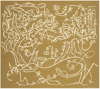
         Walter Whall Battiss (South Africa, 1906-1982) had an interest in various indigenous African art forms including rock art, San painting, and Ndebele beadwork.  You can see some of this influence in his relief block prints.  I am most intrigued by this first one, entitled Cattle Metamorphosed into Plants, because I wonder about the story behind it.  The cattle look somewhat similar in style to those in linocuts by Picasso, with whom Battiss was friends.  Picasso, too, combined bulls and plants in a fantastical way, which I featured in Picasso’s Garden.
        Next here are a couple of pieces with other animals: horses and moths.  They are not “realistic,” and they clearly demonstrate an interest in what artists today love to call “mark making.”  The moths in particular don’t look particularly planned.  Battiss includes his initals in many of his blocks, but always backwards.  This means he’s carving them so they look frontwards on the block, and thus print backwards on the paper.  That implies that Battiss either carves without planning, or draws any designs directly onto the block, rather than transferring from sketches on paper.  (There aren’t great ways to transfer onto either linoleum or wood, so my current method of doing all my work on paper first and then getting a nice, clean, clear reversed transfer is a benefit of using rubber.)
        Two pieces with boys show the influence of rock art, with the stylized naked bodies functioning almost as glyphs of people.  The first shows boys picking wild fruits from a thorny bush - one I would not want to go into without protective clothing!  The second shows a boy with pets: a nice, normal cat, but also some lizards and an unusual-looking bird.  I don’t know whether it’s intended to be a specific bird or species, or whether Battiss is just representing “bird” in a more hieroglyphic way.
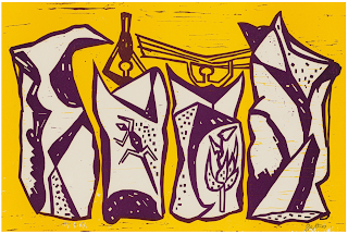
        Finally, a woodcut with two layers, which could be either reduction or separate blocks.  Two people carrying things on their heads are behind four rocks, at least two of which seem to have rock art on them.  Although most of Battiss’s work is undated, these definitely seem to be in that 
early mid-century style, and you can definitely see Battiss’s connections with Picasso and others working under the influence of African styles.


[Pictures: Cattle Metamorphosed into Plants, linocut by Walter Whall Battiss;

Horses, woodcut by Battiss, 1943;

Moths, linocut by Battiss;

Boys Picking Wild Fruit, linocut by Battiss;

Boy with Pets, linocut by Battiss;

Four White Rocks, colour woodcut by Battiss (All images from MutualArt).]

December 1, 2023

No. 2 Pencilion

         Another shortish post today, as my busy weekend is almost upon me!  To find out why I’m so busy, see the previous post.  As for today, I’ll just share my most recent piece, the No. 2 Pencilion.  This block actually began from a couple of the numerous October drawing prompts with which the Internet abounds.  For October 11, the Peachtober prompt was PENCIL, and the SCBWI Artober prompt was BEAST.  Putting the two together, I came up with this king of pencil beasts.  I transferred the sketch to rubber, but then waited to carve until Roslindale Open Studios on October 21-22.  After that I didn’t get around to finishing up and printing until after my next show at the beginning of November.  However, when I finally printed I decided to try two things.  First, I printed with plain black ink, but to make it a little more fun, I found some old (but acid-free) lined notebook filler paper left over from my kids.  After an edition of those, I carved out the erasers of the ears, and recarved the line the lion is drawing.  (I should have carved it that thin and careful in the first place!  Oh, well.)  And I printed a second edition in pencil yellow, and put in the details painted with eraser pink and drawn with pencil graphite.  I did try printing these on the lined paper, as well, but the yellow isn’t opaque enough to cover the lines and they proved too distracting.  So, plain paper for these.
        By the way, do you know why pencils are so commonly yellow?  Apparently Koh-I-Noor Hardtmuth pencil company was the first to paint their pencils yellow, and they did it to suggest Chinese royalty, since Chinese graphite was the highest quality graphite.  They won a Grand Prix for pencils in 1900 (having first introduced the yellow in 1889), after which everyone wanted to copy them.  As for the eraser on the end of the pencil, that was invented in 1858 by Hymen Lipman - but in 1875 the US Supreme Court ruled that it wasn’t an inventive enough invention to hold a patent, so all the manufacturers could do it, making those erasers ubiquitous, as well.  It was the Faber Company that first made the pink erasers with the metal ferrule so familiar today.
        Here’s some bonus belated Words of the Month action: 1. A pencil was originally a small, fine paintbrush, and comes from Latin for “little tail.”  2. The graphite in a pencil is called lead because when graphite was first discovered in England in the early sixteenth century it was sometimes called “black lead”.   So technically pencils have never had actual lead.  The word graphite wasn’t coined until 1789, from Greek graphein meaning “to write” — and yet we still call it lead more than 200 years later, so don’t expect us to stop talking about dialing phones any time soon.   3. The abbreviation for “number” is “No” because it comes from Latin “numero” instead of from English.
        As for the meaning of Number 2 in reference to pencil lead, there’s not actually a common standard, although the higher the number the harder the lead, and the harder the lead the lighter the color and sharper the point.  Many companies (and especially those outside the US) instead or in addition use the abbreviation HB for the grade of pencil right in the middle between hardness and blackness - although there’s some disagreement about the actual origins of the letters H and B.  An HB pencil should be equivalent to a No. 2.  For any child who grew up in the US in the past 50 years, number 2 pencils are famous primarily for being those required for filling in the answer dots on scantron tests.
        To be honest, these days I pretty much always use mechanical pencils because I love that there’s always a decent point.  Nevertheless, I continue to have a soft spot for the look of a traditional yellow wooden pencil.


[Pictures: No. 2 Pencilion and No. 2 Yellow Pencilion, rubber block prints with pencil details by AEGN, 2023.]

November 27, 2023

Too Busy - Delirium

         It’s the last blog post of the month, and that means it’s time for Words of the Month!  Or at least, it would be, if I actually had time for anything.  This coming weekend is super busy with not one but two major events, involving SO MANY moving pieces I have to organize and take care of.  So in my current state of (hopefully temporary) disordered mind, I offer you a single fun word of the month: delirium.  Entering English towards the end of the sixteenth century, delirium is from Latin “madness.”  Its Latin origin, however, is a metaphor.  It literally means “off or away from the furrow.”  You can imagine someone plowing their field into nice, straight, ordered furrows, back and forth… and then 
suddenly, nyeeeeooowww, they go swerving off in some random direction, through the previously sowed rows, over the wildflowers at the edge of the field, down into the ditch, up into the next farmer’s field, zig-zagging all over the place…  Delirium.
        And what is the cause of my current delirium?  On Saturday, December 2 I will be participating in the Strong Women-Strange Worlds Holiday Extravaganza.  As one of the organizers I’ll be working pretty much all day for this 8 hour festival of fun, mostly behind the scenes.  Over 45 authors of sci fi, fantasy, and horror are involved in a parade of readings, games, and literary frolics, and I encourage you to join us.  It’s free, it’s on-line, and you can drop in and out all day as your schedule allows.  Preregister HERE!  And if you want to see me, 
I’ll be playing “Bluff the Audience” at noon (US/Canada Eastern time) in which 5 authors have written fake endings to excerpts from each others’ work, and the audience gets to guess which endings are real.  It should be a hoot!  (Info on the full event schedule is here.)
        Despite being busy all day Saturday, I hope to be able to find a few hours to load my car, because on Sunday, December 3 I will be participating in the Celebrate Newton Holiday Craft Fair.  There will be live music by a variety of Newton ensembles for a festive atmosphere, and more than 50 artists and crafters showing a variety of work suitable for gift shopping.  (More info here.)  It’s my last in-person show of the year, but if you can’t make it, don’t worry - you can always contact me directly if you need 
to procure that perfect block print or book.
        While I’m running through the promotions, I’ll mention one more show at which my work will be represented in 2023: the annual “Illumination” show at Gallery Twist in Lexington.  It’s always beautiful, and this year the opening reception will be on Saturday, December 2.  I, alas, will not be there, what with the delirium of other events, but I do encourage anyone in the area to check it out as it’s always delightful.
        Now, wish me luck to make it through!

November 22, 2023

Autumnal Block Prints

         It’s time for another collection of autumnal relief block prints, and as usual, views of autumn have to emphasize color.  First up is a piece by one of my favorites, Herschel C. Logan.  It’s quite small and simple, but includes three colors: dark brown, beige, and orange.  Typical of Logan’s work, its focus is on a rural homestead, but no people in sight.  (You can revisit more work by Logan here.)
        The next piece is by an artist who’s new to me, and it’s much more complex.  Nick Wroblewski works in the Japanese woodblock style, and often includes animals in his landscapes.  This one has wonderful details in the foreground, but is also wonderfully less detailed in the background, with its warm, muted autumn colors.  The beavers are delightful, but so are the 
details of the sticks and bark, and the gnawing-marks on the felled trunk.
        Also in the Japanese style, here’s a piece by Kawase Hasui (an artist you can search in the sidebar to see a few more pieces.)  The title is “Late Autumn in Ichikawa,” and I think it does somehow manage to capture that feeling of incoming winter chill in the air, despite the warm colors of the dried grasses.  Again, the grasses in the foreground show every blade, but then fade to a blur and the silhouettes of trees in the background.  (I definitely need to work on that transition from foreground to background in my own work!)
        As a contrast from these relatively predictable landscapes, here’s an unusual view by William Hays.  This one is a reduction linoleum block print with 6 colors.  It’s very impressive, and I’d love to be able to see it in person and get a sense for the ink on the 
paper.  On the computer screen it’s almost too good, because it reads more like a photograph with the “posterize” filter than like a hand carved block print.  It certainly does invite you to jump in the leaf pile, though!
        Finally, I had to include this wood block print by Kari Percival, because what is this season without pies?  This fun piece celebrates the sharing of good food and company.  (And see my prior post on Percival here.)
        I’m certainly very grateful for my own home and family, as well as for the land I’m lucky enough to live on, sharing it with its 
beautiful trees and animals.


[Pictures: Autumn, color woodcut by Herschel C. Logan, 1924 (Image from Marianna Kistler Beach Museum of Art);

Sturdy Branches, Leafy Tops, woodcut by Nick Wroblewski (Image from NickWroblewski.com);

Late Autumn in Ichikawa, color woodblock print by Kawase Hasui, 1930 (Image from The Clark Museum);

Equinox, linocut print by William Hays (Image from artful home);

Pies, wood block print by Kari Percival (Image from KariPercival.com).]

November 17, 2023

A Jumble of Jabberwocks

          Lewis Carroll’s famous poem Jabberwocky, a classic of nonsense fantasy, has been wildly popular since its publication in 1871.  (If you’re not familiar with it, you can read the whole poem in two of the pictures below, or more easily in my original post about it here.)  Since its publication, there have been many illustrations of the jabberwock and the other creatures featured in the poem.  By far the most iconic is the 
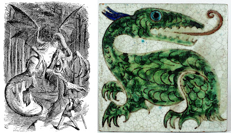
version by John Tenniel, the first picture shown here.  Indeed, it remains my favorite to this day.  But Carroll doesn’t actually say much about exactly what these creatures look like
, and that means that other illustrators can come up with completely different versions.  Paired with Tenniel’s illustration is a tile by William De Morgan, who was commissioned by Dodgson (aka Carroll) to make tiles with creatures related to his works.  That means that Tenniel’s and De Morgan’s jabberwocks, different as they are, were both Lewis Carroll-approved.
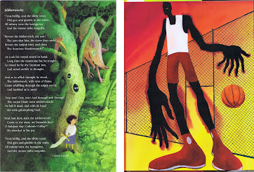
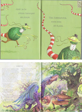
        So, we know the jabberwock has jaws that bite, claws that catch, and eyes of flame.  We know it’s manxome, and that it whiffles and burbles… And that’s really all we know.  So there’s no contradiction if  Kevin Hawkes depicts the jabberwock rather like a pig, while Christopher Myers connects the poem with the Mesoamerican ball game and depicts the jabberwock like a monstrous basketball player.
        Joel Stewart can follow Tenniel’s lead in giving the jabberwock a few items of gent’s clothing, while adding a checkerboard grin and long, stripy tail.  And Eric Copeland can imagine something more like a feathered dragon.  No wrong answers here, as long as we all have those grabby claws!  Scary or whimsical?  Similar to a real creature, or completely wacky?  It’s all fair.
        Some illustrators have also shown us some of the other creatures mentioned in the poem.  Tenniel depicted the toves, borogoves, and raths of the first verse, which you can see 
here.  But he never showed the jubjub bird or bandersnatch, which perhaps left the door open a little wider for the illustrators who followed.  P
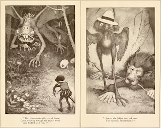
eter Newell makes his magnificent jabberwock a little reminiscent of a naked mole-rat, while his bandersnatch looks somewhat baboon-inspired, and the jubjub bird is simply a bit odd.
        Charles Santore gives each of these charismatic megafauna a full double-page spread.  His jabberwock is clearly a dragon, and his jubjub bird would indeed be something to beware, but his bandersnatch is the most original, resembling a tiger-warthog cross with a spiked tail 
mace.
        For a few more versions of the Jubjub bird you can revisit my posts on Mythical J, and be sure to see my own depiction at J is for Jubjub Bird.  (I’ve never done the jabberwock because I’m completely satisfied that Tenniel got it right.)
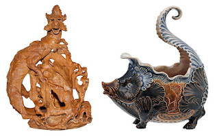
        I conclude with one last artist, Mark V. Marshall, who worked at Doulton Pottery.  I’ve included his jabberwock sculpture for completion, although it doesn’t particularly excite me, but I find his rath absolutely delightful.  I’m assuming it’s some kind of little pitcher.  All we know about the raths from the poem is that they’re mome.  Humpty Dumpty tells Alice that raths are a sort of green pig, which has clearly inspired Marshall.
        What’s your vision of the jabberwock?  Does it wear clothes?  Is it a dragon or a mole-rat or a basketball player?  Or do you have some completely new ideas of your own?


[Pictures: Jabberwock, pen and ink (copied as wood engravings for printing), by Sir John Tenniel, 1871;
Jabberwock, tile by William De Morgan, 1882 (Image from Wiener Museum of Decorative Arts);

Jabberwock (and Jubjub bird?), illustration by Kevin Hawkes from Imagine That! Poems of Never-Was selected by Prelutsky, 1998;

Jabberwock, illustration by Christopher Myers from Jabberwocky, 2007;

Jabberwock, illustration by Joel Stewart from Jabberwocky, 2003;

Jabberwocky, illustration by Eric Copeland from Poetry for Young People: Lewis Carroll, ed. E. Mendelson, 2000;

Jabberwock, Jubjub bird, and Bandersnatch, illustrations by Peter Newell from Through the Looking-Glass, 1902 (Images from Internet Archive);

Jabberwock, Jubjub bird, and Bandersnatch, illustrations by Charles Santore from Jabberwocky, 2020;

Jabberwock and rath, Doulton pottery by Mark V. Marshall, c. 1886 (Images from Wiener Museum of Decorative Arts).]