July 30, 2013

Words of the Month - Of Magic and Muggles

        Tomorrow is Harry Potter's birthday, the anniversary of Hagrid's dramatic arrival at a shack on an island to deliver to Harry his acceptance letter to Hogwarts School of Witchcraft and Wizardry.  Harry's birthday introduced us in 1997 (1998 in the US) to the wizarding world according to J.K. Rowling, and also to some of the wizarding world's unique vocabulary.  Rowling clearly enjoyed making up words for her magical universe, and the series's incredible popularity has brought many of those words into the mainstream.  Here are a few of the most widely recognized.

muggle - A Muggle is a non-magical person who's not part of the wizarding world.  Most Muggles are completely unaware that magic even exists.  This is the word that has gained the widest currency, taking on a life of its own and earning itself a place in dictionaries.  Among some people it's used to mean someone without skill in a particular area, or someone outside the circle of a particular interest or activity.  In this context it's often used pejoratively, or at least dismissively, unconsciously illustrating one of Rowling's primary themes: prejudice against outsiders.  Those who disparage the people who don't share their interests or skills may soon be calling them mudbloods.  (By the way, Rowling was sued over the word muggle by a woman who used it first, but I think this illustrates that it's easy enough for multiple people to independently come up with the same pleasing combinations of sounds.  That's always a danger when you're trying to be creative.  Rowling says her word derives from mug, a gullible person.)

quidditch - The wizarding world's favorite sport, quidditch is played on broomsticks and uses four balls: a quaffle, two bludgers, and the golden snitch.  Some Muggles have devised a terrestrial and non-magical game they call quidditch, and a number of colleges now have so-called quidditch teams.  But I say, if you can't play on a broomstick, what's the point?

dementor - Dementors are horrible dark creatures who feed on happiness and, if given the chance, will suck out a person's soul.  They were used as guards at the wizard prison Azkaban, until the Ministry of Magic lost control of them.  It's good to be aware of them because even though they're invisible to Muggles, we can still feel their miserable and demoralizing influence.  Sometimes life feels as if all the happiness is getting sucked out, and then you know to hold on to your soul because a dementor is near.  The best antidote to dementor depression is chocolate.

expelliarmus - I picked this as an example of a Hogwarts-style magical spell.  I don't know whether any particular one of the spells from Harry Potter is the most commonly recognized, but I've certainly heard a few here and there.  One of my favorites, expelliarmus is a combination of the Latin expellere, meaning ‘to drive or force out’, and arma, meaning weapon.  It's the disarming spell, and illustrates Rowling's copious use of Latin for magical words.

animagus - Wizards who can take the form of an animal, animagi are quite rare.  As a word I think this one has a particular genius.  It seems so obvious that it's hard to believe the word doesn't date back to the middle ages.  You might think the more abstruse or complicated words would show more creativity, but often it's much harder to make up a new word that seems completely natural and unforced.

horcrux - In contrast to animagus, the roots of horcrux are not obvious.  Nevertheless, it shows Rowling's talent for coinage because it really seems like it could have been a real word from alchemy or occult magic.  A horcrux is an object in which a wizard has hidden a part of his soul, but since the wizard must commit an atrocity in order to break off the piece of his soul in the first place, it's always a dark and evil thing.  Rowling's word captures the feel of dark, mysterious, arcane magic well.

        Don't forget that even Muggles can celebrate Harry's birthday with some well-chosen magical words - after all, it's J.K. Rowling's birthday, too.

[Pictures: "The Quidditch World Cup," chapter heading drawing by Mary GrandPré from Harry Potter and the Goblet of Fire, 2000;
"The Dementor," chapter heading drawing by GrandPré from Harry Potter and the Prisoner of Azkaban, 1999.]

July 26, 2013

Critters by Siegl

        Helen Siegl (1924 - 2009) was born in Austria and eventually became a US citizen.  She did lots of work as an illustrator, which is how I came across her.  I found an anthology of animal poems illustrated (rather sparsely, unfortunately) with wood block prints by Siegl, and I thought I'd share a few.
        Her style is very skritchy, composed of lots of scratchy white lines for texture and shading.  Her whites show lots of rough bumps and tailings  and her blacks show wood texture as well as the many little carved lines.  It's a style that sometimes seems too messy or sketchy for my taste, but in other pieces works beautifully.  For example, the fluffy feathers of the ostrich below are great, and Siegl's rough style is perfect for a slightly messy, dusty bird.
        Some of her cuter creatures, such as puppies and kittens (and the children I found when I looked up more of her work), are not appealing to me.  I think they suffer from a slight aura of "Precious Moments," which is why I haven't included any here.  I much prefer her creepy-crawlies, which don't try to be cute.  They have a real sense of personality.  I especially like the lobster above, with its little circles to add zest to the straighter, more angular lines.
         These are all wood block prints, but Siegl also did linoleum block prints and plaster block prints.  I couldn't find much information on her plaster block technique, which apparently she invented in Austria when wood was scarce.  However, it seems likely to me that the use of the plaster may have contributed to her style of making lots of scratchy lines, since that would probably be a fairly natural way for plaster to be carved.
        These animals aren't necessarily Siegl's most characteristic work, but they're what I first discovered, and I like them.  You can see lots more, much of it multi-colored, and including lots of illustrations of religious themes, children, Aesop's fables, and more at her web site.  (I do plan to share a selection of her marvelous made-up critters another time.)

[Pictures: Under the Water and on the Shore, wood block print by Helen Siegl;
Buzzers, Leapers, and Flyers, wood block print by Siegl;
Ostrich, wood block print by Siegl, all images from The Birds and the Beasts Were There, The World Publishing Company, 1963.]

July 23, 2013

Shangri-La

        I had always assumed that Shangri-La was an ancient mythical place, like Atlantis or Eden.  But I learned when D and I watched the documentary "In Search of Myths and Heroes" that it was actually invented by James Hilton in his 1933 novel Lost Horizon.  That's pretty impressive for one author to have made such a huge cultural impact - and the more so when you consider that I've never even heard of him!  Obviously Hilton hit a chord with his tale of the discovery of a hidden paradise.  However, while Shangri-La itself may be a modern invention, it was based on a variety of ancient sources.  The idea of Shangri-La has been part of mythology for a long time.
        Shangri-La is a place where the inhabitants dwell apart from the rest of the world, untroubled by the wars and sicknesses of others, in a state of blissful perfection.  The location is a hidden valley, always green and flowering among forbidding snowbound crags.  These fantasies have existed for cultures around the world, often as destinations in the afterlife, but sometimes possible for the occasional living hero to reach.  Shangri-La adds to the general concept of a hidden paradise the flavor of Oriental mystery and mysticism.
        Many areas of China and Tibet have laid claim to the title of Shangri-La, mostly for tourism purposes, of course.  One county in China even officially changed its name to Shangri-La.  The Hunza Valley in northern Pakistan is another likely source of inspiration for Hilton's Shangri-La.  However, I'm more interested in the deeper roots of this mythical place.
        Shambhala is a pure kingdom in Buddhist mythology dating back even before the beginnings of Tibetan Buddhism.  It represents a spiritual place, but also a physical one, albeit reachable only by those with the adequate karmic merit.  Its physical location is often thought to be in central Asia or the Himalayas, but possibilities stretch from northern India to southern Siberia.  Of course, in Buddhist thought Shambhala represents states of body and mind, but in fantasy terms it's easy to see the allure of such a physical place.  If Atlantis gives us ways to think about the destruction of powerful nations, Shambhala and Shangri-La give us ways to think about ideals of perfection and refuges from the imperfections of real life.
        It's no accident that Shangri-La is hidden in the midst of difficult terrain, because its hold on our imagination comes not just from its perfection, but from the fact that its perfection lies elusively somewhere in the midst of hardship.  Shangri-La invites us
to imagine What does paradise look like?  How do the people there live?  But perhaps even more importantly, What does it take to get there?  Intrepid exploration, tenacity through hardship, spiritual enlightenment, sheer lucky chance, or grace?  I imagine it will probably take all those things to find Shangri-La.
        (My A-to-Z post about Shangri-La is here.)

[Pictures: View of Shangri-La, set design by Stephen Goosson from the movie "Lost Horizon,"1937 (Image from Cinema Style);
Map of the Kingdom of Shambhala, thangka (painting on silk) by anonymous artist, classical (I don't know what that means by way of date);
View of Shambhala, concept art by James Paick from the video game "Uncharted 2," 2009 (Image from Scribble Pad Studios).]

July 19, 2013

Hasui in the Moonlight

        The artist, Kawase Hasui (Japan, 1883-1957), described the location of this woodblock print as giving "an impression of eternal and infinite beauty," and I absolutely agree with him.  At least, I've never seen Matsushima Bay on the northeast coast of Japan, but this certainly is a beautiful print.
        Hasui was among a group of printmakers trying to meld traditional Japanese woodblock themes with a more modern aesthetic.  (Of course "modern" is now about a hundred years old!)  There definitely is something more personal about this piece compared with older Japanese woodblock prints, something softer, more three-dimensional, less staid and rigid.  There's a little more of a look of Monet here.
        There's also something really interesting going on in the sky, which has clearly not been inked in the smooth traditional way.  I don't know how Hasui achieved this effect, whether through inking with smaller brushes, or some sort of ink stick, or whether the texture was applied to the paper after printing with something more like cray-pas or pastels…  But I like it.  It adds just the right amount of movement to keep a peaceful scene from becoming static.
        Hasui went on to write of this piece, "I regret my inability to do justice to this ideal subject," but I think he wasn't giving himself sufficient credit.  I think he captures a wonderful mood of beauty, romance, mystery, and serenity.

[Picture: Matsushima in the Moonlight, woodblock print by Kawase Hasui, 1919 (Image from the Smithsonian's Sackler Gallery).]

July 16, 2013

Atlantis

        Atlantis, as everyone knows, was an ancient island nation of incredible sophistication, advanced technology, and wealth, which sank into the sea in a single cataclysmic moment, and was lost forever.  Our earliest account of Atlantis comes from Plato in about 360 BCE, but his descriptions may well have been based on earlier traditions.  He claimed they were.  Ever since Plato, people have been debating whether or not Atlantis was real (either wholly, or based on real historical elements), but either way it's been enormously influential.
        You can look at the original descriptions of the land…  Its mountain-girt coast, its concentric rings of land and canals…  Its name, meaning "of Atlas" after its king, a son of Poseidon…  Its military prowess and threat to Athens…
        You can look at attempts to place Atlantis in the real world… from Santorini in the Mediterranean sunk after a volcanic eruption, to Doggerland in the North Sea flooded by a tsunami, to the Azores in the Atlantic never actually sunk at all, to Antarctica, to Andalusia… (That last theory is sketched out in a National Geographic documentary which we enjoyed watching in 2011.)
        But while I have a great time looking at these theories and speculating about possible historical connections, in some ways I think all this science (or pseudoscience) is missing the real point.  The idea of lost lands and civilizations seems to exist in many cultures and certainly has had an enduring hold on the human imagination, so I think the interesting question is Why are we so fascinated by this?  What do these stories provide for us?
        The answer changes over time, as is clear by the way the story of Atlantis changes over time.  For Plato, Atlantis represented the antithesis of Athens.  Athens was the perfect society, and Atlantis was the military juggernaut that threatened it but ultimately was brought down by the only nation noble enough to resist it.  (That would be Athens, of course).  In the sixteenth century Sir Thomas More coined the word utopia, and the discovery of the New World fueled all sorts of theories connecting Atlantis to the Americas, especially the Mayans.  In 1882 there was a great revival in Atlantis mythology, reshaping Atlantis as a utopian center not only of antediluvian culture and technology, but also setting the stage for all sorts of New Age and occult theories about the religion and supernatural powers of Atlantians.  So, when we needed to see a powerful enemy destroyed, Atlantis gave us that story.  When we needed to explain how "savages" could have built incredible monuments and had a rich culture, Atlantis gave us that explanation.  When we needed to cling to a romance of greatness no longer evident and power that might yet be possible, Atlantis gave us that mythology.  When we need a cautionary tale about the dangers of hubris or the impermanence of power, Atlantis gives us that warning.
        Atlantis or Atlantis-like nations appear in plenty of fantasy, too.  From Verne's Twenty Thousand Leagues Under the Sea, to Tolkien's Númenor, from comic books by both DC and Marvel, to video games of multiple types, to an animated movie by Disney, Atlantis remains a popular source of mythology.  I'm not immune to the appeal of the ancient advanced civilization long lost.  Such a mythology is part of my own book Ruin of Ancient Powers.  I'm sure the legend of Atlantis will continue to fascinate and inspire people for a long time to come.
        (My A-to-Z post about Atlantis, plus lots of pretty pictures, here.)

[Pictures: Atlantis, drawing by Géza Maróti, before 1941 (Image from Wikimedia Commons);
Map of Atlantis (north is at the bottom), woodcut from Mundus Subterraneus by Athanasius Kircher, 1665 (Image from OU History of Science Collections).]

July 12, 2013

New Printmakers

        This morning was my last session of the Relief Printmaking class I taught this week.  I had 13 kids entering grades 5 - 8, 12 girls and one quietly intrepid boy.  We did seven projects over the course of five mornings, and concluded with a short open house for parents and other friends to come in and admire all the work.  I had a wonderful time, and I think all the kids enjoyed it, too.  So today I want to share some of the beautiful work of these emerging printmakers.
        Some of the projects worked better than others - the collagraphs, for example, were somewhat disappointing due to their fragility and the difficulty of inking and printing satisfactorily.  On the other hand, everyone mastered the difficult task of carving out letters for the bookplate/name tag project.  Of course the rubber blocks were the most popular printmaking medium.
It's my favorite, too, so I'm not surprised.
        There are two things about teaching art that I find the hardest.  The first is logistical.  Children work at such different speeds that it's always a real challenge to satisfy the quicker workers with plenty of new projects to keep them busy, while allowing the slower workers an opportunity to complete their work before the class moves on.  (The zentangle-style styrofoam prints were one of these extra projects I added for the speed-demons, and it turned out to be a lot of fun.)

        The other difficult thing is more philosophical, and it's that children at this age are so self-critical.  Developmentally, there's a point when a child's aesthetic ability to judge artwork outstrips her physical ability to create what she envisions.  This point usually hits right around middle school, and it's the point when a lot of kids decide
they "can't do art" and stop trying.  When I worked in schools and could build up relationships with children over months and years, they trusted me enough to believe me when I told them if they kept working they could improve, and they trusted me enough to believe me when I told them a piece they were struggling with was actually much better than they were giving it credit for.  With only one week for the kids in this summer class to get to know me, they didn't always believe me when I tried to convince them not to dismiss a piece just because it didn't conform to their stereotypical middle school idea of what Good Art should be!  Some pieces got abandoned that should have been much more admired.  Still, I think even the most self-critical came away with at least three pieces they were really pleased with, and that's not too bad for a week's work.


[Pictures: Jaguar, rubber block print by SK, 2013;
Dragonfly, collagraph by AM, 2013;
Bookplate, rubber block print by BW, 2013;
Abstract, styrofoam block print by TN, 2013;
Wading Bird, rubber block print by VM, 2013;
Starfish, rubber block print by IJ, 2013;
Antonio the Disco Man, rubber block print by ME, 2013;
Tree, rubber block print by MV, 2013;
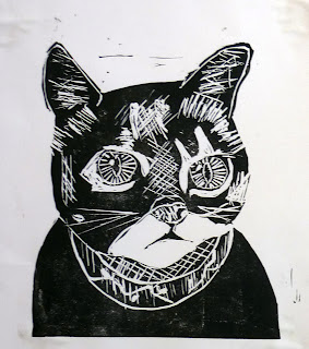
Cat, rubber block print by JD, 2013;]

(I'm sorry I don't have room to include a piece from each of my students - or maybe two each.  I've crammed in as many as I could, and I assure you that you're missing some really stupendous work in the pieces you can't see, including a couple of magnificent hawks and a toucan, some lovely beach scenes, cute bear cub and dogs, and much more…)

July 9, 2013

"Atlantis: the Lost Empire"

        Another animated children's fantasy movie my family watched a little while ago was Disney's "Atlantis: the Lost Empire."  This didn't get a huge amount of fanfare at release, and I was pretty much oblivious of it at the time, so perhaps this one isn't really on your radar, either.  I was predisposed in its favor since the main character, Milo Thatch, is a linguist at the Smithsonian.  Also, it was supposed to be unique
among Disney animated features in being inspired by Jules-Verne-type sci-fi adventures.  But while I found it enjoyable, I also found it very typical of Disney's style.  My summary: serviceable, nothing outstanding, but worth watching with children who need a movie that appeals to the imagination without being too intense.  Three and a half stars, B, mild thumbs-up… Take your pick of rating system.
        (Spoiler Alert: plot summary below.)
        Perhaps the most noticeable thing for D and me was the striking resemblance of the plot to that of "Avatar," (another movie known for pushing the use of CGI.)  It goes like this: a group of modern western humans discover an exotic civilization and, in their desire to exploit a natural resource of incredible power, threaten to destroy the civilization without regard to land or people.  However, the member of the human team in charge of interpreting the foreign culture falls in love with the scantily clad yet feisty native princess, and manages to pull together a team to defend her land in an exciting battle against superior force.  At the end all the humans leave except our hero, who stays behind to marry the princess.  Sound familiar?  The funny thing is, "Atlantis" was released in 2001, eight years before "Avatar," so it would be unfair to fault it for unoriginality - at least on that score.  (On the other hand, it did come after "Indiana Jones and the Last Crusade," with which it shares a Grail Diary and a sexy blonde German-born second-in-command who falls to her death at the climax.)
        While "Atlantis" can't be accused of copying "Avatar," it certainly made plenty of use of standard tropes and clichés, including the modern white male who has to save the natives who are incapable of saving themselves, and the humble adventurer who wins the heart of the princess.  I have no objection to a judicious use of classic tropes - after all, they're classic for a reason - and I really don't fault "Atlantis" for following a somewhat clichéd story line as its basic outline.  The story satisfied P and T (who have not seen "Avatar"), and was also satisfactory to me in that caring about others was Good, the search for knowledge was Good, exploiting natural resources for greed was Bad, following your conscience and cooperating to stand up for what's right Saved the Day, Good triumphed, and True Love crowned it all.  Really, I'm never going to complain about that!  But nevertheless, I would have liked a few more unexpected twists along the way.
        As for the visual experience, I see that "Atlantis" was supposed to represent "the distinctive visual style of comic book creator Mike Mignola."  I know nothing of Mignola, and I'm no comic book aficionada, but I will say that the style of the characters did strike me -- it struck me as a jarring mish-mash of assorted disparate styles, as if different animators were in charge of different characters without any effort to bring them together into a cohesive look.  For example, Princess Kida looked like standard Disney, Helga Sinclair looked like "Aeon Flux," and Audrey the mechanic looked like she fell out of a Mario Brothers video game.  But there were fun steampunky vehicles, and the pretty scenery was clearly inspired by classical accounts of Atlantis, so that was cool.  (I plan to consider Atlantis itself another time.)
        As usual, I've listed my complaints, so I want to end with what we liked.  We liked that it was never too scary or graphically violent, but still had action.  We liked the set-up with the discovery of the lost, secret fantasy kingdom.  (I liked that linguistics was portrayed as Interesting and Useful.)  We liked Milo and Kida, and we especially liked the ensemble characters.  In fact, probably our favorite parts of the entire movie were the comic lines and interactions between some of the group of explorers.  We especially liked Dr Sweet, but our favorite of all was Vinny the demolitions expert and florist.

[Picture: "Atlantis" movie poster - I'm too lazy to try to track down the artist or artists responsible.  That's what they get for not doing block prints!]

July 5, 2013

Fireworks!

        Our town does a pretty nice fireworks display, which three generations of my family enjoyed very much on the evening of July 3 (so as not to compete with the big Boston fireworks extravaganza on the Fourth.)  It occurred to me that fireworks, like block prints, are a design in light on dark, so I decided to search around for some relief printed depictions of fireworks.  Here are some of the highlights of my search.


        Some artists go for relative realism, including Anna Ostroumova-Lebedeva, whose color woodcut really captures the glowing golden sparkles of some of my favorite fireworks.  The seventeenth century engraving, on the other hand, goes for every detail of what must have been a spectacular pyrotechnic display, but it somehow fails utterly to capture the brightness and light of being there.  It seems more historical than artistic.


        Hiroshige's fireworks appear in two versions.  Which do you like better?  I couldn't decide which I preferred, so I've posted both.  I've actually put the second version first, because this way I think they could be time lapse - first the bright flash, then the fading sparks.


        Other artists are a little more impressionistic or stylized.  Felix Vallotton focuses on the ooh and aah of the crowd, although I have to say they don't look as happy or festive as our town crowd on Wednesday night.  Fumio Fukita's color kaboom is certainly more festive, and I do tend to like being able to focus on a single beautiful firework at a time.  But I think Frans
Masereel's fireworks display over a city best captures the sheer exuberance of fireworks.  This must be the grand finale with all kinds of fireworks going off in all directions all at once, lighting up the whole sky.
        I do like fireworks!


[Pictures: Fireworks in Paris, woodcut by Anna Ostroumova-Lebedeva, 1908 (Image from All-Art);
From the reception for Louis XIII and Anne of Austria in 1622, engraving (Image from Fulltable.com, where there are also some other images of fireworks);
Fireworks at Ryogoku (two versions), woodcuts by Hiroshige, 1857-58 (Images from Wikimedia Commons and Honolulu Museum);
The World's Fair 6, woodcut by Félix Vallotton, 1901 (Image from Galerie Maximillian);
Flowers of Edo, woodblock print by Fumio Fukita, 1990 (Image from Scriptum);
Fireworks, woodcut by Franz Masereel from The City, 1925 (Image from Studio and Garden).]

July 2, 2013

Rune Staffs

        Here's Olaus Magnus again, with some more woodcuts of interesting fantasy stuff.  Magnus was a Swedish diplomat who published his History of the Nordic Peoples in 1555.  (I've shared some of Magnus's other work here and here.)  I enjoy the mix of history, fantasy possibilities, and, of course, wood block prints to illustrate his work.
        Today I've got a few wood block prints illustrating the use of rune staffs.  I've had an affection for runes since a little knowledge of Norse history introduced me to the futhark around the same time that Tolkien introduced me to the fantasy properties of runic alphabets.  (Cool linguistic note: the root of the word rune meant "secret" or "whisper."  That root has developed into words in the modern Baltic languages meaning variously, "to cut (with a knife)", "to speak," and "song," or "poem.")
        Historically, it's important to note that the mythology of divination using runes is a modern invention, but nevertheless, runes were clearly believed to have divine and magical properties.  But what exactly are the rune staffs mentioned by Olaus Magnus in his History of the Nordic Peoples?  I tried to do a little research, but found nothing.  In the first depiction above, parents are shown teaching their children how to use and
read rune staffs.  But how do you use a rune staff?  The children may be enlightened, but I'm not!
        The rune staffs show up again in a picture of "the Signification of Thunderstorms for Every Specific Month."  What are the wise men with the rune staffs doing?  Meteorology?  Prognostication?  Recording rainfall?  Warding off lightning and floods?  Praying for rain?  Playing solitaire or gambling?  If Magnus tells us in Book 1 Chapter 35, I don't know.
        And finally, here is Magnus's chart of "The Alphabet of the Geats," which he also calls in Latin "Alphabetum Gothicum."  Thanks to my history and my Tolkien, I think the runes have a wonderfully mystical, romantic look… but are they magic?  Of course they are.  All writing is magic, as cultures around the world have known and we would be wise to remember!

[Pictures: On Rune Staffs, woodcut from History of the Nordic Peoples by Olaus Magnus, 1555;
On the Signification of Thunderstorms for Every Specific Month, woodcut from Magnus, 1555;
The Alphabet of the Geats, woodcut from Magnus, 1555 (All images from avrosys.nu.)]