Showing posts with label ABC. Show all posts

August 5, 2022

Harding's Bird Alphabet

         It’s been a while since I featured an artist with a relief-print alphabet, so today I present Angela Harding (U.K., b. 1960) whose block prints focus on the plants and animals of the British countryside.  She has done an alphabet of wood engravings of birds (although technically I can find only 22 of them!)  It looks like most of these birds are part of the British landscape, although she’s had to include a few others to complete the alphabet.
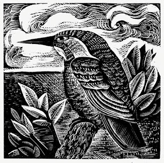
        Her style is not about realism, although the birds certainly include identifiable details.  They’re influenced by a mid-20th-century aesthetic that combines a certain amount of geometry, roughly carved texture, and stylization of composition.  My favorite is the kingfisher.  I like everything about this one: the patterns of the bird’s feathers, the contrast with the sky and 
water, the leaves in the foreground and the clouds in the background…
        Next up, the blackbird.  This works well because the simple black shape pops against the background, without too much mixing and mushing of texture and pattern.  The background has a lovely little house at the end of a path, and in the foreground the blackbird is finding berries.  Why people should take so much delight in watching birds eat I’m not sure I can explain.  I only know that we do.
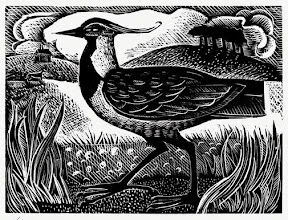
        V is, I think, the only letter for which Harding has used a bird’s scientific name instead of its common name.  V is for Vanellas vanellas, which is the northern lapwing aka peewit.  How can you not admire the wonderful plume on its head?  In her little blurb about this piece, Harding mentions that she remembers lapwings in her childhood near “the small outcrop of trees called the Callow,” which I assume is what’s showing in the background of the piece.  That means this scene is actually a real, particular landscape.  I wonder how many of the others are?
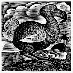
        Finally, for any alphabet you always have to check X.  Yes, Harding has cheated, as one so often has to do for X, but I think her choice is rather clever.  X is for Dodo, the universal symbol of all the birds and creatures that are no more.
        In addition to these small wood engravings,  Harding does a lot of linoleum block prints, and combinations of relief printing with color blocks from screen printing, as well.  She’s illustrated a book of birds, as well as a number of other books and book covers, but they’re all focussed on wildlife in landscapes.


[Pictures: K is for Kingfisher;

B is for Blackbird;

V is for Vanellas Vanellas;

X is for Dodo, all wood engravings by Angela Harding (Images from AngelaHarding.co.uk).]

February 22, 2019

Brown's Alphabet

        Here’s another block printed alphabet, and this time of a very different style.  James Brown’s alphabet doesn’t depict animals or people or anything starting with each letter, as my other featured alphabet books and collections have done.  Rather it’s simply a graphic representation of each letter itself.  Each of Brown’s letters is a linoleum block print in two colors, and the interesting thing is that they are actually the same block printed twice in different colors and at different orientations.  The way the letters are designed almost to tesselate, as the F, or to set up interesting secondary patterns, as the A, is clever and fun.  In some, such as the K, the letter would probably be clearer (if less graphically interesting) if it were printed only once, but in others, such as the Z, the double printing helps make the letter pop.  Still others, including the U, require both orientations of printing to be combined in order to form the letter completely.  In many cases I’m not crazy about the color combinations, but in some, such as the H, the layering of the two inks adds an interestingly different third color to the image.
        Another interesting feature of Brown’s printing is its imperfection.  There are areas of lighter ink, lines where the edge of the brayer isn’t smoothly blended, and even little bits and blotches where scraps of linoleum or dust got caught in the ink.  Normally these would be considered to have ruined the print, but Brown obviously embraces them as part of the graphic quality of hand-printed pieces.
        Naturally I don’t love these as much as my favorite black and white animal alphabets, but I do think they’re very cleverly designed.  I also think they must have been fun to play around with!  And of course they certainly make for some interesting variety, and variety, as we all know, is the spice of life.

[Pictures: Alpha, linocut by James Brown;
Foxtrot, linocut by Brown;
Hotel, linocut by Brown;
Zulu, linocut by Brown;
Kilo, linocut by Brown;
Uniform, linocut by Brown (Images from James Brown).]

May 8, 2018

A-Z Reflections

        Well, I don’t generally publish my reflections about my blogging because why should anyone care?  But this year they’re asking that the Reflections post be linked in order to tally up everyone who completed the A-Z Challenge, so here are a few thoughts so that I dutifully have reflections to link:
     - I should have included a one-sentence intro at the top of each post reiterating what my theme was, so that people who dipped in here and there would understand what they were finding.
     - I wish the spreadsheet of the links for each day was searchable (or maybe it was, and I just didn’t know how.)  Also that it included the title of each post.
     - My speed would definitely be to do the alphabet over two months instead of just one, but I certainly enjoyed coming up with all the posts, and managed to keep ahead of the days better this year than last (although that probably had more to do with my theme than with my somehow getting better at blog challenges).
        And now I shall share something a little more interesting for all you alphabet lovers.  This alphabet, illustrated with hand-colored woodcuts, comes from The Hobby-Horse, or the High Road to Learning from 1820.  There are some really interesting details, especially considering that this was most definitely intended to be educational for children.  What children’s alphabet today would include “D - was a Drunkard” or “G - was a Gamester”?  What educational book would teach children that the Robber should be whipped, the Oyster-wench is a scold, and the Vintner is a sot?  And notice that we're missing the letters I and U; they were often considered mere variants of J and V.  (Plus it's easier to arrange 24 letters than 26... and would have made April's challenge a little easier, too.)
        There are some pretty amusing details, as well, such as the King governing a mouse, for no apparent reason other than making a rhyme, which presumably also explains why on earth an archer should shoot a frog.  There’s the elegant Lady dressed in such current fashion that you can date the book from her attire alone.  There’s the Quaker who looks extremely un-Quakerly, apparently refusing to bow not because of a belief in equality but because of sheer overwhelming snobbery.
        These particular wood block prints are certainly not my favorite style, although some of the people’s expressions are skillfully done like political cartoons, and the hand coloring in this edition, though I tend to prefer my woodcuts uncolored, is exceptionally high quality.  Mostly, though, this alphabet is a fascinating demonstration of how children’s books illuminate their own time and agenda with remarkable clarity… and that’s surely amusing and educational.

[Pictures: “A was an Archer” alphabet from The Hobby-Horse, or the High Road to Learning, published by J. Harris and Son, 1820 (Images from A Nursery Companion by Iona and Peter Opie, 1980).]

February 16, 2018

Alphabet Transformations

        Here’s a series of doodles I set myself back in Dec. 2000 - Jan. 2001.  I drew one a day in my journal.  I’m not sure whether I got the idea from somewhere else or made it up myself, but the idea, obviously, is to transform each letter of the alphabet, in three intermediary steps, into an object that begins with that letter.  I had a lot of fun with it.  It was interesting to select a target object that had some sort of 
logical connection with the shape of the letter.  It was interesting to figure out the best view of it to take advantage of that connection.  It was interesting to figure out the intermediate steps, and of course it was fun to do all the drawing itself.
        I enjoyed it so much that later I assigned it to students who had finished their work early during a unit on Surrealism when we had talked about transformations.  Each student did only one or two letters as she had extra time, but eventually we ended up with a complete alphabet (plus lots of duplicates of the more exciting letters.)  I displayed the letters all around the top of the classroom.
        There’s really no need for deep analysis here - I was amused doing these doodles, and I thought you might be amused to see them.  (Remember that you can click on the pictures to see them bigger.)


        I’m off this afternoon to hang my art at the Boskone Art Show of the New England Science Fiction Association.  When that’s over I’ll be getting to work on preparations for teaching my printmaking classes in March.  (There are still spaces left.  If you’re interested in doing lots of fun rubber block printing, check it out here at Needham Community Education.)

        And finally, Happy Lunar New Year of the Dog!


[Pictures: Alphabet transformations, 26 sets of drawings by AEGN, 2000-2001.]

September 30, 2016

Words of the Month - Loanwords

        English is notorious for being a borrowing language.  As the famous epigram puts it, English doesn’t just borrow from other languages, it follows them down dark alleys and rifles through their pockets for loose vocabulary.  Of course, the beauty of linguistic borrowing is that the donor language doesn’t lose what the borrowing language takes.  Everybody wins!  And English has enriched itself to a remarkable degree with its insatiable borrowing habit.  Consider the following story:

Remarks on a Timid Explorer
        Last Thursday a Massachusetts oil tycoon named Dan lost his final dollar.  He did not even possess an extra nickel for the jukebox, so he decided to depart on safari.  He packed his rucksack, duffel, and tote bag, put on a khaki suit and a plaid bandana, and bid his bungalow adios.
        He trekked a couple hours and paused for refreshment.  He devoured bananas and barbecued beef with catsup.  He opted to drink lime soda, not tea or coffee, because caffeine irritated his nerves, but soon he became anxious anyway.  He was terrified of cougars, coyotes, jackals and alligators, and especially bandits, hoodlums and thugs.  He was not naive, but in kindergarten he had read too much about ninja assassins.  It bothered him.
        First the only animals he observed were a gecko and an ebony and ivory skunk, but suddenly a horde of yaks galloped up in a stampede.  Fortunately, it did not take a sleuth to deduce they were coming.  Without panic, Dan hid behind a hickory tree.  When it was over, he was beat -- a zombie from exhaustion -- and he stumbled home, put on his flannel pajamas automatically, like a robot, and slept.

        Okay, it isn’t the finest literature, but the question is how many loanwords do you see in this story?  You presumably noted adios and ninja, perhaps naive and Massachusetts.  Maybe you found ten or even twenty more…  This story uses 135 unique words, of which 60 (44%) are borrowings into Modern English, and another 29 (21%) were borrowings into Middle English.  Moreover, those 89 loanwords - yes, 89 - were borrowed from more than 33 different languages.  So, 65% - considerably more than half - of the words in this story are not actually native to Old English.  Now that’s a language that likes to borrow!
      Of course it changes a little if you calculate the percentage not by unique words, but by taking frequency into account.  In that case there are 202 total words in the story, and only 44% are loanwords.  Here’s the story again, so you can see which words are which.  Those borrowed into Middle English are in italics, and those borrowed into Modern English are in bold.  (There are also links to some of the words that have been discussed in previous posts.)

Remarks on a Timid Explorer
        Last Thursday a Massachusetts oil tycoon named Dan lost his final dollar.  He did not even possess an extra nickel for the jukebox, so he decided to depart on safari.  He packed his rucksack, duffel, and tote bag, put on a khaki suit and a plaid bandana, and bid his bungalow adios.
        He trekked a couple hours and paused for refreshment.  He devoured bananas and barbecued beef with catsup.  He opted to drink lime soda, not tea or coffee, because caffeine irritated his nerves, but soon he became anxious anyway.  He was terrified of cougars, coyotes, jackals and alligators, and especially bandits, hoodlums and thugs.  He was not naive, but in kindergarten he had read too much about ninja assassins.  It bothered him.
        First the only animals he observed were a gecko and an ebony and ivory skunk, but suddenly a horde of yaks galloped up in a stampedeFortunately, it did not take a sleuth to deduce they were coming.  Without panic, Dan hid behind a hickory tree.  When it was over, he was beat -- a zombie from exhaustion -- and he stumbled home, put on his flannel pajamas automatically, like a robot, and slept.

        One perpetual note of caution: etymology can be very difficult to pin down, and a few of the words in here are uncertain or debated.  I tended to go with the interpretation that would swell my count, just to make my point, so it’s fair to say that there’s a margin of error of a few percentage points in either direction.  Still, the conclusion is valid: people accuse English speakers of failure to learn other languages, and in all seriousness I absolutely agree that we need to do better.  But give us credit - even when we speak only English we’re speaking dozens of other languages, too!

[Pictures: A Horde of Yaks!
Yak, wood engraving by Alan James Robinson from An Odd Bestiary, 1982;
Yak, linoleum block print with multiple blocks by Christopher Wormell from An Alphabet of Animals, 1990;
Y, wood block print by Antonio Frasconi from Bestiary, 1965;
Yak, wood block print from An Alphabet of Quadrupeds, 1852 (Image from International Children’s Digital Library);
Y is for Yak, wood block print with multiple blocks by C.B. Falls, from ABC Book, 1923;
A Yin and a Yang of Yaks, linocut by Elizabeth Rashley from Ark-Bound Creatures, 2014 (Image from Avenue Press).]

May 23, 2014

ABC de Puerto Rico

        My computer up and died last Saturday, and I had to find other things to do with myself until I got it back yesterday.  I had some serious withdrawal, but luckily there was gardening to be done, and reading, and carving on the block I began at Dedham Open Studios… so it isn’t as if I had nothing to do - I just couldn’t do all the things I wanted to.  But during that time another block printed alphabet book arrived through interlibrary loan: ABC de Puerto Rico, with woodcuts by Antonio Martorell.
        There’s something pretty funny about an alphabet book in another language, because the pictures don’t match up.  After all, for me J is not for crab!  Actually, it turns out that J isn’t really for crab in Spanish, either.  However, the juey is the great land crab of Puerto Rico (and that’s its English name, too).  Many of the words in this book turned out to be quite specific to Puerto Rico - which makes sense, of course, since it’s meant to be a Puerto Rican alphabet.  At any rate, I particularly like the letters that work in English, too, although I’ve chosen my favorite images rather than my favorite words.
        My favorite of all is the island - just what a tropical paradise ought to look like, and I enjoy the way the word is incorporated into the the picture.  Actually, this entire book is as much about design and typography as it is about wood block prints.
        I had to include the hammock - another fun use of the letter in the picture, and one that works equally well in English - and of course the juey.  My final example is R for rolita, which is apparently a Puerto Rican dove.  I really like the tower, but I was very tempted to crop off the child on the side, whom I don’t particularly like.  In the end I reminded myself that I should be representing the artwork accurately, and restrained my censoring impulses.  Full disclosure, 
however: despite the integrated design of each page, I have eliminated all the extra words, which included Spanish poems as well as lists of other random words that begin with the same letter.  After all, I wanted this to be about the pictures.

[Pictures: Isla;
Hamaca;
Juey;
Rolita, wood block prints by Antonio Martorell from Abc de Puerto Rico, 1968.]

June 6, 2013

Ocean Alphabet

        This Saturday is World Oceans Day, and I couldn't let such an important occasion go by without a little block print celebration.  And having just discovered an appropriately nautical abecedary, what better way to celebrate the ocean than with some ocean images from block printed ABC books?  "Oh boy," I can hear you saying, "She's right!  There is no better way to celebrate than with block prints!"  I'm so glad we agree!
        Life began in the oceans, life continues to teem in the oceans, and new life forms are still being discovered in the oceans.  I don't have any block prints representing the bizarre and alien creatures from the deepest trenches or the boiling deep sea vents, or even a good old-fashioned coelacanth.  I also didn't want to repeat images I've posted here before,
including sea turtles, cormorants, flying fish and walrus…  Nevertheless, perhaps today's small sampling can still serve as a reminder of how much we stand to lose by failing to take care of our oceans.
        I begin with the ocean itself: S is for sea.  After that I've put the images in alphabetical order, in honor of their sources in alphabet books.  I include fish, crustacean, mammal, and cephalopod, plus the human-made craft for exploring the ocean (or, of course, exploiting it).  The printing blocks are carved from wood, linoleum, and rubber.
        As always, I'm admiring the range of different styles, and how each artist brings a different way of carving, resulting in a very different sort of look.  Compare the swirly doodling patterns of Anderson's sea with the straight lines of Robinson's xiphias
(swordfish).  Compare the textured detail of Pease's fish with the large solid areas of Dodds's schooner.  Compare the intense colors of Wormell's lobster and narwhal with the stark black and white of my nautilus.  Each so different, and each so interesting and beautiful.  Now isn't this a fun celebration?


[Pictures: Sea, linoleum block print by Walter Inglis Anderson, 1930's (Image from The Walter Anderson Shop);
F stands for fish, wood block print by R.H. Pease, hand painted, from The Ladder to Learning by Miss Lovechild, 1852 (Image from Project Gutenberg);
Lobster and Narwhal, linoleum block prints with multiple blocks by Christopher Wormell, from An Alphabet of Animals, 1990;
Nautilus, rubber block print by AEGN, 2009, from Amazing, Beguiling, Curious, 2010;
Schooner, linoleum block print by James Dodds, from Alphabet of Boats, 1998;
Xiphias, woodcut by Alan James Robinson, 1982, from An Odd Bestiary, 1986.]

June 4, 2013

Boats by Dodds


        Some friends of mine, upon hearing that I like block-printed alphabet books, lent me on Sunday Alphabet of Boats.  This is a charming little book, just under five inches square, featuring a bold, simple linoleum block print representing a sailing boat for every letter of the alphabet.  Now, I'm not much of a boat buff, but, like many people, I've always found sailboats beautiful.  Moreover, I think their lines and shapes make them great subjects for black and white block printing.
        The artist of this Alphabet of Boats is James Dodds (UK, b. 1957), who apprenticed as a shipwright before going to art school.  So, unlike me when I get an idea to go make a block print of some random thing, he really knows whereof he carves.  At the end of the book there's a very brief explanation of how the development of the different boats related to each other through history and geography.  This gives some context to the fact that some of the boats look very similar, while others have more obvious differences.
        All the pictures have the same strong, graphic format: the boat in silhouette against a textured sky, with a thick black border.  Does this make for visual consistency or for boredom?  I suppose that's a matter of opinion, but I like it.  I also really like the endpapers, with their grid of tiny black boats.
        Now, those of you with a mathematical bent might have noticed, as I did, that there are 32 little boats on the endpapers, and only 26 letters in the alphabet.  I set out comparing all the pictures to discover what the extras were - and I found to my surprise that only 22 of the illustrations from the alphabet are actually represented on the endpapers, while there are ten bonus boats.  Just a little extra nautical fun for those who want more!
        I also went looking up James Dodds on the internet, and I liked what I found so much that I plan to feature more of his work another day.  So stay tuned for Dodds's much more detailed work later.


[Pictures: Cutter and Dhow, linoleum block prints by James Dodds;
Wherry and Xebec, lino prints by Dodds;
Endpapers, lino prints by Dodds,
Yawl, lino print by Dodds, all from Alphabet of Boats by James Dodds, 1998.]

September 4, 2012

Artist's Best Friend

        I've done my share of Cat Art, but I'm afraid I've been very weak in the dog department.  As an artist I have two main problems with dogs.  First, I haven't got one, so there's no handy muse hanging around the house modeling charming poses for my inspiration.  Second, dogs don't all look the same.  When I make a portrait of my cat, it looks a lot like your cat, or anyone's cat, or your generic image of Cat, and all cat-lovers can relate to it.  But dogs don't look like Dogs; they look like pugs, or poodles, or labs, or chihuahuas, or dachshunds, or Saint Bernards, or whippets…
        Still, other artists have been better than I, and to get a sampling of dog block prints I've returned to my virtual collection of alphabet books and pulled out D is for Dog.  I've come up with five dogs for your enjoyment today.  Perhaps my favorite is from a new alphabet source I discovered on-line.  This dog represents D in The Ladder to Learning, published in 1852 by R.H. Pease, who advertises himself as an "Engraver on Wood."  (The author is given as Miss Lovechild, but with a name like that, I can't help suspecting that there is no such person!)
        Betsy Bowen and Mary Azarian have both painted their prints, although Mary Azarian has black and white versions of hers as well.  (Unfortunately, I couldn't find an uncolored version to post today.)  But despite any similarities of color, these two pieces show opposite ends of the dog spectrum, Bowen going with active working sled dogs, and Azarian with a lazy old hound snoozing in the armchair.  Azarian's looks ready for a snuggle, and of Bowen's huskies I like the one closest to the sled best because you can see its face the most clearly.
        Antonio Frasconi and Walter Anderson have both treated their dogs in a very graphic, decorative manner.  Frasconi's makes me think of the friendly, loyal mutt, and Anderson's seems almost medieval to me, taking part in a field of decorative motifs.  Both artists have clearly had fun with the graphic qualities of the medium.
        Recently I've been thinking it's time I tried some Dog Art of my own, but in the meantime I hope all you dog-lovers out there can find a puppy to love somewhere in this selection!


[Pictures: D stands for dog, wood block print by R.H. Pease, hand painted, from The Ladder to Learning by Miss Lovechild, 1852 (Image from International Children's Digital Library);
Dogsled, hand-colored woodblock print by Betsy Bowen from Antler, Bear, Canoe: A Northwoods Alphabet Year, 1991 (Image from Betsy Bowen Studio);
Dog, hand-colored wood block print by Mary Azarian from A Farmer's Alphabet, 1981 (Image from Mary Azarian's web site);
D, wood block print by Antonio Frasconi from Bestiary, 1965;
Dog, linoleum block print by Walter Inglis Anderson, 1930's (Image from The Walter Anderson Shop).]

March 27, 2012

Another Woodcut Abecedary

        I've made another fun ABC discovery.  This is An Odd Bestiary: Or, a Compendium of Instructive and Entertaining Descriptions of Animals, Culled from Five Centuries of Travelers' Accounts, Natural Histories, Zoologies, &c. by Authors Famous and Obscure, Arranged as an Abecedary.  You might think that after that full disclosure of a title I wouldn't need to tell you anything more about this book, and indeed the title is pretty accurate (except that I'm not sure I would have called it particularly "Odd.")  But it manages to include a whole host of my favorite things all bound into one: block prints, ABC, animals, history, and even a few mythical beasts to add a fun surprise to the collection of remarkable real creatures.
        The artist, Alan James Robinson, has included two portraits of each animal.  The first is a line drawing, and the second a wood engraving.  Each animal is also given two quotations, one long and one short.  These quotations are a lot of fun, spanning the travels of John Mandeville to the travels of Charles Darwin.  They illuminate the way people have described and interpreted animals that were strange and new to them, from the Middle Ages to the rise of modern science.  The selected animals range from beasts that seem fairly straightforward to us, to oddities of nature, to wholly mythical beasts -- but all of them seemed equally bizarre and wondrous to the early naturalists whose descriptions are quoted.
        But of course it's the block prints that earn this book a proud place on this blog. Robinson's woodcut style is dense with lines of texture.  Feathers, fur, wrinkles and all sorts of shading are shown with delicate lines of white in the black.  The animals are generally isolated so that nothing distracts from the portrait.  Some of them have less contrast than I like, but in my favorites all that texture and detail contribute to giving the animals a real sense of individuality.  They have a delightful gleam of expression in their eyes.


[Pictures: Jerboa, woodcut by Alan James Robinson, 1982;
Walrus, woodcut by Robinson, 1982;
Flying fish, woodcut by Robinson, 1982;
Ostrich, woodcut by Robinson, 1982.
All images scanned from An Odd Bestiary, designed and illustrated by Alan James Robinson, text compiled and annotated by Laurie Block; University of Illinois Press edition, 1986.]

January 27, 2012

Queen Anne's Lace

        Queen Anne's lace is the wild carrot, introduced to America from Europe.  The froth of tiny white flowers looks like lace, and the single dark flower in the middle is said to represent a drop of blood where the queen pricked herself with her needle.  The funny thing is, though, it isn't called Queen Anne's lace any place there ever was a Queen Anne.  In the UK its common name is apparently "bishop's lace."  But Queen Anne's lace is a much better name, for two obvious reasons.  First, anything named after "Anne" has to be good.  (Okay, there may be a slight bias there.)  But secondly, anything with a name that begins with Q is invaluable to those of us with a love of alphabetics.  I have yet to see a botanical alphabet with Q represented by anything else but Queen Anne's lace.  (Hmm.. I guess you could use quince…)
        I have here today three block prints of Queen Anne's lace, from three gardening alphabets.  First up is the Q from Gerard Brender à Brandis's Wood Engraver's Alphabet.  It shows his all-over, meticulously detailed style.  But although his depiction is very detailed, it's not laid out at all like a botanical print but instead seems more like a close-up snapshot in a field, or else a design for fabric.  Queen Anne's lace, with its tiny white lines, is a natural for carving into a black background as Brender à Brandis has done here.
        The second Q comes from Mary Azarian's Gardener's Alphabet.  Azarian paints her wood block prints in this book with watercolor, making them perhaps less dramatic, but brighter and more cheerful.  Azarian's version is no botanical drawing either, since she's shown not only the plant but a whole scene of people picking and enjoying the flowers.  Although this piece mostly uses the more traditional black lines on white, the thick field of plants and flowers is actually done by leaving the black background.
        Finally, my version of Queen Anne's lace, made as the Q for my botanical alphabet poster.  Unlike the other two, I've focussed on just one plant, but like them I left the black background around all the tiny white details.  I made sure to include one of my favorite parts of the flower - not just the little flowerets, but the delicate, feathery spikes of the leaves and bracts.

[Pictures: Queen Anne's Lace, wood engraving by Gerard Brender à Brandis, from A Wood Engraver's Alphabet, 2008;
Queen Anne's Lace, wood block print with watercolor by Mary Azarian, from A Gardener's Alphabet, 2000;
Queen Anne's Lace, rubber block print by AEGN, 2007 (sold out).]

December 27, 2011

Brender à Brandis Alphabet

        I got a wonderful Christmas gift from my parents - another block printed alphabet!  Now that this alphabet is added to my collection, I'm sure more of Gerard Brender à Brandis's wonderful prints will be showing up in future alphabet posts, but here's an introduction to his work.
        A Wood Engraver's Alphabet should really be called "A Botanical Alphabet."  Each letter is represented by a beautiful, detailed wood engraving of a plant, most of them being common garden flowers, with a few exotics filling things out.  Unlike me, Brender à Brandis used only common names for alphabetizing; no scientific names.  (But he did have to cheat pretty badly for X: foXglove. (Compare some other artists' attempts at X).)


        Gerard Brander à Brandis is a Canadian, born in Holland.  He's a gardener and orchidophile and has done several other books of botanical wood engravings, which I have not seen (although you can find some of the images on-line.)  I feel a certain sense of connection with another artist who works to portray something so celebrated for colors in a medium that allows only for form and pattern in black and white.  But of course his style is very different from mine.
        I just love the detail and texture possible with wood engraving.  Many of Brender à Brandis's pieces are almost lacy.  Many of them remind me of Renaissance diaper patterns (no, that has nothing to do with nappies.  A diaper is a repeated design woven into fabric.  Maybe I need to revisit this one in the Words of the Month some time.)  Anyway, what I mean is that many of the pieces in this alphabet are designed with an equal pattern all over instead of a single point of focus.  The Rose is an example of that.
        My favorites are usually the ones that have high contrast, though.  I like it when there are areas of black and white instead of everything an even level of texture.  I really love Morning Glory, for example.
        We're having a pretty mild winter here so far, but even so it's always pleasant to spend a little time among flowers in December.

[Pictures: Fireweed, wood engraving by Gerard Brender à Brandis, from A Wood Engraver's Alphabet, 2008;
Zinnia, wood engraving by Brender à Brandis, from A Wood Engraver's Alphabet, 2008;
Rose, wood engraving by Brender à Brandis, from A Wood Engraver's Alphabet, 2008;
Morning Glory, wood engraving by Brender à Brandis, from A Wood Engraver's Alphabet, 2008.]