October 30, 2015

Words of the Month - Weird Etymologies

        If there’s something strange in your neighborhood…
        If there’s something weird and it don’t look good
        Who you gonna call?  Ghostbusters!
        Yeah, it’s that time of year when strange things may be seen in your neighborhood, but instead of calling Ghostbusters, I will, of course, pin my faith on etymology.  Here are a handful of interesting origins for some of English’s many ways of referring to the strange and uncanny…

strange - The different meanings of strange in the English language continue to coexist (as illustrated by the Doors’ “People are strange when you’re a stranger…”)  We can still talk about strange meaning “foreign or unfamiliar” (our original, late 13th century meaning, from French, from Latin) while about a century later we gained the meaning “queer, surprising.”  The shift from one meaning to the other is pretty straightforward, too.  Think of the word outlandish, by way of comparison.  But some of our other odd words are a little odder.

odd - In Old Norse the word oddi began as a triangle, shifted to refer to the unmatched point of an isosceles triangle, and the points of other things, such as spearheads and promontories, and also the extra number or object in excess of an even set.  For example, the odd man breaks a tie in voting.  English borrowed the word with this meaning around 1300, where it took around a century to gain the sense of “rare, special.”  Think of the similar two senses of singular, by way of comparison.  The concept of the “odd one out” led eventually to our “strange, peculiar” meaning around 1580.

weird - In Old English wyrd was a noun meaning “fate, destiny.”  By Shakespeare’s time the word was pretty much extinct, having been replaced by Latinate words.  It did remain, however, in Scots dialects, meaning a witch (one who controls people’s fates), and appearing most commonly in the phrase “the weird sisters,” meaning the Fates in the classical sense, but generally thought of as hideous, uncanny witches.  That’s how Shakespeare found the word when he was raiding Holinshed’s Chronicles of England, Scotlande, and Irelande for plots.  From the strange spellings in the First Folio of Macbeth, it’s actually unclear whether Shakespeare understood the word’s real meaning or just borrowed it willy-nilly.  At any rate, as time went on and the only place English speakers ever encountered this uncommon word was to describe the three ghastly, deformed, supernatural witches in productions of Shakespeare’s play, they interpreted it accordingly.  Thus by the early 19th century the word had gained new life and currency, but with the meaning “strange (adj),” instead of “fate (n).”

bizarre - A more recent addition to English (around 1640), borrowed from French, which borrowed it from Italian.  The Italian bizarro meant “irascible, tending to quick flashes of anger,” which shifted toward “unpredictable” and thence to “strange.”

peculiar - A prime example of an Inkhorn Term, English gained this word in the mid 15th century from Latin “private property,” literally “property in cattle.”  In English it first meant “belonging exclusively to one person,” but it wasn’t long before it gained the sense of “special,” and from there shifted to “unusual.”

        What’s kind of fun about these words is that they all began in different places, and converged over the centuries on the sense of… well, weird.  It’s interesting that we seem to keep adapting new words to try to get at that meaning from all different directions.  After all, isn’t weird almost by definition the stuff that’s hard to describe or explain?  But the beauty of language and its essentially social nature is that no matter how hard it is to talk about something, we never stop trying.

[Pictures: Macbeth and Banquo meet the Weird Sisters, woodcut from Chronicles of England, Scotlande, and Irelande by Raphael Holinshed, 1577 (Image from the Folger Shakespeare Library);
Choleric Men Drinking (i.e. bizarro), woodcut by Erhard Schön, c. 1530 (Image from Quadriformisration).]

October 27, 2015

Ford's Dragons

        Henry Justice Ford (England, 1860-1941) is probably most famous for his illustrations of Andrew Lang’s “Coloured” Fairy Books, in which his pre-Raphaelite sensibilities are a wonderful match for the traditional tales of romance, adventure, magic, and mayhem.  He illustrated in the era when reproduction was done by carving wood blocks, but as you look at these pieces you can see that they look like drawings - in other words, although they may have been wood block prints, they reflect the skill of the carvers in reproducing complicated drawings, but they don’t represent the use of the wood block as an art form in its own right.
        Anyway, I’ve chosen today four of Ford’s illustrations of dragons, because you can see he has a marvelous way with them.  Each one is different.  Some are seriously scary, others are delightfully whimsical.  Some have more snake-like heads, others beakier faces.  Some are scalier, others more leathery.  They have a variety of horns, ears, beards, and other accoutrements.  I think these are all different species, which makes sense as they appear in different stories from different parts of the world.


        I also like the variety of expressions Ford’s dragons display.  They all seem to have a bit of personality.  You can believe that these dragons are sentient beings, rather than mere brute monsters.  They’re always interacting with other characters, their eyes watching the people around them, their expressions ranging from malevolence, to concern, to amusement.  It isn’t easy to give a dragon an expression of character without making it cartoony (I know because I’ve tried!) and Ford does exceptionally well.  Perhaps he met a few dragons in his day, to sketch from life or to gain a particular affinity for the beasts!


[Pictures: The Dragon Carries off the Three Soldiers, illustration by H.J. Ford from “The Dragon and His Grandmother”;
The Youth Secures the Dragon, illustration by H.J. Ford from “The Dragon of the North”;
The Seven-Headed Serpent, illustration by H.J. Ford from “The Seven-Headed Serpent”;
The Dragons Dancing, illustration by H.J. Ford from “The Flower Queen’s Daughter,” all from The Yellow Fairy Book edited by Andrew Lang, 1894 (All images scanned by George P. Landow at The Victorian Web.)]

October 24, 2015

What's New in the Studio

        Having had a show last weekend, I got two blocks carved, and printed them this week.  Here’s one of them.  This is Dunguaire Castle (a restored sixteenth-century tower house), from a photo I took in Ireland this summer.  My challenge in the piece was to suggest all the lovely stone texture while getting the light and dark values, and not being too literal about the individual stones.  I did better on the dark sides than the light sides, but I like the look over all.
        The next show is in two weeks (Roslindale Open Studios), and in the meantime, my big challenge is that I need to make up new batches of cards and calendars, and my printer isn’t feeling well.  But I’ll also be preparing some more new blocks to carve.  One is already begun, and I have a couple of possible ideas for another…

[Picture: Castle on a Bay, rubber block print by AEGN, 2015.]

October 20, 2015

National Day on Writing

        Today is the National Day on Writing, and according to the National Council of Teachers of English its purpose includes “emphasizing the lifelong process of learning to write and composing for different audiences, purposes, and occasions.”  When I think of writing I naturally think first about writing fiction, then secondarily about poetry, scholarly nonfiction, journalism, and other lengthy, thoroughly-crafted pieces.  One thing that’s cool about the National Day on Writing is the NCTE’s recognition that people write all kinds of things all the time, without really thinking of themselves as writing.  All those Tweets and texts are writing, of course, despite Autocorrect’s best efforts.  In fact, deplorable as some of that content may be, these forms of writing actually make more obvious and explicit what has always been one of the true purposes of writing: communication.  Writing is a social act.  With the exception of the “note to self,” the whole point of writing is to share ideas between people.  Sometimes in reading a pompous article or highbrow novel we may forget that someone put down their ideas for the sole purpose of sharing them with others.
        On this Day of Writing, we’re encouraged to share all the different ways we write, the forms we write in, the different audiences, purposes, and occasions.  So here’s my list of the sorts of writing I might do on an average day.
     - to do lists and shopping lists (usually just for myself, but sometimes used for communication with other members of the family)
     - my fiction work in progress (both the text, and lots of notes on research and ideas)
     - e-mails (some are just short notes coordinating car-pooling, some are requests for information from strangers or companies, others are lengthy correspondence sharing all the news of the day or week with siblings, parents, friends)
     - blog post
     - updates to my web sites (mostly descriptions of new pieces and details of upcoming events)
     - texts with P and T (coordinating pick-up after activities and commenting on the kids’ news)
     - handwritten notes included in orders to be shipped off (plus writing the address on the package!)
     - journal (every evening before bed, just writing down the events of the day and anything that’s particularly on my mind)
        Of course there’s other writing on particular occasions, from grant applications and art and book blurbs, to poems on Christmas gifts, to presentations for school visits.  The important point to keep in mind is that writing is everywhere.  You may think that if you’re not writing a novel you aren’t writing anything, but pay attention to all the writing you actually do in your life.  Now make sure any children in your life see how important writing is to you, and how important it is that we all pay attention to our writing, and do it well!  The National Day on Writing encourages us all “to write, and to enjoy and learn from the writing of others.”

[Picture: David's Inkwell, wood block print by AEGN, 2000 (Commissioned as an illustration for Resistance and Obedience to God: Memoirs of David Ferris, ed. Martha Paxson Grundy, Friends General Conference, 2001.)]

October 16, 2015

What in the World is That?

        This crazy locust-monster-thing appears most unexpectedly in a series of twelve engravings of insects and birds from 1594.  You can see in the image of the entire page that this is not some pre-scientific misunderstanding of a perfectly normal animal.  The artist is clearly able to depict extremely accurately observed insects.  The other insects are real, identifiable, detailed, and scientific, so it seems reasonable to suppose that this larger thing was equally accurately observed from life.  So, assuming it to be real, what is it?  It’s sort of an insect… it does have six legs, after all, although they’re definitely not those of your typical insect.  They look to be muscled and jointed like a vertebrate.  The antennae are consistent with an insect, but the body is not in three parts (indeed, it almost looks like a fish) and the eyes are not compound (indeed, they look downright intelligent).  I’m not sure whether it has six wings, too, or only four arrayed oddly with three on one side and one on the other.  As it’s otherwise symmetrical, though, I’m guessing it has six wings with two on the far side simply out of sight.  In any case, the wings are neither insectoid nor avian, and the tail is pretty unusual, too.  The webbed feet imply an aquatic life, while the wings, of course, imply flight, and the proboscis implies that it sucks nectar.  Assuming
everything in the picture to be to scale, this creature must be about three inches long, and heftier than your average hummingbird.  I can imagine that this is the sort of thing that most people take to be a bird as it whirrs past, and only every once in a while does someone have a double-take and wonder if they’ve been overdoing the medications.  While I see no evidence of a stinger or pincer, it would still be pretty alarming to have it buzzing around your head or landing on your arm.  Unfortunately we know nothing about its coloration from this image, but the patterned wings lead me to hope that it may be quite brightly or dramatically hued.
        I really get a kick out of this thing, and I love that it’s so skillfully depicted with such careful detail.  I wish I knew what the artist called it, and any information about where it’s supposed to live.  Presumably the renaissance artist took it to be in the insect class, which is why it appears in this particular engraving, but it’s clearly not a proper insect, so what in the world is it?

[Pictures: Grasshoppers and other insects, engraving by Nicolaes de Bruyn and Assuerus van Londerseel, 1594 (Image from the Rijksmuseum).]

October 13, 2015

A Glimpse of Rowayton

        Today’s wood block print illustrates both the miracle and the frustration of the internet.  It’s a detail from a larger wood block print, and I’m simultaneously delighted to have seen it - something I would presumably never have known existed if it weren’t for the internet - but frustrated that I can’t find any image of the entire piece.  The world wide web is teasing me!
        Oh well.  I’ll try to appreciate what I have instead of feeling aggrieved about what I don’t have, just like I’m always telling P & T.  So let’s take a look at what we have here.  This is by Jim Flora, famous in the 40s and 50s for his album cover designs, and other commercial illustration work.  This is a scene of the town where he lived.  It’s a very artistic-looking place, with those wonderfully patterned trees, and all those big, fancy birds!  As a matter of fact, Crockett Johnson, Maurice Sendak, and Ruth Krauss lived there, too, so perhaps this is where they got their inspiration.  If my town were inhabited by those birds, I’d be pretty inspired, too.  It’s enough to turn anyone into an artist.  I love the happy dog at the right, too.  Most of the people in this town look pretty happy, which gives the lie to all those who claim that misery is necessary for proper artistic inspiration.
        Anyway, I find this piece of a piece delightful.  I’m very sorry not to be able to see the whole thing - after all, I don’t even know how much more there is.  Are we missing just a sliver along the right and bottom?  Or is this only a tenth of a much bigger whole?  But even so, I’m enjoying at least this much.

[Picture: detail from Remembering Rowayton, woodcut by Jim Flora, c 1974 (Image from Jim Flora blog).]

October 9, 2015

Midsummer Fairies

        We’re going to a performance of A Midsummer Night’s Dream this evening, and since it is a fantasy story, I thought today I’d look at what kind of fantasy it presents.  It isn’t serious speculative fiction - there isn’t really much speculation at all, other than “What would be the silliest way to get a bunch of people to get mixed up for maximum situational comedy?”  Scholars think that Midsummer Night’s Dream is one of the few (if not only) plays for which Shakespeare made up the plot himself instead of borrowing someone else’s story.  But he obviously didn’t spend a lot of time on in-depth consistent world creation!
        The first question is what kind of creatures his fairies are.  They’re described as climbing into acorn cups and being wrapped in the shed skin of a snake, yet obviously they appear on stage the size of normal humans.  Moreover, even if you had a special effects budget to film the play and make the fairies small, the fairies would have to be full human size in order to keep a human changeling in their train, have affairs with
humans, and cuddle amorously with Nick Bottom, all of which they’re described as doing.  So there’s a contradiction there.  The other contradiction comes in their powers.  Puck is his usual puckish self, doing small mischiefs such as curdling milk and teasing horses.  He also has the power to transform himself into other shapes, including a crab-apple and a stool, and he has the power to transform Bottom’s head into an ass’s, and to travel at superhuman speed like the Flash.  Not bad, but for the most part petty little powers.  Titania and Oberon, on the other hand, have the power, by their quarreling, to disrupt the entire climate and cause natural disasters as if they were gods rather than mere sprites.  These contradictions can be somewhat explained if we imagine that the fairy realm is divided into different grades of spirits: the king and queen (and perhaps other noble or high fairies) who are human-sized and extremely powerful, and the lesser fairies, including Peaseblossom, Moth, Cobweb, and Mustardseed, who are tiny and have lesser magic.  Puck is, perhaps, a middling sort.
        None of the fairies, however, has the power to make the mortals fall in love.  For that they need to borrow another sort of magic.  Oberon explains that a flower has become magical by being hit by Cupid’s dart - thus raising the question of how Cupid fits into this universe.  Presumably we have the traditional Greek gods with all their traditional attributes, in addition to the fairies with their assorted supernatural abilities.  A mermaid is mentioned, too, so we know there are potentially other magical beings in this universe, as well.
        The fantastical elements in A Midsummer Night’s Dream are not just stage-dressing.  The whole plot of the play is made possible by the magic of the flower playing havoc with who loves whom, and the magic of Puck, who runs around making sure everything happens at the right time and place, and having a little too much fun with magical mischief along the way.  So this certainly is a fantasy and not just a human plot in fairy’s clothing.  Still, it isn’t a particularly good fantasy, is it?  For all the magical trappings, it doesn’t really invite you to imagine anything beyond the everyday world, and it’s always the simple, all-too-human tradesmen who steal the show.  But then, perhaps that is a true speculative fiction theme after all: how ordinary people can encounter the unknown, incomprehensible Other, and the different ways they can respond.  In any case, I’m really looking forward to the production tonight.  After all, it’s all in good fun, from the lovers’ overblown arguments to the “Mystery Science Theater 3000”-style play-within-a-play.  What can we do but smile and agree with Puck, “Lord, what fools these mortals be!”

[Pictures: Titania and Bottom, illustration by Paul Konewka, 1868 (Image from Book Graphics);
Costume design for Moth from Augustin Daly’s 1888 production (Image from the Folger Shakespeare Library);
Costume design for Oberon (But he looks like a Bishop Fish, doesn’t he?) from George Devine’s 1954 production (Image from Claremont University);
Puck, woodcut from 1825 edition by W. Harvey (Image from the British Library);
Puck meets a fairy, illustration by W. Heath Robinson from 1914 edition by Constable & Co;
Fairies at the feast, illustration by W. Heath Robinson from 1914 edition by Constable & Co (Images from The Pictorial Arts).]

October 6, 2015

Mix and Match Butterflies

        Last week I described the “mix and match” block printing project I did with my students.  Today I’ll share the mixing and matching I’ve been doing myself.  Over the summer I carved 3 small butterfly blocks, plus a flower.  (They aren’t real species of butterflies, by the way, although they’re certainly based on actual shapes and patterns in the world of lepidoptera.)  I made them to print in multiples in different arrangements, but I also wanted to try something that showed each of the butterflies on its own.  So the first way I printed them was to paint watercolor backgrounds on my paper, and then print them on top with black ink.  Because I use water-based ink I can’t paint on top with watercolor, hence painting the paper first.  Of course that means it isn’t easy to get the color and the printing to match up exactly.  I made myself a template and painted with the template showing slightly through the paper from the back, but even so, it was hard to get things lined up.

        To experiment with different colors and patterns of arranging lots of butterflies, I tried two things.  First I printed plain black butterflies and scanned them.  Then I printed a bunch of them on my printer, cut them out, and played around with arranging the little bits of paper.  When I’d decided on a few patterns I liked, I moved back onto the computer.  Again using my scanned butterflies, I arranged them in photoshop, where I could easily change colors, and add and subtract entire layers of butterflies and flowers.  Here are some of my assorted designs.  You can see that I haven’t gotten too wild with it, and I’ve stuck with symmetry.  (I did try a variety of brighter colors, but didn’t like any of them.)  I guess I’m really just not terribly wild and crazy!
        The one with the yellow flower in the middle is an actual print which I did during my summer class, while all the students were busily at work, too.  The others are on photoshop, but include a couple of designs I have decided to print.  I started printing this morning and finished a round of blue and lavender background flowers, but with all the different colors of ink it’ll be a while before I’m done with it all.  I’m planning to do three different variations based on some of the designs here, so I thought I’d go ahead and share the designs without waiting until I finish the actual printing.  After all, the point here is to see what happens when you combine small blocks in multiple ways.  Although I hope to have some finished products before long, the point today isn’t the finished pieces but the process.


[Pictures: Bright Butterflies, rubber block print with watercolor by AEGN, 2015;
5 patterns using rubber blocks of 3 butterflies, 1 flower, and a leaf, by AEGN, 2015.]

October 2, 2015

Mix and Match Project

        Recently I’ve been fooling around again with a project that I began back in July when I was doing it with the kids in my summer classes.  The idea is to carve a number of small blocks and then print them together into one image.  I encourage the kids to experiment with different combinations, arranging the blocks in different ways, with or without multiples of each block, for different effects.  Interestingly, this is a project that really seems to challenge students, especially the younger ones.  For one thing, they have difficulty thinking of a theme for a set of blocks that can go together.  Many of them want to make very specific elements of a very specific scene, rather than elements that can be combined in a variety of different ways.  Even with more generalizable blocks, most kids’ first instinct is to make scenes out of their component pieces.  Some make the leap that they can arrange their blocks into more abstract designs, and very few indeed are bold enough to experiment with overlapping their images.  (And I have to confess that when I do the project, I’m not much inclined to overlapping, either!  Soon I’ll
post the mix and match blocks I’ve been doing, but today is dedicated to the kids’ work.)  This project makes a fun way for the kids to experiment with issues of composition, to combine relatively small simple blocks into larger pieces with more impact, and to try out different formats.
        I begin the project by showing lots and lots of examples to try to explain the idea and the range of possibilities.  Then I give the students their blocks precut in a couple of different dimensions - long skinny rectangle, larger square, medium rectangles - to encourage them to try some different things and get some variety into their composition.  After they’ve carved, I push them to experiment with printing multiple variations before settling on their favorite way to combine their blocks into a finished piece.
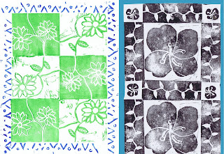
        Long long ago when I was teaching middle school full time, I did a similar project with students in an elective on Art of India.  We studied the designs and printing blocks used for traditional Indian cotton fabrics, and then the kids carved and printed their own blocks.  Students were instructed to consider borders, and to think about how the blocks would match up when printed next to each other.  They were told they could print blocks on top of each other, but again, very few of them overlapped their printing.
        You can see here some of the variations kids have come up with.  There are scenes in which the components are arranged logically to represent the real world.  There are designs in which the components are arranged into medallions or patterns (usually symmetrical.)  Components can be printed so that they fit right up against each other, or spread with space between.  Color is another possible  variable.  It’s always so much fun to see all the different ways that kids address an artistic challenge.


[Pictures: Fish, print from multiple rubber blocks by ME, 2015;
City, print from multiple rubber blocks by AT, 2015;
Fair Food, print from multiple rubber blocks by CH, 2015;
African Animals, print from multiple rubber blocks by NF, 2015;
Print from multiple rubber blocks on fabric by 8th grader, c. 2000;
Prints from multiple rubber blocks on fabric by two 8th graders, c. 2000;
Flower Medallion, print from multiple rubber blocks by EE, 2014.]