August 29, 2022

Words of the Month - Not Quite There

         I confess to enjoying the creative and varied idioms with which people insult each other’s intelligence.  I find them humorous, and poetic, and interesting in what they tell us about the ways we think about intelligence and the workings of the human mind.  There are a few metaphoric structures I particularly enjoy.  The first of these is lacking.  Some examples include

     not playing with a full deck

     not firing on all cylinders

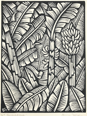
     one banana short of a bunch

     two tomatoes short of a salad

     a few clowns short of a circus

     a few sandwiches short of a picnic

     a few bricks shy of a load

     a few French fries short of a Happy Meal

     12 shy of a dozen

     3 cents short of a dollar

     his/her puzzle is missing some pieces

     a few episodes short of a full season

The basic metaphor here is that a fully-functioning brain is like a complete X, so when a person isn’t thinking too well, it’s like having an incomplete X.  What I enjoy about this is the wide range of things that can serve in the metaphor.  “Not firing on all cylinders” is pretty straightforward, because imagining the brain to be like an engine seems reasonable, and everyone knows that a malfunctioning engine is a problem.  But what about people who don’t even like tomatoes in their salad?  And is a circus really a good metaphor for a fully-functioning brain?
        The second metaphoric structure is intelligent objects.  Of course, the objects themselves are not intelligent; rather, they stand in for intelligence because they’re characterized by traits that we use as metaphors for intelligence.

     not the brightest bulb

     not the sharpest knife in the drawer

     not the quickest bunny in the meadow

     not the sharpest tool in the shed

The basic traits that serve as metaphors for intelligence seem to be brightness/luminosity, sharpness, and swiftness/speed.  Indeed, all of these words (bright, sharp, swift) are simple synonyms for "smart."  So this group of idioms all use the structure of saying that someone does not have as much of the trait X as some object well-known for the trait X.
        The third category is a bit of a catch-all, but one common theme these all share is the metaphor of the mind as a building.

     the elevator doesn’t go all the way to the top

     the lights are on, but no one’s home

     a few tiles loose

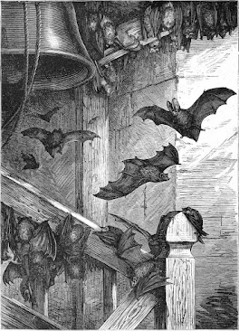
     bats in the belfry

All of these work because an unsound or inadequately-functioning structure represents an unsound or inadequately-functioning brain.  (The last two are more often idioms for insanity than unintelligence, but I included them because there is a bit of overlap, and they fit with the same points I’m making with the others.)
        All of these idioms illustrate some interesting things about us humans.  For one thing, they show that we are not always very kind to each other, and for another, that we’re not always very tolerant of those whom we deem to be not mentally “normal.”  But on the other hand, they also demonstrate our incredible creativity, and how much we value intelligence, as well as the way we love to play with language.  These phrases reveal some of the metaphors for how we think about thinking, and how we try to get a grip on our own mysterious mental powers.
        Now, I’m certainly not advocating that you use any of these phrases to hurt people’s feelings or make others feel bad, but as a linguistic game?  Bring ‘em on!  Have you ever heard any other idioms along these lines?  Can you make up some new ones?  What about idioms in other languages?  I love to hear them all, though hopefully not used to describe me.


[Pictures: Banana Grove, linocut by Bruce Goold, 1992 (Image from Australian Galleries);

Hare, wood engraving from An Alphabet of Animals, 1865 (Image from Digital Archive);

British bats at home, wood engraving from Cassell’s Natural History, 1896 (Image from Project Gutenberg).]

August 24, 2022

Ross's Collagraphic Cities

         John Ross (USA, 1921-2017) was a prominent printmaker who used a variety of techniques but particularly did a lot of work in collagraph.  To get the full scoop on collagraphs, see these previous posts: Collagraph and Students’ Collagraphs.  The basic gist is that a collagraph is printed from a block that is built up (collage-wise) rather than carved down, or etched or engraved down.  One thing that makes collagraphs interesting, though, is that they can be printed relief or intaglio.  This first one looks to be relief-printed, with all the tiny white lines of the stairs carved into the material, but the thin black lines of the scaffolding 
on the right built with thin lines of mat board or some such material.  You can see that those black lines have a sort of white halo immediately around them where ink can’t reach and/or the paper doesn’t get pressed, while farther away from the raised black lines there is a bit of ink.
        For comparison, the second piece is clearly printed intaglio.  All the little scratched-in lines making textures are printed in black, and you can see the look of wiped away ink on the large arches at the top that would be built up out of pieces of material.  Naturally I favor the relief printing, but it would be fun to experiment with both.
        I paired the next two pieces because if you look closely they have a number of repeated elements, which makes me curious about Ross’s process.  There’s a section that includes the tall 
tower with vertical lines on the left, across to the cathedral with arched doorways and a dome on top.  The block extends the entire height of the paper, although the piece above goes higher with the arches, and the one on the bottom goes slightly lower on the roof with the skylight.  This entire section appears to be reused in its entirety in both of these pieces and I can’t figure out which of these two was made first, because they both seem to be cut down instead of added to.  Then the top piece has more added to the right side, while the bottom piece has more added to the left.  So how did Ross construct them, in what order, and what was the creative process?  As another note of interest, the top is printed black on white, while the bottom is printed silvery-grey on black, giving them a different look and a different emphasis.  (I like them both a lot, but I definitely like the top one best!)
        The final piece is also printed relief, and also printed with light ink on dark paper.  In this one you can see some really interesting texture in the cliff on which the city stands.  That part of the collagraph block is built not with carefully cut board, with carefully cut details, but rather is crumpled paper.  It makes such a wonderful texture!
        In all of these pieces you can see that Ross really loved the idea of imaginary cities, which is a recurring theme for me, too.  He made an entire book in which he illustrated some of the “Invisible Cities”  of Italo Calvino.  I love the fantasy element in these cities, such as the proliferation of staircases, and the great arches as of entire cities being underground or enclosed.
        As for the medium of collagraph, Ross himself said, “One of the most useful printmaking techniques for my images is the collagraph, which I helped to develop.  The plates for this method are generally made of mat board with gesso adhering paper, fabrics, cardboard and found objects to the mat board base. Razor blades can cut lines and other shapes to place on the base.  From these ordinary materials, I can create city streets, mountains, canyons, pueblo dwellings, oil refineries, skyscrapers, and other constructions, either realistic or visionary.”


[Pictures: Isadora, collagraph by John Ross, 1993;

Atrium, collagraph by Ross, c. 1970’s;

Despina, collagraph by Ross, undated;

Cellar City, collagraph by Ross, c. 1980’s;

Silver Peak, collagraph by Ross, 1984 (All images and quotation from The Old Print Shop).]

August 19, 2022

The Sampo

         Today’s post is on something about which I am definitely not an expert.  Rather, it’s one of those things I happened to hear about and found intriguing.  So I’ve looked it up and offer you a very surface-level summary of something that tickled my fancy.  That something is the Sampo.  What is the Sampo?  Well, part of the fun is that no one seems to know exactly what it is.  It’s a magical artifact that features prominently in the Kalevala, the national epic of Finland.  A poem cycle collected and edited from oral folklore in the mid-nineteenth century, the Kalevala has several different sections describing the actions, reactions, and interactions of a handful of characters.  And then there’s the Sampo.
        The Sampo is forged by Ilmarinen, a god of metalworking and master artificer and inventor, at the demand of Louhi, the witch queen of the north - although it takes a fair amount of extortion and trickery to get even to this stage.  Once Ilmarinen started working on a magical artifact, he had several rough drafts.  A magical crossbow was rejected because it demanded a victim every day, a magical ship was rejected because it always sailed toward battle, a magical cow was rejected simply because it was ill-tempered(!), and a magical plow was rejected because it plowed up meadows and fields that were already planted.  But finally Ilmarinen succeeds in creating the Sampo, with which he is pleased.  He presents it to Louhi, who locks it away in her vault.  Later Ilmarinen and the other heroes set out to take the Sampo from Louhi by force, because it brings prosperity to her whole land, and they want some of that wealth.  In the ensuing battle the Sampo falls into the sea and is lost forever.
        Okay, but what IS the Sampo?  Well, I said at the top that “no one seems to know,” but actually I think it’s more a case of everyone knowing exactly what they think the Sampo is, but it’s just that they all wildly disagree with each other.  Some scholars think it’s a sort of world pillar or world tree, others a compass, or a treasure chest, or various other kinds of artifacts.  In the Kalevala it’s described as a sort of multi-sided mill which grinds out infinite useful things.
On one side the flour is grinding,
On another salt is making,
On a third is money forging,
And the lid is many-colored.
Well the Sampo grinds when finished,
To and fro the lid is rocking,
Grinds one measure at the day-break,
Grinds a measure fit for eating,
Grinds a second for the market,
Grinds a third one for the store-house.
        You can see how this would bring prosperity!  There are other similar magical devices in folk and fairy tales from around the world, such as the salt mill in “Why the Sea is Salt,” the cornucopia of Greek mythology, and a variety of ever-filling pots.  Many of these other artifacts also get lost or destroyed at the end of their stories - often, like the Sampo, because of people behaving greedily.  However, the Sampo may be unique (in my knowledge) for its variety of products.  Plus it’s beautifully decorated, so I think it gets bonus points for that!  Still, I notice in my search for pictures, that while there are lots of illustrations of “the forging of the Sampo,” I don’t see a lot of pictures of what it looks like when it’s finished.
        I am not very familiar with the Kalevala, and I very much enjoyed learning a bit about this wondrous, though ill-fated, magical object.  If you could make a Sampo, what would you have it produce?  And how would you decorate it?


[Pictures: The Forging of the Sampo, painting by Joseph Alanen, 1910-11 (Image from Tampere Art Museum);

The Forging of the Sampo, painting by Väinö Blomstedt, 1897 (Image from Kalevaseura).]

August 15, 2022

Summer Nights

         This is the second part of my selection of block prints depicting summer, and this time I’m focussing on the evening.  As I mentioned in the previous post, the real way to tell that a piece is depicting summer is when people are doing summer activities, and perhaps the most tell-tale summer activity is swimming.  In today’s first piece we see men, women, and children, all frolicking in the shallow water at the shore, while boaters and even a horseback rider are farther out.  The printing technique is chiaroscuro, in which a mid-tone block fills most of the background, with just a bit of white carved out for highlights.  I’m not sure it adds a ton to this particular piece, but it does contribute to an impression of early evening with that ruddy light as the sun begins to go down.
        Next is the summer evening activity for city dwellers: sitting on the front steps visiting with family and friends.  This is a very simple piece, probably printed by hand without a press, given the pale, uneven inking.  The only texture is the wood-grained door.  It’s probably a hot night, without air conditioning to draw everyone inside and away from the community.  I wonder which of these people are couples, or which live in this building, (assuming they aren’t all from different apartments in the same building)?  And how do they know each other?
        The third piece comes from a series entitled “Songs for the Four Seasons,” and features one of my own favorite icons of summer evenings: catching fireflies.  This triptych is from nearly 130 years ago, but shows that despite the invention of bathing suits and air conditioning, some simple joys of summer persist.   Five richly-clad women and their children enjoy the natural light show as darkness falls.  The composition is interesting in that it has 
very little foreground and very little background, and the people are posed across a detailed middle ground.
        When it’s finally fully dark (which can take a long time in the summer in higher latitudes), it’s time for the next light show: fireworks.  This piece shows fireworks - I think! although the style is really interesting in having so many similar lines that it can be hard to parse out the details.  I think it’s cool that you can make out the people as well as you can, given that in some ways the entire paper is just a mush of every-which-way white lines.  Among the details that I do enjoy picking out are birds in the sky, the fish kite to the left, and someone wearing a Chicago Bulls basketball T-shirt in the middle right.  There’s some interesting architecture at the top left, and I do like the look of the fireworks, especially at the top.
        Finally, after all that excitement, we settle down for a peaceful summer night.  Someone’s still out in a boat, and the full moon lights the way, but I’m sure everyone else is getting ready for bed.  No doubt it will be refreshingly cool with the breeze off the water.
        Do you prefer your summer nights to be full of celebration and activity, or peaceful and quiet?  Or perhaps some of each?


[Pictures: Summer Evening, woodcut in black and brown by Auguste Louis Lepere, 1910 (Image from Cleveland Museum of Art);

Summer Evening, from One-Hundred Views of Chicago, woodcut by Bronislaw M. Bak, 1967 (Image from Art Institute Chicago);

Summer - Women and children catching fireflies, woodblock print by Chikanobu Yoshu, 1894 (Image from The Japanese Art Open Database);

Summer Night Harbin, woodcut by He Weimin, 1998 (Image from Art Institute Chicago);

Summer Moon at Miyajima, color woodblock print by Tsuchiya Koitsu, 1936 (Image from Art Institute Chicago).]

August 10, 2022

Summer Days

         It seems like every time we have winter snow, I post a collection of block-printed winter snow scenes - but do I ever post a collection of summer scenes?  No I do not, but today that changes.  In fact, I gathered enough summer scenes (and I’m busy enough) that I’m going to split into two posts, the better to enjoy the summer bounty.
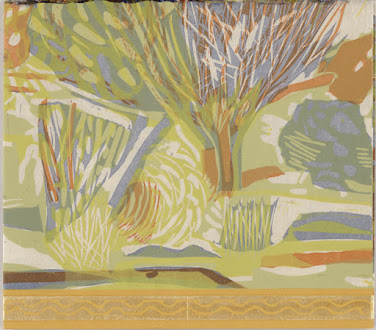
        I’m starting with the one that is not only a bit different from my usual taste, but also an unusual format.  It’s actually a two-sided piece on which the other side is “Winter Night.”  But I like this “Summer Day” much better.  It looks to be three blocks with interesting overlapping areas, plus a sort of ribbon of gold along the bottom, which may be part of binding the two sides together.  In any 
case, I particularly like the summery color choice, which looks quite sultry, and although it’s a bit abstract, it’s clear that there are trees and bushes, grass, sunshine and shade.
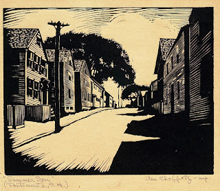
        Second is a hot late-afternoon streetscape by Asa Cheffetz, who also has a number of summer country scenes that really tempted me today.  I’m sure I’ll post them another time, but for now I thought I’d embrace the variety of showing summer in a town.  No one’s out in this scene, so I imagine they’re all inside, looking for a bit of relief from the blazing sun.  I love the three-way 
contrast between black shadows, bright sunlight, and textured buildings.
        Our third piece would definitely be my choice for a summer vacation spot (if I actually ever went on summer vacations any more, heh).  Beautiful scenery, cool trees and cool water, secluded porch on which to overlook it all…  This piece is from a series of four, depicting the garden in each season, and it’s everything to love about Japanese wood block prints: the composition, the colors, the exquisite detail.  Beautiful.
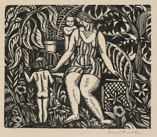
        I’ll close out today with people dressed for the season.  In some ways summer seems to be the “unmarked” season in art.  If you see snow, it’s winter, colored leaves for autumn, flowering trees for spring; but summer seems to be the season of the absence of other seasonal cues.  The one thing that really does mark summer is people bathing, or in swimsuits, or people having picnics.  So here’s a mother dressed for summer, with two children undressed for summer, on a bench in a lush garden growing like a jungle.  It feels almost tropical, and certainly ready for a picnic.
        I love summer, but frankly I’m only too happy that our recent hot spell is over.  I’ve had a bit more than enough of truly summery weather.  (Now if only we could get some more rain.)  But I never get tired of these summer block prints.


[Pictures: Summer Day, color linocut by Ruth Fine, 1994 (Image from University of Wisconsin-Madison);

Summer Sun (Portsmouth, N.H.), wood engraving by Asa Cheffestz, 1928 (Image from The Clark Museum);

Garden in Summer, color woodblock print by Hiroshi Yoshida, 1933 (Image from Moku-Hanga.org);

Summer, wood engraving by Cecil Buller, c. 1926 (Image from Cleveland Museum of Art).]

August 5, 2022

Harding's Bird Alphabet

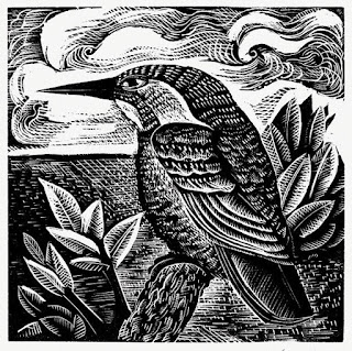
         It’s been a while since I featured an artist with a relief-print alphabet, so today I present Angela Harding (U.K., b. 1960) whose block prints focus on the plants and animals of the British countryside.  She has done an alphabet of wood engravings of birds (although technically I can find only 22 of them!)  It looks like most of these birds are part of the British landscape, although she’s had to include a few others to complete the alphabet.
        Her style is not about realism, although the birds certainly include identifiable details.  They’re influenced by a mid-20th-century aesthetic that combines a certain amount of geometry, roughly carved texture, and stylization of composition.  My favorite is the kingfisher.  I like everything about this one: the patterns of the bird’s feathers, the contrast with the sky and 
water, the leaves in the foreground and the clouds in the background…
        Next up, the blackbird.  This works well because the simple black shape pops against the background, without too much mixing and mushing of texture and pattern.  The background has a lovely little house at the end of a path, and in the foreground the blackbird is finding berries.  Why people should take so much delight in watching birds eat I’m not sure I can explain.  I only know that we do.
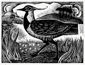
        V is, I think, the only letter for which Harding has used a bird’s scientific name instead of its common name.  V is for Vanellas vanellas, which is the northern lapwing aka peewit.  How can you not admire the wonderful plume on its head?  In her little blurb about this piece, Harding mentions that she remembers lapwings in her childhood near “the small outcrop of trees called the Callow,” which I assume is what’s showing in the background of the piece.  That means this scene is actually a real, particular landscape.  I wonder how many of the others are?
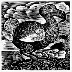
        Finally, for any alphabet you always have to check X.  Yes, Harding has cheated, as one so often has to do for X, but I think her choice is rather clever.  X is for Dodo, the universal symbol of all the birds and creatures that are no more.
        In addition to these small wood engravings,  Harding does a lot of linoleum block prints, and combinations of relief printing with color blocks from screen printing, as well.  She’s illustrated a book of birds, as well as a number of other books and book covers, but they’re all focussed on wildlife in landscapes.


[Pictures: K is for Kingfisher;

B is for Blackbird;

V is for Vanellas Vanellas;

X is for Dodo, all wood engravings by Angela Harding (Images from AngelaHarding.co.uk).]

August 1, 2022

Tales After Tolkien Guest Post

         Today’s post is just a short signpost, to send you over to the Tales After Tolkien Society, where I have a guest post about the connection between medievalism, Tolkien, and my bestiary On the Virtues of Beast of the Realms of Imagination.  I’m delighted to be featured there because I’m always a scholar at heart, despite not having gone into academia.  So when I heard from a fellow author about their invitation to fantasy authors to reflect on how medievalism and Tolkien-ism influence their work, I jumped on the opportunity.
        Head right on over to Guest Post: A Modern Fantasy Project with a Medieval Inspiration.  And be sure to leave a comment and give Tales After Tolkien some love!
[Picture: Tales After Tolkien Society header (Image from Tales After Tolkien).]