January 31, 2022

Words of the Month - Ception

         This month I’m looking at the wide variety of words that end in -ception.  That’s not a root that means anything by itself in English, and it’s hard to see a common thread in the meanings of the various words that use it: reception, deception, exception, interception, conception, perception, contraception, inception…  What’s going on here?  The Latin root of -ception comes ultimately from capare, meaning “to take, seize.”  So let’s have a look at how that root manages to yield us such a wide range of meanings.
        Interception is relatively easy to see: it’s seizing something between the two ends of its path, as when a ball is caught between the throw and the intended target.  So far, so good.
        Perception isn’t too bad, either.  Its roots literally mean “to grab something entirely,” and the idea of grasping ideas is a pretty straightforward metaphor.  If you get it, then of course you’ve grasped it!
        Conception is a similar metaphor when used to refer to ideas: holding something with your mind.  But the pregnancy meaning came first, with the idea of the embryo being held in the womb.  The metaphor suggested the idea of your brain becoming pregnant with a new thought.  Interestingly, contraception was coined in 1886 by replacing the con- of conception with contra- meaning “against.”  So unlike today’s other words, it didn’t really derive from Latin or from a time when the -ception root actually still had its Latin meaning.
        Deception can also be explained with an all-English synonym that makes use of the same root meaning: taking in.  Even back in Latin the literal meaning of seizing something in a trap or snare was joined by the metaphorical meaning of tricking or cheating.
        Exception, as you can guess when you think about the prefix ex-, means taking something out of a group or category, or out of the scope of a rule. 
        Reception has an overlay of recent meanings, but to see its connection to the Latin root it’s easier to look at the verb form receive.  That clearly has to do with taking possession of something, although the re- prefix is unclear, since in this case it doesn’t mean doing anything again.  Interestingly, the noun form first entered English with an astrological meaning, but soon enough meant “the act of taking possession of something.”  From there it added the idea of taking a person into a place, company, etc, and from there the word was given to the ceremonial gathering in which people are taken into company.  And in the twentieth century we also begin to seize radio and later television signals right out of the ether.
        Inception is a beginning, which doesn’t seem to have much logical connection to catching anything, but I will remind you that you could just as well speak of a new undertaking, which has take right there in it, just as inception has seize right there in it.  We also have phrases such as “I’ll take it up,” or “I’ll take it in hand.”  Clearly we do resonate with some idea of grabbing hold of an endeavor in order to begin it.


[Picture: Circle of Angels, rubber block print by AEGN, 2007 (sold out).]

January 26, 2022

Year of the Tiger

        Next week we will be entering the lunar/Chinese Year of the Tiger (the water tiger, to be specific), and that always makes an excellent excuse to celebrate with block prints.  As you can imagine, tigers are a pretty popular subject for block prints: not only are they large charismatic mammals, but they have a great graphic pop that translates well to the graphic nature of relief block prints.  Nevertheless, there’s a broad diversity in how various artists have depicted these iconic animals.
        We begin with a couple of Japanese wood block prints, and unfortunately neither is dated, although I’m guessing that the first may be around the 1920s and the second around 
the 1960s.  I definitely like the first one best, with its powerful realism, beautiful wood grain, and dramatic crescent moon.  On the other hand, the second is certainly fun for contrast.  It’s by Toshijiro Inagaki whom I’ve featured before, whose distinctive style is influenced by his background designing kimono fabric.  It’s definitely got more of a pussy-cat vibe.
        Stepping over to Europe and back in time, we’ve got another tiger that looks rather cheerful and friendly, although probably not intentionally!  This one comes from Topsell’s seventeenth-century encyclopedia, and the anonymous artist had almost certainly never seen a tiger.  The next piece isn’t “realistic,” either, but this is done with deliberate stylization.  It’s by Stephen Alcorn, whose other animals I featured recently.  His tiger’s patterns are very interesting, and not at all the plain solid black and solid orange stripes you would expect.
        Finally, two roaring tiger faces, the first by Albertine von Bresslern-Roth, another artist whose animals I’ve featured in a previous post.  She often has a wonderful touch of Art Deco about her style, and although it’s less evident in this piece, she clearly celebrates that dynamic, sinuous power.  This is not a tiger to mess with!  And we end with a tiger made to 
celebrate Chinese new year.  Artist Andrew Valko has done something interesting with making the tiger’s face blend with an all-over patterned background — which of course is what tigers actually do in their jungle habitats.
        Six tigers, six different styles, and many many wishes that we all enter into a year of resilience, tenacity, celebration of blessings… and lots of beautiful art.  (Plus a couple more tigers you can revisit here: Big Bold Cats by Artzybasheff.)


[Pictures: Roaring Tiger over the Crescent Moon, color woodbock print by Ohara Koson, early 20th century (Image from Galerie bei der Oper);

Tiger, wood block print by Toshijiro Inagaki, mid-20th century (Image from Fuji Arts);

Of the Tiger, wood block print from The history of four-footed beasts and serpents by Edward Topsell, 1658 (Image from Internet Archive);

The Tiger, color relief-block print by Stephen Alcorn, 1988 (Image from The Alcorn Studio & Gallery);

Tiger’s Roar, color linocut by Norbertine von Bresslern-Roth, first half of 20th century (Image from Skinner)

Year of the Tiger, woodcut by Andrew Valko, 1998 (Image from AndrewValko.com).]

January 21, 2022

Here's Something Cool: Make Your Own

         Sometimes I find fun stuff that is not exactly the subject of this blog, yet seems tangentially related - and certainly worth sharing.  Such posts are what the “cool thing” label in the sidebar represents.
        Today’s cool thing is two fun little ways to waste time on-line.  The first involves seventeenth-century copper engravings by Matthäus Merian (father of the famous Maria Sibylla Merian, about whom you can read a previous post).  Engravings that Merian made for works of natural history by Jan Jonston are cut up and recombined chimera-style by the Hybridizer, allowing you to create all manner of intriguing new beasties.  There is a delightfully wide variety of creatures including mammals, reptiles, birds, insects, and sea creatures.  There is also the added benefit that some of the animals are depicted a little oddly in the first place, making your made-up creatures even sillier.  Which one is your favorite?
        The second toy is the Historic Tale Construction Kit featuring elements from the Bayeux tapestry.  Combine and recombine all sorts of people and things in the iconic medieval embroidery style, and use them to tell your own stories or illustrate your own memes.  Its subjects are limited by the fact that the Bayeux tapestry itself is of limited subject matter, but with all the options for editing, the determined creator could no doubt depict just about anything.  What message do you think needs to be shared medieval-needlework-style?
        Allow me to encourage you to take a little break, let your imagination wander, and have some fun being as silly as you need to be to reclaim some sanity.


[Pictures: Assorted creations made on the Hybridizer and the Historic Tale Construction Kit.]

January 17, 2022

Equality and Justice

        Every year, the day that we celebrate Martin Luther King, Jr.’s life and message should be a reminder that we are still woefully far from equality and justice, but at the same time, we still hope for it, and work for it, and dream of it, and demand it.  Here are a few block prints holding up that theme.
        First is “The Dreamer” by Steve A. Prince (USA).  I don’t have a lot of information about this particular piece, but I think King’s weariness makes a good reminder from so many of the images that show him looking strong and indomitable.  He was both.  And we all can be both, too.  Prince often makes epically large woodcuts, but the scale of the gouge marks in this image implies that it’s pretty small.  Nevertheless, it’s beautifully detailed.
        I don’t love today’s second portrait of King nearly as much, but I figured I’d share it anyway, because maybe you find it especially evocative and inspirational!   By Mervin Jules (USA, 1912-1994) it was made in the mid-to-late 1960s.  (Relief block prints of King are not as common as screen prints.  After all, it was the 60s…)
        Finally, a linocut not of King but of an archetypal African American woman by Elizabeth Catlett (USA/Mexico, 1915-2012).  
The title of the piece is what makes it especially appropriate to feature today: My right is a future of equality with other Americans.
        I’ll also direct you to a couple of previous posts with relevant images you may find inspiring: Keep Dreaming, and Bryan’s Songs.  If each of us can just keep plugging away the best we can at this whole issue of equality, justice, and loving our neighbors, we’ll get there eventually.


[Pictures: The Dreamer, wood block print by Steve A. Prince (Image from Atlanta Printmakers Studio);

Martin Luther King Jr., woodcut by Mervin Jules, c 1936-8 (Image from Amon Carter Museum of American Art);

My right is a future of equality with other Americans, color linocut by Elizabeth Catlett, 1947/1989 (Image from National Museum of African American History and Culture).]

January 12, 2022

On Selecting an Excerpt to Read

         It’s happening again: events that had been scheduled and planned and eagerly awaited are being cancelled due to the new covid surge.  This is discouraging.  (Yes, of course it’s not as discouraging as hospitalizations and death are, but still, it is certainly a disappointment.)  Once again, however, we are trying to make do with on-line events, and I have two on-line author readings coming up in the next week.  I will duly plug them because you, too, probably have need of some fabulous on-line events in these days of staying at home as much as possible.  Today, however, I’ll also share a few thoughts about some of the considerations involved in selecting passages to read at author events.
        • The first and least-negotiable factor is the time frame.  Each event has its own requirements depending on its format and the number of authors.  I’ve participated in readings that had to be under 4 minutes, all the way up to readings where I have 20 minutes to share.  Both of my upcoming events are in the 7-8 minute range, which is roughly the equivalent of 4 pages from a book.
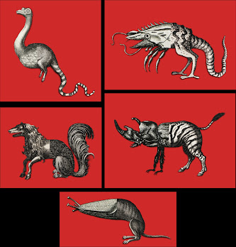
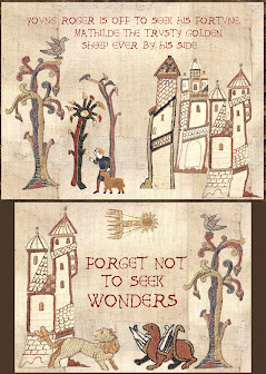
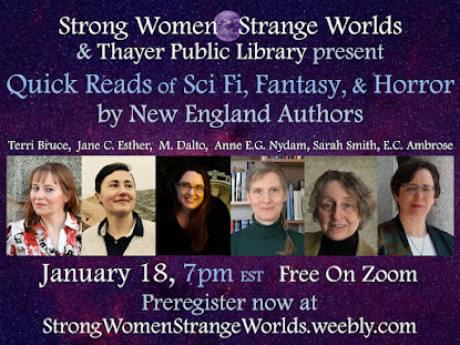
        • The second decision is which book to read from.  Sometimes this is determined by outside factors, such as the theme of the reading.  For example, my event on January 18 has a New England theme, so I’m planning to read from the one of my books (The Extraordinary Book of Doors) that has scenes explicitly set in the Boston area.  Or, for another example, when my bestiary was first released I featured it at all my readings because it was fresh and new.
        • So I’ve decided which book I want to share, and I know how long a scene I get to share, and now I have to decide which scene.  This is where it gets really knotty.
               1. You want to pick a scene that gives an accurate idea of what the book is like.  If your book is deep and tragic in tone, you probably don’t want to share the one scene that’s slapstick farce.  Likewise, you want to share a scene featuring someone the book is really about, rather than a scene that focusses on a minor character that the reader will never see much more of.  In other words, if someone goes on to read the rest of your book, they should feel that it was as your reading had represented it.
               2. You want to pick a scene that the audience can drop into without too much confusion.  It’s common to give a little intro to your reading, such as “In this scene Anneke the scullery maid has just discovered that her laundry basket is sentient, and now the two of them are hiding in a wardrobe and eavesdropping on a conversation between the evil Emperor Kolek and his chief advisor Rompollion.”  Then you can start dropping names and the audience (hopefully) will have enough orientation to get the hang of things.  However, there’s a limit to how much explanation you want to give, so it’s probably best to select a scene with only a few characters, and also one that doesn’t make too much reference to things that have happened earlier in the story.  This ends up meaning that the scene you choose will almost always have to be from the first half of a book, because by the time you’re in the second half there’s usually already too much water under the bridge.
               3. You want to pick a scene that stands on its own with at least a little bit of shape to it.  It should have its own beginning, middle, and stopping place.  Often it’s very effective if the stopping place is a dramatic mid-scene cliffhanger leaving the audience wanting more, but that doesn’t mean that you can just stop randomly whenever your allotted time runs out.  You need to pick an ending place with an eye to effect, whether that’s the cliffhanger or the startling revelation or the note of satisfying closure.
        • With all these considerations to juggle, it can actually be extremely difficult to pick the perfect scene for a reading, and for several of my books I have one excerpt that I think works the best… which makes it even harder when you add one more consideration: sometimes you have to pick a different scene because there may be audience overlap with a prior reading and you want to share something new and different every time.
        For the New England reading I thought I’d share one of those Boston-area scenes… But after having read through my options a couple of times, I’m not sure that any of those particular scenes works very well with all the other considerations I’ve laid out above.  Mostly they’re close to the end of the book and seem to require far too much background explanation.  So, what will I be reading at these two upcoming events?  I haven’t decided yet!  But I can confidently assert that, my own dithering aside, they will be really enjoyable events, and if you like sci fi and/or fantasy, you should definitely join us on zoom!
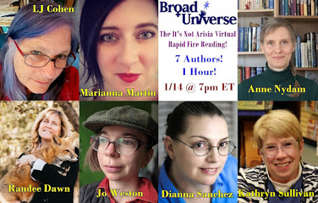
        Friday, January 14, 2022, 7:00pm (EST) - Broad Universe Not-Arisia Rapid Fire Reading:  This is the reading that is taking place on zoom because Arisia, the convention at which it was originally scheduled to take place in person, was cancelled.  So you won’t get chocolate thrown to the audience as often happens at Broad Universe Rapid Fire Readings, but you’ll still get to hear excerpts from all the amazing books.  
     Tuesday, January 18, 2022, 7:00pm (EST) - Strong Women-Strange Worlds and the Thayer Public Library of Braintree MA:  This is a special edition of our QuickReads, featuring New England authors of sci fi and fantasy.  

January 7, 2022

Snow Scenes

        Every year when we have a nice snowfall I write a post with a theme of snow scenes.  And I never run out of pieces to share, because block printmakers do seem to love snow scenes!  Perhaps it should not come as any surprise; after all, snow, like the most basic relief prints, reduces the world to black and white.
        First is a wood engraving, which allows lots of very fine detail, so that we see not only every snow-covered twig on every tree, but even the reflections of all those snowy twigs.  I like the sky of such fine little gouges that it reads grey, and the twigs show up beautifully against it.  I’ve featured lots of Herbert Pullinger’s work before, because I love it.  You can read a whole post about him here, and see another of his winter scenes here.
        Next up is a view by Utagawa Hiroshige, another artist who made lots of views of snowy scenes.  (You can see a previously posted one at the second link above.)  This piece is interesting because it has an extra technique added to the traditional block printing: the scattered snowflakes were printed through a stencil.  The print includes one verse of poetry by Taihaidô Nomimasu:

   The snow covers the signs warning against

   Breaking the cherry branches,

   And also breaks them itself.

Cherry trees are such an iconic and stereotypical symbol of spring that it’s fun to see them in a wintry scene.
        I conclude with a piece called “White Christmas,” because in my house we’re celebrating Christmas Part II tomorrow with family that couldn’t be with us on December 25.  This is another wood engraving, and I like the way the super-fine lines have been used to shade the sky, contrasted with the simplicity of the tiny buildings.  Cheffetz did a whole calendar of small prints, and there’s more information here, where I showed a few of his spring pieces.
        I will have to figure out when to get to the supermarket, but other than that, I’m looking forward to staying cozy in our snowy refuge.


[Pictures: Rittenhouse Town, wood engraving by Herbert Pullinger, c.1950 (Image from PAFA);

Evening snow at Asuka hill, color woodblock print by Utagawa Hiroshige, c.1837 (Image from The Fitzwilliam Museum);

White Christmas from “A New England Calendar,” wood engraving by Asa Cheffetz, 1934 (Image from Art Institute Chicago.)]

January 3, 2022

Brazilian Dragons

         José Francisco Borges (Brazil, b. 1935) is considered one of the foremost woodcut artists in Brazil, and he got his start making cover designs for cordel literature (about which you can read a previous post here).  His editions are not limited and vary widely because he continues to print popular images repeatedly, as well as modifying or recarving blocks over time.  He also prints blocks in both black and white and color.  He is a definitely a folk artist, despite having been embraced by the art world.  Perhaps because of his cordel roots, Borges gives all his work a banner across the bottom with the title and his name.
        His work depicts a wide variety of subject matter, but today I’m sharing a sampling of his fantastical creatures.  In addition to lots of depictions of the devil (my favorite title is “The Woman who Put the Devil in a Bottle”), and mermaids, Borges loves to depict dragons.  His dragons, however, are not generally very close to the typical modern western version I imagine.  Some are more humanoid, some are called “serpents,” and relatively few have wings.  All are bold and spiky and inclined to a certain lumpiness.
        I had trouble limiting myself when there were so many I liked, so I’ll just say a brief word about each of these.  The two block prints at the top show how Borges revisits designs.  My assumption is that the top version was first, and the second version is reversed because it was copied onto a wood block from the first (and simplified along the way.)  The top right dragon is especially delightful to me!
        Next up is a very unusual serpent.  It has only hind legs and no wings.  Although I always tend to be inclined toward black and white, in this piece it’s definitely the color that makes it pop.  I love the pattern on the snaky body.  Then the next dragon isn’t snaky or even very reptilian at all.  It almost seems more like a monstrous monkey with its upright posture and hairy texture.  But all the spikes and horns and that arrow-tipped nose ensure that it’s something fantastical.
        The next piece is in some ways the most classic dragon, especially when you look back a few hundred years to when legless dragons were more common.  I love its coils and spikes.  It’s followed by a monster with 7 unique heads, which puts the Lycian chimaera to shame.  Not only does this have goat and snake heads, but also lizard, chicken, bull, human, and maybe another goat.  Plus it’s got wings like leaves and a tail like a spatula!
        And then comes the lumpiest dragon of all, with more carefully carved scales than any of the others, spikes everywhere, and three stalks on its head that I would love to think are extra eyes (although I’m guessing Borges probably didn’t intend that).  I also give you a creature entitled “frog,” but clearly no ordinary, everyday frog!  And finally an interesting sun-faced monster.  Living in the northeast in January, I think of the sun as a benevolent and welcome creature, but in the Sertão region of Brazil where droughts are common and deadly, it is seen as a monster.
        What do you think of these dragons, serpents, and monsters?  I certainly wouldn’t want to meet any of them in real life, but in block print form they really cheer me up!

[Pictures: The Fight of the Dragons, two versions, wood block prints by José Francisco Borges, second version dated 2020 (Images from Pinterest and Cestarias Regio);

Fight Between the Jaguar and the Snake, wood block print by Borges, 2003 (Image from Arte Popular do Brasil);

The Dragon, wood block print by Borges, 2005 (Image from Indigo Arts Gallery);

The Serpent, wood block print by Borges, 2003 (Image from Arte Popular do Brasil);

Beast of 7 Heads, wood block print by Borges (Image from Mirabile);

The Dragon and the Monkey, wood block print by Borges, 1994 (Image from Indigo Arts Gallery);

The Frog, wood block print by Borges (Image from flickr Galeria de Gravura);

The Monster of the Sertão, wood block print by Borges (Image from Mariposa).]