December 30, 2016

Words of the Month - Words of the Year

        It is, of course, absurd to attempt to encapsulate any whole year in a single word, but nonetheless, it clearly appeals greatly to the human urge to categorize, simplify, and identify patterns.  The Germans did it first, in 1971, and there have been English “words of the year” since about 1998 (as far as I can see.)  There isn’t just one, because of course there is no one official language organization for English.  So here are some Words of the Year 2016 from several sources.

post-truth - relating to or denoting circumstances in which objective facts are less influential in shaping public opinion than appeals to emotion and personal belief.  This word was selected by Oxford Dictionaries.  The word was first seen in print around 1992, but has been gathering steam in the past decade, and the pressure cooker exploded in 2016.  (Note truthiness, which was the American Dialect Society’s Word of the Year in 2005.)

surreal - marked by the intense irrational reality of a dream.  This word was selected by Merriam-Webster, based on spikes in look-ups of the word on-line over the course of the year.  Apparently people look up the word surreal every time there’s a terrorist attack or political upheaval of some kind.  As Merriam-Webster explain, “Surreal is looked up spontaneously in moments of both tragedy and surprise.”  The word actually dates to the 1930s to refer to the artistic movement, and as an art-historian-type, the 2016 sense strikes me as not quite an accurate usage - at any rate, I don’t think of terrorism as being “surreal”… but I guess if enough people do, then the meaning simply shifts.

xenophobia - fear or hatred of foreigners, people from different cultures, or strangers.  This word was selected by Dictionary.com, again based on spikes in on-line word searches.  The UK vote to leave the European Union and the US presidential election especially drove this, although the refugee crisis has also been significant in the new “popularity” of the word.  As Dictionary.com point out, “while our lookup data can tell us what Dictionary.com users are interested in, it doesn’t tell us the reason for the interest… What we do know is that… xenophobia was a recurring subject of discourse in 2016.”

singular “they” - This word was selected as the 2015 Word of the Year by the American Dialect Society.  They have not yet chosen their word for 2016 (but are now accepting nominations, if you want to send them some suggestions.)  Read my previous post on the use of they as a third-person singular gender-neutral pronoun; it’s a usage that’s been around since at least Chaucer.  But what’s new is that they is now also being seen to include non-gender-binary usage.  It can mean he, she, or neither/something else.  It can mean that gender isn’t being specified in the sentence, or at can be specifying a gender that is neither he nor she.

        I’ll be curious to see what the American Dialect Society select for 2016, and whether it continues in the depressing vein begun by the others.  Words have incredible power.  They can shine a powerful light on the truths of our society and culture, and they have the power to hurt us and to define us.  But they also have the power to uplift us, and we don’t have to let them confine us.  Let’s make 2017 a year in which we make sure that the words that describe us are more inspiring.
        Best wishes to all for a new year of unfaltering hope and many joys.

[Picture: All the Year Round, color wood block print by Kent Ambler (Image from kentambler.net).]

December 23, 2016

A Visit from St. Nicholas

        Arguably the best-known fantasy poem in the English language is “A Visit from St. Nicholas,” aka “’Twas the Night Before Christmas.”  Perhaps the most interesting thing about it is the way it’s spread and shifted since its first publication in 1823.  For example, some editors have bowdlerized the line “the breast of the new-fallen snow,” and others have changed “ere he drove out of sight” to “as he drove out of sight,” thinking “ere” too archaic.  In my opinion, such editors are seriously insulting readers of all ages.  Children are perfectly capable of taking the occasional unfamiliar word in stride, just as they can take the “sugar plums” and the “laying his finger aside of his nose,” both of which were unfamiliar concepts to me as a kid.  The names of the reindeer have also shifted, from an originally Dutch version (Dunder and Blixem) to, more commonly, the German version (Donner and Blitzen).  I don’t know why that is.
        Clement Clark Moore’s image of St. Nicholas was enormously influential, along with Thomas Nast’s illustrations.  (That’s if indeed we assume the poem was written by Moore.  There is a certain amount of controversy over that, although apparently the balance of expert opinion tips toward Moore.)  The plump “right jolly old elf” with the white beard and the pipe are now the invariable image of Santa Claus, but there were many possible versions in the first half nineteenth century.  The one thing that I think hasn’t stuck about Moore’s version is the size.  We see “a miniature sleigh and eight tiny rein-deer, with a little old driver.”  As a child I took this to mean that St. Nick was actually much smaller than a normal adult.  Then it occurred to me that perhaps this was perspective and they looked small because they were distant.  But then I shifted my interpretation back again: we hear “the prancing and pawing of each little hoof,” and of course he was able to bound down the chimney which, in a chubby man, certainly implies general smallness.
        Finally, it’s worth noting that St. Nick’s job here is just to fill the stockings.  There’s no Christmas tree mentioned in this house, and Santa Claus isn’t delivering a ton of large consumer goods.  We’ve had serious gift inflation in almost two centuries.  Not that I’m complaining - I love a treeful of gifts for all - but it’s worth noting that originally we were expecting a few little treats, not dozens of Nintendos!
        And finally, let’s give a special mention to some of the best fantasy elements of the poem.  There’s the miniature aspect, of course, and there’s the flying reindeer and sleigh.  There’s the rising up the chimney, which sounds much more magical to me than the bounding down.  And my favorite line of all, “Away they all flew like the down of a thistle.”
        And so I’ll close, like St Nicholas, “Happy Christmas to all, and to all a good night!”  But I’ll also add, “Happy Channukuh,” and “Happy any other holidays you may be celebrating!”
        (You can refresh your memory of the entire poem here.)

[Picture: Illustration by anonymous artist from Christmas Rhymes and Stories by Clement Clark Moore, 1884 (Image from Reusable Art).]

December 20, 2016

Color Our Collections

        It’s hard to step foot in a mall or store these days without seeing the fancy coloring books that are all the rage.  If you enjoy coloring, you should definitely check out the coloring pages provided by a number of museums and libraries, featuring items from their collections.  I’m particularly partial because any librarian looking for black and white images suitable for coloring is likely to end up with a preponderance of wood block prints to reproduce, and that’s what you’ll find in these coloring books.  Admittedly, not all the images really make the greatest coloring pages - some have grey-tones, which aren’t so nice to color over, some have too much open space, or not enough interesting details.  Still, the pictures are fun to look at in any case, and you’ll find a nice variety of abstract designs, pretty scenes, and all sorts of images that are just plain weird.  So grab your colored pencils or fine-tip markers, print out a few of these historical pages, and go crazy!  It’ll be a good way to create a calm, colorful oasis in a busy, stressful season.
        The Dittrick Medical History Musem in Cleveland has provided this cool seventeenth century mechanical hand.  I wonder whether anyone was ever successfully fitted with one of these pre-steampunk cyborg attachments!  And I love that it's emerging from clouds like a divine apparition.  The whole coloring book is here.
        From Oxford’s Bodleian Library we get a wonderfully fancy initial, with monsters and flowers, two of my favorite things.  I think this one would work particularly well as a coloring page.  The whole coloring book is here.


        If you want something more modern, how about this great abstract design from the Smithsonian Libraries?  It doesn’t have as much detail, but it could be very bold, with lots of scope for experimenting with color choices.  The whole coloring book is here.
        The New York Public Library gives us this image of an astrolabe, which could make for a particularly interesting coloring page because in the original the lines aren’t intended to outline shapes or build up an image, yet they divide the space into lots of interesting areas with lots of possibilities.  What would it look like with the emphasis on shapes instead of lines?  The whole coloring book is here.
        And one more bonus coloring book for you, from the University of Minnesota.  It features a few nice mythical creatures, available here.


[Pictures: Mechanical Hand, wood block print from The Works of that famous chirurgion Ambrose Parey, translated out of Latine and compared with the French, 1634;
Initial S, wood block print from Lucain, Suetone, et Salluste, 1490;
Largo, woodcut by Oswald Herzog from Plastik: Sinfonie des Lebens, 1921;
Astrolabium Physicum, engraving by Martin Waldseemüller, 1517.] 

December 16, 2016

Bryan's Songs

        I’ve recently discovered another book illustrated with wood block prints.  Walk Together Children is a a collection of Black American spirituals, simply the music and lyrics, illustrated with large wood block prints by Ashley Bryan.  These blocks are quite rough-hewn, with the space entirely full of details or textures.  Interestingly, the pages of music are also carved, but I’m focussing on the pictures, and I’ve selected a few to share with you today.
        First up, a really beautiful portrait of a family.  They hold up their heads with dignity, and their faces are rough-worn but they look as if they might be just about to smile.  Their eyes are especially beautiful.
        The people in this second piece are much less detailed, and the two at the back of the boat look a bit wooden, although the family in the middle are lovely.  The huge waves and rough water almost dwarf the boat, and the oarsmen are straining.  The child looks quite unhappy - I hope he isn’t going to be sick! - but by contrast the man and the woman in the middle are quite calm, singing in their faith.
        I like all the details in this view of small houses, possibly slave quarters, or possibly a humble freehold.  Overall the piece is quite busy with a lot going on, rather jumbled together, but I like the one white leaf on the plant in the lower right, and I like the tree in the upper right.  I like the chickens, and the pattern of the crookedy shingles on the roof.
        Finally, here’s a piece with several separate elements, rather than a single cohesive scene.  My favorite part is the tree with the animals, especially the owl and the monkey.  I like the way the leaves fill in all the spaces between things, sometimes black and sometimes striped.  I’m dubious about the angel’s embouchure, having a couple of trumpeters in the family, but I like the wings.  The young man in the lower left is once again beautifully portrayed.
        I’ve seen some of Ashley Bryan’s other artwork, including sculptures made from found objects, and he always has a nice sensibility of finding the beauty in the ordinary.  It’s a real treat to see how his block prints reflect the dignity and joy in songs born of injustice and unspeakable hardship.
        (Also, I featured a couple more of Bryan’s block prints here.)

[Pictures: O Freedom;
Deep River;
My Good Lord’s Done Been Here;
Where Shall I Be?, all wood block prints from Walk Together Children: Black American Spirituals, by Ashley Bryan, Atheneum, 1974.]

December 13, 2016

The World Turned Upside Down

        A title like Rhymes for Children Illustrated with Appropriate Wood-cuts kind of makes you wonder whether all the other children’s books were illustrated with inappropriate woodcuts.  But in fact the publisher probably felt quite pleased at finding appropriate illustrations for these poems, seeing as he clearly didn’t have them purpose made, but simply rifled through the boxes of old wood blocks in the basement looking for something to reuse.  Despite being published in 1919, the illustrations are distinctly nineteenth century in style, some even eighteenth century.  In some cases the insipid little poems match the illustrations so very appropriately that I wonder whether the publisher actually commissioned verse to match the available illustration.  In any case, this isn’t a very high-quality production and I would have thought that by 1919 children were expecting something better, but there is one illustration here that tickles my fancy greatly.  The poem it heads is entitled “The World Turned Upside Down,” and relates a rather abrupt tale of birds, fish, and small animals turning hunter and wiping out sportsmen.  But given the apparent making of the book, I wonder what this block was originally intended to illustrate.  [Addendum: While looking through something else, I discovered this image with the title "The Water Wonder, or Fishes Lords of Creation" attributed to an eighteenth century chap-book also entitled The World Turned Upside Down.  But the chap-books also reused wood blocks, so this still might not be the original usage.]
        The fish fishing for a man is obviously what inspired the poem, but you can also see that fish are flying in the air and birds swimming underwater, and a lamb is attacking a lion or wolf.  I'm not sure what the balls under the tree are - apples growing from the ground, perhaps?  “The World Turned Upside Down” was the name of a British ballad from the mid-seventeenth century, which had nothing to do with fish or birds or any of the rest of it, so the original block print doesn’t illustrate that.  It leaves me very curious as to what the original block print illustrated.  Anyway, I think it’s funny.

[Picture: The World Turned Upside Down, wood block print from Rhymes for Children, 1919 (Image from Internet Archive).]

December 9, 2016

Swiss Church

        Here’s a pleasing wood block print by August Cueni (Swiss, 1883-1966).  I can’t tell you anything about him, except that he seems to have been primarily a painter, and to have painted primarily in a post-Impressionistic style reminiscent of Cezanne.  I basically found this one woodcut, which I like a lot.  Some subsequent searching around turned up evidence of a book of his wood block prints, but not much in the way of decent pictures.  So that makes Cueni a good artist to enjoy today, the day before another sale (Needham Winter Arts Festival).  So there aren’t details or analysis, just a wood block print I like, that I’m sharing with you.

[Picture: Kirche von Dittingen bei Laufen (Church of Dittingen in Laufen), wood block print by August Cueni, first half of twentieth century? (Image from Blouin Art Info).]

December 7, 2016

Here's Something Cool: Gate of Hell

        My schedule this week seems to be one unending parade of meetings, which is not my idea of happiness.  Moreover, what time isn’t spent in meetings is spent in preparing for the Needham Winter Arts Festival this Saturday, so here’s something cool just to tide you over until I have more time for blogging.
        No, it isn’t new news, dating back to 2013, but in case you missed it at the time, archaeologists discovered a classical site in southwest Turkey believed to be a gate to the underworld.  About two thousand years ago the Greek writer Strabo described the entrance to hell, “The space is full of a vapor so misty and dense one can scarcely see the ground.  Any animal that passes inside meets instant death.  I threw in sparrows and they immediately breathed their last and fell.”  A temple over a lethal cave in which the power of the god of the underworld strikes invisible instant death?  Sounds like a fantasy site, all right.  Apparently people made pilgrimages to the site to offer sacrifices, to witness that animals died but the priests could enter the gate of hell and return unharmed, and to ask questions of the oracles.  And now, lest we’re too eager to dismiss this all as a load of ignorant superstition, it looks like the site has been rediscovered, complete with invisible instant death.
        The cave is full of carbon dioxide from nearby hot springs, and the archaeological site includes the remains of a temple, steps on which pilgrims could sit to watch the spectacle, inscriptions to Pluto, and dead birds - not ancient birds, but modern, forward-thinking birds of today who are attracted by the warmth of the cave and suffocate in the poisonous atmosphere.  As for the oracles, they were presumably hallucinating in not-quite-deadly fumes, and we don’t know for sure how the priests managed to enter the cave and miraculously survive.  I think they must have figured out that the poisonous gas is heavier than air, so they could have used pockets of oxygen to get a safe breath inside.
        Anyway, my point here mostly is just that this is cool.  But also the reminder that much fantasy is rooted in real phenomena.  It isn’t just a way to explain the physical mysteries of the world, but a way to use the physical mysteries to think about the intangible mysteries.  I may not believe in an actual theological hell that can be entered from a ruined temple in Turkey, but I do believe that this whole story tells us some thought-provoking things about how humans encounter the concept of death, how they treat animals, how they use (and take advantage of?) each others’ wonder, how they experiment with (and abuse?) their own minds, and more.
       Here’s a somewhat longer article.

[Picture: Digital reconstruction of the Ploutonium, from Francesco D’Andria (Image from Seeker).]

December 2, 2016

Holiday Cards

        Many adults’ experience of block printing consists of making a family holiday card back in the days before ubiquitous photo cards.  That may seem hopelessly old-fashioned, but remember that retro is cool!  On Tuesday I ran a printmaking workshop at a local senior living community, at which people could make cards (or, of course, any small relief block print).  Some people came with ideas, sketches, or pictures to work from, while others came ready to start from the very beginning, but soon they were all working on drawing designs.  A couple were members of the local Art Association, while one or two did not think of themselves as being artsy at all.  Combine this diversity with the fact that people always work at widely variant speeds and we had a wide range of progress, from a woman who unfortunately had to leave very promptly and never even got to print, to one who stayed half an hour late and was able to complete about a dozen cards.  Still, I think everyone got excellent work done.
        One of my favorite things about printmaking is that the simple can look as striking as the complex.  We also had a selection of more stylized and abstract designs than I usually see with my children’s classes, which was fun.  One woman started with a basic design and, after inking once, added more carving, then checked again, added more, for three or four iterations, having more and more fun carving further designs.  Another woman was the opposite, having originally designed some extra details which she decided she didn’t like and then carved away, leaving a quite simple but dramatic geometric design.  Many made holiday designs with natural elements - snow, holly, birds, stars…
        In this season of a million generic commercial holiday cards, who wouldn’t enjoy receiving a good, old-fashioned hand-made card?  It demonstrates a little more thought and care, a little more special affection.  If you’d like to make holiday cards for your friends and family this year, it isn’t too late.  Here are a few tips:
     1. If you want to make a single whole scene you’ll need a piece of rubber in the neighborhood of 3.5x4.5 inches.  That will fit nicely on standard 8.5x11 inch paper that’s cut in half and folded once, which fits nicely in standard “invitation” envelopes.
     2. Another option is to cut smaller, simpler blocks that can be combined into larger patterns, such as holly leaves and berries, or snowflakes, or stars.
     3. Ordinary white paper works, but feels awfully flimsy for cards, while heavy card stock is harder to print on without smearing.  Therefore I recommend a paper in the 32 - 60 lb range.  (Alternatively, you could use plain paper folded into quarters so that each sheet becomes one card instead of two.)
     4. You don’t have to stick with white paper, of course.  You could print on colored paper - white snowflakes on blue, green pine trees on lighter green, black birds on bright red…  You get the idea.
     5. Remember that you can use a stamp pad if you don’t have ink and brayer.  It isn’t hard to find pads in all different colors big enough for blocks of this size.
     6. It may help you to pre-fold a few cards before printing in order to help you get used to where you have to print your block.  Without thinking it through, you may find you’re printing your cards so they open upside-down or backwards.  At the very least, don’t print an entire batch before you’ve checked that they’re right!
        I think the participants in my workshop made some really attractive designs, and I worked on my holiday design, too.  We’re just doing what we can to put the ART in HeARTfelt Holiday Wishes!
[Pictures: Carving;
Tweaking and touching up;
Inking;
Some finished cards by class participants, all photos by AEGN, 2016.]

November 29, 2016

Words of the Month - Hearing Double

        Perhaps you say “tom-ay-to” and I say “tom-ah-to,” but we both agree that we are, in fact, saying the same word despite different pronunciations.  Obviously this is the case with
the vast majority of words in any given language - that speakers recognize different dialect pronunciations as being the same word.  However, English does have a handful of exceptions.  These word pairs are actually simply two different pronunciations of the same word, which somehow came to be reinterpreted and accepted as being separate words.

girl, gal - Two words with similar meanings, girl has been around since about 1300, while gal was an eighteenth century pronunciation noted in New England.  It’s similar to the Northern English dialect usually indicated gell or gel, but somewhere along the line gal gained its own identity as a separate word, rather than simply a phonetic spelling of a dialect pronunciation.

thresh, thrash - Thresh is an Old English word meaning to sift grain by beating it.  Thrash is recorded as a dialectal variant of thresh from the 1580s, but had gained its own slight twist, “to beat [something other than grain],” around 1620.  I can only guess that if the meaning shift first occurred in an area with a slightly different pronunciation, it was that area’s pronunciation that was attached to that new meaning.

creature, critter
vermin, varmint - Most people probably think of critter and varmint as slangier or dialectal words, the sorts of things Yosemite Sam hollers, and not the sorts of words you would use in serious writing.  They probably became their own words precisely because they struck people as funny, and distinctively indicative of a certain sort of hillbilly or Wild West speech.   They are both Americanisms from the early nineteenth century, although the spelling “varment” was found in dialect areas of Britain in the 1530s.  One interesting note, though, is that there are many words in which modern Standard North American dialect pronounces er while British Received pronunciation says arclerk, Derbyshire, shard/sherd, and so on.  So varmint and critter are probably fairly accurate indicators of the original pronunciation of English colonists.

saucy, sassy - Sassy is simply an American version - I’m pretty sure a southern American version - of saucySaucy meaning “cheeky” dates from the 1520s, while sassy dates to the 1830s.  Really, they mean exactly the same thing, and I can’t tell you why sassy now gets its own spelling and entry in the dictionary, but I’m glad it exists as its own word.  It gives all of us the option to use either pronunciation whatever our own dialect may be.

hoist, heist - Here’s a set where our different pronunciations have acquired quite different meanings.  The original, hoist, had various slang meanings among criminals: “to steal” (note similar meaning in shoplift), or “to lift up an accomplice to reach a window to break in.”  It’s the American pronunciation that, in the 1930s and 40s, took those slang meanings and gave them a word of their own.  (By the way, the noun, meaning “a robbery,” came first.)

roil, rile - Perhaps you recognize the sound pair here, even though it’s spelled differently from the one above: oi - i.  Once again roil, “to stir up or muddy,” is the original word, while rile is the phonetic spelling of the American pronunciation.  (In 1848 John Russell Bartlett wrote that rile was a common pronunciation and spelling in both Britain and America, but I’m assuming only as a dialectal variant in Britain.)  Once again the slightly shifted sense, “to agitate [people],” became attached to the variant pronunciation, leaving the original pronunciation with its original meaning.

strop, strap - Everyone knows the word strap, while strop is somewhat more obscure.  It’s the leather band on which to sharpen razors.  Nevertheless, it’s strop that’s the original word for a band of leather, while strap is a Scottish and possibly nautical pronunciation.  Why did the dialectal version completely displace the original some time in the sixteenth century?  I can’t tell you.  (And in case you’re wondering, strip is not closely related to either, despite ending up with a similar sound and meaning.)

stamp, stomp - You might think that stomp and stamp would follow the same pattern as strop and strap.  If you thought that you’d be displaying good linguistic instincts - but you’d be wrong.  This time stamp is the older Old English word, with the meaning “strike the foot forcibly downwards” from the mid-fourteenth century.  It’s stomp that’s the variant, from about 1800.  Unfortunately, I don’t know what dialect is responsible for giving us stomp.

        Why do some dialect pronunciations get to be spelled phonetically and become their own words, while most don’t?  Why do some even get to add their own unique definitions to the language while others remain synonyms of the original?  I don’t think anyone can explain it, but it is a fun phenomenon.

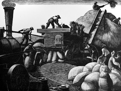
[Pictures: Threshing, wood engraving by Clare Leighton, c 1933 (Image from Warwick Leadlay Gallery);
Yosemite Sam, drawings by Warner Bros. Animation studio;
Razor strops, wood block prints from Montgomery Ward Catalog, 1895 (Image from Kristin Holt).]

November 22, 2016

Art for Friends

        Chances are you’ve never heard of a small, unobtrusive, text-heavy picture book called Goldie the Dollmaker.  Published in 1969, the illustrations are grey-tone, the cover is grey-tone on cream only 7x6 inches.  It’s not a book that grabs the eye.  The story is not exactly thrill-packed, either, and I would never have said I loved it as a child.  But nevertheless, since receiving a copy when I was ten, it’s stuck with me.  I’ve never forgotten it because it’s got some poignant messages about what it means to be an artist.
        The plot summary is that Goldie lives alone making wooden dolls.  One day in town she sees a beautiful Chinese lamp and buys it despite knowing that it will take three months of work to pay for it.  A friend’s horror over the cost and impracticality of it gives her buyer’s remorse, and makes her feel utterly lonely, until she dreams of the artist who made the lamp.
        Now I’ll admit I’m stingy and generally frown on impulse buys and impracticality, but I do love beautiful, handmade things and the joyful connections they can make.  And I do think a lot about creating things, and appreciating the creations of others.
        Author M.B. Goffstein’s first point is how an artist works.  Goldie makes her dolls with real care, choosing wood that seems just right for each part, rather than using precut wood that might be quicker but doesn’t feel as alive.  She explains, “It’s not as interesting to carve.  And then it doesn’t turn out as good.  It never looks alive…  I have to love making them.”  And the final step for each doll: “Goldie smiled and smiled into the doll’s eyes in the friendliest, sweetest way, and she painted a smile right back to herself on the little doll’s face.”  If you don’t care what you’re making, why should anyone else care?  But if you invest it with love, it can carry that love out into the world.
        The real climax of the story is the dreamed conversation between Goldie and the artist who made the lamp.  A warm, polite voice begins, “That lamp you bought.  I made it.”
        “Oh, it’s beautiful!” said Goldie.
        “So we are friends.”
        “But I don’t know you,” she said.  “I wish I did.”
        “You do know me,” laughed the voice.  “You know me better than the people I see every day.”
        “But who are you?”
        “I made that lamp you bought today!”
        “Oh, said Goldie.  “Oh, I see.”  And she sat for a moment, smiling.  “But you don’t know me,” she said suddenly.
        “Yes I do.  I made the lamp for you - whoever you are.”
        I wouldn’t go so far as to say that the people who buy my art or read my stories know me better than my family and friends, or that I know them, but we do know each other in a very particular, special way.  There is something we share because I made something I love, and they love it, too.  I hoped, as I created it, that it would bring someone joy - someone I’ve never met and didn’t know - and when they saw it, some of the love I put into it resonated with them.  So when you look at a piece of art that moves you, or read a story or poem that touches you, take a moment to appreciate that connection: the artist made it for you, hoping that you were out there somewhere, ready to be, in some sense, a friend.

[Picture: Goldie’s house, illustration by M.B. Goffstein from Goldie the Dollmaker, Farrar, Straus, Giroux, 1969.]

November 18, 2016

Kanreki Print Show

        Here’s another printmaking find that was sent to me by a friend.  It’s the catalogue of an exhibit of contemporary Japanese prints that is already over, and which I wouldn’t have been able to get to in any case, but it looks like it must have been spectacular.  It’s another of those bittersweet internet moments: if it weren’t for the internet I wouldn’t have known about this or been able to see any of the pieces at all, but at the same time the pictures are so small that they just leave me frustrated that I can’t see the art in person, or at least bigger and more detailed.  I’m so glad I’ve had this glimpse, but so wish I could have more!
        The exhibit was put together by the College Women’s Association of Japan, and this is the 60th annual printmaking show they’ve assembled.  (You can read more about the history and purpose of the organization and the show on the exhibit web page.)  The show includes a wide variety of printmaking techniques, and a wide variety of images.  I’ve picked out a handful of those that
struck my eye - those that I really wanted to be able to see up close.  There isn’t enough detail for me to speculate very intelligently about technique, or to admire any particular strokes of genius, but there is enough to say, “This looks pretty cool!”
        At any rate, it’s always nice to see such a vibrant collection of contemporary printmaking.  At most of the shows I do I seem to be pretty much the only printmaker.  At Mother Brook Arts & Community Center last weekend there were actually three of us: an etcher, a silkscreener, and myself.  I’m still the only one doing relief block prints, but it’s nevertheless nice to see printmaking of all kinds alive and well in the art world.

[Pictures: Gentle Prayer, woodcut by Ayaka Kobayashi;
Fruit of September, woodcut by Mitsuru Hiraki;
The Night Piece, woodcut by Gen Yamanaka;
Colleague, woodcut by Iwao Akiyama;
Village Breeze, wood engraving by Yoichi Kenmoku;
Toward the Sea, woodcut by Yuko Iwakiri (All images from Highfield Hall and Gardens).]

November 15, 2016

What's New in the Studio - Mini Prints

        Actually, what’s “new in the studio” has mostly been happening outside the studio: I’ve been carving a lot of blocks at my recent spate of shows, but now that I am back in the studio, I’ll be printing them.  Today’s printing is two mini blocks I’ve designed to be able to pair together or stand separately.
        My mini prints are very small images that I frame up in miniature frames and sell for $10.  They’ve all been very popular.  They’re cheap enough for an impulse buy with cash on hand, small enough to carry away in a purse, the right price for little thank you gifts or hostess gifts, and small enough to fit somewhere on your desk or dresser even if you don’t have any wall space.  At that price I’m obviously not going to get rich from them any time soon, but they’re fun.  They’re my opportunity to explore ideas that don’t warrant a whole big block.  It’s a challenge to think of things that are simple enough to fit in about two inches square, but are still detailed enough to be interesting, and are iconic enough that they’re meaningful and pleasing to people all on their own.
        So, over the past few years I’ve generally tried to have two mini prints available at all my shows.  As one sells out, I think of the next one.  This time I’ve made two at once, so I’ll end up with three until something sells out.  It will be fun to see which sells out first, kittens or puppies, or whether people like to keep them as a pair.
        From a technical perspective, in some ways the little blocks are just as much work as big ones.  The carving is much quicker and easier certainly, but the printing turned out to be surprisingly frustrating.  For one thing, the ink didn’t want to be the right consistency, but I’ve also concluded that with the tiny blocks it works much better to use a thin paper.  The smaller the block, the less surface area of ink there is for the paper to stick to, and this morning the thicker paper I tried kept shifting and leading to smudged prints.  The thinner paper, on the other hand, stayed put and gave a clean print.  I inked and pressed the puppy 45 times, with two complete cleanings of the block in the middle, in order to get a decent edition of twelve.  Oof.  At that rate $10 isn’t enough!  On the other hand, the kitten block, with different ink, took me fewer than 20 tries.  Finally, matting and framing takes about the same amount of time and effort regardless of size, but of course it uses much less material and can be done with the scraps of mat board that are too small for anything else, which is satisfying.  I imagine I have a little while before I sell out of these, but I’ll still be mulling possibilities for the next mini print.

[Pictures: Forever Puppy, rubber block print by AEGN, 2016 (sold out);
Forever Kitten, rubber block print by AEGN, 2016 (sold out);
A Wish for Peace, rubber block print by AEGN, 2010 (sold out);
Carolina Wren, rubber block print by AEGN, 2014 (sold out);
Hedgehog, rubber block print by AEGN, 2016 (sold out);
Seahorse, rubber block print by AEGN, 2010 (sold out).]

November 11, 2016

Hatred Can Never Make America Great

        This is a blog about block printing and juvenile fantasy.  I have never been explicitly political here and I don’t want to be political, although of course my general views on things have been quite clear all along, but today I cannot be silent.  As a straight, Christian person of European ancestry I feel a deep responsibility to confront and reject the hatred that people have been unleashing for months, and especially so now that Donald Trump has become
president-elect by fomenting and encouraging extreme hatred and violence.  It isn’t enough to stand aside from the thuggish acts of others - it’s essential to be an active ally to those immigrants, people of color, Muslims, LGBTQ people, women, and all others whose rights, safety, and even lives are now in increasing danger.  More than half of voters in the United States voted against Trump, and however horrifying it is to me that the margin was that slim, it’s still true that if we all refuse to accept racism, homophobia, misogyny, climate destruction, and the rest of the toxic brew of hatred, we actually can do something about it.  We actually can make America great.  Like so many of us, I feel pretty discouraged and helpless in the face of the tsunami of hatred that Trump is surfing, but I do know one thing absolutely and without doubt: it is not okay.  It is not a mark of superiority, it is not the American ideal, it is not in any way Christian, and to let it go unchecked leads not to greatness, but to vandalism, lynch mobs, concentration camps, police state, world war, and ultimate annihilation.  We’ve seen it before.  I do not want to see it again.  Please stand up and make it absolutely clear: the majority of American people cannot, must not, and will not tolerate a culture of hatred.
        And with the crashing bathos that marks troubled times during which life goes on, I have another open studio show this weekend.  This will be my first time at Mother Brook Arts & Community Center, and while I can’t help suspecting that people may not be in much of an art-buying mood, I still invite you to come by and see the work of over 50 artists in a single former school building.  After all, now more than ever it is vital that we come together and hold fast to what is true and beautiful.

[Pictures: “Walk Together Children” (in two parts), wood block prints by Ashley Bryan from Walk Together Children: Black American Spirituals, Atheneum, 1974.]

November 8, 2016

Election Day

        If you’re a USA citizen, please vote today.  It matters.  I won’t write more because if you still don’t understand how important it is, there’s not going to be anything I can say to convince you.  But please vote, and please vote against hatred.
        If the state of politics in this country is as distressing to you as it is to me, you’ll be in desperate need of something heartwarming right about now.  As much as I like block printing, I know that sometimes you need the stronger stuff: video clips of roly-poly puppies or of kittens falling asleep, photos of baby pandas or
bunnies… Better yet, puppies and kittens and ducklings all together, with fluffy peace and love abounding.  Please go do an internet search, and don’t stop until you feel a little better.  In the meantime, however, I have a few sweet block prints to help you remember that all is not wholly dark and rancorous.
        Option one, a curious, playful kitten, always a good choice.  I like the wood grain on this one, and the soft look of the kitten with multiple greys and relatively indistinct edges.
        Option two, something a little more holistic, a world of sunshine and flowers and butterflies and bunnies.  I like the almost patchwork feel of this one, with each hill or segment having its own theme which fits into a whole.
        Option three, a relatively recent mini print of my own, because hedgehogs are so very, very cute.  One afternoon back in the spring I spent half an hour with a hedgehog at our school district’s science center.  The little guy needed to be held and handled because he hadn’t had enough socialization at his previous home, and although he didn’t like me a bit (he didn’t like anybody - hence the need for socialization) I certainly liked him!  If only it were always so easy to be patient and gentle with the angry, frightened, prickly critters we meet.

[Pictures: The Vote, wood block print by Helen West Heller, 1947 (Image from Mainly Meiji);
Kitten and Knitting Wool, wood block print by Masaharu Aoyama, c 1950-60s (Image from Ohmi Gallery);
Happy Hills, woodcut by Vicky Katzman (Image from Etsy shop vickykatzman);
Hedgehog, rubber block print by AEGN, 2016 (sold out).]

November 4, 2016

Here's Something Cool: Cypher Book

        From time to time I come across nifty things that catch my fancy, and I file them away for possible future sharing.  But many of them never seem to fit into a particular theme, or I don’t really have enough information for a substantive post, and I never end up sharing them after all.  Well, all that is about to end.  I hereby initiate a new category of blog posts: Here’s Something Cool!
        First up is a sixteenth century cypher machine in the shape of a book.  This is emblazoned with the arms of Henri II of France, so presumably was made for him or his agents, but more than that I cannot tell you.  The object is in the collection of the Musée Renaissance in the Chateau de’Écouen, but a search of the museum’s website reveals no additional pictures or information, so I am left with nothing but questions.  How was this cypher machine used?  Half the dials have Roman numerals, while the other half appear to be blank, except for a single C or crescent on each one.  The large dial on the left is marked with numerals, and spins within a ring of letters.  The whole thing is in the shape of a book.  Is it disguised as a book, or merely whimsically decorated in that shape?  Was it used for serious espionage, or novelty entertainment?  Who invented it and who made it?  Henri II was the inventor of the patent, or at least the first government to introduce the idea of patents for inventions.  Does this mean he was particularly interested in inventions, or particularly supportive of inventors?  If there’s a patent for this cypher machine, no one’s mentioned it.
        Henri’s mistress, favorite, and veritable co-ruler was Diane de Poitiers, whose emblem was the crescent moon.  It can hardly be coincidence that this device is decorated so lavishly with crescents, as spokes on the dials, etched between all the dials, and so on.  Does that indicate that Henri and Diane used this encoder for their private communication, or that it was made for Diane’s use in her own political and diplomatic endeavors, or simply that the craftsman figured Henri would be pleased to see Diane’s emblem along with his own?
        In another fun note, Henri II was the son of Francis I for whom, according to my fantasy, The Extraordinary Books of Doors were made.  Since Francis died before their completion, it was to Henri II that Sebastiano Serlio would have presented his magical masterpiece.  So, did Henri take after his father in having a particular predilection for magical devices disguised as ordinary books?  It certainly is fun to speculate.
        As for this Cool Thing, its design is beautiful, its workmanship is impressive, and its history is just a a big, fascinating question mark.

[Picture: French cypher machine in the shape of a book, between 1547-1559 (Image from Wikimedia Commons).]

November 1, 2016

Wood Engravings by E. White

        A visitor at one of my recent events put me onto British wood engraver Ethelbert White (1891-1972).  Produced in the 1920’s and 30’s, his work has a definite vibe of the era: that push and pull between modernism and nostalgia.  A lot of his work features pastoral and agricultural scenes, but I’ve most enjoyed some more urban, architectural images, so that’s what I’m sharing with you today.
        White was among the movement advocating relief block printmaking as an artist’s medium, using the materials as a mode of artistic expression in their own right, rather than simply reproducing another artist’s design.  This tends to result in more black, more sketchiness of line, more details suggested with just a hint of line or shadow, more interesting variations of tool use producing more variety of textures…  Wood engraving is particularly conducive to drawing with white on black instead of black on white like most other art media: pencil, ink, paint, etc.
        Wood engravings are necessarily fairly small, but White’s are quite large for the medium, often in the neighborhood of 5-8 inches on a side.
        White’s scenes always have people, and I like his people best when they’re either so insignificant as to be ignorable, or an important enough part of the scene and composition to have a little personality.  I like the portly gentleman in the Royal Exchange and the bent back of the sailor at Recco.
        A few other details that particularly please me: the framing tree over the scene of the Pont Neuf, and the beautiful details of the bridge itself; the horses and carts at the Royal Exchange, suggested with such efficiency; the vehicle at St George’s, Hanover Square, placing the scene in a particular time; the slightly rougher carving of the sky over Recco, contrasting with the very fine, thin lines of engraving on the buildings.  Altogether I very much like White’s balance of black, white, and texture.  Some wood engraving has a tendency to get a little samey, all fine grey texture, and I love a little more punch and contrast.  I’m so pleased to have been introduced to Ethelbert White and his relief block prints!


[Pictures: Le Pont Neuf, wood engraving by Ethelbert White, c. 1924 (Image from Abbot and Holder)
The Four Courts, Dublin, woodcut by White, c. 1928 (Image from Abbot and Holder)
Recco, wood engraving by White, c. 1930 (Image from Ernest Brown & Phillips)
St. George’s, Hanover Square, wood engraving by White, 1924 (Image from Ernest Brown & Phillips)
The Royal Exchange, wood engraving by White, 1923 (Image from Conrad Graeber).]

October 28, 2016

Words of the Month - Ghosts

        English is known for its richness of synonyms, and words for supernatural spirits are no exception.  You’d think communication would be served by one or two words for ghosts, but no, English feels the need for dozens.  In honor of Hallowe’en, therefore, here are a few of them, with some of the etymological stories behind them.

ghost - From Old English, before we gained all those other synonyms, this could mean all kinds of spirits, angels, demons, soul, breath…  It was the word available in Old English to translate the Latin Bible’s Holy Spirit, which is why we hear of the Holy Ghost, thus confusing generations of Christian children.  It remains, however, our most basic word for the spirits of the dead that may remain to haunt the world of the living.

specter (or British spectre) - This one is from French (c. 1600) from Latin spectrum meaning “appearance.”  That idea of “appearance” seems to be a common way to name the spirits of the dead.  Compare…

phantom - Ultimately from the Greek root phantazein “to make visible,” it reached English around 1300 by way of French, by way of Latin.  However, it meant “illusion” first and didn’t come to be applied to ghosts until the end of the century.

apparition - Ultimately from Latin apparitionem “appearance,” in English this was first used for Epiphany: the appearance of the Christ Child to the Wise Men.  A century later, about 1600, it had begun to mean “ghost” from that same sense of a startling supernatural appearance.

eidolon - Another “appearance,” borrowed from Greek in 1801, in English this meant “ghost” first, and later came to gain the meaning “an ideal image,” which is quite an upgrade.

revenant - Borrowed from French in 1814, this is literally “one who returns,” another nice metaphor for the unquiet spirit.  As such, it’s getting at the same idea as…

haunt - As a synonym of ghost, this dates to mid nineteenth century African-American vernacular, but the original meaning of the verb was “to frequent, to visit,” so a haunt is a spirit that hangs around in a particular place.

shade - It’s easy to see how a dark or shadowy thing could come to be a metaphor for a ghost.  English made this leap in the 1610s.

spirit - Not all spirits are of dead people.  As the “soul” or “essential principle,” a spirit refers to a ghost only when it refers to the essence of a person that should have moved on at death.  Its ultimate root is Latin for “breath,” but had become an English “ghost” by the late fourteenth century.

wraith - Borrowed from Scottish in the 1510s.

spook - Borrowed from Dutch in 1801.

poltergeist - Borrowed from German in 1838, featured previously here.

dybbuk - Borrowed from Hebrew in 1903, featured previously here.

Manes - deified or venerated spirits of the dead, Roman.

Lemures - evil spirits of unburied dead, Roman, featured previously here.

White Lady - Probably the most famous particular kind of ghost, dressed all in white and often the spirit of a woman who was betrayed by a lover.  Legends of White Ladies date back at least to the medieval era, but many of the more recent White Ladies seem to have been killed in car crashes.

        Why so many?  Apparently spirits of the dead are a major preoccupation about which people have spent a lot of time talking over the centuries.  So you see that no matter what sort of hauntings you may encounter this Hallowe’en, the English language leaves you amply equipped to discuss them.

[Pictures: Athenodorus Confronts the Spectre, illustration by Henry Justice Ford, c. 1900;
The Ghost of the Murdered Wife Oiwa, polychrome woodblock print by Utagawa Toyokuni, 1812 (Image from The Met);
Dante and Virgil before Farinata, wood engraving by Gustave Doré from Dante Alighieri’s Inferno, 1861 (Image from Open Culture).]

October 25, 2016

Immigrants

        This morning I gave a talk about the effect of immigration over the centuries on the English language.  Not surprisingly, since this is really interesting stuff, the audience had all kinds of questions and thoughts on the matter, the room was overflowing, and the question period ran to the end of our allotted time.  Much fun was had by all!  So for today’s blog post I thought I’d do a quick search and see what relief block prints depicting immigrants I could turn up.  I was pleased to find some very cool ones to share.
        First, this view of the Jewish immigrant neighborhood of New York City’s Lower East Side.  The artist, Albert Potter, was an immigrant from Russia, although he grew up in Providence, Rhode Island.  I love the framing of the overpass bridge.  I’d also like to point out that the prices on the pushcarts are backwards - yes, it can happen to anyone making a relief block print!
        The next artist is also an immigrant, a Bahamian who lives part time in the United States.  His piece is darker and more dense, showing immigrants on the move, picking up what they can carry and going.  These people are strong and determined, and those of us who have never been immigrants should imagine ourselves in that situation and appreciate what it takes to pick up and move your whole life.  The people are depicted entirely in thin outlines and sketchy white highlights so that the crowded carving reflects the crowd of people.
        Finally, an image of Mexican immigrants in Milwaukee made by Raoul Deal.  (I don't know whether he's an immigrant, as well.  I couldn't find a full biography.)  Apparently this woodcut is quite large, so I’m sorry I can’t get the full impact of it by seeing it small on my computer screen.  The people in this image are sandwiched between the Mexican and USA flags, representing that feeling of being between.  I can imagine from their postures the love and aspiration they feel toward their new country, and the enveloping beloved identity of their old home.
        The issue of immigration has, of course, been a hot topic recently, with much hysterical rhetoric.  It’s complicated and messy, I know, with lots of concerns that must be addressed and needs that must be balanced.  But I confess that I cannot help but see immigrants as simply people: human beings who just want what all humans want - to have food and shelter, to feel safe, to have meaningful work, and to care for those they love.  These things shouldn’t be too much to ask, and I like how these three wood block prints focus on the humanity of their subjects, something we must never lose sight of no matter how difficult the situation.

[Pictures: Eastside New York, woodcut by Albert Potter, c 1931-5 (Image from Library of Congress);
The Immigrants No. 2, woodcut by Maxwell Taylor, 1996 (Image from invaluable.com);
From the series Ní De Aqui Ni De Allá (From Neither Here Nor There), woodcut by Raoul Deal, c 2013 (Image from Milwaukee Journal Sentinel).]