September 30, 2022

Words of the Month - Divine Etymology

        The word divine, an adjective for God or gods, comes from Latin (by way of Old French), and ultimately from a Proto-Indo-European root meaning “to shine,” relating to the sky, heaven, and gods.  Divine is far from the only English word with a god in its etymology, however.  It’s clear to see how the diva on the stage is a goddess, deriving from the feminine of the same root.  But other words are a little more unexpected.  (Including one more from the divine root, here.)
        Hygiene comes to English in the 1670s from French, which got it from Greek.  It comes from the goddess Hygieia, a daughter of Asclepius, the god of medicine.  She was the goddess of health, cleanliness, and sanitation.  One of her sisters was Panacea, goddess of universal remedy, whose name has also become an English word.
        Going to the opposite end of the spectrum, let’s consider termagant, a word that doesn’t see a lot of use these days, but which means “a violent, overbearing person (most often of women)”.  This word comes from the name of a god, but not one that anyone ever believed in.  Teruagant (or other spellings) was a fictional Muslim god in medieval European literature, which didn’t have a clue about actual Islamic beliefs.  The word shifted to become applied mostly to women apparently because the character of Termagant was depicted on stage wearing long robes like a gown, and since all actors were men anyway, the audience may have interpreted the character as being a female.
        Another strong and offensive character is ammonia, a colorless gas with an overpowering smell.  The word was coined in 1782 based on the older sal ammoniac, or “salt of Ammon.”  Ammon was the Greek and Roman name for the Egyptian sun god Amun, in whose oracle temple visitors could collect the ammonium chloride crystals.
        Erotic comes directly from Eros, the Greek god of sexual love.
        Iridescent, as well as iris (both the flower and the eye color), come from Iris, the messenger goddess of the Olympian gods.
        The pharmacist who first isolated the opiate morphine named it after Morpheus, a Greek god of dreams.
        Your nemesis against whom you inescapably struggle is named for Nemesis, the Greek goddess in charge of bringing retribution upon those who disrespect the gods.
        A panic may be caused by Pan, the Greek god of the wild.
        Your breakfast cereal derives from Ceres, the Roman goddess of agriculture.
        As you can see, the Greek and Roman gods have given us no shortage of words!
        Many people already know that the days of the week are named for gods: Tuesday for Tiw, an ancient Germanic supreme deity; Wednesday for Woden (aka Odin), the Germanic supreme god; Thursday for Thor, Germanic god of thunder (we could count the word thunder itself as deriving from the god, while we’re at it); Friday for Frigg (aka Frija), Germanic goddess of marriage, motherhood, and prophecy; and Saturday for Saturn, Roman god of time and father of Jupiter.
        And now it’s time to bid you adieu, the French salutation which literally means “to God,” short for “I commend you to God.”  The Spanish version adios has also entered English.  But did you know that our homegrown English goodbye is a contraction of “God be with you”?


[Pictures: Hygieia, engraving by Raffaello Morghen, before 1833, representing an ivory bas-relief, c 400-430 CE (Image from Wellcome Collection);

The oracle of Jupiter Ammon, engraving by Abraham Ortelius, 1624 (Image from Bibliotheque nationale de France);

Frigga spinning the Clouds, illustration by J.C. Dollman from Myths of the Norsemen from the Eddas and Sagas by H.A. Guerber, c 1909 (Image from Internet Archive).]

September 26, 2022

Textures by Deines

         E. Hubert Deines (USA, 1894-1967) worked primarily in the medium of wood engraving, which almost by necessity gives his work a look of very fine details and an emphasis on textures over solid blacks and white.  Remember that wood engraving is done with tools that scratch out lines as opposed to tools that gouge out areas.  Even within the realm of wood engraving, however, I think Deines does some really interesting things with texture.
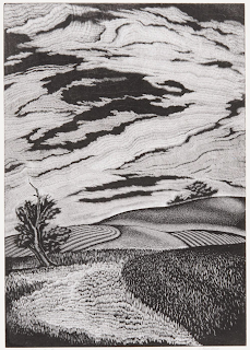
        In the first piece (remember to click on images to see them bigger) there is a wide variety of shading created with a wide variety of texture marks.  There are stipples, and lines of various short lengths.  Most of these lines are straight, but the larger grass pattern in the near right includes some more squiggly lines.  There is also much use of the multi-line tool, which allows you to carve some number of tightly spaced 
parallel lines (often around 5) at each stroke.  The trees on the hill in the background have a downright fuzzy look because there is no outline, but only the multi-line tool carving out tiny white lines all around the black that is the trees.
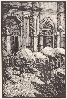
        The second piece has the necessity of portraying a much wider variety of real-world objects.  Instead of just grass and sky, there’s stone architecture, canvas awnings, cobbled street, clay pots, and people.  Deines does all this once again using just different textures, with very few outlines.  He uses an even larger variety of different kinds of carved marks, from the sparse dots in the lower right shadow to the crosshatching of the upper right building, to the curved white lines of the wrought iron.  The suggestion of Corinthian column capitals is especially interesting, because they really aren’t very accurately detailed - and yet our eyes read the picture perfectly.
        Looking through the remaining pieces I have today, you can see his mastery of which textures to use where.  The textures have to do triple duty.  First, they suggest real-world textures, such as grass, clapboard, and cloud.  Second, they suggest value, the art term for how dark or light an area is.  Bright sun to deep shadow, and white canvas to dark earth, the sort of texture carved will determine how light or dark an area reads.  Third, the textures have to contrast with each other sufficiently to differentiate areas and objects.  
Dienes carves remarkably few outlines (an ability that always amazes me, since I tend to make a lot of use of outlines!)  And without outlines to tell you “This is where the tree ends and the grass begins,” or “This bit is a clay pot but that bit is shadow on the plaza,” it’s the textures that need to do that work instead.  How bold or prominent to make the various sorts of textures is a blending or a compromise of all those considerations.  I really love how Deines does it.
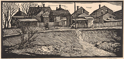
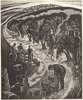
        By the way, now that we are well into autumn, I made sure to include two autumn-themed pieces, the first and the last.  But perhaps my two favorites are today’s pieces three and four, which contrast beautifully with each other.  A dreamy glow or a sharp punch 
of angles; distinct, strong black and white lines, or tiny white scratches so fine and delicate as to blur into the illusion of a range of greys.  (The bolder one, by the way, has those stronger lines because it’s a linoleum block print, not a wood engraving like the others.)  Which of these pieces is your favorite?


[Pictures: Autumn Tone Poem, wood engraving by E. Huber Deines, 1940;

Cathedral Plaza - Guadalupe, Mexico, wood engraving by Deines, 1933;

The Deserted Neighborhood, linocut by Deines, 1934;

Ode to Morning, wood engraving by Deines, 1945; 

Pippins Coming Down, wood engraving by Deines, 1939 (All images from Marianna Kistler Beach Museum of Art).]

September 21, 2022

International Peace Day

         Today is the International Day of Peace, and although (as with most such declared days), we’d be much better off with more than one a year, I do want to address how we think about peace.  In art it’s relatively straightforward: there are many works of art, small and large, famous and personal, that celebrate, explore, promote, or cry out for peace.  There are pieces that reproach us about the costs of war (Picasso’s “Guernica,” Nevinson’s “Paths of Glory,” Kollwitz’s “The Parents”) and pieces that call us into the benefits of love (Rockwell’s “Golden Rule,” Hicks’s “Peacable Kingdom” )  There are pieces that explore how we can reach across divides, and how we can better understand each other’s needs, hopes, and dreams.  There are pieces that simply invite us to sink down into beauty.  As for myself, many of my block prints include at least some element of the work of promoting peace: All In this Together, Out of Darkness, Keep Dancing, Tree of Life, Blessing, Behold, it is Good, The Enormous Turnip, Dancing with Animals, The Family Who Lived in a Shoe, Holy Mountain, Hope…  I enjoy portraying people of all sorts and creatures of all varieties living, working, and playing together in cooperation and love.  A picture can open new worlds in the mind, and can stick in the heart in a way that makes art an important tool for peace.
        What about stories about peace?  Well, in some ways that’s a lot harder because after all, plot equals conflict.  No conflict, no plot; no plot, no story.  So a description of a peaceful Utopia is unlikely to be much of a story, and since stories are so much more powerful to humans than philosophical musings (It’s All About Stories), no matter how much we may intellectually support peace, what we really get excited about are those gripping stories where our heroes keep slashing or shooting or punching until they kill all the bad guys.  And when those are the stories we cherish, it can be very hard to imagine peace.  So, what’s a story writer to do?
        Well, first of all, this is one of those places where speculative fiction could have a special edge in saving the world (How Juvenile Fantasy Will Save the Earth).  Certainly retelling true stories of peace is incredibly important, and it’s vital to be reminded that true stories of peace are indeed more common and more achievable than the news would have us believe.  In addition to these stories, speculative fiction can also help us imagine new and even more powerful visions of peace.  But how, without plots full of conflict?
        1. First of all, peace is not necessarily about the absence of conflict, but rather about how conflicts are dealt with.  Where there are people (and all sorts of organisms) encountering each other, there are inevitably going to be conflicts.  But do we tell stories in which the only way to “solve” conflicts is to slash, shoot, and punch until all the bad guys are dead?  Or can we tell each other different stories, in which creativity, respect, understanding, and love are brought to bear?  Stories in which, instead of winners and losers, there are comings-together?  Many of my books explore these themes, especially the Otherworld series, The Bad Advice of Grandma Hasenfuss, and the Kate and Sam Adventures.
        2. Might it be possible to imagine how our stories could change if we were able to avoid some of the needless conflicts we bring on each other?  What stories could still be told?  Struggles to solve other problems, such as diseases or natural disasters?  Quests to learn more about the depths of space, oceans, or history?  What else can you think of?  Now let go of your preconceptions, open your mind, ask “What if…?” and tell me now: What else can you think of?


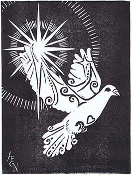
[Pictures: Hope, rubber block print by AEGN, 2015;

Blessing, rubber block print by AEGN, 2021;

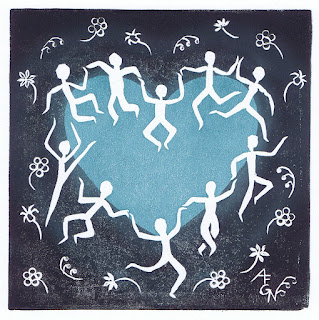
Keep Dancing, rubber block print by AEGN, 2022.]

September 16, 2022

Colville's Mix-and-Match

         Somewhat to my surprise I realize that I had never done a post on the block prints of Amanda Colville (U.K.).  This is a surprise because Colville’s work is one of the models I show students in my classes to demonstrate the Mix and Match project.  You can read back about the project, and see some student work here (or some of my own mix-and-match prints here), but today I want to (finally) share some of Colville’s work that helps inspire the project.
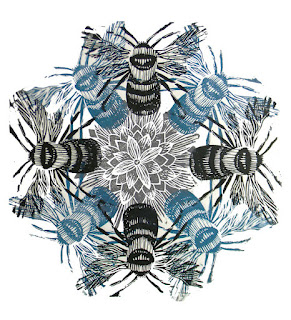
        The first example is quite simple, made with two blocks, a flower and a bee.  The complexity comes in how those two blocks are combined and multipled.  Three colors of ink (grey, blue, and black), and nine impressions build up the larger piece.
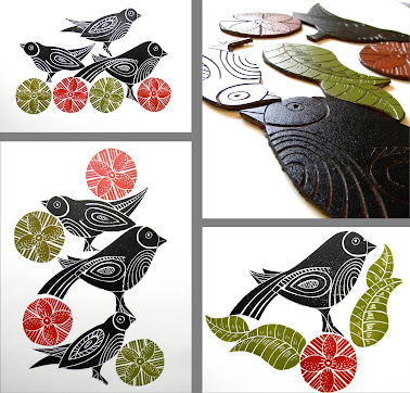
        You can see some more about the process by looking at the individual linoleum blocks and a variety of ways they've been combined.  One set of leaves, two quite similar flowers, and three birds are printed in all sorts of different combinations.  (You can see in these pieces that Colville’s work often has a very folk art look.)  In these examples there is no overlapping, as opposed to the bees, which are squished together on top of each other.  As I mentioned in my post on the project, it seems to be much easier for kids to think about setting all their blocks next to each other without overlapping, and it’s true that the bee example looks much more sophisticated and complex than the simple bird examples.
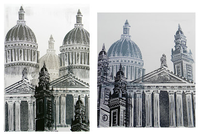
        Finally I include the example that I find most interesting of all, in which Colville has deconstructed and then reconstructed an architectural scene.  Instead of making a single block print of St Paul’s Cathedral in London, Colville has chosen three of its distinctive architectural features to carve as separate blocks.  A tower and the pediment from the West Front, as well as the iconic dome are then recombined “to form an overall impression.”  Again, Colville has experimented with different arrangements of these elements, and in addition to overlapping and repeating elements as we’ve seen in the examples above, this time Colville has added yet another variable: partial printing.  Any given block can be printed in its entirety as part of the piece, or just inked and printed in sections.  I love Colville’s creativity in playing with her elements.
        Amanda Colville does make lots of single complete block prints (I featured one here), and I do like many of them very much.  It’s this mix-and-match approach, however, that really caught my attention and makes me keep returning to her work as an example for my students.
        (By the way, if you’re interested in joining me in person for a relief block printmaking class this fall, check out the Needham Community Education flier for details.)


[Pictures: Bees, lino print by Amanda Colville, 2012;

St Paul’s, lino prints by Colville, 2012;

New Prints, lino prints by Colville, 2011 (All images from the artist’s blog Mangle Prints).]

September 12, 2022

Fantascycles?

         The first two-wheeled, human-powered steerable machine was invented in 1817.  It was powered by a rider pushing it along with his (yes, usually his) feet, but inventors were soon going nuts with two, three, and four wheels, and peddles, treadles, and hand cranks in various permutations.  By the 1860s the famous (or infamous) boneshakers appeared, followed by high-wheeled penny-farthing bicycles in the 1870s, and finally “safety” bicycles that were more-or-less our modern bicycle design appeared in the 1880s.  And throughout all this time and beyond, inventors were full of brilliant ideas of how to adapt and improve the bicycle concept and cash in on its promise and popularity.  Many of these inventions can only be considered “steam”punk science fiction, even if their hopeful inventors thought they had a future in reality.
        The epicycle (1896) and the motor-monocycle (1905) both explored the benefits of suspending the rider within one huge wheel.  This would allow great speed, plus the monocycle was alleged to “fall” forward rather than pushing against the ground, thus allowing it to travel over any terrain including loose sand.  ‘“It bounds over rocks and other obstacles,” declares its inventor, “with as much ease as a horse trained to jump.”’
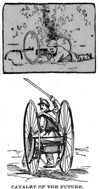
        Of course military use always drives invention, and the cavalry of the future was expected to use bicycles.  I do like the idea that the Harveyized steel wheels of the armored war cycle (1900) can be used as shields when the soldier dismounts and “transforms himself in a moment [from] motorman to sharpshooter.”  As for the Humbrecht’s dicycle (1896), its two wheels are mounted side-by-side instead of in a line, and its military use consists in its ability to carry a fair amount of baggage, as well as its inability to be killed by a bullet like a horse.  But its utility is not confined to the military, “as it is especially adapted to those who do not care to go to the trouble of learning to ride a bicycle, and… As there is no straddling necessary, the modesty due to the ladies is always present… and no unbecoming bloomers or short skirts are necessary.”
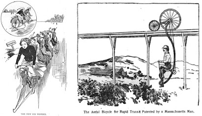
        But why confine the use of bicycles to the ground?  I offer you the ice cycle (1899), which has both spiked tires and runners, and seats no fewer than eight eager cyclists.  Inventor “Mr. Lenz proposes at the trial exhibition to have all eight seats of the machine occupied by a bevy of girl riders.  He rightly judges that they will enhance the attractions of the occasion.”   Or how about the aerial bicycle (1896), which travels on a rail.  According to the press release, “the problem of rapid transit has been solved.”
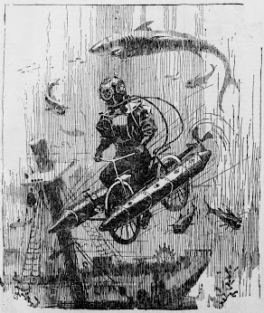
        And most useful of all, the submarine bicycle (1896), with which “new contrivance [the diver] can pedal about at any desired distance above the bottom…  How pleasant it would be to construct a sextuplet submarine bicycle… [with] a brilliant electric light, that would enable three couples to go bike-riding under water, instead of taking moonlight rides on the surface…  It would only be a question of a short time until charts of the underwater route to adjacent summer resorts would be on sale.”  Who says a fish doesn’t need a bicycle!  The article which introduces this wonder to an eager public also mentions in passing, “We have had plans for wheelmen to ride to and from the clouds and to ride underground in cycle tunnels.  There have been bicycle railways and bicycle boats…”  I’m just sorry I don’t have more information about all of those, as well!


[Pictures: Epicycle, illustration from The Marble Hill Press, July 23, 1896;

Motor-Monocycle, illustration from The Cook County Herald, July 15, 1905;

Armored War Cycle, illustration from The Deseret Evening News, September 22, 1900;

Humbrecht’s Dicycle (Cavalry of the Future), illustration from The Barton County Democrat, May 13, 1897;

Ice Cycle (The New Ice Wonder), illustration from The Dupuyer Acantha, April 27, 1899;

Aerial Bicycle, illustration from The San Francisco Call, August 19, 1896;

The Submarine Bicycle, illustration from The San Francisco Call, November 22, 1896 (All images from Lumberwoods, with thanks for compiling these!)]

September 7, 2022

Dragons by Doyle

         Today I have for you a selection of dragons from the mind of Richard Doyle (UK, 1824-1883).  Doyle became an acclaimed illustrator of fairy tales, working on several of the most  popular fairy tale books of the Victorian era.  Despite this success, he was held back in his career by unreliability, both in meeting deadlines and in the quality of his work.  I myself looking at a wide array of his work can see that much of it is just simply not very good.  But what he does consistently have is a wonderful sense of fantasy, portraying all manner of sprites, pixies, fairies, and goblins, as well as monsters and dragons including those I have for you today.
        A word on Victorian-era illustration: most were printed from engravings, which were carved based on pencil drawings by the named artist.  In the case of these pieces, they are wood engravings, which usually means relief printing, but based on the line work I’m guessing these were printed intaglio instead.  For a full explanation of the process of how one of Winslow Homer’s illustrations was turned into a printing block 
in this era, you can read this prior post.  In any case, sometimes the engraver signed his or her name, and sometimes not.  We know, for example, that the first piece above was cut by Isabel Thompson and the last by “Swain S.C.”
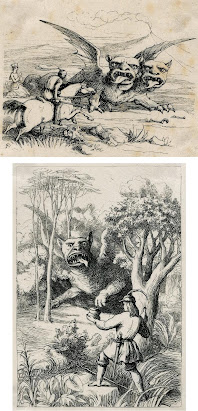
        But we’re really here for the dragons.  The first one was labelled a “griffin” by some curator at the British Museum, although its scales and reptilian tail certainly make it a strange one.  But I read the fairy tale which it illustrates, and I assure you that it is, in fact, a young dragon.  I love that it’s wearing a belt with a few utility items, and holding its hat in its claw as it approaches the young man most deferentially.  I love its puppy-dog expression, as if it’s apologizing for devouring the cattle again.
        Next we have two dragons who have a distinct familial resemblance, despite the fact that one is Polish and the other Italian.  One has one head and the other has two - is there a three-headed sibling living somewhere else in Europe, as well?  The one on top depicts the classic scenario of the knight galloping in to rescue the princess, but the one on the bottom shows another method of conquering a dragon: offering it food and wine to put it to sleep.  In any case, both these dragons are less reptilian than you might expect, with un-forked tongues, and stubby, ogre-like faces.
        Finally we have a whole flock of little wyverns, being herded beside a lake - or possibly up out of the water - by a witch.  I can’t check on what story this might be illustrating because I don’t know what book it’s from, but I can imagine all sorts of fun scenarios involving these little dragons.
        I have actually featured one of Doyle’s watercolors once before, illustrating Fairyland, and here’s another to round out today’s dragons.  This shows yet another would-be dragon-slayer, but I like the change of perspective where we see him in the distance more from the dragon’s point of view.  This is a much more classic dragon, as well, and a particularly fine one - but it does have the special trait of a marvelously long tail.

[Pictures: The young dragon offers to serve Pista, wood engraving by Richard Doyle (cut by I. Thompson) from Fairy Tales from All Nations, 1849;

Bogoris attacks the Sylant, wood engraving by Doyle from Fairy Tales from All Nations, 1849;
Pista encounters the first dragon, wood engraving by Doyle from Fairy Tales from All Nations, 1849;
A witch sending a group of small dragons, wood engraving by Doyle;
The Dragon of Wantley, watercolor by Doyle (All images from The British Museum).]

September 2, 2022

Family Tree

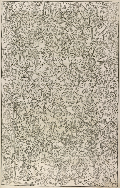
         This wood block print comes from an incunabula (early printed book) by Rodrigo Sánchez de Arévalo, aka Rodericus Zamorensis (Spain, 1404-1470).  Zamorensis wrote Speculum vitae humanae (Mirror of human life), published it in 1468 (possibly the first printed book by an author who was still alive at the time), and saw it become quite popular.  It was quickly translated into several other languages.  As for what the book was actually about, it discussed the pros and cons of various trades and walks of life, thus making it a valuable resource for the study of medieval society.  For my purposes, however, the earliest editions are less interesting, because not until slightly later editions were illustrations included.
        This full-page woodcut comes from a German edition from Augsburg c. 1475, and represents some sort of family tree.  I’m not sure how it fits into the whole book, since this seems to be the only edition I see that includes it.  I find it a marvelous wood block print.  The level of detail is fantastic, with all the little people adorned with their identifying headgear and accoutrements, and the elaborately botanical vine that connects them all.  It’s the only full-page illustration in the book, so it clearly warranted a special effort.  The illustration is followed by five pages of a key to identify all the people.  The first person, labelled A, is at the lower right corner, and he’s identified as Albrecht earl in Elbes, lord of Sassenburg.  It’s a distinguished family, including plenty of dukes and duchesses and even kings and queens, plus at least one abbess and what looks like a pope or other high-level churchman.  Many of the men hold swords, but some have staves or scepters, and I like the wide variety of headgear.
        One thing I particularly appreciate is how many women are included in this family tree.  I mean, logically any family tree should be about half and half, but all too often the women are invisible.  Here we not only have what are presumably grandmothers and great-grandmothers, but also an array of daughters illustrated, as well as the names, dates, and estates of a number of wives included in the key for their husbands.
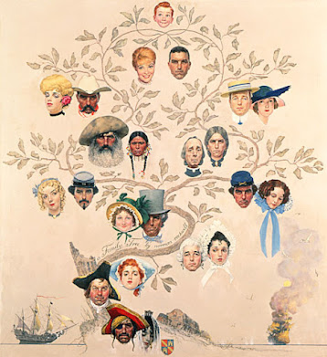
        Ultimately my medieval German is far too weak for me to spend the time trying to decipher this whole thing to find out exactly who all these people are and how they relate each other, and to Zamorensis or his patrons.  But while I enjoy history, that’s not really the point here.  I like the picture for the infinite possibilities it suggests.  It reminds me of Norman Rockwell’s famous “Family Tree” painting, in which he imagined all the varied ancestors whose lives came before an “ordinary American” boy.  We’re all the product of hundreds and thousands of ancestors, whether we know who they are or not, and I love to think about all the people who came before - and how they had no idea of all the people who would come after, including me!


[Pictures: wood block print from Spiegel des menschlichen Lebens by Rodericus Zamorensis, c. 1475 (Image from Library of Congress);

Family Tree, painting by Norman Rockwell, 1959 (Image from Norman Rockwell Museum).]