Welcome to the April A to Z Blog Challenge! My theme this year is Relief Printed Alphabet Squared, an alphabet of alphabets illustrated with relief block prints. Find the master list of participating blogs here and see what tickles your fancy.
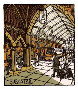
Now, without further ado, let's get to today's block-printed alphabets, which all have to do with England. First up is London A-Z by Tobias Till. Each of these large multi-color linoleum block prints represents a London place or landmark, and E is for Eurostar. I had a bit of a tough time choosing just one favorite to add, so I finally settled on two:
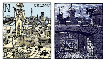
N for Nelson atop his column and T for Traitor’s Gate in the Tower of London. Although some of Till’s prints in the series are quite colourful, I like the way both of these are somewhat subtle. They all have great detail, without being too fussy.
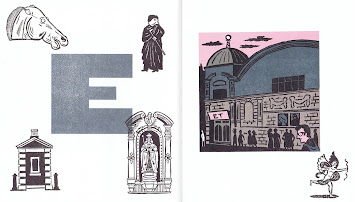
Christopher Brown gives us another Alphabet of London, in which E is for Electric Cinema as its primary illustration, but also includes little images illustrating “Eros,” Elizabeth I, Ely Place, Elgin Marbles, and the Elephant Man. Each of Brown’s letters has one large color linoleum block print plus five little black and white extras, and the
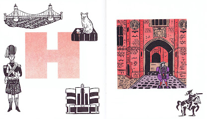
second letter I’m sharing is H for Henry VIII at Hampton Court Palace, plus those extra H places and historical characters. (Luckily there’s an index at the back of the book, or I wouldn’t have recognized all of these.) Two more of those little extra pictures will show up in later letters, so keep your eyes open for them!
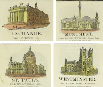
All this celebration of England is nothing new. I’ve also got Illustrated London Alphabet from 1861. As is common in the children’s books of this era, there are detailed wood block prints that would, in my opinion, be more attractive if they had not had a careless, hurried splash of paint thrown across for colour. At any rate, here E is for Exchange. For additional examples I’ve gone all out and shared M for Monument (Nelson sneaking in again), S for St. Paul’s, and W for Westminster Abbey.
The moral of E is by all means to celebrate the places you love.
And also, love those things that make each place distinctive, unique, and special.
So, what’s your favorite place you’ve ever been that begins with E?
[Pictures: Eurostar, Nelson, Traitor’s Gate, linocuts by Tobias Till, 2011 (Images from Tobias-Till);
Electric Cinema, Hampton Court Palace, linocut prints by Christopher Brown from An Alphabet of London, 2012;
Exchange, Monument, St. Paul’s, Westminster, hand-coloured wood block prints from Illustrated London Alphabet, 1861 (Images from Toronto Public Library).]


7 comments:
I'm enjoying these letters. Wish I could use some of them instead of this years a-z letters.
I´m loving your theme, and of course I´ll jump back to A to visit all your posts.
The prints are beautiful, that Eurostar is my favourite, so steampunk!
:D
Interesting collection.
Ronel visiting for E:
My Languishing TBR: E
Earth Mother Demeter
I adore the London A-Z. It has such an old-fashioned look and, then, I realize that i'm looking at the Eurostar. Ha!
Kristin, I went through all the trouble of making my letter icons only because I wasn't sure there were going to be any official ones this year - then they had them and I thought I'd wasted all that time, so I'm glad to hear you're enjoying them and my work wasn't in vain! =)
Thanks to Absenta, Ronel, and Joy for stopping by!
I agree with you that the splash of color isn't really necessary, and could have been done much better.
I am really impressed by the amount of material you seem to have. You must have combed through so many illustrated alphabets. This theme is so extra A to Z; it's great!
Melanie, I wasted WAY too much time on this. I keep thinking I'll pick a nice, simple theme, and then I can't help myself from adding more and more... The digitised resources out there are just so amazing!
Post a Comment