Welcome to the April A to Z Blog Challenge! My theme this year is Block Printed Alphabet Squared, an entire alphabet of alphabets illustrated with relief block prints. As usual, I’ve started early, but you can find out more about the A to Z Challenge here.
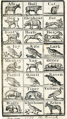
Today I’m spotlighting two alphabets and they both come from Thomas Bewick. Bewick (UK, 1753-1828) is generally considered to be the artist who brought wood engraving to its pinnacle as a medium of illustration. Read my prior post about him to learn more. He was an early proponent of making illustrations for children with as much care as those for adults, and you can certainly appreciate the level of accuracy and detail in these wood engravings, which are quite small. The first alphabet today was made when Bewick was only about 24, but he’d already been a wood engraver for a decade. I’ve gone ahead and included the entire thing, since it’s all one sheet. (Remember you can always click on the pictures to see them bigger.) Here B is for Bull, but I particularly like the Elephant, Fox, Goat, and Ibex. (Why should I have to pick just one when I’ve already included them all?) Dating to 1777, this one is about tied as the oldest alphabet I’ll be sharing.
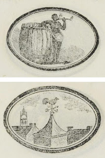
Our second alphabet today was published 38 years later, and is another of those small educational pamphlets that we’ll be seeing lots of in the letters to come. In this alphabet B is Black, along with the text “Black Men and Wo-men are na-tives of warm coun-tries.” Here’s the time to note that when you go researching English children’s books from the nineteenth and early twentieth centuries you are likely to come across some pretty appalling examples of racism, sexism, and other messages that should definitely not be taught to children any more. (People of various nations and cultures was a particularly popular theme as the British Empire began to overtake more and more of them, and I find it fascinating to see the varying attitudes the authors and artists could take with their subjects.) But in this case, although Bewick is certainly exoticizing black people, I actually like how simply matter-of-fact he is. He portrays the Black man on a par with the white men who show up in the alphabet (including the Captain, the Fiddler, and the Haymaker), and with far more dignity than the
Drunkard and the Userer. However, I’ve passed over all those people and chosen W for Weathervane as my favorite illustration in this little book, because I always like rooftop views.
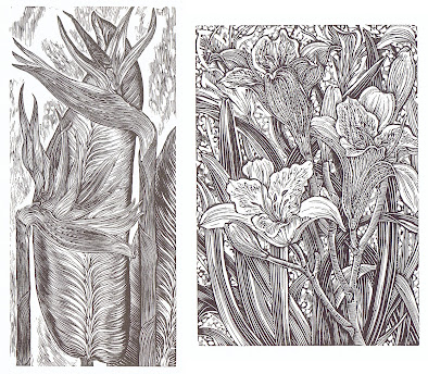
Today’s first bonus B is the Bird of Paradise flower from A Wood Engraver’s Alphabet by Gerard Brender à Brandis. I’ve shared a number of images from this one before, including F, M, R, Z, and also Q. The ones I posted already were chosen because they’re my favorites, but today I’ll go ahead and add D for Day Lily.
You can also revisit an alphabet of funky linocut letter designs by James Brown. I previously posted A, F, H, K, U, and Z. (The A is also in the title collection in the Theme Reveal post, and one more of Brown’s letters will show up as one of the letter icons before the end of the alphabet.) And here’s his B, Bravo.
The moral for B is Be kind, Be honest, Be brave, Behave yourself, and sometimes, if you’re feeling overwhelmed, just Be.
And also, beware of B’s in your bonnet.
So, to be or not to be? That is the question, as we all know.
[Pictures: Alphabet, wood engraving by Thomas Bewick, 1777 (Image from The British Museum);
Black, Weathervane, wood engravings by Thomas Bewick from The Child’s Instructor, or Picture Alphabet, 1815 (Images from McGill Library);
Day Lily, wood engraving by Gerard Brender à Brandis from A Wood Engraver's Alphabet, 2008;
Bravo, linocut by James Brown (Image from James Brown).]


4 comments:
That bird of paradise flower image is really beautiful! Thank you :)
The Multicolored Diary
The detail on the wolf on the first set of blocks is impressive. I really like the flower ones, though :-)
Ronel visiting for B:
My Languishing TBR: B
Birds of Faerie
Hello! I like the idea that care should be taken in illustrating children’s books, and I’m glad that someone eventually realized it.
On a somewhat related note: many years ago, a friend of mine was searching for an illustrator for a children’s book she’d written, and one artist she was considering did some sample drawings which were very much drawn as if a child had done them. Big banana-moon heads, if you know what I mean, and giant cauliflower hands. And I it got me thinking about what kids are likely to want in their illustrated books, vs. what we often want to give them. I think that as a kid, I preferred beautifully illustrated books that were way above my own feeble artistic ability (The Rainbow Goblins stands out as a favorite). But I don’t know; maybe some kids really do want illustrations that are just a peg or two above what they could do themselves. I can see that making sense, too. What do you think?
Melanie, I agree with you - I loved very detailed, beautiful realism - not cartoons, not faux-childish, not "edgy" art, not overly stylized in any of the ways that modern art critics favor (and also, to be honest, I probably wouldn't have loved all these black and white block prints, or the block prints I myself do now!) But I suppose that children, just like all other people, must vary pretty widely in their tastes.
Post a Comment