July 14, 2023

Student Printmaking

         This week I taught printmaking to kids for the first time in four years, so it’s also been four years since I’ve been able to share kids’ creations.  This week’s group included students who will be entering grades 5-9, none of whom had done printmaking before.  Over the course of the week we got through quite a few projects, so today I’m sharing what I consider to be some of the highlights.  Of course, art is personal and a matter of taste, so the kids themselves might have other favorites, as might other adults.  But these are some of my favorites.
        The first grouping are examples of the “foreground and background” project, in which they carved sets of blocks intended to be printed together.  The deer and the mushrooms are both by one student, and I love the contrast between them and the way she was able to think so differently about the two pieces.
        Next are examples of patterns: mostly 1.25 inch squares carved and printed repeatedly.  The piece in the lower left, however, is by a student who filled most of her blocks with dense patterning.  You can see another of hers in the next grouping, and I’m sure you can guess which one it is!
        All the pieces in this third group are classic relief block printmaking: one block, one color ink, and let the bold, graphic effect carry it.  From simple to detailed, block prints always look great!  The piece in the lower right is an example of a happy accident.  The rubber turned out to have some sort of odd flaw which caused it to print with that craquelure effect, which just happens to work perfectly for the water in the koi pool.  (Although it happened to work great for this piece, however, I will say that I have been unhappy with recent orders of rubber.  I feel like the quality has gone down substantially since I began using this brand some 20 or more years ago.  More and more of 
the blocks are flawed these days.)
        And finally I have two pieces to share that came out particularly well.  In both cases the students used reference pictures in designing their sketches, so I wouldn’t call the designs 100% original.  However, they did both do such an excellent job in their execution that I’d say they really demonstrated full understanding of what they were trying to do and how to get there.  The sea arch was printed first on white paper, which was them given a watercolor sky.  Because we use water-based ink, this artist had to work very meticulously at the edges to avoid making the printing ink run, while still making a very painterly wash of color.  He also used watercolors on some of his other pieces with equally effective results.  
The final piece is an example of a Provincetown-style white line print.  It’s quite small and beautifully detailed.
        Did any of these inspire you to give printmaking a try?  Which project looks like the most fun to you?


[Pictures: Deer, rubber block print with two blocks by EV;

Mushrooms, rubber block print with two blocks by EV;

Dog, rubber block print with two blocks by KL;

Waterfall, rubber block print with two blocks by VM;

Little square, rubber block print by EV;

Little square (and the block), rubber block print by CZ;

Rubber block by SV;

Little square, rubber block print by CG;

Cow, rubber block print by LG;

Landscape, rubber block print by CG;

Vase, rubber block print by CZ;

Abstract music, rubber block print by SV;

Koi pond, rubber block print by VM;

Sea arch, rubber block print with watercolor by MW;

Provincetown-style rubber block print by KL, all 2023.]

July 10, 2023

Recent Reads of MG Magic

         MG, for those who don’t know, is Middle Grade, a category of books for kids in the age range of roughly 8-12 or sometimes 14 years old.  Of course the reading level and content taste of individual kids varies widely, but that’s the general ballpark.  (Plus of course there’s the fact that while I am well over 14 years old, I very much enjoy MG books.  Maybe I’ll explain why in another post, but for now, let’s get to the books!)  It’s been quite a while since I posted about books I’ve been reading, but I’m writing such a post now because I recently received an ARC (Advanced Review or Reading Copy) of a book that will be released this summer, and I wanted to do my part to help generate buzz!  So we’ll start with
        The Demon Sword Asperides by Sarah Jean Horwitz.  Asperides the demon sword is pinned through the heart of its late master, a supremely evil sorcerer knight, when someone (bored dark sorceress Cleoline, to be specific) resurrects the guy.  At the same time, Asperides just can’t help himself from inveigling naive, somewhat hapless would-be knight Nack from entering into a binding soul-contract to be the demon sword’s next master.  Meanwhile the young novitiate seer Therin foretells the return of the Missing Moon…  Each character with their various motivations and talents (and lack of talent, at times) struggles to follow their chosen path, as those paths begin to converge and intertwine.  What will happen when the Missing Moon returns and the evil sorcerer knight carves a hole into the demon realms in an attempt to retrieve the missing 80% of his soul?  I enjoyed this book very much, with its light, humorous tone, lovable characters, interesting world-building, and tons of heart.  Horwitz is a master at making “dark” characters with hearts of gold, as demonstrated in her previous book The Dark Lord Clementine.  (Horwitz joined me for an interview about 
it on this very blog three years ago, and I encourage you to read what she has to say about writing
 Middle Grade fantasy.)  But not all hearts are gold, and our heroes have their work cut out for them, discovering the true meaning of duty, honor, courage, and knighthood.  Curious?  Want to hear more?  Horwitz herself will be giving a live on-line reading from The Demon Sword Asperides on July 20.  Learn more about the event at Strong Women-Strange Worlds!
        Another MG book I read relatively recently and loved was Sal & Gabi Break the Universe by Carlos Hernandez (and its sequel Sal & Gabi Fix the Universe).  This is not a book that needs any extra buzz from me, because it’s won tons of awards and starred reviews since its release in 2019.  Sal Vidón is struggling at a new (but wonderfully wacky and innovative) school, as well as struggling with the loss of his mother.  Student council president Gabi Reál is doing everything she can to keep her friend Yasmany from being expelled for bullying after he picks a fight with Sal.  Another very funny book, which touches on all kinds of heart-wrenching issues without ever losing its light touch, this is another one that warmed me to the very cockles.  And this is one reason I love MG fantasy so much: it’s never ashamed to celebrate love and joy.  I won’t attempt a synopsis of the crazy, convoluted, multiverse-spanning plot, but I will say that the thing about these books that won me over utterly was their portrayal of happy families that come in some pretty unusual variations.  Sal may have lost his mother, whom he longs to bring back (from another universe), but he’s also got a wonderful father and stepmother.  Gabi has a mother who would embrace (and feed) the entire world if she could, plus a huge number of “dads” who include men, women, a robot, and more, all of whom love her, her critically ill baby brother, and each other fiercely.  Sometimes it seems like dysfunctional families are used by writers as just an easy shortcut to add conflict, so it’s really refreshing and satisfying to see a portrayal of healthy, happy, and delightfully diverse, loving families who work together to solve their problems.
        The Lock-Eater by Zack Loran Clark (2022) is another magical adventure with a wonderful message of love and acceptance.  Melanie Gate is an orphan in the capital city of the thaumacracy.  She has a strange talent for opening locks, which occasionally causes trouble, but most of all, she longs for adventure.  Then adventure finds her, in the form of a mage’s gearling who turns out, impossibly, to be sentient, alive… a person.  In fact, Traveler is an absolutely endearing person, and also (all too rare in stories) one whose desire to do no harm makes him work hard to be a pacifist.  This world (which is flavored like 19th-early 20th century Europe with 2 competing magical systems) is well-drawn, the adventure twists and turns with several surprising pivots, and there are many likeable characters.  Like the families in Sal & Gabi, Melanie’s orphanage family is loving and supportive, and they have her back when she needs them.  Although there were times when the theme of diversity and inclusion seemed a tad heavy-handed, it’s not a theme I’m going to object to (and it may seem less obvious to MG readers).  In addition to that I appreciated that the characters engaged seriously with issues of non-violence.  I enjoyed this one very much, and the ending was warm and satisfying.
        Each of these books has its own distinct flavor, and you can take your pick between light goth, madcap sci-fi, or political epic fantasy… but I would recommend any of them to anyone who needs a reminder that love is its own powerful kind of magic, and no matter who we are, we can all choose to wield it.

July 5, 2023

Block Prints by Latham

         Barbara Latham (USA, 1896-1989) was born in Massachusetts but ended up spending most of her adult life in New Mexico.  She was a painter and illustrator, but also made block prints and wood engravings.  I’ve selected a few that I particularly like.  Up first is one that I think shows Latham’s illustrator sensibilities.  The scene here hints at a story, and the pretzel woman definitely looks like a character.  I like the contrast between the crowd of baby carriages implying the presence of children, and the fact that we actually don’t see any babies or children anywhere.  There’s 
an affectionate humor in this scene.
         If you want to see children, how about this charming family of bears?  It’s adorable, but perhaps the most interesting thing is the textures of the rocks.  You can see clearly the distinctive marks made by the multi-line tools unique to wood engraving, but Latham has gone above and beyond the usual in the sorts of patterns and textures she’s created with these tools.  Although on the whole I really love my rubber block prints for myself, I do have a bit of envy when I see what’s possible with the medium and tools of wood engraving.
        These geraniums are a linoleum block print rather than a wood engraving, and although it still has plenty of fine lines and details, you can see that this piece doesn’t have that almost fuzzy appearance imparted by the engraving tools.  The thing I find most interesting about this piece is how the shadows 
on the wall and the shaded side of the window frame are printed much more lightly than the heavy blacks of the rest of the piece.  The most staightforward method would be simply to press more lightly on the areas where she didn’t want the ink as dark.  That’s hard to control, however, so she may also have used a mask of some sort to lift a bit of excess ink off the selected areas.  In any case, I love the depth it adds to the piece.
        I couldn’t find a clearer image of this last piece, but I wanted to include it anyway because I love the warmth and light of it.  The woman sits in the evening contentedly darning a sock in a cozy corner.  The lamplight glows, throwing the shadows 
around the woman like a dark blanket.  Here I’m envious once again because I think lighting is one of my weaknesses in my own pieces.  I always love to see it done beautifully.
        Latham may perhaps illustrate the fact that illustrators tend in general to get less acclaim than straight “Fine Artists,.”  Nevertheless, although hardly a household name these days, she had a long and successful career in her time.  There’s one more fun tidbit I want to share about Latham and her art — but you’ll have to wait for another post to see it!


[Pictures: In the Park, wood engraving by Barbara Latham, c. 1937 (Image from Old Print Gallery);

The Bear Family, wood engraving by Latham, 1937 (Image from Amon Carter Museum);

Geraniums, linocut by Latham, c. 1934 (Image from Philadelphia Museum of Art);

Lucy, wood engraving by Latham (Image from The Owings Gallery).]

June 30, 2023

Words of the Month - Kaput

         It’s been a while since I mentioned Proto-Indo-European, so here’s a quick refresher: it’s an ancient language that no longer exists, but which linguists can extensively reconstruct by tracing back from all the known languages which descended from it, which include most of the languages of Europe and India including Latin and Romance languages, Celtic languages, Germanic languages, Greek, Slavic languages, Persian, Sanskrit and the Indian languages descended from Sanskrit.  That’s a lot!  It also means that many Proto-Indo-European (PIE) roots have produced a whole plethora of modern English words, by coming down through various branches and twisting and turning in various ways over the approximately 5000 years since PIE was spoken as a single unified language.  I’m bringing it up today because I’m going to share just a few of the many English words that ultimately derive from the PIE root *kaput-.  (The asterisk, by the way, indicates that the form is reconstructed, as opposed to directly attested, since there was no writing to directly attest any part of PIE.)  *kaput- means head.
        Let’s start right off by tackling the obvious question: is this related to the English word kaput?  The answer is yes, but in a very indirect and convoluted way, so let’s take it step by step.  English borrowed kaput from German (around 1895, but popularized during World War I).  It means “destroyed, ruined,” but derived from a term that German had borrowed from French, faire capot, which referred to winning all the tricks in the card game piquet, which was popular in the 16th century.  That French phrase literally means “to make a bonnet/hood,” but was also marine jargon for a sailboat being overset in a squall - or capsized.  The capot which meant “bonnet or hood” in the phrase was also the name of a hooded cloak or cape (the word is, in fact, a diminutive of cape) worn by sailors and soldiers.  The capes in question are named for their hoods or caps, which come from Latin caput “head” because of course they’re worn on the head.  And the connection of Latin caput from PIE *kaput- is perfectly clear.
        From cap and cape we also have all kinds of English words from hubcaps and cap-guns, to the chapel that I discussed previously.  Then there’s escape, which literally meant “to get out of one’s cape,” presumably leaving it behind in the hands of the captor.  (Captor, however, is unrelated, despite appearances.)
        Other English words that derive from the Latin caput include biceps (c 1640, “two-headed,” because of the structure of the muscle), cadet (c 1610, from Gascon capdet, from Medieval Latin capitellum, a diminutive of caput), cad (c 1730, shortened slang of cadet), cape “promontory of land” ie “headland.”  And don’t forget captain.
        I need a whole paragraph just for capital in all its various meanings, but many of them involve a conflation of head with the meaning first.  “Head city,” “top of a column,” and “upper-case letter” are pretty straightforward.  Capital meaning “wealth” came from a distinction made in medieval Latin between the head or first sum of money and the subsequent interest added to it for a loan.  Medieval Latin capitalis meaning “property” also led, by way of two dialects of Old French, to both cattle, which originally meant property of any kind, and chattel.  Meanwhile, capital punishment involves a connection between the head and life itself, and of course sometimes meant decapitation.
        Chapter is a division of a book or other organization - a heading, in fact.  It’s another diminutive, and comes by way of Old French, which is where we also get the ch in the words chief, chieftain, kerchief (a cloth covering the head) and mischief (an event that comes to a head in a bad way), which is the opposite of achieve (literally “to come to a head”).  On the other hand chef, despite its ch, is from modern French (1842).  Capitulate comes from the idea of drawing up the terms of surrender in articles or chapters, but comes straight from Medieval Latin instead of going by way of French, and recapitulate means to go back over the main chapters or headings of discourse.
        Then there’s precipice, literally meaning “before or forth + head,” in other words, “headlong or headfirst,” which is how you might fall down it.  The verb precipitate came first by nearly a century, and precipitation was even earlier (late 15th century, of fallen angels and alchemical solutions - but rain didn’t fall into English with this word until the late 17th century).
        You can also revisit cappuccino and cabbage, discussed last month, and add the uncut gemstone cabochon which comes from the same Old French slang as cabbage.
        All the examples I’ve listed so far came into English by way of the Latin branch of PIE.  But English also gets the version that developed directly down through the Germanic branch, which is where we get head itself.  And of course head leads to a whole array of figurative uses, many of which we’ve already seen in the same ways the Latin version was used: top, first, most important, most prominent, individual, and so forth.
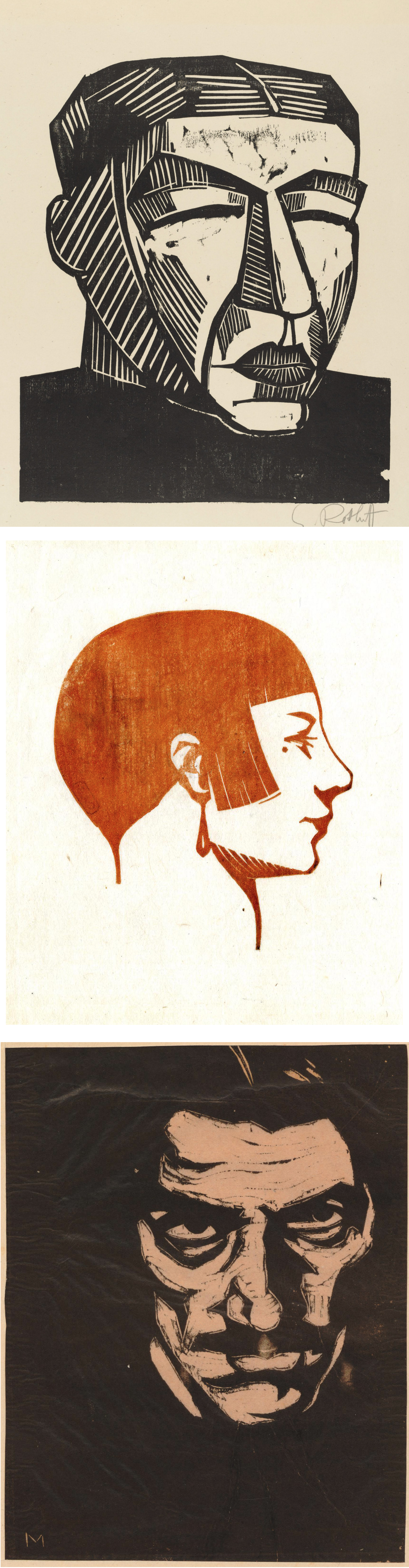
        Whew, that’s a lot of heads for one day, illustrated with a lot of wood block prints of heads, so that’s enough from me before we all lose our heads!


[Pictures: Head of an Awa Doll, colour woodblock print by Taniguchi Kunbi, 1948 (Image from The British Museum);

Portrait head, woodcut by Wiktoria Goryńska, 1931 (Image from The British Museum);

Head of a mountain peasant, woodcut by Władysław Skoczylas, 1927 (Image from The British Museum);

Mother, woodcut by Karl Schmidt-Rottluff, 1916 (Image from MoMA);

Tête, woodcut by Emile Charles Carlègle, 1932 (Image from The British Museum);

Self-portrait, woodcut by Emilio Mantelli, c 1911-18 (Image from The British Museum);

Head of an old man, woodcut by Hans Baldung, c 1518 (Image from The British Museum);

Grand tête de femme, woodcut by Marie Laurencin, 1910 (Image from The British Museum).]

June 26, 2023

Tiny Block Challenge Part II

         Blow the fanfare!  I completed 30 tiny rubber block prints in one month, thus accomplishing my own unofficial challenge to stay engaged - and use up some of the many little scraps of rubber I had accumulated.  I’m pretty pleased with the breadth of variety, making at least one print for each of the rough categories into which I divide my art on my web site (animals, plants, people, places, stories, and Interesting Things).  But the tiny format certainly lends itself better to simple single items than to sweeping vistas or complicated scenes.  At any rate, here are the tiny prints from the second half of the month:

16. Birdhouse

17. Vogelhuisje

18. birdhouse (Japanese)

19. Cementos, Quintana Roo

20. Dalahäst

21. birdhouse (Mayan)

22. birdhouse (Russian)

23. coy cat

24. Mudskipper

25. Venus Fly Trap

26. Lagopus

27. Llama calligraphy

28. Siren Song

29. Rocking Chair

30. Faithful Friend

        A few notes on the printing of some of these…  * The birdhouses were all printed together as a single piece, and I added to it a bird and a post, (which were bonus blocks as far as the challenge was concerned.  The bird is only about a half inch square).  * For the mudskipper and the Venus fly trap I started out printing in colors, but decided in the end that you really can’t beat black, so those are mixed editions with some in each color.  * The llama was inspired by Islamic calligraphy and was an attempt to make the word into the thing.  * The siren and the final little girl were both done with an eye to illustrating short stories, and they will probably end up as parts of larger scenes for those illustrations.  For the little girl I plan to do the extra bits on the computer, but I may fool around with collage for the siren.  We’ll see.
        So for now I’m declaring myself finished.  I still have plenty more items on my list of ideas, and I still have plenty more small scraps of rubber, but I also have plenty of other things that need doing.  If nothing else, it’s going to be an awful lot of work just to get a full selection of these matted and framed before my next sale, which is less than a month away!  I also need to finish scanning these and getting them up onto my web site.  (The page of Tiny Prints is here, and will be updated as time permits.)
        Then there’s all the other stuff… 
Remember how this challenge started because summer is supposed to be a slow season?  Well, of course I’m as busy as ever.  I’ll be teaching kids’ printmaking classes for the second week in July, and participating in the Linda Plaut Festival of the Arts on July 22.  I’m also working on writing and submitting a steady trickle of short stories and poetry, so I continue to find that I simply don’t possibly have the time to do a lot of housework!
        Back when I started working more on the short stories (instead of novels), I found the smaller bite-sized pieces very refreshing.  (Revisit a post about that here).  Well, if short stories and normal block prints are “bite-sized,” that must make these tiny prints no more than nibble-sized!  Amuse-bouche art.  I’ve definitely enjoyed my tiny challenge, and will try to do more of these tiny prints as part of the usual mix, without waiting to set myself a special assignment.
        What’s your favorite?  Or what would you have done instead?  Well, don’t just tell me - go give it a try for yourself!


[Pictures: All block prints and photos by AEGN, 2023.]

June 21, 2023

A Little Whimsy

         Here are a few relief block prints that are a little quirkier than your average piece of  Serious Art.  First up are two by Ed Haddaway, who is primarily a sculptor but does have a page of block prints on his web site.  His block prints are populated by these strange therianthropic people endowed with odd noses or rabbit ears.  What I particularly like about them is their appearance of going about their possibly magical lives with a general air of friendliness.  “Till the Wee Hours” shows two of these people floating in the night sky far above the dark trees.  One has wings, the other… a necktie?  Are they parent and child?  Guardian angel and protectee?  Two spirits in love?  A fairy granting a wish to a less magical being?  I love the mystery of this image, as well as its magic.
         It’s the title that raises the questions for this second piece: “Life is a Story Read to a Duck.”    My father always says “Life is a ___” in which the blank is filled by random words that strike his fancy at the time.  And I always reply, “Why?”  
What’s the metaphor here?  What’s the point we’re trying to make about the nature of existence?  In my father’s case, he generally doesn’t have a deep point to make; he just likes the sound of his phrases.  So, is that the case for Haddaway?  But setting aside all philosophy, what I actually like about this piece is just taking the scene at face value: here’s a duck enjoying a book read by some companionable rabbity figure who’s sharing quality time, love, and story.
        Today’s second artist is Nick Morley, aka Linocut Boy.  I think Morley must be doing something a little similar to me; he says “I seem to be making a lot of little cute prints at the moment.  I’m not sure why.”  What’s fun about them - and why I say they’re a little similar in spirit to what I’m doing with my tiny prints - is that they don’t have to have a reason or “make sense” or justify themselves or the effort to make them.  Some little idea pops into your head and it may not be worth a whole huge production, but is it worth a tiny block?  Why not!  Some little idea like, “I know, how about a potato cowboy!”  These definitely tickle my whimsy-bone.
        I hope these quirky prints give you a little smile today, too.


[Pictures: Till the Wee Hours, block print by Ed Haddaway, 1992;

Life is a Story Read to a Duck, block print by Haddaway, 2021 (Images from EdHaddaway.com);

Potato Cowboy, linocut by Nick Morley, 2023 (Image from linocutboy.com);

Juggler, linocut by Morley, 2023 (Image from linocutboy.com).]

June 16, 2023

Songs for the People

         This poem is by Frances Ellen Watkins Harper (US, 1825-1911), a remarkable woman who wrote poetry, short stories, a novel, and journalism, and was among the first African-American women to be published in the USA.  You should definitely look her up if you’re not familiar with her, as she really should be a household name.  For the purposes of this blog, however, let me go ahead and share Songs for the People without further ado.

Let me make the songs for the people,

     Songs for the old and young;

Songs to stir like a battle-cry

     Wherever they are sung.


Not for the clashing of sabres,

     For carnage nor for strife;

But songs to thrill the hearts of men

     With more abundant life.


Let me make the songs for the weary,

     Amid life’s fever and fret,

Till hearts shall relax their tension,

     And careworn brows forget.


Let me sing for little children,

     Before their footsteps stray,

Sweet anthems of love and duty,

     To float o’er life’s highway.


I would sing for the poor and aged,

     When shadows dim their sight;

Of the bright and restful mansions,

     Where there shall be no night.


Our world, so worn and weary,

     Needs music, pure and strong,

To hush the jangle and discords

     Of sorrow, pain, and wrong.


Music to soothe all its sorrow,

     Till war and crime shall cease; 

And the hearts of men grown tender

     Girdle the world with peace.


        A lovely sentiment, but What, you may ask, does this have to do with art or fantasy?  There are two ways that I think this poem warrants a place this blog.  For one thing, it is speculative in the sense that it attempts to imagine what it would take to create a world girdled with peace.  Quaker sociologist Elise Boulding studied and taught about the role of imagination in helping people work toward their visions of peace (mentioned in this previous post), and that’s exactly what Harper is doing in this poem.
        Then in addition to that speculative element, this poem describes what I hope to do with my own art and writing.  Harper uses a metaphor of music, but in my mediums of block prints and fiction I, too, hope to thrill the hearts of people with more abundant life, help hearts relax their tension, and touch hearts so that they grow tender.  (And a couple of previous poems and posts with a similar message: The Elfin Artist, and Where My Books Go.)  The more we are bombarded with a rising backlash of hatred - just as Harper saw in her country after the glorious promise of Emancipation - the more important it is that we stir ourselves with ardor for love and peace.


[Picture: Frances Ellen Watkins Harper, wood engraving by Bensell, Schell, or anonymous, from The Underground Rail Road by William Still, 1879 (Image from Library of Congress).]