February 7, 2017

Beyond the Thorns

        I just finished printing this piece, which I had actually carved last summer, and first printed in the early fall or so.  I’d initially printed the thorn block with dark green and didn’t like it.  There wasn’t enough contrast for it to pop; it just looked like mush.  I was discouraged enough that I didn’t get around to trying again until now, with a deadline coming up in the form of Boskone Sci-fi and Fantasy Art Gallery in a week and a half.
        Actually, this piece’s history is even longer than that.  It goes all the way back to when I saw some of M.C. Escher’s pieces in which he had a grey background with black framing by another block.  That was back in 2015, and you can read my initial post here.  Ever since then I’d been mulling what I might do with the idea of background and foreground blocks.  But I still hadn’t got around to doing anything until I gave the assignment to my students this summer, and their work gave me the kick I needed.  (You can see what they came up with in this post.)
        I’ve mentioned before that “Sleeping Beauty” is one of my favorite fairy tales.  The part of the original German version that I like best is the descriptions of the mysterious sleep behind the mysterious hedge of thorns.  (I wrote a poem about it, too, but that's not yet published.)  I love the idea of the beautiful sleeping castle hidden away for a hundred years, but there all the time if one could only glimpse it.  So while my castle block is pretty straightforward, what I really had fun with was the thorn hedge block, just beginning to sprout buds and other signs of life, and open up as the hundred years come to an end.

[Picture: Beyond the Thorns, rubber block print from two blocks by AEGN, 2016-7 (sold out).]

February 3, 2017

Year of the Rooster

        Happy Year of the Fire Rooster!  Actually, the animal of the year is a word that means either rooster or chicken, so they’re equally good symbols.  In honor of which, today I’ve collected a nice selection of relief block printed fowl.  I always enjoy seeing the different ways different artists choose to depict the same thing.  You can really see how each artist’s style and choices contribute to different pieces.
        I’ll start with my own, in which I was most interested in playing with patterns.  To me the interesting thing about chickens is the remarkable array of patterns in their feathers, and how they’re repeated and varied.  I was also fooling around with borders: the chicken’s border is an “egg and dart” design, which I thought terribly clever.  (Apparently I’m easily amused!)
        Jacques Hnizdovsky is the king of relief block printed patterns and he’s done many birds of all sorts with intricately geometric feathers.  But interestingly, his rooster is more about the the sweep of feathers than their design.  His rooster is quite simple and bold, and very sleek.  I'd even go with "regal."
        Hugh Ribbans was also clearly playing with pattern in his hen.  The various areas of feathers are quite stylized, with individual feathers outlined in some areas, and filler patterns in others.  I like how active this hen looks, head down and scurrying, unlike the more static creatures it’s so much easier to show.
        Thomas Bewick’s chickens are illustrating a fable, so they come with their whole story: barnyard, dunghill, jewel and all.  There are lots of little details, including the broken pipe on the dunghill, and the fences and outbuildings of the farm.  That makes a nice transition to my last fowl, which carries its farm inside it.  This is definitely a different, interesting take on the patterns that make up the feathers.  I like the way the grain looks feathery at the bottom and the sky morphs up into the tail, and the diagonals of the furrowed field are a little reminiscent of wing feathers.
        Chickens are one of the most common and popular creatures for artists, so there were certainly plenty more I could have chosen, but I tried not to get carried away.  At any rate, I hope these provide plenty of inspiration.

[Images: Chanticleer, rubber block print by AEGN, 2009 (sold out);
Hen and Chicks, rubber block print by AEGN, 2009 (sold out);
Cock, woodcut by Jacques Hnizdovsky, 1972;
Little Hen, linocut by Hugh Ribbans (Image from hughribbans.com);
The Cock and the Jewel, wood block print by Thomas Bewick from The Fables of AEsop, 1885 (Image from Internet Archive and University of California, Victorian Web);
Bantam Chicken, linocut by Kelly Shields (Image from her Etsy Shop RedFlowerLetterpress).]

January 31, 2017

Words of the Month - Of Doodads and Thingamajigs

A - whatchicalt, B - widget, C - dingus, D - jiggembob, 
E - doohickey, F - thingamerry, G - flumadiddles
        What do you call the object that you don’t know what to call?  There’s always been a need for such a word, the word that can refer to any specific thing, but never means anything in particular; the word that fills in when you don’t have the right word.  Interestingly, English doesn’t have a “real” word to fill this need.  All the words we use are slang, considered silly and informal, and subject to the abrupt changes and shifting fashions of slang usage.  You’d think it would be reasonable to have a proper word in good standing to indicate a forgotten or unknown word, but for whatever reason, we don’t seem to have one.  Instead we have…

whatchamacallit - Phrases along these lines are among our earliest recorded filler words, including what-calle-ye-hym from the late 15th century, and whatdicall’um and whatchicalt from the 16th century.  Our current variant dates to 1928.

jiggembob - The first half of the 17th century seems to have preferred coinages with -bob, including giggombob and kickumbob.

thingy - The arrival of thingum in the 1670s ushered in the 18th century’s favorite way to indicate ignorance, with such gems as thingamabob (1751), thingumtitoy, thingamerry, thingummytite, thingumadad, and thingummy (1796).  Some of these sound quite ridiculous to my ears, but several are still going strong.  One I’m most likely to use is the late arrival thingamajig (1824).

dingus - This American option (1876) apparently comes from Dutch.  This sent me to the on-line translation sites to find out what words other languages use.  Dutch did indeed translate “whatchamacallit” as dinges, French offered Quoi de neuf, and Hungarian gave me izé, but the vast majority of languages from German to Hindi to Russian to Vietnamese came back with “whatchmacallit.”  Of course, this is just as likely to be because of gaps in the on-line dictionaries as actual lexical gaps in the languages, but it does make me curious whether whatchamacallit is one of English’s greatest contributions to the vocabulary of the worlds’ peoples!

doohickey - The early years of the twentieth century seem to have favored doo- variants such as doodad (1905), doohickey (1914), and doodah (1928).  My thesaurus also lists doofunny, doojigger, and doowhacky (without dates).
        While these doodads were prevalent in the USA, British English went for ooj- words, including oojah (1917) and oojamaflop (WWII).  I encountered “oojah” in Dorothy L. Sayer’s Gaudy Night from 1935.

whoosiwhat - Here’s one I can’t find any references to, despite the fact that I’ve certainly both heard and used it.  Part of the problem may be the spelling.  Not being proper words, these terms tend not to have single set spellings.  I’ve also heard the variant whoosiwhatsis, as well as both whoosies and whatsits. 
        My thesaurus also lists flumadiddle, which I can’t recall having heard and can’t find a date for, but was presumably in use at some point.

gadget - It’s worth noting the subset of words that specifically refer to mechanical objects or parts of machinery for which no technical name comes to mind.  Gadget (1850-86) is from sailors’ slang and gizmo (1942) is from USA navy and marine slang.  Widget (c 1920) seems to be from the civilian world.

what’s-his-name - There are also words that specifically refer to a person whose name we don’t know or can’t recall.  These stretch from what’s-his-name (1690s) to what’s-his-face (1967).

A variety of whoosies and whatsits.
        In Ireland in the 1990s I knew a girl of maybe 5 or 6 years old who referred to anyone whose name she didn’t know as simply thing.  And that, of course, is the simplest word solution of all.  “Hey, thing, can you please hand me the thing from the thing?  No, the other thing; the one beside the little thing with the thing!”  Hmmm… maybe there’s a reason we have different words for different objects.

[Picture: Wood block print (p 189) from De Re Metallica by Georgius Agricola, 1556 (Image from Project Gutenberg);
On Skills of Blacksmiths, wood block print from Historia de Gentibus Septentrionalibus by Olaus Magnus, 1555 (Image from avrosys.nu).]

January 27, 2017

Mozart's Fantasy

        Today is Wolfgang Amadeus Mozart’s birthday (1756-1791), in honor of which let’s have a look at his most famous fantasy opera, “Die Zauberflöte” or “The Magic Flute.”  In some ways it’s classic fairy tale: a prince is travelling to seek his fortune, he must rescue a princess, there’s a wicked mother/witch and a wise wizard, a monster serpent, love at first sight, magical gifts, transformations, trials to prove our heroes’ virtue, and happily ever after.  But there are also some wonderfully unusual twists on the fairy tale stereotypes.  We first meet our prince not slaying the monster serpent, but yelling (singing) “Help!” and fainting.  He has to be rescued by three women.  We first meet the wicked witch as a grieving mother begging the prince to rescue her kidnapped daughter.  Only later do we discover that the “kidnapper” is protecting the daughter from her own mother’s evil ways.  But though she may be a villain, the Queen of
the Night has the greatest, most spectacular arias and is arguably the star of the opera from a musical point of view.  One of the prince’s trials is a vow of silence, which is not an unusual motif in fairy tales but is certainly an interesting choice for an opera, and also musically interesting is the humming song when the comic sidekick has his mouth magically padlocked.  Altogether the opera is enormously fun: lots of fun and varied music, lots of humor, fun costumes and sets…  The prince and princess are really the least interesting characters compared with all the other supposedly secondary characters, and it’s clear that Mozart and his librettist Emanuel Schikaneder pulled out all the stops to make this an enjoyable spectacle.
         So today I’ve got for you a few images of The Magic Flute.  There are many cool paintings and sketches of costume and stage design for different productions, but in keeping with my blog theme, I’ve stuck with black and white.  I couldn’t find any relief block prints, so I’ve got engravings and a paper-cut.  That’s my favorite, with the Queen of the Night enthroned in the full moon among the stars.  This is when she still seems benevolent, with her three henchwomen to the left, and Prince Tamino and sidekick Papageno to the right.  Another
version of the Queen of the Night is featured in this image that may show the costuming for the very first production of the opera in 1791 (although their clothing styles look early nineteenth century to me).  She’s not nearly so strange and over-the-top here as in many modern productions.  You can also see her daughter Pamina, and Sarastro, although alas not large enough to see very well.
        Papageno the bird-catcher is shown here with his wonderful feathered outfit and a nice crest of feathers, and his magic bells.  The description of the image says the other person is Prince Tamino, although I had guessed it was one of the Queen of the Night’s henchladies-in-waiting - oops.  In any case, if that’s the giant serpent beside them, it sure doesn’t look very monstrous to me!
        Finally, a stage setting from 1865, emphasizing the Egyptian vibe.  I love how Princess Pamina’s costume is so thoroughly Victorian despite its Egyptian details.  I take the others to be Sarastro, the Queen of the Night, and on the far right Monostatos, the most unsympathetic villain of the piece.
        Many people interpret Die Zauberflöte to be an allegory of the triumph of reason over superstition and ignorance, and goodness knows we could use some of that triumph nowadays.  Nevertheless, I don’t think the story needs to “mean” anything: it’s just a silly magical story told with some of the most incredible music ever written.

[Pictures: Königin der Nacht, scissors-cut by Lotte Reiniger, 1935? (Image from Stadtmuseum Tübingen);
Costume designs from Die Zauberflöte, 1791? (Image from One Delightful Day);
Papageno and Tamino, engraving by C.C. Glaßbach, 1792? (Image from viaLibri);
Act 3, tableau 5, La Flute enchantée, engraving, 1865 (Image from Wikimedia Commons).]

January 24, 2017

Grashow's Flies

        James Grashow (USA, 1942 - ) is a woodcut artist who does complex, detailed, occasionally political, and usually weird wood block prints.  He did a series of pictures of flies, all of which are puns on phrases with “fly” in them.  Horse fly, house fly, and shoe fly are pretty straightforward, super fly and Spanish fly are a little stranger.  I’ve just picked my favorites purely based on aesthetics.  I think these make the best creatures and the best images.


        The dragon fly makes a marvelous creature, and I like to picture it being only about the size of a large dragonfly, buzzing around the garden in an everyday way, spitting small sparks.  The fish fly is fun because its insecty legs end in fins, which could conceivably improve its swimming.  Its wings clearly help in the air, and it’s catching a bug in its jaws although its hooked tail implies it could also snare larger underwater prey.  I think it’s about a foot long.  The zipper fly looks like a noxious insect, with its grippy little forearm parts.  Does it slap with its tail?  Smack with its zipper pull?  Or does it simply fly around with a pleasant little zipping noise?
        Grashow clearly had a lot of fun with this series, and I’m all in favor of art being fun.


[Pictures: Dragon Fly, wood block print by James Grashow;
Fish Fly, wood block print by Grashow;
Zipper Fly, wood block print by Grashow (All images from JamesGrashow.com).]

January 20, 2017

Cold Iron

        One of my current works-in-very-little-progress involves conflict between humans and the faery, so I’ve been looking at what one can do to repel the Fair Folk.  One of the most common and basic substances that faeries hate is iron, or “cold iron.”  In a fantasy set in the modern world, this leads to all kinds of difficulties.  Iron, usually in the form of steel, is everywhere in the modern world.  Houses are riddled with beams, nails, edges, appliances, tools, silverware, pots and pans…  How would a faery even be able to enter a human building without excruciating discomfort or debilitating loss of magic?  My story centers around a changeling, but how do you replace a human with a faery and expect it to pass in a world of steel?  So modern fantasy has to come up with some refinement on what exactly it is that makes a substance count as efficacious iron.
        I’ve seen some stories in which “iron” counts but “steel” doesn’t, but this really doesn’t hold up.  Steel is almost entirely iron and it makes no sense that mixing as little as 1% of carbon or other elements would render the iron harmless - especially as worked iron has had these “impurities” for the past 4,000 years.  So what about the idea that hand-worked wrought iron is obnoxious to the Fair Folk, but not factory mass-produced metals?  Or what about adopting the phrase “cold iron” as the relevant substance?  That, of course, calls for a definition of what makes a particular iron “cold.”
        One possible definition is that “cold iron” is simply a poetical epithet for any kind of iron, but that gets us nowhere.  An 1811 dictionary defined cold iron as “a sword, or any other [presumably iron or steel] weapon for cutting or stabbing.”  In other words, it’s edged metal that’s at issue.  This would be a useable distinction in a story, but doesn’t explain centuries of tradition, such as the use of horseshoes to repel evil spirits or the iron fence around a cemetery to contain ghosts.  Some modern authors have chosen to define cold iron as meteoric iron, which certainly has had wonderful properties attributed to it in cultures around the world, but again fails to account for the apparent efficacy of more ordinary old-fashioned iron objects.  There is such a thing as “cold forging,” in which the metal is worked at room temperature, but this is rare for iron or steel, which are usually heated above the recrystallization temperature to be worked.
        It seems logical to go to the root of the problem: What exactly is it about iron that pains supernatural creatures?  At root it seems to be that iron tools are of the human world, representing humans’ dominion over nature.  But if that’s the problem, surely the faery would hate plastic and other synthetics even more, thus making any interaction of faeries in the human world even more difficult.  And if the faery can never go anywhere near anything of human manufacture, I don’t have much of a story, do I?
          So, what’s a fantasy author to do with all this?  I still haven’t figured it out.  As of now I’ve given one character iron hardware on her front door and a wrought iron coat rack in the front hall, but of course I could change that if I changed the rules of my universe.  Another character wants to test for the presence of a faery, and was planning to do so with an iron object.  Having reached this point I need to be very clear about exactly what sort of iron would bother the faery, and what wouldn’t.  What do you think?

[Pictures: Illustration by Helen Stratton from Songs for Little People by Gale, 1896 (Image from British Library);
Di Spada e Pugnale, wood block print from Opera nova… de l’arte de l’Armi by Achille Marozzo, 1536 (Image from MDZ Digitale Bibliothek);
Two smiths making a horseshoe, wood block print by Jost Amman from Das Ständebuch, 1568 (Image from Wikimedia Commons).]

January 17, 2017

Printmaking at Arisia

        This past weekend I was at the Arisia sci-fi/fantasy/fandom convention, where I was on a couple of panels, exhibited in the art show, and ran two workshops on rubber block printmaking.  I had great groups at both sessions, including several who had joined me in workshops last year and were back for more.  All sessions at Arisia last an hour and a quarter, which is not really enough time for most people to design, carve, and satisfactorily print, but people do work at different rates, and most of them were able to ink up their block at least once.  Everyone was patient with the limitations of time and materials, and the fact that in the dry hotel air it was very difficult to keep the ink at the right consistency.  I think they were well-pleased with their work, and at the very least, I enjoyed seeing what everyone came up with!
        My printmakers ranged in age from probably about 6 to 60s, and we had a delightful variety of themes, from landscapes, to abstract designs, to animals.  As usual, I wasn’t able to photograph them all, so I’m sorry I can’t share with you more, including a cool winged key and a camouflaged frog, among others.  Here, at least, is a sampling of miniature works of art.  I like the slight roughness in the filigree and the sun face, so that they really do retain the look of hand carving.  I like how the owl’s background is so full of swoopy texture.  


[Pictures: Flower, and other carving;
Filigree, Sunshine, The Cutest Unicorn Ever;
Clockwork Cat, Snowy Owl in a Winter Tree, Owl;
Water Lily, art by printmaking workshop participants at Arisia, January 2017 (Photos by AEGN).]

January 13, 2017

A Few More Block Prints

        On Wednesday I visited the high school to talk about block printmaking.  The students in the senior art class were working on lino reduction block prints and their work was incredibly impressive.  The most complex reduction print I’ve ever done is 3 levels of carving and inking (plus paper), but these kids are doing four, thus totally outclassing me!  I really wanted to take pictures to share with the world, but out of respect for the students’ privacy I refrained.  So I have the work of another, unrelated, artist instead.


        The block prints of Neil Brigham (USA) caught my eye today in part because he does a lot of reduction prints.  Some have more layers of ink, but I particularly liked these first two, which are soothingly monochromatic.  They also serve to show that a reduction print can be fully realized and beautiful even if it is relatively simple - just two inks (for the owl) or three inks (for the shingle).
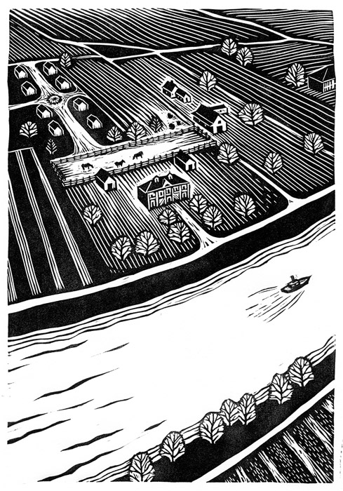
        Brigham does lots of great black and white work, too.  As an illustrator he does various little logos and spot illustrations that are very pleasing.  Block printing works so well when you want a big punch in a little size!  But I picked out these two medium-sized pieces to share because I find them especially interesting.  The bird’s-eye view has such a nice balance of detail and simplicity, and I especially like how the white around the large building gives it a special emphasis.  In the riverboat I particularly like the treatment of the smoke, which I know would never be my own style, and the treatment of the plants in the foreground, which is almost how I’ve worked sometimes, but not quite.  It’s interesting that the very bottom plants are just outlines, with no filling-in or texture, and that the black shape isn’t correlated with the white outlines; it’s its own separate layer of plants.
        A quick search didn’t turn up any picture books illustrated by Brigham, but I’d love to see him do some.  I think he’d do a wonderful job.


[Pictures: Wisdom, reduction block print by Neil Brigham;
Down East, reduction block print by Brigham;
Winter, linoleum(?) block print by Brigham;
Harvest, linoleum(?) block print by Brigham (All images from Neil Brigham.com).]

January 10, 2017

The Fantastic Leonardo

        Leonardo da Vinci (Italy, 1452-1519) is known as an artist and a scientist, and an all-around Great Mind.  He was clearly also a fan of speculative fiction.  Speculative fiction didn’t exist as such in the fifteenth century, of course, but what else do you call an interest in inventing inventions that can’t possibly be built with present technology?  Or sketching from life the habits of animals that don’t exist outside the imagination?  Or then again, perhaps Leonardo wasn’t making these things up.  Maybe he really did have flying machines and all manner of other magical devices.  Maybe he really did draw his dragons from life.  In the sequel to The Extraordinary Book of Doors (one of my current “works in progress” that isn’t getting much work or progress, alas) I’ve discovered that Leonardo would have had access to a mythical beast sanctuary patronised by his own patron, Francis I of France and Francis’s good friend the Abbess of Tarascon.
        At any rate, over the winter vacation we went to an exhibit about Leonardo da Vinci at the museum of science.  It had a lot of 3-D models built to replicate sketches from his notebooks, and these were wonderfully pre-steam-punky and proto-sci-fi for sure.  Alas, there was no mention of the bestiary Leonardo wrote, which includes entries on the basilisk, dragon, unicorn, phoenix, jaculus, and lots more.  After extensive on-line searching for digitised copies or pictures of the sketches that illustrated these writings, I’m beginning to suspect that perhaps Leonardo didn’t illustrate his bestiary at all.  So here for you to enjoy are some of his unconnected drawings of creatures.  
        This first dragon is sure proof that Leonardo visited the mythical beast sanctuary.  See how Chinese this dragon’s head is?  Where would an Italian man in France see an Asian dragon unless he travelled through an enchanted doorway to a garden in China?… which just happens to be the location of the sanctuary maintained by the Abbess of Tarascon.  Moreover, the fur is a unique touch, clearly not something that you would make up from traditional legends - ergo it must be drawn from life.
        This little dragon, on the other hand, is of European stock, but just a hatchling, no larger than the cats with which it plays.  During the renaissance dragons were generally considered symbolic, but this one is obviously an active part of the household or barnyard where Leonardo was sketching.
        Leonardo was clearly a man who was not only intensely curious about the observable facts of nature, but also equally enthusiastic about the visions of his imagination.  I believe this is a common theme among the most creative thinkers throughout history.


[Pictures: Two mechanical models based on sketches by Leonardo da Vinci, photos by AEGN;
Study of a dragon, pen and ink and metalpoint sketch by Leonardo, 1513 (Image from Universal Leonardo);
Detail from Cats, lions, and a dragon, pen and ink wash over black chalk by Leonardo, c 1513-15.
Young woman seated with a unicorn, pen and ink sketch by Leonardo, 1479 (Image from Universal Leonardo).]