June 12, 2023

Tiny Block Challenge Part I

         Because for me summers tend to be a slow season for art shows, etc., I decided to set myself a little challenge: to carve a tiny block a day for some number of days.  I actually never really specified the parameters for myself, seeing as it’s all arbitrary anyway.  Of course 30 is a standard number for such challenges, but I also believe in wiggle room, so I was thinking perhaps 25 tiny block prints over the course of a month.  On the other hand, so far I haven’t needed too much wiggle room, so perhaps I’ll get to 30 after all.  This post is the halfway progress report, as I have now done 15 tiny blocks in 16 days.
        Because these blocks are so small, it’s pretty quick and easy to carve them, but that is, in some sense, putting cause and effect in reverse.  These blocks are small because they’re actually the little scraps of rubber that get left behind for various reasons: the edges of the larger blocks if they don’t come out even when I cut them down into smaller pieces, the corners that get cut off if I’m trimming away background, the salvageable parts of blocks that get abandoned by students during classes…  Some of these scraps get used when I offer little free activities during which people get to carve their own mini block, but I still have lots of leftover bits.  So I decided to do the challenge because I had small bits of rubber, rather than using small bits of rubber because I decided to do a challenge.
        I had no intention of giving myself an assignment that would be more stressful than fun, so I brainstormed a list of possible subjects before I started, so that if I ever have a day when I don't feel any particular inspiration, I can easily pick something off my list.  Most of the items are specifically the sorts of things that make me happy, but which don’t seem to warrant a whole big full block print treatment.  See this prior post about Mini Prints, in which I mention how I think slightly differently about subjects that are going to be this small and this inexpensive.  (Although I have decided to raise my prices since 2016.)  This month’s “tiny prints” range from that same mini size which is up to about 3.5 inches, all the way down to a mere .75 inches.
         I’ve printed most of these with archival stamp pad ink rather than regular printing ink, as they’re too small to roll well with a brayer.  With a couple I’ve added a touch of additional color with colored pencil or marker, and with a few I’ve printed multiples per page.  One hasn’t had its official edition printed yet, because I’m planning to combine it with something still to come.  Here’s what I’ve done so far:
1.  Reading Glasses
2.  El Tenedor
3.  Giant Anteater
4.  Wasp
5.  adirondack chair (Summer Seats)
6.  border doodle (not yet printed)
7.  Peapods
8.  Dublin door
9.  Rubber Ducky (actually two blocks)
10. hummingbird and lily (Nectar)
11.  Little Cyclops
12.  Ladybugs
13.  Horseshoe Crab
14.  Race Point Light
15.  Kunchorn Waree
        Rather than post each of these separately on my web site, I’m putting together one page with all of them.  (The page isn’t finished yet, since I continue to make more and more, but here it is so far.)  I plan to bring a bunch of these tiny prints to my in-person shows, and I’ve ordered lots of new mini frames in various dimensions.  I look forward to seeing what sort of reception they get.  I hope they tickle others as much as they tickle me!
        Have you ever done a daily creative challenge of some sort?  And do you have any ideas for me?  I still have 10-15 to go!


[Pictures: All block prints and photos by AEGN, 2023.]

June 7, 2023

Book Week Scavenger Hunt

         Children’s Book Week was in May and I missed it at the time, partly because I’ve basically been boycotting them since the Rush Limbaugh fiasco in 2014.  But I believe in redemption and now that I look back at recent years it seems like Every Child A Reader, which runs Children’s Book Week, is doing more good than harm, so I’ve decided to play along with one of this year’s featured activities.  In keeping with the theme of this blog, however, wherever possible my selections come specifically from the realm of children’s fantasy, or (for a second choice) children’s non-fantasy or adult fantasy.

* Shooting Star - Stardust by Neil Gaiman, of course (see a little more here)

* Bright Idea - “Ali Baba and the Forty Thieves” (see a little more here)

* Character I Look Up To - A Little Princess by Frances Hodgson Burnett

* Real-Life Person Who Made Positive Change - Desmond and the Very Mean Word by Desmond Tutu and Douglas Carlton Abrams (see more here)

* Bonfire - Uh oh… I can think of plenty of books with campfires or cooking fires (how about Rumpelstiltskin by Paul O. Zelinsky) and plenty of books with  buildings on fire (how about Treasure of Green Knowe by L.M. Boston or Going Postal by Terry Pratchett) but I actually can’t think of any proper bonfires right now!

* Idea that Comes to Life - Harold and the Purple Crayon by Crockett Johnson (see a little more here, plus some wordless picture books with the same theme here)

* Team Who Works Together - Lots, as that’s one of the best themes!  But I’m going to go with The Scandalous Sisterhood of Prickwillow Place by Julie Berry (and also Kate and Sam to the Rescue by Anne E.G. Nydam)

* Book that Inspires Me - The Golden Key by George MacDonald (see more here)

* Invention - Frank’n’Stan by M.P. Robertson (see more here)

* Light Triumphs Over Darkness - Pretty much every one of my favorite books!  But to pick one that makes a real theme of light and dark, The Tale of Despereaux by Kate DiCamillo

* Sun - fable of “The Sun and the North Wind” by Aesop (see more here)

* Book Sparks Change - Ink, Iron, and Glass by Gwendolyn Clare (or perhaps The Extraordinary Book of Doors by Anne E.G. Nydam)


        Have you ever read any of these?  Which are your favorites?  Which books would you pick for these categories?  And how about discussing your choices with a child reader in your life!


[Image from Every Child a Reader]

June 2, 2023

Carter's Landscapes

         Thayer Carter is a painter and printmaker who began in New England, has travelled extensively, and now lives in New Mexico.  The travel is a key element in his work, as most of his scenes are views of specific places.  I’ve picked four that are particularly pleasing to me.
        I’ll start with the one that caught my attention in the first place, a view of the tiled rooftops of a city in Ecuador.  I’m a sucker for rooftop views, as you can see in many a previous post (including some by Ross, Bewick, Xiang, and Escher here and here).  There’s a nice variety of patterns in this one by Carter, all punctuated by the spires.
        A very different landscape is this tree caught in the sunlight.  Hills and ocean in the background just serve to set off the glorious halo of light.  This is a scene from a provincial park in Newfoundland.  It certainly looks idyllic in this deceptively simple woodcut.  Carter has made all the right choices about black and white and pattern.
        Another piece in which very simple lines build up into something much more complex, this grove of saguaro cactuses pleases me greatly.  I like the way the spines are mostly portrayed by tiny dots, and only around the edges are they lines.  Some of the cactuses are suggested by nothing except an outline of little criss-crossed spines.  This implies a wonderful sense of 
light.  The rest of the ridges and shape of the saguaros are portrayed with simple squiggly lines, but the arrangement of white and black again gives us a dramatic desert light.
        Finally, another architectural scene.  Once again, Carter does a wonderful job of catching the light.  The window frames are not outlined at all on the side where the light is strong, and areas in shadow are stark, solid black.  My favorite thing about this one is the power lines.  Generally when I take photographs when I’m travelling, I hate the intrusion of power lines into my pictures, especially when I’m photographing older architecture.  But here it’s become not a flaw but a feature, and the lines make a wonderful graphic design.
        Carter is another of those hundreds, if not thousands of block print artists that are not exactly household names, but who are doing incredible work that deserves to be seen and appreciated by more people.


[Pictures: Cuenca, Ecuador, woodcut by Thayer Carter, 2016;

Dildo’s Run, woodcut by Carter, 2019;

Saguaro, Sabino Canyon AZ, woodcut by Carter, 2008;

Arequipa, Peru II, woodcut by Carter, 2016 (All images from thayercarter.com).]

May 29, 2023

Words of the Month - C Food Special

         I’m always getting curious about random words that catch my attention, and looking up their etymologies.  It happened to be a strange coincidence that a bunch of words I recently looked up were all food words that started with the letter C, and so, my friends, we have ourselves a theme.  Since there’s really no more method behind my madness than that, let’s get started without further ado.


cabbage - English gained this word in the mid-fifteenth century from a French dialect, and to talk about a head of cabbage is redundant as cabbage simply means “head.”  (In fact there are an enormous number of words that derive from the same Latin root, so here are some of them with their own Words of the Month theme.)


canapĂ© - The French were using this word for finger foods by the late eighteenth century, and it seems to have been borrowed by English about a hundred years later around 1890, although possibly not really embraced until the era of speakeasies and cocktail parties.  The literal meaning of the word, however, is “canopy.”  So what’s the connection between fancy little sandwiches and a suspended covering providing shelter?  Well, since Roman times canopies were often suspended over couches or sofas as protection against insects, which meant that many of the Romance languages adapted the word “canopy” to refer to the couch.  Then somewhere along the line the word for couch was applied to the foods that are convenient to eat while seated on a couch instead of around a table - and are made by “seating” various toppings on bread or crackers.  So our canapĂ©s are really named after sofas that are named after canopies.


chutney - English-speakers borrowed the Hindi word chatni in 1813, along with the condiment itself.  The etymology of the Hindi word is “to lick” or “eat with an appetite.”  I certainly am happy to lick up a good chutney!


clove - Another food used to add flavor, cloves are a spice made from the dried buds of the clove tree.  The shape of those dried buds gives them their name, which comes from the Latin clavus meaning “nail,” (by way of Old French, of course).

Cloves of garlic, on the other hand, are completely unrelated.  That word goes all the way back to Old English, and ultimately from a root meaning “a thing that is cleft or cloven,” because of the way a bulb of garlic is divided into those separate cloves.


chestnut - The nut in chestnut, which appeared in English as chesten nut around 1510, is another redundancy, as the chesten part already meant “chestnut” (from French, from Latin, from Greek).  The Greeks probably borrowed the word from some language of Asia Minor, where the trees famously grew.  By the way, the secondary meaning of chestnut, “an old, well-known joke or anecdote” probably comes from the play “The Broken Sword” by William Dimond, in which two characters disagree over whether it’s a cork tree or a chestnut tree that features in story heard for “the twenty-seventh time.”


chai - While we’re on the subject of redundancy, “chai tea” is another one, since chai means “tea” in Hindi, which borrowed the word from Chinese cha.  (English tea is also ultimately from Chinese, though the form comes by way of Dutch, by way of Malay or Min Chinese.)  The reason chai in English refers to spiced tea, rather than plain tea, is that we borrowed both word and beverage as masala chai, which means “mixed-spice tea.”  It’s the most recent of today’s acquisitions, not becoming widely used in English until the 1990s.


cappuccino
- And while we’re on the subject of fancy beverages that didn’t become popular in English until the twentieth century, this espresso coffee drink is named for Capuchin monks, an order of Franciscans.  Capuchin means “little hood,” a part of the monks’ habit.  The coffee, however, is named for the color of these hooded robes, a reddish-brown that apparently is what you get when you add a little milk or cream to an espresso.  (I wouldn’t really know, as I’d pick chai any day!)


        I hope you enjoyed this little tasting of C foods!  And the next time you partake in one of them, take a moment to savor the joys of etymology and the history it preserves.


[Pictures: Red Cabbage, wood block print by Jacques Hnizdovsky, 1971 (Image from HMML Art Collection);

Sweet Chestnut, wood engraving from Nouveau dictionnaire encyclopedique universel illustre, 1885 (Image from OldBookIllustration);

Cappuccino Coffee, linoleum block print by Meg, 2019 (Image from her Etsy shop WanderingStarPrints).]

May 24, 2023

Dinosaurs at Work

         Allow me to introduce you to two recent small blocks featuring a new theme for me: dinosaurs.  Like lots of people, I’ve always been interested in dinosaurs, but for a couple of reasons they hadn’t heretofore been subjects of my block prints.  One reason is that I could hardly take my own photographs of them, so I’d have to use other artists’ versions as reference, which I usually try to avoid.  (Of course I have to refer to other artists’ work with mythical creatures, but with those I’m also free to change as much as I want to make them my own.  With dinosaurs, on the other hand, I need to stick to reality at least as much as we currently know it - which is shown only by other artists’ work.)  The second reason I haven’t done dinosaurs before is that I didn’t have any idea that would in any way bring something new or contribute something that hadn’t been done before - and probably much better - by someone else.  So, what changed?
        Parasaurolophus is the dinosaur known for having a large hollow crest on its head.  Scientists aren’t entirely sure what these crests might have been for or how they were part of the parasaurolophus lifestyle, but a current leading theory is that they were resonating tubes to give the parasaurolophus a wonderful booming call of some sort.  Parasaurolophus is also the dinosaur that was my son P’s favorite back when he had a more active interest in dinosaurs, and therefore I have a particular sentimental fondness for it myself.  And one day the idea came to me of a parasaurolophus singing… in a smoky nightclub… perhaps in the 1940s… Parasaurolophus Sings the Blues.
        Not too long after, I got the idea of a great blue heron riding a bicycle.  (I can’t break it down any further or tell you where that idea came from.)  But I was also playing around with ideas for a more “serious” realistic great blue heron design, so I was considering other bike-riding options, and that led me again to dinosaurs.  So there in my brain was something like perhaps an oviraptor or deinonychus riding a bicycle… but once again that vintage vibe seemed like even more fun… a dandy dinosaur riding a velocipede from around 1868…  Of course once I thought of velocipede, it had to be a velociraptor.  Contrary to their portrayal in “Jurassic Park,” velociraptors are actually a bit small to ride a human-sized bicycle, but the wordplay was irresistible: Velociraptor Rides a Velocipede.
        These are both small pieces, not quite minis, but definitely “just for fun”-sized.  Will there be more in the series?  I don’t currently have another idea, but I wouldn’t rule it out if something tickles my fancy.  What’s your favorite dinosaur?  And what do you think its favorite hobby might be?
        For more dinosaurian fun, check out these prior posts:

            Words of the Month - Dinosaurs

            Dinosaur Fantasy Books

            A winged theropod

            A robot-ish T. rex

            Where the dinosaurs might live in my neighborhood


[Pictures: Parasaurolophus Sings the Blues, rubber block print by AEGN, 2023 (sold out);

Velociraptor Rides a Velocipede, rubber block print by AEGN, 2023 (sold out).]


May 19, 2023

Where My Books Go

         Today’s poem is not exactly fantasy in its own right, but it certainly evokes magic.  It was used as a preface by William Butler Yeats to Irish Fairy Tales, published in 1892.

Where My Books Go

All the words that I gather,
   And all the words that I write,
Must spread out their wings untiring,
   And never rest in their flight,
Till they come where your sad, sad heart is,
  And sing to you in the night,
Beyond where the waters are moving,
   Storm-darken’d or starry bright.


        The first line is often quoted as “All the words that I utter,” and I do actually like that version better.  But I am unable to track down where that version comes from and whether it’s actually Yeats’s edit, or a misquotation.  (If anyone can actually tell me where the “utter” version originated, I’d be happy to hear it.)
        This poem, as I said, is magical, and it describes the magic of books: to cross oceans, to pierce darkness, to fly from heart to heart, and to bring comfort.  At any rate, that’s certainly my wish for my own books!  Unlike most of Yeats’s poetry, this one is very simple: no allusions to mythological figures, no allegories for the politics of the day, no deeply layered meanings…  Just a vision of the power of story.  Though simple, however, it is not simplistic, because the beauty of the images gives this short poem intensity.
        William Butler Yeats (Ireland, 1865-1939) is hardly an obscure poet, and given his love of mythology and Irish folktales, it’s no wonder that he’s appeared in this blog before.  You can revisit The Stolen Child and The Song of Wandering Angus.  But really, if any poem or book has ever come where your heart is, you can attest to the truth of this poem.  Whether your heart was sad before the words flew to it, or simply became more full of joy after, you know where books can go.  And any time I hear from a reader that any of my words (or pictures) have done that for them, it reminds me exactly why I keep doing this.


[Picture: Greenwood Cove, Mendocino Coast, five-color multi-block wood block print by Tom Killion, 2004 (Image from tomkillion.com).]

May 15, 2023

Aliens Among the Diné

         DinĂ© (Navajo) artist Duhon James works in wood and linoleum block printmaking, using lots of symbols of his home, such as sheep, corn, hogans, and stars.  But to these traditional symbols he adds… space aliens.  I don’t know whether James thinks of his depictions as sci fi or fantasy, exactly, but I do get the idea that he thinks of them as speculative.  His aliens seem to be about connections, the unknown, and maybe a bit of satire.  In the first piece a UFO is beaming up a traditional hogan, while the caption WĂłshdÄ™́Ä™́ says “Come In.”  This leaves a lot of questions: are the aliens welcoming the people?  Is this frightening or awe-inspiring?  What will happen next?  Questions are what speculative fiction is all about.
        The next piece says “Yá’át’ééh,” which means “Greetings,” or “Hi.”  The aliens break with alien tradition by wearing 
traditional Di
nĂ© hats and hairstyles, emphasizing both the connections with the people and the questions about those connections.  The font of the text is old-fashioned computer font, and I tried to look up the symbol at the bottom to see whether it’s a traditional DinĂ© symbol, but I couldn’t find out what it is.
        The third piece is entitled “Great Seal of the Abduction,” and the seal in question is the Great Seal of the Navajo Nation.  Once again we’re repeating this theme of having all the symbols of a traditional Navajo life being beamed up by a UFO.  I don’t know exactly what messages James is expressing, or what vibes DinĂ© viewers might be getting, but for me these seem to raise questions about how to embrace and be embraced by the new, modern, ever-evolving times, 
without being completely uprooted and subsumed.
        For all the potentially serious questions, however, these pieces also definitely have a sense of humor and funky charm that appeals to a lot of people.


[Pictures: WĂłshdÄ™́Ä™́’ linoleum block print by Duhon James;

For What We are Exposed & Encountered to the Star People, linoleum block print by James;

Great Seal of the Abduction, linoleum block print with watercolor by James (Images from First American Art Magazine and Etsy shop DuhonJames).]

May 10, 2023

Twelve Views of Cherry Blossoms

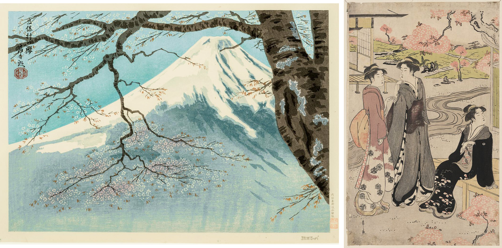
         This is one of my favorite times of year, when we take our evening walks and it’s still light, and the scents of dozens of various flowering trees and shrubs waft across us.  When I started to look at block prints to celebrate this, it immediately became clear that I would have to focus in a bit - and even so you can see I’ve crowded this post full!  So today I’m looking at some of the different ways Japanese printmakers have portrayed cherry blossoms.  This first grouping includes different views of distant trees with large clouds of blossoms.  The first two are by Hiroshige and in both the areas of blossoms are inked with shaded pink to accentuate the edges of the trees.  In the first there is a scattering of darker pink spots for added detail and texture, while the second actually has myriad blossoms carved out, with their outlines printed in light pink.  The carving of all that detail must have been quite a job!  The third piece in this group is by Toshi Yoshida, and the clouds of pink cherry bloom are given black outlines, and no texture.
        In my second pairing both have the petals of the blossoms carved out and left white.  The difference in approach between the two is that in the first the white carving shows up against the background of the scene, while in the second it is providing detail within a pink cloud.  That makes the flowers look a little sparser on the first, each flower individually carved against the blue of mountainside and sky.  Although the second also has individually carved flowers, they read as if there are many more flowers than just those that are carved.  The pink areas remind me of a textile pattern.
        If we really want to focus on individual flowers, here are a couple of pieces that feature single branches of a flowering cherry tree.  Although they were made about a century apart, they both use black outlines to give precision to the edges of the petals and the lines of the stamens.  In the second one, however, Kiyu has also employed a completely different technique for part of the branch: a grey silhouette.  It’s quite detailed in its contours, but includes no details of color, texture, or outline.
        Next I have two pieces that include a whole cloud of blossoms, but (unlike the pieces in the first grouping) seem to depict each individual flower.  The first is a large print that actually served as a travel poster, advertising the famous cherry trees of the Juho-ji Temple.  It was printed with only three colors (pink, blue, and black), indicating that it was a fairly low-cost production, but the amount of work it took to carve out the black outlines of each flower is astonishing!  I’ll also point out that this piece shows a cherry blossom viewing party, which is an extremely popular subject for Japanese prints, but is usually of far less interest to me than the scenery.  In this case, however, I really enjoy it (probably because even though there are lots of people, they’re still dwarfed by the tree).  The second is about 200 years later, and uses a much simpler technique.  It looks like it involves three blocks: the background inked with a gradation, the branches, and the blossoms, carved as a silhouette and inked with variegated pink.
        That one is actually the most recent of today's pieces, but still looks relatively traditional.  For my final grouping I’ve selected a few depictions of cherry blossoms with a more “modern” look.  One in black and white includes the cherry petals as both positive and negative: carved white within the cloud of the tree, and carved black as they scatter down on the person below.  The charming bird flies over a single blossom and bud, which are simple white shapes against the dark blue background, given just a little detail by simple pink and red shapes representing petal edges and stamens.  Then the final piece is just an enormous mass of pink.  I can’t tell exactly how many blocks are involved, or how many different colors of layered ink, but it’s fairly complex.  The carving is somewhat rough and abstract in shape, but the way the layers build up to give depth and detail is quite amazing.
        I hope you’ve enjoyed this hanami, “flower viewing.”  My own favorite flowering tree is the hawthorn in my back yard, and if it rains at the wrong time all the petals get knocked off before I’ve enjoyed them, which certainly underscores the transient beauty of blossoms.  In these woodblock prints, however, we get to capture and preserve some of that beauty.  No, it isn’t the same as seeing them (and smelling them) in person, but we artists still keep trying!


[Pictures: Yamato hasedera, woodblock print by Hiroshige, 1859 (Image from Library of Congress);

Yoshitsune’s Cherry Tree and the Shrine of Noriyori, woodblock print by Hiroshige, 1855 (Image from MFA Boston);

Sankei-en, woodblock print by Toshi Yoshida, 1935 (Image from Honolulu Museum of Art);

Cherry Blossoms at Tachibo Village, woodblock print by Tokuriki Tomikichiro, 1950s (Image from MFA Boston);

Niwa no hanami, woodblock print by Eishi, between 1788-91 (Image from Library of Congress);

Cherry Blossoms, woodblock print by Kawarazaki Shodo, c. 1950s (Image from Panteek);

Cherry Blossoms in Moonlight, woodblock print by Ichikawa Kiyu, mid 1800’s (Image from MFA Boston);

Cherry-blossom Viewing Party at Juho-ji Temple, woodblock print by Miki Tangetsu, c 1804-18 (Image from MFA Boston);

Hanging Cherry Tree, woodblock print by Namiki Hajime, 2007 (Image from Ukiyo-e.org);

The Best Blooming Time, woodblock print by Kozaki Kan, c. 1980’s (Image from Ukiyo-e.org);

A Bird Flying Over A Cherry Tree Blossom, woodblock print by Azechi Umetaro, 20th century  (Image from Ukiyo-e.org);

The Fragrant Red Cherry, woodblock print by Hao Boyi, 1995 (Image from Ukiyo-e.org).]

May 3, 2023

A to Z 2023 Reflection: &

         My theme this year was Block Printed Alphabet Squared, in which I planned to feature a relief block printed alphabet for each letter.  Alas, I seem utterly incapable of keeping things simple, and I ended up piling in multiple alphabets for each letter.  After all, how could I be so heartless as to turn away all the extra alphabets I discovered?  So I put way more time and effort into the research than I had intended.  On the other hand, I got everything drafted before April, which was lucky, since April turned out to be a very busy month for me.  But next year I’m going to give myself more limits, and this time I really mean it.
        I did manage to do lots of visiting this year - indeed, too many to list them all here - and I enjoyed lots of fun, interesting, and diverse themes.  And, as always, I very much appreciated those who came by and left comments here.  It’s always cool to see how different people gravitate to different styles and subjects of art.  Plus I always hope I can introduce a few people to the joys of relief block prints!
        I shall now continue to follow my tradition of using the Reflections post to squeeze in a few more bits that didn’t fit into the main alphabet.  These are the oddities.  While most people think of an illustrated alphabet as depicting words that begin with each letter, a few of the alphabets I found took a different approach.  
The Infants’ Guide to the Alphabet and first principles of pronunciation, from 1826, uses different strategies for different letters, but for some it’s about the sound of the name of the letter.  C is for Sea, I is for Eye, and U is for Yew.  I’ve also included R and Y because they strike me as neither one thing nor the other, and thus particularly strange choices.  This booklet does have rather pleasing little wood engravings, though.  I especially like the eye.
        
The Child’s Guide to Spelling and Reading, from 1810, also tries to demonstrate the sounds of the letters, this time mostly with onomatopoeia.  Z for buzzing is excellent (although I’ve heard of a gadfly, but never a gad-bee).  I really like F for the wind and H for the mouth breathing.  R for the dog snarling and I for the mouse squeaking also make sense, but about some of the others… I have questions.  I can kind of make a grunting M sound, but it hardly seems like a noise likely to help a child learn their letters.  Does the frog croak with X because Aristophanes has them say “koax koax” in The Frogs?  And does a hare really squeak W?  These little wood engravings are pretty crude (especially when compared with Bewick from the same time period), but I do like the wind, and the little Gad-bee is actually pretty cute for a fly.
        Another odd choice is W for Wren, in the Pictorial Lesson Book for the Very Young.  How this is supposed to help children learn the alphabet I do not know, and I’m reminded of the tongue-in-cheek alphabets in which A is for aether, G is for gnome, K is for knight, P is for pterodactyl, and so on.  It’s fun if that’s your theme, but a very strange thing to put at the end of an otherwise straightforward alphabet.  To go along with the wren I’ve got a couple of odd birds from An Alphabet of Birds.  In this case there’s nothing wrong with the alphabet - Albatross is at A and Titmouse is at T, just as you’d expect.  It’s the coloring I take issue with, as albatrosses are grey and white, and titmice are grey.  (There are some colorful tits, but more in the blue and yellow range; I don’t believe there are any red ones.)
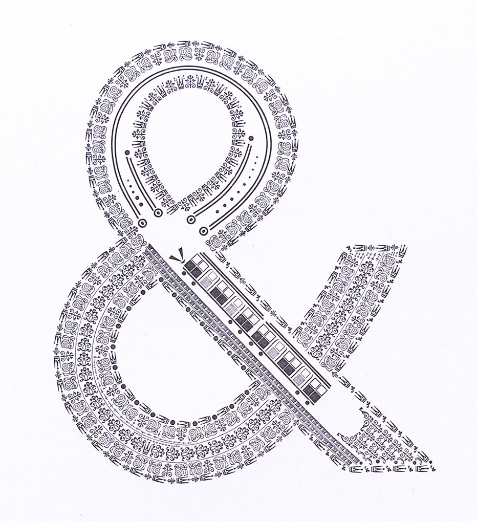
        Finally, let’s end this year’s A to Z Challenge with the “letter” that often ended English and American alphabets in the early nineteenth century: &.  At the top of this post is an ampersand created out of other little type dingbats by Starshaped Press.  To learn where the word “ampersand” came from, read this prior Words of the Month post.  I’ve also given you a few little alphabet verses in which & plays a character.  In the colored one you need to pronounce it “ampersand” to make the verse scan right, but in the un-illustrated one I think it scans better if you read “etcetera” instead.  Poor & may be 
considered a letter of the 
alphabet in many of these primers, but it seldom gets an illustration because you can’t exactly say “& is for…”  What, &romeda?  &roid?  &ean Condor?  So instead I’ve just got a little collection of &’s as they appear in some of these alphabets.
        The moral of & is that even if we count it as the last letter of the alphabet, it’s impossible for it to be the end.  They all lived happily ever after… &…

[Pictures: London Underground, letterpress design from The Well-Traveled Ampersand by Starshaped Press, 2017 (Image from Starshaped Press);
Sea, Eye, Arrow, Yew, Double-Yew, Weigh, wood block prints from The Infants’ Guide to the Alphabet and first principles of pronunciation, 1826 (Image from British Library);
Wind, Mouth, Mouse, Bear, Dog, Hare, Frog, Gad-bee, wood engravings from The Child’s Guide to Spelling and Reading, 1810 (Images from University of Washington);
Wren
, wood engraving from Pictorial Lesson Book for the Very Young, 1849 (Image from Toronto Public Library);
Albatross, Titmouse, hand-colored wood engravings from An Alphabet of Birds, c1854-58 (images from University of Florida);
Y, Z, &, letterpress from Uncle Buncle’s A.B.C., 1841 (Image from British Library);
Hand-colored wood block print from The History of A, Apple-Pie, 1858-1865 (Image from University of Washington);
Collection of & from
(First 2) The Princess Royal’s First Step to Learning, 1846 (Image from Toronto Public Library);
The Golden Alphabet of Natural History, 1826 (Image from Toronto Public Library);
The Infants’ Guide to the Alphabet and first principles of pronunciation, 1826 (Image from British Library);
Richardson’s Juvenile Cabinet, 1830 (Image from Toronto Public Library).]