July 8, 2022

Three Merpoems

         Today I have excerpts from three merfolk poems to share.  They’re all too long to repeat in full, and they’re all rather wordy and repetitive anyway, so I thought I’d just give you some of the highlights from each.  The first two are a pair by Alfred, Lord Tennyson (UK, 1809-1892) and come from his first solo collection of poems published in 1830.  Entitled “The Merman” and “The Mermaid,” they share the same structure, and each begins with the question “Who would be a merman/mermaid… on a throne?”  The poems then proceed into a fantasy of the carefree lives of the merpeople, concerned only with frolicking about and flirting with each other.  The mermaid dreams of being loved by everyone, while the merman dreams of kissing all the mermaids.  It’s fluff, but there are some fun descriptive passages.


There would be neither moon nor star;
But the wave would make music above us afar —
Low thunder and light in the magic night —
Neither moon nor star.
We would call aloud in the dreamy dells,
Call to each other and whoop and cry
All night, merrily, merrily;
They would pelt me with starry spangles and shells,
Laughing and clapping their hands between,
All night, merrily, merrily,
But I would throw to them back in mine
Turkis and agate and almondine…


Till that great sea-snake under the sea
From his coiled sleeps in the central deeps
Would slowly trail himself sevenfold
Round the hall where I sate, and look in at the gate
With his large calm eyes for the love of me.


The first excerpt is the merman’s fantasy, and I particularly like the image of “low thunder and light in the magic night” far beneath the surface of the ocean.  The second bit is the mermaid, and I like her description of the sea serpent “with his large calm eyes.”

        For a different take on merfolk lore, here’s “The Forsaken Merman” by Matthew Arnold (UK, 1822-1888), which is from this poet’s first published collection as well (1849), which may imply something about how sober, serious elderly poets don’t write about merfolk!  At any rate, this poem reverses the common folktale trope of a human abandoned by a wife from one of the magical races.  (See a prior post for some of the ways this usually plays out in selkie lore.)


Children dear, was it yesterday
We heard the sweet bells over the bay?
In the caverns where we lay,
Through the surf and through the swell,
The far-off sound of a silver bell?
Sand-strewn caverns, cool and deep,
Where the winds are all asleep;
Where the spent lights quiver and gleam;
Where the salt weed sways in the stream;
Where the sea-beasts, ranged all round,
Feed in the ooze of their pasture-ground;
Where the sea-snakes coil and twine,
Dry their mail, and bask in the brine;
Where great whales come sailing by,
Sail and sail, with unshut eye,
Round the world for ever and aye?


“The sea grows stormy, the little ones moan.
Long prayers,” I said, “in the world they say.
Come,” I said, and we rose through the surf in the bay.
We went up the beach, by the sandy down
Where the sea-stocks bloom, to the white-wall’d town.
Through the narrow paved streets, where all was still,
To the little grey church on the windy hill.
From the church came a murmur of folk at their prayers,
But we stood without in the cold-blowing airs.
We climb’d on the graves, on the stones worn with rains,
And we gazed up the aisle through the small leaded panes.
She sate by the pillar; we saw her dear:
“Margaret, hist! come quick, we are here.
Dear heart,” I said, “we are long alone.
The sea grows stormy, the little ones moan.”

But, ah! she gave me never a look,
For her eyes were seal’d to the holy book.
Loud prays the priest; shut stands the door.
Came away, children, call no more.
Come away, come down, call no more.


There are a few interesting points about Arnold’s story.  For one thing, the human woman has gone down into the ocean to be with the merman (I like the description of that underwater realm in the first excerpt).  But it’s when she hears church bells that she returns to the land for fear that she’ll lose her soul with the merfolk.  For another thing, the merman is caring for the children as a single father and he obviously really loves and misses his wife.  The church is slightly ambiguous - it’s blinding a mother to the love of her husband and the needs of her children, even as it is a holy place where she sings joyfully.  Finally, although the poem ends with the merfolk “left lonely forever,” we do catch a glimpse of the human woman gazing out at the sea with a sigh and a sorrow-laden heart, missing her children.  It seems to me that her departure from the ocean looks a lot like Beauty leaving the Beast: she says she needs to go home, and he tells her to go, but to come back.  Once she gets there, she seems to forget all about him.  In Beauty and the Beast of course she does return at the last possible moment, and save the Beast and live happily ever after.  Do you think there’s a chance that could happen for this family, as well?


        You can read the poems in their entirety here: The Merman, The Mermaid, The Forsaken Merman.


[Pictures: Mermaid, color woodcut by Russian artist whose name I can’t make out because it’s in Cyrillic, 1915 (Image from StardustPrintShop);

Sirenes, engraving from Symbolorum & emblematum by Joachim Camerarius, 1590-1605 (Image from Linda Hall Library);

Proteus, wood block print from Emblematum libellus by Alciato, 1546 (Image from Glasgow University).]

July 4, 2022

America the Beautiful

         I know there are many people who are finding it a little difficult to “celebrate freedom” today when half of the people in this nation have just had federal protection stripped away from their right to personal bodily liberty.  I feel that, too, but to me rather than refusing to celebrate, this is all the more reason to celebrate the good things, which are why we need to keep working as hard as we can to help the country we love live up to its best possible ideals.  This is my homeland, land that I love, and so today I’m celebrating with block prints illustrating what perhaps should have been our national anthem: a poem written by Katharine Lee Bates usually called “America the Beautiful.”  The version we sing is her 1911 revision.

O beautiful for spacious skies,
For amber waves of grain,
For purple mountain majesties
Above the fruited plain!
America! America!
God shed His grace on thee
And crown thy good with brotherhood
From sea to shining sea!


        The spacious skies are depicted by Frances H. Gearhart (USA, 1869-1958), about whom you can learn a bit more in a previous post.  This sky has a wonderful subtlety of color, with multiple blocks each with washes and gradations of color.  Gearhart’s skies make we wish I could fly!
        For amber waves of grain I decided to go with a close-up for variety, and I offer this woodcut of a cornfield by Jacques Hnizdovsky (Ukraine/USA, 1915-1985), another artist you can revisit in a prior post.  Okay, I grant you, this piece has neither amber nor waves, but it does capture, as Hnizdovsky’s work always does, the astonishing geometry in organic things.  Certainly this field is abundant, and it reminds me just how much I love fresh corn on the cob.
        Purple mountains’ majesties were easy to find, being a very popular subject for artists!  I had a tough time deciding, but in the end I went with a view of mountains that isn’t even purple.  (After all, this blog is called “Black & White” for a reason.)  This one is by Tom Killion (USA) who is primarily known for his Japanese style printmaking.  The precision in all the little trees is impressive, but I particularly love the white peaks against the clouds that seem to be rushing across the night sky.
        The fruited plain made me think of an orchard, and I’ve chosen this one by Linanne Armstrong (USA).  There’s drama and interest in the pattern of shadows across the ground between the straight rows of trees, but I also like the pop of color in the fruit.  Plus one apple sits on the ground, showing us that this fruit is ripe and ready to pick - more of that abundance that we can truly enjoy only when we make sure it’s available to everyone.
        And finally, a shining sea, this one on my coast of the USA, the east.  It’s by Linda Mahoney (USA), and I particularly like the way she uses the Japanese moku hanga technique, but keeps her carving simple and a little rougher than in traditional Japanese blocks.  I also appreciate that she tells us that this piece was made with 4 blocks and 8 pressings.  This surging tide is sure to be cold, so I think I’ll stick to a walk along the beach!
        This Fourth of July I urge all citizens and residents of the United States to take a moment to celebrate how beautiful this land is, and how precious are the dreams of its people, so that we don’t let frustration and cynicism blunt the love that gives us a reason to keep moving forward, one step at a time.


[Pictures: Clearing, color woodblock print by Frances H. Gearhart, undated (Image from Dalton’s);

Corn, woodcut by Jacques Hnizdovsky, 1971 (Image from WorthPoint);

Lembert Dome, Tuolumne Meadows, wood block print by Tom Killion, 2000 (Image from TomKillion.com);

Afternoon in the Orchard, linocut by Linnane Armstrong, 2011 (Image from Whidbey Life Magazine);

Coast Guard Beach, Spring Tide, wood block print by Linda Mahoney, 2021 (Image from LMahoneyPrints.com).]

June 29, 2022

Words of the Month - Wordle Lit

         Wordle mania is sweeping the world, and I am absolutely on board with this bandwagon.  I’ve always loved Master Mind, and I’ve always loved words, so yeah, Wordle seems pretty perfect for me.  (And see a post about one of my other favorite word games: Babble.)  I also enjoy a number of the Wordle spin-offs: Dordle, Quordle, Hurdle, Octordle…  And in this spirit I have just invented a new literary form: Wordle Lit.  (Or, to carry on the punnish trend of the other names: Wordlit.)  This is stories or poems expressed in exactly six 5-letter words.  I had some fun amusing myself fooling around with the idea, and I share with you today a few of my attempts.
        I’ll be honest (as I always try to be): super short, constrained stories and poems are not my natural taste.  (See a prior post about haiku for my flippant contribution to that too-short genre.)  I’ve been trying to write flash fiction recently as a challenge to myself, and have managed only two stories so far that come in under 1,000 words, and another four or so under 1,500.  I’m naturally a lot wordier and more expansive than that.  So no, I don’t really anticipate that my new-fangled Wordle Lit will actually contribute anything truly 
great to the world’s literature.  Still, it’s an entertaining challenge.  How do you work within the English language’s grammar, which demands -s in some places and -ed in others, messing up the letter counts of words?  Then there’s the exclusion of the whole slew of vital “little words,” including a, the, and, but, he, she, they, and all manner of other bits and bobs necessary for the grammatical functioning of most sentences.  How many messages can you even express with so much constraint?   On the other hand, everyone loves to praise “spare” prose and to hate on adverbs (see a prior post in which I push back), and here we’re in a format that makes the adverb options so slim as to be almost impossible anyway.
        Consider this distillation of a classic: SIREN SINGS WHILE LURED SHIPS CRASH.  It sounds more like a newspaper headline than poetry - an effect of having to leave out those little words.  It also might make more sense as Sirens sing instead of Siren sings - but I’ve had to compromise to follow the English language’s requirement that letters be added for various grammatical functions.
        I’ve decreed that contractions are unacceptable, but what about possessives?  If a word is properly spelled with an apostrophe, is that automatically unacceptable?  I have ordained that I will allow proper nouns, even though Wordle doesn’t use them.  After all, stories are very often about people and other proper nouns.    The more I think about Wordle, and even more about Wordle Lit, suddenly I become hyper aware of words like hyper and aware and words that just happen to be five letters long.  Could they be the basis of a story?
        If you choose to write your own Wordle Lit, no, you don’t need to do the color coding, which I artificially added afterwards, just to make it look more in the spirit of the thing.  So, are you a pithy, clever writer who can come up with something truly marvelous in my new form?  Please share!


[Pictures: Wordle Lits by AEGN, 2022.]


June 24, 2022

Who Is Catching Whom?

         Any time you hear a story, it’s wise to consider who is telling it.  “History is written by the victors” is the most obvious reminder, but every story has a particular perspective depending on the teller.  The idea of a sailor catching a mermaid for a wife may be an old favorite, but we always think of it from the same point of view: the human, not the merperson; the male, not the female.  And this perspective has the effect of making the human male the active protagonist while the mermaid becomes the passive prize to be won.  Consider all those selkie stories discussed in this prior post, in which the selkie is forced onto land when her sea skin is stolen by the human man.  Well, story spinner that I am, it is obvious to me that the mermaid, too, would have a point of view.  And feminist that I am, I’m all about relationships that are equitable and mutually satisfactory.  If a fisherman has caught a mermaid, this strikes me as pleasing and romantic only if the mermaid has equally caught the fisherman.
        (I will note that “The Little Mermaid” is told from the mermaid’s point of view with the mermaid as the protagonist, but still, it’s hardly a healthy, equal relationship.)
        (I will also note that you can enjoy some other block prints of merfolk here.)
        I remembered an interesting piece by Boris Artzybasheff that has neither top nor bottom, as it can be viewed equally either way.  (You can see that piece here.)  This idea struck me as perfect for my mermaid and her fisherman (or, of course, my fisherman and his mermaid).  I actually made a little sketch of the idea a number of years ago, but only came back to it last month when I was looking for ideas of blocks to carve during my spring shows.  I had fun on the pattern and texture of the fisherman’s sweater, but otherwise it’s a fairly simple piece: cheerful, friendly, a little cartoonish in style, and printed in a mix of bright watery colors just for fun.  I made the design balanced and symmetrical, and I labelled it with the title on one edge and the signature on the opposite so that both orientations are equal.
        The real complication comes when I go to mat, frame, and display.  As soon as the piece is hung on a wall, a decision has to be made.  Who is catching whom?  I’ve matted one of the edition, and put the label on the back oriented to the side, so as to determine neither a top nor a bottom.  But the framed piece has to have a top.  Which way up would you hang it?  Or would you switch it every once in a while and see whether anyone notices?  Or, of course, you could always get two (they’re not expensive - ha!) and hang one each way.  What story will you tell about this happy pair?


[Picture: Big Catch, rubber block print by AEGN, 2022.]

June 20, 2022

Juneteenth

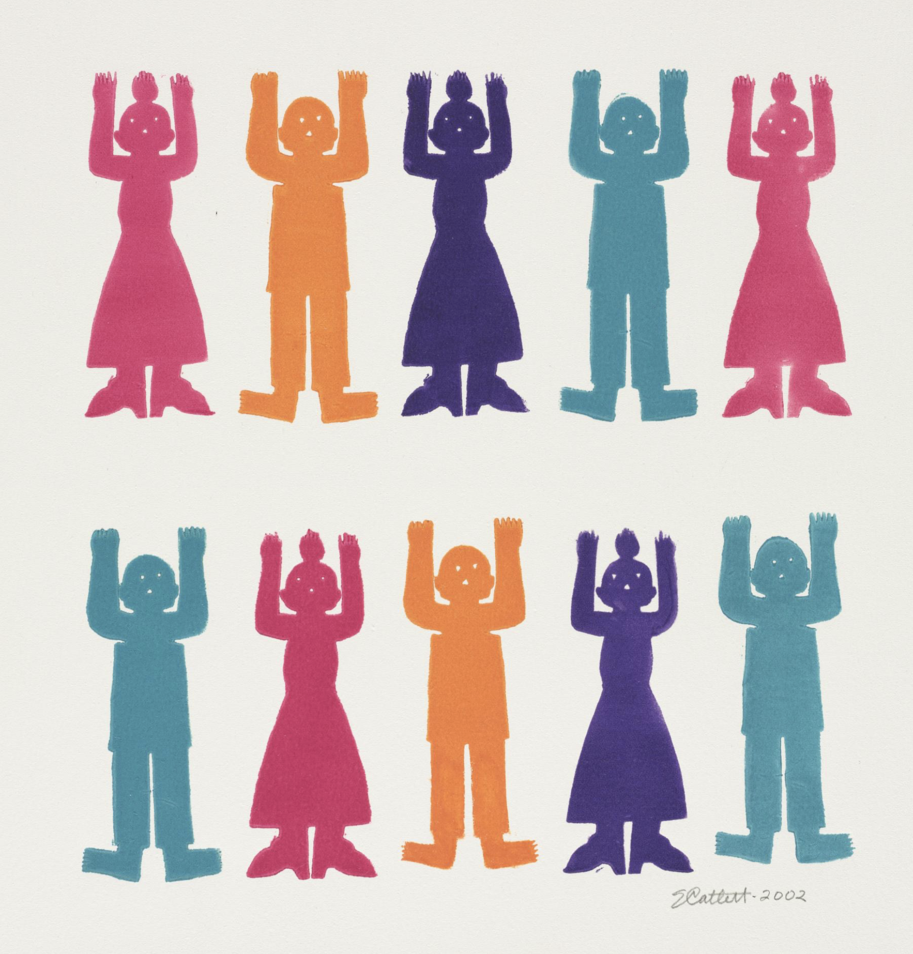
         I wasn’t able to find any block prints directly related to Juneteenth, so I’m celebrating instead with a couple of African-American printmakers whose work celebrates their identity and experience.  I’ve started with a piece by Elizabeth Catlett (USA/Mexico, 1915-2012).  I’ve featured her before, so you can revisit a couple of pieces here and here.  She’s done a lot of very moving work exploring the experiences of Black Americans during slavery and through the twentieth century.  Today, however, I’ve picked a piece that is more celebratory.  The silhouetted people don’t have obviously happy expressions, but their bright colors and the title of the piece “Magic People,” make me feel that it’s about resilience and survival and working together to stand up together.
        Next a beautiful piece by Deborah Grayson, an artist I know very little about.  In her statement she talks about exploring silence and what it reveals and protects about the inner lives of Black women.  I love the expression on this face, with the closed eyes looking inward and the hint of a smile at what she sees there.  As a white woman I can’t speak for what the experience of Juneteenth means for Black people in this country, but it seems to me that while it is a celebration of the end of slavery, it’s also an acknowledgement of the disgraceful injustices that were supposed to have ended much sooner (or, indeed, should never have happened at all), and a reminder to keep envisioning a future that addresses and eliminates the injustices with which we’re still plagued.  Today’s first piece represents the celebration, and this second piece represents that dreaming of the future.
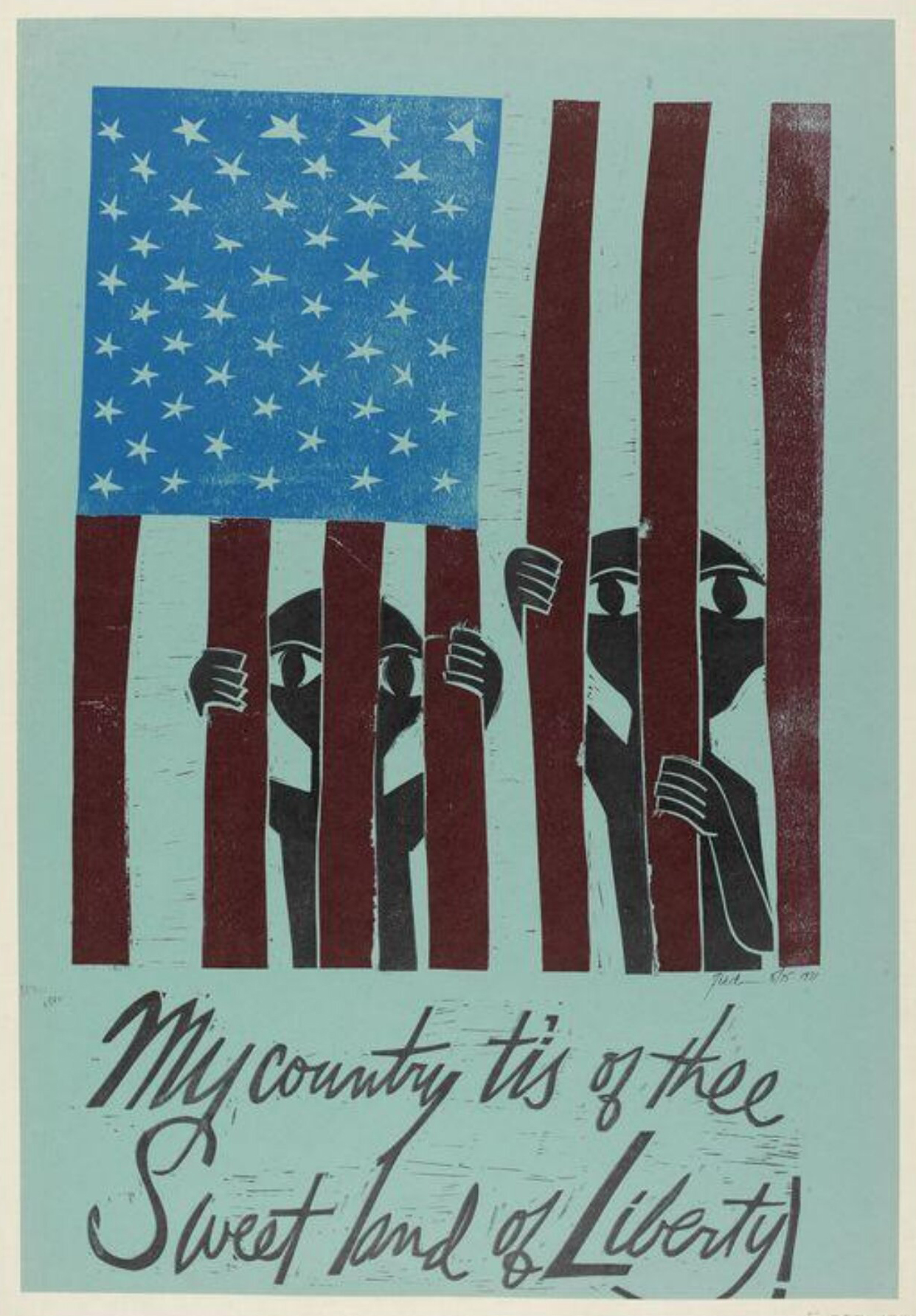
        The third piece is by Paul Peter Piech (USA/Wales, 1920-1996) who is not African-American, but whose piece seemed appropriate to represent that third element of Juneteenth: the acknowledgement of the wrongs that still need to be addressed.  (I’ve featured Piech before, so you can see more of his work here.)
        My own awareness of Juneteenth is relatively recent (as in, I'd never heard of it as a child).  Do you have any stories or memories that make this holiday especially meaningful to you?


[Pictures: Magic People, linoleum cut by Elizabeth Catlett, 2002 (Image from Cleveland Museum of Art);

Innervisions 2 (Unfurling), relief block print by Deborah Grayson (Image from GraysonStudios.com);

Liberty, linoleum block print by Peter Paul Piech, 1971 (Image from V&A).]

June 15, 2022

Fantasy Botany

         This week I’ve finally been giving my garden some attention, so it seems a good time to share a bit of fantastical botany.  I have to start with the classics, which of course may or may not have been considered fantasy at the time.  The most famous is probably the mandrake, which is a a real plant, but had many fantastical properties attributed to it.  The root was said to be shaped like a person, and to shriek aloud when uprooted.  This scream could kill the hearer, but it was worth it to try to obtain the root because it could be used in love potions and flying ointments, as well as other magical brews.
        There’s a long history of fascination with plants that blur the line with animals, and I’ve featured a number in prior posts including: the vegetable lambs
        Alice encountered a garden of sentient flowers Through the Looking Glass, but really, they were so rude they were hardly worth knowing.  Consider instead how much fun illustrators have had with the nursery rhyme 
Mary, Mary, quite contrary, how does your garden grow?
With silver bells and cockle shells, and little maids all in a row.
One need not necessarily interpret this to mean that the bells, shells, and maids were actually growing in the garden as plants, but it’s so much fun to illustrate them that way that there are many illustrations turning contrary Mary’s garden into a small fantasy world.
        Another place to find fantastical plants is the Voynich manuscript.  I’ve written before about this mysterious cipher manuscript, which dates to the fifteenth century and includes illustrations of plants most of which are not quite identifiable, and many of which seem to be entirely made up.
        A strange book that may have been inspired at least in part by the Voynich manuscript is the Codex Seraphinianus, made by Italian artist Luigi Serafini between 1976-1978.  It is in the form of an encyclopedia of a strange world, full of surreal and fantastical illustrations, and it is written entirely in a meaningless script.  The first chapter is on 
plants.  The illustrations are bright, detailed, sometimes grotesque or disturbing, but often beautiful and delightfully quirky.  Because of the indecipherable text, it’s impossible to know what any of these plants are called, or exactly what properties may be attributed to them.
        The Land of Neverbelieve by Norman Messenger, on the other hand, is a similar sort of encyclopedia of an imaginary world, but it’s written in English, so you get to learn fun facts about the marvelous illustrations, such as knowing that the cross-section of the chocolate tree depicts its delicious peppermint center.  This book includes all manner of fantastical creatures and things, but is especially rich in marvelous trees.
        I’m not going into too much depth in this post because Fantasy Botany is on my list of possible future A to Z themes, so I need to save up.  On the other hand, that’s no reason not to give plants a little attention in the meantime.  So, how does my garden grow?  With golden tomatoes, and tasty herbs, and pretty rudbeckia scattered all over the place.  What would you like to grow in your fantasy garden?


[Pictures: Mandrake, wood block print from Ortus sanitatis by Johann Prüss, 1499 (Image from Internet Archive);

My Lady’s Garden, color wood block print by Walter Crane from The Baby’s Opera, printed by Edmund Evans, c 1877 (Image from International Children’s Digital Library);

Mary, Mary, illustration (possibly by Howard Del?) from Mother Goose’s Melodies for her Little Goslings, 1881 (Image from International Children’s Digital Library);

Two plants from Voynich Manuscript, c 1401-1599 (Image from Yale University Library);

Illustrations from Codex Seraphinianus, by Luigi Serafini, 1981;

Illustration from The Land of Neverbelieve by Norman Messenger, 2012.]

June 10, 2022

Shining the Light through Block Prints

         I recently got a chance to look around Yale University’s beautiful Humanities Quadrangle building (formerly known as the Hall of Graduate Studies, built in 1932), and I suddenly recognized an old friend.  No, not one of my classmates at the reunion, but Jost Amman, the sixteenth century wood block artist and carver.  I’ve featured Amman’s self-portrait on this blog (as well as a number of his other pieces), and there he was on a stained glass window with the light coming through.  Further exploration revealed that many (if not all) of the windows were decorated with reproductions of wood block prints.  What fun to recognize some, and to meet new friends!
        The original wood block print from which this next window was adapted dates to 1493, and presumably was chosen because it depicts a theater, coming from a book of plays.  It’s a fantastic image with lots of great details, like the crowded audience and more people coming up the steps, and the elaborately decorated pillars and other architecture.  However, somewhere along the line someone decided to censor the label on the scroll above the ground floor - which was probably the right choice on a college campus, since the original block print says “Fornices,” revealing that the ground floor
 is a brothel.  Apparently a draftsman in the office of the building’s architect (James Gamble Rogers) picked for inclusion in the architecture the opening line of the 1921
popular novel Scaramouche, thinking it a bit of a prank to feature something so distinctly unscholarly.  Perhaps the artist of this window was following the same impulse!
        I was able to trace the ship back to a 1502 edition of a book of maritime law.  I like how the artist of the window has used a bit of license in changing the pattern in the sky, as well as completing the edges of the ship.
        The designers of the Yale buildings were presumably trying to represent a range of arts and sciences in their decor, and for the more modern steam engine they had to find a more recent image.  This window depicts a locomotive built in 1804 by Richard Trevithick.  It was the first locomotive to successfully run on rails, and was the grand kick-off of the age of trains.  This wood engraving of it comes from a book published in 1900.  Once again the stained glass artist has exercised artistry of his or her own in cropping the composition and adding a background glorifying the magnificent power of the steam engine.  This appeals to all my steampunk sensibilities.
        Finally, I include this Pegasus because I thought it made a wonderful motif on the window, however, I was unable to track down the original on which it was based.
        Ever since I was a child I have been a huge fan of Collegiate Gothic architecture (which should probably more accurately be called “collegiate Elizabethan,” but I’m not a historian of architecture, so I won’t quibble.)  And perhaps no one does it better than Yale!  The level of care that went into every detail of this building is spectacular.  You can also revisit a prior post featuring some of the stone creatures that decorate Yale buildings (including the griffin that decorates the heading of this very blog).
       I always like to say that making relief block prints is carving light into darkness, but how much more wonderful is that light when it’s really shining through in the form of windows!


[Pictures: Stained glass from Yale’s Humanities Quadrangle, 1932 (photos by AEGN, 2022);

Der Formschneider, wood block print by Jost Amman from Eygentliche Beschreibung aller Stände auff Erden, 1568 (Image from Yale University Library);

Theatrum, wood block print from Comoediae by Terence, 1493 (Image from National Gallery of Art);

Title Page, wood block print from Libre de consolat tractant dels fets maritims, 1502 (Image from Sotheby’s);

Trevithick’s Locomotive, wood engraving (by H.W. Benno?) from The Progress of Invention in the Nineteenth Century by Edward W. Byrn, 1900 (Image from Internet Archive).]

June 6, 2022

Picasso Poster

         This poster is an interesting example of Picasso’s work in a very casual mode.  Picasso (Spain, 1881-1973) was hardly a stick-in-the-mud when it came to art, but it’s interesting to see what he made when he clearly wasn’t even trying very hard!  Picasso collaborated for many years with Hidalgo Arnéra, a printer, and one of the things they mostly produced was posters for bullfights and other local events.  This poster is for the annual ceramic festival of Vallauris, in 1956.  It’s got very basic carving, simple images, and Picasso even carved the 6 backwards.  Clearly he didn’t put a lot of effort into this one.  On the other hand, it was with Arnéra that Picasso developed his reduction print methods for printing multi-colored pieces with only one block (another way to keep it quick and cheap?)
        So, what’s going on here?  The carving is very basic, and (given the backwards 6) probably not even sketched out in advance.  It makes me wonder whether mushing together the double L in Vallauris was a design choice or a way to correct the spacing after starting in carving without a plan!  What is complicated, though, is the layering of colors.  It looks to me like the right and bottom sections of the paper were colored with blue, while the top, left and bottom sections of the paper were colored with yellow (making green across the bottom).  The center was left unprinted at first.  If the carved block was then printed over these colors in magenta, the yellow, white, blue, and green show through where the block was carved, while magenta over yellow makes red, magenta over blue makes purple, and magenta over green makes blackish.  The one thing I'm not sure of is how the words across the top got to be orange, so I'm probably missing some step.  
        To get to the most basic level about this piece, I’m really not at all excited about it as a work of art.  By all means see this prior post about one of Picasso’s prints that I am excited about!  But as one of the pieces demonstrating experiments with relief printing and the development of new ways for relief printmaking to be used, I find it fascinating.
        What do you think?


[Picture: Exposition Vallauris, linocut by Pablo Picasso, printed by Imprimetie Arnéra, 1956 (Image from AEGN, at the National Gallery of Scotland).]

June 1, 2022

Eisenman's People

         At the Yale Art Gallery last weekend, keeping my eyes open, as always, for relief block prints, I saw this piece by Nicole Eisenman.  The title of the piece seemed particularly fun: “Drippy Cloud Guy.”  However, a closer look reveals that the piece is officially Untitled, and a little research once I returned home revealed that most if not all of Eisenman’s prints are untitled.  Here are a few other things I learned.
        Nicole Eisenman (USA, b.1965) has received pretty much every possible big-name award including a Guggenheim Fellowship and a MacArthur “genius award.”  She seems to have made a slew of prints, including wood block prints and a number of other printmaking techniques, in 2012.  (She is gender fluid and uses both she and they pronouns.)  I also discovered in the course of 
my quick research that, honestly, I am not much of a fan of most of her work.  I did, however, find these
 wood block prints that I wanted to share.
        To begin with the “drippy cloud guy,” I’m definitely tickled by the idea of lying on one’s back in the grass and drawing the raining clouds above.  Given Eisenman’s other work, I wouldn’t be surprised if this man is seeing the clouds as breasts and sketching accordingly, which probably Means Something.  Still, there’s a whimsy that appeals to me.
        The second piece definitely has whimsey, as a person and a bird give each other a peck (pun intended).  For some reason they both look quite surprised.  The skritches and 
scratches of texture add interest, especially combined with
 the color, which looks as if it’s probably painted in the background.
        The third person is quite intense, white eyes staring out of the red shadow.  The wood grain plays an important role, as does the gradation in the inking.
        And finally, another more whimsical person.  His eyes are pointing every-which-way like a cartoon, and although everything else is very simple, his ears have a beautifully detailed texture of fine arcs.  A colored background and variegated inking add a little dimensionality.  And most importantly, he has a friendly smile.


[Pictures: Untitled (Drippy Cloud Guy), woodcut by Nicole Eisenman, 2012 (Image taken by AEGN at Yale University Art Gallery);
Untitled, woodcut by Eisenman, 2012;
Untitled, woodcut by Eisenman, 2012 (Images from Koenig & Clinton);
Untitled (for Parkett 91), woodcut by Eisenman, 2012 (Image from Parkett).]