E. Hubert Deines (USA, 1894-1967) worked primarily in the medium of wood engraving, which almost by necessity gives his work a look of very fine details and an emphasis on textures over solid blacks and white. Remember that wood engraving is done with tools that scratch out lines as opposed to tools that gouge out areas. Even within the realm of wood engraving, however, I think Deines does some really interesting things with texture.
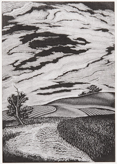
In the first piece (remember to click on images to see them bigger) there is a wide variety of shading created with a wide variety of texture marks. There are stipples, and lines of various short lengths. Most of these lines are straight, but the larger grass pattern in the near right includes some more squiggly lines. There is also much use of the multi-line tool, which allows you to carve some number of tightly spaced
parallel lines (often around 5) at each stroke. The trees on the hill in the background have a downright fuzzy look because there is no outline, but only the multi-line tool carving out tiny white lines all around the black that is the trees.
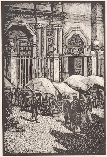
The second piece has the necessity of portraying a much wider variety of real-world objects. Instead of just grass and sky, there’s stone architecture, canvas awnings, cobbled street, clay pots, and people. Deines does all this once again using just different textures, with very few outlines. He uses an even larger variety of different kinds of carved marks, from the sparse dots in the lower right shadow to the crosshatching of the upper right building, to the curved white lines of the wrought iron. The suggestion of Corinthian column capitals is especially interesting, because they really aren’t very accurately detailed - and yet our eyes read the picture perfectly.
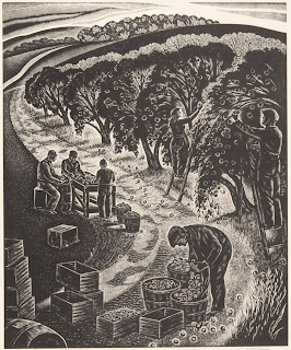
Looking through the remaining pieces I have today, you can see his mastery of which textures to use where. The textures have to do triple duty. First, they suggest real-world textures, such as grass, clapboard, and cloud. Second, they suggest value, the art term for how dark or light an area is. Bright sun to deep shadow, and white canvas to dark earth, the sort of texture carved will determine how light or dark an area reads. Third, the textures have to contrast with each other sufficiently to differentiate areas and objects.
Dienes carves remarkably few outlines (an ability that always amazes me, since I tend to make a lot of use of outlines!) And without outlines to tell you “This is where the tree ends and the grass begins,” or “This bit is a clay pot but that bit is shadow on the plaza,” it’s the textures that need to do that work instead. How bold or prominent to make the various sorts of textures is a blending or a compromise of all those considerations. I really love how Deines does it.
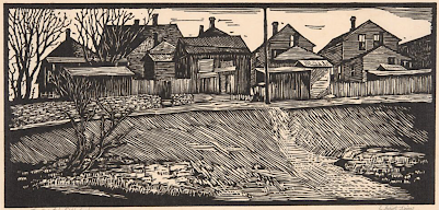
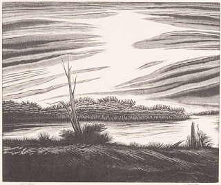
By the way, now that we are well into autumn, I made sure to include two autumn-themed pieces, the first and the last. But perhaps my two favorites are today’s pieces three and four, which contrast beautifully with each other. A dreamy glow or a sharp punch
of angles; distinct, strong black and white lines, or tiny white scratches so fine and delicate as to blur into the illusion of a range of greys. (The bolder one, by the way, has those stronger lines because it’s a linoleum block print, not a wood engraving like the others.) Which of these pieces is your favorite?
[Pictures: Autumn Tone Poem, wood engraving by E. Huber Deines, 1940;
Cathedral Plaza - Guadalupe, Mexico, wood engraving by Deines, 1933;
The Deserted Neighborhood, linocut by Deines, 1934;
Ode to Morning, wood engraving by Deines, 1945;
Pippins Coming Down, wood engraving by Deines, 1939 (All images from Marianna Kistler Beach Museum of Art).]

No comments:
Post a Comment