November 29, 2016

Words of the Month - Hearing Double

        Perhaps you say “tom-ay-to” and I say “tom-ah-to,” but we both agree that we are, in fact, saying the same word despite different pronunciations.  Obviously this is the case with
the vast majority of words in any given language - that speakers recognize different dialect pronunciations as being the same word.  However, English does have a handful of exceptions.  These word pairs are actually simply two different pronunciations of the same word, which somehow came to be reinterpreted and accepted as being separate words.

girl, gal - Two words with similar meanings, girl has been around since about 1300, while gal was an eighteenth century pronunciation noted in New England.  It’s similar to the Northern English dialect usually indicated gell or gel, but somewhere along the line gal gained its own identity as a separate word, rather than simply a phonetic spelling of a dialect pronunciation.

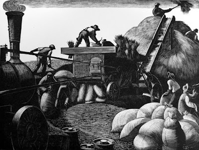
thresh, thrash - Thresh is an Old English word meaning to sift grain by beating it.  Thrash is recorded as a dialectal variant of thresh from the 1580s, but had gained its own slight twist, “to beat [something other than grain],” around 1620.  I can only guess that if the meaning shift first occurred in an area with a slightly different pronunciation, it was that area’s pronunciation that was attached to that new meaning.

creature, critter
vermin, varmint - Most people probably think of critter and varmint as slangier or dialectal words, the sorts of things Yosemite Sam hollers, and not the sorts of words you would use in serious writing.  They probably became their own words precisely because they struck people as funny, and distinctively indicative of a certain sort of hillbilly or Wild West speech.   They are both Americanisms from the early nineteenth century, although the spelling “varment” was found in dialect areas of Britain in the 1530s.  One interesting note, though, is that there are many words in which modern Standard North American dialect pronounces er while British Received pronunciation says arclerk, Derbyshire, shard/sherd, and so on.  So varmint and critter are probably fairly accurate indicators of the original pronunciation of English colonists.

saucy, sassy - Sassy is simply an American version - I’m pretty sure a southern American version - of saucySaucy meaning “cheeky” dates from the 1520s, while sassy dates to the 1830s.  Really, they mean exactly the same thing, and I can’t tell you why sassy now gets its own spelling and entry in the dictionary, but I’m glad it exists as its own word.  It gives all of us the option to use either pronunciation whatever our own dialect may be.

hoist, heist - Here’s a set where our different pronunciations have acquired quite different meanings.  The original, hoist, had various slang meanings among criminals: “to steal” (note similar meaning in shoplift), or “to lift up an accomplice to reach a window to break in.”  It’s the American pronunciation that, in the 1930s and 40s, took those slang meanings and gave them a word of their own.  (By the way, the noun, meaning “a robbery,” came first.)

roil, rile - Perhaps you recognize the sound pair here, even though it’s spelled differently from the one above: oi - i.  Once again roil, “to stir up or muddy,” is the original word, while rile is the phonetic spelling of the American pronunciation.  (In 1848 John Russell Bartlett wrote that rile was a common pronunciation and spelling in both Britain and America, but I’m assuming only as a dialectal variant in Britain.)  Once again the slightly shifted sense, “to agitate [people],” became attached to the variant pronunciation, leaving the original pronunciation with its original meaning.

strop, strap - Everyone knows the word strap, while strop is somewhat more obscure.  It’s the leather band on which to sharpen razors.  Nevertheless, it’s strop that’s the original word for a band of leather, while strap is a Scottish and possibly nautical pronunciation.  Why did the dialectal version completely displace the original some time in the sixteenth century?  I can’t tell you.  (And in case you’re wondering, strip is not closely related to either, despite ending up with a similar sound and meaning.)

stamp, stomp - You might think that stomp and stamp would follow the same pattern as strop and strap.  If you thought that you’d be displaying good linguistic instincts - but you’d be wrong.  This time stamp is the older Old English word, with the meaning “strike the foot forcibly downwards” from the mid-fourteenth century.  It’s stomp that’s the variant, from about 1800.  Unfortunately, I don’t know what dialect is responsible for giving us stomp.

        Why do some dialect pronunciations get to be spelled phonetically and become their own words, while most don’t?  Why do some even get to add their own unique definitions to the language while others remain synonyms of the original?  I don’t think anyone can explain it, but it is a fun phenomenon.

[Pictures: Threshing, wood engraving by Clare Leighton, c 1933 (Image from Warwick Leadlay Gallery);
Yosemite Sam, drawings by Warner Bros. Animation studio;
Razor strops, wood block prints from Montgomery Ward Catalog, 1895 (Image from Kristin Holt).]

November 22, 2016

Art for Friends

        Chances are you’ve never heard of a small, unobtrusive, text-heavy picture book called Goldie the Dollmaker.  Published in 1969, the illustrations are grey-tone, the cover is grey-tone on cream only 7x6 inches.  It’s not a book that grabs the eye.  The story is not exactly thrill-packed, either, and I would never have said I loved it as a child.  But nevertheless, since receiving a copy when I was ten, it’s stuck with me.  I’ve never forgotten it because it’s got some poignant messages about what it means to be an artist.
        The plot summary is that Goldie lives alone making wooden dolls.  One day in town she sees a beautiful Chinese lamp and buys it despite knowing that it will take three months of work to pay for it.  A friend’s horror over the cost and impracticality of it gives her buyer’s remorse, and makes her feel utterly lonely, until she dreams of the artist who made the lamp.
        Now I’ll admit I’m stingy and generally frown on impulse buys and impracticality, but I do love beautiful, handmade things and the joyful connections they can make.  And I do think a lot about creating things, and appreciating the creations of others.
        Author M.B. Goffstein’s first point is how an artist works.  Goldie makes her dolls with real care, choosing wood that seems just right for each part, rather than using precut wood that might be quicker but doesn’t feel as alive.  She explains, “It’s not as interesting to carve.  And then it doesn’t turn out as good.  It never looks alive…  I have to love making them.”  And the final step for each doll: “Goldie smiled and smiled into the doll’s eyes in the friendliest, sweetest way, and she painted a smile right back to herself on the little doll’s face.”  If you don’t care what you’re making, why should anyone else care?  But if you invest it with love, it can carry that love out into the world.
        The real climax of the story is the dreamed conversation between Goldie and the artist who made the lamp.  A warm, polite voice begins, “That lamp you bought.  I made it.”
        “Oh, it’s beautiful!” said Goldie.
        “So we are friends.”
        “But I don’t know you,” she said.  “I wish I did.”
        “You do know me,” laughed the voice.  “You know me better than the people I see every day.”
        “But who are you?”
        “I made that lamp you bought today!”
        “Oh, said Goldie.  “Oh, I see.”  And she sat for a moment, smiling.  “But you don’t know me,” she said suddenly.
        “Yes I do.  I made the lamp for you - whoever you are.”
        I wouldn’t go so far as to say that the people who buy my art or read my stories know me better than my family and friends, or that I know them, but we do know each other in a very particular, special way.  There is something we share because I made something I love, and they love it, too.  I hoped, as I created it, that it would bring someone joy - someone I’ve never met and didn’t know - and when they saw it, some of the love I put into it resonated with them.  So when you look at a piece of art that moves you, or read a story or poem that touches you, take a moment to appreciate that connection: the artist made it for you, hoping that you were out there somewhere, ready to be, in some sense, a friend.

[Picture: Goldie’s house, illustration by M.B. Goffstein from Goldie the Dollmaker, Farrar, Straus, Giroux, 1969.]

November 18, 2016

Kanreki Print Show

        Here’s another printmaking find that was sent to me by a friend.  It’s the catalogue of an exhibit of contemporary Japanese prints that is already over, and which I wouldn’t have been able to get to in any case, but it looks like it must have been spectacular.  It’s another of those bittersweet internet moments: if it weren’t for the internet I wouldn’t have known about this or been able to see any of the pieces at all, but at the same time the pictures are so small that they just leave me frustrated that I can’t see the art in person, or at least bigger and more detailed.  I’m so glad I’ve had this glimpse, but so wish I could have more!
        The exhibit was put together by the College Women’s Association of Japan, and this is the 60th annual printmaking show they’ve assembled.  (You can read more about the history and purpose of the organization and the show on the exhibit web page.)  The show includes a wide variety of printmaking techniques, and a wide variety of images.  I’ve picked out a handful of those that
struck my eye - those that I really wanted to be able to see up close.  There isn’t enough detail for me to speculate very intelligently about technique, or to admire any particular strokes of genius, but there is enough to say, “This looks pretty cool!”
        At any rate, it’s always nice to see such a vibrant collection of contemporary printmaking.  At most of the shows I do I seem to be pretty much the only printmaker.  At Mother Brook Arts & Community Center last weekend there were actually three of us: an etcher, a silkscreener, and myself.  I’m still the only one doing relief block prints, but it’s nevertheless nice to see printmaking of all kinds alive and well in the art world.

[Pictures: Gentle Prayer, woodcut by Ayaka Kobayashi;
Fruit of September, woodcut by Mitsuru Hiraki;
The Night Piece, woodcut by Gen Yamanaka;
Colleague, woodcut by Iwao Akiyama;
Village Breeze, wood engraving by Yoichi Kenmoku;
Toward the Sea, woodcut by Yuko Iwakiri (All images from Highfield Hall and Gardens).]

November 15, 2016

What's New in the Studio - Mini Prints

        Actually, what’s “new in the studio” has mostly been happening outside the studio: I’ve been carving a lot of blocks at my recent spate of shows, but now that I am back in the studio, I’ll be printing them.  Today’s printing is two mini blocks I’ve designed to be able to pair together or stand separately.
        My mini prints are very small images that I frame up in miniature frames and sell for $10.  They’ve all been very popular.  They’re cheap enough for an impulse buy with cash on hand, small enough to carry away in a purse, the right price for little thank you gifts or hostess gifts, and small enough to fit somewhere on your desk or dresser even if you don’t have any wall space.  At that price I’m obviously not going to get rich from them any time soon, but they’re fun.  They’re my opportunity to explore ideas that don’t warrant a whole big block.  It’s a challenge to think of things that are simple enough to fit in about two inches square, but are still detailed enough to be interesting, and are iconic enough that they’re meaningful and pleasing to people all on their own.
        So, over the past few years I’ve generally tried to have two mini prints available at all my shows.  As one sells out, I think of the next one.  This time I’ve made two at once, so I’ll end up with three until something sells out.  It will be fun to see which sells out first, kittens or puppies, or whether people like to keep them as a pair.
        From a technical perspective, in some ways the little blocks are just as much work as big ones.  The carving is much quicker and easier certainly, but the printing turned out to be surprisingly frustrating.  For one thing, the ink didn’t want to be the right consistency, but I’ve also concluded that with the tiny blocks it works much better to use a thin paper.  The smaller the block, the less surface area of ink there is for the paper to stick to, and this morning the thicker paper I tried kept shifting and leading to smudged prints.  The thinner paper, on the other hand, stayed put and gave a clean print.  I inked and pressed the puppy 45 times, with two complete cleanings of the block in the middle, in order to get a decent edition of twelve.  Oof.  At that rate $10 isn’t enough!  On the other hand, the kitten block, with different ink, took me fewer than 20 tries.  Finally, matting and framing takes about the same amount of time and effort regardless of size, but of course it uses much less material and can be done with the scraps of mat board that are too small for anything else, which is satisfying.  I imagine I have a little while before I sell out of these, but I’ll still be mulling possibilities for the next mini print.

[Pictures: Forever Puppy, rubber block print by AEGN, 2016 (sold out);
Forever Kitten, rubber block print by AEGN, 2016 (sold out);
A Wish for Peace, rubber block print by AEGN, 2010 (sold out);
Carolina Wren, rubber block print by AEGN, 2014 (sold out);
Hedgehog, rubber block print by AEGN, 2016 (sold out);
Seahorse, rubber block print by AEGN, 2010 (sold out).]

November 11, 2016

Hatred Can Never Make America Great

        This is a blog about block printing and juvenile fantasy.  I have never been explicitly political here and I don’t want to be political, although of course my general views on things have been quite clear all along, but today I cannot be silent.  As a straight, Christian person of European ancestry I feel a deep responsibility to confront and reject the hatred that people have been unleashing for months, and especially so now that Donald Trump has become
president-elect by fomenting and encouraging extreme hatred and violence.  It isn’t enough to stand aside from the thuggish acts of others - it’s essential to be an active ally to those immigrants, people of color, Muslims, LGBTQ people, women, and all others whose rights, safety, and even lives are now in increasing danger.  More than half of voters in the United States voted against Trump, and however horrifying it is to me that the margin was that slim, it’s still true that if we all refuse to accept racism, homophobia, misogyny, climate destruction, and the rest of the toxic brew of hatred, we actually can do something about it.  We actually can make America great.  Like so many of us, I feel pretty discouraged and helpless in the face of the tsunami of hatred that Trump is surfing, but I do know one thing absolutely and without doubt: it is not okay.  It is not a mark of superiority, it is not the American ideal, it is not in any way Christian, and to let it go unchecked leads not to greatness, but to vandalism, lynch mobs, concentration camps, police state, world war, and ultimate annihilation.  We’ve seen it before.  I do not want to see it again.  Please stand up and make it absolutely clear: the majority of American people cannot, must not, and will not tolerate a culture of hatred.
        And with the crashing bathos that marks troubled times during which life goes on, I have another open studio show this weekend.  This will be my first time at Mother Brook Arts & Community Center, and while I can’t help suspecting that people may not be in much of an art-buying mood, I still invite you to come by and see the work of over 50 artists in a single former school building.  After all, now more than ever it is vital that we come together and hold fast to what is true and beautiful.

[Pictures: “Walk Together Children” (in two parts), wood block prints by Ashley Bryan from Walk Together Children: Black American Spirituals, Atheneum, 1974.]

November 8, 2016

Election Day

        If you’re a USA citizen, please vote today.  It matters.  I won’t write more because if you still don’t understand how important it is, there’s not going to be anything I can say to convince you.  But please vote, and please vote against hatred.
        If the state of politics in this country is as distressing to you as it is to me, you’ll be in desperate need of something heartwarming right about now.  As much as I like block printing, I know that sometimes you need the stronger stuff: video clips of roly-poly puppies or of kittens falling asleep, photos of baby pandas or
bunnies… Better yet, puppies and kittens and ducklings all together, with fluffy peace and love abounding.  Please go do an internet search, and don’t stop until you feel a little better.  In the meantime, however, I have a few sweet block prints to help you remember that all is not wholly dark and rancorous.
        Option one, a curious, playful kitten, always a good choice.  I like the wood grain on this one, and the soft look of the kitten with multiple greys and relatively indistinct edges.
        Option two, something a little more holistic, a world of sunshine and flowers and butterflies and bunnies.  I like the almost patchwork feel of this one, with each hill or segment having its own theme which fits into a whole.
        Option three, a relatively recent mini print of my own, because hedgehogs are so very, very cute.  One afternoon back in the spring I spent half an hour with a hedgehog at our school district’s science center.  The little guy needed to be held and handled because he hadn’t had enough socialization at his previous home, and although he didn’t like me a bit (he didn’t like anybody - hence the need for socialization) I certainly liked him!  If only it were always so easy to be patient and gentle with the angry, frightened, prickly critters we meet.

[Pictures: The Vote, wood block print by Helen West Heller, 1947 (Image from Mainly Meiji);
Kitten and Knitting Wool, wood block print by Masaharu Aoyama, c 1950-60s (Image from Ohmi Gallery);
Happy Hills, woodcut by Vicky Katzman (Image from Etsy shop vickykatzman);
Hedgehog, rubber block print by AEGN, 2016 (sold out).]

November 4, 2016

Here's Something Cool: Cypher Book

        From time to time I come across nifty things that catch my fancy, and I file them away for possible future sharing.  But many of them never seem to fit into a particular theme, or I don’t really have enough information for a substantive post, and I never end up sharing them after all.  Well, all that is about to end.  I hereby initiate a new category of blog posts: Here’s Something Cool!
        First up is a sixteenth century cypher machine in the shape of a book.  This is emblazoned with the arms of Henri II of France, so presumably was made for him or his agents, but more than that I cannot tell you.  The object is in the collection of the Musée Renaissance in the Chateau de’Écouen, but a search of the museum’s website reveals no additional pictures or information, so I am left with nothing but questions.  How was this cypher machine used?  Half the dials have Roman numerals, while the other half appear to be blank, except for a single C or crescent on each one.  The large dial on the left is marked with numerals, and spins within a ring of letters.  The whole thing is in the shape of a book.  Is it disguised as a book, or merely whimsically decorated in that shape?  Was it used for serious espionage, or novelty entertainment?  Who invented it and who made it?  Henri II was the inventor of the patent, or at least the first government to introduce the idea of patents for inventions.  Does this mean he was particularly interested in inventions, or particularly supportive of inventors?  If there’s a patent for this cypher machine, no one’s mentioned it.
        Henri’s mistress, favorite, and veritable co-ruler was Diane de Poitiers, whose emblem was the crescent moon.  It can hardly be coincidence that this device is decorated so lavishly with crescents, as spokes on the dials, etched between all the dials, and so on.  Does that indicate that Henri and Diane used this encoder for their private communication, or that it was made for Diane’s use in her own political and diplomatic endeavors, or simply that the craftsman figured Henri would be pleased to see Diane’s emblem along with his own?
        In another fun note, Henri II was the son of Francis I for whom, according to my fantasy, The Extraordinary Books of Doors were made.  Since Francis died before their completion, it was to Henri II that Sebastiano Serlio would have presented his magical masterpiece.  So, did Henri take after his father in having a particular predilection for magical devices disguised as ordinary books?  It certainly is fun to speculate.
        As for this Cool Thing, its design is beautiful, its workmanship is impressive, and its history is just a a big, fascinating question mark.

[Picture: French cypher machine in the shape of a book, between 1547-1559 (Image from Wikimedia Commons).]

November 1, 2016

Wood Engravings by E. White

        A visitor at one of my recent events put me onto British wood engraver Ethelbert White (1891-1972).  Produced in the 1920’s and 30’s, his work has a definite vibe of the era: that push and pull between modernism and nostalgia.  A lot of his work features pastoral and agricultural scenes, but I’ve most enjoyed some more urban, architectural images, so that’s what I’m sharing with you today.
        White was among the movement advocating relief block printmaking as an artist’s medium, using the materials as a mode of artistic expression in their own right, rather than simply reproducing another artist’s design.  This tends to result in more black, more sketchiness of line, more details suggested with just a hint of line or shadow, more interesting variations of tool use producing more variety of textures…  Wood engraving is particularly conducive to drawing with white on black instead of black on white like most other art media: pencil, ink, paint, etc.
        Wood engravings are necessarily fairly small, but White’s are quite large for the medium, often in the neighborhood of 5-8 inches on a side.
        White’s scenes always have people, and I like his people best when they’re either so insignificant as to be ignorable, or an important enough part of the scene and composition to have a little personality.  I like the portly gentleman in the Royal Exchange and the bent back of the sailor at Recco.
        A few other details that particularly please me: the framing tree over the scene of the Pont Neuf, and the beautiful details of the bridge itself; the horses and carts at the Royal Exchange, suggested with such efficiency; the vehicle at St George’s, Hanover Square, placing the scene in a particular time; the slightly rougher carving of the sky over Recco, contrasting with the very fine, thin lines of engraving on the buildings.  Altogether I very much like White’s balance of black, white, and texture.  Some wood engraving has a tendency to get a little samey, all fine grey texture, and I love a little more punch and contrast.  I’m so pleased to have been introduced to Ethelbert White and his relief block prints!


[Pictures: Le Pont Neuf, wood engraving by Ethelbert White, c. 1924 (Image from Abbot and Holder)
The Four Courts, Dublin, woodcut by White, c. 1928 (Image from Abbot and Holder)
Recco, wood engraving by White, c. 1930 (Image from Ernest Brown & Phillips)
St. George’s, Hanover Square, wood engraving by White, 1924 (Image from Ernest Brown & Phillips)
The Royal Exchange, wood engraving by White, 1923 (Image from Conrad Graeber).]