September 30, 2014

Words of the Month - Of Nimrods and Nincompoops

        Bugs Bunny, smart alec that he is, is never without a snappy insult for his antagonists.  Some of his favorites, such as maroon, a simple mispronunciation of moron, he applies in many situations, but Bugs often gets more specific.  For example, in “Bully for Bugs” he calls Toro the bull a nincowpoop, tailoring his mispronunciation to the occasion.  This month’s words are three silly, sometimes even affectionate, Bugs Bunny insults that turn out to derive from the names of specific people.

smart alec(k) - Its first use in print is attested from 1865, but its probable origins lie with the shenanigans of a certain Alexander Hoag in the 1840s.  He and his wife ran a scam in which he would rob her customers while she kept them occupied (if you know what I mean, wink wink, nudge nudge).  Alec gave local cops a share of the takings in return for turning a blind eye.  Then Alec got smart.  He came up with a new way to rob the customers that wasn’t so obviously tied back to him, which he felt the cops didn’t need to know about at all.  Which was great until the police realized he was cheating them out of their hard-earned graft, whereupon they arrested Alec and his wife Melinda.  Thus the police gave the nickname Smart Alec to Mr Hoag and soon to other criminals who were too smart for their own good.

nincompoop - Dating back to the mid seventeenth century (and first spelled nicompoop) Dr Johnson’s 1755 Dictionary gave the word a derivation from the Latin legal phrase non compos mentis, which is a pretty appealing theory, but one for which linguists find no other evidence and can’t square the earlier spelling.  The current theory is that this is another word derived from another man who behaved stupidly: in this case, Jesus’s follower Nicodemus.  Now, it hardly seems fair that a respected member of the Sanhedrin who was later martyred and sainted should have his name turned into a synonym for fool, but apparently this is based on the incident where he questioned Jesus and had trouble understanding his teachings, and therefore was given as an example of someone who didn’t quite get it.  (Which just goes to show that folks in the seventeenth century must have felt pretty darn smug about their understanding of Jesus, because it seems to me that if not entirely understanding the teachings of Jesus is sufficient to qualify one as an idiot, then we’re all in trouble.)  Apparently in French nicodéme means "fool", making the name even clearer.

nimrod - In another example of Bugs Bunny’s ability to pick the appropriate insult, he calls the gweat hunter Elmer Fudd a “poor little Nimrod.”  Nimrod, as Bugs well knew, was another Biblical character, this time from back in Genesis and Chronicles, where he is named as a grandson of Noah, a king, and “a mighty hunter before God.”  That’s really about all the Bible has to say, but the religions that use these texts all have traditions that associate Nimrod with the Tower of Babel and opposition to God.  By the fifteenth century English speakers used the name Nimrod to mean “tyrant” and later to mean “hunter of great physical strength.”  It isn’t surprising that it should have been applied from time to time sarcastically, 
and Bugs Bunny was not the first to do so.  He was, however, the most public and popular to do so, and he did so at a time when fewer people knew their obscure Biblical hunters any more, leading to the widespread reinterpretation of the word nimrod as a synonym for “jerk, idiot, or dimwit.”  (At least, this reinterpretation is almost universal in Bugs’s homeland, but not common in other English-speaking areas.)

        This Bugs Bunny origin of the “idiot” definition of nimrod has had the internet all a-buzz recently, and I find it quite plausible myself.  This is the time, however, to note that all three of the etymologies I’ve shared today are, like so many others, best theories rather than proven facts.  It’s hard enough to prove any etymology conclusively, and slang terms are harder by far, because of their shyness about showing up in citeable printed records.  So, back to Bugs and Elmer…  The story of the fall of Nimrod is all over the web, but almost nowhere does anyone actually name a cartoon in which it appears.  The only one cited anywhere that I could find is 1940’s “A Fresh Hare,” but I watched it carefully, and Bugs Bunny never calls Elmer “Nimrod” here.  I’m not going to say the story’s busted, because I’m positive that I recall Bugs Bunny using the insult, but I can’t remember in which cartoon.  Can anyone else?  If any Bugs Bunny fans out there can tell me where this usage appears, I’d love to know!  In the meantime, we can all hope that our own names don’t someday end up in the dictionary meaning something bad.

[Pictures: Elmer Fudd and Bugs Bunny, designed by Bob Givens, 1940;
Christ and Nicodemus, woodcut by Karl Schmidt-Rottluff, 1919 (Image from LACMA);
Nimrod fights with the boar, engraving from a picture by Franz Ludwig Catel, from Historisches Bildrebüchlein by J.H. Kampe, 1801 (Image from Virtuelles Kupferstichkabinett).]

September 26, 2014

Good Children's Fantasy Block Prints

        As reported a couple of months ago, this summer I taught two week-long relief printing classes for children in grades 5-9.  I bewailed the fact that a concatenation of camera catastrophes deprived me of most of the photos I had taken of the kids’ wonderful work, so I haven’t been able to do most of the posts I was planning on various projects and themes.  However, I see that I do have a decent selection of fantasy-themed work to share with you.
        Classes, like individual children, develop their own personalities, and in the second week the particular mix of students inspired and encouraged each 
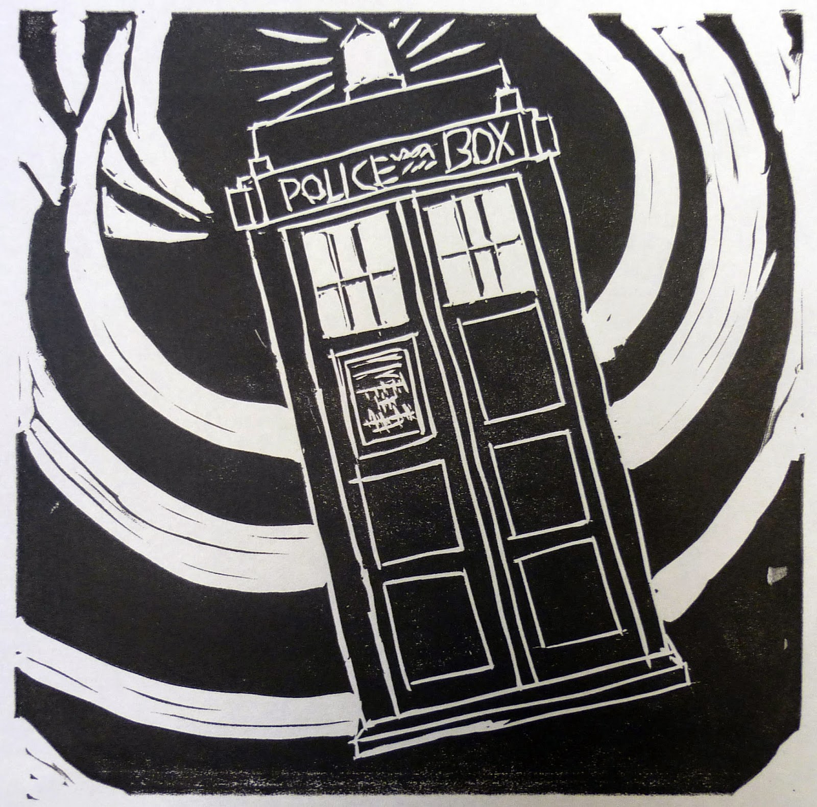
other to do mythical creatures, which was fun to see.  For some of these pieces, such as the unicorn and the Tardis, the kids used photos for reference, while others, such as the chimera and large dragon, were designed wholly from scratch (or at least with any references provided only by the kids’ memory.)

        You can see in all these pieces that students at this level tend to think first in terms of outlines or shapes, with very little work on texture.  I think this is partly because that’s a level of  complexity they aren’t ready to consider when this whole idea of carving is still pretty new and takes a lot of concentration.  I think it’s also partly because they’re impatient and don’t want to take so long on fiddly little details before declaring that they’re ready to ink and see what they’ve got!  Using lines instead of solid white or solid ink on something as straightforward as the hair of the unicorn’s mane and tail is about as far as they go at this stage.  I hope some of them will continue to do block printing in the future and eventually they can start pushing themselves further.

        Still, I was very proud of the work these kids did in one week, and there are elements of each of these pieces that are quite delightful.  Perhaps my favorite is the orange dragon with its fierce energy.  The carving of the chimera, by contrast, is impressively controlled and smooth, and it has an expression of charming benevolence.  (Two expressions, in fact.)  The Tardis makes strong use of black and white, while the unicorn is made especially magical by its rainbow inking.  The series of three small creatures were designed to be mixed and matched in various combinations.  So, five different students, five different takes on portraying fantasy themes, five different styles and approaches to carving…  I’m sorry I don’t have pictures of all the kids’ work so I could show you a few more examples (I remember a sea serpent and at least one more quite different unicorn, for example) but I hope these give you a taste of the skills and imaginations of these up-and-coming block print artists.

[Pictures: Dragon, rubber block print by AF, 2014;
Chimera, rubber block print by ME, 2014;
Tardis, rubber block print by AM, 2014;
Unicorn, rubber block print by AV, 2014;
Unicorn, Dragon, and Griffin, rubber block prints by TPN, 2014.]

September 23, 2014

The Good Child's Book of Stops

        I always like to observe National Punctuation Day, which is coming up tomorrow.  So today I have for you some funny wood engravings from Punctuation in Verse, or, The Good Child’s Book of Stops, of around 1826.  Here’s Mr. Stops, stopping the galloping reader for a 
toll.  Mr. Stops himself is pretty excellent, all made of punctuation as he is, with his fashionable neoclassical tollbooth surmounted by its exclamation point.  He contrasts delightfully with the realistically detailed horse and swans.  (Reading while horseback riding seems like a bad idea, but presumably not as stupid as reading while driving.)  It’s worth noting also that this book advertises itself as being “Embellished with Twelve Neatly Coloured Engravings.”  If this coloring job is neat, I’d hate to see the messy version!
        Mr. Stops proceeds to provide little Jane with two examples to prove the importance of punctuation.
     Four rooms I have and hating gloom
     I’ve twenty candles in each room
     Five and twenty in the four
     Indeed there are not less nor more

        THE SAME, PROPERLY POINTED.
     Four rooms I have; and hating gloom,
     I’ve twenty candles.  In each room
     Five; and twenty in the four.
     Indeed there are not less nor more.
        Interestingly, one of the stops included at the end of the book is the ellipsis, which Madame Leinstein gives as a long dash, rather than the three dots we know today.  Also, she defines it as indicating omitted letters, rather than omitted words.  I wonder when the three-dot ellipsis came into use.  (Fun vocabulary word: using an ellipsis to show a sentence trailing off into silence is called aposiopesis.)
        But back to Mr. Stops.  Obviously these wood engravings were rather shoddily produced without any great care, with neither particular skill nor concern for artistry.  Today’s equivalent would no doubt be the generic cartoon-style illustrations of a 
million cheap educational paperbacks for kids.  But while the workers who hand-painted The Good Child’s Book of Stops were clearly not giving it their all, I think the artist who designed Mr. Stops must have actually had some fun.  And if there’s one thing that everyone agrees is fun, it’s punctuation, right?

[Pictures: Each galloping reader a moment should stay;
Mr. STOPS and little Jane, hand-colored wood engravings from The Good Child’s Book of Stops by Madame Leinstein, c 1826;
Additional marks, typesetting from The Good Child’s Book of Stops printed by Dean and Munday.  (Images from Internet Archive)]

September 19, 2014

Mechanical Treasures (II)

        As my children and I continue our mad steampunkery, imagining and creating cool assemblages of intriguing junk, I thought this was a good time to share some more incredible sculptures I’ve discovered on the internet.  Although not all either truly steampunk (or fantasy), these sculptures nevertheless have much in common, particularly the use of salvaged industrial-type materials and a mechanical look as of magical automatons.  Their scale ranges from fingertip-tiny to big-as-a-kid, and their materials range from watch gears to car parts, and bullets to circuit boards.  I absolutely love these things!
        The little grasshopper was made by Tom Hardwidge and I like its relative simplicity.  It’s got charm and the lovely gleam of all that brass and copper, and would make a great steampunk version of a good-luck cricket on the hearth.  I think using a bullet for its body (not live ammo, don’t worry) is a sort of sword into plowshare gesture.
        I can’t tell you much about artist Christian Champin or his camel Taj because he writes in French, which unfortunately I can’t read.  Some of his sculptures are quite monumentally large, and he uses not only nifty gears and well-shaped machine parts, but also random scraps of truly junky warped and rusted metal.  This marvelous camel is one of my favorites.
        I had to show this circuit board dragon because… well, because it’s a dragon, duh!  But actually the Blue Kraken workshop makes much more gorgeous jewelry, so I also had to show you this butterfly.  These pieces are not only beautiful jewelry, but they're drawing attention to the beauty in something ignored, usually hidden, and discarded without thought.  It’s hard to think of them as upcycled trash, but they are!  It’s a reminder to all of us to keep our eyes open.
        The next artist, Celia Smith, seems to make exclusively birds, and exclusively out of wire.  I don’t know whether all her wire is recycled, but certainly much of it is.  I have a big hank of old telephone wire down in the basement now, with all its different colors.  It’s tempting to start in doodling with it, pretending it’s pencil line and I’m scribbling… except that my scribbles wouldn’t capture the shape, movement, and 
personality of my subject the way Smith’s wire scribbles do!  I’m a lifelong dabbler, but I do admire the skill that comes from dedicating one’s work to a single, focussed goal.  (Besides, I certainly don’t need to begin yet another project right now!)
        And finally, two miniature masterpieces, a perfect steampunk fairy and dragon.  Sue Beatrice makes her tiny sculptures from watch parts.  (I featured her darling rabbit a while back.)  It must be so much fun to match the little random bits and pieces with their perfect part in each creation.  It must also be wonderful to have such a large collection of watch parts as to have all those varied bits to choose from!  The main question I’d love to ask the artist is how she connects the pieces so precisely.  Glue?  Screws?  Some sort of soldering or welding?  I have yet to find an ideal way to assemble my own much less elaborate creations.
        Are you inspired to appreciate the beauty in unvalued things?  To create a second life for something disposable?  To revel in the imagination where auto transmissions become camels and computers become dragons?  Are you inspired?


[Pictures: Roborthoptera spira aureum, assorted metal sculpture by Tom Hardwidge (Image from Arthrobots);
Taj, found metal assemblage by Christian Champin (Image from Christian Champin Chez);
Dragon brooch and Blue long wing butterfly necklace, mixed materials by the Blue Kraken (Image from the Blue Kraken);
Egret, wire sculpture by Celia Smith (Image from Celia Smith);
Steampunk fairy and pocket watch dragon, metal assemblages by Sue Beatrice (Images from All Natural Arts).]

September 16, 2014

Beating the Wrecking Ball

        Here’s a nice small wood block print that pleases me.  I like the way the traditional ornate church is superimposed over the plain grey skyscrapers.  This piece caught my eye today because next week I’ll be attending a wedding in Boston’s Trinity Church, which is famous for its pairing with the modern glass Hancock Tower next door.  Sometimes these pairings of old and new detract from the beauty of both buildings, but sometimes they work well, each accentuating the style of the other.  I think they work well together in this block print, where the grey geometric background enhances and frames the Gothic Revival steeples.  (Though the pairing didn't work well in real life, as you can see in the photo below.)  I have very little information about the print, and still less about the artist, but I assume this was done with two blocks: the grey skyscrapers, and the black church, each with their framing edge.  I’m sorry not to be able to find anything about the artist other than the name “Salter”, or to be able to look up any other work done by him or her.
        On looking for more information, I did find this additional block print of the same church, but with even less information: none at all, to be precise.  No idea when it was made or by whom.  But I don’t find it nearly as interesting, in any case.
        As for the church itself, it was built on Fifth Avenue in New York City from 1869-72, was large, expensive, and highly fashionable, and lasted less than a century before being demolished in 1949 or ’52 to make way for a very unremarkable office building.  This photograph shows much the same view as Salter’s wood block print, if it were cropped.  Given the dates, the block print might have been made to commemorate the building 
before demolition, as the congregation was already in trouble and closing its doors.  Whether that was the artist’s intention or not, I’m glad this print was made in time.

[Pictures: Collegiate Church of St. Nicholas 5th Ave, woodcut by Salter, 1947 (Image from St. Nicholas Center);
unknown block print by unknown artist of unknown date (Image from Andrew Cusack);
Old Church Saved from Sale, photograph by Sam Goldstein 1946 (Image from St Nicholas Center).]

September 12, 2014

Taboo, Or Not Taboo?

        Definitely taboo, but of a special kind.  Actually, I just wanted to use that title, but today’s post is really about geasa, a particular sort of taboo in Irish mythology.  A geis is a personal restriction, idiosyncratic, and often laid on a person as a curse or a gift.  And for my purposes, one of the interesting aspects of a geis is its magical properties.  Although he’s obviously not Irish, think of Samson, forbidden to cut his hair.  If his hair is cut, he loses all his strength: a curse.  Yet as long as he doesn’t cut his hair, he has magically enhanced strength: a blessing.
        Another aspect of geasa (that’s the plural) that make them good fantasy fodder is that they often take the form of a riddle that must be solved.  Think of Shakespeare’s Macbeth, who is told that “no man of woman born shall harm” him.  Of course, this being mythology, we know someone will find a way to break the spell, and the trick turns out to be that Macduff, delivered by Caesarean section, qualifies for the job.  Consider, too, the Witch-king of Angmar, Lord of the Nazgul in The Lord of the Rings.  It is prophesied that “not by the hand of man will he fall,” which makes him feel all self-confident and secure… until he finds himself faced in battle by a woman and a hobbit.  Now, these prophesy-type geasa are a little different because they don’t lay any requirements on their subject; there’s nothing in particular that Macbeth must do or not do to preserve his geis (other than avoid shieldmaidens, hobbits, and anyone delivered by c-section - which is not so easy these days!).  Nevertheless, Celtic folklore seems to count them.
        An example of a geis that is both prophecy and riddle is the Welsh hero Lleu Llaw Gyffes’s destiny to die neither “during the day nor night, not indoors or outdoors, neither riding nor walking, not clothed and not naked…” etc.  As with Samson, his wife induces him to show a way to fulfill those conditions so that she can betray him.  However, what I find interesting about this example is how closely it parallels the traditional eastern European folk tales such as “The Peasant’s Wise Daughter.”  (See “Clever Katya” for another nice example.)  “Neither riding nor walking” is astride or dragged, or with one foot on some non-riding animal; “not clothed and not naked” is wrapped in a fishing net; and so on.  In those “clever peasant girl” tales the riddle is solved not to weaken and kill a hero, but in order to impress and demand justice from a more powerful figure (often the tsar himself.)  I much prefer to see cleverness applied to positive ends!
        In the “clever peasant girl” stories, the riddle is given by the powerful man, and the woman gains power by solving it, whereas in Irish mythology geasa are often laid upon men by women, which is presumably the way for women to wield power.  It’s also often the device that leads to a hero’s downfall.  Because we know the rules of the hero’s geis, we can see his downfall coming, as in Greek tragedy.  The hero is led inexorably into breaking his geis, whereupon we can watch the relentless doom stoop ever closer until the inevitable end.  Not my kind of story, to be honest.  But here’s a representative example: Cúchulainn has one geis never to eat dog meat, and another geis that he must eat any food offered him by a woman.  Needless to say, the day comes when a woman offers him dog meat and the hero is ineluctably doomed.
        What I don’t know is what it takes to lay a geis on someone.  Surely not just anyone can say just anything.  It must require something special to make it real and binding.  At any rate, while I tend not to be much interested in stories with inexorable fate, this seems like an idea with lots of interesting possible applications.

[Pictures: Macbeth encountering the witches, woodcut from Holinshed’s Chronicles of England, Scotland, and Ireland, 1577 (Image from Wikimedia Commons);
Cú Chulainn’s Death, by Walter C. Mills, 1921 (Image from paddybrown).]

September 9, 2014

New in the Studio: Warbler Reduction

        Way back in May we had a banner year for warbler migration, and among our handsomest visitors were the magnolia warblers.  I was quite smitten with them and immediately began picturing a reduction block print to capture that dramatic black and yellow.  But it hasn’t been until now, when it’s time for the fall migration to take the warblers back again, that I’ve gotten around to making my vision real.
        As I’ve explained before, a reduction block print is one in which the same block is carved and printed multiple successive times on the same sheets of paper.  In this case, there were only two carvings and two inkings, first yellow, then black.  You can see each color separately here, although in fact the black never was printed separately, except the once, just so I could show you the  second state of the carved block.  As is always the case in a reduction print, you can see that the black includes nothing that yellow hadn’t covered, because I couldn’t put back any rubber that had already been carved away at the yellow-inking stage.
        I also enjoyed carving the leaves, experimenting with a different way of combining the three colors (yellow, black, and white) on each one.  I looked at a lot of autumn maple leaves to get ideas for patterns of dark and light, and I fooled around with various textures.  Fun!
        Registration (which means getting the multiple inkings to line up on top of each other correctly) is always my biggest challenge, and I was delighted to discover that when one of your colors is bright, light yellow, the registration is somewhat more forgiving.  A little yellow showing at the edge of the black just doesn’t look offensive the way an unaligned edge of some darker color might.  But beyond that, I had built myself a new registration frame and it worked pretty well, so I did better at lining up my printing anyway.  In fact, this was the least frustrating reduction print I’ve ever done.
        I was delighted with the magnolia warblers back in May, and I’m pretty delighted with this one, too!

[Pictures: Magnolia Warbler, rubber block reduction print by AEGN, 2014;
Magnolia Warbler state 1, and carving state 2, by AEGN, 2014.]

September 5, 2014

Warning: Steampunkification in Progress

        My 12-year-old son P and I have finally plunged into the steampunk creation frenzy we’ve been mulling for so long.  Steampunk creation is greatly aided by a magpie habit of collecting nifty objects, and I’m lucky to come from a long line of pack rats.  Our sources of material were four.  1. I’ve been collecting bits and pieces for years, and we’ve been raiding the attic and basement.  2. My parents have been cleaning out their house of nearly 50 years, and they set aside a box for us full of wonderful tidbits: broken watches, electronics dating back to the bakelite era, random hardware and housewares… 3. P, T, and I went to the local thrift store and picked up a few inspiring treasures there, including some brass candlesticks and an eggbeater.  4. And finally we did invest in a few retail purchases, including spools of copper wire in two gauges, a few assorted jewelry findings, and two pairs of ordinary, inexpensive welding goggles.  Thus prepared, we set to work.
  P’s primary project is an energy ray gun, (which verges a little more toward atomicpunk, I suppose, but we aren’t picky).  Its base is the base of a fishing reel.  Its ray generator is a cathode ray tube out of some old television.  Other components include a hanger cut up for 
wire, the springs out of several defunct ballpoint pens, the top of a former wristwatch, and much glue.  At its lower settings, the ray gun can energize things positively, but by the time you set it into the red zone I’m afraid it’s lethal.
        I also helped P (aka Professor Nathaniel Tarlington) make a holster so that he can wear the ray gun around.  His second project is, of course, goggles.  These arrived only yesterday, so he hasn’t gotten very far modding them yet.  He’s cut apart the visor so that each eyepiece can be raised or lowered separately, and we devised chains to hold the eyepieces up.  He’s also begun painting selected areas copper.  He’s got many further plans percolating.
        My main project is a steampunk violin.  I’ve had this old non-functioning trashpicked violin in my attic for years (possibly decades) because it was way too cool a thing not to keep.  And now finally it’s receiving its revival.  (It doesn’t make music, unfortunately, because that would just be way more than I can handle, but it looks pretty darn cool, I must say!)  I’ve given it a very excellent old pressure gauge, a bit of clockwork interior from a defunct alarm clock, a bridge of gears, and five strings.  One of my favorite touches was replacing the knob of one tuning peg with a lightbulb.  I’ve substituted for bow hair (which was missing anyway) a coiled wire, and 
decorated the rest of the bow with generous lashings of wire and gears.  I’m also making a strap for the violin so that I can carry it, and this is being decorated, too.  So far I’ve used old watch cases to make a Tuner & Bach’s Psychoacoustic Sonic Frequency Gauge (Pat. Pend.) and some other Clockworky Thing.  I plan to make a third item, but haven’t decided what yet.
        I’ve also started a pair of the requisite goggles, which will decorate my pith helmet as I go exploring around the alternate-Victorian world with my mechaniola.  “Why a pith helmet and a violin?” you ask?  Because my steampunk character is a bard.  It’s the same philosophy as the bard Svarnil from my high fantasy Otherworld Series - studying history and archaeology, learning the truth, and telling the stories that keep the truth alive and pass it on to each new generation - but this time steampunk style!
        The thing about steampunk is that at its roots, it isn’t just about the cool look.  It also tries to capture some spirit of the time when technology was still hand crafted with an eye for elaborate beauty as well as function, and when the potential of progress seemed limitless.  The steampunk spirit also emphasizes reusing, recycling, making things to last instead of built-in obsolescence and disposability, and mastering our technology instead of letting it master us.  But here in our house we’re just having a lot of fun making really cool things mostly out of a lot of old junk.
        I’ll post back later when our projects are completed, which will be in time for Hallowe’en.

[Pictures: P’s ray gun;
P’s goggles and my goggles, incomplete;
Mechaniola and detail of strap, photos by AEGN, 2014.]

September 2, 2014

Going With the Grain

        As I mentioned not long ago, one of the things I like about Susan Blair’s Billy Goats Gruff is her use of woodgrain, and here’s another print by another artist that uses woodgrain beautifully.  In this one by Barbara Whipple (U.S. 1921-1989), the woodgrain pattern is just a background, not part of the object depicted, yet I think it really contributes to the picture more than just a simple background.  I don’t know whether Whipple carefully planned how the branches of her tree and the knots and swirls of the wooden plank would match up, or whether it was just serendipity that put them together so well.  I really like the way the tallest spindliest branch is against a thinner area of woodgrain, and how the thickest area is behind the trunk.  Knots fall behind knotted areas of the tree, and the thick area of grain to the upper right almost reminds me of a sort of phantom limb, where a thicker main branch has broken off.
        I’ve always wanted to experiment with woodgrain in my prints, but it isn’t that simple.  An ordinary plank won’t print its grain - you need to use a severely weathered piece, which is unlikely to be flat enough to print well, or you need to use a fine wire brush to artificially weather a flat, new plank, eroding away the softer areas and leaving behind the harder grain.  Someday I may get around to trying this out myself, but for now I’ll just have to stick with enjoying what other artists have done.
        And speaking of what other artists have done, here are a few pieces I’ve featured in the past that include nice woodgrain texture:
     The Fulton Fish Market by Antonio Frasconi
     Astatic by Josef Albers
     Life Rock, Bear Rock, God's Finger by Merlyn Chesterman

[Picture: Bristlecone on the Blue, two-color woodcut by Barbara Whipple, c. 1983 (Image from Annex Galleries).]