March 30, 2023

Diana #AtoZChallenge

        Welcome to the April A to Z Blog Challenge!
  My theme this year is Relief Printed Alphabet Squared, an alphabet of alphabets illustrated with relief block prints.  As usual, I began early, but you can find out more about the A to Z Challenge here.
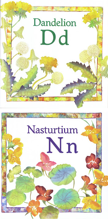
        We start today with the Wildflower Alphabet of Diana Pomeroy.  I had previously featured her counting book, but this is my first time sharing anything from her alphabet.  Pomeroy’s block printing method is unique among all the alphabets I’m sharing in this year’s challenge: she uses potatoes!  (You can read more about that medium here.)  Her D is Dandelion, and I do like this one very much.  You can see very clearly here her interesting mix of relief and intaglio effects.  That is, they’re relief prints because the ink is spread on the raised surface of the carved block.  But sometimes there is also a different color of ink pressed down into carved lines, which also prints, and that’s intaglio.  I had a very difficult time picking just one other flower to share because I love so many of them, but I’ve settled on the Nasturtiums at N.
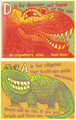
        Today’s bonus alphabet is from David Frampton.  I’ve mentioned his ABC before, and shared B, R, W, X, and Z.  Of course today I have D’s Dinosaur.  I think my favorite might be R with its almost pointillist sense of color and texture, but in order to share something new today I’ve selected A for Alligator.  Frampton makes his wood block prints with a separate block for each color, so you can see that these require the carving and printing of 4-5 blocks each.  The designs have a clear sense of fitting into the rectangle of the blocks, which is then the rectangle of the page in the book.
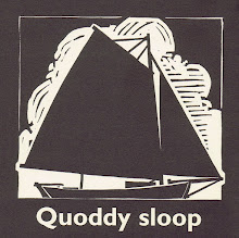
        Today I also invite you to revisit James Dodds, from whom I’ve already shared D (Dhow), so today I’ll share Q (Quoddy sloop).  You can also go back and visit C, S, W, X, and Y from his linoleum block printed Alphabet of Boats.  In a dramatic contrast from Frampton, Dodds’s boats are small, but very bold and simple.
        Of course the moral of the three different artists at D, with their three different and widely diverse relief block printing techniques, is that you need never weary of block printmaking, because there’s always something new.
        And also, anything that can be carved can be printed!  (Although possibly not everything should be carved and printed, so don’t do anything rash…)
        So, what’s your favorite medium for creativity?  Is it watercolors, knitting, origami, or glassblowing?  Or is it cooking, dancing, bagpipes, or writing memoir?  This is creativity I’m asking about, so it could be just about anything!  
(But admit it, relief block printing’s one of the best!)

[Pictures: Dandelion, Nasturtium, potato prints by Diana Pomeroy from Wildflower ABC, 1997;
Dinosaur, Alligator, woodcuts by David Frampton from My Beastie Book of ABC, 2002;
Quoddy sloop, linoleum block print by James Dodds from Alphabet of Boats, 1998.]

March 27, 2023

Comic Crawhall

         Welcome to the April A to Z Blog Challenge!  My theme this year is Relief Printed Alphabet Squared, an alphabet of alphabets illustrated with relief block prints.  You can find the master list of participating bloggers here.  Check them out!
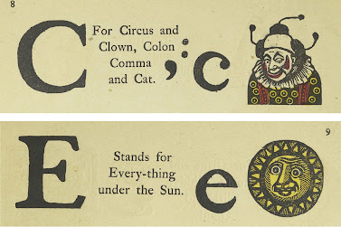
        Joseph Crawhall II (UK, 1821-1896) dabbled in many pursuits, but his interest in old chapbooks, broadsides, and their woodcuts is very much reflected in his own work.  His Old Aunt Elspa’s ABC is a bit of an oddity.  Published in 1884, it makes a somewhat tongue-in-cheek ye olde imitation of books that were already going on a century older.  For C, Crawhall gives us a Clown that I find a little disturbing, and I’m not even one of those people with a clown phobia.  But my 
favorite letter is E, which is illustrated by the sun, but which actually stands for Everything.  This
 amuses me.  You’ll be able to see one more of Crawhall’s letters coming up later.  See if you can spot it!
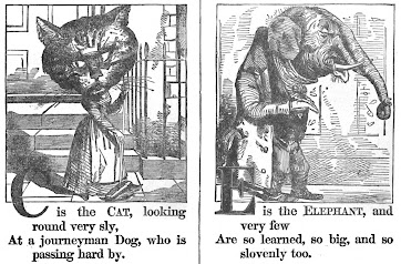
        Next up is another somewhat odd alphabet, A Comic Natural History, featuring detailed wood block prints of anthropomorph-ized animals with enormously oversized heads.  C is for Cat, another rather hideous illustration.  (C doesn’t seem to be serving us well, I’m afraid!)  But
I also give you another E, the slovenly Elephant, which I find rather more endearing.
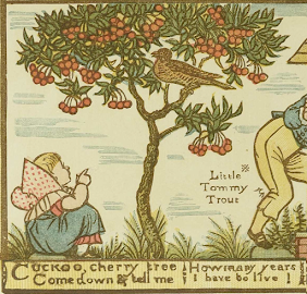
        Finally, we can’t talk about block printed alphabets without mentioning Walter Crane (UK, 1845-1915), an enormously influential force in children’s picture book illustration for decades.  He published at least four lavishly illustrated alphabet books, and possibly more I’m forgetting about.  I’ve shared a few letters previously, including A and Q from Baby’s Own Alphabet, as well as V and X from The Absurd A.B.C.  I include here today the Calf for C (along with A-D) from his Noah’s Ark Alphabet, and the C (Cuckoo) from Baby’s Own Alphabet.  Crane's illustrations were originally color wood block prints, but were then sometimes reprinted with lithography in later editions.
        The moral of C comes from both the clown and the comic cat, and is the reminder that humor is very much in the eye of the beholder.  (And more on that topic here.)
        Riddle of the day: which letters encircle the earth?  (Or possibly another one: which letters carpe the diem?)
        So, all of today’s alphabets are aimed squarely at children.  Do you remember any alphabet books from your childhood?  Did you have a favorite?


[Pictures: Clown, Everything, wood block prints by Joseph Crawhall II from Old Aunt Elspa’s ABC, 1884 (Images from Toronto Public Library);
Cat, Elephant, wood block prints from A Comic Natural History, (1886?) (Image from Hathi Trust);
Calf, Cuckoo, wood block prints by Walter Crane from Noah’s Ark Alphabet c. 1871, and Baby’s Own Alphabet, 1875 (Images from Toronto Public Library).]

March 24, 2023

Bewick #AtoZChallenge

         Welcome to the April A to Z Blog Challenge!  My theme this year is Block Printed Alphabet Squared, an entire alphabet of alphabets illustrated with relief block prints.  As usual, I’ve started early, but you can find out more about the A to Z Challenge here.
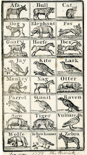
        Today I’m spotlighting two alphabets and they both come from Thomas Bewick.  Bewick (UK, 1753-1828) is generally considered to be the artist who brought wood engraving to its pinnacle as a medium of illustration.  Read my prior post about him to learn more.  He was an early proponent of making illustrations for children with as much care as those for adults, and you can certainly appreciate the level of accuracy and detail in these wood engravings, which are quite small.  The first alphabet today was made when Bewick was only about 24, but he’d already been a wood engraver for a decade.  I’ve gone ahead and included the entire thing, since it’s all one sheet.  (Remember you can always click on the pictures to see them bigger.)  Here B is for Bull, but I particularly like the Elephant, Fox, Goat, and Ibex.  (Why should I have to pick just one when I’ve already included them all?)  Dating to 1777, this one is about tied as the oldest alphabet I’ll be sharing.
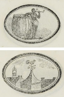
        Our second alphabet today was published 38 years later, and is another of those small educational pamphlets that we’ll be seeing lots of in the letters to come.  In this alphabet B is Black, along with the text “Black Men and Wo-men are na-tives of warm coun-tries.”  Here’s the time to note that when you go researching English children’s books from the nineteenth and early twentieth centuries you are likely to come across some pretty appalling examples of racism, sexism, and other messages that should definitely not be taught to children any more.  (People of various nations and cultures was a particularly popular theme as the British Empire began to overtake more and more of them, and I find it fascinating to see the varying attitudes the authors and artists could take with their subjects.)  But in this case, although Bewick is certainly exoticizing black people, I actually like how simply matter-of-fact he is.  He portrays the Black man on a par with the white men who show up in the alphabet (including the Captain, the Fiddler, and the Haymaker), and with far more dignity than the 
Drunkard and the Userer.  However, I’ve passed over all those people and chosen W for Weathervane as my favorite illustration in this little book, because I always like rooftop views.
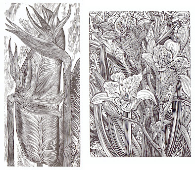
        Today’s first bonus B is the Bird of Paradise flower from A Wood Engraver’s Alphabet by Gerard Brender à Brandis.  I’ve shared a number of images from this one before, including F, M, R, Z, and also Q.  The ones I posted already were chosen because they’re my favorites, but today I’ll go ahead and add D for Day Lily.
        You can also revisit an alphabet of funky linocut letter designs by James Brown.  I previously posted A, F, H, K, U, and Z.  (The A is also in the title collection in the Theme Reveal post, and one more of Brown’s letters will show up as one of the letter icons before the end of the alphabet.)  And here’s his B, Bravo.
        The moral for B is Be kind, Be honest, Be brave, Behave yourself, and sometimes, if you’re feeling overwhelmed, just Be.
        And also, beware of B’s in your bonnet.
        So, to be or not to be?  That is the question, as we all know.

[Pictures: Alphabet, wood engraving by Thomas Bewick, 1777 (Image from The British Museum);
Black, Weathervane, wood engravings by Thomas Bewick from The Child’s Instructor, or Picture Alphabet, 1815 (Images from McGill Library);
Day Lily, wood engraving by Gerard Brender à Brandis from A Wood Engraver's Alphabet, 2008;
Bravo, linocut by James Brown (Image from James Brown).]

March 20, 2023

Animals #AtoZChallenge

         Welcome to the April A to Z Blog Challenge!  My theme this year is Relief Printed Alphabet Squared, an alphabet of alphabets illustrated with relief block prints.  As usual, I’m starting early, but you can find out more about the A to Z Challenge here and see what varied and interesting themes other bloggers will be exploring this year.
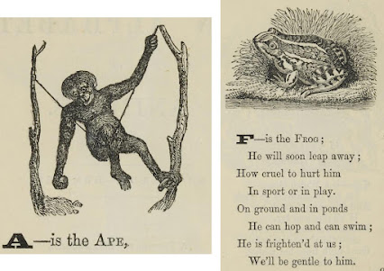
        Without further ado, we’ll start with An Alphabet of Animals, a little paperback book published in 1865 and billed as being by “A Lady,” with no attribution for the illustrator of the wood engravings.  Given common practices at the time, it’s entirely possible that the 
illustrations were reused from unrelated blocks the publisher already owned from past projects, so they could well be done by all different more-or-less anonymous artists.  A is for Ape in this alphabet, and it’s a pleasing enough depiction, if nothing too exciting.  I like how cheerful this ape looks.  My favorite letter from this alphabet is the frog of F, which has lots of attractive detail.  I’ve also included the entire verse for the frog because it’s a nice one.
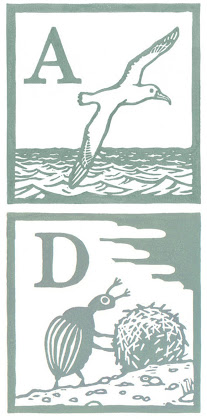
        Today’s second alphabet is also animals.  This one is by illustrator Andrew Wightman.  His linoleum block A is Albatross, and it shows the clean, clear, bold style shared by all his animals in this series.  My favorite, though, is D’s Dung Beetle, which has a cartoonish charm.  Although most of Wightman’s animals are fairly realistically portrayed, the dung beetle is more anthropomorphized, and is really quite adorable.
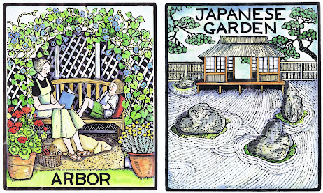
        I’ll also share a few bonus alphabets for the letter A, which I’ve mentioned in the past.  Most important is Mary Azarian, who has published two lavishly illustrated wood block alphabets.  Here’s her A for Arbor from A Gardener’s Alphabet, in which she has water-colored her wood block prints.  You can also see the letters G, Q, U, and X from this book in previous posts.  They’re some of my favorites, but today I’ve added J to the list.
        And I love Azarian’s black and white A Farmer’s Alphabet even more.  (The book is black and white, but she's also made watercolored versions of some of its wood block prints.)  From that one I’ve already shared not only A (which is Apple), but B, D, G, H, MX, and Z (Zinnia, probably my favorite).  Be sure to check them out.
        Then there’s the linocut alphabet by Walter Inglis Anderson (USA, 1903-1965).  I’ve written about him before, as well as sharing his letters A (also Apple), D, M, S (my favorite perhaps? Sea), and T.  Plus his B (Butterfly) appears in the title collection in the Theme Reveal post, and his Z will help us close out the A to Z Challenge.
        For a moral today I can’t do better than “A Lady” in her observations on the frog.  Children, let’s not be cruel to any living creatures.  Instead, we need to treat all around us gently.
        And also, the journey of 26 letters starts with a single A.
        So, if you were to select an alphabet of animals, what’s the one favorite animal you would be absolutely sure to include?

[Pictures: Ape, Frog, wood engravings from An Alphabet of Animals, 1865 (Images from McGill Library);
Albatross, Dung Beetle, linocuts by Andrew Wightman, c. 2015 (Images from AndrewWightmanPrints);
Arbor, Japanese Garden, wood block print by Mary Azarian from A Gardener’s Alphabet, 2000.]

March 15, 2023

#AtoZChallenge 2023 Theme Reveal

         It’s time for the 2023 April A to Z Blog Challenge!  The A to Z Challenge involves bloggers from all around the world, who each share 26 blog posts throughout the month of April, working their way through the alphabet from A to Z.  This will be my 8th A to Z, and yes, there are some things that I intend to do the same way I always do:
     • Starting early so I can take a few extra days off during April
     • Offering you lots of links to previous posts with additional bonus information
     • Morals!  Sure, morals have absolutely no intrinsic connection to this year’s theme, but you know what?  My A to Z posts have included morals for the past 4 years, and I reckon by now it’s simply what I do.  What can I say; I’m just a sententious kind of person.
        However, despite continuing to observe my own customs, what will be unique for this year is, of course, a new and exciting theme.  After several years of fantasy topics, it’s time to give block printing the spotlight, and this year I’m going meta and offering an alphabet of alphabets.  Get ready for Relief Printed Alphabet Squared!  In each post I’ll introduce you to some alphabets that are all illustrated with relief block prints.  I’ll give you the illustration for the letter in question, as well as my favorite illustration from the entire set.  And of course sometimes there might be more.  (If you miss the fantasy, don’t worry.  I can never resist letting a few strange and fantastical characters sneak in!)
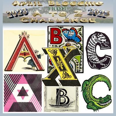
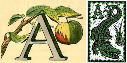
        As for today, of the seven letters in the title picture above, five will be introduced later, as will this A is for Apple.  You’ll have to stay tuned and join me throughout April to find out where they all come from!  The other letters featured today are part of alphabets that aren't going to get their own posts.  In some cases that’s because I wasn’t able to find a complete (or even mostly complete) alphabet.  In other cases it’s because I couldn’t figure out any way to assign their alphabet to a letter that wasn’t already full!  (As usual in alphabets, some letters are oversubscribed, while others go begging for more.)  Therefore I’ll tell you about those letters today.
        The second B in the title picture, with a Boat, comes from a nineteenth century primer, and although we’ll see many primers in the coming weeks, there will be no more from this particular book.  The second C in the title collection, shaped like a crocodile, is a modern linocut by Mark Long.  I’d have loved to feature that alphabet, but I couldn’t find good pictures of most of its letters.  However, there will be one more from his alphabet coming up as an icon for one of the letters, and another in the grand finale, so keep your eyes open for them!  The yellow X comes from Cousin Honeycomb’s New Royal ABC from 1855.  That little book has no pictures illustrating its letters, but just large, fancy colored capitals (of which one more will also appear shortly as a letter icon).
        The A for Alligator is a 2 color linoleum block print by Kerry and Neil Stavely.  I like the spiky A which looks appropriate to both the water plants and the alligator’s teeth and claws.
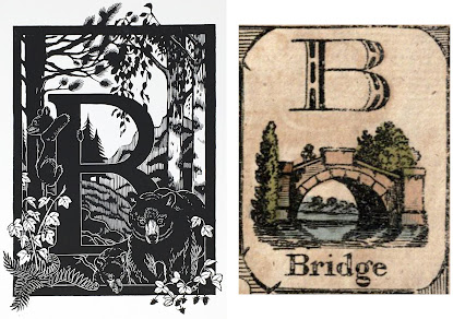
        B is for a number of things in Karin Rytter’s Linocut ABC.  Bear is the most obvious, but her detailed and accurate scene also includes Birch trees, Berries, and possibly some other things.  I particularly like the bear cub climbing up the trunk of the letter.  My other B is for Bridge and I find this a particularly charming little composition.  It’s one of the earlier alphabets in this series, dating back to 1808.  Like all the early ones, the color was hand-painted over plain black wood block printing.
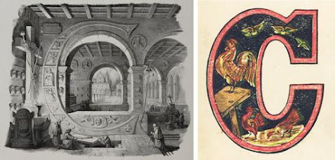
        This amazing C is for Crypt, Church, and dozens of other words in Italian, which is its native language.  Many of them also work in English.  Although I really enjoy the entire architectural alphabet by Antonio Basoli, I haven’t featured it elsewhere because it’s engraved and printed intaglio, not relief printed.  (However, I couldn’t resist one other letter from another engraved architectural alphabet by another artist, so don’t forget to look for that among the letter icons to come.)  The other C today is for Cock, and brings things back down to reality with The Farmer Boy’s Alphabet, printed with multiple blocks in multiple colors.
        So, now you’ve had a taste of some of the alphabetical block printed delights in store.  If you’re ready to get started early with this A to Z Challenge, come back for my very next post and find out what Alphabets A is for.  But if you prefer to participate at the right and proper time, don’t worry.  Each day in April I’ll include links to send you to the officially designated letter.  Either way, I’ll see you soon!
        The moral of this theme is of course that even alphabets should be alphabetized!  Just remember the famous rhyme: A before B, especially before C… Or something like that, anyway.
        So, when you see an illustrated alphabet, do you go through in order, or do you skip straight to your initials to see whether they’re good pictures?  (My name starts with A, so I don’t even have to choose between those two approaches!)


[Pictures: X, hand-colored woodcut from Cousin Honeycomb’s New Royal ABC, 1855 (Image from Toronto Public Library);

Boat, wood block print by John Gilbert from The Prince of Wales’ Primer, 1847 (Image from Toronto Public Library);

Crocodile, linocut by Mark Long (Image from Typography Daily);

Alligator, linocut by Kerry and Neil Stavely (Image from Horse & Hare);

Bear, linocut by Karin Rytter (Image from Karin Rytter Studio);

Bridge, hand-colored wood block print from The Royal Alphabet, 1808 (Image from University of California);

Church, copper engraving by Antonio Basoli from Alfabeto Pittorico, 1839, (Image from Storia e Memoria di Bologna);

Cock, wood block print possibly by Harrison Weir from The Farmer Boy’s Alphabet, 1860 (Image from University of Florida).]

March 10, 2023

Wind Dragons

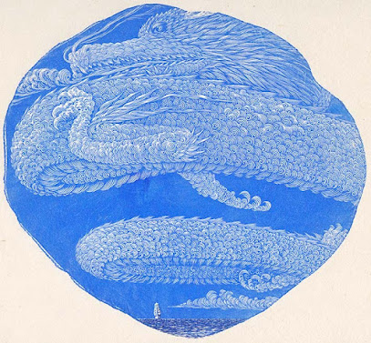
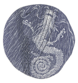
         Just a short post today as I’m hard at work preparing for the April A to Z Blog Challenge (foreshadowing).  But that doesn’t mean I don’t have something amazing!  Here are two wood engravings of wind dragons by Atsushi Matsuoka (Japan, b. 1971).  To review, wood engravings are carved on hard, fine end grain, which means the block of wood is cut across the branch or trunk of a tree, not along its length.  That means there’s a limit to how big a block can be, without either joining up multiple chunks of wood, or using synthetic substitutes for natural wood.  And that means that most wood engravings are very small.  Moreover, nowadays it’s quite common for artists to use the actual irregular round shape of the tree’s cross section, as opposed to wasting surface area by chopping off the edges to make square or rectangular blocks.  Matsuoka shows this technique in today’s two pieces.  The second is fairly round, which is pretty straightforward from a design point of view, but the first is a little more irregular.  Matsuoka had to decide how to use the shape of the wood for his composition, and he put the smaller, more pointed part toward the bottom so the piece is almost more diamond-shaped.
        Both pieces show flying dragons composed entirely of tiny curled lines, so that they are simultaneously scaly and puffy like clouds.  I love how they look like wispy dragons made of air, wind, and cloud.  The first is the enormous power  of the entire sky, blowing the sailing ship across the ocean.  The second is a rain dragon.  We’re looking upward into the rain, and the power lines (printed with a separate block) evoke the electric power of a storm.
        Now that spring is upon us (here in the northern hemisphere), I hope the rain dragons are benevolent to us this year!


[Pictures: Direction of the Voyage, wood engraving by Atsushi Matsuoka, 2020;

Raining, wood engraving by Matsuoka, 2013 (Images from Atsushi Matsuoka).]

March 6, 2023

The Faëry Chasm

         It’s been a little while since I posted a fantasy poem, so today here’s one by William Wordsworth (UK, 1770-1850).  This is a sonnet published in 1820.


No fiction was it of the antique age:
A sky-blue stone, within this sunless cleft,
Is of the very footmarks unbereft
Which tiny Elves impressed; – on that smooth stage
Dancing with all their brilliant equipage
In secret revels – haply after theft
Of some sweet Babe – Flower stolen, and coarse Weed left
For the distracted Mother to assuage
Her grief with, as she might! – But, where, oh! where
Is traceable a vestige of the notes
That ruled those dances wild in character? –
Deep underground? Or in the upper air,
On the shrill wind of midnight? or where floats
O’er twilight fields the autumnal gossamer?


        I definitely dislike the line “Is of the very footmarks unbereft” which, ironically for a poet claiming to use the language of the common man, is an opaque double negative presumably jammed in there just to get the rhyme.  But on the other hand, there are two parts of the poem I find particularly moving.  One is the mention of the changeling in lines 6 through 9.  In terms of the “plot” of the poem, it’s just a throwaway line to say “Maybe the fairies were celebrating after stealing a human child.”  But the lines beautifully express the human mother’s complex feelings in a nightmare situation.
        I also really like the punch line of the whole thing: we can see the marks of their footprints, but where is there any trace of the most important part of the dance, the music?  That leaves no vestige.  I’m reminded of the lines from my own book Sleeping Legends Lie, “When a song is interrupted in the middle, where does the music go?  Is the song dead?  Does the song have a ghost?  No, it is as though it never existed.  It leaves no ash, no shadow, nothing.”


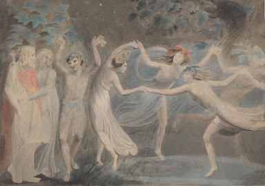
[Picture: Oberon, Titania and Puck with Fairies Dancing, watercolor by William Blake, c. 1786 (Image from Tate).]

March 1, 2023

Chalandre's Nevers

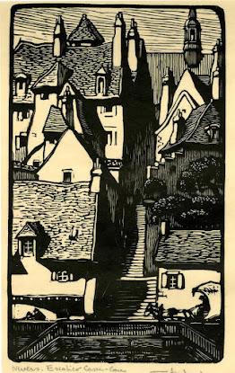
         Today’s block print artist is Fernand Chalandre (France, 1879-1924).  Chalandre was born and spent most (or possibly all?) of his life in Nevers, France, where he was confined to a wheelchair, but nevertheless travelled all around his hometown sketching people and scenery and turning them into block prints.  Looking at his views of Nevers I find the steep streets and staircases extremely scenic, but I imagine they must have been quite a challenge to navigate in a wheelchair.
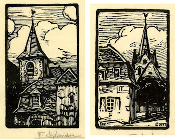
        Chalandre’s pieces are all rather small, and he also did quite a few bookplate designs (although I haven’t selected any of those to share today).  Many of them show small scenes tightly cropped in interesting ways.  For example, the first piece is a narrow slice of view which centers on a staircase.  None of the buildings on either side are shown in their entirety.  (By the way, the British Museum dates this piece to 1925, while telling me that Chalandre died in 1924. Since it’s signed by the artist, I don’t know what to make of this!)  Another example is the church spire, which focusses tightly on the tower rather than showing the entirety of the church.
        The second church spire, on the other hand, while still the focus of its piece, is actually in the background, the bulk of the church building obscured by the tree and house in the foreground.  The various textures may seem somewhat roughly carved, but they actually work perfectly.  Also, keep in mind that this piece is only 33x55 millimeters (about 1.5x2 inches) so in fact those are tiny little precision details.
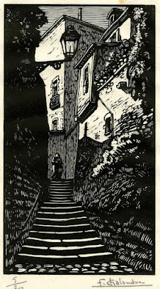
        You can see that the details increase when the size increases, in this view of another stone stairway, which is about 4.5x7.75 inches.  I especially like the areas at the top: the lamp, the windows, the flowers on the right…
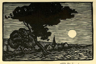
        These are all listed as woodcuts, but the tiny size of them, and particularly the carving patterns of this last one, make me wonder whether they aren’t actually wood engravings instead.  The rougher shapes on the ground look like they could be gouges, but the use of nothing but thin lines to depict shapes and textures is more characteristic of engraving.  At any rate, I always love a moonlit scene, and this one is wonderfully serene.
        Chalandre was a new discovery for me, and I’m very pleased to have made his acquaintance.  I hope you enjoy his small, sensitively observed work as much as I do.


[Pictures: Nevers, Escalier Casse-Cou, woodcut by Fernand Chalandre, 1925;
Church spire with birds, woodcut by Chalandre, 1919;
Church in Cuffy, France, woodcut by Chalandre, 1919;
Stone steps, woodcut by Chalandre, 1925;

Moonlit landscape, woodcut by Chalandre, 1919 (All images from British Museum).]