December 30, 2014

Words of the Month - Bertie, Bill, and Ted

        Our read-alouds have not been fantasy for quite a while.  We had a long stretch of classic British Golden Age mystery stories, and now we’ve plunged into P.G. Wodehouse’s Jeeves and Wooster short stories.  But a couple of months ago we did introduce the children to the classic fantasy or sci fi movie “Bill and Ted’s Excellent Adventure.”  And having enjoyed Bill and Ted in close proximity to Bertie Wooster, I’m struck by how similar they are.  The basic idea of rather feckless protagonists solving flighty problems with outrageous schemes ties these all together, but the really important thing in both is the language.  It isn’t for the plot that I enjoy either; it’s for the language.  Bill, Ted, and Bertie are all eminently quotable because they have such a delightful way with words – and their respective ways with words are actually very closely akin.  Let’s look at the main characteristics of Bill and Ted’s and Bertie’s speech.  They meld together the following disparate components to create unexpected speech that tickles us.
        1. Silly slang of their era
Bertie: rummy, bally, blighter, what ho, topping, chappie
Bill & Ted: dude, totally, whoa, babe
        2a. Fancy, learned vocabulary
Bertie: curvet, pastoral, superfluous, pestilential, diffident, quivering ganglions
Bill & Ted: bodacious, esquire, bogus, heinous, tranquil, personages of historical significance
        2b. Archaic or exaggeratedly poetical language
Bertie: rich raiment, eftsoons or right speedily, for the nonce, mazzard
Bill & Ted: afoot, resplendent, odious, chaste
        3. Quotations and references to sources ranging from pop music to The Classics
Bertie: “Where is my wandering boy tonight” (hymn), “A livelier iris gleams upon the burnished dove” (poem by Tennyson - in fact, Bertie quotes a lot of Tennyson), “Now is the time for all good men to come to the aid of the party” (typing drill)
Bill & Ted: “All we are is dust in the wind” (song by Kansas), “Every rose has its thorn just like every night has its dawn” (song by Guns n’ Roses)
        4. Playing with words and grammar with positively Shakespearean freedom from embarrassment
Bertie: “The end was certainly not yet.  Indeed, it would be difficult to think of an end that was less yetter.” (Intro to The World of Jeeves), “The good old persp. was bedewing my forehead by this time in a pretty lavish manner.” (Jeeves in the Springtime)
Bill & Ted: “most non-triumphant,” “your Royal Deathness,” “Mr. the Kid”
        And finally, Bertie especially is a master of Similes
Bertie: “chuckled like the last bit of water going down the waste-pipe in a bath” (Scoring off Jeeves), “He looked pretty much like an explosion in a tomato cannery on a sunset evening” (Jeeves and the Unbidden Guest), “She fitted into my biggest armchair as if it had been built round her by someone who knew they were wearing armchairs tight about the hips that season” (Jeeves and the Unbidden Guest), “Her demeanour was now rather like that of one who, picking daisies on the railway, has just caught the down-express in the small of the back” (Aunt Agatha Takes the Count)
        The thing about humor is that it thrives on the unexpected, or the reversal of expectations, and Bill, Ted, and Bertie all know how to tweak our expectations about language.  They all three revel in the riotous joy of words, and I positively lap it up!  So, in their spirit, let me wish you all a perfectly topping New Year, and remember to Be excellent to each other!

[Picture: Detail from The Fate of the Cigarette Fiend, wood block print by John Held, Jr, 1929 (Image from Rich Powell Illustration);
Detail from cartoon by John Held, Jr, 1920s.]

December 26, 2014

Interesting Image by Alberto Beltrán

        Here’s a somewhat surreal wood or linoleum block print by Alberto Beltrán García (Mexico, 1923-2002).  I like the mysterious vaults leading away into the dark tunnel, and the curling embellishments around the arch.  With the woman’s body encompassing the mysterious tunnel, and the person sitting grouchily outside as if he’s in a pout refusing to enter, there would seem to be some sort of psychological, metaphorical meaning to this scene — but what it might be I have no idea.  I have no additional information about this piece, not even the title, so I really have no idea what the artist was thinking about with it.  But I like it.  It’s mysterious and seems to invite adventure.  It seems appropriate as the new year beckons.


[Picture: My source didn't give the title or date of this wood or linoleum block print by Alberto Beltrán García (Image from here.)]

December 23, 2014

Nativity 3

        Today’s nativity scenes are from the twentieth century, and demonstrate the idea of revisiting a theme repeatedly.  I would tend to think, “I’ve done a nativity scene.  What’s the point in doing another?  I don’t have any new ideas about how to show it.”  But many artists do have new ideas about showing the same subject.  Besides, if they’re designing a Christmas card every year, as many artists have done, they have an impetus to come up with new ways to  depict the same scene.  So today I have three pieces each from two largely contemporaneous artists, each of whom did many nativity scenes over the years.
        Eric Gill (England, 1882-1940) is first, beginning with a depiction that includes only the Holy Family and a midwife.  Joseph looks somewhat aloof, on the edge with his arms crossed, and the star and the people’s skin make the only areas of white larger than a scratch.  Second is a madonna and child rather than a stable scene, but I include it because I’m tickled by the fact that Mary’s knitting.  In fact, though, she seems more intent on her knitting than on the angel, or even than the baby, who seems to reach up to her for attention he isn’t getting.  I confess to not being much of a fan of Gill’s people’s expressions.  So how about a nativity in silhouette, which I think would make a lovely Christmas card.  I’m not sure of the identity of the animal in the lower right, but I like the bird coming in from the top.  I also like how the baby is reaching out to the animals.  No stiff, cold, overly-stylized expressions to be seen.  Gill has designed this like a paper cutting, with all the black areas attached so that there are no loose pieces.  Of course, as a block print it would have been fine for there to be islands of black, so it’s an interesting design choice.
        Gwen Raverat (about whom you can read more in an earlier post) shows her people with much more tenderness.  This first is simple, but only about an inch and a half tall, which means that the carving is really very detailed.  Actually, these three pieces are all quite small.  The second is my favorite.  Raverat is great with light, and I love the way the baby is the light source, making his parents’ robes and faces glow.  (Speaking of robes, note that these people are no longer dressed in contemporary fashion, but in our conception of historically accurate clothing.)   And finally, a lovely mother and child.  They may have haloes, and this baby is being set gently in a manger, but still, it depicts that universal 
element of the Christmas story: the miracle of a newborn baby and the love between parent and infant.


[Pictures: Nativity with Midwife, wood engraving by Eric Gill, 1913;
Madonna and Child with Angel, wood engraving by Gill, 1916;
Animals All, wood engraving by Gill, 1916 (Images from the Tate);
The Manger, wood engraving by Gwen Raverat, 1912;
The Nativity, wood engraving by Raverat, 1916;
The Manger 1, wood engraving by Raverat, 1932 (Images from The Raverat Archive).]

December 19, 2014

Nativity 2

        I have two more images of the birth of Jesus today, from the broad mid-range of the chronology between the Renaissance and the twentieth century.  In general I tend not to be as excited about this middle period of printmaking.  It’s a little too detailed, a little too focussed on reproducing drawing rather than retaining a look of carving.  It’s also the period when copper engraving, etching and other intaglio printmaking techniques took over the spotlight, and an etching is, of course, really just a drawing.  In etching the artist sketches on the treated plate, and after the acid does the work of carving, it’s printed so that the drawing is reproduced in ink.  It’s really not my thing, but this is Rembrandt, and it’s a lovely scene, so I found it in my heart to include it.  Like a lot of Rembrandt’s work, much of the beauty is in the homeliness of the characters.  They’re in their own contemporary, everyday dress and they look just as the neighbors might look, coming to admire any new baby.  I like that Mary looks plausible as a woman who just had a baby, rather than those stiff, thin, cold medieval Marys who can’t possibly have ever been pregnant, let alone just been through labor.  The whole scene is suffused in warmth, and the sort of holiness that shines in its own small corner of the night rather than glaring out in a blaze of publicity.
        And skipping two hundred years to Gustave Doré again, this second nativity scene shows why wood block printing is so good for depicting light.  After all, when you draw with a pen or pencil (or etching needle), you’re drawing darkness on your light paper, but when you carve a wood block, you’re drawing the light into the black.  Doré’s scene may be the typical sentimental Victorian version of the nativity, and I think the one kneeling shepherd has a face more like a mask of tragedy than an adoring man, but I do very much appreciate that Doré’s shepherds are both men and women.  Have you ever noticed that in most versions Mary seems to be the only woman in the entire land of Galilee?  Of course women, too, came to admire the wondrous infant, and as the old joke goes, they probably brought more useful gifts than gold, frankincense, and myrrh.

[Pictures: Adoration of the Shepherds, with Lamp, etching by Rembrandt van Rijn, 1654 (Image from Wikimedia Commons);
The Nativity, wood engraving by Gustave Doré, 1866, from The Doré Bible Gallery, 1891 (Image from Project Gutenberg).]

December 16, 2014

Nativity 1

        In European art the nativity of Jesus has long been a favorite subject, and I’ve collected a number of lovely relief block prints on the Christmas story.  I thought I’d dole them out in chronological order as we head toward Christmas.  So, our first pieces are the earliest, right around the turn of the century - the fifteenth into sixteenth century, that is.
        This first one from about 1497 still retains much of the charm of medieval art, with its gothic architecture and lack of perspective or accurate scale.  I like the little angel peeking between Mary and Joseph, and the ox on the left with a very funny expression on its face.  Jesus is laid right on the ground, with only a bit of Mary’s gown and, of course, his own spiky halo to soften his bed.  Note the holes in the thatch of the stable’s roof, where the beams show through.  We’ll see that again.
        Next up, another Book of Hours, this one from 1502.  Here there’s much less background because the main figures fill the space, but there’s still a charming little framing arch.  Jesus is awake and receiving visitors in the disconcertingly non-newborn way that’s so common in medieval religious art.  I take the kneeling figure to be one of the wise men, and I like his mild, genuinely humble expression, as opposed to the two kings behind him, who are clearly whispering together, trying to figure out what to make of this all.
        But we couldn’t leave the early period with these relatively crude efforts, so here’s Albrecht Dürer’s 1510 Nativity to push us firmly into the Renaissance.  Note the perfect perspective of the stable beams (but note, too, that the stable is still inadequately thatched and looking quite ruinous.)  We still have our little angel, too, but this time it looks more like it’s the one tucking Jesus in, and this time the baby has a cozy basket to be tucked into.  As in all early Bible illustrations, the characters are wearing contemporary clothes, cotte and hose for the shepherds here, and note the kings’ knightly surcoats in the second piece and the observers’ hoods in the first.
        I find it interesting to see what elements of the scene each artist chooses to emphasize: the meanness of the stable, the magnificence of the kings, the relationship between Mary and Joseph, the specialness of the baby, the surrounding scenery, or what.


[Pictures: The Nativity, woodcut by anonymous artist from Horae, c 1497 (Image from godecookery.com);
Nativity, metalcut by anonymous artist from Horae Beatae Mariae Virginia, cum Kalendario, 1502 (Image from University of Virginia Library);
Nativity from The Small Passion series, woodcut by Albrecht Dürer, 1510 (Image from Wikipedia).]

December 12, 2014

The Cremation of Sam McGee

There are strange things done in the midnight sun
      By the men who moil for gold;
The Arctic trails have their secret tales
      That would make your blood run cold;
The Northern Lights have seen queer sights,
      But the queerest they ever did see
Was that night on the marge of Lake Lebarge
      I cremated Sam McGee.

        I don’t usually go for the undead sort of fantasy, but here’s a poem that’s just so much fun to hear that I have to include it.  The poem comes from Songs of a Sourdough, but poet Robert Service (1874-1958) was anything but a sourdough, an experienced old-timer of the Yukon.  He came late to the gold rush territory and worked primarily as a bank manager.  What he was, however, was a sociable man with a quick ear for a catchy turn of phrase, and a gift for capturing both the romance of the north and its humor.  That first book of poems became an immediate best-seller in the early twentieth century, and Service remained a wealthy, prolific, celebrity author for the rest of his life.  As for The Cremation of Sam McGee as a fantasy tale, it’s pretty straightforward.  The magic really comes only in the final punch line, but the world creation is also wholly in keeping with fantasy.  Even though the poem claims to be set in a real time and place, Service uses a fantasy aesthetic to evoke a land as strange, mysterious, and magical to most of his audience as Middle Earth or the moon.
        It’s a long poem, so I give you here just excerpts.  Please read the entire poem here.  And try reading it aloud.  It really is meant to be savored by tongue and ear.  Better yet, grab a blanket and a mug of hot chocolate, and recite it while gathered around the fireplace as the snow whirls outside and the frost clings to the windowpanes.


On a Christmas Day we were mushing our way over the Dawson trail.
Talk of your cold! through the parka's fold it stabbed like a driven nail.
If our eyes we'd close, then the lashes froze till sometimes we couldn't see;
It wasn't much fun, but the only one to whimper was Sam McGee.

And that very night, as we lay packed tight in our robes beneath the snow,
And the dogs were fed, and the stars o'erhead were dancing heel and toe,
He turned to me, and "Cap," says he, "I'll cash in this trip, I guess;
And if I do, I'm asking that you won't refuse my last request."

Well, he seemed so low that I couldn't say no; then he says with a sort of moan:
"It's the cursèd cold, and it's got right hold till I'm chilled clean through to the bone.
Yet 'tain't being dead—it's my awful dread of the icy grave that pains;
So I want you to swear that, foul or fair, you'll cremate my last remains."

A pal's last need is a thing to heed, so I swore I would not fail;
And we started on at the streak of dawn; but God! he looked ghastly pale.
He crouched on the sleigh, and he raved all day of his home in Tennessee;
And before nightfall a corpse was all that was left of Sam McGee.

Now a promise made is a debt unpaid, and the trail has its own stern code.
In the days to come, though my lips were dumb, in my heart how I cursed that load.
In the long, long night, by the lone firelight, while the huskies, round in a ring,
Howled out their woes to the homeless snows— O God! how I loathed the thing.

Till I came to the marge of Lake Lebarge, and a derelict there lay;
It was jammed in the ice, but I saw in a trice it was called the "Alice May."
And I looked at it, and I thought a bit, and I looked at my frozen chum;
Then "Here," said I, with a sudden cry, "is my cre-ma-tor-eum."

Some planks I tore from the cabin floor, and I lit the boiler fire;
Some coal I found that was lying around, and I heaped the fuel higher;
The flames just soared, and the furnace roared—such a blaze you seldom see;
And I burrowed a hole in the glowing coal, and I stuffed in Sam McGee.

Then I made a hike, for I didn't like to hear him sizzle so;
And the heavens scowled, and the huskies howled, and the wind began to blow.
It was icy cold, but the hot sweat rolled down my cheeks, and I don't know why;
And the greasy smoke in an inky cloak went streaking down the sky.

I do not know how long in the snow I wrestled with grisly fear;
But the stars came out and they danced about ere again I ventured near;
I was sick with dread, but I bravely said: "I'll just take a peep inside.
I guess he's cooked, and it's time I looked"; ... then the door I opened wide.

And there sat Sam, looking cool and calm, in the heart of the furnace roar;
And he wore a smile you could see a mile, and he said: "Please close that door.
It's fine in here, but I greatly fear you'll let in the cold and storm—
Since I left Plumtree, down in Tennessee, it's the first time I've been warm."

There are strange things done in the midnight sun
      By the men who moil for gold;
The Arctic trails have their secret tales
      That would make your blood run cold;
The Northern Lights have seen queer sights,
      But the queerest they ever did see
Was that night on the marge of Lake Lebarge
      I cremated Sam McGee.

[Pictures: Dog Sled Team, linocut by George Kuthan, c. 1950-69 (Image from University of British Columbia library);
They fell down and died as they walked, illustrationt by Ray Brown, from American Merchant Ships and Sailors by Willis J. Abbot, 1902 (Image from Project Gutenberg);
The Moaning of the Tied, wood block print by anonymous artist, from The Great Frozen Sea by Albert Hastings Markham, 1894 (Image from Project Gutenberg).]

December 9, 2014

Weather Effects

        It’s a grey day here, not a black and white one.  Fog and drizzle aren’t natural subjects for single color relief block prints, but I’ve collected a few lovely woodcuts that use various techniques to depict interesting weather effects.  We’ll start with a few that use multiple colors of ink to produce gradations of grey.  Shiro Kasamatsu’s lovely woodblock in traditional Japanese style was printed multiple times with multiple colors, giving us a gleam of clouded sky reflected in the water, and dark, wet trees fading into a dark, wet background.  Zha Sai’s drizzle is a reduction print with at least three colors of ink.  It looks to me like willow branches, but it could also be streaks of water down a windshield, or perhaps something else.  It’s focussed so closely on the streaming details that it’s almost become abstract.
        Dan Miller’s woodblock uses a background block of grey-inked woodgrain to represent fog behind the black silhouettes of a block of trees.  Even the black block, though, is printed with the ink sparse enough that the woodgrain shows clearly, making the ground misty, too.  He appears to have used a bit of Japanese technique in inking the black block, painting some areas deliberately darker.
        If you want to see weather in plain black and white block prints, you aren’t going to get today’s steady grey rain.  No, you’re going to get something more dramatic.  Here are two wood block prints with weather that really gets your attention.  Tadeusz Stefan Zielinski’s storm washes over the landscape in cloudbursts punctuated by the luminous light that strikes down between the thunderheads.  Emma Schlangenhausen’s weather is perhaps the most dramatic of all, with her jagged clouds, streaks of rain like lightning, and sweep of the foreground.
        Today is  good day to stay indoors, here, and this is good art to stay indoors with!

[Pictures: Autumn Drizzle at Kokedera Temple, woodblock print by Shiro Kasamatsu, 1960 (Image from Castle Fine Arts);
Drizzle, reduction woodcut by Zha Sai, 2007 (Image from Davidson Galleries);
Trees and Fog, Maine, woodcut by Dan Miller (Image from live auctioneers);
House and Storm, wood engraving by Taeusz Stefan Zielinski, 1925 (Image from The Annex Galleries);
Noordwyk, woodcut by Emma Schlangenhausen, c 1917 (Image from The Annex Galleries).]

December 5, 2014

Sales

        This weekend I will be participating in two shows/sales.
        Saturday, 10:00-5:00 - Holiday Open Studio in my own house, as one of the Needham Artists in independent locations.  Here’s a thought about open studio browsing:
        My house, being on a dead-end street in a corner of town, doesn’t get much foot traffic.  Many people who come find themselves the only visitor here at the time, which can feel awkward.  I understand; I’ve been there as the visitor in other studios, and when you’re the only one you might feel like you have to take lots of time, look at everything, maybe even buy something whether you wanted to or not, because it would feel so rude not to.  In fact, you may not even want to go to an artist’s house or studio at all lest you feel put on the spot.  But trust me, it’s okay not to buy anything.  It’s okay not to want to chit-chat.  It’s okay to look around briefly and leave.  Obviously artists love it when someone admires everything and buys lots of stuff, but we do understand that not everyone is going to.  We’d rather have you come and buy nothing than not come at all.  We’d rather have you come just to look without intending to spend any money than to have you not come at all because you’re afraid of feeling awkward.  After all, sales are just one part of art shows.  Meeting people, making connections, getting out the word, education, and having friendly conversations are all important, too.  Being an artist is often a solitary pursuit and we enjoy the opportunity to connect with people, sales or no sales.  So please don’t be shy!  Stop by and say hello to your local artists when you get the chance!
        For more details about the Holiday Sale, my address, and the locations of other participating artists, see this Needham Artists Holiday Sale web site.

        Sunday, 2:00-4:00 - Local Author Book Fair at Wellesley Free Library.
        I don’t have any thoughts to share about this event, because this will be the first time Wellesley Library has run it, and it’ll be the first time I’ve ever done anything like it.  I don’t know entirely what to expect, although I assume it will be similar to art shows in group spaces that I’ve done.  I’m excited about it, though, because at my art shows the books are a minor detour for most people.  I’ve never done a show where the people came because they were looking for books.  I’m hoping it will involve lots of interesting conversations about stories, reading, and what makes books great!  I’m also hoping that it will reach a new group of people who don’t yet know that my books exist, but who might be exactly the kind of people I’ve been writing for - in the words of A.A. Milne, “those, young or old, who like the things which I like.”
        For more details about the Local Author Book Fair, see this flier.

[Pictures: Market, woodcut from Orbis Sensualium Pictus by Jan Amos Comenius, 1658 edition?;
Library, woodcut from Neuer orbis pictus für die Jugend… by Jacob Eberhard Gailer, 1842 (Images from Wikimedia Commons.)]
(Full quotation from Milne here.)

December 2, 2014

Spitzer's Landscapes

        James Spitzer (US b. 1936) has a very distinctive style, all blobby shapes with lots of inked lines left in the carved out areas.  In fact, he never makes any spaces pure white; his carved areas always have fairly heavy texture from the blade.  His landscapes look like fantasies or doodles, but they’re actually based on real places.  I’m not familiar enough with any of these places to know what sort of resemblance Spitzer has captured, but I really get a kick out of them in any case.  His clouds look as solid as his hills, and his skies as thick as his rivers.  His buildings look as round as his trees, and his grass, air, and pavement all 
have the hairy texture of a friendly monster.  His bridges dance, his hills are scoops of ice cream, and his outlines have the happy confidence of a toddler.  These are exuberant block prints.
        I don’t have any first-hand information about his technique, but looking at these images it seems to me that Spitzer is very careful and deliberate with his thick black outlines, and then spontaneous and impromptu with his textures and carving out the inside areas.  Most of the time he seems to use only one blade for everything, although the very top edge and corners of the sky 
in “Hurley Bridge” and “Bridge at Damping Wind” appear to have been done with a wider blade.  Obviously this is no accident - Spitzer has deliberately chosen the blade and carving style that will leave all those little dashes of ink, and he carves in different patterns depending on the design he wants (mostly horizontals, or following the curve of the outlines).
        I would probably have guessed that these pieces were from the 60s, but they’re actually all from the early 90s.  I don’t have any examples of what sort of work Spitzer might have been doing back in the 60s except 2 muddy, angular acrylics posted at the same gallery.  But whatever influences contributed to Spitzer’s wood block aesthetic, this is clearly his own particular style, and I find it delightful.


[Pictures: Hurley Bridge, woodcut by James Spitzer, 1991;
Bridge at Damping Wind, woodcut by Spitzer, 1992;
Bodega Near the Bay, woodcut by Spitzer, 1990;
Rhone River, woodcut by Spitzer, 1990;
The Overpass at Ringaway Ave, woodcut by Spitzer, 1991
(All images from The Annex Galleries).]

November 28, 2014

Words of the Month - & Lady Mondegreen

        Everyone knows an example or two of misinterpreted lyrics or misheard phrases.  You may have heard of Gladly, the cross-eyed bear (“gladly the cross I’d bear”), and Olive, the other reindeer (“all of the other reindeer”) who have become famous.  You may even have wondered about the secret Asian man in the 1960's song “Secret Agent Man.”  I recall an incident years ago where someone thought I declared that I was working on a nudist play - which would indeed be quite a surprise to any who know me.  In fact, I’d said that I was working on “a new display” (of student artwork.)  In another case, teachers were discussing student schedules.  One said that “if he or she has an early lunch period…” and another teacher asked, “Who’s Hiroshi?”  So, who is Lady Mondegreen of my title?  She comes from writer Sylvia Wright’s interpretation of the ballad “The Bonnie Earl o' Moray.”  She heard lines as “They hae slain the Earl o’ Moray, and Lady Mondegreen” when it actually should have been “… and laid him on the green.”  Wright thus coined the term mondegreen (in 1954) to describe new words or phrases that spring from such misinterpretations.
        Most mondegreens, including all my examples above, are funny, mere novelties laughed over by we who know better.  It’s not uncommon, however, for a mondegreen interpretation to change the lyrics of a song over time.  One example is the calling birds of the fourth Day of Christmas.  They originally were colly (black) birds, but as the word colly became archaic and unfamiliar, singers reinterpreted the sound as another word that seemed to make more sense.
        Coolest of all, it’s actually possible for a mondegreen to form a new, respectable, generally accepted word.  In the early nineteenth century, schoolchildren included the & sign at the end when reciting the alphabet.  To make clear that the “and” they were saying was a word in itself, it was called “per se and.”  That made the alphabet end “X, Y, Z, and per se and.”  That final phrase was heard by the children as “ampersand,” which gradually came to be accepted as a real word.  It’s attested in proper English usage from 1837.
        So as we begin to rev up the holiday season, if you’re a carol singer, enjoy all those holiday songs, from Olive the other reindeer and the four calling birds, to “Get dressed, ye married gentlemen,” and “with the jelly toast proclaim, Christ is born in Bethlehem.”  And as you sing, remember to enjoy the company of good Lady Mondegreen.

[Pictures: Donibristle House, where the Earl of Morey was slain in 1592, woodcut by unknown artist  (Actually, this house looks Georgian, and Donibristle House was set afire at the time of the murder in 1592, so it almost certainly wouldn't have been this building, but it’s the best I could do.  Image from When Raine Starts);
Four blackbirds singing, linocut by Ann Lewis, used with the artist's permission (Image from the artist’s web site).]

November 25, 2014

Helpful Cat

        Having done prints of several dogs in the past year, and having sold out of most of my earlier cat pieces, I thought it was time for a new cat.  It took me a while to get around to it, though, because I didn’t want to do it if I couldn’t try something different from the huge amount of Cat Art I’ve done before.  I had a few ideas, but the cat wouldn’t cooperate.  I’ve rhapsodized before about how our cat Nightshade was such a muse, but recently Talia has been a veritable anti-muse.  Every time I saw her in the right pose I’d grab my camera for a reference photo, and every time she’d wait until I was just about to snap the picture and then move.  If I even so much as reached for a pencil, she’d 
stretch and shift just before I could sketch anything.  She’s been unhelpful like this for months!  But finally I came up with something to work with, and I carved and printed this rather intense cat.  To tell the truth, this isn’t quite what I was intending.  I was imagining a mellower look in its eyes, but when I inked the block and saw it glaring up at me so challengingly, I decided this was probably more representative anyway.
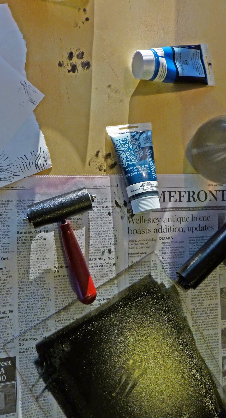
        But despite her apparent reluctance to be a model, Talia has managed to participate in the printmaking in a more hands-on way.  Yes, I really ought to say “paws-on.”  In the midst of a block she jumped onto my table, right into the middle of the ink plate.  Startled, she ran off over the table, along the windowsill, and across the floor, leaving her own trail of relief prints behind her.  I know I always say I encourage everyone to make block prints, but I draw the line at printing 
all over the floor!  I like having the company, but I can do without the participation.

        Happy Thanksgiving to those in the US!  May your family and friends be loving and your feast lovely.


[Pictures: White Paw, rubber block print by AEGN, 2014;
Cat tracks, photos by AEGN, 2014.]

November 21, 2014

The Lamp-post in the Wood

        In the next week we have the anniversaries of C.S. Lewis’s birth and his death, so this seems a good time to mention Narnia.  The Narnia books are, of course, extravagantly praised and extravagantly condemned for their Christian theology, and I intend to write about religion in fantasy some other time.  But Lewis himself didn’t set out originally to write Christian apology for children, however much Narnia may have ended up there.  In fact, as he said himself, it “all began with a picture of a Faun carrying an umbrella and parcels in a snowy wood. This picture had been in my mind since I was about sixteen. Then one day, when I was about forty, I said to myself: 'Let's try to make a story about it.’”  It’s funny that this picture stayed with him so long, because it’s the same picture that has stayed with me the most clearly, with the addition of the lamp-post, glowing in the snowy dusk.  It’s not the escape through the woods, or the childrens’ heroism, or even the resurrection of Aslan that stays with me most vividly, but that picture of the lamp-post, Mr Tumnus, the parcels, the umbrella, and the snow.
        So the principle I’m interested in today is how a story doesn’t need to begin with a grand concept - even a story that ends up being about as grand a concept as Christian Salvation.  In fact, often the books with the aim of grand concept-ness only end up being preachy.  A good story begins with something that begs to have a story told about it.  I’ve written about how my story The Extraordinary Book of Doors was inspired quite simply by the images and ideas evoked by the title of Sebastiano Serlio’s Extraordinary Book of Doors.  Sometimes a story is inspired by an imagined character.  Sometimes it starts with an interesting setting, sometimes with a little-known factoid (I think a lot of whodunits begin with factoids.)  So the point is that anything can potentially inspire a story.  The trick is to notice these inspirational snippets - notice them, remember them, cherish them, revisit them, mull about them, and then sit down and actually begin to write.  That’s the stage I’m in now, with a sequel to The Extraordinary Book of Doors.  I’ve collected pages of notes on all manner of little inspirations: historical facts, new characters, lines of conversation, and other cool things.  But now I have to write, because no inspiration, however brilliant, is a story until I can get it out of my head and onto the page.

[Picture: Meeting Mr Tumnus, book sculpture by Justin Rowe, 2013 (Image from Days Fall Like Leaves).]
Quotation from It All Began with a Picture, C.S. Lewis, 1960.

November 18, 2014

Embroidery in Wood?

        Doing a little research for the barely-begun sequel to The Extraordinary Book of Doors, I came across some wood block print designs for embroidery.  This isn’t really a surprising thing, since as long as woodcuts were the technology available for illustrating books, they were made to illustrate and instruct on all manner of activities.  I find it interesting that at least some of these books of textile designs were marketed not to professionals but to gentlewomen at home.  I expect that in the Victorian era, but not in the 16th century.
        Technically, the carving took a lot of skill.  In this middle piece particularly it would have been difficult - and quite tedious - to carve out the interior of every little square in the grid, leaving behind only the thin lines in between.  This design is truly intended to lay out exactly how to make the design, so it requires that level of technical accuracy.  The third piece, by contrast, is carved more traditionally, and is more in the nature of inspiration or general ideas for embroidery than an actual design to follow.  I’m intrigued by the hoops around the dogs’ middles, as well as by the winged sprites or fairies growing out of the flowers.  They’re like mermaids, only botanical.  Somebody was clearly doodling!
        My favorite embroidery design, however, is the first one, also the earliest.  I like the black-on-texture carving style, and I like the variety of patterns, from naturalistic to stylized to geometric.  This would actually be easier to carve than the others, but I like the balance of 
black and white.  I’m guessing that with books of this sort none of the craftspeople involved were considered Artistes.  Nevertheless, they had mastered their skill and used it to create something both useful and pleasing.  I wonder how many women embroidered these very designs, and what color schemes they chose to bring these black and white guidelines to life.

[Pictures: Page 1 from Ein ney Furmbüchlein, woodcut designed by Johann Schönsperger the Elder, c. 1525-30 (Image from The Metropolitan Museum of Art);
Woodcut from Ornamento Delle Belle & virtuose Donne by Matteo Pagano, 1554 (Image from The Metropolitan Museum of Art);
Woodcut from La vera perfettione del disegno, by Giovanni Ostaus, 1567 (Image from mfa).]

November 14, 2014

Altum Incognitum

        You’ve heard of terra incognita on old maps, of course: unknown land, unexplored territory.  But unexplored land is scarce these days, and if you want to find the true unknown on earth you need to look to the depths of the ocean: altum incognitum.  Here’s my new leviathan block print, which does just that.
        For the first stages in the creation of this piece, and the description of the leviathan, you can refer back to my earlier post.  More than anything else, in this piece I was trying to experiment with depicting light.  Sunlight fades as the water gets deeper and deeper, so the first job was to try to make a gradation from top to bottom.  The leviathan itself had to be visible, but I tried to give it a sense of looming out of the darkness.  To this end I put white outlines only along the top edges, and left the bottom undefined.  I also tried to give an appearance of glowing to a few spots of bioluminescence, and finally I wanted to show the stirring up of the water as the monster writhes about, as the description of the leviathan demands.
        The leviathan isn’t the only inhabitant of the ocean, of course, so I added some other fun details.  From the top going down you can see great white sharks (although they’re black), blue whales (although they're white), a couple of disproportionately large sea turtles, and an oarfish, which is one of the creatures given as the scientific explanation for a number of sea serpent sightings.  Also a few schools of unidentified fish.  Continuing down still further, there are sperm whales and a giant squid, but also a plesiosaur of some sort and the kraken itself, huge, of course, but rather small compared with the leviathan.  And finally, down near the ocean floor, a somewhat ill-defined gulper eel and anglerfish, giant tube worms near the deep sea vents, and some truly enormous sea stars.  I had fun deciding what to put into the picture and how to compose it, and I challenged myself on the small details and precision of lines depicting the water and leviathan.  Alas, the biggest challenge of all on a block with this much black is to get the inking relatively dark and smooth.  I never did get it as perfect as I would have liked, but I’m still pretty happy with my image of the mystery of the unknown deep.

[Picture: Altum Incognitum, rubber block print by AEGN, 2014 (sold out).]

(And thanks to local Latin teacher L. Downey for obligingly checking my Latin phrase!  When it comes to Latin, I know only enough to know that I don’t know enough.)

November 11, 2014

The Poppies Blow

        First Armistice Day, celebrating the end of hostilities in the war that was to end all wars, then Remembrance Day, and now, in the US, Veterans Day, I’m sorry that we seem to have turned a celebration of peace into a celebration of militarism.  But whatever the day is called, we can all agree that those who were killed in war must be remembered.
        The red poppy has been a symbol of the dead since the Napoleonic Wars, because it grows in the disturbed earth of battlefields and field graves.  Popularized as a symbol by Canadian John McCrae’s poem In Flanders Fields at the beginning of World War I, and spread still further after the war by US-ian Moira Michael, the poppy is a beautiful reminder of the terrible costs and sacrifices of war.  Here’s a bouquet of poppies in relief block prints.
        Thinking of all this, it seems to me that there’s something poignant about relief block prints of these ephemeral blossoms with their tissue petals.  First there’s the contradiction of carving their image into the block, like carving up the earth, using physical effort, cutting and pressing, to replicate something effortless and fragile.  And then of course, all this work is to make permanent record of something that lasts only a few days - what is a block print of a flower, after all, but a remembrance of something precious and gone?  How fitting.  The difference, of course, between remembering the poppies and remembering the dead of war is that next year’s poppies will bring us all the joy and beauty of this year’s.  Let us 
never forget that each individual human, unlike a poppy, is not only precious but unique and irreplaceable.


[Pictures: Poppy Field, linocut by Helen Maxfield (Image from helenmaxfield.com);
Papaver, woodcut by Leonhart Fuchs from De historia stirpium commentarii insignes, 1542 (Image from University of Minnesota Libraries);
Common Poppy, rubber block print by AEGN, 1997;
Summer Song:Poppy, reduction woodcut by Renee Covalucci (Image from Zullo Gallery).]

November 7, 2014

Ambum Stone

        Here’s a funny critter that looks quite fantastical.  This sculpture, called the Ambum Stone (or sometimes Ambun), comes from Papua New Guinea.  It’s tentatively dated to 1500BCE, although it wasn’t excavated properly.  No one knows its original use or what it meant to the people who made it, but modern New Guinea people often consider ancient stone sculptures to be of supernatural origin and use them in their own religious or ceremonial ways.  This one is about 20 inches tall and is one of the earliest and most detailed of prehistoric Pacific sculptures.
        What I’m most interested in, however, is this creature’s identity.  It looks as if it would be right at home amid mythical beasts.  Some scholars think it’s meant to depict the embryo of an echidna, which is certainly an obscure enough thing to make a sculpture of.  You can see that this newborn echidna (called a puggle, because obviously we need a word that’s both cute and silly to describe such a creature) 
shares our Ambum’s curved profile, nose, and tummy.  Cryptozoologist Karl Shuker, however, points out that the Ambum sculpture’s ears, big round eyes, and defined neck (and lack of spines) are inconsistent with an echidna and suggests it could be a palorchestes.  What’s a palorchestes, you ask?  Sheesh, don’t you know anything?  Well, it's a genus of terrestrial herbivorous marsupial with (paleontologists think) a long schnozz.  You can see from the picture that this animal, too, bears a certain resemblance to the Ambum critter.  Unfortunately, as far as any evidence goes, palorchestes lived only in Australia 
and went extinct some 11,000 years ago.  So, while it isn’t inconceivable that something in the genus lived in the wilds of Papua New Guinea until three or four thousand years ago, it’s a long shot.
        Personally, I rather like the idea of the Ambum Stone representing some creature that really does look just like it, round eyes, round tummy, proboscis and all.  I'm tempted to put such a creature in a story some time.  The way it’s sitting makes me think it must be the size and temperament of a panda, mild-mannered but elusive, and out there still, somewhere in the dense, unexplored rainforests of New Guinea.  You never know - surely it’s possible!

[Pictures: Ambum Stone, sculpture by anonymous artist, c 1500BCE (Image from National Gallery Australia);
Beau, short-beaked echidna puggle (Image from Taronga Zoo via ZooBorns);
Palorchestid, drawing by artist whose name I can’t make out (Image from Nova).]