July 29, 2014

Words of the Month - Local Color

        Humans are weird when we talk about colors.  Whether this has to do with brain function, optics, cultural phenomena, or who-knows-what is a matter of hot debate in linguistics.  You’d think that all humans, whatever their native language, would have words to describe the same basic set of colors, say black, white, and the colors of the spectrum.  But if you thought that, you’d be wrong - astonishingly wrong!  I find it hard to imagine living and speaking with some of the variations in color terminology that exist in other languages; for example, in Arabic (and a number of other languages) the word used to describe the sky is the word for green, and in Serbo-Croation (still the general linguistic term despite the political controversy) blond hair is called by the same word that means blue.
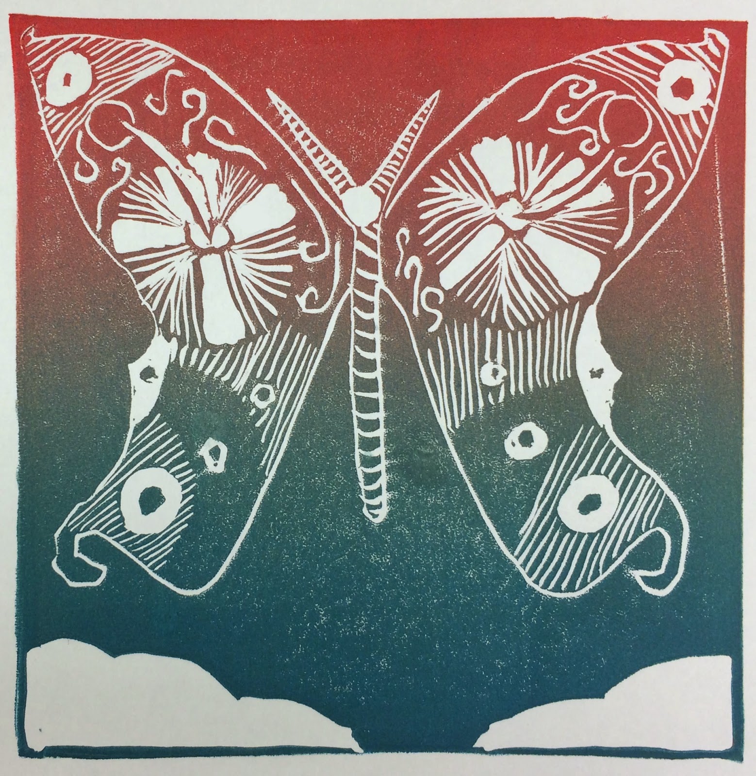
How many distinct colors do you see in this print?
What words would you call those colors?
        In 1969 Berlin and Kay published a classic linguistics study showing that all languages have a limited number of “basic color terms” (between 2 and 12), and that which colors languages name follows a specific pattern.  For example, if a language has only two terms, they will be black and white (or, more broadly, dark-cool and light-warm.)  Where there are three terms they will be black, white, and red.  In all languages with six basic color terms those words will represent black, white, red, green, yellow, and blue.  And so on.  This study has become controversial, as all big theories tend to do, but despite disagreements over details of methodology, additional data, or interpretation, this still shows something pretty interesting about the breadth of human language: things that seem utterly basic for speakers of one language may seem to be minor distinctions for speakers of another language.
        A second point to be made here is that just because a language may have only two “basic color terms” doesn’t mean that speakers of those languages can’t talk about subtle color variations.  Of course they can; they just use adjectives, similes, and such: “dark like the color of a leaf in shadow” or “light as a cherry blossom,” for example.
        English is a language unusually rich in words for colors.  We have eleven out of twelve possible basic color terms.  The only distinction we’re missing is separate words for light blue and dark blue (although we have separate words for pink and red - more on this in a later post!)  But in addition to our basic color terms (black, white, red, green, yellow, blue, brown, orange, pink, purple/violet, and grey) we have a seemingly infinite array of non-basic terms.  First of all, there are all the words that are simply based on an object of a particular color, such as ruby, rose, lavender, alabaster, silver, and chocolate.  There are also compound words that add modification to our basic words, such as grass-green, blood-red, lily-white, sky-blue, and pitch-black, and those simile phrases such as white as snow and red as a lobster.  But there are also an amazingly large number of words that are very specifically color words and nothing else, but which aren’t basic color terms because English speakers perceive them to indicate variants of more basic colors.  Examples of these words include dun, beige, ecru, taupe, rufous, scarlet, crimson, maroon, puce, verdant, azure, cerulean, and magenta.
        Many of these latter category of words began as similes, but are now color words pure and simple.  Maroon, for example, comes from French for chestnut (1791), taupe comes from French for mole (early 20th century), scarlet comes from a kind of rich fabric (color meaning from late 14th century), and puce comes from French for flea (1787.  Yeah, think about the implications of that: people were so familiar with the purplish-brown color of a flea that if you described something as “flea” everyone knew exactly what color you meant!)  In fact even some of our basic color terms were once metaphorical, including pink and violet.  As for orange, it was only in the twentieth century that it joined the ranks of red and yellow as a basic color term.  It was used to describe color as early as the 1540s, but was seen as descriptive rather than basic for centuries, along the lines of peach or emerald.
        So why do some languages have so many more dedicated color words than others?  Why does English have so many wonderful words for colors?  That’s a mystery and I don’t have an answer.  I do know that, as usual, I revel in our rich rainbow of vocabulary.  (And I know that there are more posts to come, dealing with additional interesting intricacies of color words. So tune in next month for more colorful Words of the Month!)

[Picture: Butterfly (Rainbow version), rubber block print by TPN, 2014.]

July 26, 2014

Triumph and Tragedy (Student Work Week 2)

        My second week of classes was outstanding - the printmaking kids (spanning grades 5-9) worked incredibly hard and created a huge amount of varied and beautiful work.  My intention was to share a sampling today and then highlight some particular projects and themes in posts to come.  But unfortunately for that plan, I dropped my camera in the parking lot and somehow it managed to lose the vast majority of all the pictures I had taken of student work.  Most of last night was spent vainly trying to recover photos, so I’m feeling pretty frustrated right now.  So for now all you get is two quick pictures.  The first (cropped to protect the identity of innocent students) is a very small part of the display at our end-of-the-class art 
show.  And second is one of the few pieces that luckily didn't get deleted from the camera.  (I love the design in the background!)
        I’ve made a number of notes of possible things to tweak or new things to try next year, and now all that remains is for me to clean up all the art supplies that I unloaded into the front hall yesterday afternoon.  And buy a new camera.  *sigh*  But I do hope to post more substantively soon.

[Pictures: ZB and HW with a sampling of their work;
Panda, rubber block print by EE, 2014 (photos by AEGN).]

July 22, 2014

The Importance of Fantasy IV

        Seek not that your sons and your daughters should not see visions, should not dream dreams;  seek that they should see true visions, that they should dream noble dreams.

        Not to have fantasy would be to have no dreams and no visions.  But dreams and visions exist not merely for entertainment or excitement; when they are true and noble they fuel our souls.


[Picture: Pandora Dreaming, wood block print with watercolor by AEGN, 2005.]
Quotation from an 1867 essay by George MacDonald in A Dish of Orts.

July 19, 2014

Student Work (Week 1)


        This past week I taught a printmaking class to a group of kids entering grades 5-7.  On Friday we held an open house to show off all the work they’d done in five mornings, and we filled five large tables with the display.  Obviously I can’t post all that here, so I’ve picked just a few samples.  
Specifically, I’ve picked only straight-up rubber block prints that require no other discussion, since I’m saving some of the other work to show another time.  Even so, you’ll notice that some of the kids experimented with multi-colored inking, and some achieved a variety of textures.  Some were thinking in terms of outlines, while others thought more about shapes and areas.
        I love the way the block print medium gives a boldness and graphic impact to all their work.  Why do you think I do block prints myself?  Because the medium just looks good!  (That and it’s so much fun to do, of course.)


        Next week I have another class with another group of kids and the chance to see yet more fabulous work.  (Also the chance to tweak my projects and presentations based on how things went this week.)  It’s a busy two weeks - I’m teaching a second art class for younger kids each day, too - so it’ll be nice to be able to sit down and relax a bit when it’s over, but what a privilege to see what these kids can do!


[Pictures: Horses, rubber bock print by AD, 2014;
Hawk, rubber bock print by AM, 2014;
Owl, rubber bock print by KK, 2014;
Village, rubber bock print by TS, 2014;
Sea Turtles, rubber bock print by LJ, 2014;
Girl, rubber bock print by BW, 2014;
Flower and insects, rubber bock print by CC, 2014;
Butterfly, rubber bock print by RB, 2014.]

July 15, 2014

A Review of "Doors"

        I’m in the midst of week one of my two weeks of teaching summer art classes.  Each day I’m teaching relief printmaking in the morning and assorted art projects in the afternoon.  The afternoon group are younger kids (entering grades 3-5) not my usual beloved middle
schoolers, so I confess to having a steep adjustment curve to their attention spans and concentration levels.  (And my feet are pretty tired by the time I get home each afternoon - it’s been twelve years since I taught full time!)  That said, both groups are doing some really fun work.  So far the younger kids have painted scenes inspired by Rousseau’s jungles and made collages inspired by Matisse.  The middle school printmakers have made collagraphs using glue and string, and have done several rubber block prints.  I’ll treat you to some of the masterpieces of printmaking at the end of the week.
        In the meantime, I wish to direct you to a great review of The Extraordinary Book of Doors on Charlotte’s Library, a fabulous blog focussing on middle grade speculative fiction.  I’m so grateful that Charlotte read Doors, and so pleased that she enjoyed it.
        And finally, while I’m making announcements, Goodreads has recently launched a feature called “Ask the Author.”  I’ve answered one question so far, but would love to start more conversations, so please go to Goodreads and ask me some questions!

[Picture: Three magical keys, illustration from The Extraordinary Book of Doors by AEGN, 2013.]

July 12, 2014

Of the Mimick or Getulian-Dog

        Here’s a charming little woodcut of a rather odd critter from renaissance books of natural history.  The mimick or Getulian-dog (Canis getulus) is described in Conrad Gesner’s Historiae animalium from 1551-8 along with other dogs, such as greyhounds, spaniels, and bloodhounds.  It appears again in Edward Topsell’s The history of four-footed beasts and serpents from 1658.  (I’m not sure whether it’s in Topsell’s original History of four-footed beasts first published in 1607.)  The spaniels and other dogs are still with us, but of course we know of no mimick or getulian dog nowadays.  So, is the Getulian dog now known by another name, or is it extinct, or has it always been mythical?  According to the worthy naturalists Gesner and Topsell, this dog has shaggy hair, long legs, short tail, curved back, and a face sharp and black like a hedgehog.  I think it looks pretty adorable, but its appearance isn’t what makes it special.  It is “apt to imitate al things it seeth, for which cause some have thought that it was conceived by an Ape.”  Mimicks are trained to act out human parts in plays, or to perform as servants for poor men.  “In Egypt in the time of king Ptolemy [they] were taught to leap, play, and dance, at the hearing of musicke.”
        Topsell places the Getulian dog in England, although its name “Getulian” would imply an origin in Northern Africa, which would also fit with its prevalence in Egypt in Gesner’s time.  So, what could this creature be?  Nowadays some people think it must be the poodle, on account of the long legs, shaggy hair, and sharp nose.  Some think it’s really an ape such as a baboon, on account of the behavior.  Of course I think it would be fun if it were really something magical, but I’d enjoy finding out a real explanation, too.
        As for this illustration, which I find so delightful, it’s never easy to learn much about the artists responsible for renaissance woodcuts.  Gesner named Lucas Schan of Strasbourg as one of his main illustrators, but I have no idea whether this particular image was drawn by Schan, by some other artist, or possibly even by Gesner himself.  And whoever drew it, it was presumably carved by someone else entirely.  The illustration I’ve shown here comes from Topsell, but was clearly copied as exactly as possible from Gesner.  The only difference is that it’s reversed, presumably because it was copied exactly from Gesner’s printed image onto Topsell’s block, which then flipped when that second block was printed.  But whatever anonymous artist or artists deserve credit for this one, I think it’s great, with confident curves and curls.  Unlike many contemporary illustrations of beasts, it doesn’t look distorted, stiff, or unnatural.  It looks odd enough to be interesting, but natural enough to be believable.

[Picture: The Mimick, or Getulian-dog, woodcut from The history of four-footed beasts and serpents by Edward Topsell, 1658 (Image from University of Houston Libraries).]

July 9, 2014

Baskin's Tyrranus

        I’m on vacation, so this will be short, but yesterday I was at the Portland Museum of art and saw there one of Leonard Baskin’s monumental wood block prints.  At 72 inches tall it’s life sized, if not life-proportioned, and very dramatic and striking.  Do I like it?  Probably not, but it’s definitely a pretty cool woodcut, pushing off in yet another direction of what’s possible and what a relief block print can be.  For Baskin everything was intensely political - he said “Art is content or it is nothing.”  But when I looked at this I was thinking at least as much about process as about content.  It’s interesting to me to think about how Baskin (U.S. 1922-2000) might have planned and carved and printed a block so big.
        (The exhibit I actually enjoyed most in the museum was a show of work by Richard Estes - it turns out he does a wider range of work than I had realized, and I really loved some of it much more than I’d expected.  If you’re in Portland ME be sure to check it out.  I think the show runs through September.)


[Picture: Tyrranus, woodcut by Leonard Baskin, 1982 (Image from R. Michelson Galleries, although of course I saw the one at the Portland Museum of Art.)]

July 4, 2014

"The Book... no, I mean the Movie Was Better"

        The movie “How to Train Your Dragon 2” is not to be confused with the book How to Be a Pirate, the second in Cressida Cowell’s How to Train Your Dragon series, by which the movies were inspired.  About the only thing the books and the movies have in common is a few names.  Now, normally this really irritates me.  I’m always railing, “If you thought the book would make a good movie, make the movie follow the book.  And if you think the book won’t make a good enough movie, then don’t make it into one!  Go write your own movie script!”  Major pet peeve of mine, actually.  But in the case of “How to Train Your Dragon,” I find myself relaxing my rule for the simple reason that I actually like the movies better, different as they are from the books.
        I do like the book series.  Hiccup is a great character and his adventures are funny, convoluted (in a good way), and generally heartwarming when it comes down to it.  They illustrate the value of thinking, creativity, loyalty, and other Good Stuff.  They’re cleverly written.  They’re also aimed very squarely at a fairly narrow target audience of, say, 8 to 10 year old boys who find potty humor fabulously subversive and hilarious.  Since I am not, as it happens, an 8 to 10 year old boy who finds potty humor fabulously subversive and hilarious, I roll my eyes and do my best to tolerate those elements of the books, because I enjoy other elements.  But the movies have succeeded in making stories, characters, and situations that appeal to a much broader audience.  They succeed in emphasizing some of the deeper elements in the stories, while eliminating the gratuitous pee-pee-poo-poo stuff.  Also, Toothless in the books is just completely irritating, while Toothless in the movies is awesome.
        [WARNING: This paragraph may contain potential SPOILERS.]  The villain in “How to Train Your Dragon 2” is not Alvin the Treacherous, but a new-for-the-movie character called Drago.  But the worst actions are committed by Good Guys under mind control.  It turns out that dragons have no free will and are helpless to disobey the thoughts of an alpha dragon - a concept about which I’m definitely not best pleased.  I like free will.  But the yoke of evil was successfully thrown off - Yay! - so it was okay in the end.  There was one major plot element never explained (why should the evil alpha dragon do what Drago says, anyway?) and two plot pieces that D and I thought might have (and should have) gone a little differently.  We thought Astrid should have become the new chieftain of Berk, since according to Hiccup, she’s the one who’s actually good at that sort of thing.  And we thought something further should have happened with the deposed evil alpha dragon - redemption, banishment, penance… something.
        Anyway, our final review for “How to Train Your Dragon 2” is that it wasn’t as good as the first movie, which really is one of our top favorites, but still excellent.  P and T enjoyed it a lot, P despite the mind control, which is a plot element he utterly loathes.  We didn’t watch it in 3D, so all the soaring shots designed for maximum 3D spectacle were wasted on us, and seemed unnecessarily long, although they were still quite beautiful.  The scenes in the secret dragon cavern were absolutely lovely.  We recommend this movie with all eight of our family thumbs up.

[Pictures: Hiccup and Toothless;
Berk, images from the movie by DreamWorks, 2014.]

July 1, 2014

Toshijiro Inagaki

        Here’s another artist I couldn’t find too much information about.  Toshijiro Inagaki (Japan, 1902-1963) was primarily known as a designer of kimono patterns.  These patterns were made by using stencils to print on fabric with a resist medium before dyeing.  Although most of the pieces I found on-line were labelled as woodcuts, in one place the similar-looking style was labelled as being printed from paper stencils, which is what they actually look like.  Still, it’s 
unclear to me whether some of those stencil-looking pieces were done with stencils, or whether he just did his woodcuts with that same style.  The pieces I’ve selected to show here mention embossing in their descriptions, which would mean they’re definitely woodcuts.  But whatever the medium, the style clearly reflects a stencil sort of way of looking at shape, color, and space.  Inagaki’s pieces mostly have large areas of ink and no ink without any small, detailed texture cuts.  They differ from the traditional Japanese wood block printing technique in being carved and printed from single blocks.  When they have multiple colors, the colors are inked all over the single block at once, blending.  This, too, is reminiscent of fabric printing.
        I’ve been able to find pictures of many of Inagaki’s pieces that have been printed in several different color variations, including pure black options.  I tend to favor those, of course, but I’ve included one of the colored ones today so you get more of a feel for Inagaki’s typical work.  (Not that I can claim to be an expert on his “typical work” with the small amount of info I found.)
        I did find one interesting note stating that Inagaki was part of the sosaku hanga movement that “advocated that to be ‘art,’ the woodbock print must be self-drawn (jiga), self-carved (jioku), and self-printed (jizuri) with the desire of expressing the self.”  Yet in other places I found statements that his blocks were printed by someone else.  Another mystery.
        Finally, I include one last example by Inagaki that is much more traditional.  There’s no statement about how many blocks this piece used, but if it was just one, it was presumably inked in multiple stages at least.  It’s very simple, but very pleasing, I think.


[Pictures: Temple in Forest, woodblock print by Toshijiro Inagaki, 1950s;
Mt. Arashiyama, woodblock print by Inagaki, 1950s;
Yasaka Pagoda, woodblock print by Inagaki, 1950s;
Path in a Grove, woodblock print by Inagaki, 1950s (Images from artelino);
Evening Sky, woodblock print by Inagaki, 1950s (Image from UkiyoeGallery.com).]

Quotation from UkiyoeGallery.com