Showing posts with label step-by-step. Show all posts

June 10, 2026

Jigsaw Printing

         The jigsaw method of printing is a way to print multiple colors while carving only one block.  The basic idea is that after carving a block you cut it apart into separate pieces for each color.  You can then ink each piece separately with a different color of ink, reassemble the inked block (hence the term “jigsaw”) and then print it all together as one block.  This has the advantage of saving time, as you’re pressing only once, and it also has the advantage of ensuring that all the different colors are perfectly lined up every time, which can be difficult when printing separately.
        I tend to think of this as a modern method, but in fact it was used in the second major book printed with moveable type in Europe: the Mainz psalter of 1457.  The Gutenberg Bible (about which you can read more here) included both black and red ink, but after a brief experiment with printing each page twice for the two colors, Gutenberg decided it was easier to print just once and have someone add the red letters by hand afterwards.  The Mainz psalter, printed by Johann Fust and Peter Schöffer, who had split from Gutenberg, included black, red, and blue ink.  It appears to have been printed with just one pressing for each page, meaning that the colored initials were inked separately and then set into the forme with the black letters.  And even more to the point for the jigsaw technique, the extra-fancy woodcut initials that include both red and blue ink were cut so that the letter slid apart from the ornamental surround, so they could be inked in two separate colors and then fit back together.
        Just for fun, I’ve included here for you the same letter B, once from the 1457 edition and once from 1459, because I think it’s interesting that the blue and red are reversed.
        
Jigsaw printing is a technique I’ve wanted to try for a while, and I’ve just done a first simple experiment with this cat luxuriating on a comfy blanket.  The thing is, though, that Fust and Schöffer, as well as today’s artists who use the technique, use oil-based ink.  This allows them all the time in the world to ink as many different little bits of the block as they need and carefully reassemble them all before printing.  Because I generally use water-based ink which dries much more quickly, I don’t have time to ink multiple pieces and put them together before getting my paper pressed onto the reassembled block.  So this piece, while carved jigsaw style, was actually printed with each of the two pieces separate.  That meant I did still have the challenge of registration (getting the separate pressings to line up). 
        Despite not getting the full advantage of having my pieces reassembled before pressing, I’m still pretty pleased with this latest Cat Art.  (My next show isn’t until the fall, so I won’t know until then whether other people find it pleasing, too.)  At some point I may try a proper jigsaw block with oil-based ink - I do have a couple of ideas - but I confess that getting out multiple colors of oil-based ink at once may be a bigger mess than I have room for.  In any case, though, it’s an interesting technique.


[Pictures: Ornamental B and C, wood block prints from Mainz Psalter, 1457 (Images from University of Manchester);

Ornamental B and D, wood block prints from Mainz Psalter, 1459 (Images from Bodleian Libraries);

Life of Luxury, rubber block print by AEGNydam, plus photos of block, 2026 (Image from NydamPrints.com).]

May 24, 2019

More Printmaking Books

        Today I’ll switch to pure printmaker mode, and speak to anyone who is interested in getting started with printmaking, or in developing some new techniques.  I’ve lately got my hands on a few relatively recent guides to printmaking, and thought I’d offer my reviews.

Print Workshop, Christine Schmidt, 2010 - Quite comprehensive in including a thorough discussion of materials, tools, and basics, it also includes a wide range of techniques of which relief printing is only one.  In fact, it’s really too broad for my tastes, becoming too diffuse with projects including embroidery, a mobile, image transfer of commercial photographs, and so on.  I’m also not crazy about books that include templates and instructions that encourage copying someone else’s project instead of coming up with your own — especially in a book with the subtitle “Truly Original Projects”! — although I acknowledge that many people need to get a few copied projects under their belts before they feel confident in branching out.  Schmidt does at least encourage readers to modify projects, and not to worry if their result is not just like the sample shown in the book.

Block Print, Andrea Lauren, 2016 - As the title implies, this focusses on block printing, thus including more detail and information within the narrower scope.  It does include some needless complications — why draw your design on paper, then trace onto tracing paper, and then transfer from tracing paper to block? why bother with “registering” a single block and a single sheet of paper? — but it also includes some interesting techniques such as using transparent acrylic and acetate sheets for different ways to register multiple colors.  I also like the “International Artists’ Gallery” section at the end.  This is a very nice intro, though possibly a little daunting for true beginners.

Block Print Magic, Emily Louise Howard, 2019 - An excellent introduction, including the usual descriptions of materials, plus explanations of several transfer methods, the basics of carving, printing, and so on.  There’s also a discussion of setting up a studio - which is lovely but far from necessary for a beginner.   I’d hate for anyone to think they can’t get started because they won’t have a studio like that!  Howard’s first project is quite similar to my “Not a Zentangle” project, which obviously implies that her approach to teaching is not too dissimilar from mine.  She includes a variety of projects that focus on various techniques using various numbers of blocks, and she even has a few projects at the end that involve collaging and finding uses for not-quite-perfect prints, which I may have to play with myself.  I also like the “Artist Spotlights” with examples of the work of a handful of printmakers, explaining their inspirations and methods of working.  I liked this guide a lot.

        One of the points I’m always harping on about is that relief block printing is a very easy art medium to jump into without a lot of money, or a lot of space, or a lot of time, or a lot of experience.  Although I teach classes and we have a blast, you don’t need to take a class.  If you want some introductory instruction, find a book at your local library, skim through it for the basics, and then dive right in.  Enjoy — and let me know how it goes!

[Pictures: Potato printing page from Christine Schmidt, 2010 (For more on potato printing, check out my previous post);
My favorite project from Andrea Lauren, 2016;
The Cabin with details from Emily Louise Howard, 2019.]

August 28, 2018

Students' Collagraphs

        This summer my classes produced some particularly pleasing collagraphs, and I’d like to share a few.  For a refresher on the definition and techniques of collagraph, check out this previous post.  I’ve given students a variety of materials to use over the years, ranging from classes in which anything goes, including dried leaves, and scraps of every imaginable textured material, to classes who used nothing but puff paint.  This year’s provided materials were basically puff paint, craft foam, and corrugated paper.  This first picture is a sampler I created to demonstrate the effects the different materials could have.
   1. printing styrofoam (the kind usually used by kids too young for carving tools)
   2. a foam sheet that came wrapped around some books I ordered
   3. corrugated paper
   4. textured mat board
   5. craft foam
   6. crumpled paper
   a. puff paint (atop the types of foam, and on the base board)
   b. pressing into the two types of foam with a pencil
        This first piece made particularly nice use of the puff paint on top of craft foam.  I like the effect of the white shadow around the raised paint, contrasting with the more clearly visible edges of the craft foam shapes.


        The artist of the second piece made the unusual choice of building the bird's outlines with narrow strips of craft foam, instead of drawing them with the puff paint.  The wing is a larger foam shape, but only its outlines show because two stripes of corrugated paper were glued on top.  Its charm is in its simplicity.
        And finally, a duck that uses the variety of materials especially well.  The wing is corrugated paper, and the reeds long strips of cardboard that got a little crumpled or bent.  The water is the packing foam, and the white speckles on the duck’s body are indented into the craft foam with a pencil point.  It printed so clearly in part because instead of gluing the wing on top of the body, this artist fit the shape of the wing into a space on the body like a puzzle piece.  That means that all the raised areas are raised to roughly the same level, thus getting inked more consistently and printing more uniformly.
        I think I’ve finally found the right balance of materials to give the kids some options to stretch their creativity, while ensuring that all the materials used are stable enough to make successfully printable blocks.

[Pictures: Collagraph material sampler, by AEGN, 2018;
Flower vase, collagraph by EK, 2018;
Bird, collagraph by K F-K, 2018;
Duck, collagraph by SA, 2018.]

July 27, 2018

Mixed-Up Menagerie

        I’m pleased to share with you the new group printmaking project that I introduced with one of my classes this summer.  It is inspired by the version of “exquisite corpse” that appears in a number of novelty interactive books for children: each page features an animal, but the pages are cut into sections so that you can move the flaps and create creatures that combine heads, middles, and tails of any three animals.  In our version, each child created a block of a creature, and then printed enough impressions that I could put together a book for each student in the class (plus myself).  The kids had fun with it, and from a printmaking perspective it was great to give them a concrete reason to print multiples, since otherwise several of them were inclined to print only one impression of each block and then move on.
        First I made a template and gave each person a copy to guide their animal design.  The little horizontal lines show where the top and bottom edges of the body should be.  The one shown here is slightly modified from the version my class used, which made the animals a bit too fat.  No doubt next time I do the project I may have to tweak some more.  The kids did have some difficulty designing their creatures within the parameters of the template, and you do have to make sure they’re at least close before you let them proceed with carving.  The point of the template is so that when the different animals are mixed-and-matched, the parts will actually line up and fit together.
        I reminded the kids that their carving should include plenty of details and texture to help insure that each section of their animal is recognizable.  A scaly creature should look different from a hairy creature, and wool should look different from feathers…  This is something I’ll push even harder for next time, because it makes the hybrid chimeras look a lot more interesting, as well as helping to push the students’ carving skills to the next level.  I made an animal, too, both as a demonstration sample and to add one more creature to the mix.
        After the blocks were carved, I had the kids print on paper with a relatively large margin all around, in order to give me wiggle room to trim them down so that they would all end up uniform.  The kids had to print enough copies for all the books, but I actually ended up printing one or two supplementary impressions if some of them weren’t clean impressions or were too close to the edge of the paper or something.  Plus, of course, the kids could print additional if they wanted some that would not be cut up and bound into booklets.
        On my own time I trimmed all the prints so that they were a uniform size and lined up uniformly on the paper.  I measured not from bottoms of feet or tips of noses, but from the place where those guidelines from the template would fall: the top of the back just in front of front legs and just in front of back legs.  Next, I put together stacks of one of each creature, lined up the edges, and sliced each stack twice from the bottom of the page to within about half an inch from the top, along the same lines where the two vertical lines on the templates would have fallen.  (A rotary cutter and grid ruler are invaluable for all this measuring, trimming, and slicing.)  Then I put on a top and bottom cover of construction paper and stapled them together across the top.  I also glued on a cover label that gave a “table of contents” of each of the animals and who made it.  I had taken orders for what color cover each person wanted, and I made sure that each kid got a copy with a particularly fine impression of their own block.  (I had to make only 8 copies, so obviously all this would be a bigger job with a bigger class.)
        On the whole I think this was quite successful and I’ll definitely keep it in my collection of projects to do again.  As I said, I may have to tweak the template again after another round, and in the future I’ll work harder to make sure the kids’ designs are lined up better with the template, and that they put more detail into their designs.  But you can see how much fun these can be.

[Pictures: Unizale, from rubber block prints by NF, LA, and AEGN, 2018;
Exquisite corpse template (feel free to copy and use!) by AEGN;
Cheepizard, from rubber block prints by EK, CD, and LA;
Dogsharkeetah, from rubber block prints by KF-K, TQ, and EK, 2018.]

July 6, 2018

Playing with a Full Deck

        Playing cards were probably invented as a result of the invention of wood block printing in China around the ninth century, and were one of the most common early uses of printing in Europe in the fifteenth century.  Early in my teaching career in times almost as ancient (well, about two dozen years ago), I decided to have my students corporately create and print a complete deck of cards.  There were 56 students in the sixth grade, so each student was in charge of one of the 52 in the deck, plus two jokers, a title card, and a design for the back.  Each one designed their card, carved a rubber block, and printed on unlined 4x6 index cards.  It turned out to be a great project and a lot of fun, except that each card had to be printed 57 times, and the back had to be printed 3,135 times!  I spent a lot of long, late afternoons finishing the printing, since the kids themselves couldn’t get that many done.  But in the end, every student received a complete deck of cards.
        As with so many block print projects, both simple graphic designs and complicated detailed designs were very successful.  There were a few kids who got their letters or numbers backwards, and a few designs that were just a little too messy to read well, but for the most part the kids’ work was great.  Here are a few of my favorites.
        Notice that the bicycle treads on the ace of diamonds write “ACE ACE” and that there are six hidden diamond-shaped eggs for the 6 of diamonds.  The ace of clubs, in case you can’t see it, is composed of golf clubs, and the clubs for the 10 are charming little graveyard ghosts, plus a tree.  The queen of clubs is yet another clever interpretation of the club shape.
        With the spades you can see again how creatively different kids interpreted the shape and came up with interesting designs, from the peacock tail of the ace and the spade-spots on the cow (notice that the grass of the cow’s field is composed of 10’s), to the elegant Egyptians with 9 white spades on the chair and 9 black spades in the rest of the design.  I love the skritchy lines of the jack.  I don’t know what he’s doing up there, but he does look like a bit of a rascal.
        The spider and its web seems cute as the 4 of hearts, but there’s a little darkness to the idea of ensnaring hearts, and the king of hearts, with its tattoo aesthetic, also seems not quite to be trusted!  On the other hand, making the Tin Woodman the ace of hearts seems especially perfect, and I just find the graphic design of the jack very pleasing.
        This was a very ambitious project with sixth graders, and I might have chickened out had I actually been more experienced and realized what I was getting myself into.  Nevertheless, I, and I think the whole class, were pretty proud of our accomplishment.  I have a new scheme for a group project for my printmaking classes in the next two weeks, but I’ll have to see how the classes go before I decide whether or not to introduce it.  If we do it, though, you’ll certainly be among the first to see the results!


[Pictures: Ace of diamonds, rubber block print by Susanne Kelly, 1994;
6 of diamonds, rubber block print by Melissa Cain, 1994;
Ace of clubs, rubber block print by David Thorpe, 1994;
10 of clubs, rubber block print by Margaret Cromwell, 1994;
Queen of clubs, rubber block print by Sarah Morrissey, 1994;
Ace of spades, rubber block print by Nikki Hafezizadeh, 1994;
2 of spades, rubber block print by Matt Murphy, 1994;
10 of spades, rubber block print by Emily O’Brien, 1994;
9 of spades, rubber block print by Emily Hazelwood, 1994;
Jack of spades, rubber block print by Nicole LeFrancois, 1994;
Ace of hearts, rubber block print by Sacia Fowler, 1994;
4 of hearts, rubber block print by Mary Fredrickson, 1994;
Jack of hearts, rubber block print by Molly Smith, 1994;
King of hearts, rubber block print by Chris Kinniburgh, 1994.]

May 4, 2018

First Experiments

        During the April A-Z Blog Challenge I was teaching a community ed block printing class with adults, and I couldn’t post any of their work because the April blog was entirely booked.  But now A-Z is over and it’s time to switch gears and share some fun rubber block prints.
        This is the introductory project of the class: the chance to start getting a feel for the rubber, how to get different effects, what the patterns look like when they’re inked and printed, and generally just dig in and see what happens.  Each artist began with a small rubber block, 3x4 inches, divided the space into several areas, and experimented with different patterns and textures in the different areas.  The idea was inspired by Zentangle doodling, but the purpose is very different.  It’s a chance for beginning printmakers to get the hang of this whole relief print thing before starting on a block for which they have grand plans and the potential for disappointment.  For example, how do you make each little carved line end exactly where you want it?  What’s the most comfortable and controlled way to carve curves
and circles?  What’s with that whole backwards thing where the more you carve the lighter an area gets?  How do you get the contrasts and patterns you want?
        I had nine artists in my class, and, as usual, they brought a range of experience, a range of taste and style, a range of ideas and inspirations.  As this was my first class of adults, I was also quite amused and interested to note how adults differ from children in the way they approach the projects.  Anyway, since I have only seven projects pictured here today, there are clearly two I didn’t manage to photograph, but nevertheless you get the idea of some of the range of patterns and effects the class produced.  It should be noted that these blocks were mostly just roughly inked and printed to get the idea, so they are not perfect impressions.  Some were worked further afterwards, others were declared finished, and we went on to the next block.
        Thanks to all my students - I had a great time and hope you did, too!
        And an ANNOUNCEMENT to anyone local: this weekend is Needham Open Studios - the 20th year of NOS, no less.  This anniversary year there are over 45 artists in 15 locations all around Needham, showing a variety of art in all sorts of media and styles.  It should be a lovely weekend to get out and about and enjoy some really inspiring art.  I’ll be showing at First Baptist Church on Great Plain Avenue, along with 6 other
artists.  In fact, the car is already packed and I’m about to go set up the space.  I hope to see you there on Saturday or Sunday!

[Pictures: Experimental patterns, rubber blocks by seven artists, 2018.]

July 21, 2017

Student White Line Prints

        Last summer I did a couple of posts about the Provincetown white-line style of block prints, because I was planning to have my students give it a try in my summer printmaking class.  You can refresh your memory in the post about the style, and the post on my own attempts at the technique.  But I never did post any student work because that year’s class were meticulous workers and ran out of time before we got to the project.  But this year’s group got to try it, and they did a great job with it.
        The work I’ve posted here today was done by kids going into fifth and seventh grade (although the whole class had students going into 5-9).  I explained that they needed to think about making a design like a coloring book: just outlines around areas, with no areas too big or too tiny, and no need to think about black and white or texture.  Although this was a bit of an adjustment from how I’d been trying to get them to think about all their other block print designs all week, it is a fairly natural, easy way for them to think of designs, so in the end they probably did better with it than I do!
        Like the one sample I had done last summer, these designs were carved into rubber and colored with markers, which works reasonably well.  I encouraged the kids to try a few different color schemes, which some of them really took to, as you can see with the crazy-colored cows.  I also encouraged them not to leave too large a plain background, and you can see in the bird an example of a student who had more plain background than I wanted them to aim for - but it still works out pretty well.
        From a teacher’s perspective, this is a good project for the end of the class because it doesn’t use printing ink.  That means a) the cleaning of ink plates and brayers can begin a little sooner, and b) more importantly, there aren’t any prints at the end of the class with ink still tacky, making it easier to stack up all the art and get it home without a mess.  For more detail about the step-by-step, check out the previous post on the technique.  Some additional tips for success with students are:
   1. Pre-cut each block with an extra half inch of rubber on one side, and draw a line to mark the extra area.  This is the place where they will tack their paper to keep it registered while coloring and printing.
   2. Pre-cut paper to exactly the size of the finished image and give it to students to draw their designs.  That way you don’t have to worry that they’ll get confused and put carving in the extra area.  When they transfer their designs to the rubber, just show them to line it up even with the outside edge, and their paper should end at the line drawn on their rubber.
   3.  Fold each sheet of printing paper along one edge.  Then when a student is ready to print, you can line up the crease of the paper just outside their carved area and tack it down with thumbtacks onto the extra rubber.  The fold makes it clear to them how the paper folds back so they can color an area, and folds down so they can press it.
        From the students’ perspective, this project made a nice variety from the other printmaking projects, was quite quick and simple to carve, and was a lot of fun.

[Pictures: House and Waterfall, block print by EA, 2017;
Cow, block prints by AA, 2017;
Bird, block print by ELZ, 2017;
Dragon, block print by EZ, 2017.]

December 2, 2016

Holiday Cards

        Many adults’ experience of block printing consists of making a family holiday card back in the days before ubiquitous photo cards.  That may seem hopelessly old-fashioned, but remember that retro is cool!  On Tuesday I ran a printmaking workshop at a local senior living community, at which people could make cards (or, of course, any small relief block print).  Some people came with ideas, sketches, or pictures to work from, while others came ready to start from the very beginning, but soon they were all working on drawing designs.  A couple were members of the local Art Association, while one or two did not think of themselves as being artsy at all.  Combine this diversity with the fact that people always work at widely variant speeds and we had a wide range of progress, from a woman who unfortunately had to leave very promptly and never even got to print, to one who stayed half an hour late and was able to complete about a dozen cards.  Still, I think everyone got excellent work done.
        One of my favorite things about printmaking is that the simple can look as striking as the complex.  We also had a selection of more stylized and abstract designs than I usually see with my children’s classes, which was fun.  One woman started with a basic design and, after inking once, added more carving, then checked again, added more, for three or four iterations, having more and more fun carving further designs.  Another woman was the opposite, having originally designed some extra details which she decided she didn’t like and then carved away, leaving a quite simple but dramatic geometric design.  Many made holiday designs with natural elements - snow, holly, birds, stars…
        In this season of a million generic commercial holiday cards, who wouldn’t enjoy receiving a good, old-fashioned hand-made card?  It demonstrates a little more thought and care, a little more special affection.  If you’d like to make holiday cards for your friends and family this year, it isn’t too late.  Here are a few tips:
     1. If you want to make a single whole scene you’ll need a piece of rubber in the neighborhood of 3.5x4.5 inches.  That will fit nicely on standard 8.5x11 inch paper that’s cut in half and folded once, which fits nicely in standard “invitation” envelopes.
     2. Another option is to cut smaller, simpler blocks that can be combined into larger patterns, such as holly leaves and berries, or snowflakes, or stars.
     3. Ordinary white paper works, but feels awfully flimsy for cards, while heavy card stock is harder to print on without smearing.  Therefore I recommend a paper in the 32 - 60 lb range.  (Alternatively, you could use plain paper folded into quarters so that each sheet becomes one card instead of two.)
     4. You don’t have to stick with white paper, of course.  You could print on colored paper - white snowflakes on blue, green pine trees on lighter green, black birds on bright red…  You get the idea.
     5. Remember that you can use a stamp pad if you don’t have ink and brayer.  It isn’t hard to find pads in all different colors big enough for blocks of this size.
     6. It may help you to pre-fold a few cards before printing in order to help you get used to where you have to print your block.  Without thinking it through, you may find you’re printing your cards so they open upside-down or backwards.  At the very least, don’t print an entire batch before you’ve checked that they’re right!
        I think the participants in my workshop made some really attractive designs, and I worked on my holiday design, too.  We’re just doing what we can to put the ART in HeARTfelt Holiday Wishes!
[Pictures: Carving;
Tweaking and touching up;
Inking;
Some finished cards by class participants, all photos by AEGN, 2016.]

August 5, 2016

Background and Foreground

        Last week I taught my annual summer printmaking class, and I want to share a project the kids did.  I introduced it for the first time this year, and I’m really pleased with the results.  The project was inspired by some of Escher’s work that I shared here previously, and my artists (this year all kids going into 6th and 7th grade) were to make two blocks to be printed together: one background block and one foreground block.  I showed them Escher’s pieces, plus a few others by way of explanation.  The kids had to stretch themselves a little, but got the concept well.  They made a real effort to use texture, too, which is often something kids neglect.
        I pointed out that the main focus of their piece could be the foreground block with the background block as, well, just background.  That’s what most of them did.  But another way to do it was to make the main focus the background block, with the foreground block as framing, and one student went about the project that way instead.  Finally, there was one student who made foreground and background more equal, with her tropical sunset and palm trees.
        One of the things I liked about this project was that it seemed to inspire lots of experimentation.  Most of the students tried printing with a variety of color combinations, and one made a series worthy of Monet in making color combos for every time of day.  One decided in the end that she liked one of her blocks better on its own, while another decided to carve a second background as another option to put behind her foreground block.  It was a lot of fun for the kids, and a lot of fun for me to see everything they came up with.  Several of the students asked where they could get supplies to do more printmaking at home, so I hope at least a few of them will keep with it!
        This is another of those projects that I’ve been wanting to do myself for quite a while, but haven’t yet got around to.  I have a couple of ideas marinating in my mind, and I hope to get something down on rubber before the end of the summer.


[Pictures: Elephant, rubber block print by CL, 2016;
Barn, rubber block print by NR, 2016;
Tropical Paradise, rubber block print by RB, 2016;
Desert, rubber block print by KW, 2016.]

July 26, 2016

Provincetown White-Line Technique

        You can review my previous post to brush up on the origins of Provincetown white-line printmaking.  Today I’m going to go into more depth about the step-by-step of the method.
         So, step one is to design an image like a coloring book picture - just the outlines of all the areas.  I actually made four or five different sketches trying to figure out the right level of detail for a first experiment in this style.  I kept making designs that I thought would be too complicated.  However, when all you carve is basic outlines, carving goes very quickly compared to the usual kind of blocks that I do!  The characteristic white outlines result when those lines are the only areas of the block that are actually carved away and can’t carry ink.
        Once all the outlines are carved, each outlined shape is then painted with ink, one at a time, and pressed individually.  To keep the registration, the paper is tacked onto the edge of the block, folded back while an area is painted, then folded down and pressed to print the ink.  This is repeated until all the colors are done for a single complete impression.
        As I mentioned before, in a traditional multi-block print, you print the entire edition’s worth of one color (one block), followed by the entire edition with the second color (second block), and so on.  In the Provincetown method, all the colors are done on one impression before the second impression of the edition is begun.  The Provincetown printers often worked on several blocks at a time so that they could do the yellow of three different blocks, then the light green of all three blocks, and so on.  I had two blocks to work on, but one was carved in wood and inked with watercolors, but the other was carved in rubber and inked with markers, so they didn’t share ink anyway.  (Watercolor doesn’t work with rubber blocks because it just beads up, and besides, the rubber block version is to be a possible project for my class this week, so I wanted a version that would be easy for kids.)
        At any rate, the effect of each impression being colored individually is that each impression can be done with its own individual color choices - any two impressions from the same block could have all the same colors, or minor variations, or a completely different palette.    For my wood block print I decided what colors I liked best and just stuck with them - no wildly original red dandelions or purple grass.  But I did make two versions of the child.  Although the design is based on a photograph I took of my son P many years ago, I love the photo because of its universality.  It might be my own son, but don’t all children love to pick flowers?  Don’t all children recognize the beauty in the flowers that adults tend to call weeds?  Don’t all children love dandelions or other “interactive” plants that can be blown, popped, scattered, or otherwise played with?  So I made the blond version that looks like P, and I also made a version with another child, who may be painted with different colors, but is exactly the same at heart.  Aesthetically I like the second child better because I think the dark colors have more interesting contrast with all the light and bright colors elsewhere.
        I tried more variations with my window box design, where I experimented with different colors of flowers, and different combinations of siding and window box paint.  Because I used markers, I couldn’t blend the perfect colors but was stuck with the plain colors that came in the set.  Mostly I would have liked some lighter colors for the house siding: a greyer blue, a paler yellow, maybe a beige…  But while they give less flexibility in color, the markers and the small size of the block do make it easier to experiment.
        I confess that this is not my favorite kind of relief block print.  I like prints better with more interesting carving, and I like the ink to emphasize the carving, rather than just its own color.  I don’t think I have any interest in doing more, or at least not at the moment.  Still, it was fun to try something new, and if my students come up with any masterpieces at the end of the week, I’ll be sure to share them.

[Discovering Dandelions, white-line wood block print in two color variations by AEGN, 2016;
Paper tacked to blocks for registration;
Paper tacked to wood block with several colors printed;
Paper tacked to rubber block with several colors printed, photos by AEGN, 2016;
Little Window Box, while-line rubber block print in three color variations by AEGN, 2016 (sold out);
Inked block by AEGN, 2016.]

July 8, 2016

Trace Monotypes

        Unlike relief block prints, a monotype, as its name implies, is a one-off rather than a method of making multiples.  Generally it’s done just like any painting, only instead of painting onto your paper, you paint onto a smooth plate of some sort, then press paper onto the plate to transfer the design.  Generally I have little interest in this.  There is, however, one sort of monotype I occasionally make, and at the RISD art museum this past weekend I was tickled to see one and discover that it has a name: trace monotype.
        A quick word about names: monotype and monoprint used to be considered more or less synonymous, but recently people have begun to reserve monotype for the image printed from a smooth plate, and monoprint for varying images printed from a plate that may have some etching or carving on it.  I confess that I’ve been using them interchangeably, so I guess I’d better get more accurate in future!
        Anyway, a trace monotype is done by inking a plate, laying paper down on the ink, and then drawing a design on the back of the paper.  Wherever you draw, the paper is pressed more firmly and sharply against the ink, making a dark inked line on the front of the paper.  There’s often a shadowy look around the line as the pressure, and therefore the amount of ink, fades away from the line.  You can also see on this piece by Hedda Sterne (USA, 1910-2011) the smudgy appearance caused by random ink transfer, especially wherever the artist’s fingers happened to brush or press.
        I make monotypes in only one particular circumstance: when I’ve just finished printing a block and there’s still a fair amount of ink left on my plate.  Rather than waste it, I roll it out as evenly as I can, and use it for a monotype.  In addition to the tracing technique, I also play with several other methods to manipulate the way ink transfers to paper.  First, I remove ink from the plate in some places, for white highlights.  I can use the tip of a paintbrush handle for a sharp white line (as the outline of the chair), the bristles of the
paintbrush for a brushy-textured area (as the skunk’s stripe), or my fingertips for a wider line with smudgier edges.  Then I lay the paper onto the plate and work from the back, again tracing with the paintbrush handle tip (or just a pencil) for a sharp black line (as the tenrec’s lines), or pressing with my fingers with various amounts of pressure for various amounts of ink transfer (as the doodle below).  One other method I’ve used is to cut a stencil, lay it over the ink, and then press the paper over it.  The stencil blocks the ink from the paper (as the snowflake).
        Unlike an ordinary block print, monotyping gives not only black and white but potentially a whole range of greys.  However, it’s quite hard to control.  If the ink is too thick and wet on the plate, the whole monotype turns out a black blob.  If the ink’s too thin and dry, you get barely any image at all.  Still, I’ve had fun fooling around with it on occasion.
        Also, the kids in my classes love this.  At the end of each class, just before it’s time to clean up, one child takes each plate and tries a monotype.  I help by holding the clear acrylic plate up while they work so that it’s backlit and they can see a little bit more what effect they’re having.  All the other kids watch and cheer the artist on and applaud the results - or groan sympathetically if it doesn’t turn out.  There aren’t as many plates as students, but over the course of a couple of days everyone gets a chance.
        I don’t post my monotypes on my web site or bring them to shows.  (And unlike my block prints, I don’t keep track of when I make them, which is why I have no dates below.)  I’m not particularly proud of how they turn out, and I see them as mere doodles and experiments.  But that’s just because I haven’t been interested enough in them to work at figuring out how to make them better.  For me they’re an amusing little afterthought to the “real” printmaking, but obviously some artists, such as Sterne, have used this technique more seriously.

[Pictures: Untitled (Radar), trace monotype by Hedda Sterne, c 1949;
Untitled chair, monotype by AEGN;
Tenrec, monotype by AEGN;
Monoprint Skunk II, monotype by AEGN;
Untitled snowflake, monotype by AEGN;
Untitled doodle, monotype by AEGN.]

November 24, 2015

Everyday Printmaking Supplies

        One of the things that really allowed me to get going with rubber block printing some twenty years ago is the fact that it can be done in a small space, is relatively easy to interrupt and clean away as needed, and doesn’t require much expensive equipment.  Indeed, these are exactly the qualities that made linoleum block printing take off as a popular medium at the beginning of the twentieth century.  So I prefer to use proper cutting tools for carving and a proper brayer for rolling the ink, but all the other equipment I use is ordinary, everyday objects repurposed for printmaking.  Here are some of those homemade, cheap tools.
        glass - The plate on which I roll out my ink is the glass from a broken picture frame.  You could just as easily use a mirror without a frame, and both picture frames and mirrors are often available for small change at yard sales, or for free in other people’s trash.  Not only is the plain glass just as good as any fancy ink plate you might buy, but it’s actually better than the metal ones you may see for sale, which simply aren’t smooth enough to work well.  (I’ll note that I bought plexiglass plates for my students, to eliminate the risk of breaking or of cuts from the edge of the glass, but for myself, I just have to be a little careful when handling the edge.)
        wooden spoon - Instead of a press or a baren I use this beautiful wooden paddle/spoon.  I bought it at one of those stores that sells cheap overstocks, cut off the long handle, and sanded the stump a little.  If you go this route, the important qualities to look for are smoothness and flatness.  A spoon with a curved bowl may push too far down into carved out areas, and may also distort the rubber more when pressing.
        thumb tack - Very small circles are almost impossible to carve well, but a thumb tack makes quite nice tiny round dots on a print.  If you merely push in and pull out, the hole will be too small even to show up, but if you push down quite deep and wiggle the thumbtack around in a circular motion, you get a good dot.  (Now I just need to figure out an easy way to carve small circles just one size up.)
        toothbrush - The best tool there is for cleaning blocks.  The rubber blocks have to be cleaned both before and after printing.  Before printing the toothbrush helps scrub off any little clinging threads of rubber that didn’t quite get carved free.  Your fingers alone don’t knock off the bits that are still slightly attached.  (Cleaning also removes grease, the powder that keeps the rubber sheets from sticking to each other, dust, cat hair, graphite, or anything else that might flaw the inking.)  After printing, the toothbrush scrubs ink out of even the tightest crevices.
        daubers - I made these to add small areas of different colors of ink to printing blocks.  I don’t guarantee that they’re the best possible tool, but they’re the best thing I’ve tried.  They consist simply of a small bit of polyester fiber stuffing wrapped in flannel and secured with a rubber band.  (I have two sizes, but of course even the smaller can’t be incredibly accurate in inking, so I don’t expect to be too precise.)  They can be washed out with soap and water in the sink - just squeeze them a lot under the water to make sure they’re thoroughly rinsed - reshape if necessary, and allow to dry.
        The thing about relief printmaking is that it’s a poor artist’s medium, and a busy-with-other-things-in-life artist’s medium.  If you wanted to you could use an ordinary fine knife blade to carve ordinary household objects such as erasers or potatoes, and ink them with an ordinary paintbrush.  You might not have to buy any supplies at all.  So don’t think you need to get a fancy professional setup in order to get started.  Use your imagination and see what you can come up with.

[Picture: some printmaking supplies, photo by AEGN, 2015.]

October 6, 2015

Mix and Match Butterflies

        Last week I described the “mix and match” block printing project I did with my students.  Today I’ll share the mixing and matching I’ve been doing myself.  Over the summer I carved 3 small butterfly blocks, plus a flower.  (They aren’t real species of butterflies, by the way, although they’re certainly based on actual shapes and patterns in the world of lepidoptera.)  I made them to print in multiples in different arrangements, but I also wanted to try something that showed each of the butterflies on its own.  So the first way I printed them was to paint watercolor backgrounds on my paper, and then print them on top with black ink.  Because I use water-based ink I can’t paint on top with watercolor, hence painting the paper first.  Of course that means it isn’t easy to get the color and the printing to match up exactly.  I made myself a template and painted with the template showing slightly through the paper from the back, but even so, it was hard to get things lined up.

        To experiment with different colors and patterns of arranging lots of butterflies, I tried two things.  First I printed plain black butterflies and scanned them.  Then I printed a bunch of them on my printer, cut them out, and played around with arranging the little bits of paper.  When I’d decided on a few patterns I liked, I moved back onto the computer.  Again using my scanned butterflies, I arranged them in photoshop, where I could easily change colors, and add and subtract entire layers of butterflies and flowers.  Here are some of my assorted designs.  You can see that I haven’t gotten too wild with it, and I’ve stuck with symmetry.  (I did try a variety of brighter colors, but didn’t like any of them.)  I guess I’m really just not terribly wild and crazy!
        The one with the yellow flower in the middle is an actual print which I did during my summer class, while all the students were busily at work, too.  The others are on photoshop, but include a couple of designs I have decided to print.  I started printing this morning and finished a round of blue and lavender background flowers, but with all the different colors of ink it’ll be a while before I’m done with it all.  I’m planning to do three different variations based on some of the designs here, so I thought I’d go ahead and share the designs without waiting until I finish the actual printing.  After all, the point here is to see what happens when you combine small blocks in multiple ways.  Although I hope to have some finished products before long, the point today isn’t the finished pieces but the process.


[Pictures: Bright Butterflies, rubber block print with watercolor by AEGN, 2015;
5 patterns using rubber blocks of 3 butterflies, 1 flower, and a leaf, by AEGN, 2015.]

October 2, 2015

Mix and Match Project

        Recently I’ve been fooling around again with a project that I began back in July when I was doing it with the kids in my summer classes.  The idea is to carve a number of small blocks and then print them together into one image.  I encourage the kids to experiment with different combinations, arranging the blocks in different ways, with or without multiples of each block, for different effects.  Interestingly, this is a project that really seems to challenge students, especially the younger ones.  For one thing, they have difficulty thinking of a theme for a set of blocks that can go together.  Many of them want to make very specific elements of a very specific scene, rather than elements that can be combined in a variety of different ways.  Even with more generalizable blocks, most kids’ first instinct is to make scenes out of their component pieces.  Some make the leap that they can arrange their blocks into more abstract designs, and very few indeed are bold enough to experiment with overlapping their images.  (And I have to confess that when I do the project, I’m not much inclined to overlapping, either!  Soon I’ll post
the mix and match blocks I’ve been doing, but today is dedicated to the kids’ work.)  This project makes a fun way for the kids to experiment with issues of composition, to combine relatively small simple blocks into larger pieces with more impact, and to try out different formats.
        I begin the project by showing lots and lots of examples to try to explain the idea and the range of possibilities.  Then I give the students their blocks precut in a couple of different dimensions - long skinny rectangle, larger square, medium rectangles - to encourage them to try some different things and get some variety into their composition.  After they’ve carved, I push them to experiment with printing multiple variations before settling on their favorite way to combine their blocks into a finished piece.
        Long long ago when I was teaching middle school full time, I did a similar project with students in an elective on Art of India.  We studied the designs and printing blocks used for traditional Indian cotton fabrics, and then the kids carved and printed their own blocks.  Students were instructed to consider borders, and to think about how the blocks would match up when printed next to each other.  They were told they could print blocks on top of each other, but again, very few of them overlapped their printing.
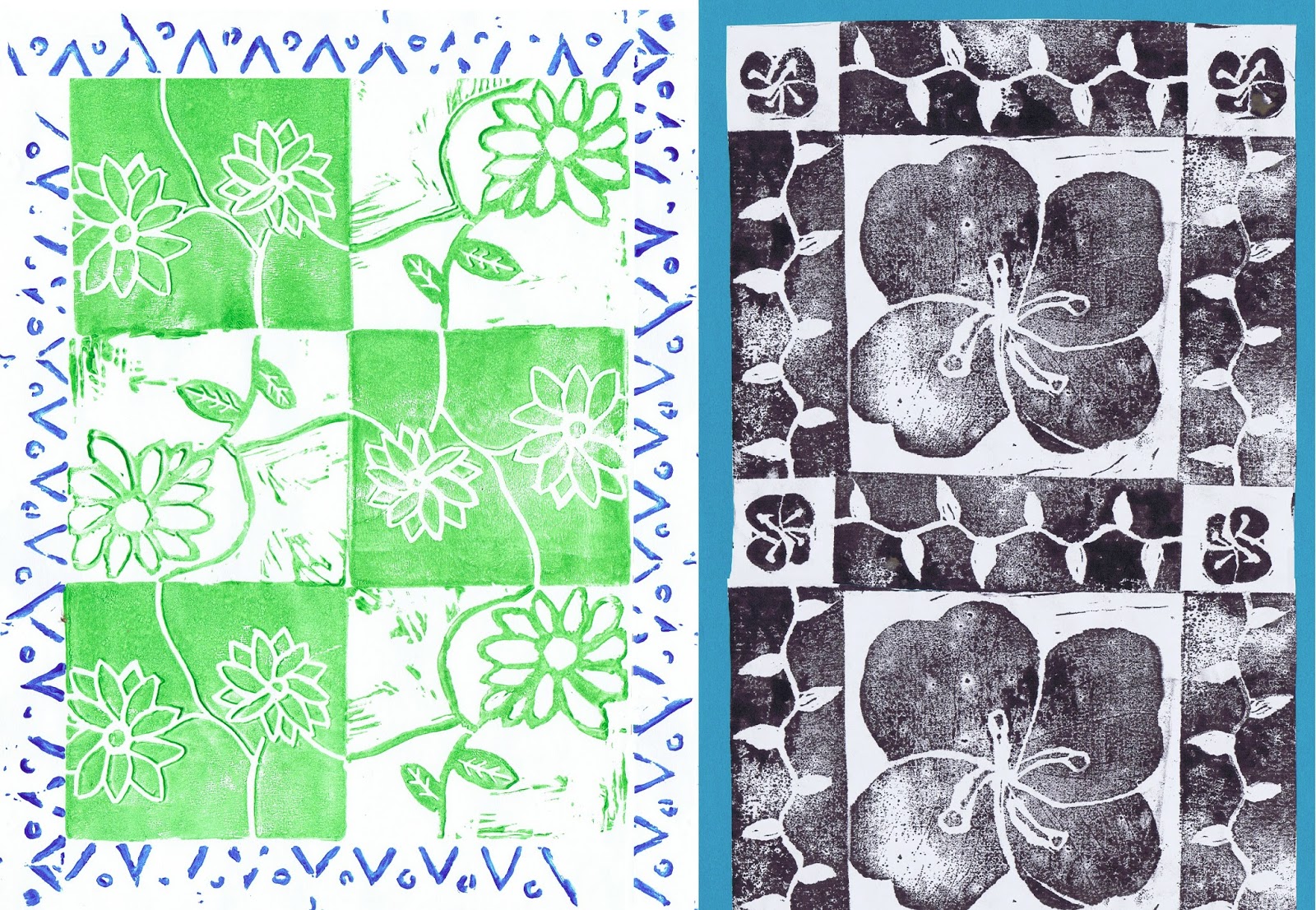
        You can see here some of the variations kids have come up with.  There are scenes in which the components are arranged logically to represent the real world.  There are designs in which the components are arranged into medallions or patterns (usually symmetrical.)  Components can be printed so that they fit right up against each other, or spread with space between.  Color is another possible  variable.  It’s always so much fun to see all the different ways that kids address an artistic challenge.


[Pictures: Fish, print from multiple rubber blocks by ME, 2015;
City, print from multiple rubber blocks by AT, 2015;
Fair Food, print from multiple rubber blocks by CH, 2015;
African Animals, print from multiple rubber blocks by NF, 2015;
Print from multiple rubber blocks on fabric by 8th grader, c. 2000;
Prints from multiple rubber blocks on fabric by two 8th graders, c. 2000;
Flower Medallion, print from multiple rubber blocks by EE, 2014.]