December 29, 2021

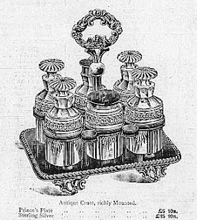
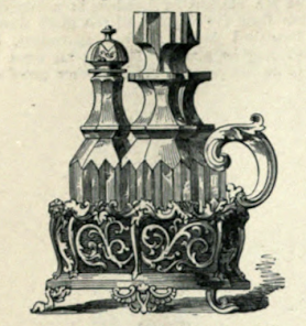
Words of the Month - From the Cruet

         Some of our oldest, most basic foods can be found in salad dressing, including oil and vinegar.  So where do we get these words?  Their origins are more interesting than you might expect for such ordinary words.


oil - Once upon a time all oil was olive oil.  The word oil derives (by way of French, by way of Latin) from the Greek elaion meaning “olive tree.”  Not until after about 1300 did the (Middle) English word begin to expand its meaning to include other fatty or greasy liquids.


vinegar - Once upon a time all vinegar was wine vinegar.  You can see the wine right there in the word: vin-.  Our word equals “wine + sour” in Old French, ultimately from Latin (although the actual Latin word for vinegar is vinum acetum.)  Oddly, the -egar part of the word is the same as the word eager, which originally meant “strenuous, ardent, fierce,” because the Old French had picked up on the other connotations of the Latin word that meant “sharp, piercing, ardent, zealous” as well as “sour.”


mustard
- We’ve got more wine in the mustard, which derives (again by way of Old French) from Latin mustum meaning “new wine,” because the condiment was originally made by mixing the crushed seeds with wine.  From the condiment named after the wine, the word was applied to the seeds (late 13th c) and eventually to the plant (mid 14th c).  The color meaning came much later - mid 19th c.  On a fun side note, Dijon mustard is of course named for the city of Dijon in France, but that city’s name derives from the Latin name Divius, meaning “divine.”


salad - The salad itself was once upon a time vegetables seasoned with brine, and the word derives from Latin for “salted.”  The slaw that might be a particular type of salad comes from the same root, but by way of Dutch.


        So any time you dress a salad your words are seasoned with a long and flavorful linguistic history.  And if you’re eager for vinegar and think mustard divine, you’re right on target.


[Pictures: Antique Cruet, richly Mounted, engraving from advertisement for Mappin & Webb’s, 1895 (Image from ebay);

Cruet-Frame with an arabesque pattern, by Messrs. Elkington, shown in the Great Exhibition of 1851, engraving from The Art Journal Illustrated Catalogue: The Industry of All Nations (Image from Hathi Trust);

Six-Bottle Dinner Cruet,  engraving from advertisement for Mappin & Webb’s, 1892 (Image from ebay).]

December 24, 2021

Merry Christmas!

         Today I have four block prints showing a variety of depictions of Christmas scenes.  Up first is a classic renaissance Holy Family by Hans Sebald Beham (Germany, 1500-1550).  Joseph is hard to see, way down low behind Mary - I like to imagine that he’s playing peek-a-boo with Jesus, who is reaching out to him.  For a selection of earlier fifteenth and sixteenth century woodcuts of the nativity, you can see my previous post Nativity 1 in a series tracing depictions of the holy family in relief block prints through the ages.  (The more modern depictions are covered in Nativity 2 and Nativity 3, as well as two more I posted for Christmas 2018.)
        My next Christmas scene for you is set in Africa and I really enjoy the elephant adoring the infant!  This is by Azaria Mbatha (South Africa, b.1941) about whom you can learn more - and even see another episode from the Christmas story - at a previous post.  
Mbatha is known for imbuing his Biblical scenes with African culture and sensibilities, and I think it works really well.  Another of his characteristics is including multiple scenes in each piece, and in this case the four corners each include another scene.  The lower left looks like it may be the three wise men riding in on an elephant, and I’m guessing the lower right may represent the shepherds.    The upper corners look like scenes from the life of Jesus, preaching on the left, and his baptism on the right.
        With the third piece, by Mary Amelia Kretsinger (USA, 1915-2001), we get even more abstract.  Without the title “Christmas,” you probably wouldn’t associate this with Christmas at all, but Kretsinger has let us know that this isn’t just any ordinary star.  I’m actually not sure quite how she made this piece.  If she carved away between the black lines, how is the grain still showing?  So is it perhaps printed with two layers of black, one for the wood grain and then a second for the stronger outlines?  Plus there’s grey and brown presumably printed separately.  I like to think of the brown and black blocks in the lower left as representing the inn and stable, but given that there’s another black block in the upper right, they may not be intended to be anything but abstract shapes.
        And continuing with the star, here are the three wise men heading toward it in a Christmas card design by Herschel C. Logan (USA, 1901-1987).  (Logan made a whole annual series of Christmas card designs and perhaps next year I’ll do a whole post on them.)  I will leave you with Logan’s wish: to those who celebrate Christmas, may it be Very Merry indeed!


[Pictures: Holy Family under a Canopy, woodcut by Hans Sebald Beham, c 1530 (Image from Vassar College);

Nativity scene, linocut by Azaria Mbatha, second half 20th century (Image from MutualArt);

Christmas, color woodcut by Mary Amelia Kretsinger, 1974 (Image from Kansas State University);

Christmas card, color woodcut by Herschel C. Logan, 1925 (Image from Kansas State University).]

December 20, 2021

O Christmas Tree!

         The Christmas tree’s origins are a bit murky, with some historians connecting it with pagan tree worship and the Yule log, others with the eighth century St Boniface, while some trace its origins to the “tree of paradise” associated with medieval mystery plays performed on Christmas Eve.  The modern Christmas tree got its start with Martin Luther, who supposedly added candles to the decoration of the evergreen he brought into his home.  Later resistance to the Christmas tree tradition was strong in Catholic areas and was not because of its supposed pagan connections, but because of its Protestant roots.  (The Vatican did not erect a Christmas tree until 1982.)
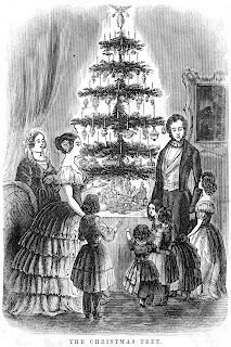
        Queen Charlotte displayed a Christmas tree in England at a party in 1800, and Queen Victoria kept up the tradition, whereupon the upper middle classes avidly copied it in the mid-nineteenth century.  Hessian soldiers stationed in Canada set up trees in 1781, but it took a while to move beyond being an ethnic German tradition.  In the United States, the first image of a Christmas tree was published in 1863, but it was Godey’s Lady’s Book and its editor Sarah Josepha Hale that get credit for popularizing it.  An engraving of a fashionable Victorian family basking in the glow of their tree in 1850 was the first widely-circulated image of a “modern” Christmas tree in America, and within about 20-25 years the Christmas tree tradition had become common in the USA.
        There is some magic associated with Christmas trees.  I'm thinking of the scene in “The Nutcracker” ballet where the Christmas tree grows enormous, thus signalling the transition to a fantasy world.  Premiered in 1892, the ballet clearly reflects the late Victorian-era romanticism associated with the decorated tree.
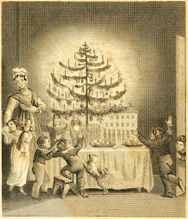
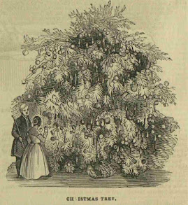
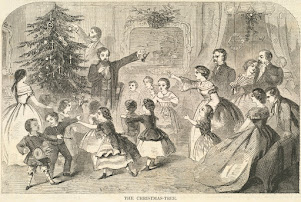
        Anyway, I’ve gathered a few historical engravings of Christmas trees (and a couple of woodcuts).  Most of these trees are placed atop a table, which we still do in our house (although we use a very low side table.)  It’s much more practical - the presents can go underneath and the cat doesn’t get herself into trouble - and I don’t know why this tradition ever changed.  I guess just the usual assumption that bigger must be better.  On the other hand, the one woodcut from 1845 suggests an enormous shrubbery.  I would assume this one must be outdoors, except that the gentleman isn’t wearing a hat, so I don’t know.
        Of course, these prints don’t capture the wonderful colors of a Christmas tree (let alone the scent), but I do like the way some of them show the sparkle and glow, with white carved out all around the trees and their delicate branches.  I do love Christmas trees!


[Pictures: Christmas Eve, engraving, frontispiece from The Stranger’s Gift edited by Hermann Bokum, 1836 (Image from Internet Archive);

Christmas Tree, wood block print from Illustrated London News, Dec. 27, 1845 (Image from The Social Historian);

The Christmas Tree, engraving from Godey’s Lady’s Book, Dec. 1850 (Image from Wikimedia Commons);

The Christmas Tree, wood engraving by Winslow Homer from Harper’s Weekly, Dec. 25, 1858 (Image from Boston Public Library);

F.A.O. Schwartz advertisement, wood block print, 1898 (Image from ebay).]

December 15, 2021

The Frozen Ocean

        Here’s a wintry poem, and an interesting bit of fantasy by Viola Meynall (UK, 1885-1965).  It’s not so much a story as a scenario, a very simple “What if?”  What makes it particularly interesting, though, is that it isn’t asking “What if the ocean froze over?”  Rather, it’s asking, “What if the Ocean chose to freeze?”  Indeed, it is actually freezing itself.


The sea would flow no longer,
It wearied after change,
It called its tides and breakers in,
From where they might range.


It sent an icy message
To every wave and rill;
They lagged, they paused, they stiffened,
They froze, and were still.


It summoned in its currents,
They reached not where they led;
It bound its foaming whirlpools.
“Not the old life,” it said,

“No fishes for the fisherman,
Not bold ships as before,
Not beating loud for ever
Upon the seashore,


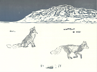
“But cold white foxes stepping

Onto my hard proud breast,
And a bird coming sweetly
And building a nest.


“My icebergs shall be mountains,
My silent fields of snow
Unmarked shall join the land’s snowfields —
Where, no man shall know.”


        This ocean is personified - but not too personified.  It is given consciousness, will, and abilities such as communication, but it is definitely not human.  It seems not only tired of being in constant motion, but almost rebellious: no fish for you!  (I can certainly imagine the ocean having had enough of humans on it, although our poor oceans are warming up instead of freezing.)  Some of the images are really lovely, such as, “It summoned in its currents,” and “cold white foxes stepping onto my hard, proud breast.”  By the end Earth is really an alien planet, with its solid ice surface above liquid seas below, like some of the moons of Jupiter and Saturn.  I certainly wouldn’t want to experience a cataclysm like the freezing of the ocean (would the foxes and birds survive, either?), but it makes a great poem!


[Pictures: Sea Ice, color woodblock print by Ina Timling (Image from Etsy shop TimlingPrints);

The Sinking of the Jeannette, wood engraving by G.T. Andrew after a design by M.J. Burns, 1884 (Image from Naval History and Heritage Command);

Arctic Fox and Slope Mountain, woodcut and linocut by Teal Francis, 2016 (Image from TealFrancis.com).]

December 10, 2021

Japanese "Modern" Printmaking

         The Japanese ukiyo-e printmaking of the 17-19th centuries gave way in the twentieth century to two new printmaking movements in Japan.  One was shin-hanga, which aimed to continue the traditions of ukiyo-e into modern times.  The traditional methods were preserved, with art design, woodblock carving, and printing each done by different artisans, with the creative force often coming from the publisher as well as the artist who drew the designs.  The images also tended to evoke nostalgia with traditional views.  On the other hand, these artists incorporated elements of Western art into their work, as well as depicting some more modern views and details in order to update the traditional woodblock print.
        The other 20th-century movement was sosaku-hanga, which was a reaction to the traditional methods of ukiyo-e.  It emphasized the single artist drawing, carving, and printing his (or her, but usually his) creative vision.  It was inspired by Western ideas of solitary artists, as well as by Japanese folk-art traditions.  Block prints from this movement have much more in common with Western ideas of “modern art,” with experimentation, expressionism, spontaneity, and a movement away from traditional conventions of realism.  This movement really took off after World War II.
        Hokusai and Hiroshige are among the most famous ukiyo-e artists, and I’ve linked their names to previous posts featuring their work, plus more here and here.
        Hasui is probably my favorite artist working within the shin-hanga movement and you can see some of his work here, here, and here, but I’ve included today an evocative city street scene by Yoshida Hiroshi.  He was trained in Western oil painting as well as Japanese printmaking, and had a shrewd eye toward how to blend the two for maximum appeal.  There are electric lights and some influences of Western dress, as well as Western one-point perspective, in an image that nevertheless clearly follows in the traditions of ukiyo-e depictions of urban life.  (And another post with Hiroshi here.)
        Today I give you two examples from the sosaku-hanga movement, at the top and bottom of this post.  You can see that both look more “modern” than the shin-hanga piece in the middle.  The last piece, by Shima Tamami, does one of my favorite things: 
using the grain of the wood as part of the picture.  The bare tree trunks are stylized, and the tree texture on the hill in the background is very rough and almost abstract.  Meanwhile, the first piece, by Kasamatsu Shiro, experiments with depicting trees in a different way.  The yellow leaves are actually negative space, showing through beneath the areas that are carved away from the green which forms both the foreground trunks and the fade-away into the distant mountainside.  This is a very different method from traditional Japanese printmaking, in which the shape and color of the trees would have been printed with its own block, and I really like how the negative space works in this.
        In addition, I’ve done previous posts on sosaku-hanga artists HiratsukaMunakata, and Saito if you want to see more examples.


[Pictures: Shadow of a Mountain, color woodblock print by Kasamatsu Shiro, 1959;

Kagurazaka Street after Night Rain, color woodblock print by Yoshida Hiroshi, 1929;

A Stand of Trees, color woodblock print by Shima Tamami, 1959 (All images from The Clark Museum).]

December 6, 2021

Graphics Extravaganza

         I am not a graphic designer with any official status, whatever that might be.  I’ve never had any classes or earned any degrees, and I really have no idea how graphic design is supposed to be done… Nevertheless, here we are, with me doing all the graphics for Strong Women•Strange Worlds, the group of women and non-binary speculative fiction authors-helping-authors by running twice-monthly group author readings of fantasy, sci fi, and horror, free on Zoom.  For our year-end Holiday Extravaganza we have pulled out all the stops and have six hours of live programming on Zoom on December 12, as well as numerous supplementary activities.  Going on right now, even as we speak, there are micro-fiction contests set by authors on Twitter (@StrangeWorlds2) and a creative scavenger hunt to be found on the web site.  It is actually quite amazing how much fun stuff we have prepared for SFF readers, featuring more than 40 authors in a wide array of creatively reimagined party games that center around our books and stories.  You can see the complete schedule, and by all means register for the party and join us (here!)
        From the art perspective of this blog, however, I wanted to show off some of my graphics.  I had to make over a dozen new images to announce and advertise all the various activities (not to mention the graphics to be used during the activities, which are generally less exciting and more utilitarian.)  It’s been a huge amount of work, but an interesting creative challenge, and I’m actually pretty pleased with myself.  To start with, the SW•SW logo has three silhouetted women with a black and purple-galaxy background, and a purplish planet.  I started fooling around with ways to tweak these elements to evoke a festive, holiday vibe while still remaining tied to our brand look.  (Ha ha - do I sound like a real graphic designer?  Probably not, but you get the idea.)
        Here are a variety of the designs I came up with.  There are a couple of general bits, playing around with making the planet serve for various holiday icons.  I’ve included the bit about the micro-fiction contests, showing the winterized version of our usual galactic background.  Then there are pieces for three of our live events, each distinctive, but still calling back to our theme.  By the way, I will be participating in the 2:00 session of “Speed-Date a Book” and the 4:00 “Whose Scene is it Anyway?”, so if you want to see me and some of my books game-show style, this is your chance!


[Pictures: all designs by AEGN for Strong Women•Strange Worlds, 2021.]

November 29, 2021

Words of the Month - Caroling in a Cape?

         Do you prefer your carols a capella, or accompanied?  A carol has been a joyful song since about 1300, although it was also a circle dance, and may in the depths of its Greek etymology have involved accompaniment by a flute.  A capella has a much more interesting etymology.  It means literally, from Italian, “in the style of the chapel,” which may seem a little odd as most church music nowadays is accompanied by at least an organ, if not a full electronic “praise band.”  The phrase refers to older church music - sixteenth century and before - when much of the music was indeed unaccompanied chants.  Oddly, however, it didn’t enter English until the latter half of the nineteenth century, by which time it was already badly out of date to imply that unaccompanied vocals were in the style of church music.
        But let’s go back even further, to the etymology of capella and English chapel, which come from the same root.  A chapel is a place of worship smaller than a full church, and the word literally means “little cape.”  One theory is that this refers to the cloth laid over the altar during service, but a far more interesting theory is the traditional one: that the first “chapel” was the sanctuary in which the cape of St Martin of Tours was preserved as a relic.  (St Martin cut his cloak in half to give part to a beggar, and later dreamt that Jesus was wearing it.  But the relic is the half of the cloak that he kept.)
        In addition, the older traditional carols often include syntax, grammar, and vocabulary that don’t show up any more in the rest of our modern speech.  These unfamiliar words and phrases can lead to Mondegreens, like the four calling birds sung about at this time of year (prior post on Mondegreens here).  Some other phrases you may not hear much of outside of Christmas carols include:
    cloven
skies - an archaic past tense of cleave, cloven means “split,” which makes the arrival of the angels very dramatic (but perhaps less fragrant-smelling, if you thought this had to do with cloves)
    gladsome tidings - meaning “making or causing to be glad,” -some is a suffix that is no longer productive in English, although you can still see it in a fair number of words including quarrelsome, meddlesome, cumbersome, troublesome, wearisome, and worrisome.
    bring him laud - We still use laud as a verb meaning “to praise,” and in the adjective laudatory, but it is no longer seen as a noun (meaning “praise, glory”) except in the carol.
    give ye heed - Nowadays we would say “you” instead of ye - except that in modern syntax we wouldn’t say the pronoun at all, but would rather use the imperative construction “give heed,” or more likely simply “heed”…  or even more likely, “Listen!”
    veiled in flesh the Godhead see - Between the syntax, the vocabulary, and the theology, this one is pretty dense to modern ears, though quite poetic, really.  The -head in Godhead is from the same root that developed in parallel into -hood, the form that is still productive today.  (Prior post on productive and unproductive suffixes here.)
        Whether you celebrate Christmas or not, whether you sing carols or not, such traditions are a vital way to keep some older forms of the language from disappearing entirely, which I think is always fun to see.


[Pictures: A Christmas Carol, woodcut by J.A. Duncan, 1899 (Image from Graham’s Antiques);

Saint Martin on Horseback, woodcut by Hans Baldung, early 16th century (Image from The Met);

The Angels, illustration from A Book of Christmas Verse Selected By H.C. Beeching, 1895 (Image from the British Library).]

November 24, 2021

Give Thanks

         Tomorrow I will be celebrating Thanksgiving, and it is a good time to share a brand-new project that I think has a lot to do with gratitude.  Despite the complicated history of the origins of Thanksgiving, despite the fact that the national myth of The First Thanksgiving has been badly skewed, despite the fact that some people may feel they have little to be thankful for in the arrival of new people on these shores 400 years ago, I persist in my belief that it is a good thing to celebrate gratitude.  I am grateful for my home, which is on such beautiful land of the Pawtucket people — and of me and my family.  I am grateful for that family, and I am grateful for the people I don’t know or love so well, who still are part of the fabric of my community, and who love their own homes and their own families.  I’m grateful for the people who produce and sell me food and art supplies and books and all the other things - both necessary and merely delightful - that make my life so good.  I’m grateful for the people who buy my art and books (or even just say nice things about them!) so that I feel supported and encouraged in doing this thing I love.
        One of those people is a friend who last week saw the sketch of a block I’ve just started working on.  She said that I should make the design into a coloring page, and we could share it with anyone who needs a little reminder, in these times of fear and hatred and anxiety, that each day we can make the choice to try to live in a whole different mode altogether.  So that’s what I’ve done!
        Feel free to download this coloring page HERE and color it as beautiful or eye-catching or cheerful or soothing as you desire!  Print lots of copies and bring them with you to your Thanksgiving get-together, and let everyone in the family color as you wait for the turkey to come out of the oven!  Send the colored pages to family and friends who couldn’t be with you, or drop them in your neighbors’ mailboxes; share this link with everyone you know… and then do it: try to fill your day with love in every way you can, whether that’s forgiving someone who hurts your feelings, or realizing that you might be hurting someone else, or being kind to the people in the shops (especially if you actually go out shopping during the crazy post-Thanksgiving shopping rush when people tend to get a little harried and cranky!)  Reach out to someone you’ve lost touch with, send a note of gratitude to someone who is important in your life, smile at everyone you pass when you’re out for a walk - and don’t be swayed by anyone who’s trying to fill your day with hatred.  Just try your very best to love them anyway, even while firmly not allowing them to do their hateful things.  Even you being just one person doing this will absolutely make a difference, and if we all do it, it will a change the world.
        Okay, that turned into a bit more of a sermon than I was intending.  In fact, all I really wanted to say was that I am full of gratitude.  My art and my writing tend to be the parts of my gratitude that overflow and spill out so much that I want to share them with everyone, which is what I wanted to do with this coloring page today.  If you want to share it, too, that would make me very happy.  And if you want to share your colored masterpieces back with me and with the wider world, I would love to post a gallery of them all!  So snap a picture of coloring in progress and/or the finished piece, and email it to me.  (Rather than post my email here, I’ll direct you to go to my web site nydamprints.com, go to the bottom right-hand corner, and smash that “Contact Me” link.)
          As for the block for which this was just the design, I started carving a bit at a demo last weekend, but I am exercising incredible restraint in saving it to carve during upcoming shows.  In due course, when the block is actually finished and printed, I will be sure to let you know.  Also, if you want some additional coloring pages of my designs, you can find a collection here: Stay-at-Home Activities 1.
        Happy Thanksgiving and love to all!


[Pictures: Fill This Day coloring page, by AEGN, 2021;

All in this Together, rubber block print by AEGN.]

November 19, 2021

Observing the Moon

         In honor of last night’s lunar eclipse, I have for you today a collection of prints depicting the moon.  I begin with a diagram from 1540 that actually depicts an eclipsed moon in the shadow of the earth.  It doesn’t show us the weird rusty color, but I do like the way the moon’s face is in negative from the moon in its full light.  This wood block print was carefully hand colored, as part of one of the most lavish scientific works of the renaissance.
        The moon, of course, is one of the things that all humans have in common, so it’s no surprise that I was able to find beautiful depictions of the moon from all around the world.  Next up is a Japanese view with plum blossoms, which means it’s not an autumn 
moon, but I love it so much I had to share.  I particularly like how the great expanse of night sky that fills most of the composition is not really flat and empty.  You can see the wonderful wood grain in it.
        Travelling back in both space and time to renaissance Europe (about 150 years later than the first piece, however), we get a wonderful view of men observing the moon.  One points up at it, seeing something of significance or wonder.  This delightfully bold wood block print comes from a Hebrew prayer book, so I can’t read the 17th century Hebrew to know what the illustration has to do with the text.  It has a nicely stylized face in the crescent, and also demonstrates a characteristic of early wood block prints that is at once a ridiculous waste of the medium and endearingly backwards.  That is, the stars are black.  In a medium that does nothing better than black backgrounds with white shapes carved into them, a medium 
perfect for just such a scene as a night sky with glowing moon and stars, the renaissance 
artists stubbornly and obtusely insist on making their prints copy a drawing in black ink on white paper, even though it’s both far more work and far less attractive to put black stars on a striped sky.
        So I shrug and move on to some modern depictions of the moon.  This is a silkscreen rather than a relief block print, but I include it anyway because I love the compare-and-contrast with the other depictions.  Even though it comes from the traditional imagery of the Kwakwaka’wakw Nation of the Pacific Northwest Coast, it shares with European moons the image of a human face.  I love the eyes that may be 
closed, but perhaps are simply looking downward, as the moon does.  Either way, it is serene, yet still with a strong sense of motion in all the curving shapes.
        And finally, another piece that could perhaps be a depiction of an actual eclipse, although the moon on the far side of Earth from the sun is not wholly shadowed.  This is made as a reduction print, and has wonderful colors as the fiery sun shades into a black sky.
        Were you able to observe the eclipse last night?   There was nothing to see here, as it was completely overcast, but I’ve been lucky enough to see a lunar eclipse once before, so I wasn’t too disappointed.  And the block prints are always there, rain or shine!


[Pictures: Diagram of lunar eclipse, hand colored wood block print from Astronomicum Caesareum by Petrus Apianus, 1540 (Image from Met Museum);

Moon over White Plum, color wood block print by Ohara Koson, c 1910 (Image from Hara Shobo);

Woodcut from Birkat ham-mazon, 1669 (Image from Bayerische Staatsbibliothek);

4 Phases of the Moon, silkscreen by Francis Dick, 2012 (Image from Cedar Hill Long House);

Sun Moon Earth, reduction linocut by Kylie Dally (Image from Etsy shop PotionsPress).]

November 15, 2021

Bite-Sized Writing

         This post is about writing process - and lack of writing process.  For the past several years I’ve had two novels “in progress,” except that they are really getting no progress at all.  It’s not that I’m not excited about them, and it’s not that I don’t have any ideas for them… It’s just that every time I sit down to write it seemed like nothing was going anywhere.  This has been deeply, painfully, infuriatingly frustrating.  But I was still doing plenty of block prints, thank goodness, and that got me off on the tangent of writing On the Virtues of Beasts of the Realms of Imagination, which is not a novel but a whole collection of individual pieces for individual beasts.  That came out two years ago, and not long after it was finished covid struck, and I felt like that should have been perfect for writing… Plenty of time at home, all my outside activities cancelled, just peace and quiet at my desk…  But I still couldn’t seem to focus on those novels.  And then this summer I finally made a breakthrough: short stories.  Taking a small idea and writing a bite-sized story about it is actually manageable, and since the summer I’ve written seven new short stories, and it feels SO GOOD to be writing!
        I’ve been a bit rusty at figuring out how much plot a short story needs, and how to dive in with the right level of detail, since I’d been writing long form for so many years, but I think I’m finding my way back into the hang of it.  Now that I’m focussing on these short stories, I’ve found my creativity popping, and when I sit down to write I can actually get stuff down and feel like it’s going somewhere, and I can actually finish these small projects.  So I’ve diagnosed my issue as stress, which may be glaringly obvious, but I hadn’t given it credit for just how badly it was interfering with my ability to persevere on large projects.  Covid sure as heck didn’t help, but this started before covid, with the stress of politics, environmental disaster, escalating violence, and all the rest of the panic-inducing news bombarding us.  However, these bite-sized projects are something I can handle: a single image, sketched, carved, printed; a single mythical creature, imagined with just a little twist; a single scenario, followed just a little way to see what happens next; a single character with an interesting perspective, given a little push; a single observation, clarified and polished into a poem...
        If you’ve been having trouble with writing or creativity, I encourage you to give yourself permission to take smaller bites.  Scientific studies demonstrate that stress is actually the enemy of creativity, so if you’re feeling like you’re struggling right now, it’s not your fault.  (More here, at the beginning of the summer.)  Just take a deep breath, take one little fleeting idea, and try playing with it for a while.  Here are the stories I’ve written in the past five months or so

   - sci fi about a loner pilot encountering an alien mycorrhizal network

   - folktale-fantasy about a trickster

   - sci fi mash-up between “Hope is the thing with feathers” and “The Tell-Tale Heart”

   - fantasy about a unicorn maiden whose job is to sit in a glade and tame unicorns

   - fantasy about Pandora opening the jar, seen from an unusual character’s view

   - fantasy about Rumpelstiltskin set in an early-industrial-revolution mill

        I’ve been submitting stories to various speculative fiction magazines, and collecting plenty of rejections, and only one acceptance so far: for a very short, humorous, sweet story set in a Lovecraftian town.  It's scheduled to be published in February.  In the meantime, I’ve got three more short stories with a few paragraphs jotted down, and several poems I’ve been working on.  I’ve got one block about half-way carved and another sketch ready to transfer to rubber.  (I’m saving these to work on during upcoming art shows.)  And I’m just enormously grateful to be working and finding satisfaction in actually being able to create things.  More than ever I’ve been trying to incorporate messages of joy and hope into my work, because clearly we all need as much of this as possible these days.  I know I do!


[Picture: Beyond the Thorns, rubber block print (two blocks) by AEGN, 2017.]

November 10, 2021

Woodcut in the Digital Age

         Christiane Baumgartner (Germany, b. 1967) has been a recent star in the world of printmaking, for her huge woodcuts that reproduce digital images.  Her usual technique is to take found photographs or stills from video, often from television footage, in all their graininess, distortion, and “noise,” convert to black and white, blow the images up to monumental sizes, and then carve them as wood block prints.  This first image, from a photograph of military cargo planes, is made into a print 14 feet long, which took ten months to carve.  Obviously we aren’t getting the real impact of the piece by seeing it small on a screen, which turns the huge, hand-carved woodcut back into the little photograph with which it began.
        Baumgartner says she’s interested in the juxtaposition between the oldest and the newest methods of reproduction, the laborious handmade with the instantly technological.  She also works a lot with series, which is related to turning video back into still images.  Here are a couple of pieces from a series of 6, which, although still larger than most of my own block prints, are a size more manageable to look at on a computer screen.  (Click on it to see it bigger.)  You can see how her carving is entirely horizontal lines, with the image formed by the relative widths of black and white.  This connects the piece physically with the technology of digital images made up of all their little rows of pixels.
        It would not be accurate to say that I like Baumgartner’s work, but I certainly find it interesting.  I can imagining making a piece or two experimenting with these ideas, but then I would get bored!  She does make extremely small editions of each piece, which is entirely understandable for the big ones, which must be quite a job to print.  I can admire the craftsmanship - not to mention patience and persistence - required for these pieces.  And I’d certainly be interested to see some of Baumgartner’s pieces in real life.  Seeing them in person would be a very different experience, where the handmade quality would be more visible.  I can imagine that I might really like them in person, but it’s harder for me to get excited about the images as they appear on my computer screen.  What do you think of this idea of reproducing video and photography in this way?


[Pictures: Transnall, woodcut by Christiane Baumgartner, 2002;

Pink Moon 2 and 5, woodcuts by Baumgartner, 2019;

Nordlicht 1 (from a series of 4), woodcut by Baumgartner, 2018 (All images from Christiane-Baumgartner.com).]

November 5, 2021

Guess That Medieval Beast 9

         It’s been quite a while since our last round of Guess That Medieval Beast, so I’ll just remind you that if you’d like to start at the beginning and test yourself with the earlier rounds, go to the Labels list in the sidebar and click on “game,” which is down near the bottom of the list.
        And now, without further ado, our Round 9 Mystery Creature!  This creature appears in a copy of Der naturen bloeme from about 1350, one of those works that is just beginning the transition from medieval bestiary to renaissance encyclopedia.  To describe this thing is perfectly straightforward: it’s a fish with hands.  It seems to be using its hands to reach its big, toothy mouth, but that’s about all the picture tells us, although it does have very nicely detailed gills, scales, and fins, and an attractive coloration.  Go ahead and make your guess: what sort of creature is this?


November 1, 2021

Alcorn's Birds (and Frog)

         Stephen Alcorn (USA) has a distinctive style of printmaking that looks like a lot of fun to do — and is also a lot of fun to look at.  I’ve picked four creatures that show off the characteristics of Alcorn’s style that I like best.  First is this duck, whose feathers show a delightful mix of patterns.  They blend an accuracy of observation with a creativity of expression.  Then there’s that wonderfully embellished background, which could possibly represent some sort of trees or bushes in the background, but is really just an excuse to fill the space with a delightfully baroque pattern.  Combined with the ground that looks almost expressionistic or even cubist, and you have a piece that should be a mere mish-mash, but instead somehow works together.
        The next bird includes all these same traits: wonderfully stylized patterns for the feathers, renaissance-style embellishments in the sky, and early modern-style ground.  In addition, however, it adds two more characteristics to the mix.  One is the use of two blocks for a chiaroscuro effect.  (Find a refresher on chiaroscuro block prints here.)  Consistent with my general prejudices, I’m not sure it adds all that much to the image of the vulture, which I think I would like just as well (or better?) in plain black and white.  However, I do really like the grey border.  The border has a wonderful design, and the second color sets off the main image beautifully.  (Indeed, this is exactly the look I was going for in the illustrations for my book On the Virtues of Beasts of the Realms of Imagination.)
        The frog is a delightful creature, although I might wish he had more white!  I love the patterning in the background, as well as the border.  Alcorn uses an interesting technique to make the backgrounds lighter than the creatures: cutting fine lines across the entire design.  I do like the effect, although I tried it once myself and did not consider it a success.  This may be one of those things that just works better in the harder mediums such as lino and wood than the soft rubber, in which it is difficult to make very fine parallel lines.  Interestingly, each side of this border has a different design, but I like them all.  I also like the fine, all-over texture of the ground beneath the frog.
        The final bird is back to black and white, and its border is not patterned, but otherwise you can still see Alcorn’s characteristic style.  The owl is perhaps even more stylized than some of the others, so that it has almost a folk art vibe, especially in the slightly floral look to the pattern on the shoulder, for example.  All of these pieces are actually fairly large for block prints, so I’d love to see them in real life - I think they would have a lot of dramatic impact.


[Pictures: Mother Duck, With Her Ducklings, relief block print by Stephen Alcorn, 1987;

The Vulture, relief block print with two colors by Alcorn, 1988;

Kiss Me - I’m Really a Prince! relief block print with two colors by Alcorn, 1987;

The Great Owl, relief block print by Alcorn, 1988  (All images from The Alcorn Studio & Gallery).]