July 31, 2024

Words of the Month - Gothic Identity Crisis

         How did the word Goth manage to morph from a blond barbarian to a death rock fan with black eyeliner, by way of Notre-Dame de Paris cathedral?  The twists and turns the word has taken over nearly two millenia are a great illustration of the influence of culture and political power on our interpretations of words.
        This isn’t a history blog so I’m not going to go in-depth on the history, but we’ll start with the various Gothic tribes of Europe.  Probably ultimately of Scandinavian origin, the Goths were famous for their warriors.  Most of our accounts of them come from Roman authors, and the Romans both recruited Goths into their own army in large numbers, and experienced raids from the Goths for centuries, so the warrior aspect was what they paid the most attention to.  Eventually Goths made up a significant proportion of the Roman army, but of course the most famous historical point was the Sack of Rome by the Visigoths in 410 CE.  History (written, again, first by Romans and then by Roman admirers during the Renaissance) gave goth the definition “uncivilized barbarian, savage despoiler,” which appears in English in the 1660s.
        Meanwhile, Giorgio Vasari and the Italian Renaissance architects, who admired all things classical, used the word gothic disparagingly to refer to the art and architecture of northern Europe in the Middle Ages.  The implication was that this style was a) in opposition to Roman style and b) Germanic — and therefore barbaric.  This definition (“medieval architectural style”) entered English around 1640.  Of course the builders of the great Gothic cathedrals of Europe had not called their own style “gothic.”  They generally called it Latin for “French work,” “modern work,” or “new work”!  Not to mention that the Goths as a distinct people had pretty much ceased to exist by the sixth century, long before the earliest Gothic architecture in the twelfth century.
        Time passed, and eventually fashion circled around to a Gothic Revival in architecture, which began slowly but picked up steam in the late eighteenth century.  (Political oomph was provided to the movement by reaction to the ugliness and new troubles caused by growing industrialism, as well as reaction to the republicanism of the United States and France, and finally by powerful high church members of the Church of England who were embracing the Catholic roots of their religion.)  Meanwhile, in 1764 Horace Walpole lived in a Gothic Revival “villa” he had built, and there he wrote The Castle of Otranto, a dark and gloomy medieval tragedy set in a dark and gloomy medieval castle.  By the second edition Walpole had subtitled his novel A Gothic Story, and spawned a literary craze.  So now the word gothic had yet another meaning in English: characterized by an aesthetic of fear and haunting, threat of supernatural events, a typically dark and claustrophobic atmosphere, and melodramatic elements such as vengeance, murder, and imprisonment, which often serve as metaphors for psychological or social conflicts.  All these connotations were a sort of synthesis between the idea that gothic meant “barbarous, terrifying, and opposed to the rationality of the Enlightenment,” while simultaneously embracing that opposition and admiring (indeed, wallowing in) melodrama, extreme emotion, and “atmosphere.”
        Then in 1979 music reviewers were describing post-punk band Joy Division as “Gothic” based on its dark aesthetic and gloomy lyrics.  And thus the word came to be applied to the goth subculture of post-punk music and fandom, which is centered on music, fashion, and life-style.  There are numerous sub-divisions of goth music and culture, but in general they involve a lot of black.  Black hair, black nail-polish, eye-liner and lipstick, black leather, black fishnets…  You could say that the one thing these most recent goths have in common with the original Goths is that they both see themselves as rebels outside the dominant empire.
        What’s the first meaning you think of when you hear the word gothic?  And where do you think this ever-evolving word will go next?


[Pictures: Reconstruction of a Gothic long house of late 2nd century, Masłomęcz, Poland (Image from Wikimedia Commons);

Goths Cross a River, painting by Évariste Vital Luminais, 19th century (Image from Wikimedia Commons);

Facade of Reims Cathedral, late 13th century (Image from Wikimedia Commons);

Choir of ChartresCathedral, early 13th century (Image from Wikimedia Commons);

Virgin of the Annunciation, painted stone sculpture, ca. 1300-1310 (Image from The Met);

Strawberry Hill House, designed by Horace Walpole, 1749- ca. 1774 (Image from Wikimedia Commons);

Detail of frontispiece to The Mysteries of Udolpho by Ann Radcliffe, 1794 (Image from Wikimedia Commons);

Baroque Skeleton Lamp, gothic decor by The Blackened Teeth, 2024 (Image from The Blackened Teeth);

Robert Smith performing with The Cure, 1989 (Image from Wikimedia Commons).]

July 26, 2024

What's New in the Studios

         This morning I taught a one-shot block printmaking workshop in Wellesley, and I’m in the middle of a series of classes in Newton in July, and I’m all fired up about the work my students are doing!  So today I’m going to share a few samples.  (As always, I didn’t manage to photograph everything, alas.)  I’ll start right in with the exciting reduction prints that were done in class on Wednesday.  This first one is in three rounds of carving, 3 layers of ink, plus white paper.  If you need the basics of reduction block prints, you can read a two-part post on the process: Reduction and Completed Reduction.  The essence of it is, however, that instead of using a different block for each color, the same block is carved more and more for each layer of ink.  The day lily was printed with a light orange, then a red-orange, and then a black.  The black ink, however, rather than print solid and opaque, tended to cover the earlier colors only lightly.  Variables affecting this probably included how thick or textured the earlier layers of ink were, how dry the earlier layers of ink were, and how dry the current black ink was.  Plus there’s always the variable of the ink’s thickness and how hard it’s pressed, so when you add all those variables together, each print comes out unique.  The prints ended up with this luscious ember-like glow that was really pleasing.
        We were an a real orange kick that night, and the second reduction print is a Baltimore oriole.  This was based on a design that had a background in another color, so the decision to make a textured background really made this piece unique and interesting.  The tension in printing this block was how to balance wanting the black on the bird to be as dark and solid as possible, while wanting the black in the background to be less bold and obtrusive.  Carving out more of the background might be a solution, but there’s pretty much always a compromise between too dark in some places and too light in others.
        Other projects in the class were the classic one-block one-color-ink that just never gets old.  What works really nicely in the chicken is how the background can be a very simple cross-hatching that works well as an abstract pattern to set off the chicken, but simultaneously works as a suggestion of chicken-wire for a hutch or yard.  (The chicken’s comb was colored red, but I didn’t get a picture of the final result.)  And I think the theme of the night might be backgrounds, because I like the unusually finely textured background of the whimsical Christmas tree car, which gives the piece lots of energy and movement.
        This morning’s workshop didn’t have enough time to get into more complex projects, but that’s a nice moral of its own: even really simple blocks can look great.  I think this blue daisy is absolutely charming, and it’s been printed on note cards, so who wouldn’t enjoy receiving this cheerful hand made card?  There was some experimenting with different colors, there was some interesting work on background textures, there was adapting a more complicated colored painting into the simple but dramatic lines of relief block printmaking…  Great stuff!

        Finally, here are a few blocks I’ve been working on myself:
1. The largest one is based on my photograph of a robin’s nest, and is intended to be an illustration in my forthcoming book Bittersweetness & Light.
2. The medium one is, I think, just about finished and ready to print.  It’s what I carved while doing a show last week.  It’s Triceratops doing a crossword puzzle.
3.  The smallest one is a hooded merganser, and is the sample I brought to the workshop today so that I could demonstrate how to transfer the design to rubber, and how to use the carving tools.
        If you’d like to get in on the action, I’m always trying to spread the gospel of relief block printmaking!  The next classes I’ll be teaching will be in October, offered through Needham Community Education.  (The fall catalogue will launch on August 15, but you’ll be able to find it here.)  And of course you can always dive in on your own.  You can find my handout of process and materials here, plus plenty of resources on this very blog.  Try the label Step-by-step to get started, or browse through all the amazing block prints I’ve shared for inspiration.


[Pictures: Day Lily, in process and finished, reduction block print by JK, 2024;

Baltimore Oriole, in process and inished, reduction block print by VS, 2024;

Chicken, rubber block print by LB, 2024:

Christmas tree car, rubber block print by SC, 2024;

Assorted work by students at Wellesley Council on Aging, 2024;

Robin’s nest, Triceratops, and Merganser, blocks carved by AEGNydam, 2024.]

July 22, 2024

More Time for Hobbs

         This weekend I did get to go to the Harvard Art Museums to see the series of monumental wood block prints by LaToya M. Hobbs, and I’m so glad I did!  The intense impact of 5 prints, each 8 feet tall by 12 feet wide, is not something you can get from viewing on a screen.  Still, I’ll share just a little more about it here, because that’s better than nothing.  First, you can reread the original post Carving Out Time, to see the introduction to this series of wood block prints.
        To follow up on my own question about the works of art that are referenced in this series, the exhibit display gave the answer: these pieces are influences rather than actual possessions in Hobbs’s house.  All the references were listed with their sources, which was helpful and interesting.  It also informed me that among the references is a painting by Hobbs’s husband Ariston Jacks, who’s also an artist.  (Plus fantastic drawings by each of her two sons, although I’d guessed those!)  These all appear in panel 4.
  I also learned from the display that these pieces were printed by Big Ink, a group which often uses a road roller to print such big pieces.  The physical ability and expertise to print such large blocks is an impressive achievement in its own right.
        Another fun thing was being able to get up close and see the textures and patterns of the gouges.  Here’s a close-up of what is probably about 12x18 inches of panel 3.  You can see the balance between not really being super detailed, yet having everything necessary to make the image pop into existence.  Hobbs uses speckles for the carpet, crosshatches for the chair upholstery, scanty outlines for the table legs, and slightly thicker gouges for glints of light.  Elsewhere she uses all-over lines for plain walls, and large areas of black with few lines for hardwood floor.
        I’m gushing about the carving, but what I love most of all about this series is the subject.  Not surprisingly, the depiction of an artist embedded in her life and family is something that really resonates with me.  I’ve included details today of some of my favorite parts: working with one son at the computer, perhaps warning him he’s had enough screen time and it’s time to get off.  And then there’s the bedtime story, which was one of my absolute favorite parts of motherhood.  (Perhaps today it’s particularly fitting that I enjoy Hobbs’s depiction of her time juggling life with her young children, since as of this morning my own nest is officially empty!)


[Pictures: details from Carving Out Time, five woodcuts by LaToya M. Hobbs, 2020-21.  (Photos by AEGNydam, but visit the artist’s web site latoyamhobbs.com)]

July 17, 2024

Carving Out Time

        I’m going to try to get to this exhibit in person, but in case that doesn’t happen, I’ll go ahead and share it today in case anyone else who reads this is in the area and able to see it at the Harvard Art Museums before it closes on July 21.  LaToya M. Hobbs made a series of five enormous woodcuts depicting a day in her life.  Each of the five panels is eight feet tall, so these are basically life-sized!  Not only are they life-sized, but they’re also life-like, depicting life in a way that simultaneously shows the realities and makes them monumental.  It looks like each of the five panels is actually made from three big blocks pieced together.
        Hobbs explores the fact that she’s not just an artist who gets to sit in her studio making art, but is also a wife and mother who has to balance the work, play, complications, and joys of being a fully rounded human being.  This is very clear in the title of the series: Carving Out Time.  It’s a little like my series “Busy Time,” “Story Time,” and “Bed Time,” although of course my pieces are very small and simple, while Hobbs’s pieces are a technical tour de force as well as a bravura masterpiece of art.
        The walls of Hobbs’s rooms show work by other artists including Jean-Michel Basquiat, Elizabeth Catlett, and Margaret Taylor Burroughs.  I don’t know whether Hobbs actually owns these works and has them hanging on her walls, or whether they are more metaphorical: the art that furnishes the interior rooms of her heart and mind.
        I’d really love to be able to get a close-up look at the carving and inking, which doesn’t show up very well on-line.  I’d also love to get the sense of size, which is impossible on a little screen.  If I do manage to get to the exhibit this weekend, I’ll report back!  But even if I don’t, I think it’s safe to say that I love everything about these pieces: their subject, their medium, their execution, their humor, and their aesthetic impact!
        (Update: I was able to see it in person, so you can see what I discovered at More Time for Hobbs.)


[Pictures: Carving Out Time, five woodcuts by LaToya M. Hobbs, 2020-21 (Images from Harvard Art Museums).]

July 12, 2024

Is There a Caladrius in the House?

         My husband and I are both down with covid, so this seems like the right time for a post on the caladrius.  We don’t know all the details of what a caladrius looks like, but we do know it’s a bird with pure white feathers.  Sometimes it seems to look like a dove, but at other times it’s got longer legs and beak like a small heron or egret, and sometimes it’s practically a duck.  But the important thing about it is its magical power.  When someone is ill, the caladrius perches on their sickbed and inspects them.  If the patient is doomed, the caladrius turns its head away and all hope is lost.  However, if the patient can be saved, then the caladrius gazes in their eyes and draws their sickness into itself.  It then flies up to the sun, where the germs (or whatever) are burned away, leaving both the patient and the caladrius pure and healthy once again.
        The caladrius was discovered by the ancient Romans but was enthusiastically embraced by the bestiary-writers of the medieval era.  Of course, most of them never had the chance to see an actual caladrius because they’re very rare and the only people who could actually keep one around were kings.  Still, there are lots of great illustrations of the caladrius at work.  The first ones are the classic iconography: a man is shown lying in bed with the bird sitting at his feet.  Often the man is wearing a crown, and you know you’re a king when you wear your crown even when you’re lying sick in bed.  Heavy is the head, indeed.  (Even though the crown is very common, I’ve got only one in today’s selections because I was going for variety.)  As for the caladrius, sometimes it’s depicted looking at
the patient, and sometimes it’s turned away.
  Some scholars have speculated that whether or not the caladrius is optimistic in its prognosis is correlated to how dire and dismal things actually were in the area at that time in history.  (I think this would be a fabulous topic for a thesis I don’t intend to write, but if you do, please let me know your results!)  I love how miserably ill the king looks in the first image - and I’m not just being cruel and heartless to laugh at his expression, because I know he’ll recover fully.
         However, sometimes the artist includes both options in the picture, no doubt sort of like the little diagram in the instruction sheet of the covid test that shows the difference between positive and negative results.  I like how in image three the patients have the facial expression appropriate to their diagnosis.
        My next little collection shows things  a little differently.  In the first one (image five) it looks like a doctor - or perhaps the Keeper of the Caladrius - has brought in the bird to examine the patient.  In image six the patient looks a bit corpse-like, but his wife(?) is smiling at him, weak with relief, as the caladrius flies up toward the sun, bearing the man’s illness away with it.
        As for image seven, I included it because I love the way the caladrius and the patient are staring at each other.  The bird seems to be smiling slightly, but the man looks like he doesn’t appreciate the scrutiny.  He ought to be grateful, as the alternative is shown right there in the same panel, with a different colored background in a sort of “Sliding Doors” scenario.
        And image eight is here because I was trying to find more wood block print illustrations of the caladrius.  Most of the ones I found just show a completely generic-looking bird, not doing anything distinctive.  That style of illustration occurs in many of the hand-illuminated bestiaries, as well, in which surprisingly often the caladrius isn’t even white, which is its one distinctive physical feature.  So I’ve ignored all of those pictures, because they’re no fun.  This wood block print, on the other hand, is much more detailed and skillful than the others in the book and I suspect the printer happened to have it around from another project.  This patient is clutching a crucifix, and since the bird has turned its back, that’s really the only option left to him.
        As for our plague house, I don’t think we need a caladrius.  Obviously it would be lovely to have the sickness instantly drawn out of us and carried away to the sun, but I feel pretty confident that we’ll pull through eventually in any case.


[Pictures: Caladrius, illumination from Bestiary, 1226-1250 (Image from Bodleain Libraries);

Caladrius, illumination from Bestiary, 1236-1250 (Image from British Library);

Caladrius, illumination from Bestiary, 1200-1225 (Image from Bibliothèque nationale de France);

De Charadrio, wood block print from Tou Hagiou Patros (Physiologos) by Saint Epiphanius, 1587 (Image from Biodiversity Heritage Library);

Caladrius, illumination from Bestiary, 1275-1300 (Image from Bibliothèque nationale de France);

Caladrius, illumination from Bestiary, 1225-1250 (Image from Bibliothèque nationale de France);

Caladrius, illumination from the Peterborough Psalter and Bestiary, 14th c. (Image from Cambridge University);

Caladrius, wood block print from The noble lyfe & natures of man by Laurence Andrew, 1521 (Image from Internet Archive).]

July 8, 2024

Saint George Strikes Again

         I previously did a post about Saint George slaying the Dragon, which you should go ahead and see here: St George’s Day.  In it I have a wide variety of wood block prints of the scene, ranging from around 1504 to 1941.  But in the more than ten years since that post, I’ve collected a bunch more prints on the theme, so here’s another collection.
        Knights killing dragons has long been a very popular theme for artists, with Saint George being the most popular one of all.  The iconography tends to be fairly standardized: George is most often riding a horse and plunging his lance down the throat of the dragon on the ground below.  Often the damsel in distress is shown in the background.  Sometimes you can see George’s shield or pennant with his cross on it, although of course in most wood block prints it’s black-and-white instead of red.
        Today’s first three examples are all very standard, but they have some interesting details.  Number one, by Albrecht Dürer, has the princess peering out from behind a boulder, plus some bones scattered around the ground to demonstrate just how dangerous the dragon is.  I love its feet and long tail corkscrewing away into the distance.  The dragons are often quite small, as in today’s second piece, but Dürer’s dragon is as large as the horse, which is quite respectable.  As for the second piece, it shows the princess safely away on a clifftop, praying for the knight’s victory, but the most interesting thing about this one is the background.  Wood block prints of this era seldom have dark backgrounds, but this one does a great job using the characteristics of relief printing for a nicely speckled dark ground and a patterned background that is reminiscent of the the patterns in hand-painted illuminations.  These first two are both from the early sixteenth century, so you can see by the comparison why Dürer was considered such a master!
        As for the third piece, it’s quite small and rough, with flaws in the image where the wood block presumably was cracked and damaged.  The dragon, however, is kind of adorable, with wide, happy eyes and a big grin.
        The next examples are also quite crude.  Here are a series of three woodcuts from an eighteenth century chapbook, and they show three stages in Saint George’s battle: he rides up and greets the princess as the dragon rushes in from the left.  The center is the standard iconography as George delivers the fatal thrust, and then the third image shows George having cut off the dragon’s head to bring back as a trophy.  There’s a continuity error where his horse has changed color, and I think it would have looked better if it were black all along for a punch of contrast.
        Next to those is a modern ikon in an interesting skritchy carving style.  I like the saint’s halo and the glow of little lines making a sort of halo around the entire horse.  The dragon is another funny one, but it’s got its tail around the horse’s leg so if it can survive just a few minutes longer it might bring George down!
        The last two pieces today are the most dramatic of all.  I particularly love the dragon in piece #6.  He looks like he’s actually giving George a serious fight, having broken off the lance and spewing smoke.  He’s got an interesting forked tail, as well.  As for the knight, he doesn’t seem to be wearing armor or using a saddle, although he’s got quite the extravagantly plumed helmet.  And the final piece puts a modern twist on the whole thing by mounting Saint George on a motorcycle.  To balance that touch, the rest of the composition is very traditional, although carved in a rough expressionistic style.  I love this twist on the traditional version.
        As I said in my previous post on this topic, I’d rather see happy healthy dragons than glory in the violence of slaughter, but if I set aside my love of dragons and remember them as the representations of evil that they used to be, I’ll leave you once again with the quotation from G.K. Chesterton: Fairy Tales are more than true; not because they tell us that dragons exist, but because they tell us that dragons can be beaten.


[Pictures: Saint George, woodcut by Albrecht Dürer, 1504-5 (Image from The British Museum);

Saint George on horseback, wood block print by anonymous Italian artist, 1519 (Image from The Met);

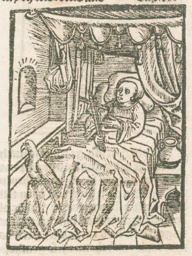
Saint George of England, frontispiece of The most illustrious History of the Seven Champions of Christendome by Richard Johnson, 1661 (Image from Yale University Library);

Three woodcuts from “The Life and Death of St. George,” 18th c., from Chapbooks of the Eighteenth Century by John Ashton, 1882 (Images from Internet Archive);

Ikon, wood block print by Michael Aggelaki (Image from eikastikon);

Saint George and the Dragon, wood block print by Guiseppe Scolari, 1550-1600 (Image from Art Institute Chicago);

Victory. Saint George on motorcycle, woodcut by Igor Koutsenko, 21st c? (Image from Saatchi Art).]

July 3, 2024

Frances Gearhart's Block Prints

         The Gearhart sisters lived together in Pasadena, California, where they never married and often collaborated.  The youngest, Edna, was a painter, poet, and author, while the middle sister, May, was most known for etchings.  But for this blog I’m focussed on the oldest sister, Frances (USA, 1869-1958) who did block prints.  Frances was largely self-taught, but she apparently took a summer class with Morley Fletcher and was influenced by her sisters, who studied with Arthur Wesley Dow.  She certainly was also influenced by the Arts and Crafts movement and the exhibitions of Japanese block prints that were making a splash in the art world at the time.  You can see a little more about this background in a previous post that features another of Gearhart’s woodblock prints: Gearhart’s Sky.
        Although she made some black and white prints, Frances Gearhart became famous for her color wood block prints.  The vast majority of her pieces depict landscapes of California, which means there are certainly a lot of recurring themes: sky, mountains, ocean…  There are also some recurring themes in her composition, and I start with two common compositions.  One is a low horizon with a large sky and interesting clouds over the landscape.  Gearhart does beautiful skies, with bold clouds and subtle colors.  In the case of this first piece, the low landscape shows a meandering river leading to a lake or arm of the ocean between distant mountains which melt into the clouds and sky.  The colors are especially beautiful.
        The second piece is an example of another common motif: magnificent trees in front of a beautiful vista.  In this case we’re looking down to the sea.  You can see clearly in this one how Gearhart uses the Japanese style of painting watercolor ink onto her blocks in gradients.
        The third piece splits the compositional difference by adding a dramatic tree to the large-skied view across a bay.  This time the weather is overcast with rushing, busy clouds gathering.  The muted colors are masterfully selected to evoke incoming rain.
        Another characteristic of Gearhart’s work is that her landscapes don’t usually include people or even signs of people.  However, there are exceptions, and this fourth piece includes a very dramatic bridge.  The California landscape requires some spectacular engineering to make it accessible to humans, so in some sense the fact that Gearhart can show us all the other beautiful views implies the existence of roads and bridges to get her there.  Personally, I don’t usually like to include people in my landscapes, either, but I do love this bridge, which springs from the sides of the streams much like the trees that Gearhart loves.  The background is only faintly evoked, but the rocks and ripples of the foreground are much bolder.
        Next up is a mountain view which demonstrates another trick that Gearhart often uses.  The final, darkest block of the piece is not black but dark blue, which gives an interesting effect.  Also interesting in this piece is that the distant mountain is almost more detailed than the foreground, at least in terms of the number and complexity of colors.
        The final piece has a different color palette, warmer and higher-contrast.  The yellow sky and yellow greens combine with the very black shadows to look like afternoon of a hot, still day.
        Although Gearhart depicted California throughout the year, I’ve picked some images that seem very summery to me, and make me want to get out and take a hike!


[Pictures: This Joyous World, wood block print by Frances Gearhart, 1928;

Above the Sea, wood block print by Gearhart, ca. 1932;

Rain Tomorrow, wood block print by Gearhart, ca. 1930;

Below the Bridge, wood block print by Gearhart, 1920;

High Country, wood block print by Gearhart, ca. 1927;

A Shrine to Pan, wood block print by Gearhart, ca. 1930 (All images from Harold Leitenberg’s page on Frances Gearhart).]