Showing posts with label A-Z Challenge '23. Show all posts

May 3, 2023

A to Z 2023 Reflection: &

         My theme this year was Block Printed Alphabet Squared, in which I planned to feature a relief block printed alphabet for each letter.  Alas, I seem utterly incapable of keeping things simple, and I ended up piling in multiple alphabets for each letter.  After all, how could I be so heartless as to turn away all the extra alphabets I discovered?  So I put way more time and effort into the research than I had intended.  On the other hand, I got everything drafted before April, which was lucky, since April turned out to be a very busy month for me.  But next year I’m going to give myself more limits, and this time I really mean it.
        I did manage to do lots of visiting this year - indeed, too many to list them all here - and I enjoyed lots of fun, interesting, and diverse themes.  And, as always, I very much appreciated those who came by and left comments here.  It’s always cool to see how different people gravitate to different styles and subjects of art.  Plus I always hope I can introduce a few people to the joys of relief block prints!
        I shall now continue to follow my tradition of using the Reflections post to squeeze in a few more bits that didn’t fit into the main alphabet.  These are the oddities.  While most people think of an illustrated alphabet as depicting words that begin with each letter, a few of the alphabets I found took a different approach.  
The Infants’ Guide to the Alphabet and first principles of pronunciation, from 1826, uses different strategies for different letters, but for some it’s about the sound of the name of the letter.  C is for Sea, I is for Eye, and U is for Yew.  I’ve also included R and Y because they strike me as neither one thing nor the other, and thus particularly strange choices.  This booklet does have rather pleasing little wood engravings, though.  I especially like the eye.
        
The Child’s Guide to Spelling and Reading, from 1810, also tries to demonstrate the sounds of the letters, this time mostly with onomatopoeia.  Z for buzzing is excellent (although I’ve heard of a gadfly, but never a gad-bee).  I really like F for the wind and H for the mouth breathing.  R for the dog snarling and I for the mouse squeaking also make sense, but about some of the others… I have questions.  I can kind of make a grunting M sound, but it hardly seems like a noise likely to help a child learn their letters.  Does the frog croak with X because Aristophanes has them say “koax koax” in The Frogs?  And does a hare really squeak W?  These little wood engravings are pretty crude (especially when compared with Bewick from the same time period), but I do like the wind, and the little Gad-bee is actually pretty cute for a fly.
        Another odd choice is W for Wren, in the Pictorial Lesson Book for the Very Young.  How this is supposed to help children learn the alphabet I do not know, and I’m reminded of the tongue-in-cheek alphabets in which A is for aether, G is for gnome, K is for knight, P is for pterodactyl, and so on.  It’s fun if that’s your theme, but a very strange thing to put at the end of an otherwise straightforward alphabet.  To go along with the wren I’ve got a couple of odd birds from An Alphabet of Birds.  In this case there’s nothing wrong with the alphabet - Albatross is at A and Titmouse is at T, just as you’d expect.  It’s the coloring I take issue with, as albatrosses are grey and white, and titmice are grey.  (There are some colorful tits, but more in the blue and yellow range; I don’t believe there are any red ones.)
        Finally, let’s end this year’s A to Z Challenge with the “letter” that often ended English and American alphabets in the early nineteenth century: &.  At the top of this post is an ampersand created out of other little type dingbats by Starshaped Press.  To learn where the word “ampersand” came from, read this prior Words of the Month post.  I’ve also given you a few little alphabet verses in which & plays a character.  In the colored one you need to pronounce it “ampersand” to make the verse scan right, but in the un-illustrated one I think it scans better if you read “etcetera” instead.  Poor & may be 
considered a letter of the 
alphabet in many of these primers, but it seldom gets an illustration because you can’t exactly say “& is for…”  What, &romeda?  &roid?  &ean Condor?  So instead I’ve just got a little collection of &’s as they appear in some of these alphabets.
        The moral of & is that even if we count it as the last letter of the alphabet, it’s impossible for it to be the end.  They all lived happily ever after… &…

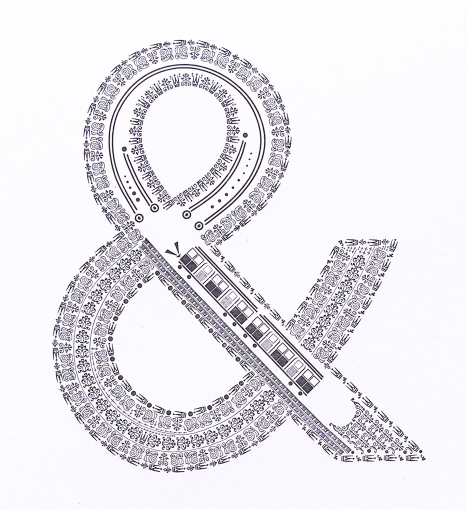
[Pictures: London Underground, letterpress design from The Well-Traveled Ampersand by Starshaped Press, 2017 (Image from Starshaped Press);
Sea, Eye, Arrow, Yew, Double-Yew, Weigh, wood block prints from The Infants’ Guide to the Alphabet and first principles of pronunciation, 1826 (Image from British Library);
Wind, Mouth, Mouse, Bear, Dog, Hare, Frog, Gad-bee, wood engravings from The Child’s Guide to Spelling and Reading, 1810 (Images from University of Washington);
Wren
, wood engraving from Pictorial Lesson Book for the Very Young, 1849 (Image from Toronto Public Library);
Albatross, Titmouse, hand-colored wood engravings from An Alphabet of Birds, c1854-58 (images from University of Florida);
Y, Z, &, letterpress from Uncle Buncle’s A.B.C., 1841 (Image from British Library);
Hand-colored wood block print from The History of A, Apple-Pie, 1858-1865 (Image from University of Washington);
Collection of & from
(First 2) The Princess Royal’s First Step to Learning, 1846 (Image from Toronto Public Library);
The Golden Alphabet of Natural History, 1826 (Image from Toronto Public Library);
The Infants’ Guide to the Alphabet and first principles of pronunciation, 1826 (Image from British Library);
Richardson’s Juvenile Cabinet, 1830 (Image from Toronto Public Library).]

April 29, 2023

Zebras #AtoZChallenge

         Welcome to the April A to Z Blog Challenge!  My theme this year is Relief Printed Alphabet Squared, an alphabet of alphabets illustrated with relief block prints.  Find the master list of participating blogs here.  We may be at the end of the alphabet, but it’s not too late to discover some new blogs.
        So, here we are having made it all the way through the alphabet, only to fail at the final hour!  I do not have a single block-printed alphabet made by a Z artist, or with a Z theme, or featuring even a single Z word anywhere in the title.  What’s a poor abecedarian to do?  Zebras, of course.  Everyone knows that Z is for Zebra, and as one of the myriad alphabets sampled here expresses in its little verse, alphabets really would be lost without the zebra.
        I’ve actually already done a previous post on Z for Zebra, which you can check out for a sampling of Z’s from some of the alphabets mentioned at earlier points in this A to Z (plus a bonus zebra that isn’t part of an alphabet).  Then there are all the zebras from their various alphabets that have already appeared in this year’s blog challenge at B, L, R, and W.  But even with all that, we’ve barely begun to explore the rich herd of zebras provided 
by illustrated alphabets.  I start with the zebra from The Good Child’s ABC which was introduced back at G.  There may be nothing surprising or remarkable about this one, but I think it’s a good, solid Z, with a well-executed wood engraving for a zebra with plenty of spirit.
        Next I threw together a whole herd of little illustrations.  They span 200 years of illustrated alphabets, and range from fine wood engravings to rough wood block prints to smooth linoleum block prints.  Illustrations 6 and 9 reveal the baffling (and annoying) habit of nineteenth century painters to slosh some color across every zebra, even though the whole essence of zebras is black and white.  Illustrations 3 and 7 make the zebra into the shape of its Z.  Illustration 5 depicts a mechanical zebra toy rather than a real zebra.  Illustration 8 comes from an untitled alphabet book of 1820, that hasn’t had a previous appearance in the A to Z Challenge.
        My next group includes zebras with some different personalities.  The zebra by Laforge (whose alphabet was introduced at L) is carrying a friendly baby through a bright yellow plain.  Lottie Pencheon’s zebra (alphabet introduced at P) shows off her signature simplification.  And the last set of zebras, showing a madly galloping band (and also showing that gratuitous yellow paint!), comes from another alphabet that hasn’t previously been featured in this A to Z Challenge.  It’s Papa’s Present of Pretty Pictures for Pretty Little People of 1844.  (How could I not have featured that one at P?  Well, P was already full!)
        The final grouping includes a delightful fuzzy zebra by Alan James Robinson, whose alphabets were introduced at R.  The others all have a certain oddity.  The first is by Walter Inglis Anderson, introduced at A.  You’ll notice that the Z is backwards, which implies that he drew his designs directly onto the linoleum and got a little confused!  The second, from 
Aunt Lely’s Picture Alphabet introduced at L, makes me wonder why the zebra stands in a graveyard.  Is it because it has reached the End?  And the third, by Lynn Hatzius, introduced at S, is just altogether odd!  It’s meant to be making the semaphore sign for Z, but the wrong arms are going in the wrong directions.  It should be the the left arm (our right) going straight out to the side, while the right arm (our left) crosses the body at a diagonal.
        I guess the first moral of Z is that it’s very easy to get directions mixed up when carving and printing relief block prints!
        And also, the journey of 26 letters usually ends with zebras.
        So, which of all these wonderful zebras is your favorite?  (And feel free to include those in other posts, too.  Personally, I’d probably choose the zebra by Jacques Hnizdovsky.)  Why does it appeal to you?  Which I guess means that I’m asking you what you’d put in your personals ad when you’re looking for a zebra!

[Pictures: Zebra, hand-colored wood engraving from The Good Child’s ABC, between 1847-1867 (Image from University of Washington);
Zebra, wood block print from Hoch-Deutsches Lutherisches ABC, 1840 (Image from Goethe Universität);
Zebra, linocut by Caroline Nuttal Smith, c. 2017 (Image from Etsy shop cnuttalsmith);
Zebra, wood block print from Antonio Frasconi from Bestiary, 1965 (Image from FrasconiArt);
Zebra, wood engraving from The American Indestructible Primer, c. 1880 (Image from University of Florida);
Mechanical Zebra Toy, linocut print by Christopher Brown from An Alphabet of London, 2012;
Zebra, hand-colored woodcut from The Infant’s Nursery Alphabet, 1853 (Image from Toronto Public Libraries);
Zebra, linocut by Mark Long (Image from Typography Daily);
Zebra, hand-colored wood engraving from alphabet booklet, c. 1820 (Image from University of California);
Zebra, wood block print by Joseph Crawhall II from Old Aunt Elspa’s ABC, 1884 (Image from Jospeh Crawhall II society);
Zebre, wood block print with pochoir by Lucien Laforge, 1924 (Image from Mille Feuilles de Bretagne);
Zebra, lino cut print by Lottie Pencheon, c. 2011 (Image from Lottie Pencheon);
Zebra, hand-colored wood engraving from Papa’s Present of Pretty Pictures for Pretty Little People, 1844 (Image from Toronto Public Library);
Zebra, linoleum block print by Walter Inglis Anderson from An Alphabet, 1930’s (Image from WalterAndersonArt);
Z, wood engraving from Aunt Lely’s Picture Alphabet, 1855-62 (Image from University of Washington);
Z, linocut by Lynn Hatzius from A Semaphore Alphabet, 2002 (Image from Books on Books);
Zebra, wood engraving by Alan James Robinson from An Odd Bestiary, 1982.]

April 28, 2023

Young Youth Year

         Welcome to the April A to Z Blog Challenge!  My theme this year is Relief Printed Alphabet Squared, an alphabet of alphabets illustrated with relief block prints.  Find the master list of participating blogs here.  Whatever you’re interested in, someone’s probably blogging on it, so start reading — you’ve got a lot of catching up to do!
        Today’s first alphabet is the water-themed series of linocuts by Sarah Young.  Her Y is Yabby, which I had to look up.  It’s an Australian crayfish.  I love the wide variety of subjects Young chooses, from tropical to arctic, from modern to 
mythological, from natural to technological, but all related to bodies of water.  I had a tough time picking favorites since I like a lot of these, but I went with H for Harbour and J for Jellyfish.  You can also see her K back in a previous year’s A to Z post, and I expect that some of her pieces with myth
ological beings may  yet show up some time in the future.
        Then there’s Youths’ Battledoor from the mid-nineteenth century.  Battledoor (more often spelled battledore) is another word I didn’t know before encountering it during 2020’s A to Z theme of Nursery Rhymes.  It originally meant a bat or paddle used for various crafts and jobs including laundry, glassworking, and baking (like a pizza peel).  It then came to be applied to a sort of very simple alphabet or primer printed on a paddle so that it was durable and easy for young children to hold when studying.  
The m
eaning was then extended further to any short, simple primer, which is how it’s used in the title of this little alphabet booklet.  Its Y is indeed a Youth, and in case you’re wondering what he’s doing, he’s playing with a whipping top.  For additional letters I’ve chosen the delightfully self-referential Book for B, and the handsome Unicorn at U.
        Our Year alphabets are actually a series of four books, each of which includes an entire alphabet of acrostics for one season.  The acrostics are by Steven Schnur and are interesting in including some very different sorts of words from most of the other 
alphabets.  There are verbs, abstract nouns, and even adjectives.  But of course I’m really here for the illustrations, which are linoleum block prints painted with watercolors by Leslie Evans.  (I assume that’s the same artist who did the Vanishing Wildlife alphabet back at V.)  Not surprisingly, my favorites are the ones that give a little more emphasis to the carving, and rely less on the paint.  Because we’ve got four entire alphabets here, I’m only sharing the Y’s for Summer (Yacht) and Winter (Yearn).  That gives me a little more room to share one favorite from each of the four season’s alphabets.  In Spring X is for X-ing, Summer’s D is Daisy, in Autumn B is for Barn, and in Winter A is for Awake.  (For another alphabet with a year theme, also remember Bowen’s Northwoods Alphabet back at N.)
        The moral of Y is that although youth may be wasted on the young, don’t yearn for yesterday.
        Riddle of the day: which letters will give you the best advice?
        So, what’s your favorite month or season of the year?

[Pictures: Yabby, Harbour, Jellyfish, linocuts by Sarah Young, (Images from sarah-young.co.uk);
Youth, Book, Unicorn, hand-colored woodcuts from Youth’s Battledoor, 1828-43 (Images from University of Washington);
Yacht, Yearn, hand-colored linoleum block prints by Leslie Evans;
X-ing, Daisy, Barn, Awake, hand-colored linoleum block prints by Leslie Evans from SPRING: An Alphabet Acrostic by Steven Schnur, 1999; SUMMER by Schnur, 2001; AUTUMN by Schnur, 1997; WINTER by Schnur, 2002.]

April 27, 2023

Xylographer MarX

 
        Welcome to the April A to Z Blog Challenge!  My theme this year is Relief Printed Alphabet Squared, an alphabet of alphabets illustrated with relief block prints.  Find the master list of participating blogs here, and go around and see how many of my fellow bloggers have had to cheat to find an X!
        Xylography is a fancy word from Greek roots for wood block printing.  Therefore most of the alphabets featured this entire month are technically alphabets of xylography, but today I have for you an alphabet in which the X is for Xylographer.  William Nicholson’s alphabet of people includes everyone from a beggar to a countess.  (It was also made in two versions: one in which the Executioner and Toper were replaced with more child-appropriate Earl and Trumpeter.)  At any rate, however, I have for you in addition to the X, a Milkmaid for M, and you can revisit the U which I posted twelve years ago.  (Goodness gracious, I’ve been blogging a while!)
        Today’s other featured alphabet is yet again animals, this time by Enid MarX.  Given that I cheated in counting MarX for X, I guess I shouldn’t really complain that her X is for frog - for the shape of it, not the word, as the little couplet of text that goes with the picture explains.  I don’t really like the colors applied to the frog, but those appear to have been done by a different artist who put together a book of her alphabet posthumously, so I don’t hold it against her.  I’ve given you an extra helping of favorites from this alphabet, including M (Monkey), A (Anteater), and J (Jaguar).  I like Marx’s playful style a lot (even if the frog’s colors are perhaps a little too playful for me).
        Well, that’s about it for X.  If you crave more X-citement you can go read a previous post in which I shared the X strategies of a number of the alphabets that have already shown up in this A to Z Challenge.  (You will already have seen that post if you’ve followed previous links to find more letters from the alphabets in question.)  That post also in
cludes one of my 


favorite morals, which is drawn from the difficulty of finding X’s for alphabets.  So I can’t do better today than to repeat: 
These verses teach a clever child to find

Excuse for doing all that he’s inclined.

(For purposes of the challenge we should probably spell it X-cuse!)
        And also, Fall IX times, stand up X times.
        So, in all our various alphabets so far we’ve seen people categorized in many different ways: where they live (B, E, J), what job they do (C, E, F, H, J, K, L, P, Q, T, X), their social class (E, G, H, K, L, Q), their familial relationship (F, M, U, W), their religion (U), their age (I, Y)…  If you were to be memorialized in an alphabet, what word would you choose to represent?


[Pictures: Xylographer, Milkmaid, hand-colored wood block prints by William Nicholson from An Alphabet, 1899 (Images from Wikimedia Commons);
X, Monkey, Anteater, Jaguar, wood block prints by Enid Marx from Marco’s Animal Alphabet, 1979 (Images from the saleroom and Books-on-Books).]

April 25, 2023

West Wonder

 
        Welcome to the April A to Z Blog Challenge, in which bloggers spend the month working our way through the alphabet in 26 posts.  My theme this year is Block Printed Alphabet Squared, an alphabet of alphabets illustrated with relief block prints.

        We begin today with yet another animal alphabet, by Kathleen West.  This one is hand-colored and done in an Arts and Crafts Mission style which is especially evident in the fonts of the letters and words, as well as the strong outlines and borders and the choice of earthy colors.  W is for Walrus, and I’ve also shared T for Turtle as a favorite.  These have a very appealing blend of accuracy and whimsy.  West’s animals have real character.
        Dame Wonder’s Amusing Picture Alphabet actually has two illustrated alphabets.  The first (which I give you second) is the entire alphabet with very small pictures embellishing the letters.  (One of them already appeared in this A to Z Challenge as a letter icon.  Did you notice it?)  The larger illustrations throughout the rest of the little 
book do duty for multiple letters each.  Mostly 4 letters each, but by the time you get to the end of the alphabet they get piled in!  H
ere W is for Windmill, and you can also see Uncle, Violin, X for the Roman numeral, Yacht, and Zebra.  I think the composition is well done, and I find it quite an attractive little alphabet, especially for what is clearly a fairly low-budget production.
        Today’s bonus is two animal alphabets by Christopher Wormell.  I love his work and have featured him many times before: you can find F, L, N, Y, and Z from his Alphabet of Animals, and C and X from A New Alphabet of Animals.  He made both books with the same format, but a completely different selection of creatures (except for 
X, because as we will all be reminded tomorrow, X’s can be hard to come by).  The two W’s from the two books are Walrus and Woodpecker.  Plus I’ve also got another favorite from each, C for Cobra and T for Toucan.
        The moral of today is that the wonders of animals are inexhaustible.
        And also, the second half of the alphabet is far less privileged than the earlier letters (which is something people with last names such as West and Wormell are well aware of).
        So, what’s something you’ve been wondering about?

[Pictures: Walrus, Turtle, hand-colored block prints by Kathleen West (Images from The Mission Motif);
U through Z, and A through Z, hand colored woodcuts from Dame Wonder’s Amusing Picture Alphabet, 1860’s (Images from University of California);
Walrus, Cobra, linoleum block prints with multiple blocks by Christopher Wormell from An Alphabet of Animals, 1990;
Woodpecker, Toucan, linoleum block prints with multiple blocks by Wormell from A New Alphabet of Animals, 2002.]

April 24, 2023

Vanishing Viano

         Welcome to the April A to Z Blog Challenge!  My theme this year is Relief Printed Alphabet Squared, an alphabet of alphabets illustrated with relief block prints.  You can find the master list of participating blogs here, and see what other alphabetized themes people are blogging about.
        Just a little late for Earth Day, I’m starting today with a hand-colored linocut alphabet of Vanishing Wildlife by Leslie Evans.  Sadly, picking only endangered species doesn’t constrain the choice too much, and many of the same creatures that appear in other animal alphabets are here, too.  Also sadly, many of the pictures posted on-line are far too small to appreciate the details.  V (Vicuña) is one of those.  It also made it a little hard to pick favorites when I can’t really see them very well.  So I give you D (Komodo Dragon), N (Numbat), and also L (Lemur), which is one of the few posted large enough to enjoy.
        The alphabet by Hanah Viano is another for which I’m bending the rules.  These illustrations are not relief block prints, but papercuts.  Although obviously it’s a very different medium, like scratchboard it shares with relief printing some of the approach: you have to think about your design subtractively.  Instead of putting in the lines and shapes you want, as you do with drawing, painting, and most other media, you have to cut away everything that isn’t the lines and shapes you want.  This similarity of approach gives papercut a certain similarity in appearance to block printing, and therefore I sometimes let it sneak into this blog.  (As, for 
example, in this previous post.)  Viano’s Natural Alphabet has Violet for V, but for my favorite letter I’ve picked P for Pebble.  I love pebbles.  Lots of people love pebbles.  And yet, how often do we celebrate them by giving them a whole letter in an alphabet?
        Finally, today’s bonus alphabet is by Dione Verulam.  Her alphabet features activities which, presumably, are part of her everyday life.  Of course, since she’s a countess her everyday life doesn’t always look much like mine!  I have previously shared I and P from this linocut alphabet, and today I have V for Visiting.  However, my favorites are N for Needlework and R for Reading.  I like the layering of patterns, and the series of noble portraits on the library wall.
        The moral of V is to get serious about conservation.  We do not want to lose these animals!  After all, variety is the spice of life (and of healthy ecosystems, so actually life itself).
        And also, never forget to notice and appreciate the pebbles of joy.
        So, what’s your favorite hobby or activity?


[Pictures: Vicuña, Dragon, Numbat, Lemur, hand-colored linocuts by Leslie Evans (Images from Etsy shop SeaDogPress);
Violet, Pebble, papercuts by Hanah Viano from B is for Bear: A Natural Alphabet, 2015;
Visiting, Needlework, Reading, linocuts by Dione Verulam, before 2010 (Images from dioneverulam.com).]

April 22, 2023

Universal Uncle

         Welcome to the April A to Z Blog Challenge in which we spend the month blogging our way through the alphabet!  My theme this year is Relief Printed Alphabet Squared, an alphabet of alphabets illustrated with relief block prints.  Even if you’re just joining now, it’s not too late to find out what it’s all about here.
      We’ll start U with another primer, The Universal Primer of 1846.  It’s illustrated with very simple wood block prints, and U is for Uncle, bestowing a book upon a lucky nephew.  Some of the illustrations are a bit crude, but V’s Vulture is really quite nice.  
(Should I be concerned that I seem
 to be featuring a disproportionate number of vultures?  They've already shown up at B, G, I, P, and R.)
        But while we’re on the subject of uncles, how about Uncle Buncle’s A.B.C.?  Uncle Buncle illustrates his alphabet with large, detailed, hand-colored wood block prints that include subjects representing multiple letters in each scene.  Here U us for United, in a verse that also includes the words Veterans, Well-trained, and Xenophon.  As a contrast to this martial scene, I have chosen to share the page that includes Q for Quaker, R for Ride, S for Sun, and T for Trees.  Much more peaceful and pleasant - downright utopian.
        The Uncle Frank’s Series has a Funny Alphabet, in which the illustrations are a sort of font of letters formed from people, somewhat like the one back at F.  The rhymes that go along with the letters don’t always seem to bear a lot of relation to what the people are doing, although some seem more appropriate than others.  U lists “Uniform, Union, and Unicorn,” which really doesn’t seem to have anything to do with anything.  Q is Quit, which also seems a little random, but I picked it because I like the way the character crosses his leg over to make the tail.  The J, however, is Jemima Mermaid, which the picture bears out.  I love that she’s the only one given a special anatomical dispensation to form her letter.  
(Besides, of course, I’m always happy to sneak in a magical being.)
        The moral of U is United we stand; divided we tear each other down.
        Riddle of the day: which letters are the most utilitarian?
        So, do you have a particularly funny uncle or aunt?

[Pictures: Uncle, Vulture, wood block prints from The Universal Primer, 1846 (Images from Toronto Public Library);
United, Quaker, hand-colored wood block prints from Uncle Buncle’s A.B.C, 1841 (Images from The British Library);
U, J, Q, hand-colored wood block prints from Uncle Franks’ Series Funny Alphabet, 1850-64 (Images from University of California).]

April 21, 2023

Translating Trades

         Welcome to the April A to Z Blog Challenge!  My theme this year is Relief Printed Alphabet Squared, an alphabet of alphabets illustrated with relief block prints.  Find the master list of participating blogs here.
        So far in this A to Z Challenge I’ve shared a sprinkling of non-English alphabets, including Italian, German, French, Latin, and Spanish.  Some of their words would have worked for an English alphabet, and some wouldn’t, however, today’s first alphabet is entirely about the fact that words start with different letters in different languages.  In A is for Bee: an Alphabet Book in Translation, T is for Octopus… or Tako, Tmanun, and Tintenfisch.  This is a subject I particularly enjoy, and I also enjoy the illustrations, even though they’re actually scratchboard rather 
than relief prints.  Still, it’s a medium with a very similar approach and look, and I do let it sneak into this blog on occasion.  I’ve chosen two more letters to share: A for Anu, Ari, Aamoo, Abelha, and J for Jaylam, Jaanalind, Jimina.  (In case you’re wondering how to say any of those words, the book includes a link to a web site where you can hear them!)  One other cool touch is that the letter itself is incorporated in some way into each illustration.
        A popular topic for alphabets over the years has been trades or occupations, and it can be particularly interesting to see how these have changed over the centuries.  In this alphabet from the middle of the nineteenth century T is for Tailor, but it also includes R for Rat Catcher, which you probably wouldn’t see in an alphabet from today.  (E for Exterminator or P for Pest Control, maybe, but I seriously doubt it would be one of the 26 at all.)  The one I find most interesting is U, because it depicts the Undertaker carrying the coffin all by himself with a tumpline!  (And of course Undertaker is another trade a modern alphabet probably wouldn't mention.)  You can see another letter from this alphabet back at K, plus previously posted Z.  There are also a couple of decorative letters without their pictures serving as the icons for C and M.
        I’ve got another alphabet of trades that dates to 100 years later in the mid-twentieth century.  This time T is for Teacher.  I chose Z for Zoo Keeper because I like the picture, but I also couldn’t resist including W for Writer “whose stories delight.”  What especially marks this alphabet as being a product of its time is that the Teacher and the Homemaker at H are the only occupations shown as women, and no people of color anywhere.  (For comparison, today’s other book of trades from 100 years earlier has only one woman, but she’s the queen!)  This is a particularly clever book, though, because in addition to the alphabet, it also introduces the numbers 1 through 26, and readers can count the appropriate objects in each illustration.
        Today’s moral is obviously that the way we look at the world is very much dependent on when and where we’re living.
        Riddle of the day: which letters are the worst noodges?  (On the other hand, if you have only one, it makes the best cuppa.)
        So, what do you want to be when you grow up?


[Pictures: Octopus, Bee, Ostrich, scratchboard illustrations by Ellen Heck from A is for Bee, 2022; 
Tailor, Undertaker, hand colored wood block prints from Pictured Alphabet, c.1857 (Images from University of Washington);
Teacher, Writer, Zoo Keeper, relief block prints by Mary Fidelis Todd from ABC and 123, 1955 (Images from plaindealing).]

April 20, 2023

See-Paynton Smith Semaphore

         Welcome to the April A to Z Blog Challenge!  My theme this year is Block Printed Alphabet Squared, an alphabet of alphabets illustrated with relief block prints, which are something everyone should spend more time enjoying.  Join the A to Z crew here.
        Today’s first alphabet artist is Colin See-Paynton.  He’s done an amazing alphabet of birds, but in a cool twist, it isn’t the birds that are assigned by letter.  Instead, each letter of the alphabet 
stands for the collective n
oun for each species of bird.  (If you don’t know about collective nouns, here’s a prior post on them.  Plus, in case you’re missing the fantasy and folklore of past years, here’s a post on collective nouns for mythological creatures.)  Thus S is for a Sedge of Bitterns.  See-Paynton’s work is huge by wood engraving standards, and incredibly detailed, so I could have picked a number of favorites, but I’ve exercised admirable self-control and selected C for a Covert of Coots.  I especially love the way the water is transparent, allowing us to see coot feet and fish below, as well as sparkles in the depths, and dragonflies up above.
        Next I have two alphabets by Caroline Nuttall Smith.  One is all cars and motorcycles, and S is for Sunbeam.  I’ve chosen J for Jaguar as a second letter to share, because I like its style!  Smith likes putting words in her linoleum block prints, and she obviously really loves vehicles, too.  
While her second alphabet doesn’t have a theme, no fewer than 8 of the letters are represented by modes of transportation - and that’s not even counting S for Shoes!  I give you T for Tugboat as my favorite.  You can also see her Queen back
 at Q, and there will be one more at the end.
        Today’s final alphabet is so different that I wanted to share it even though it’s quite incomplete.  A Semaphore Alphabet by Lynn Hatzius consists of odd linocuts depicting puppet-like figures that have the head of something starting with each letter, and arms approximating the semaphore position for each letter.  A is therefore an Angel making the semaphore sign for A.  I found the S picture used as an illustration for a completely
 different book by Hatzius, but I’m pretty sure it must be reused from this alphabet.  So, S is for Squirrel, and its arms are in the correct semaphore position for S.  You’ll get a chance to see one more of these funny figures at the grand finale.
        Today’s moral is to remember that body language can be as eloquent as words written with letters.
        And also, slow and steady wins the race - at least if it’s a steeplechase, but probably not if its a sprint.
        So, what’s your favorite mode of transportation?


[Pictures: Sedge, Covert, wood engravings by Colin See-Paynton (Images from See-Paynton.co.uk);
Sunbeam, Jaguar, Shoes, Tugboat, linocuts by Caroline Nuttal Smith, c. 2017 (Images from Etsy shop cnuttalsmith);
Angel, Squirrel, linocuts by Lynn Hatzius from A Semaphore Alphabet, 2002 (Images from Books on Books and lynnhatzius.com).]