December 31, 2013

Words of the Month - Cheers!

        It’s New Year’s Eve and tonight at midnight millions of people around the world will be raising a glass of something involving alcohol, and toasting stuff.  So let’s take a closer linguistic look at where this all comes from…

        First, the alcohol itself - Our word comes from Arabic al-kuhl, which means “the kohl.”  Yes, we’re talking about antimony sulfide in a very fine powder form used as makeup, especially eye-liner, alá Cleopatra.  When the word first entered English in the sixteenth century it meant “powdered cosmetic.”  However, this fine powder was made by sublimation, or essentially distillation, which meant that soon other things made by distillation, including liquids, came to share the name.  “Alcohol of wine” was the intoxicating ingredient in that beverage, and not until the mid eighteenth century did plain “alcohol” refer to this.  (A hundred years later the word’s meaning was expanded back out to include the entire class of chemical compounds.)

The most popular drink at the New Year is probably Champagne, which of course is named for the region in France whence it originates, but some might choose other poisons (after all, intoxicate means quite simply “to poison” from Latin).  Some possibilities include

rum - short for rumbullion and rombostion, though where either of those words came from is unclear.  They’re possibly related to the adjective rum originally meaning “good, valuable,” though by the end of the eighteenth century it had shifted to its modern sense of “strange, bad, spurious” perhaps because of how dubious were the people and things to which the slang rum was so often applied.

gin - short for geneva, which has nothing to do with the Swiss city, but rather with the Dutch word for juniper, with which berries the drink is flavored.

whisky/whiskey - from Irish uisge beatha “water of life.”  This is on an analogy with Latin aqua vitae (from which also French eau de vie for brandy.)

hooch - short for Hoochinoo, from the name of a native Alaskan tribe whose liquor was popular with miners in the Klondike during the gold rush.  (The tribe’s name, from Tlingit Hutsnuwu, is supposed to mean “grizzly bear fort.”)

        But whatever booze you pick (booze was originally a verb meaning “to drink a lot” but was helped along linguistically by a nineteenth century Philadelphia distiller named Edmund G. Booz.) chances are you’ll make a toast, so called because of the actual slices of toast the Romans put in their communal cups of wine.  Then call out: Cheers (British)
Prosit (German, from Latin “may it be good for you”)
Skoal (Danish, literally “bowl, cup”)
Salud (Spanish, “health”)
Sláinte (Irish “to your health”)
L’chaim (Hebrew “to life”)
Chin chin (European, onomatopoeic for the clinking of glasses)
Here’s looking at you, kid (famous from “Casablanca”)

        Personally, although I’m happy to join in toasts, I won’t be drinking any alcohol because I’m a teetotaller.  This word was coined in 1833 by English abstinence campaigner Richard Turner.  The word has nothing to do with tea (although I certainly do prefer tea to alcohol!).  Rather it’s a stutter for emphasis.  I’d probably have spelled it 
t-total.  Apparently tee-totally was a common slang adverb in some areas with an Irish dialect influence, including parts of North America, but Turner seems to have been the one to apply it to t-total abstinence.  At any rate, so determined was he to claim credit that he actually has “Author of the Word TEETOTAL” carved on his gravestone.

         But whatever you drink tonight, be it water, whisky, ginger ale, gin, or tea, I wish you a healthy and happy new year!

[Pictures: Men raising a toast, woodcut from Every Body’s Toast Book, and Convivial Companion “by an Adept,” 1851 (Image from The Butcher’s Floor);
Still Life II, rubber block print by AEGN, 2009 (sold out).]

December 27, 2013

More Bold

        Ten days ago I shared some fantasy wood block prints by the mysterious Alan Bold.  Today I want to share a few more of his scenes that aren’t particularly fantastical.  (These illustrations do also come from a book of stories by Walter de la Mare, so they may be set in fantasy worlds; I don’t know.)  All three share a certain similarity in composition, with clear framing.  The first two especially share the trick of showing a glimpse of some bright scene through the framing of a dark area.  The dark foregrounds look lush and close with their layers of foliage.  The images place us deep in the natural world of woodland creatures, while the human world is only glimpsed in the distance, like some forbidden heaven.  The deer and huge flowers in the first one look almost Oriental, like a Persian or Mughal miniature, perhaps.  The creatures in the second have more personality - is
that a rabbit with its funny too-big head, and a squirrel with leafy ears?  I particularly like their bright eyes and enjoy that Bold has made me, the viewer, part of the animals’ conference.
        The third piece has another little bright-eyed creature, but I have no idea what it’s supposed to be.  And this time the framing is in reverse: the little beast is perched on the windowsill at the edge of the human world, looking back out toward the natural world.  It looks to be pretty high up, too, unlike the low vantage point of the others.  I find the leaves on the left that look like horse chestnut leaves to be especially pleasing, for some reason.


        All in all I’ve been quite delighted by all these woodcuts by Bold, and I’m sorry not to be able to find out anything more about him or what other work he might have done.


[Pictures: three wood block prints by Alan Bold, from Broomsticks and Other Tales by Walter de la Mare, 1925. (Images from 50 Watts)]

December 24, 2013

A Christmas Carol

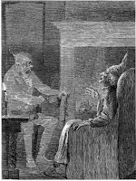
        Today I’m thinking about Charles Dickens’s A Christmas Carol as a fantasy tale.  It’s got a ghost, it’s got supernatural spirits, it’s got time travel and alternate realities…  It’s so mainstream that most people would never consider it speculative fiction or “genre,” but of course it is.  And like any good fantasy, the story isn’t merely about ghosts or time travel because they’re nifty; it uses the fantasy elements to tell a story about much more basic and important things: love, how our choices affect the world and our own hearts, what it means to be human…  And the story explores these issues in ways that a purely “realistic” setting might not allow.  Just as it takes the unearthly spirits to break through Ebenezer Scrooge’s world-wise shell, so it sometimes takes a story that asks us to suspend our disbelief before we can break through our own world-wise shells.
        So if you celebrate Christmas, let me wish you a Merry one that breaks through and goes a little deeper than the “reality” of commercials and busy parking lots and malls.  And whether you celebrate Christmas or not, I wish you a clear-eyed imagination that’s willing to see beneath surface appearances to the magic beneath.


[Pictures: Marley’s Ghost, wood engraving by Sol Eytinge,
In the Churchyard, wood engraving by Eytinge, both from A Christmas Carol by Charles Dickens, 1869.(Images photographed by Philip V. Allingham at The Victorian Web)]

December 20, 2013

Los Pastores

        My mother just brought me a rather strange little book that was being deacquisitioned from a library she works with.  It had come to the library in the first place from the sister of the artist who carved the linoleum blocks that illustrate the book.  I hesitated to use the word “illustrate” because in fact the linocuts don’t just provide the book with pictures but with all the text, too, copyright page and all.  The book is Los Pastores: Excerpts from an old Christmas play of the Southwest, as given annually by the Griego Family, Santa Fe, New Mexico.  And excerpts it is, indeed.  There is no actual plot to this “play;” it’s more of a seemingly random collection of unrelated lines without progression or coherence.  Very odd altogether!  But the block printing is cool.
        My favorites are the little southwestern scenes - rough, not detailed, but very pleasing with their clean-lined adobe architecture and textured hills.  The scene on the bottom I take to be a view of the Palace of the Governors in Santa Fe.  Built shortly after 1610, it became three centuries later the home of the School of American Research (now the School for
Advanced Research on the Human Experience), an institute for archaeology and anthropology.  Our book Los Pastores came out of that school, the author Mary R. Van Stone presumably collecting and recording local cultural traditions.
        I’ve included here also a two page spread showing how the artist, Louise Morris (U.S. 1896-1971), carved blocks of text and also blocks of music.  They make a nice composition, reminiscent of fifteenth century block books, but with a twentieth century arts-and-crafts flair of their own.  The extra designs filling all available space are fun.
        Finally, since this is supposed to be a Christmas story, and a Christmas-time blog post, I include the nativity scene.  Actually, this isn’t the classic scene, since it’s missing most of the usual characters.  But the baby Jesus is there, so it’s good!  I like that there are lots of stars scintillating in the stable, and I really admire how the animals are so accurately detailed with such simple, basic gouges.
        This book is an interesting piece of cultural and art history, and I enjoyed seeing how Morris chose to carve and illustrate her material.


[Pictures: Linoleum block prints by Louise Morris from Los Pastores, recorded and translated by Mary R. Van Stone, 1933.]

December 17, 2013

Bold Fantasy Illustrations

        I came across these charming woodcuts some time ago on a blog about book illustration and design.  The illustrations come from two books of poetry and stories by Walter de la Mare, which list the illustrator as “Bold,” and that’s all I know.  Another site gives the name Alan Bold, but still no further information.  So let’s look at these wood block prints purely on their own.
        First, my favorite, a wonderfully strange bird in the smiling moonlight.  Is the bird perched there on the smooth trunk, or poised mid-leap?  Is it chasing the man, does the man flee it, or is there something else in the distance from which the man is running so frantically that he’s lost his hat?
        I think the bird-creature has a benign look, but there’s no doubt that this little imp means trouble.  Camouflaged among the leaves, he’s plotting his next mischievous move.  It could be anything from pinching the baby to slitting the throats and drinking the blood of the entire family.  The malice is unmistakeable.
        Though perhaps not quite so evil, I definitely wouldn’t trust this sprite.  I have the feeling that he doesn’t strike a bargain without being quite sure he’ll be getting the better end of the deal.  Oh, he’ll flatter you and make you feel clever, but don’t underestimate him.  He may be no larger than a tulip, but he has magic, never doubt it.
        The carving of this witch is particularly interesting.  Lurking in the shadows, her form is pulled into the light by hundreds of sharp, skinny strokes.  The only large areas of white are the light from the doorway where a man peers into the dark hut, and the cat’s huge, glowing eyes staring, not at the intruding man or the mistress witch, but at YOU!  (I like the owl up in the rafters, too.)
        And finally, a strange fish gliding through the underwater gloom.  Is it a human in fish form, or a fish in human form, or some sort of merperson?  I suppose I’d know the answers if I read the poem by de la Mare, but it’s kind of fun just wondering.  I especially like the fish’s ear, as well as the fish-face swimming toward us - not an easy view to depict.
        I really like these wood block prints and think they’re perfect evocations of strangeness and mystery.  I’m sorry not to know anything about the artist.  But I will be sharing a few more images by Bold on another day, so that’s something to look forward to.

[Pictures: Four woodcuts by Alan Bold from Stuff and Nonsense, and So On by Walter de la Mare, 1927;
Witch, woodcut by Bold from Broomsticks and Other Tales by de la Mare, 1925
(Images from 50 Watts).]

December 13, 2013

Reverso Fairy Tales

        Reverso poems are those which can be read down the page for one message, and then read with the order of the lines reversed to make a different message.  According to the “rules” propounded by Marilyn Singer, you can change only punctuation and capitalization between the two versions.  Singer claims to have invented the form, which I find dubious, but I believe she did invent the name.  She’s also popularized the idea with her books of reverso poems on traditional fairy tales.  As she points out, reverso poems are particularly well suited to telling two sides to a story, and fairy tales are always interesting to explore from a second point of view.
        Mirror, Mirror contains fourteen such poems, along with bright two-sided illustrations.  In some the change in word order doesn’t really seem to add much new understanding, but in others there’s a surprising twist of perspective that can make you think about the story in a new way.  This would be particularly intriguing and exciting to lower elementary-aged children who are just beginning to learn about the concept that different people have different points of view.  There’s a poem telling Goldilocks’s story, for example, which reverses to tell the story as the Three Bears see it.  Another set of poems pairs the importance of Rumpelstiltskin’s name with the apparent unimportance of the miller’s daughter’s name.  I think Singer’s second book of fairy tale reversos, Follow, Follow, is even better.
        Here’s a fun one: Birthday Suit

Behold his glorious majesty:
me.
Who dares say he drained the treasury
on
nothing?
Ha!
This emperor has
sublime taste in finery!
Only a fool could fail to see.

Only a fool could fail to see.
Sublime taste in finery?
This emperor has -
ha! -
nothing
on!
Who dares say he drained the treasury?
Me.
Behold his glorious majesty.

        Inasmuch as poetry is supposed to immerse us in language more intense than everyday prose, evoking images with the power to pierce and draw forth emotion, these lines just don’t have it.  But poetry’s other job, to show us the world in a new way and to invite us to consider magic we might otherwise not have noticed, is admirably served by these collections.  The poems also demonstrate for children the wonderful concept that language can be played with, that words can be juggled for multiple meanings, and that how you tell a story makes all the difference.

[Picture: Cover illustration by Josée Masse, Mirror Mirror by Marilyn Singer, Dutton, 2010.]
Poem by Marilyn Singer from Follow Follow, Dial, 2013.

December 10, 2013

Block Print a Day 7

        And back again to black and white.  This apple has a Matisse-like feel, with its flat planes of ink, simple outlines, and background arabesques.  I think it’s lovely!
        There are more than 7,500 varieties of apples in the world, which means you could eat an apple a day for more than twenty years without ever repeating varieties!  (That’s assuming you could actually get a hold of them all, of course.  The US apple industry grows fewer than 100 varieties commercially, and there are more of the top three varieties grown than all the others combined.)  It sounds rather like art, really, when you think about it… I could keep going, offering you a block print a day for years and years.  Some would be more appealing than others, some would be industry favorites and others unknown.  There are some artists who are superstars for a reason, but it’s also fun to keep poking around looking for some of those lesser-known, small-time artists who just might have created some undiscovered treasures.  So never forget to get your daily dose of art by keeping your eyes and heart open as you go through your day.

[Picture: Apples: Still Life with Patterning, linocut by Morgan Rose Hansen (Image from Etsy shop MorganRoseHansen)]

December 9, 2013

Block Print a Day 6

        In trying to find a variety of relief print techniques I couldn’t do without Japanese moku hanga.  This sure looks incredibly different from Saturday’s bold, rough, spontaneous black and white!  It looks more like a delicate watercolor painting -- and it is indeed the technique of inking the block with watercolor glazes that allows the subtle gradations of color.  However, unlike a watercolor painting, everything about a Japanese woodblock print is minutely and meticulously planned.  This particular piece, a still life, is rather unusual, as prewar Japanese printmakers tended to concentrate on people and landscapes.  (You can see one of Kawase Hasui’s landscapes here.)  These may be the yummiest-looking apples of the week.

[Picture: Budo to Ringo (Grapes and Apples), Japanese color wood block print by Kawase Hasui, 1940 (Image from Ukiyoe-Gallery)]

December 7, 2013

Block Print a Day 5

        A is for Apple - such a classic phrase.  Despite all the alphabet books around now, covering every theme and style, A is still for apple.  Yet this alphabet offering hardly looks like a boring textbook.  It looks more like a magnificent brocade doodle.  I wonder how much Walter Anderson planned his block and how much he just set to with a blade, trusting in the medium to produce something with interest and impact.


[Picture: A for Apple, linoleum block print by Walter Inglis Anderson, 1930s (Image from walteringlisanderson.com)]

December 6, 2013

Block Print a Day 4

        For those times when an apple is not just an apple, here’s one of Albrecht Dürer’s riffs on
the theme of the first temptation.  It’s another story scene, but hardly a slice of everyday life.  This apple-picking is no innocent country pastime, and not a miracle but a curse.  I must say these apples don’t look as tempting as yesterday’s, but the feather-crowned serpent looks suitably disreputable, rather like the Grinch who stole Christmas, another villain who “slithered and slunk” and lied to an innocent girl.


[Picture: Detail from The Fall of Man, woodcut by Albrecht Dürer, c. 1509/10 (Image from wikimedia commons)]

December 5, 2013

Block Print a Day 3

        Here’s another shift, from high-priced gallery art world to something more like the craft of wood block printing - an image in which the marks of carving are not hidden and the style looks homespun instead of slick and professional.  It’s also a shift from seeing the apple as its own subject to seeing it as part of a story, an everyday object in the lives of everyday people.  And isn’t that a miraculous thing?


[Picture: A for Apple, woodblock print by Mary Azarian from A Farmer’s Alphabet, 1981 (Image from artslice)]

December 4, 2013

Block Print a Day 2

        Is a block print better when it’s trying to look like a sloppy paint job instead?  Is an apple better when it isn’t so dagnab representational?  I dared to be bored by yesterday’s traditional apple, and art is taking its revenge with Roy Lichtenstein!  I may prefer my apples and my relief block prints less scribbly, but I have to admire the technique that turns the staid medium of wood block printing into something that looks so spontaneous.

[Picture: Two Apples from Seven Apples Woodcuts, woodcut in colors by Roy Lichtenstein, 1983 (Image from Christie’s)]

December 3, 2013

A Block Print a Day

        I got looking at assorted relief block prints of apples, and decided to spread them out for you, one a day for your good health.  I hope you enjoy the wide range of styles and techniques.
        I begin with this most traditional wood block print, in the style of those utilitarian Victorian pictures made for illustration.  It’s beautifully done - precise, accurate… dare I say a little boring?  Perhaps, but I do like the way the lines create the shape and give it three-dimensionality.

[Picture: Apple, woodcut by Steven Noble (Image from stevennoble.com)]