August 29, 2014

Words of the Month - Coloring Between the Lines

        Psycholinguist Jessica Love describes a 2007 study of how our words for colors affect our perception of colors.  Remember last month’s Words of the Month in which I wrote about “basic color terms” and how English has 11?  The largest number of basic color terms any human language boasts is 12, and Russian is one of those color-enhanced languages.  In Russian there are separate words for light blue and darker blue, which are perceived as being different colors, just as pink and red are for speakers of English.  So what?  Well, in the study Love describes, Russian speakers proved quicker than English speakers at differentiating light from darker blue.  Because their language was telling them (subconsciously) that these were two different colors, their brains were quicker at putting them in different categories.  English speakers, on the other hand, could differentiate red and pink quickly, but were slower at the two blues, which their language told them are mere variants of a single color.  (That this was indeed a linguistic effect, even though the test participants were going too quickly to be thinking about the words, was shown by the fact that when they were given a linguistic task to do at the same time as the color test (reciting strings of number words), the Russians lost their speed advantage.)  So while it’s true that language doesn’t imprison our thoughts, preventing us from considering any concepts outside those for which our language gives us words, this study suggests that the words we have certainly do have some influence over the way we perceive the world.
.
        I know that in my mind there really is something intrinsically different about pink and red, even though, as an artist, I’m fully aware that you make pink by mixing white with red, just as you make light blue by mixing white with blue.  Who could ever perceive pink as merely light red?  Absurd!  (I remember as a child finding the crayon labelled “light red,” and being quite baffled.)  And presumably native Russian speakers feel the same about light and dark blue, which I see as clearly being different values of a single color.  It looks like my brain has accepted English’s color definitions wholly.  But on the other hand, we have no shortage of words for different colors on the borders of blue, such as turquoise, aqua, teal, lavender, and yet despite having distinct words, we view these colors as mere variants of blue, or green, or purple. As in last month’s post, not all color words qualify as “basic color terms.”  Nor can we all agree on whether turquoise is really blue or really green.  I’ve had many a conversation over the categorization of a shirt, for example.  Not only do English speakers think turquoise is a subcategory, but we can’t even say for sure what it’s a subcategory of!  But why do these language differences exist?  Why does one language count as basic what another language dismisses as mere subcategory?  This suddenly begins to seem a little chicken-or-eggish: do speakers of some languages perceive colors in accordance with their language’s distinctions, or do the languages of some speakers name their colors in accordance with their speakers’ distinctions?

[Pictures: “Lively silhouette” fabric design by Jane Sassaman in two colorways (except that I fooled with the colors a bit on photoshop to heighten the red and blue.)]
See Jessica Love’s blog post on The American Scholar.

August 26, 2014

My Billy Goats Gruff

        Today I’m going to break down the various choices I made in my own illustration of the classic Norwegian folk tale The Three Billy Goats Gruff.  (If you’re not familiar with the story, or need a refresher in the details, you can read the original English translation here.  There are, of course, many variants, but this is the basis.)
        So, first of all, I was not illustrating a book, so I wanted to do a single image rather than a series of pictures of the various stages of the story.  And if I get only one image in which to convey the story, what goes into that image?  Probably the most obvious choice would be to pick one iconic moment from the plot, possibly either the set-up scene or the climax.  However, I like trying to design a single image in which you can read all the important elements, even if they don’t all appear at once in the chronology of the story.  So I knew I wanted to include in my design all three goats, the bridge, and the troll under it.
        Now for the details.  First, the entire motivation for the story is that the goats needed to cross the bridge to get to the grass on the other side, so I wanted to include that piece of the story.  I made one side of the bridge rocky and barren, and the other lush and deliciously grazeable.  Next, I figured that any troll living under a bridge should be at least semi-aquatic, so I gave him scales rather than the long hair you usually see on trolls.  (His appearance was influenced by some depictions of Japanese oni, just because I liked the look.)  I also gave him a gnawed bone, and put the skull of a former victim among the rocks, just to raise the stakes.
        A note here on black and white.  As I always tell kids when I’m explaining block print design, “Black shows only against white, and white shows only against black.”  I wanted the area under the bridge to be dark, and that meant the troll needed to be white.  (You can, of course, use outlines, but I think it looks better with more of a balance of black and white.)  And therefore, if the sky above the bridge is to be bright, the goats must be black.
        As for the Gruffs themselves, I wanted to show in my picture a hint of how each of them interacted with the troll.  The smallest goat is quite fearful and nervous, not sure whether he’s actually going to make it across until he reaches the other side safely.  The second goat holds his head up boldly, but steals a sidelong glance at the frightening troll below.  As for the biggest billy-goat Gruff, he’s already got his big horns lowered aggressively.
        That violent end to the story has been softened somewhat in many of the modern retellings, and that’s probably a good thing, since this isn’t one of those myths about confronting the depths of evil and darkness that life may hold.  Like many short folk tales, this is more of a fable, intended to illustrate a relatively simple point, not to be analyzed excessively.  It’s about the folly of greed, the ability of guile to conquer strength, and the danger of being a bully.  My favorite thing about the story, though, is the repetetive rhythm of the telling.  Trip trap, trip trap…  Who’s that tripping over my bridge?  In the version by Mary Finch  (illustrated by Roberta Arenson very differently with bold, technicolor collage) 
there's a great song:
     I’m a troll from a deep dark hole,
     My belly’s getting thinner,
     I need to eat - and goat’s a treat -
     So I’ll have you for my dinner!
When P and T were about four years old I would sing this in my deepest voice to a tune something like “Jack and Jill” or "Polly Wolly Doodle," and we all enjoyed it.  The kids even used it as the occasional request for a snack, lending just a bit of empathy for the troll, without detracting from our rooting for the goats, who of course were hungry, too.

[Pictures: The Three Billy Goats Gruff, rubber block print by AEGN, 2007 (sold out);
Cover of The Three Billy Goats Gruff, collage by Roberta Arenson, 2007.]
Quotation from The Three Billy Goats Gruff by Mary Finch, 2007, Barefoot Books.

August 22, 2014

Three Billy Goats Blair

        Susan Blair used wood block prints to illustrate her retelling of the story of The Three Billy Goats Gruff in 1963.  The style of woodcut illustrations in the 60s seems to have been to look much more like carved wood.  (For example, check out the work of Helen Siegl and Ann Grifalconi.)  Nowadays most of the books illustrated with block prints seem to use a lot more hand coloring and mixed media such that the wood-carviness is less obvious.
        At any rate, Blair has done some very clever things with woodcut here.  First and foremost, I love the way she’s used the wood grain in the backgrounds.  You can see it most clearly in the first example, where a knot in the wood makes the sun in the sky, and the patterns of the grain make wonderful beams of 
morning light.  Blair’s use of separate blocks is interesting, too.  With the exception of the green and black, most of her blocks don’t cover the same ground.  Alignment isn’t an issue because the blocks don’t have to line up precisely on top of one another.  They fit into each other’s empty spaces with some white around the edges, or some acceptable overlap.
        I have to say that the troll looks rather adorable, but that’s probably a good choice.  The troll is supposed to illustrate greed and stupidity more than pure, chilling evil.  I’m also amused by the fact that Blair’s made the bridge sag under the weight of the largest billy-goat.  Compare the bridge in the two pictures shown here.  The poor troll’s getting squeezed under that bridge, and he looks rather frightened before ever he threatens to eat the biggest goat!
        The limited color scheme (three colors plus black and white) is practically unheard of in today’s picture books, but while Blair’s work certainly fits into the style of its time, I think that it doesn’t come across as unappealingly dated.  I like that it isn’t pretty or cutesy, but gives some rough strength to a story that isn’t particularly pretty or cute, either.  There are some other very nice versions of this classic Norwegian tale available, but I’d love to see children exposed to these wood block print illustrations instead of some of the triter, more cartoony versions.
        Tune in next time to see my illustration of this story, and compare the choices I’ve made in depicting the goats Gruff.

[Pictures: Three woodcuts by Susan Blair, from The Three Billy-Goats Gruff, 1963, Holt, Rinehart and Winston, Inc.]

August 19, 2014

The Man-Moth

        Today I present the first two verses of a poem by Elizabeth Bishop (US, 1911-1979).  Although those who like to divide literature into genres would never consider Bishop a fantasy poet, she definitely has a wonderfully wandering imagination that pulls magical flights of speculation out of ordinary settings.  In this case, the poem was actually inspired by a typo Bishop saw in a newspaper.  The article meant to mention a mammoth, but wrote “manmoth” instead, which led to the following odd but beautiful fantasy.

                Here, above,
cracks in the buildings are filled with battered moonlight.
The whole shadow of Man is only as big as his hat.
It lies at his feet like a circle for a doll to stand on,
and he makes an inverted pin, the point magnetized to the moon.
He does not see the moon; he observes only her vast properties,
feeling the queer light on his hands, neither warm nor cold,
of a temperature impossible to record in thermometers.

                But when the Man-Moth
pays his rare, although occasional, visits to the surface,
the moon looks rather different to him. He emerges
from an opening under the edge of one of the sidewalks
and nervously begins to scale the faces of the buildings.
He thinks the moon is a small hole at the top of the sky,
proving the sky quite useless for protection.
He trembles, but must investigate as high as he can climb.


        (You can read the rest of the poem at the Poetry Foundation.)


Poem from North & South, 1946.
[Picture:  The Death’s Head Moth gives the Signal for the Silkworm’s funeral procession to begin, engraving by J.J. Grandville, first half 19th c (Image from Imagekind);
Detail from Essay de papilloneries humaines, etching by Charles Germain de Saint-Aubin, 1756-60 (Image from the British Museum).]

August 15, 2014

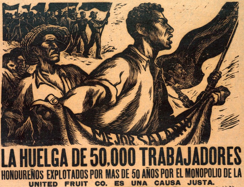
Mexican Political Art

        Mexico has a long history of using art, including relief block printing, in politics and social activism.  The Taller de Gráfica Popular (Popular Graphic Arts Workshop) is a Mexican collective of printmaking artists founded in 1937 and “primarily concerned with using art to advance revolutionary social causes.”  It made mostly posters and handbills supporting certain political causes (and of course condemning others), but also made portfolio editions of some prints.  
Wood block printing is still being heavily used by the ASARO collective (Assembly of Revolutionary Artists of Oaxaca) that was established with the conflict in Oaxaca that came to a head in 2006.  It’s very cool that art (and especially relief block printing) is so vital and immediate in getting out messages.  Its role is made even more important by the fact that multiple languages are spoken in Mexico, and in many regions there is no one language spoken by everyone.  Go art, the universal language!
        But I confess that for all the power of the best pieces made by Mexican political artists, I tend not to like much of their art.  After a while it all begins to look the same: raised fists, evil soldiers, marching workers, banners, corpses…  It begins to seem as if all those artists working for all those years could appeal to only one emotion: rage.  There’s a place for anger of course - we need physical pain to tell us when something’s wrong with our bodies, and we need anger to tell us when something’s wrong with our societies.  Nevertheless, a steady diet of rage quickly becomes unpleasant and eventually unhealthy.  And if Mexico has a long history of relief printing, it has an even 
longer history of using powerful art to make chilling statements about politics and power.  Images of decapitated human heads and devoured human hearts are so prevalent in the art of the Mayan archaeological site Chichén Itzá that my children and I began to chant a little club beat ditty “Heads ’n’ hearts ’n’ heads ’n’ hearts…” at every new frieze.  And that brings me to another point about political art: look at enough and it all looks the same regardless of which side it's supporting.  Our side is martyred and their side must be crushed, always always always.  Yes, we need the anger to tell us there’s a problem that needs fixing, but it seems to me that the rage is only the alarm call and not the solution.  For the solution we need to let go of the bloodthirsty frenzy of heads ’n’ hearts ’n’ heads ’n hearts and actually use our heads and our hearts to reach real solutions.

[Pictures: Ayude a impedir este crimen (Ethel y Julio Rosenberg), linoleum block print by Francisco Mora, 1953;
La Huelga de 50,000 Trabajadores, linleum block print by Alberto Beltrán, 1955 (Images from Princeton University Digital Library);
La Serpiente, wood engraving by Leopoldo Mendez, c 1943 (Image from Live Auctioneers);
Nuestros Muertos, wood block print by APPO Cooperative, 2006 (Image from Illustration Concentration);
Stone carvings at the tzompantli in Chichén Itzá, c 1200 CE (Image from The Flying Kiwi since I didn’t want to bother scanning my photo!).]

August 12, 2014

Another Review of "Doors"

        The Extraordinary Book of Doors has received another nice review, which you can see here at FangirlNation.
        In reading reviews of a book I’m so completely immersed in, it’s fun to see what aspects different readers pick up on.  In this case reviewer Jessica Greenlee has particularly noted that “the primary focus of the book is on discovery,” and that Doors is largely non-violent (particularly in comparison with many current books for middle grade and up.)  I especially like Greenlee’s statement that Doors is “recommended for people who wonder what is behind doors.”  I know I’m definitely that kind of person myself, and I like that way of putting it.  Yes, we could call it simply curiosity, but somehow thinking of it this way expresses that additional element of snoopiness (I’m not saying I’m proud of it), as well as the idea that what you discover might actually go somewhere.
        Curiosity is a major element in all my books, no doubt partly because I am the sort of person who wonders what’s behind doors, but also because I’m not the kind of person who actually wanders off through forbidden doors at the drop of a hat.  In that regard, I’m more Chen than Polly…  but that’s what books are for, isn’t it?  So that we can have the fun, the intellectual stimulation, the excitement, the mind-expansion of all those adventures without actually having to go off and do anything scary!
        But head over to FangirlNation and read the review for yourself.

[Picture: An enticing doorway at Cobá, where we were having adventures last week, photo by AEGN, 2014.]

August 1, 2014

Cleaning

        A while ago I saw this wood block print by Dutch artist Samuel Jessurun de Mesquita in an exhibition at the mfa, and it seems appropriate today.  I’ve had plenty of housework to do recently, including getting down on my hands and knees and washing the kitchen floor this morning.  Here are some of the things I find especially interesting and appealing about this piece from 1898:
     - much of the image is very simply white outlines on black, and yet such skillful outlines, especially the folds and wrinkles that depict the fabric of the woman’s dress
     - the contrast between those plain, simple outlines and the detailed texture of the wood floor
     - the dots on the dress have a nice sparkle, too
     - that dress!  Can you imagine having to get down on your knees and work in such voluminous skirts?
     - I love how the wet portion of the floor is darkened so simply and effectively by not carving out the woodgrain pattern there
     - with her face turned down the woman is anonymous, as if perhaps she’s just part of the faceless machinery of the bar or restaurant where she works, yet at the same time her anonymity makes her universal: she’s every woman who’s ever had to scrub a floor
        I don’t think I’m ever likely to enjoy house-cleaning, but the magic of art is that it can bring beauty to this, too. 

[Picture: Schoonmaak, Dienstbode (Cleaning, Maidservant), wood block print by Samuel Jessurun de Mesquita, 1898 (Image from the Museum of Fine Arts).]