April 17, 2023

Pencheon Preble Primer

         Welcome to the April A to Z Blog Challenge!  My theme this year is Relief Printed Alphabet Squared, an alphabet of alphabets illustrated with relief block prints.
        P’s first alphabet is by Lottie Pencheon, and features charmingly stylized linocut animals.  Her P is Parrot, but that’s probably my least favorite - because I actually love just about all of them except that one.  Trying to pick which I would share as my favorite, I got carried away, so I 
give you C (Chickadee), L (Lemur), R (Raccoon), V (Vulture), and Y (Yak).  I just love how such simple shapes can capture the essence of these creatures.  Plus, I managed to sneak one more of her animals into this year’s A to Z, which you’ll come to in due course.
        Today’s second alphabet, by John Preble, has a much more unusual theme: Louisiana.  Here P is for Pinecone, and I really like its pattern of black and white.  However, for my other letters I’ve selected a couple that are a little more uniquely characteristic of Louisiana: F for (cat)Fish and J for Jazz.  I like the sense of movement in the catfish.  I also like the Art Deco feel of the letters included in these 
pieces, which is why I used another of Preble’s letters (cropped from its picture) as the letter icon for K.
        We couldn’t run through a whole series about alphabet books without the word Primer.  Although not all primers include illustrated alphabets, there are lots that do.  I’ll start with The Royal Primer from about 1776 (Authoriz’d by His Majesty King George II).  P is for Peacock, and it’s really a pleasing and surprisingly detailed tiny illustration.  Some of my other favorites include the Fish that appears to swim along the surface of the water at F, and the funny Mouse at M.  I include this alphabet in its entirety so that you can compare it with Bewick’s back at B.  These two were 
made at the same time, and follow the same model.  You can see why Bewick was considered the master of the wood engraving, as his are certainly more expertly done.  (Compare the two Nags, for a head-to-head contest.)  One interesting difference, however, is the choice of letters.  Neither of these includes our modern 26.  Both omit U, which was originally considered an orthographic variant of V, and The Royal Primer omits I, which (as I mentioned at the post on I) was originally considered an orthographic variant of J.  Bewick, however, includes a separate I, but omits X.  I have to wonder to what extent letters were left out just to make the alphabet fit in a convenient grid of 24.  Twenty-six letters is really so ungainly!
        The word “primer” originally meant both “prayer book” and “school book,” since reading was taught from prayer books.  The New England Primer takes this double meaning seriously, including plenty of religious instruction along with its basics of reading.  Many versions of The New England Primer were published with minor differences by many publishers in many cities over many years, starting by 1764, and going up to at least 1836.  Some versions have pictures reversed from each other, implying that the illustrations of one version were copied onto new wood blocks, and then reversed when the new blocks were printed for a new version.  The edition
I have for you today dates to around 1830, and P is for Peter denying His Lord.  I also give you L for Lion and Lamb, and M for Moon, which is one of the few that doesn’t directly reference the Bible.
        The United States School Primer is undated, but judging from the fashions on the people it shows throughout the book, the illustrations must have been made around 1810
or at least before about 1820. P is Pot, which isn’t a particularly exciting picture to look at.  However, this alphabet does have a particularly interesting selection of words, and I’ve chosen additional letters to share based less on the pictures themselves and more on the unusual choice of word.  E is Engine, I is Ink-stand, J is Jews-harp, and S is Skull.  (Later the same publisher also put out The Blue Pictorial Primer with the same alphabet, but this time printed in blue ink.)
        And finally we have The American Indestructible Primer, so called because it’s printed on fabric.  This book contains two illustrated alphabets.  One is larger
pictures of animals, but unfortunately
they’re painted over with color that obscures the details.  You’ll be able to see one of these illustrations as the icon at the letter S, however mostly I just find them disappointing.  So instead I’m sharing pictures from the other alphabet, which is illustrated with small, neat wood engravings in attractive framing borders.  P is for Peach, and I’ve also selected G and H to share, featuring Guinea Pig and House.  Plus you’ll be able to see two more when we get towards the end of April.
        (Remember that for all the pictures in this blog, you can click on them to see them bigger.)
        The moral, at least according to The New England Primer, is: In Adam’s fall, We sinned all.
        And also (according to The Royal Primer): He who ne’er learns his A, B, C,  For ever will a Blockhead be.
        I know you can do better than those!  What words of wisdom do you have for children?  (Bonus points if it’s in the form of a rhyme.)

[Pictures: Chickadee, Lemur, Parrot, Raccoon, Vulture, Yak, lino cut prints by Lottie Pencheon, c. 2011 (Images from Lottie Pencheon);
Pinecone, Fish, Jazz, block prints by John Preble (Images from abitamysteryhouse.com);
Peacock, Lion, Mouse, wood engravings from The Royal Primer, c. 1776 (Images from University of California);
Peter, Lion, Lamb, Moon, wood engravings from The New England Primer, published by S. Babcock, 1826-30 (Images from University of Florida);
Pot, Engine, Ink-Stand, Jews-harp, Skull, wood engravings from The United States School Primer, early 1800s (Images from University of California);
Peach, Guinea Pig, House, wood engravings from The American Indestructible Primer, c. 1880 (Images from University of Florida).]

April 15, 2023

Orsini Objects

         Welcome to the April A to Z Blog Challenge!  My theme this year is Block Printed Alphabet Squared, an alphabet of alphabets illustrated with relief block prints in all their glorious diversity.  Find the A to Z master list here and check out all the other participating bloggers.
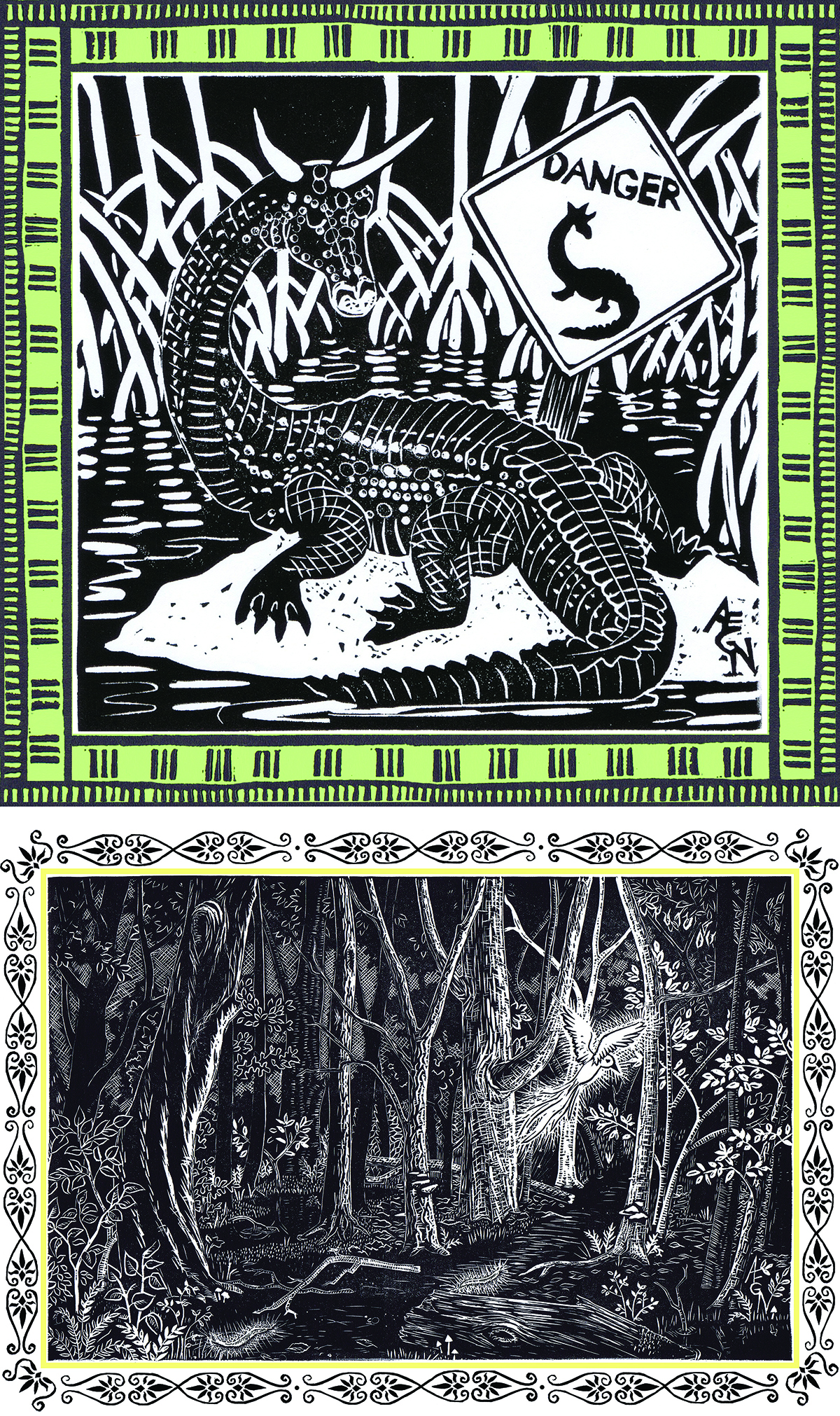
        For O I have for you an alphabet by Sebastien Orsini.  It’s another alphabet of animals, but the selection of creatures gets a little shaken up by the fact that it’s in French.  The O is represented by Oreillard Gris, a particular species of European bat known in English as the grey long-eared bat.  I’m also sharing A for Alligator, which works in English, and L for Libellule, which doesn’t.  The alligator is actually the only one of these three that I’m
sharing with you as it appears in Orsini’s book: with two colors, plus black, plus a highlight of white.  The grey and white versions of the other two are apparently the original linoleum block prints.  In any case, you can see that Orsini’s style makes incredible use of texture, focussing in on the patterns of scales and wings and plants.  I love how the views are closely cropped rather than just sticking an animal in the middle of a frame as so many others (myself included) tend to do.
        For O we also have The Common Object ABC Book.  Here O is Ox.  The capital letters are themselves part of the illustrations, and I chose H as a second letter to share because I like the way the Horse is really using the H as part of its environment.  I also give you Q because it’s for Quadrille, which is not a word that shows up in very many modern alphabets!  However, despite the fact that you can see in the Theme Reveal post that A is for Apple, I have to say that I quibble with calling any of the three words in today’s post objects.  So let’s try again…
        Alphabet of Objects does a better job of picking things that are actually objects.  O is for Organ (meaning a portable barrel organ).  Also not something you see too often these days.  I give you J for Junk because it’s another somewhat unusual choice, and I like the variety.  I’ve also included A for Anchor along with a section of the page header because here you can see something else rather unusual about this book: the red coloring is actually printed, rather than hand-painted.  Multiple colors couldn’t be printed at the same time, and you can see that the two runs through the press haven’t been perfectly lined up, a common problem.
        The moral of O is that the more ornate you try to be, the more likely you are to make mistakes.  Which you could take as a lesson to “Keep it simple,” or on the other hand you could take it to mean “You can’t make an omelette without breaking eggs.”
        Riddle of the day: which letters are in debt?
        So, do you enjoy a good organ tune?  Or if not, what’s your favorite musical instrument?  (If you want to see mine, here’s a prior post.)

[Pictures: Oreillard, Alligator, Libellule, linoleum block prints by Sebastien G. Orsini from Dans le Mystere des Animaux Sauvages, 2011 (Images from Sebastien Orsini);
Ox, Horse, Quadrille, hand-colored wood block prints from The Common Object ABC Book, c. 1880 (Images from University of Maryland);
Organ, Junk, Anchor, wood block prints from Alphabet of Objects, 1864-70 (Image from University of California).]

April 14, 2023

Nydam Nursery

         Welcome to the April A to Z Blog Challenge!  My theme this year is Relief Printed Alphabet Squared, an alphabet of alphabets illustrated with relief block prints.  Check here for the master list of participating blogs.
        Well, obviously given my predilections, I myself have done block printed alphabets of my own, and obviously I was going to feature them, so today is the day for the three block 
printed alphabets of Anne E.G. Nydam.  The first one I completed is botanical, and the N is Nasturtium.  I love the shape of nasturtium leaves and the shape of the flowers, but
what I really love is their fiery colors, so I’ll be honest: this is one of those few cases where color might really be better than black and white.  (Go back and enjoy Pomeroy’s nasturtiums at D!)  My favorites in this alphabet are probably P (Poppy) and T (Thistle) because they’ve got some interesting texture.  Although some of the illustrations in this alphabet are wood block prints, all three of these are rubber block prints.  The whole alphabet is available as a poster, which you can see here.  One other note about this alphabet is that for some of the letters I used the Latin (scientific) names of plants instead of English.  So this is actually a bilingual alphabet of sorts.
        The second Nydam alphabet is animals, and N is for Nautilus.  The animal alphabet has a poster version, too, and there is also a book version called Amazing, 
Beguiling, Curious, which includes fun scientific facts about each creature, as
 well as questions to get young scientists (and artists) thinking about what they observe.  (Did you know that a nautilus can have up to ninety tentacles?)  I’m having a hard time selecting a favorite, and you can see the whole thing on the poster here, so for today I’ve chosen to highlight the very first one of these animals I ever carved, and the last.  Those are R for Rhinoceros and V for Vicuña, spanning a 13 year spread.
        Then the third Nydam alphabet collects Beasts of the Realms of Imagination, which was the subject of my A to Z Blog Challenge in 2019.  The N is represented by Ninki Nanka, which you can learn all about here.  Once again it’s not easy for me to pick favorites because these are all my beloved babies!  But to exercise discipline and pick just one I think I’ll go with the Hercinia at H (and you can learn more about it here).  These animals are all part of an alphabet book that was not aimed at children at all (although children do seem to enjoy it).
        But enough about me, let’s get back in the Nursery with The Nursery Present of 1830.  N is for Nest, and I give you also C for Coach (because nowadays you’d get C for car instead), and F for Fruit (which is a particularly attractive little picture).  The painting job in this book is of considerably higher quality than most - actually an enhancement rather than a defect.
       Today’s bonus is Antler, Bear, Canoe: A Northwoods Alphabet Year by Betsy Bowen.  You can see B, D, Q, and X in prior posts.  N is for Northern Lights, but I don’t think that one works as well as some others in a wood block print, so I’ve also shared L for Loon.
         The moral for N is Never let the truth get in the way of the truth!  In other words, sometimes fictional stories are more true than the “reality” we think we know.  And sometimes looking at something in a new way can reveal fresh truths.
        And also, go check out my books!  You or a child you know might enjoy one!  (By the way, while I’m shamefully plugging my own alphabets, all of the originals of the block prints that illustrate my books were made in limited editions for sale, and you can still find many of them on my web site.  Nasturtium and poppy are available; thistle is sold out.  Vicuña is available, nautilus and 
rhino are sold out.  Ninki Nanka is available; hercinia is sold out.)
        So, have you ever seen the northern or southern lights?


[Pictures: Nasturtium, Poppy, Thistle, rubber block prints by AEGN, 2006, 1997;
Nautilus, Rhinoceros, Vicuña, rubber block prints by AEGN from Amazing, Beguiling, Curious, 2010;
Ninki Nanka, Hercinia, rubber block prints by AEGN from On the Virtues of Beasts of the Realms of Imagination, 2019;
Nest, Coach, Fruit, hand-colored wood block prints from The Nursery Present, 1830 (Images from University of California);
Northern lights, Loon, watercolored wood block prints by Betsy Bowen from Antler, Bear, Canoe: a Northwoods Alphabet, 1991.]

April 13, 2023

Maire Mayo Machine

         Welcome to the April A to Z Blog Challenge!  My theme this year is Relief Printed Alphabet Squared, an alphabet of alphabets illustrated with relief block prints.  (And yes, there are more than enough to fill an alphabet!)
        Find out all about the A to Z Challenge here.
        Today’s first featured alphabet is by Maire Littledale (UK, 1910-1994), and it’s an alphabet of British birds illustrated in small wood engravings.  M is clearly for Magpies, but interestingly the artist didn’t actually title her pieces, so I just have to guess at their identification.  My guess for I is Iceland Gull, and Y is presumably Yellowhammer.  These seem to have been intended to illustrate a book, but I find no evidence that the book was ever made.
        Next up is another nature-lover, and a contemporary of the first, Eileen Mayo (UK, 1906-1994).  These illustrations come from Nature’s ABC and are very smooth, controlled linoleum block prints.  Most of Mayo’s letters include an animal and a plant, and most of them are species that would be found in the British countryside or garden.  For M we have 
Magpie (again) and Magnolia.  I’ve also given you two other letters.  In the F page (Frog, Forget-me-not) you can see how Mayo actually integrates the large letter and informational text as part of her art, although I’ve cropped it out of M and I (Insects, Iris).  Her work beautifully combines scientific accuracy with stylish design, and the F has a particularly attractive flow to it.
        I’ve also got for you, by contrast, The “White” Sewing Machine Alphabet for the Million.  I’m guessing that this booklet was printed up as an advertising giveaway, and every letter includes a peppy little verse extolling some fabulous quality of White sewing machines.  It’s actually a great 
piece, because it’s well-designed, cleverly tongue-in-cheek, and a perfectly legit alphabet book, even if it is most definitely agenda-driven.  M is for Mother, telling her sons how quiet her sewing machine is.  I especially like E for Ease, because it's not the sort of word we find in most of our alphabets.  Plus, I like the picture, with its detailed silhouette and faintly cross-hatched suggestion of a background.
        Then as a bonus I’ll wrap up with ABC de Puerto Rico, illustrated with wood block prints by Antonio Martorell.  M is for MangĂł.  Apparently this acute pronunciation is distinctive to Puerto Rico, but of course M does just as well for the ordinary English Mango, too.  I like this illustration a lot, although I’m not sure whether there’s any particular significance to the carousel in the picture (does Merry-go-round work in Puertorriqueñas?), or whether Martorell just liked the way it made a letter M fit into the illustration of the mango tree.  And your extra letter from Puerto Rico is A for Agua (which obviously doesn’t work in English).  It makes particularly nice use of the graininess of the
wood.  I’ve featured this a
lphabet before, and you can see H, I, J, and R in a prior post.
        The Moral of M is to learn to identify your local birds.  It’s guaranteed to give you much delight!
        And also, a miss is as good as a mile, and manners make a man.
        So, do you have a favorite bird?  And which do you find most appealing: plumage, behavior, or song?


[Pictures: M, I, Y, wood engravings by Maire Littledale, before 1936 (Images from V&A);
Magpie, Frog, Insects, linoleum block illustrations by Eileen Mayo from Nature’s ABC, 1944 (Images from ARHC, Full Table, sandandwill);
Mother, Easy, block prints from White Alphabet for the Million,
 1884 (Images from University of Maryland);

MangĂł, Agua, wood block prints by Antonio Martorell from 
Abc de Puerto Rico, 1968.]

April 11, 2023

Laforge #AtoZChallenge

         Welcome to the April A to Z Blog Challenge!  My theme this year is Relief Printed Alphabet Squared, an alphabet of alphabets illustrated with relief block prints.  Find the master list of participating blogs here and see what adventures my fellow bloggers are offering this month.
        Lucien Laforge (France, 1889?-1952) never made it big as an artist, primarily working as a cartoonist for left-leaning newspapers.  You can see the cartoonist’s confident simplification  in his alphabet book from 1924, and you can sometimes see that touch of sharp satire, but for the most part it’s absolutely charming.  The black outlines were carved and printed from wood blocks, and the color was applied 
with the pochoir technique, which is a fancy word for stencils.  Being French, this
is another of those alphabets that doesn’t necessarily work in English, and L is for Lune, English moon.  I love the dark town with its red tile roofs, and blue church steeple against the night sky.  It so happens that this is probably my favorite letter from Laforge's alphabet, but I didn’t have any trouble picking a couple more to share as well.  F is Fantasmagorie, which I suppose works as F for Fantasy (rather than P for Phantasmagoria).  I think first of Cinderella’s coach, but who knows what story is being told here?  That’s the fun of it: imagining all sorts of different magical possibilities within this steeply angled and oddly stripy landscape.  Then I’ve also selected U for Usine, which
means factory.  This scene is not so idyllic with a menacing red sky, rivers of black smoke, and an aircraft flying over.  Still, it’s a bold and dramatic image.  One more of Laforge’s letters is still to come, and I’ll give you a hint: it works in English, as well.
        For the rest of the day we’re going back to the nineteenth century, where I have a few different types of alphabet book, all for the education and entertainment of good boys and girls.  Aunt Lely’s Picture Alphabet is one of those with detailed vignettes combining multiple words for each letter.  L is for Lamp, Light, Ladder, Lamp-lighter, Ladle and Loaf.  The anonymous artist has made an attempt to fit all the objects into plausible scenes, as you can see at K, but it hasn’t worked out so well for L.  For my favorite I’ve chosen the spread of S and T, because I particularly like the 
Snail.  I also like how the little verse includes some S adjectives in addition to nouns.  Later you’ll get a chance to see one of only two letters from this alphabet that does not illustrate multiple words.  (Can you guess which letters those would be?)
        The Lu Lu Alphabet is the sort of alphabet book that tries to tell a connected story for the letters to show up in.  Honestly, it’s not much of a story, and I don’t know why it’s called Lu Lu, since that doesn’t seem to be a character in the story.  Be that as it may, the Lady at L is indeed very elegant, with the feathered hat that was introduced in the book at F, and the children who first began to dance at D.  However, for my favorite I give you the spread of Y and Z because I’m so tickled that they all had to drive home in a carriage pulled by a zebra!
        And finally, as a bonus, The Ladder to Learning by Miss Lovechild, the sort of alphabet book that just lists words.  I like the somewhat crude charm of the wood block prints, but the crudeness of the painting isn’t nearly so charming.  You 
can see D, F, and Z in earlier posts, plus one of the fancy letters will be an icon in a later post, but for today here’s the Lion for L.
        The moral of L is to Look before you Leap.
        And also, don’t try harnessing a zebra to your carriage.  They really don’t like it.
        So, who do you think is in that phantasmagorical coach?  And where are they going?  And would it be even cooler if it was pulled by a team of zebras?


[Pictures: Lune, Fantasmagorie, Usine, wood block prints with pochoir by Lucien Laforge, 1924 (Images from Mille Feuilles de Bretagne, Ma Galerie a Parisand Librairie Abraxis-Libris);
K, L, S, T, wood engravings from Aunt Lely’s Picture Alphabet, 1855-62 (Images from University of Washington);
Lady, Yeoman, Zebra, wood block prints from The Lu Lu Alphabet, 1867 (Images from University of California);
Lion, hand-colored wood block print from The Ladder to Learning, 1852 (Image from University of Maryland).]

April 10, 2023

King Knox #AtoZChallenge

        Welcome to the April A to Z Blog Challenge!  My theme this year is Relief Printed Alphabet Squared, an alphabet of alphabets illustrated with relief block prints, because alphabets and relief block prints are two great tastes that go great together.  Find the master list of participating blogs here.
        Today we begin with an alphabet of Kats.  Just kidding!  It’s Cats A-Z by Martha Knox.  The cat at K is Kirlee, the first male of the Devon Rex breed, which are the ones with curly fur and even curly whiskers.  I like that Knox 
has given this wood block print a curly background pattern, too.  But there are 
others I like more, and since K is another sparse letter, I’ve chosen two favorites to share: I for Iriomote cat, and J for Jeoffry.  Jeoffry, in case you’re not familiar with him, is the cat of eighteenth century poet Christopher Smart, who extols Jeoffry’s godliness at great length.
        While we’re exalting mere mortals (and in a cute segue from the Rex of Kirlee’s breed), how about some KingsAunt Friendly’s Royal Alphabet includes lots of Kings, of course, but also some Queens and other words associated with the history of British Royalty.  K is, in fact, for King, and in this case specifically King Henry VI, who wasn’t an important enough Henry to warrant the H.  (To be fair, there was a lot of competition.  When it came to G, Aunt Friendly didn’t even bother choosing a favorite, but just let it stand for all four of the Georges who had been kings as of publication.)  I also give you P, which is for Philippa, queen of Edward III, because I always enjoy a good medieval fairy tale picture.  I’m sorry to tell you, though, that this alphabet is engraved rather than relief printed, and thus wouldn’t even be here if the world of block printed alphabets weren’t so scanty in the K department.
        Thus the moral of K is, apparently, to be willing to accept “klose enough” when things don’t go your way.
        But before it’s too late, let’s just take an extra helping of Kings to get a few more block prints into this post.  King seems to be a somewhat less popular K nowadays than it was in the nineteenth century, and I think it was less popular in American books than British, although those are just my observations, not scientifically tabulated.  So here we have three kings: one American and two British, one black-and-white and two colored.  My favorite is definitely the b&w one, which has a nice look of carving and a pleasant expression on his face.  (And another letter from his alphabet, without its picture, can be found as a letter icon.  See if you can spot it!)
        Moral II: he is indeed a king who knows how to rule himself.
        So, tell me about your pets.  Do you have a kitten?  Or perhaps a koala or a kangaroo?

[Pictures: Kirlee, Iriomote cat, Jeoffry, wood block prints by Martha Knox from Cats A-Z, 2013 (Images from Words on Woodcuts);
King Henry VI, Philippa, engravings printed in color from Aunt Friendly’s Royal Alphabet, 1867 (Images from Toronto Public Library);
King, hand-colored wood block print from Pictured Alphabet, c.1857 (Image from University of Washington);
King, wood block print from The Picture Alphabet, 1830 (Image from Toronto Public Library); 
King, hand-colored wood block print from The Ladder to the Alphabet, 1845, (Image from Toronto Public Library).]

April 8, 2023

Jung Juvenile

         Welcome to the April A to Z Blog Challenge!  My theme this year is Relief Printed Alphabet Squared, an alphabet of alphabets illustrated with relief block prints.  Find out more about the A to Z Challenge here.  (And as always, thanks very much to the organizing team who pulls this all together so that the rest of us have a structure and community in which to share our work this month.)
        The alphabet by Moriz Jung (Austria, 1885-1915) is rich and dramatic.  Not only does it have a bold animal for each letter, but there’s a thick patterned border filling out the whole page.  As an Austrian artist, Jung’s alphabet stands for words in German rather than English, but luckily for us, J is still for Jaguar, and C is still for Chameleon.  I love the patterns all over everything, and how the animals are almost camouflaged in their habitats.
        Because I have only two alphabets to share with you today, and because I 
really like these, I’m going to go ahead and give you a third from Jung.  Here’s I, which is for Igel.  As you can tell from the picture, Igel is a hedgehog, so not all our letters are effectively bilingual.  (If you want to see some of Jung's non-alphabetic work with a humorous sci fi twist, check out this prior post.)
        Today’s second alphabet is Richardson’s Juvenile Cabinet, a chapbook that gives the eager child three alphabets for the price of one.  Each page includes the appropriate line from the “A was an Archer” rhyme that we’ve seen before, plus a person from a particular country or region, as well as one additional random word.  I use the description “random” advisedly because I rather suspect that the
publisher merely rummaged through his box of wood blocks in the basement to see what he could come up with.  Some of them are a bit of a stretch (rather like the idea of assigning Richardson’s Juvenile Cabinet or Fountain of Learning to the letter J).  In any case, J here is represented by two Joiners and a Janizary.  A Janissary was a member of the elite infantry army of the Ottoman Empire.  Four years before the publication of this little educational pamphlet, the Janissary corps had been abolished, with brutal violence, after they had rebelled against Sultan Mahmud II.  I have no idea how aware of these current events the average English person would have been, let alone the average English child just learning their ABC’s.
        As a second letter from the Juvenile Cabinet I give you W, because I particularly like the wood engraving 
of the Windmill in its lovely little landscape.  W is also illustrated by a Watchman and a Welchman.  (As with the J, you can see that spelling was not yet modern.)  Notice that the Welchman has a leek stuck in his hat!  
One more letter from this book was used for the icon in the post for G.  I really like how the Gamester used the G as his table.
        The moral of J is don’t judge a book by its cover, because sometimes a jaguar can change its spots.  (And a chameleon certainly can.)
        Riddle of the day: which letters squawk the loudest?
        So, which elements of today’s children’s books do you think will seem most outdated in 200 years?


[Jaguar, Chamaeleon, woodcuts by Moriz Jung, 1906 (Images from Vienna Secession);
Janizary, Welchman, hand-colored woodcuts from Richardson’s Juvenile Cabinet, 1830 (Images from Toronto Public Library).]


April 6, 2023

Infant's Insects

         Welcome to the April A to Z Blog Challenge!  My theme this year is Block Printed Alphabet Squared, an alphabet of alphabets illustrated with relief block prints.  Find the master list of participating blogs here, because you can’t tell the players without a scorecard.
        Today we begin with A Forest Insect Alphabet featuring wood block prints of 26 insects that live in southeast Texas, portrayed in woodcuts by Charles D. Jones.  I is represented by the Ips Bark Beetle, but unfortunately that’s actually one of my least favorites.  I’ve included two others to give you a better sense of these block prints: M for Monarch Butterfly, of course, and T for Tiger Beetle.  This book is interesting in a couple of regards.  For one thing, it isn’t entirely a celebration of insects.  It includes not only the monarch butterfly sorts of things that everybody loves, but also lots of pests, including even some invasive species.  The other quirky aspect of this alphabet is that the text for each letter is actually lyrics of a little song, and the book includes a CD of the Forest Insect Alphabet Song Cycle!
        But that’s not our only Insect Alphabet.  Here are a couple of images from another, this one done in completely different and rather more whimsical style with linoleum block prints by Melanie Wickham.  Unfortunately, I could find only a sampling of the illustrations from this little limited edition book, and I was not among them.  I’ve included J for Jiggers instead.  (Many of the oldest English alphabets counted I and J as variants of the same letter, so it doesn’t seem too bad a stretch.)  And for a letter that I particularly enjoy, M is Moths.  But although my access to Wickham’s insect alphabet is a little sparse, she has done two versions of complete animal alphabets, so I give you those as well.  I is Ibex in one and Iguana in the other.
        In addition to the two Insect alphabets, I also have two Infant alphabets for you.  I is, in fact, for Infant in The Infant’s Nursery Alphabet from 1853.  Plus I give you also U for Umbrella, because I like the young lady’s attitude.  By now you know these are hand-colored wood block prints.  There will be one more of the illustrations from this book when we reach the end of the alphabet.
        I stands for Inn with a very attractive little wood engraving in The Infant’s Illuminated ABC Primer Book from around 1848.  This book also includes a second alphabet which I’m not featuring because for many of the letters I can’t figure out whether the illustration actually begins with the letter or not!  However, you can see two of them in the little letter icons at H and Z.  Rather than a second letter from either of this book’s alphabets, however, today I’m giving you the pages that can serve as the moral for this post: Good little boys and girls love to read better than to be doing mischief!
        Riddle of the day: which letters have the best vision?
        So, what’s your favorite book to read instead of doing mischief?  (I know, I know, who can pick a favorite?  Just share any one of your top 15 or 20 favorite books!)


[Pictures: Ips Bark Beetles, Monarch Butterflies, Tiger Beetles, wood block prints by Charles D. 
Jones from A Forest Insect Alphabet, 2013);
Jiggers, Fireflies, 2 alphabets, linoleum block prints by Melanie Wickham from An Insect Alphabet, plus free-standing pieces (Images from ebay dibber42 and melaniewickham.co.uk);
Infant, Umbrella, hand-colored woodcuts from The Infant’s Nursery Alphabet, 1853 (Images from Toronto Public Libraries);
Inn, Good Boy, Good Girl, woodcuts by John L. Magee from The Infant’s Illuminated ABC Primer Book, c.1848 (Images from University of Washington).]