November 30, 2022

Words of the Month - Talking Turkey

         In this season of holiday feasts, it seems a good time to learn where some of our holiday feast words come from.  Study this well, and it will give you something to talk about should conversation flag over the festive table.

        turkey - The application of this word to the large North American fowl so often eaten at Thanksgiving and other holidays is a tale of linguistic, ornithological, and geographical confusion and misunderstanding.  It is indeed the same word as the country, and was first applied to the guinea fowl of West Africa, which came to Europe when North Africa was under Ottoman Turkish rule.  Thus, a bird from Turkey.  It wasn’t much later, 
however, that the word was applied to the American bird domesticated by the Aztecs and introduced to Europe by the Spanish.  As far as Europeans could tell, they seemed pretty similar and more-or-less interchangeable.  The Turkish speakers obviously knew the bird didn’t come from Turkey, but they, like the rest of the Old World, were pretty fuzzy on the distinction, if any, between America and Asia, so the Turkish word for turkey is hindi, meaning “Indian” (together with French, whose word for the bird also derives from “chicken from India”).  This is the same reason of course, that Native Americans got called Indians.  As a final note, the modern Spanish for turkey derives from the Latin for “peacock,” another superficially similar species that is just slightly more closely related to turkeys than guinea fowl.


        gravy - This word, too, involves an error that became the standard.  From Old French grave, it probably derives from Old(er) French grané, meaning “sauce or stew,” which in turn derives from Latin granum meaning “grain or seed,” a definition which included grains of salt or spices.  Gravy, therefore, was something properly seasoned.  How did it shift from grane to grave?  From the misreading of handwriting in medieval manuscripts.  To find out more, as well as other words that changed because of medieval handwriting, you can revisit the prior post “Words of the Month - Of Writing lllllllks.”


        pie - A word that I, for one, would not want to do without at the holidays, this too has an ornithological connection.  Dating back to Medieval Latin, the word meant “meat in pastry,” but in Medieval English, a pie had multiple ingredients inside the crust while a pastry had a single ingredient inside.  And that distinction may be because of a connection to the pie in magpie.  The bird was originally just called pie, from Latin pica.  (It was given its familiar name Mag(gie) before about 1600, in the same period when the 
redbreast was named Robin and the wren was commonly called Jenny wren.)  One of the magpie’s proverbial characteristics is the collection and hoarding of miscellaneous small objects - sort of like gathering various ingredients into a pastry crust.  It was also around 1600 that the pastry word pie shifted to include fruit fillings as well as meat.


        vegetable - This was an adjective first, meaning “living, growing, vigorous,” from the early 15th century, and it derives from Latin “vigorous, enlivened, sprightly.”  (So the 2oth century definition “a person who is mentally and physically incapacitated” is pretty much a complete reversal in meaning.)  By 1767 the English word included the specific meaning “a plant cultivated for food.”  I’ve looked at plenty of particular vegetable etymologies before, so you can learn about pumpkin here, and a variety of other vegetables here.


        You can also find more wood block prints of turkeys here.
        Do you celebrate with any unique and special elements in your holiday feasts?

P.S. All are invited to my final Holiday Sale of the year, the Celebrate Newton Local Holiday Market this Sunday at Newton South High School!


[Pictures: Behavior at the Table, wood block print from A Little Pretty Pocket-Book, 1787 (Image from Library of Congress);

Turkeys, three color woodblock prints by Walther Klemm, 1906, 1907, 1908 (Images from Museum of Fine Arts, Budapest);

The Magpie, wood block print from Illustrated Alphabet of Birds, 1851 (Image from University of Florida);

Magpie, color woodblock print by Allen William Seaby, 1900-1908 (Image from The British Museum).]

November 25, 2022

Native American Sampler (Part II)

         Today I have more relief block prints by Native American artists, as a token of appreciation during Native American Heritage Month.  This time I’ve got a collection of animals, which of course makes me very happy.  The turtle is simply delightful, and the piece is made even cooler because its title is written below in the Cherokee syllabary invented by Sequoia, which makes it even farther up my alley.  Dagsi is a terrapin, and in addition to the beautiful shell and head, there’s a suggestion of edge of a pond, all in bold, clean strokes.
        The rooster crowing up the morning sun is probably a reduction block print.  The tail feathers make wonderful use of all the overlapping colors (white paper plus yellow, ochre, green, and blue) and solid versus textured carving.  It was made by a Sikangu Lakota (Rosebud Sioux) artist.  Although the next piece also shows a bird facing to the left, with feathers spread, it is stark black and white while the rooster is brightly multicolored, flat shapes while the rooster has textures, and rounded shapes while the rooster is sharp and angular.  The Inupiaq (Alaskan Inupiat) artist of this piece has entitled it Bird Forms, so I 
don’t know what species of birds they are intended to represent, or even if they are intended to be specific species at all.  To me, however, it looks like a raven stealing an egg from a goose.
        This wild boar is not so much to my taste over-all, but at the same time I think the carving style and rough skritchiness of it works well to evoke the bristly boar, the prickly cactus, and the spiky desert grasses.  It comes from a Mescalero Apache artist.  Today’s final piece is from a Bering Strait Inupiaq artist, and once again we have a wonderful contrast between the two.  This last one is multiple shades of warm browns instead of severe black, and all smooth round curves instead of sharp slashes and gouges.  I love that this piece so clearly evokes seals, even though when I try to pinpoint the head or exact anatomy of the animals, they disappear into the waves of the woodgrain with a perfectly seal-like slipperiness.
        Which of today’s pieces is your favorite?  Which animal is your favorite?  What animal would you choose to carve, and how would you depict it?  For myself, of course I’ve done block prints of about a hundred different animals or more, so I certainly wouldn’t be able to pick just one!


[Pictures: Dagsi Power, linoleum print by America Meredith, c 2020 (Image from America Meredith Art);

The Early Morning, woodblock print by Leonard Leader Charge, 1965-70 (Image from Smithsonian);

Bird Forms, woodblock print by Melvin Olanna, 1975 (Image from Smithsonian);

Wild Boar, woodblock print by Wallace Rice, Sr., 1965-6 (Image from Smithsonian);

A Dream in Anchorage, woodblock print by Peter John Seeganna, 1973 (Image from Smithsonian).]


November 21, 2022

Native American Sampler (Part I)

        November being Native American Heritage Month, I was trying to find some relief block printmaking from Native American artists.  Not surprisingly, the cultures that seem inclined to produce the most relief block prints are those from the far north and northwest coast, and you can revisit one particular aspect of that in my previous post about Inuit Stone Block Prints.  Of course artists work in all sorts of media, so I didn’t end up finding a huge number of relief block prints, but I did find enough that I couldn’t share all I wanted to in one post.  So this is Part I, focussing on images of people.
        I’ll start with the most iconic images, two men in profile, with stern expressions and distinctive headdresses.  Both are powerful men, the first entitled “Pride,” and the second “Enchanter.”  I especially like the bold, simplified geometric shapes of the enchanter.  One of my goals in selecting pieces to share was to find the work of artists from a variety of Nations.  
The first is Diné (Navajo), and the second Hopi-Tewa, which are both from the American southwest area.  These pieces were also both made in the 1970s.
        Next is a woman from the same southwest region (Akimel O’odham (Pima)) and era.  Because she is somewhat turned away, we see only a glimpse of her face, but we see that she carries a pot in her arm, and a beautiful basket on her head.  The second woman faces towards us, although she gazes slightly aside.  She is Sacajawea, who was a Lemhi Shoshone woman, and here she’s depicted by an Onondaga woman.  This piece was commissioned for the bicentennial of the Lewis and Clark Expedition for which Sacajawea was a guide.
        This fisherman hails from the north (Unangan (Aleut)), and I particularly like the net and fish, as well as the wood texture on the boat.  I’m guessing, based on the bits of information describing the next piece, that it was made by a Sioux artist who was living at the time in New Mexico.  I can’t help but wonder whether this “Old Man In The Desert” is therefore inspired by the artist’s experience, if not actually being a self-portrait.  The composition is interesting, with the front of the man’s face off the edge of the picture, and his back to the sun.  It certainly looks like a rather harsh sun, but I think the man is grinning, although I guess it could be more of a grimace.  What do you think?
        The next piece is my favorite of all of these, with the carving giving such powerful expression to the faces.  It’s another by a Diné (Navajo) artist.  And the final piece also focusses on a face.  I think I’d like it better without the red block, but I do like the use of texture and pattern.  The knitted scarf is a representational use of texture, while the background is abstract patterns, but there is also unexpected texture on the face.  I don’t know who the subject is, but the artist is Mewuk (Miwok), which is a group from northern California.
        These pieces represent a diversity of style, although most of them come from the 1960s and ’70s, and many were made at the Institute of American Indian Arts in Santa Fe.  From what I could find (while absolutely being no expert) that seems to have been one of the few major areas of relief printmaking among Native American artists, other than those in the far north and northwest.  At any rate, tune in next post to continue my celebration of Native American Heritage Month with block prints of animals.


[Pictures: Pride, woodblock print by Dwayne J. Holiday, 1978 (Image from Smithsonian);

Enchanter, woodblock print by Ted Pavatea, 1971-3 (Image from Smithsonian);

Pima Lady, woodblock print by Tony Mattia, 1978 (Image from Smithsonian);

A Note to Lewis and Clark’s Ghosts, linoleum block print by Gail Tremblay, 2004 (Image from Smithsonian);

Fisherman, woodblock print by Alexandra Backford, 1965 (Image from Smithsonian);

Old Man In The Desert, woodblock print by James Holmes, 1963-80 (Image from Smithsonian);

The Tragedy, woodblock print by R.C. Gorman, 1964 (Image from Smithsonian);

Christine, woodblock print by Brenda J. Holden, 1968 (Image from Smithsonian).]

November 16, 2022

Quaker Conduits

         I have a short story published this month in Friends Journal, which is a Quaker magazine.  As a Quaker, all of my stories come from that perspective and are influenced to some degree by my beliefs, experiences, and background.  This much is true of every author.  In addition, however, I’m often a little more deliberate in working Quaker messages into the stories I write.  Non-violence is a recurring theme for me, plus looking for the Light in others, and trying to practice integrity, as well as elements of Quakerism such as “following leadings” and “discernment.”  Despite all this, however, I never mention Quakerism in my fiction, or write about explicitly Quaker characters.  There are a few reasons for this.  The Otherworld Series, for example, is a high fantasy set in a secondary world in which there’s no such thing as Quakerism, or any other real Earth religion.  The Bad Advice of Grandma Hasenfuss, on the other hand, is set in the real world, and our hero even goes to church on Sunday.  Why church and not meeting for worship?  I chose something that would seem relatively unremarkable, and hopefully relateable or at least understandable.  Danny is an “ordinary” kid, and Quakerism is not particularly mainstream.  To stick it into the story would only be distracting.
        But this short story “The Conduits” is different.  It features a girl in Quaker meeting for worship, experiencing a Quaker sort of magic.  The speculative element that makes this story some sort of fantasy is simply the What If of imagining that a metaphor I think about all the time were actually, physically, tangibly true.  Although Quakers are not the only people in the world who use this sort of metaphor or experience this sort of divine connection among people, this time I wrote my story in a Quaker setting and with a specifically Quaker perspective because the way I imagine it is most definitely coming from my own personal experience.
        Like many stories, there’s certainly a bit of wish-fulfillment - I wish I could have Maggie’s superpower, even if just for a taste.  (And while that’s a bit of fantasy for me, I’ve been surprised by the number of people who have told me they have had an experience that is at least a glimpse of something like this.)  There are definitely autobiographical elements in the story - like counting things when I was bored in meeting for worship as a child.  There are elements based on real people - like the welcoming warmth of some, and the coldness of others.  (But I do have to point out in my mother’s defense that Maggie’s well-meaning but oblivious mother is not based on mine!)
        Writing is often an act of vulnerability, because we give the world glimpses into our bare souls.  Feeling for the element of Divine love and light in the world is another tender endeavor, all too easily misunderstood, mocked, or dismissed.  To share it in writing can be vulnerable indeed.  Beyond that, progressives are often particularly shy of sharing our faith, because we’re trying so hard not to be the sort of people who are not tender with their dogmas, who shove their religion into other people’s faces or, worse yet, use it as a weapon.  But despite the Quaker setting, this story is not actually about religion, or at least not about any particular religion; it’s about love.  If you’re curious, you can read the story at Friends Journal (and enjoy the lovely illustrations by Cristina Conti.  It’s cool to have someone else illustrate my work for a change!)  You can also hear me reading the story aloud, and you can hear me talk very briefly about the story on the inaugural episode of the Friends Journal podcast “Quakers Today.”


[Picture: digital illustration by AEGN, 2022.]

November 11, 2022

Here's Something Cool: Verny's Animals

         Here’s another amazing sculptor making amazing art out of spare parts.  Igor Verny creates creatures that are often articulated and moveable, with meticulous, masterful construction.  Unlike some of the other cool recycling sculptors I’ve featured before (such as Jeremy Mayer, Matt Wilson, Xu Bing, and Julie Alice Chappell, for example), I can’t always 
identify the parts that go into Verny’s pieces.  They’re so smoothly incorporated that they look like they were made for the parts instead of originally being made for some other purpose.  They are somewhat more like the work of Edouard Martinet, but even more “disguised.”  Somehow all these disparate pieces come together into a smooth, perfect whole.
        I don’t know much about Verny, nor do I have much to say about his artwork, except, of course, “This is so cool!”  After all, that’s the point of the “Here’s Something Cool” feature on this blog.  So I’m just sharing something I ran into on the internet and loved.  It’s worth mentioning the value of reusing items that are probably classified as trash, and how this fits in with a steampunk-adjacent aesthetic.  The wasp, in particular, has a steampunk vibe with the gold decorative elements giving it a Victorian flavor.  The adorable little robots, on the other hand, might fall under some sort of atomic“punk” category, with their mid-century futuristic optimism.
        Verny has posted several photos and short videos of work in progress, but they do little to sate my curiosity.  What are these bits and pieces he’s using?  Where does he get them?  How much does he manipulate them, as opposed to leaving them as they came?  On the dragonfly’s wings and the fish’s fins, for example, did he cut the shapes from sheet metal, or did he find some pieces that were just that shape?  What about adding the veining?  But whatever the method, I love these sculptures.  Not only would I love to own one (or more) myself, but these fill me with inspiration for things I will never be able to make.  If only I could wave a magic wand and have, just for a while, a fully-outfitted metal-working shop, and the materials and skills to play in it!


[Pictures: Goldfish, sculpture by Igor Verny, 2014;

Duck, sculpture by Verny, 2013;

Little robots, sculptures by Verny, 2019;

Dragonfly, sculpture by Verny, 2018;

Wasp, sculpture by Verny, 2015 (All images from Igor Verny on Facebook).]

November 7, 2022

Discovery of a World

        Today’s post is dedicated primarily simply to quoting a cool excerpt from a book entitled The Discovery of a World in the Moone or A Discourse Tending to Prove that ’tis probable there may be another habitable World in that Planet, by John Wilkins, 1638.  Wilkins (UK, 1614-1672) was a clergyman and a polymath, and one of the founders of the Royal Society academy of sciences.  This was his first published work of popular science.  The quotation below comes at the very end of the treatise, after he has carefully set up his logical arguments, step by step, through twelve preliminary propositions.  (I leave the original spelling because I think it’s not too hard to understand.)


’Tis the method of providence not presently to shew us all, but to lead us along from the knowledge of one thing to another. ’Twas a great while ere the Planets were distinguished from the fixed Stars, and sometime after that ere the morning and evening starre were found to bee the same, and in greater space I doubt not but this also, and farre greater mysteries will bee discovered. In the first ages of the world the Islanders either thought themselves to be the onely dwellers upon the earth, or else if there were any other, yet they could not possibly conceive how they might have any commerce with them, being severed by the deepe and broad Sea, but the after-times found out the invention of ships, in which notwithstanding none but some bold daring men durst venture, there being few so resolute as to commit themselves unto the vaste Ocean, and yet now how easie a thing is this, even to a timorous & cowardly nature? So, perhaps, there may be some other meanes invented for a conveyance to the Moone, and though it may seeme a terrible and impossible thing ever to passe through the vaste spaces of the aire, yet no question there would bee some men who durst venture this as well as the other. True indeed, I cannot conceive any possible meanes for the like discovery of this conjecture, since there can bee no sailing to the Moone, unlesse that were true which the Poets doe but feigne, that shee made her bed in the Sea. We have not now any Drake or Columbus to undertake this voyage, or any Dædalus to invent a conveyance through the aire. However, I doubt not but that time who is still the father of new truths, and hath revealed unto us many things which our Ancestours were ignorant of, will also manifest to our posterity, that which wee now desire, but cannot know.


        Many of Wilkins’s propositions are strictly logical (1. That the strangenesse of this opinion is no sufficient reason why it should be rejected.) and among the scientific assertions, some have turned out to be confirmed (4. That the Moone is a solid, compacted, opacous body.  5. That the Moone hath not any light of her owne.).  Others turned out to be wrong (8. That the spots represent the Sea, and the brighter parts the Land.  10. That there is an Atmo-sphaera, or an orbe of grosse vaporous aire, immediately encompassing the body of the Moone.).  But the really important thing is that Wilkins was not afraid to speculate, and to build his speculations on logic and the science of his day.
        I really love both the argument itself, and the method of expressing it.  I love that Wilkins admits his ignorance when appropriate, and maintains a calm and scientific basis for his speculation.  And of course he was right that people would someday find a way to reach the moon, and wrong that they would find it inhabited.  His logic, however, is still perfectly valid, and there’s no reason that it can’t still apply to other planets that seem as far beyond our reach as the Moon seemed to him.
        If Wilkins had ever encountered creatures from another world, I feel sure that he would have been delighted to meet them, and tried his best to find common ground.  In a period of great political and religious upheaval in England, Wilkins was noted for his ability to work with people from all camps, his insistence on religious and political tolerance in the church and the universities, and non-partisan inclusion in the Royal Society.  He helped reduce tensions in both religious and academic circles, and seems to have been remarkably widely liked and respected.  No doubt he would have worked hard to ensure that humans and aliens were on good working terms.


You can read the entire Discourse at Project Gutenberg.

[Pictures: title page of The Discovery of a World in the Moone, wood block and type, 1638 (Image from Internet Archive);

Ni is for nickel, illustration by AEGN for Periodic Table of Alien Species by Miguel O. Mitchell, 2021.]

November 2, 2022

Posada's Calaveras

         As Día de los Muertos celebrations take place in Mexico and around the world, it’s a perfect time to look at the important role printmaking played in the development of the iconography of the holiday.  Not surprisingly, images of skulls to represent the dead have been around in cultures around the world since prehistory, although their tone for Día de los Muertos is more playful than in many other contexts.  (Compare the depictions of skulls in Mexican political art, for example.)  Sugar skulls are the most common form of calavera (skull), but the Calavera Catrina has become an icon of Día de los Muertos and appears everywhere in costumes, decorations, and artwork for the celebrations.
        José Guadalupe Posada (Mexico, 1852-1913) was an artist who worked primarily as a lithographer and political cartoonist, and he is now most famous for his satirical illustrations featuring skeletons playing the roles of various types of people.  La Calavera Catrina is by far the most famous.  Originally a satire of wealthy Mexican women who adopted European fashions, Catrina has now become a figure of affection, although she certainly still retains overtones of that Dance Macabre message that death comes for everyone, the rich as well as the poor.  She was first published in 1910 or 1912, an etching by Posada, not a relief block print, which does allow for lots of detail on her ridiculously fancy hat.  Her popularity also required a boost from Diego Rivera, Mexico’s most famous muralist, who painted a full-length, fully-clothed version of Catrina (and allegedly gave her that name, as well) in a large 1947 mural in Mexico City.
        Catrina was not Posada’s only calavera print, though, and many of the others were relief prints.  Interestingly, Posada engraved most of his relief prints on metals such as zinc and lead rather than on wood, but they were printed in relief, like wood engravings (and unlike most metal engravings).  You can see the engraving style in the use of the multi-line tool for adding shading and texture.  Also, since most of Posada’s work was printed in broadsides and other ephemera, most of his work is undated.  It was also often reused and printed on multiple occasions.  (Illustrating broadsides meant he also did a lot of illustrations of murders, executions, and other gruesomely sensationalist images.)  But let’s have a look at some of the range of Posada’s calaveras.
        Many of these calaveras are going about their business like ordinary people: dancing, having a drink, conversing with each other, playing music…  Many are dressed in different sorts of costumes: military, ecclesiastical, rich, poor, European style, Mexican folk style…  Perhaps it’s just the anatomy of a skull, but they’re usually grinning.  In terms of style, although some of these pictures are quite tiny and simple, there are also some complex, detailed scenes involving large casts of characters.  The crazy biker gang is a great example of how ambitious some of Posada’s pieces can be.  Each with a different sort of hat, and the largest skeleton even with wings, these hellions on wheels are simultaneously whimsical and horrifying, which really illustrates the essence of calaveras.
        I also want to mention one other Día de los Muertos tradition of special interest to me: calaveras literarias.  These are short poems in the form of humorous epitaphs for family and friends, (or famous or historical figures).  Any holiday tradition involving poetry is a winner, as far as I’m concerned.  And when your holidays involve block prints and poetry, now that’s worth celebrating.


[Pictures: Calavera Catrina, originally from c. 1910, reprinted 1943 (Image from Wikimedia Commons);

Dancing skeletons, and Military figure, metal-plate engravings by Posada, c.1890-1910;

Skeletons riding bicycles, etching or engraving on zinc by Posada , c.1900;

Skeleton behind the bar, etching or engraving on zinc by Posada from Medicinas de Patente de mas Famas, c.188-1910;

Guitar player, etching or engraving on zinc by Posada from De este famoso hipodromo en la pista, c.1889-1895;

Couple conversing, metal-plate engravings by Posada, c.1890-1910

Elegant couple, etching or engraving on zinc by Posada from El Gran Panteon Amoroso, c.1880-1910;

Cupid’s Skeleton, relief prints by Posada, c.1900-1910 (All images from The Met Museum).]

October 28, 2022

Words of the Month - Grave Concerns

         With Hallowe’en looming, the veil is thinning, and many an unquiet spirit is no doubt waiting to come forth from its dark haven and roam the earthly plane once more.  But in the meantime, let’s take a look at some of their possible current accommodations.


sarcophagus - The Greek roots literally mean “flesh-eating,” which is certainly a vivid and visceral way to think of a coffin.  Actually the word applied first to the kind of limestone from which the coffins were made, and was called so because this type of limestone was supposed to decompose bodies especially quickly.  (It shares the Greek root for “flesh” with the word sarcasm, which is so sharp and bitter that it feels like it strips the flesh from your bones!)


coffin - The sarcophagus might eat humans, but humans used to eat coffins.  Although by the 1520s this word referred to the box in which a body is placed for burial, before that it mostly referred to the crust of a pie or pastry.  The primary meaning of the word was “a chest or box for valuables” (from Old French, and related to coffer), but from there it was 
an easy extension to the pastry “box” in which delicious food is baked and served, and eventually the box in which a body is consigned to the earth.


tomb - This one was originally simply a mound, and from burial mounds it transferred to other sorts of burials.  It may be related to catacomb, which might derive from Latin cata tumbas, “among the tombs” — but then again, perhaps not!  The word catacomb is, as they say, of obscure origin.  Which perhaps is fitting for the obscurity of what may happen after death.


crypt - A proper crypt should be hidden, since that’s what the Greek root of the word means.  It’s the same root as in cryptic, cryptography, and so on.  Crypt came into English first as a “grotto or cavern,” and referred to an “underground burial vault” by the end of the eighteenth century, just in time for gothic romances.


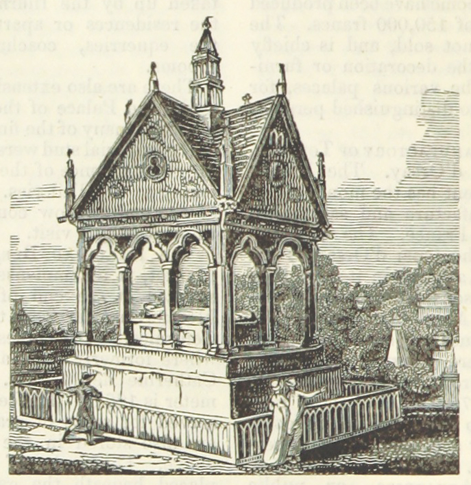
grave - Despite my punning post title, the grave in which a corpse is buried is unrelated to the grave meaning “weighty, serious.”  The six feet under grave derives from an Old English root meaning “to dig,” still around in the word engrave, making it particularly appropriate that some of these illustrations are wood engravings.  Although graves of various sorts have been dug since time immemorial, people didn’t turn in their graves until about 1888.


cemetery - Coming into English in the late 14th century, by way of Old French, by way of Late Latin, the word comes from the Greek for “sleeping place, dormitory.”  The ancient Greeks had certainly used the metaphor or euphemism of sleep to refer to death, but it was the early Christians who first used the Greek word for “sleeping place” to refer to burial 
grounds.  Let’s hope their sleep remains quiet.


        So now you know where the bodies are laid, and should you encounter any of the spirits that may arise from them, you can refresh your memory with a prior episode: Words of the Month - Ghosts.


[Pictures: Sarcophagus of Torsten Stålhandske, wood engraving by J.E. from Sveriges Historia, 1877 (Image from British Library);

Tomb of Abelard and Heloise, wood engraving from Appleton’s European Guide Book, 1875 (Image from British Library);

Procession in Crypt, wood block print by M.C. Escher 1927 (Image from WikiArt);

Wood block print from Dicks’ English Library of Standard Works, 1884 (Image from British Library).]

October 24, 2022

Autumn in the Wood(block)s

         It’s time for some relief block prints featuring scenes of autumn, and although I’m always pushing the whole black-and-white thing, autumn really needs to be all about the colors.  I have begun with one black and white woodblock: a sort of personification of Autumn, with his basket full of harvest and his hair full of wheat or other grains.  Some geese (perhaps) are flying south in the sky, and the tree looks a little more like bare twigs than leaves.  I like this little piece, but I still crave those autumnal reds and yellows.
        The second piece puts a particularly intense red in the foreground, with somewhat more muted tones on the other side of the waterfall.  All the warm colors are balanced by the particularly blue water.  This is certainly the sort of scenery people travel and hike to enjoy.
        We fly straight from fall in Japan to fall in Kansas, and a block that uses at least seven colors, but basically only blues and yellows.  I love that there is no black or really dark block, 
giving the whole scene a dreamy, hazy quality.  It certainly isn’t black-and-white, but it still feels almost monochromatic (bi-chromatic, anyway), and all the shapes of subtly different colors build up into an autumn scene washed in scintillating sunshine.
        The next two scenes have some things in common: wide range of colors, blue skies, green hills, mountains in the background, bright trees as focal points…  There are also some differences, however, and perhaps the treatment of the sky is the most obvious.  Baumann’s sky, on the right, is quite solid and smooth, except for his interesting strip of very geometric gradation across the top.  Loughridge’s sky, on the left, 
includes not only a gradation involving three layers of blue and a pale grey hatched across one another, but also squiggles of pink.  The pink squiggles themselves actually include two layers of color, and I am particularly fascinated by their casual sketchiness, making no effort to be “realistic” in the sense of copying actual patterns in the actual sky.  There’s really a lot going on here, and the various layers of colors and textures in the leaves and river stones are just as complex.
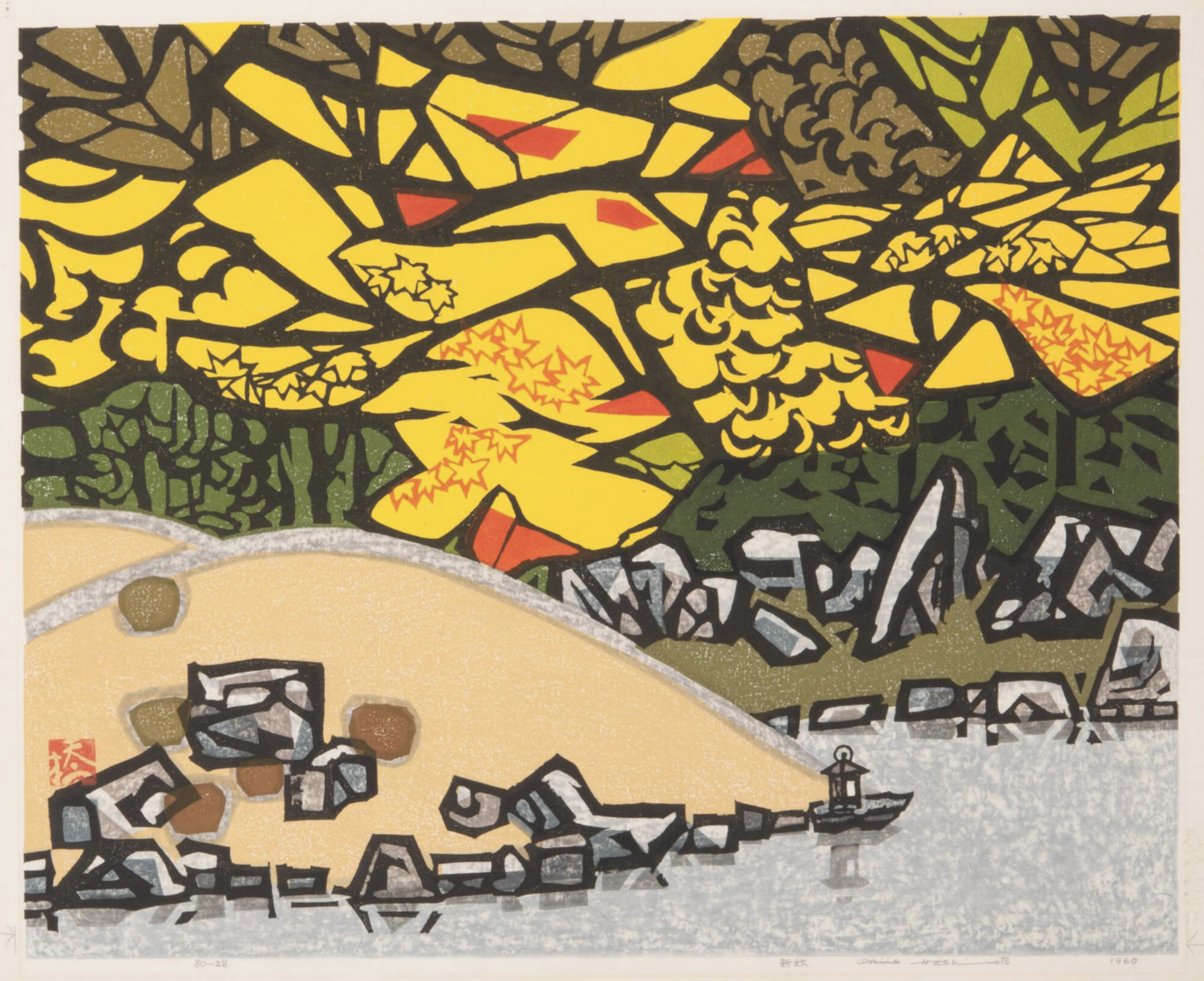
        Finally, back to Japan for a “modern” piece with blocks of solid color and strong, graphic outlines rather than subtly overlapping colors.  I don’t like this one as much, but it’s certainly interesting for variety, and there’s some fun stuff going on.  For example, the pattern of the grey is probably made by using a block that has a rough, all-over surface texture that caught the ink differently.  Despite the very bold design, there are also some subtle details, such as the orange maple leaves, and the precise lantern with its reflection in the grey water.
        Maybe you live in a part of the world where fall doesn’t have such bright colors as in these higher latitudes, or perhaps where you live it isn’t autumn at all right now.  But for me, I’m celebrating this annual blaze of yellow, red, and orange, lighting up my days whether the skies are vivid blue or thick, low grey.


[Pictures: Autumn, wood block print from A Little Pretty Pocket-Book by Isaiah Thomas, 1787 (Image from Library of Congress);

Autumn at Choshi Waterfall, wood block print by Ito Takashi, 1940s-50s (Image from Moonlit Sea);

Autumn in Kansas, color linocut by Herbert J. Demmin, mid-20th century (Image from Marianna Kistler Beach Museum of Art);

Golden Sentinels, woodblock print by Leon Loughridge, 20th century (Image from Ann Korologos Gallery);

The Sycamore, woodblock print by Gustave Baumann, 1916 (Image from Gerald Peters Gallery);

Lakeside in the Fall, woodcut by Hashimoto Okiie, 1967 (Image from Marianna Kistler Beach Museum of Art).]