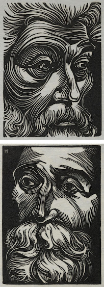
Lorenzo Homar (Puerto Rico, 1913-2004) worked as a graphic artist, a jewelry designer, and a soldier (during World War II), but of course it’s his wood block prints I care about. My absolute favorites are these two faces. My quick research revealed that the subjects of these portraits were advocates for Puerto Rican independence, as well as being interested in abolition, equality, and literature. I know practically nothing about this area of history, so I’m leaving aside the biographies and sticking to what Homar has put into these images. In his portraits, these are wise men, thoughtful, kindly, a little sad, but with beautiful visions. The way Homar has used light and shadow and the curves of lines to evoke these expressions is masterful. I love the curl of hair and beards, the bridges of noses, the faraway eyes. Seriously, these may have joined my list of top favorite portraits ever (which admittedly is a fairly long list, but still).
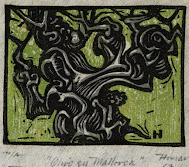
For variety, though, I’ve included a few other pieces by Homar that have a slightly different style. (I’ll note while I’m at it that this post is not even remotely representing the full range of Homar’s style, since his graphic work goes off in all sorts of other directions. I am simply offering a sampling of my favorites of his block prints.) So, next up is a very small portrait of an olive tree. Like the men, it’s old and curly, and probably has great wisdom. I think I might like it even better without the green background because it would have higher contrast against white, but I do like the touches of grey
shading on the deeply ridged bark.
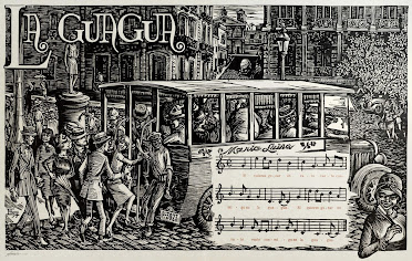
We go from fairly small and simple to large and extremely detailed. This picture of people crowding onto a city bus was one of a series of large pieces illustrating Puerto Rican folk songs. There are all sorts of wonderful touches, from the details of architecture in the background to the clothes, expressions, and postures of the varied people. It leaves no doubt that Homar was a master of his medium.
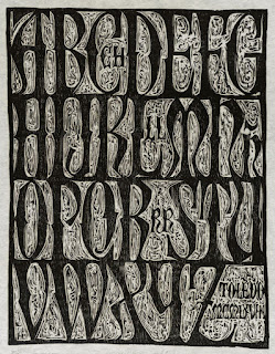
And finally a piece presumably inspired by his work in typography, a Spanish alphabet. I love the font, but just as interesting is the background. Many renaissance decorative capitals had very detailed backgrounds featuring white botanical or arabesque designs against cross-hatched shading. Homar has evoked this aesthetic with carving that, when you look at it closely, turns out to be rather rough carving and the natural wood grain. It’s amazing to me when something can be
simultaneously rough and refined, simple and detailed.
I enjoyed discovering this artist whom I hadn’t encountered before.
[Pictures: Betances, wood engraving by Lorenzo Homar, 1960;
De Hostos, wood engraving by Homar, 1961;
Olivo en Mallorca, wood block print by Homar, 1967;
La Guagua, linoleum block print by Homar, 1954;
Alfabeto Español, wood block print by Homar, 1969 (All images from Princeton University Library).]


No comments:
Post a Comment