Pages

October 28, 2022

Words of the Month - Grave Concerns

         With Hallowe’en looming, the veil is thinning, and many an unquiet spirit is no doubt waiting to come forth from its dark haven and roam the earthly plane once more.  But in the meantime, let’s take a look at some of their possible current accommodations.


sarcophagus - The Greek roots literally mean “flesh-eating,” which is certainly a vivid and visceral way to think of a coffin.  Actually the word applied first to the kind of limestone from which the coffins were made, and was called so because this type of limestone was supposed to decompose bodies especially quickly.  (It shares the Greek root for “flesh” with the word sarcasm, which is so sharp and bitter that it feels like it strips the flesh from your bones!)


coffin - The sarcophagus might eat humans, but humans used to eat coffins.  Although by the 1520s this word referred to the box in which a body is placed for burial, before that it mostly referred to the crust of a pie or pastry.  The primary meaning of the word was “a chest or box for valuables” (from Old French, and related to coffer), but from there it was 
an easy extension to the pastry “box” in which delicious food is baked and served, and eventually the box in which a body is consigned to the earth.


tomb - This one was originally simply a mound, and from burial mounds it transferred to other sorts of burials.  It may be related to catacomb, which might derive from Latin cata tumbas, “among the tombs” — but then again, perhaps not!  The word catacomb is, as they say, of obscure origin.  Which perhaps is fitting for the obscurity of what may happen after death.


crypt
- A proper crypt should be hidden, since that’s what the Greek root of the word means.  It’s the same root as in cryptic, cryptography, and so on.  Crypt came into English first as a “grotto or cavern,” and referred to an “underground burial vault” by the end of the eighteenth century, just in time for gothic romances.


grave - Despite my punning post title, the grave in which a corpse is buried is unrelated to the grave meaning “weighty, serious.”  The six feet under grave derives from an Old English root meaning “to dig,” still around in the word engrave, making it particularly appropriate that some of these illustrations are wood engravings.  Although graves of various sorts have been dug since time immemorial, people didn’t turn in their graves until about 1888.


cemetery - Coming into English in the late 14th century, by way of Old French, by way of Late Latin, the word comes from the Greek for “sleeping place, dormitory.”  The ancient Greeks had certainly used the metaphor or euphemism of sleep to refer to death, but it was the early Christians who first used the Greek word for “sleeping place” to refer to burial 
grounds.  Let’s hope their sleep remains quiet.


        So now you know where the bodies are laid, and should you encounter any of the spirits that may arise from them, you can refresh your memory with a prior episode: Words of the Month - Ghosts.


[Pictures: Sarcophagus of Torsten Stålhandske, wood engraving by J.E. from Sveriges Historia, 1877 (Image from British Library);

Tomb of Abelard and Heloise, wood engraving from Appleton’s European Guide Book, 1875 (Image from British Library);

Procession in Crypt, wood block print by M.C. Escher 1927 (Image from WikiArt);

Wood block print from Dicks’ English Library of Standard Works, 1884 (Image from British Library).]

October 24, 2022

Autumn in the Wood(block)s

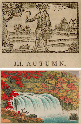
         It’s time for some relief block prints featuring scenes of autumn, and although I’m always pushing the whole black-and-white thing, autumn really needs to be all about the colors.  I have begun with one black and white woodblock: a sort of personification of Autumn, with his basket full of harvest and his hair full of wheat or other grains.  Some geese (perhaps) are flying south in the sky, and the tree looks a little more like bare twigs than leaves.  I like this little piece, but I still crave those autumnal reds and yellows.
        The second piece puts a particularly intense red in the foreground, with somewhat more muted tones on the other side of the waterfall.  All the warm colors are balanced by the particularly blue water.  This is certainly the sort of scenery people travel and hike to enjoy.
        We fly straight from fall in Japan to fall in Kansas, and a block that uses at least seven colors, but basically only blues and yellows.  I love that there is no black or really dark block, 
giving the whole scene a dreamy, hazy quality.  It certainly isn’t black-and-white, but it still feels almost monochromatic (bi-chromatic, anyway), and all the shapes of subtly different colors build up into an autumn scene washed in scintillating sunshine.
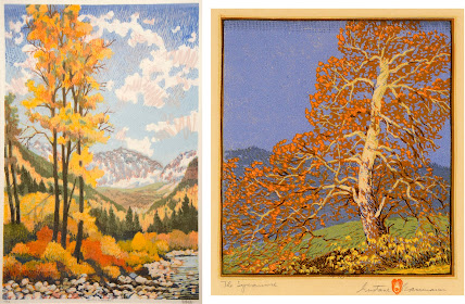
        The next two scenes have some things in common: wide range of colors, blue skies, green hills, mountains in the background, bright trees as focal points…  There are also some differences, however, and perhaps the treatment of the sky is the most obvious.  Baumann’s sky, on the right, is quite solid and smooth, except for his interesting strip of very geometric gradation across the top.  Loughridge’s sky, on the left, 
includes not only a gradation involving three layers of blue and a pale grey hatched across one another, but also squiggles of pink.  The pink squiggles themselves actually include two layers of color, and I am particularly fascinated by their casual sketchiness, making no effort to be “realistic” in the sense of copying actual patterns in the actual sky.  There’s really a lot going on here, and the various layers of colors and textures in the leaves and river stones are just as complex.
        Finally, back to Japan for a “modern” piece with blocks of solid color and strong, graphic outlines rather than subtly overlapping colors.  I don’t like this one as much, but it’s certainly interesting for variety, and there’s some fun stuff going on.  For example, the pattern of the grey is probably made by using a block that has a rough, all-over surface texture that caught the ink differently.  Despite the very bold design, there are also some subtle details, such as the orange maple leaves, and the precise lantern with its reflection in the grey water.
        Maybe you live in a part of the world where fall doesn’t have such bright colors as in these higher latitudes, or perhaps where you live it isn’t autumn at all right now.  But for me, I’m celebrating this annual blaze of yellow, red, and orange, lighting up my days whether the skies are vivid blue or thick, low grey.


[Pictures: Autumn, wood block print from A Little Pretty Pocket-Book by Isaiah Thomas, 1787 (Image from Library of Congress);

Autumn at Choshi Waterfall, wood block print by Ito Takashi, 1940s-50s (Image from Moonlit Sea);

Autumn in Kansas, color linocut by Herbert J. Demmin, mid-20th century (Image from Marianna Kistler Beach Museum of Art);

Golden Sentinels, woodblock print by Leon Loughridge, 20th century (Image from Ann Korologos Gallery);

The Sycamore, woodblock print by Gustave Baumann, 1916 (Image from Gerald Peters Gallery);

Lakeside in the Fall, woodcut by Hashimoto Okiie, 1967 (Image from Marianna Kistler Beach Museum of Art).]

October 19, 2022

Wicked Witches

         This is the time of year when you start to see witches - though more likely it’ll be the plastic ones stuck running into a tree trunk than actual unholy sorceresses sailing through the sky.  Still, with the magic of block prints we can see a variety of visions of witches.  From lone hags to whole covens, engaged in various witchy activities, and dating from 1720 to 1985...  Despite all the variety, though, I have stuck with a few main themes.  First, these witches are all of the wicked variety, and second all relatively old and ugly (except for the one young woman hitching a ride).  I have also given preference to witches riding broomsticks, although I did make exceptions for a couple of particularly famous witches.
        We’ll start with some standard modern Hallowe’eny witches by Gwenda Morgan.  These are more cartoony than horrifying, and each one has her black cat with her.  I like the way Morgan has done the sky, simultaneously making it look stormy and making black witches show up against black night.  But I actually like the ground down below best of all.
        Stepping back to the not so happy part of the history of witches, I have several illustrations from works purporting to tell of actual demonology and witchcraft.  In the old, crude wood block print a woman is approached by two witches and a demon, (and one of the witches is a man).  The witch below is accompanied by a crow, and also by the younger woman who worries me by not holding on at all.  Which is definitely proof of witchcraft, if you ask me!  And the illustration to the right of the grouping shows where we got our image of the witch, the 
pointy hats being simply a standard fashion at the time when witch hysteria was at its height in England.  She’s got her cat with her, but she is riding her broomstick backwards, a variation that used to be more common than it is now.
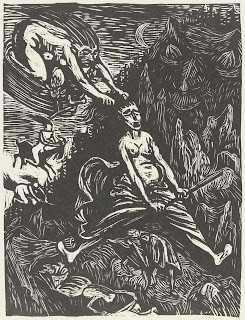
        Moving on to modern art, This wood block print by Ernst Barlach illustrates Walpurgisnacht in a scene from Goethe’s Faust.  Walpurgisnacht is actually April 30, not October 31, but it’s the night when Germanic witches gather on the mountaintops for their revels.  You can see that a couple of these witches are riding broomsticks, but one is also riding a goat, another traditional witch’s mount, and I’m not actually sure what the one in the top left is using for transportation.
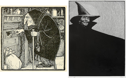
        The next two pieces illustrate particularly famous witches.  First is the wicked witch from the fairy tale “Hänsel and Gretel.”  Here she is feeling the bone that Hänsel holds out through his prison, and wondering why he doesn’t seem to be fattening up.  I just love Batten’s depiction, with the curve of the nose reflecting the curve of the back, the wonderful black robe, the bunch of big keys and the woolly slippers…  By contrast, Moser’s Wicked Witch of the West has almost no detail at all, just one huge swirl of black cape and a gleam of madness in her eye.  (In case you’re old enough and are thinking she looks a little familiar, Moser modeled her after Nancy Reagan!)  Moser is famous for his black shadows, and they certainly do the job when it’s a wicked witch we’re looking at.
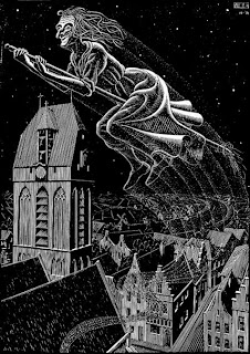
        And finally another somewhat comic witch by Escher.  This witch’s goofy grin makes her seem more bonkers than evil.  Her broom seems to have lost most of its straw, but I do like the swoosh lines showing how she’s zigzagged up from the Dutch city below (Oudewater).  And we end as we began, with my particular delight in the ground below.
        Real witches would be terrifying.  Real witchcraft accusations against innocent people are terrifying.  And that's why I definitely like to keep my witches confined to art.


[Pictures: Midnight Madness, wood engraving by Gwenda Morgan, 1955 (Image from Kevis House Gallery);

Three Persons upon three Broom-staves, wood block print from The History of Witches and Wizards by W.P., 1720 (Image from wellcome collection);

A Witch of about the middle of the Fifteenth Century, engraving by F. Armytage from Demonology and Witchcraft by Scott, 1868 edition (Image from MFLIBRA);

The Ride through the Murky Air, engraving by John Gilbert from The Lancashire Witches by W.H. Ainsworth, 1854 (Image from Project Gutenberg);

Goethe Walpurgisnacht, woodcut by Ernst Barlach, 1922 (Image from V&A);

The Witch, illustration by John D. Batten from Hansel and Gretel, 1916 (Image from Monster Brains);

The Wicked Witch of the West, wood engraving by Barry Moser from The Wonderful Wizard of Oz by Baum, 1985 edition (Image from Invaluable);

Scholastica (Flying Witch), woodcut by M.C. Escher, 1931 (Image from Skot Foreman Gallery).]

October 14, 2022

Limited Edition

         This weekend I will be at Roslindale Open Studios, always one of my favorite shows of the year, and back after covid-induced hiatus for the first time since 2019.  I’m very excited, and hope to see huge crowds of past and future art fans!  Because I’ll be there doing my best to be commercially enticing, and because I was talking a little bit about open versus limited edition prints with my fall printmaking class this week, I thought now was a good time to share a little summary of the concept of limited edition prints.
        The edition is the number of pieces printed from a block.  An open edition means that as many pieces will be printed as possible - as many as the block can produce before it wears down, and/or as many as there is a market for.  This was the traditional practice for centuries in both Europe and Asia, when wood block prints were viewed primarily as a method of reproduction, and primarily as a mass market medium.  (By the way, all this history is also true of intaglio techniques and other hand-made printing techniques, but I’m not bothering to mention them as much, since this blog focusses on relief block printmaking.)  In many cases blocks that began to sustain wear and damage were actually re-carved in order to extend their life.  You can see a bit about this in my previous post on the famous “Under the Wave at Kanegawa.”  Blocks were often printed on demand, and sometimes reworked by other artists after the original artist’s death.  Nowadays impressions made from the original version of a block, as supervised by the original artist, are of course considered more valuable - when it’s possible to confirm.  But at the time it was mostly just a matter of what the market would bear.
        Artists such as Albrecht Dürer, Hans Holbein, and Hans Leonhard Schäufelein all produced wood block prints as the equivalent of how poster or postcard reproductions of fine art are used today (as you can see in the linked posts).  Images of saints, the Totentanz, and the Power of Women themes were popular mass market prints.  After all, wood block printing was initially the only form of reproduction possible (followed by copper engraving, etching, lithography, etc.)  Some media are more fragile than others, of course, but wood blocks are relatively robust.  Certainly hundreds of impressions can be made without significant wear to the block, so there are fewer practical limits for wood block prints than for some other printmaking techniques.  So why did the practice of limiting editions of woodcuts arise?
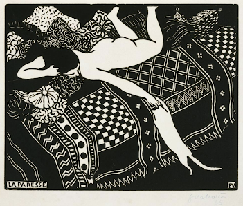
        As various photomechanical methods of reproducing images were invented and refined throughout the 19th century, they became much cheaper and easier than the older methods that involved so much work done by skilled artists and artisans.  Since relief printmaking was no longer considered the best method of reproduction, a number of artists in the west began reclaiming and exploring relief block printmaking as an artistic medium in its own right.  Artists such as Paul Gauguin, Félix Vallotton, and later Matisse and Picasso began to make works that were conceived as wood and linoleum block prints, rather than mere reproductions of other media, and they explored the unique properties of the relief print medium.  In Japan, too, by the middle of the 20th century there was a movement for artists to design, carve, and print their own works, rather than making designs which publishers then reproduced ad infinitum.  (You can read more about this movement here.)
        These artists working in relief printmaking were eager to make a distinction between their own works of art, made by hand by themselves, and the new methods of reproduction that used purely mechanical processes and did not require the hand of the artist.  The idea of the limited edition helped artists show that their prints were works of original art, even if there were multiples, rather than mere reproductions.  Both the scarcity of works in a limited edition and the reminder that each one is an original, contributes to their value.  Limited editions allow artists to price their hand-made works higher than just the equivalent of a poster.
        A limited edition print is labelled by the artist, usually in pencil below the image, and including the number of the piece within the edition and the total number in the edition (given as a fraction), as well as the artist’s signature.  In older prints, using printmaking methods with large editions and gradual degradation of the plate, the lower numbers in an edition may be considered more valuable, but in modern printmaking there’s little substance to the idea.  For one thing, editions are kept small enough that the block or plate doesn't wear down before an artists stops using it.  For another thing, the ordering of the numbers may have nothing to do with the order in which each piece was actually printed.  In my own case, after printing a whole bunch, I gather them all up, go through them, decide which ones are of sufficient quality to be included in the edition, and destroy all the others.  I then number the whole edition, and by that point the pieces have been shuffled around so much that they could be in any old order.
        Also, in general, the smaller an edition, the more valuable the prints are.  Under this principle, my work is extremely valuable, because I make such small editions, usually only around 10.  (On the other hand, I’m a small-time artist, so my work isn’t very expensive anyway!)
        Nowadays lots of different products from Barbie dolls to cars may be produced in limited editions with this idea of raising the value of something through scarcity.  But don’t forget that the real value of limited edition prints isn’t just the number, but the fact that each one is made by hand by the artist.  (And a bit more about that at prior post “Original or Reproduction.”)  So, are you ready to see some of my original limited edition prints this weekend?  I’ll see you at Roslindale Open Studios!


[Pictures: Detail of Anchored in the Living Sea, rubber block print by AEGN, 2005;

La Paresse, woodcut by Félix Vallotton, 1896 (Image from The Museum of Fine Arts, Houston);

The Devil Speaks, woodcut by Paul Gauguin, 1893-4 (Image from The Met);

Bowl of Begonias I, linocut by Henri Matisse, 1938 (Image from Minneapolis Institute of Art).]

October 10, 2022

A Poem for Hallowe'en

         James Whitcomb Riley (USA, 1849-1916) was famous for his poetry written in Indiana dialect, much of it for children, often humorous or sentimental, and supposed to represent ordinary folks.  He was especially famous in his lifetime for his live performances of his poems.  This poem is based on a 12 year old orphan girl named Allie, who worked for Riley’s family when he was a young teen.  He had written the poem in 1885 as “Little Orphant Allie,” but it was printed as “Annie” because of a typesetter’s mistake.

Little Orphant Annie’s come to our house to stay,
An’ wash the cups an’ saucers up, an’ brush the crumbs away,
An’ shoo the chickens off the porch, an’ dust the hearth, an’ sweep,
An’ make the fire, an’ bake the bread, an’ earn her board-an’-keep;
An’ all us other children, when the supper-things is done,
We set around the kitchen fire an’ has the mostest fun
A-list’nin’ to the witch-tales ‘at Annie tells about,
An’ the Gobble-uns ‘at gits you
Ef you
Don’t
Watch
Out!


Wunst they wuz a little boy wouldn’t say his prayers, —
An’ when he went to bed at night, away up-stairs,
His Mammy heerd him holler, an’ his Daddy heerd him bawl,
An’ when they turn’t the kivvers down, he wuzn’t there at all!
An’ they seeked him in the rafter-room, an’ cubby-hole, an’ press,
An’ seeked him up the chimbly-flue, an’ ever’-wheres, I guess;
But all they ever found wuz thist his pants an’ roundabout: —
An’ the Gobble-uns ‘ll git you
Ef you
Don’t
Watch
Out!


An’ one time a little girl ‘ud allus laugh an’ grin,
An’ make fun of ever’ one, an’ all her blood-an’-kin;
An’ wunst, when they was “company,” an’ ole folks wuz there,
She mocked ’em an’ shocked ’em, an’ said she didn’t care!
An’ thist as she kicked her heels, an’ turn’t to run an’ hide,
They wuz two great big Black Things a-standin’ by her side,
An’ they snatched her through the ceilin’ ‘fore she knowed what she’s about!
An’ the Gobble-uns ‘ll git you
Ef you
Don’t
Watch
Out!


An’ little Orphant Annie says, when the blaze is blue,
An’ the lamp-wick sputters, an’ the wind goes woo-oo!
An’ you hear the crickets quit, an’ the moon is gray,
An’ the lightnin’-bugs in dew is all squenched away, —
You better mind yer parunts, an’ yer teachurs fond an’ dear,

An’ churish them ‘at loves you, an’ dry the orphant’s tear,
An’ he’p the pore an’ needy ones ‘at clusters all about,
Er the Gobble-uns ‘ll git you
Ef you
Don’t
Watch
Out!


        There are two points I want to mention regarding this poem and where it stands in the world of speculative fiction.  First is the idea of telling scary stories - and having “the mostest fun” listening to them.  From time immemorial people have gathered around campfires and in darkened rooms to amuse each other with the telling of horror tales.  Intellectually I understand the idea of flirting with fear in a safe setting, but at a gut level I’ve never understood this at all; I just don’t find fear in any way enjoyable.  I seem to be one of that small minority who simply doesn’t like being scared - but the rest of you can carry on and live it up this Hallowe’en!
        The second spec fic staple this poem uses is the nursery bogey.  Nursery bogeys are creatures used to scare children into good behavior and to warn members of a community of the dangers of breaking community mores.  I’ve mentioned a number of nursery bogeys in past posts, including the Ninki Nanka and kelpie who will get you if you stray too close to dangerous waterways, and Krampus, who will punish you if you misbehave before Christmas.  Little Orphant Annie tells of monsters that punish children who mock their elders or don’t say their prayers.  Once again, this is not my favorite aspect of fantasy, but once again, humans seem to have been employing it since the dawn of language.
        At any rate, Riley has had fun invoking the “enjoyable” kind of horror in this poem.  You can actually hear him performing it here!  Although since he was recorded on a phonograph record in 1912, it’s not very clear.  (Further trivia that illustrates the popularity of the poem: the red-headed comic strip-cum-Broadway character (debuted in 1924) was named after Riley’s poem, although she doesn’t seem to have much in common beside the name.  Neither does the also-red-headed Raggedy Ann doll, who in 1915 was named after a combination of two poems by Riley: “Little Orphant Annie” and “The Raggedy Man.”)


[Pictures: Little Orphan Annie, illustration by Ethel Franklin Betts, 1892 (Image from Project Gutenberg);

Film still from “Little Orphant Annie” directed by Colin Campbell, 1918 (Image from Wikimedia Commons).]

October 5, 2022

Gallery Twist: Flights of Fancy

         Today I was able to get to Gallery Twist in Lexington and see their new show, back after a hiatus of three quarters of a year.  The show is called “Flights of Fancy,” which is a theme into which I could fit just about every piece I’ve ever done!  Not surprisingly, I particularly love this show, with its extra helpings of birds and other flying things, as well as lots of skies, and touches of light, bright colors.
        So yes, this post is to some extent an excuse for me to show off a few of my pieces on display there, and to advertise to those who may be in the general area of eastern Massachusetts that they should come see the show while it’s up (until October 16).  Also, however, I do want to share a few thoughts that this show is bringing to mind.
        1. Everyone should have art in their home.  Whether that’s the posters in the dorm room, the finger paintings by the preschooler, or framed art by “real” artists, art should not be too highbrow, too expensive, too pretentious, or too precious for anyone.  Or rather, while some art is certainly highbrow, and some is certainly expensive, don’t let that fool you into thinking that it all is.  Art, like nature, is something we may not think we truly need, and yet without it we just don’t thrive.  One of the things I like about Gallery Twist is that it is a home.  Yeah, it’s a dang fancy, beautiful home, and goodness knows we don’t all get to live in houses like that!  But nevertheless, the art is displayed in a way that reminds you you’re not in a museum; this is art that you can consider living with.
        2. Art should bring you joy.  Well, perhaps that’s obvious, especially given point 1, yet all those people who buy art as an investment, or as a status symbol, or who let the decorator buy some random fashionable thing that matches the carpet - they’re all missing the point.  Everyone should have art in their home, but it shouldn’t be just any art.  It should be art that makes them happy.  Another thing I like about Gallery Twist is how clearly the owners love the art they sell.  You can tell by the care, humor, and creativity with which the pieces are displayed that Gillian and John have enjoyed hanging each and every one.
        3. You can fall in love with individual pieces of art, but the magic can be magnified when there are more.  What are the common themes that draw little clusters and collections together: colors, subjects, memories, associations?  It’s always fun to see all the wonderfully diverse artwork at Gallery Twist, but what makes it even more fun is the arrangements.  What neighbors have my own pieces been given, and what elements get highlighted depending on how they’re rubbing shoulders?  Two different black and white astronauts; two people with their heads tipped ahead in the same posture; horses with wings, and funny birds, and shades of blue and green; swirls and doodles and touches of red…  It's a delightful chorus of art!
        If you want to know more about any of the pieces here, especially the work by other artists, you can find it all on the Gallery Twist web site.  What subjects, colors, mediums, or other themes are you especially drawn to?  What art do you most enjoy?


[Pictures: Between the Clouds, rubber block print by AEGN, 2010;

It Takes a Flock, rubber block print by AEGN, 2021;

One Giant Leap, rubber block print by AEGN, 2019;

Night Flight, rubber block print by AEGN, 2022;

Pandora Dreaming, wood block print with watercolor by AEGN, 2005, plus work by other artists in each view (Photos by AEGN, 2022 at Gallery Twist).]