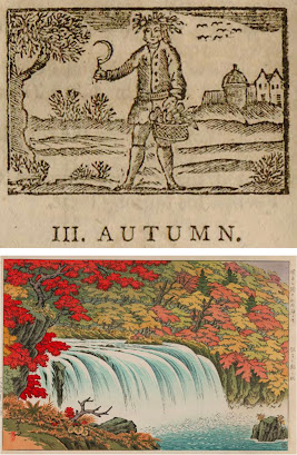
It’s time for some relief block prints featuring scenes of autumn, and although I’m always pushing the whole black-and-white thing, autumn really needs to be all about the colors. I have begun with one black and white woodblock: a sort of personification of Autumn, with his basket full of harvest and his hair full of wheat or other grains. Some geese (perhaps) are flying south in the sky, and the tree looks a little more like bare twigs than leaves. I like this little piece, but I still crave those autumnal reds and yellows.
The second piece puts a particularly intense red in the foreground, with somewhat more muted tones on the other side of the waterfall. All the warm colors are balanced by the particularly blue water. This is certainly the sort of scenery people travel and hike to enjoy.
We fly straight from fall in Japan to fall in Kansas, and a block that uses at least seven colors, but basically only blues and yellows. I love that there is no black or really dark block,
giving the whole scene a dreamy, hazy quality. It certainly isn’t black-and-white, but it still feels almost monochromatic (bi-chromatic, anyway), and all the shapes of subtly different colors build up into an autumn scene washed in scintillating sunshine.
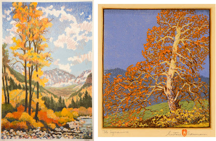
The next two scenes have some things in common: wide range of colors, blue skies, green hills, mountains in the background, bright trees as focal points… There are also some differences, however, and perhaps the treatment of the sky is the most obvious. Baumann’s sky, on the right, is quite solid and smooth, except for his interesting strip of very geometric gradation across the top. Loughridge’s sky, on the left,
includes not only a gradation involving three layers of blue and a pale grey hatched across one another, but also squiggles of pink. The pink squiggles themselves actually include two layers of color, and I am particularly fascinated by their casual sketchiness, making no effort to be “realistic” in the sense of copying actual patterns in the actual sky. There’s really a lot going on here, and the various layers of colors and textures in the leaves and river stones are just as complex.
Finally, back to Japan for a “modern” piece with blocks of solid color and strong, graphic outlines rather than subtly overlapping colors. I don’t like this one as much, but it’s certainly interesting for variety, and there’s some fun stuff going on. For example, the pattern of the grey is probably made by using a block that has a rough, all-over surface texture that caught the ink differently. Despite the very bold design, there are also some subtle details, such as the orange maple leaves, and the precise lantern with its reflection in the grey water.
Maybe you live in a part of the world where fall doesn’t have such bright colors as in these higher latitudes, or perhaps where you live it isn’t autumn at all right now. But for me, I’m celebrating this annual blaze of yellow, red, and orange, lighting up my days whether the skies are vivid blue or thick, low grey.
[Pictures: Autumn, wood block print from A Little Pretty Pocket-Book by Isaiah Thomas, 1787 (Image from Library of Congress);
Autumn at Choshi Waterfall, wood block print by Ito Takashi, 1940s-50s (Image from Moonlit Sea);
Autumn in Kansas, color linocut by Herbert J. Demmin, mid-20th century (Image from Marianna Kistler Beach Museum of Art);
Golden Sentinels, woodblock print by Leon Loughridge, 20th century (Image from Ann Korologos Gallery);
The Sycamore, woodblock print by Gustave Baumann, 1916 (Image from Gerald Peters Gallery);
Lakeside in the Fall, woodcut by Hashimoto Okiie, 1967 (Image from Marianna Kistler Beach Museum of Art).]


No comments:
Post a Comment
I love to hear from you, but please no spam, ads, hateful language, or other abuse of this community.