Pages

October 30, 2023

Words of the Month - Ye Olde TH

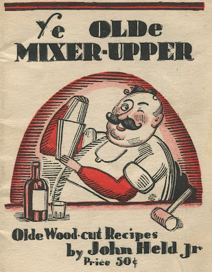
         The phrase “ye olde” (pronounced yee oldee) now denotes consciously old-fashioned things, especially those that are particularly cheesy, artificially quaint, and inclined toward trapping ignorant tourists.  Most people are under the vague impression that the phrase is genuine, if perhaps overused, and indeed it is — sort of.  Let’s clear the biggest issue out of the way at once: “ye olde” was never pronounced yee oldee.  During the time when this was a legitimate spelling, it was pronounced “the old,” just as the words have come to us today.  The -e on olde simply represented the fact that spelling was not yet standardized, and other variants including auld, alde, awld, ole and old were just as common.  Today we’re going to spend more time looking at the spelling of the sound that we now spell th.
        The -th- sound (technically a dental fricative, either voiceless /θ/ as in thumb, or voiced /ð/ as in them) is relatively rare in world languages, and while Old English and Greek have it, Latin and most other European languages do not.  Greek spelled the sound with the theta θ, and when Latin borrowed Greek words that included it, they usually spelled it th, but most often pronounced it as a simple t.  That’s come down in the pronunciation of Romance languages.  Meanwhile, Old Norse and Old English used the letter thorn þ to represent the unvoiced variant, and eth ð to represent the voiced version.  So far, so good.  But of course it wasn’t long before Latin collided with Old English…
        Old English occasionally spelled things with th on the Roman model, and when the Norman French turned Old English into Middle English, they also brought their own version of spelling.  Indeed, they drove poor eth to extinction by around 1250.  Thorn, however, was made of sterner stuff and lasted quite a bit longer.  It was especially inclined to persist in the very common words such as þat, þis, and þe.  After all, it’s shorter and quicker to write.  (If you’re paying attention, you should be thinking, “But shouldn’t those words be spelled with eth rather than thorn?”  And you’d be right, except that a) eth was extinct by now and b) English was never as precise about spelling as Old Norse!)  So far, so good (for thorn, if not for eth).  But of course then Gutenberg had to go and invent that printing press…
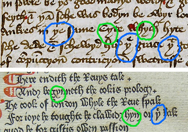
        The printing press reached England around 1475, but although we always talk about the press, it wouldn’t have done much good without the moveable type that went with it.  Most of the type in England was originally imported from the continent and therefore didn’t include pieces for the letter thorn, which wasn’t in use where the type was being made.  What to do about the missing letter?  Sometimes printers used y in place of þ because the shape was somewhat similar, and that’s how we end up with ye olde.  It’s simply an orthographic variant of þe olde and was always intended to be pronounced as such.  If you look at a couple examples of fifteenth century orthography, you can see the similarity between the two.  I’ve circled eths in blue, and y’s in green.  In the first example, handwritten around 1440, you can see that the two letters are practically indistinguishable.  In the second example, printed in 1478, the y’s look just like the handwriting, while the thorns are a little different.  (In both, you can see the habit of writing the e above the thorn as a sort of abbreviation for the.)  While Y clearly made a reasonable substitute for thorn, however, its use was not universal, and plenty of people just fell back on th instead.  As printing enforced its standardization on English, th became the winning orthographic solution, which is why today we look at “ye olde” and think it should be pronounced yee.
        As a footnote, however, English spelling still had a lot of confusion to get through before reaching its current state.  In the fifteenth century some overzealous scholars added H to the T’s of words that they thought came from Greek TH origins, such as author and Thames, while other words were borrowed from Romance languages that followed the Latin model of spelling Greek words with th while pronouncing them with t, such as thyme and Thomas.  (For more about the influence of overenthusiastic Latin-loving spelling reformers, see prior post on The Fault in Our Salmon.)  And those are just some of the reasons for the strange variety of spelling and pronunciation of words with th.
        Personally, I really miss eth and thorn and wish we still had them in the English alphabet, along with something new for ch and sh, too!


[Pictures: Ye Olde Mixer-Upper, wood-cut by John Held Jr, 1935 (Image from AbeBooks);

Detail from The Book of Margery Kempe manuscript by Margery Kempe, 1436-48 (Image from The Margery Kempe Society);

Detail from Chaucer’s Canterbury Tales, printed by William Caxton, 1478 (Image from Worcester Cathedral);

The Book Printer, wood block print by Jost Amman from Panoplia omnium illiberalium, 1568 (Image from Internet Archive).]


October 25, 2023

Fantasy Bats

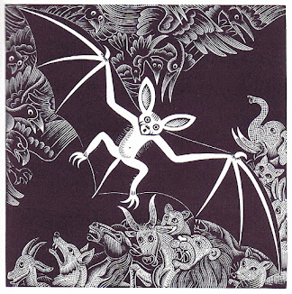
         I’m rounding out my bat kick with a collection of block prints that are truly appropriate to Hallowe’en: magical bats both wondrous and horrifying.  This first little monster is adorable, although I certainly wouldn’t want to find it perched on my shower curtain rod some night!  As far as I can tell it’s just a decorative element and doesn’t have any story that goes along with it, although I can imagine it being some kind of minor demon.
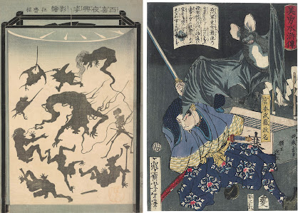
        The next illustration is definitely demons: forms of the One Hundred Night Demons, to be specific.  I’ve chosen the image because the demon at the upper left is clearly bat-like.  This wood block print shows a lantern projecting shadow pictures, and would presumably be right up the alley of anyone who gets into Hallowe’en decor (although being Japanese, it doesn’t have any actual connection to the October 31 holiday, of course).  Paired with it I have another scary Japanese bat.  This wood block print illustrates an epic battle between Miyamoto Musashi and a giant monster bat.  Musashi was a legendary swordsman who had enough battles with monsters that some time I may do a whole post on his depictions, but for our purposes today all we need to do is admire the giant bat as 
fantasy fodder.  With flight, sharp teeth, advantage in the dark, and that whole uncanny otherness, it’s not hard to see why fantasy authors and artists keep coming back to the bat for inspiration.
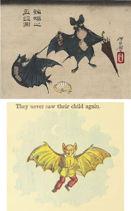
        However, since I’m fond of bats I couldn’t settle just for creepy ones.  Here are a couple of whimsical anthropomorphic bats by the previous artist.  Apparently this is a scene from a fictionalized account of the famous story of the forty-seven rōnin, except illustrated with the characters as bats because… why not?  Isn’t my point these last few posts that everything’s better with bats?  At any rate, I just love the bat with the umbrella!  It has a sort of Cyrano de Bergerac or Scarlet Pimpernel vibe.
        Next is another humanoid bat.  It illustrates the tale of naughty Oswald “The Night Wanderer,” whose parents told him to stay at home in bed and not go wandering at night.  I would say “let this be a lesson to you,” except that it’s actually a little tempting to imagine being transformed into a bat!  In any case, I find the picture quite amusing.
        This wood engraving shows Shakespeare’s spirit Ariel from “The Tempest.”  It's a lovely depiction of a bat as steed, and the white highlights of the moon give a little extra glow.  (I don’t know whether it’s black and white ink on midtone paper, or black and beige on white.)  I did a previous post on Ariel, and you can see a couple more versions of Ariel riding batback at Ariel’s Poetry.
        And finally, I have to include my own fantasy bat, Nycteris & Flederer’s Patent Mechanical Chiropterid (Model 3).  You can also read a previous blog post about the making of this piece.
        Have you had enough bats yet?  I hope that if you see a lot of bat decor around your neighborhood in the next week you will consider it (and, of course, real bats) with a little extra appreciation!


[Pictures: Bat border, wood engraving from Le Diable Amoureaux by J. Cazotte, 1845 (Image from Cornell University Library);

Shadow Picture of the Forms of the One Hundred Night Demons, woodblock print by Kawabe Kyōsai, 1867 (Image from Sackler Gallery, Smithsonian Museum);

Miyamoto Musashi Slashing a Bat, woodblock print by Yoshitoshi, 1866-7 (Image from Fuji Arts);

Bats in the Fifth Act of the Chushingura, woodblock print by Yoshitoshi, 1882 (Image from Fuji Arts);

The Night Wanderer, wood block print from Simple Hans and other funny pictures and stories, 1854 (Image from British Library);

Where the Bee Sucks, wood engraving by John Gilbert from The Songs and Sonnets of Shakespeare, 1862 (Image from Victorian Illustrated Shakespeare Archive);

Nycteris & Flederer’s Patent Mechanical Chiropterid (Model 3), rubber block print by AEGN, 2015 (now sold out).]

October 18, 2023

Waddington's "The Bat"

         While I’m in the midst of my bat theme, it’s time for a fantasy poem.  This one is by Samuel Waddington (U.K., 1844-1923).

Sleek, faery creature,
Strange freak of Nature
That through the twilight comes and goes,
Could we the mystery
Of thy life's history
Resolve, and learn what no man knows,
From what weird forces,
What hidden sources,
Thy winged soul sprang into being
Then might we clearly
Divine more nearly
The world that lies beyond our seeing.

Quaint, mimic angel!
Thy new evangel
Disclose, and share it now with me,
While through the gloaming
Thus lightly roaming,
Thou flittest round this old oak tree;
Tell me what Ages,
What Cosmic stages,
Evolved thy Spirit in the Past;
The far stars glisten,—
Speak, for I listen;
Teach me the Wisdom that thou hast.

Nay, spectral flitter,
Where glow-worms glitter,
Thou art more silent than the sphinx;
Through eras ended
Thou hast descended
Down from the sphere of 'missing links',—
Like pterodactyl
Thy race runs back till
The distance foils our dazèd sight,
To prehistoric,
Rude, allegoric,
Brute offspring of the Infinite.


The Past hath vanished,
From memory banished,
What of the Future canst thou tell?
In words aesthetic,
Sage and prophetic,
Our doubting and our fears dispel;
When life is over
Shall Darkness cover
Thy twilight wanderings with the Night,—
Or from Death's portal
Wilt thou immortal
Speed forth into the realm of light?


Mute mystic rover!
Could we discover
Thy wisdom though thou answer'st not,
There is no human,
Or man or woman,
But hath the knowledge thou hast got;
We know we know not!
The gods bestow not
On thee a wider, clearer view;—
Thou art surrounded,
On all sides bounded,
By thine own ignorance,—adieu!


        I’m not sure this poem is really exactly fantasy as much as perhaps fantastical musings on the nature of the bat.  But its imagery and metaphors definitely evoke a lot of fantasy, starting right in line 1 when the bat is called a “faery creature.”  I like the references to “winged soul,” “more silent than the sphinx,” “offspring of the Infinite,” “mystic rover,” and so on.  On the other hand, I don’t agree with the conclusion that despite all that eloquently invoked mystic wisdom, the bat is wholly bounded by ignorance!  Not that I think the actual little animals carry the burden of so much lore, but still, they’re undoubtedly masters of their own way of life.


[Picture: Fruit Bat, linocut by Kerry and Neil Stavely (Image from the artists’ Etsy shop HorseAndHare).]

October 13, 2023

Bats

         On Friday the Thirteenth in the month of Hallowe’en, I thought I should pick a “spooky” theme, and I decided on bats.  Of course, once I started looking for bat block prints, I found so many that I decided to make two posts, and today we’ll start with nice, normal bats.  I picked bats as a “spooky” theme, but in fact I really like them, and don’t personally find them spooky at all.  In fact, whenever I see them flitting about of a summer evening, it really cheers me up.  On the other hand, there’s no doubt that they’re very alien and strange in many ways, so it’s understandable that people have always found them mysterious.  Today’s first bat is a whimsical one by Artzybasheff, illustrating the fable in which the poor bat is neither a bird nor a beast, reflecting that strange “otherness.”
        Next I have a few older illustrations, starting with one from a 1499 edition of an encyclopaedia in which bats are listed in the section on birds.  (I don’t know what the Latin text says that might explain the sack-like thing on the right.)  These bats are not exactly scientifically accurate, but they’re perfectly recognizable, and they have a certain charm.  The third piece in the group is chronologically next, and is clearly much more scientific, as well as appearing in a book on quadrupeds rather than birds.  It’s by Thomas Bewick, from 1800.  The remaining piece in this grouping is an illustration intended for children, rather than for scholarly adults, and comes from an alphabet, which I’ll discuss more later.
        I definitely wanted to include a selection of Japanese block prints of bats, by way of “compare and contrast.”  The Japanese style tends to be spikier, but also very beautiful.  I’ve chosen three, all from between 1885-1905.  The first is simultaneously bold and dramatic but also very subtle.  The second makes the bats quite adorable.  The third has an amazing level of accurate detail.  This artist must have had some actual bats to observe, and he portrays one flying, but the others clinging to a piece of rock.  And then why not throw in some Japanese maple leaves, just for color and beauty?  It certainly goes with my October theme!
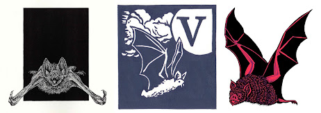
        And as we get in the Hallowe’en mood, the last three illustrations are all vampire bats.  They also all come from animal alphabets (as does the one above, also a vampire bat).  This is no coincidence: there are dozens of popular animals that begin with B, but V’s are considerably harder to find in English, making the vampire bat a much more popular option at V than the plain B is for Bat.  All of these artists were featured back in 
my 2023 A to Z Challenge, so you can see more of their creatures at posts including Robinson (and here), Wightman, and Long (plus here and here).  A few other bats have fluttered into my blog in the past, including one from a French alphabet, a few from another encyclopaedia, and one representing bats as pollinators.  Plus here’s my own block print that includes some beautiful evening bats.
        As I alluded to earlier, there’s going to be another post on block printed bats, and that’s where we’re going to go full Spooky Season.  But in the meantime, take today’s bats as a sure sign of good luck on Friday the Thirteenth!


[Pictures: Bat from Aesop’s Fables, wood engraving by Boris Artzybasheff, 1933;

Vespertilio, wood block print from Ortus sanitatis by Johann Prüss, 1499 (Image from Boston Public Library);

The Short-Eared Bat, wood engraving by Thomas Bewick from A General History of Quadrupeds, 1800 (Image from Biodiversity Heritage Library);

Vampire, wood block print by Walter Crane from Noah’s Ark Alphabet c. 1871 (Image from Toronto Public Library);

Bat in Moon, color woodblock print by Biho Takashi, c. 1905 (Image from Brooklyn Museum)

Bats from The Moon in the Country, wood block print by Kono Bairei, 1889 (Image from Fuji Arts)

Bats Flying About a Large Piece of Tufa, woodblock print by Kawanabe Kyosai, c. 1885 (Image from Worcester Art Museum)

Vampire Bat, wood engraving by Alan James Robinson from An Odd Bestiary, 1982;

V, linocut by Andrew Wightman, c. 2015 (Image from AndrewWightmanPrints);

V, linocut by Mark Long (Image from Linocut Boy).]

October 9, 2023

Glowing Rejections

         My grand experiment in short fiction submission has now been going on for just a little over two years, and in that time I’ve received a lot of rejections, as well as acceptances of 4 stories and 2 poems.  I currently have 5 stories and 3 poems out under consideration and will get out more as more submission windows open.  I continue to Keep the Rejection Pipeline Flowing, living in perpetual hope that the next acceptance may be one of these that’s currently out.  Rejections are easier to shake off and not worry about as long as I still have submissions out, holding open the possibility that although this one failed, maybe the next one will succeed.    Rejections are inevitably depressing and it’s important to keep hope going.  Given this, it’s natural that most authors only want to talk about their acceptances, but today I want to talk about rejections…  Not just any rejections, however, but those I think of as Bridesmaid Rejections.
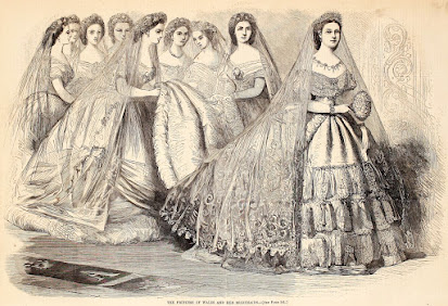
        It’s not an exact analogy, but the term came to me based on the old phrase “always a bridesmaid, never a bride” and it refers to rejections in which the editors tell me how much they loved my work, but sadly they’ve rejected it anyway.  Presumably this is sometimes because they thought it was good, but just not quite good enough, but sometimes it’s also  indicative of the state of publishing, in which editors  receive more stories they love than they can fit in an issue, no matter how much they may want to.  Moreover, their decisions about which stories to publish in a particular issue can’t be based solely on a straight ranking of quality (even if that weren’t impossibly subjective) but also on the combination of a particular mix of stories.  These factors mean that in the past two years I’ve received some positively glowing rejection letters.
        “The word choice and imagery in this piece was magical… It is with a heavy heart that we must let it go.”
        “We really loved this worthy and thoughtful story… Thank you for this haunting, poignant piece, so suffused with despair and defiance, airy lyricism and sharp psychological insight.”
        “This was such a lovely piece that you submitted. Thank you so much for writing this piece.”
        “Your writing is lyrical and precise. It makes me feel confident I am in good hands as a reader.”
        “Thank you for such a contemplative poem… The language sparkles with wonder and precision.”
        I even recieved a rejection that wasn’t so much a Bridesmaid as a Jilted-at-the-Altar Rejection!  “It is with regret that I have to reject your story, not because it wasn’t good enough to purchase, but because I do not have a current publication I can buy it for. …  I wish you all the best with this story. It actually made me tear up to read--it was so good.”  (Assuming this editor meant tear to rhyme with fear and not tear to rhyme with bear!  LOL)
        It’s important to note that most editors do not send comments with most rejections.  They all have their various form rejection letters, and I’ve certainly seen plenty of those.  So personal comments on a piece really are meaningful.  On the one hand, these Bridesmaid Rejections can sometimes feel even more infuriating than a plain old rejection - always so darn close, and yet nothing! - but there is a very positive spin to put on them.  It allows me to think of my submissions as being a way to get professional editors to do my beta reading for me!  (To be clear, I’m not sending stories that I consider to be unfinished or mere drafts.  These are thoroughly polished before I send them out.)  If I get a positive response from an editor it means that my story or poem was indeed effective for someone else: someone who doesn’t know me and has no possible incentive to say anything but what they honestly think.  That’s really nice feedback to get!  It’s also really useful, because my scheme is to publish a collection of my short stories, poems, and art, and Bridesmaid Rejections tell me that I can feel confident about publishing these pieces.  Of my stories that have not been accepted, but which I’ve been sending out a lot, half have received glowing rejections from at least one editor.  So yes, even with only a handful of actual acceptances, these unpublished stories and poems are good, darn it!  (One other note about the handful of acceptances, for those not acquainted with the business: the Science Fiction & Fantasy Writers Association has an industry-standard definition of when a writer can call themselves a “professional.”  In the short story and poetry format, it’s having as few as 3 pieces published by professional-rate-paying markets in a year.  A mere handful of acceptances is common among professional writers.)
        So why do I share all this, anyway?  1. I think it’s important to be honest about the frustrations and disappointments as well as the triumphs.  We all get lots of rejections, and it doesn’t help anyone’s mental state if we try to put on a “perfect” facade to the world and pretend we’re all success all the time.
2. On the flip side, I am kind of bragging.  Frustrating as they are, I’m proud of what these Bridesmaid Rejections tell me about my writing.
3.  The stories that will be included in my upcoming collection need to be pulled from the submission pipeline now, to ensure that I will have the rights to publish them next year.  I’ll keep on sending out the stories that aren’t earmarked for this collection (not to mention that I hope to continue writing more stuff), but it seemed good to celebrate the submission process a little, before it ends for these particular pieces.
        As for this upcoming collection I’ve been alluding to, this is my first teaser announcement: I plan to run a Kickstarter campaign starting in January, for Bittersweetness & Light!  So stay tuned for more information in a few months, as I get ever more excited and immersed in the project.  PREVIEW HERE!


[Pictures: Keep the Rejection Pipeline Flowing, photo by AEGN;

The Princess of Wales and Her Bridesmaids, wood engraving from Harper’s Weekly, April 18, 1863 (Image from Internet Archive);

Draft mock-up of cover design for Bittersweetness & Light by AEGN.]

October 4, 2023

Freedom to Read

         It’s time to celebrate the right to read.  Without access to books (and, of course, the literacy to read and understand them) there can be little true freedom, because what is freedom if people are not free to encounter the ideas of others?  I myself have made quite a few pieces celebrating the joys of reading, but today I’ve collected a small selection of other relief printmakers’ views on the subject.  I say a “small” selection because even though I’ve actually got quite a few today, this is only a small fraction of those I found - it’s a very popular subject!
        Perhaps it’s worth taking a moment to consider why the subject of people reading seems to be such a popular one for artists.  I can think of lots of reasons from the practical to the philosophical.
     1. Readers make easy models!  They’re sitting there in front of you, and they’re holding relatively still for long periods of time.
     2.  Maybe there haven’t been so many book readers before 1500 and after 2000, but for a solid five centuries reading was one of the primary forms of recreation - at least for the same populations that made and appreciated relief prints!  That means it was a subject with universal recognition and appeal for artists.
     3. Going further with that, I would think there’s a pretty high correlation between those who value the freedom of expression through art and those who value the freedom of expression through the written word and books.  When you add to that the fact that many relief print artists were/are in fact book illustrators, it’s an even higher correlation.  So yeah, there are lots of artists who celebrate a love of books.
        In choosing which pieces to feature today, I aimed primarily for variety (variety, of course, within my narrow area of relief block prints).  They date from the 18th century (number 4 and 7) to the 21st century (number 8), although most are from the early and mid 20th century.  The artists hail from Belgium/France (number 1), New Zealand (2), Germany/Canada (3), US (4,6, 8,9), France (5), Japan (7), and Mexico (10).  They represent men, women, and children, and casual reading as well as study.  The styles also cover a range of detail, precision, and stylization.  Most are my favored black and white, but of course there are also a couple with color - for variety!
        My favorites are probably 1, 3, and 10.  What about you?  Do any of these pieces make your heart sing?  And what about your favorite books?  We need art and books to provide windows and mirrors, to open our minds, and to keep us free.  Wherever you live, please be sure to speak out against book banning - especially in schools and libraries.
        If you’re interested in more work by these artists, I’ve featured several of them before, although a few were new to me today - which is always fun!  You can see more here: Masereel plus here and here, Little Pretty Pocket-Book plus here and here, Amen plus here, and McGregor-Radin.  I’ll also note that I’ve previously featured quite a few block prints depicting people reading, and while normally I’d post a bunch of 
links to earlier posts, today it seemed too hard to search them up given how many of my posts feature the words “reading” and “book.”  However, you can see three more good ones here.


[Pictures: Illustration from Die Sonne by Frans Masereel, 1926 (Image from Ader);

Portrait of Winston Rhodes, wood block print by Evelyn Page, c. 1934 (Image from Christchurch Gallery);

Young Woman Reading, woodcut by Horst Deppe (Image from Secord Gallery);

A little Boy and Girl reading, wood block print from A Little Pretty Pocket-Book, 1787 (Image from Library of Congress);

Liseuse, wood block print by Lucien Pissarro, c. 1905 (Image from Tate);

Student, wood block print by Irving Amen, 1960 (Image from Reading and Art);

Actor (probably of the Onoe family) as a woman reading a book, wood block print by Katsukawa Shunsho, 18th century (Image from National Museum of Asian Art);

A Quiet Moment, white line woodcut monoprint by Amy McGregor-Radin (Image from 13 Forest);

Man Reading in a Cabin, woodcut by Rockwell Kent, 1920 (Image from MutualArt);

A Woman Reading, wood block print by Alfredo Zalce, 1942 (Image from The Met).]