Pages

December 28, 2020

Words of the Month - Contrastive Reduplication

         Surely everyone has had the conversation in which your friend says they like the new kid, and you ask, “Do you like him, or do you LIKE like him?”  I think of this as the original and most iconic example of contrastive reduplication (aka contrastive focus reduplication), but of course there are all kinds of ways it can be used.  What’s going on here is that the speaker is trying to clarify an ambiguity.  Compare with another classic familiar to all speakers of English, “Do you mean funny ha-ha or funny peculiar?”  The meaning of the word funny is ambiguous, and the speaker is trying to focus on the correct interpretation by doubling the word with a synonym that will clarify the meaning: “funny peculiar” or “funny ha-ha.”  Contrastive reduplication is doing the same thing, except that instead of clarifying with a synonym, a speaker doubles the ambiguous word with the same word, emphasized.  It doesn’t seem like this would gain us much clarity, but in fact it’s a very commonly used strategy.
        The most common instances are when we’re indicating that the word in question is to be interpreted as the most prototypical definition possible.  As in

   No, I don’t want a safety pin; I need a PIN pin.

   He’s bringing tuna salad, so I’ll make a SALAD salad.

   Is that turkey bacon or BACON bacon?

   Is Dr Smith a PhD doctor or a DOCTOR doctor?

        Sometimes contrastive reduplication is used to clarify that a word is meant literally, rather than merely figuratively or as an exaggeration.

   It’s not really a CRIME crime.

   Wait, you mean he’s actually DEAD dead?

   Are you FINE fine, or just I-don’t-want-to-talk-about-my-problems-right-now fine?

        Some words have an ambiguity between a relatively non-specific literal meaning and a particular connotation of more depth or significance.

   Well, we didn’t really TALK talk.

   I am up.  I’m just not UP up.

   I do housework every day when I’m at home, but I have WORK work three days a week.

        Sometimes it’s really just a matter of emphasis, clarifying between a moderate interpretation of the word and a more extreme one.

   We’re rich, but we’re not RICH rich.

   Sure I’m nervous, but not NERVOUS nervous.

   Sometimes they get snow there, but not SNOW snow.

        To circle back to my initial example, LIKE like, contrastive reduplication is often used for euphemistic words to signify whether or not we mean the particular sense with the innuendo.

   But did you KISS kiss?

   Were they TOGETHER together?  or just, you know, they happened to be together?

   When he says a drink, he means a DRINK drink.

   Are you suggesting we GO OUT go out?

        You can see from these examples (or think up your own) that we use contrastive reduplication with pretty much every part of speech, as well as entire phrases, so the structure is quite flexible.  Sometimes the reduplicated version is contrasted with the word by itself, while other times it’s contrasted with the word paired with a different synonym.  In all cases, the reduplication indicates the interpretation of the word that is stronger, more prototypical, and/or more significant.
        However, the interpretation is very context-dependent, so that to hear reduplication in a vacuum, such as, “Do you think Bert is HOT hot?” may not actually give you a specific meaning.  Is Bert heatstroke hot, or gorgeous hot, or warmer-than-lukewarm hot, or horny hot, or having-a-string-of-successes hot, or something else?  Unlike my use of synonyms to specify different definitions of hot, reduplication doesn’t actually tell us anything.  So what the structure really does is to alert others that there is ambiguity here, and that we are trying to pinpoint which shade of meaning is intended.  Those shades of meaning then have to be inferred from context.  It’s an interesting linguistic phenomenon, in the spirit of which, I hope you all had a happy holiday season in which you could get together with friends and family… but not TOGETHER together, of course.  Stay safe as we make our way out of 2020 and into the new year!


[Pictures: Cabbage, Celery, Lettuce, relief-block print by Stephen Alcorn, 2003 (Image from The Alcorn Studio & Gallery);

The Kiss I, woodcut by Edvard Munch, 1897 (Image from Munch Museum).]

December 21, 2020

Guess that Medieval Beast 5

         Today’s beast for you to guess is not from a manuscript, but from a stone carving at the Rock of Cashel in Ireland.  I don’t have information on this carving in particular, but it probably dates from the 12th or 13th century, along with the majority of structures at the site.  It represents a creature that medieval artists loved to portray, some reasonably accurately, and others quite wildly off-base.  To be fair, it is a hard beast to get your head around if you’ve never seen one in real life.  So, make your guess and then…

December 17, 2020

Winter Games

         Today we are enjoying our first proper snowstorm of the season.  It would be a Snow Day, but with kids remote-learning anyway, school has not been cancelled.  (On the other hand, remote learning is never such a full schedule, and my ten-year-old neighbor is outside my window now, fooling around with a snow shovel.)  My daughter hopes to join a friend for snowpeople once the roads are cleared.  So today seems a good day to celebrate playing in the snow — with block prints, of course.
         First is a scene by Werner Drewes (Germany/USA, 1899-1985 - previous post here).  It’s almost reminiscent of something by Breughel in its busyness and humor.  There is sledding, a snowman, and a snowball fight, plus the person who has fallen down; I can’t tell whether he has skis, or whether the snowman is holding a bundle of twigs or something.  One of the more interesting effects is the black sky.  Are all these activities taking place at night?  Or even during an eclipse?
        By contrast, the lone sledder by Wharton Esherick (USA, 1887-1970) is a clean black and white with few details.  The footprints in the snow imply that the person has trudged up that whole distant slope for the pleasure of one long, smooth, uninterrupted swoop.
        Thomas Morrison Marker (USA, 1901-1978) has depicted more social sledders, although this hill, too, is fairly pristine.  All the good sledding hills in our neighborhood quickly become completely criss-crossed and packed to a shine.  One thing I really like about this print is the choice of a textured paper.  The texture of the paper works perfectly as the texture of the snow, adding nuance to all that carved-away whiteness.
        Next up is a snow sport that I have never seen: ski-joring by Lil Tschudi (Switzerland, 1911-2004).  In fact, I’d never heard of it before finding this block print, but it’s basically the snow equivalent of water skiing, in which the skier is pulled, in this print by a horse.  
I love the unusual use of a round composition for an activity that emphasizes speed and would be spread out quite horizontal in the more obvious view.  It’s very dynamic, with its curved lines and energetic poses.
        I conclude with an adorable piece by Boris Artzybasheff (Russia/USA, 1899-1965 - previous post here).  It’s an illustration of “The Story of a Bold Rabbit,” but as I have not yet read the story, I’m taking the image as a simple picture of rabbits gathering on a snowy night.  They look quite frolicsome, and the snowflakes make beautifully detailed stars.  Perhaps the rabbits will soon go sliding down the hill like the people in the other block prints.

[Pictures: Winter, woodcut by Werner Drewes, 1933 (Image from Smithsonian American Art Museum);

Winter Play, wood engraving by Wharton Esherick, 1928 (Image from Wharton Esherick Museum);

Coasters, block print by Thomas Morrison Marker, 1935 (Image from The Annex Galleries);

Ski-Joring, linocut by Lil Tschudi, 1937 (Image from Cleveland Museum of Art);

The Story of a Bold Rabbit with Cock Eyes and a Short Tail, block print by Boris Artzybasheff from Verotchka’s Tales by M. Siberiak, 1922 (Image from Internet Archive).]

December 11, 2020

Hanukkah Greetings

         I thought I’d celebrate Hanukkah by looking through the wood block prints from a couple of seventeenth-century Jewish prayer books.  Of course, since I can’t read Hebrew, I don’t really know what I’m looking at in most cases, but I wanted to share a few that seemed appropriate.
        First is a man lighting a menorah.  I have two illustrations for you, one from 1611 and the other from 1669.  You can see that the iconography is very consistent, and that becomes even clearer if you check back and compare with another menorah-lighting man I shared a couple of years ago.  It’s entirely possible that the second was directly copied from the first, or that they were both copied from an earlier model.  It’s particularly interesting that the man is dressed the same in both, since presumably fashions would have changed in the fifty-eight years between the two illustrations.  On the other hand, there are two differences.  In the first, the man uses two spills, while in the second he uses a single long spill to light the flames.  Also, the second version decides to include a pitcher.  Why?
        Next I have another set of corresponding illustrations from the same two prayer books.  I don’t know what this is actually illustrating, but I imagined perhaps if the woman were cooking oily food, it would be appropriate for Hanukkah!  However, what it really looks like is that a bowl is hanging (or magically floating?) below a lamp, and this must be significant because the woman has interrupted her cooking to raise her hands to it.  Once again the two pictures are extremely similar, except in being reversed, but once again the second artist has decided to include a pitcher.  Perhaps he (or she) just really enjoyed doing pitchers!
        I include one more illustration from the earlier book, depicting God handing the Ten Commandments to Moses on the top of the mountain.  No, it has nothing in particular to do with Hanukkah, but I liked it.  I especially enjoy the touches of beautifully curly smoke(?) rising up from the mountaintop, and the bell of the trumpet poking down from the clouds to herald this divine visitation.
        I wish a very Happy Hanukkah to all who are celebrating, and may all of us find that the Light in our lives exceeds our fears.


[Pictures: Three wood block prints from Minhagim, 1611 (Images from Universitätsbibliothek Erlangen-Nürnberg);

Two wood block prints from Birkat ham-mazon, 1669 (Images from Bayerische StaatsBibliothek).]

December 7, 2020

Guess that Medieval Beast 4

         It’s time for Round 4 of everyone’s favorite game, and this time it’s a creature I’ve discussed in this blog before.  This illumination appears in a bestiary from 1270, from the J. Paul Getty Museum.  It certainly is a beautiful illustration, with its patterned borders and background, multicolored feathers, and touches of gold…  But what is it?  It has the basic body of a dog, wings like a bird, and it’s placed in something that looks more like a sculpture by Dale Chihuly than anything else (but I’ll give you a hint, in case you haven’t guessed: it’s a fire).  This is one of the creatures that is depicted in quite a broad variety of ways in different bestiaries, but this is nevertheless one of the standard visions.  So, what creature do you think this thirteenth century artist was trying to depict?

December 2, 2020

Holiday Shopping

         This time last year I was busily matting, and framing, and making up extra packets of notecards.  Usually in early December I’m smack in the middle of a whole series of shows and sales.  But of course this year is different.  Most of my usual shows have been cancelled, and those that aren’t cancelled have gone on-line, which is not even remotely the same.  For one thing, seeing art in person is just different; you get a better sense of its size, texture, presence.  It’s more likely to grab you and charm you.  And you can buy it on the spot and walk away with it, ready to wrap for giving or hang for your own enjoyment.  Perhaps even more importantly, in-person shows have a buzz.  There are lots of artists and lots of art-viewers.  Everyone’s out and about with the shared holiday spirit of enjoying art and looking for delight.  It’s a lot more exciting than sitting in your house staring at a screen for the tenth straight hour… even if art is more fun to stare at on the screen than yet another zoom meeting.
        On the other hand, the down-side of in-person shows is that you can be in only one place at a time.  There are a number of holiday shows that friends have recommended to me, but I’ve never participated in because they’re the same weekends as other shows I already participate in.  But on-line I can be in lots of places at once, so this year I’ve joined in the virtual versions of a couple of shows I’ve never done before.  Altogether I’m participating in three shows that are all on-going for the entire month.
        Church of the Redeemer Christmas Market - This is a fund-raiser for the church, to whom I will donate a percentage of my sales.  This is not my faith community, but it is the church where my sister-in-law sings in the choir, and we always go to their Christmas Eve service to enjoy the beautiful music and ceremony.  There are a variety of artists participating, but also other fancy businesses with everything from food to fashion.  Find the participating vendors here.
        Medfield Holiday Stroll - In addition to the listings of participating artists, Medfield TV is hosting a gala event on December 4 from 6-8pm, featuring music, Christmas tree lighting, and videos of artists in their studios.  A couple of very nice, professional young women came out to film me earlier this year, and I’m excited to see what they do with the video.  (I’ll probably cringe hideously to see and hear myself, but hopefully it won’t be too embarrassing!)  There’s a nice variety of arts and crafts in Medfield’s line-up, for some excellent gift-shopping possibilities.  See the artists here, as well as a link to view the live broadcast on-line this weekend.
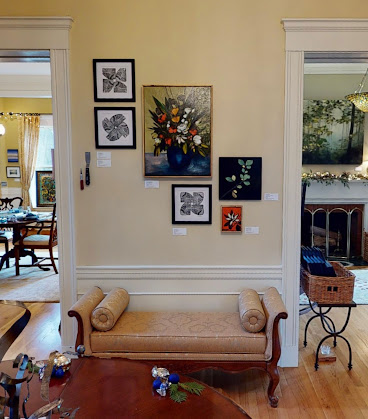
        Gallery Twist “Illumination” - This is the gallery’s annual December show, staged in their beautiful historic building in the center of Lexington.  They can’t hold their usual gala opening reception, of course, but unlike the other shows, the gallery is actually open for in-person visits this month, as long as groups are small and masked.  I do highly recommend it; it’s really fun to see the beautiful and quirky way they’ve arranged the gorgeous and eclectic variety of work.  In addition, they have on-line 360° tours and videos, plus the listings of all the art in the show.  Find all the viewing options and information here.
        My web site - Finally, don’t forget that you can see all my available work on my own web site, and it is easy to purchase directly from me.  Just contact me, whether you want to see some of my pieces in person, or arrange a completely contactless sale.  I’m also happy to answer any questions, of course, so please do let me know.  Visit my web site here.  And you don’t even have to be in eastern Massachusetts to enjoy all my shows this year!
        It’s certainly easier just to do all your holiday shopping on amazon and be done with it, but your purchases mean a lot more to small-time local artists (even on a normal year, but especially in a year when all our shows are cancelled).  Moreover, unique, original, hand-made gifts will mean a lot more to all your beloved friends and family!  Check us out and see what just might be the perfect gifts for ending a far-from-perfect year with a spirit of beauty and joy.


[Pictures: Covid-themed art at Gallery Twist, including All in This Together by AEGN, 2020;

Gallery Twist “Illumination” show, including Pinwheels by AEGN, 2020.]

November 27, 2020

Word of the Month - Pangram

        Here’s a piece I finished at the beginning of the month, representing the most famous pangram in the English language: The quick brown fox jumps over a lazy dog.  This is a small piece, and really just a mild amusement.  However, in the planning of it I got sucked down the rabbit hole of which dog breeds are the laziest, and also the rabbit hole of pangrams in other languages.  A pangram is a sentence that uses all the letters of the alphabet, with as few repetitions as possible.  A perfect pangram would have no repetitions at all, which really isn’t possible in English (unless you cheat with abbreviations or other non-words), but languages that write with syllabaries have it much easier in this regard.  They have more elements to work with, and don’t have to worry about the constant need for additional vowels.  I learned that Japanese has some amazing pangrams, including a famous poem that has been used as the equivalent of alphabetical order!
        Back in English, the quick brown fox is first mentioned in The Boston Journal in 1885, but the context (“A favorite copy set by writing teachers for their pupils”) implies that the sentence was already well known, at least in typing-teacher circles.  In addition to typing and shorthand practice, the jump of the brown fox and lazy dog were the first message sent to test the Moscow-Washington hotline between the USA and USSR governments in 1963, they show up in cryptography tests, and they are widely used to display fonts.  Although the fox and dog are the most famous pangram, they are, at 33 letters, not the shortest.  In my opinion, the best one with only 28 letters (the shortest English has without cheating) is Waltz, bad nymph, for quick jigs vex.  I am also particularly pleased by the 29-letter Sphinx of black quartz, judge my vow.
        If you like this sort of thing, I highly recommend the book Ella Minnow Pea by Mark Dunn, which is a very cleverly written fable about authoritarianism, in which letters of the alphabet are successively banned, and the characters have to speak and write in ever more convoluted ways to avoid the forbidden letters.  It centers on the supposed divinity of the fictional inventor of the famous pangram, although they use the version The quick brown fox jumps over the lazy dog, which has 35 letters.  While a pangram uses all the letters of the alphabet, writing in which one or more letters is purposely omitted, as in Dunn’s novel, is called a lipogram.
        As for my illustration of the momentous leap forever immortalized in the English language, it simply struck me as a fun little block to carve and print.  It’s been hard to feel very ambitious in this ninth month of everything-cancelled, but I am very grateful to be able to make the occasional small piece that cheers me up.


[Picture: Pangram, rubber block print by AEGN, 2020.]

November 23, 2020

Guess that Medieval Beast 3

         It’s time for another round of everyone’s favorite game!  This one is a little different because unlike most of our creatures, the craziness of today’s beast is not the standard medieval portrayal.  It appears to be the rather random personal interpretation of the illustrator of a copy of Der naturen bloeme from the first quarter of the fourteenth century.  I cannot read the medieval Dutch text to see whether there’s any clue as to why this illuminator thought the beast should look like this, and I certainly can’t think of any reason in the usual descriptions of the creature.  So, being forewarned that it’s random, make your guess!

November 18, 2020

Guess that Medieval Beast 2

         Now you know how to play the game, so here’s another illustration for you to identify.  This one comes from a manuscript of Der Naturen Bloeme dating to about 1450-1500, a relatively late copy of a work, an encyclopedia of natural history, that was written about 200 years earlier, based on another work even older than that.  Such is the way of medieval books.  What I like best about this creature is how very happy it is.  It looks just a little mischievous, but in the most good-natured possible way.  What creature is this cheerful fish-thing meant to be?  Make your guess, and then…

November 13, 2020

Guess that Medieval Beast 1

         I have a new game for you to play, which will be fun for all.  It’s true that it doesn’t feature block prints, and its connection to fantasy is only the sort of inadvertent fantasy spawned by the wild imaginations of ignorant medieval illuminators.  Nevertheless, it amuses me, and I thought it might amuse you.  So without further ado, let’s get started.  Round 1!
        Here is an illustration from a manuscript that was completed in 1471 and resides in the collection of the Bibliotheque nationale de France.  The book relates characters from the gospels to the saints and the Old Testament, but along with this content there are bonus illustrations providing a bestiary cycle along the bottoms of the pages.  I have censored the places in the image where the illustration is labelled, just in case you are someone who would look for a clue in the medieval Latin.  So, what are these charming, furry, blue critters?

November 9, 2020

Here's Something Cool: Sneinton Dragon

         This magnificent dragon sculpture glowers over Sneinton, a suburb of Nottingham, England.  It is stainless steel, and was created in 2006 by craftsman Robert Stubley (he hesitates to call himself an artist, having been a welder by trade).  Stubley had made a few other dragon sculptures previously, apparently just for fun, but was never trained as an artist.  He’s obviously a natural.  He says, “I thought, ‘I’ll have a go at making a dragon in my spare time.’  So I made one and I just got carried away with it then, thinking, ‘How can I use this medium, stainless steel, and how can I form it, and how can I get the results that I want?’”
        Residents of Sneinton were polled as to what sort of public art they’d like, and they chose a dragon.  This may refer to the history of Sneinton, because in 1914 social historian Robert Mellors wrote, “For more than half a century there has existed in certain parts of Nottingham a monster who has devoured in the first year of their lives a large number of infants… His name is SLUM.”  On the other hand, perhaps people requested a dragon sculpture simply because dragons are cool!
        I have not been to Sneinton to see this dragon myself, but it looks most excellent.  Its wingspan is 15 or 16 feet, and it has a lovely variety of texture, from rough scales to gleaming wings.  I wish my town would put up a cool dragon sculpture like this!


[Pictures: Sneinton Dragon, stainless steel sculpture by Robert Stubley, 2006 (Photographs by KevS from Wikimedia Commons and Tracey Whitefoot from Atlas Obscura).]

November 4, 2020

Honzo Zufu

         Honzo Zufu is a botanical book by Iwasaki Tsunemasa (Japan, 1786-1842), a botanist (among other studies) and samurai.  I gather that he is also the artist who made the gorgeous and scientifically accurate illustrations throughout the book — thousands of illustrations, as the book contains something like 92 volumes.  There is, however, not a lot of available information about this book, and what I could find gave me a fair bit of uncertainty.  Apparently the early volumes were produced in 
wood block print, although sources are contradictory as to whether they were color prints, or black-ink-only prints watercolored afterwards.  Later volumes were originally produced in watercolor, but then it may be that the entire thing was reproduced in wood block print after Iwasaki’s death, but I could not find any versions of that edition on-line.
        But uncertainty is not something any of us needs more of right now, so don’t worry about all that.  What we need is a bit of beauty, and that’s why I picked these pieces to share today.  These particular pieces are all wood block prints, and the really flashy flowering plants appear in the later volumes illustrated in watercolor, but in some ways these quieter plants are more soothing.  Certainly you can admire how Iwasaki arranged his compositions to show off even relatively plain plants to best effect.  He’s one of the few people I know who ranks with Maria Sybilla Merian in presenting science with true artistry, although I don’t know whether he made any scientific discoveries (as Merian did) or simply compiled and presented current knowledge.
        One of the things I find particularly appealing is the way the two-page spreads are used.  Even though each page has its own frame, the plants cross the divide.  Sometimes that’s because a plant is spread wide (or tall, although I haven’t included any with that composition) across the full space, but even when the two pages are devoted to separate plants, as in the third and fourth pictures here, Iwasaki still makes sure to bring some leaves across the divide to unify the spread.  This is very different from, say, Merian or comparable European art.
        My ability to tell you more about the book or the plants themselves is limited by my inability to read Japanese, so while I can identify many of the plants, I don’t know them all.  Just click on the pictures to make them bigger, breathe deeply, and enjoy.


[Pictures: Something in the legume family, Plate 17, Volume 5;

Ferns, Pl. 5, Vol. 6;

I don’t know what, Pl. 14, Vol. 6;

Spider lilies, Pl. 35, Vol. 7;

I don’t know what, Pl. 26, Vol. 8, all from Honzo Zufu by Iwasaki Tsunemasa, c 1828-1844 (All Images from National Diet Library).]

October 30, 2020

Words of the Month - Eggcorns and Folk Etymologies

         It is not uncommon that when someone hears (or mis-hears) a word with an unfamiliar element, they may reinterpret the word to one that makes more sense to them.  Eggcorn was an example of this, a misinterpretation of acorn, cited by a linguist in 2003, which then gave the phenomenon its name.  Although eggcorns spring from ignorance, they often exhibit a certain amount of creativity in order to come up with a new, more “logical” interpretation of an unknown word or phrase.  Some examples I’ve encountered include
    rod iron instead of wrought iron
    for all intensive purposes instead of for all intents and purposes
    one foul swoop instead of one fell swoop
    tow the line instead of toe the line
    I could of instead of I could have
    hay-day instead of hey-day
        You can see that some of these are due to the presence of archaic words (wrought, fell) that some speakers aren’t familiar with, but others seem to be simply misinterpretation.  Eggcorn phrases can also occur when speakers take a phrase all-of-a-lump and fail to consider the actual meaning of the words.  For example
    I could care less instead of I could not care less
    no certain terms instead of no uncertain terms
and even nip it in the butt instead of nip it in the bud!
        For more examples and related phenomena, check out prior posts on Mondegreens, Back-Formations, Ghost Words, Sneaky Critters, and The Curse of the Wandering N.
        Eggcorns are generally understood to be errors (except, perhaps by their speakers), but what happens when they become widespread?  Eventually they can become accepted as proper words, and then it’s called folk etymology.  Again, the changes often exhibit a certain logic, though it can be a bit of a stretch.
    andiron originally came from Old French andier, but it made so much more sense that it should somehow be related to iron.

    crayfish/crawfish were crevis in Middle English, but somewhere along the way people interpreted the word as including fish, since they live in the water and all.

    helpmate came originally from the King James Bible’s phrase “a help meet for him,” meaning “a helper appropriate or equal to him.”  This phrase was first misinterpreted to take help-meet as a helpful partner, at which point folk etymology deemed mate to be a more logical word in the context.
    muskrat originally came from Algonquian musquash, but both musk and rat seemed far more reasonable to describe this rodent that does indeed secrete musk.

    chaise lounge originally came from the French chaise longue, but while not everyone would know that longue meant “long”, everyone certainly knows that it’s something you lounge on.
    female was originally from Latin femella, a diminutive for woman (femina).  In the late 14th century it was erroneously reinterpreted to relate to male (which, by the way, also derived from a diminutive, of Latin mas).
    hey-day was originally an exclamation, and may have gained its meaning of “high point” or “time of greatest achievement” through a folk etymology association with high day, which changed the ending to day, but didn’t change the spelling of the hey.
        The language is chock full of examples of folk etymology (including belfry gaining its bell, shamefaced gaining its face, dormouse gaining its mouse, and witch hazel gaining its witch).  They began as errors but eventually became fully accepted as correct.  Will “rod iron” be next?  I hope not, because I think wrought is a particularly lovely word, but language is one of the few places where enough wrongs do indeed make a right.  Only time will tell.


[Pictures: Detail of Quercia (oak), wood block print by Giorgio Liberale, from I discorsi by Mattioli, 1568 (Image from Biodiversity Heritage Library);

Crayfish, color wood block print by Yochijiro Urushibara, c 1920 (Image from Victoria & Albert);

Rococo chaise longue, illustration from Nordisk familjebok, 1905 (Image from Wikimedia Commons).]

October 26, 2020

The Dance of Death Continues

         Looking for illustrations for last week’s Ghost of John reminded me of the Dance of Death, aka Totentanz, aka Danse Macabre, that fifteenth and sixteenth century allegory of death’s universal power.  Go back and read my previous post, focussing on Hans Holbein’s famous Totentanz…  Okay, now that you’re brushed up on the history, today I wanted to look at how artists have continued to revisit the theme in modern times.
        It shouldn’t be surprising that the Totentanz experienced its first renaissance since the Renaissance around the time of the First World War, particularly in Germany, where it was part of the cultural heritage, and where Death indeed seemed to be everywhere.  While clearly influenced by the traditional fifteenth century woodcuts, Otto Wirsching (Germany, 1889-1919) put a distinctly modern spin on his interpretation, both in content and style.  Wirsching’s series includes 9 scenes plus a title page scene, of which I have two for you today.  “Death in the Street” is more traditional in the sense of depicting Death coming for an everyday person, in this case a lower class loafer.  Death, of course, brings a gun, and in the background you can see a soldier with a bayonet and destroyed buildings.  The second piece is a little more interesting, entitled “Death with One who Stayed Behind.”  Here a wealthier man appears to be standing in a sort of museum, watching troops march by on the street while he stays safely inside.  The sign on the mounted skeleton reads “Do Not Touch,” which is clearly the man’s attitude to the war.  But Death is there with him anyway; those who thought they could keep out of it will be affected just the same.
        Working shortly after the end of World War I, Robert Budzinski (Germany, 1874-1955) goes for a comic interpretation.  In his series of 8 woodcuts, Death comes for a young woman, but when he tries to lead her away in dance, she dances with him so vigorously that she breaks him to pieces.  Budzinski seems to be both commenting on women’s new power, exemplified by wartime work, suffrage, and the “flapper” model, but also reflecting the post-war spirit of reckless exuberance in the short-lived Weimar Jazz Age.  The three pieces I have here are 4, 7, and 8 in the series.
        My next Totentanz is from 1966, by HAP Grieshaber (Germany, 1909-1981).  This portfolio includes 40 woodcuts, each of which uses at least three colors.  Although Grieshaber includes some modern scenes, he also returns to a large panoply of traditional nobility and high church dignitaries.  I’ve included a few of each.  A lot of the pieces also seem relatively straightforward in terms of iconography: simply a skeleton standing with a person.  Some, however, are more interesting.  The beige pope, for example, is kissing Death’s ring, acknowledging Death as a higher authority.  On the bottom row I get a kick out of Death dressed as a secretary or courier, no doubt saying, “Message for Mr Kaufman,” in his blandest voice.  Death is coming up to the councilor in the center row with his arms and ribcage resembling a large clock, which is interesting.  Death doesn’t care that your busy schedule is full of important places to go and things to do; when he says it’s time, it’s time.  I picked the green doctor because I especially like the background of the operating room, and I picked the orange queen just because I like the colors and patterns.  Grieshaber lived through both world wars, but this major series was undertaken as a reaction to a heart attack, giving him a reminder of his own mortality.
        Finally, I have an example from the present, by Kreg Yingst (USA).  His series includes 10 pieces, and unfortunately I don’t have titles for them.  They are clearly in modern settings (a classroom, a concert, a factory, even an ironic Halloween Party) but without titles we may lose some nuance of the artist’s intention.  At any rate, Yingst seems to be returning to the traditional motifs of people going about their lives, with Death arriving to become part of the scene.  I’ve chosen to show you a basketball game, which I enjoy because of the interesting and dramatic view from above, and an emaciated model or actress with death peering out of her dressing room mirror.
        For most of modern history we in the developed world, particularly the privileged art-patrons, have not felt the same immanence of death that originally gave rise to the Totentanz genre.  Yes, everyone will die eventually, but in fact most of us expect to live for a decent span.  During World War I, however, we were once again plunged into a world in which death was everywhere and no one was safe.  Since then the idea has been revisited by pacifists highlighting the horrors of war, cynics pointing out the hypocrisies of our modern lifestyles, and moralists reminding us of the fragility of life.  There is truth to all of these viewpoints, and it’s interesting to see that artists are still finding life in the Dance of Death.


[Pictures: Two from Vom Totentanz, portfolio of wood block prints by Otto Wirsching, 1915 (Images from 50 Watts);

Three from Totentanz, portfolio of woodcuts by Robert Budzinski, c 1920 (Images from The Annex Galleries);

Six from Totentanz von Basel, portfolio of color woodcuts by HAP Grieshaber, 1966 (Images from Lempertz and Kettererkunst);

Two from The Dance of Death, portfolio of linocuts by Kreg K. Yingst, before 2012 (Images from 50 Watts).]