Pages

April 28, 2017

Block Printmaker Quest

        Charles F. Quest (USA, 1904-1993) said that he found woodcuts “more enjoyable than any other means of expression.”  So he gets points for that!  Although he did some figures and some quite abstract pieces, Quest’s special subject is still lifes, which is, on the whole, not the most common subject for block printing.  Specifically, he experimented a lot with still lifes with mechanical elements, such as tools or machinery, and in a very “modern,” abstract style.  This first one is very typical of his work, with lots of different variations of small straight lines making different tones and textures in flat, geometric areas.  Plus I’m amused by the title, “Still Life with Vise.”  I like to imagine that someone told Quest, “You should do a traditional still life.  You know, with a vase arranged on a table…” but he misheard.
        I also give you, for a sampling of Quest’s work, a view of a furnace, which is a slightly larger scene clearly set in a basement, and a piece that’s more abstract, with more solid blacks and whites, and even some squiggly lines.  But the first two in particular I find really interesting, and attractive without being “pretty.”

        I have no previous Q printmakers.  But don’t worry; I’ll have plenty next time for R.  And this won’t be too short a post, because it’s also time for…

Words of the Month - Mind Your Q’s
        Q is a funny letter, being the only one in English with a constant companion.  The Romans borrowed it from the Etruscans, along with the usage of QV to represent the sound kw.  For the Romans, C, K, and Q could all be used to represent the sound k, but over time, for reasons I cannot tell you, C became dominant, and Q was left only when followed by the w sound.  English received the Q, and its attendant U, from the Norman French in 1066, and it began to supplant the earlier English spellings so that cwic became quick.  (Note that the Norman French were pronouncing their qu’s as kw.  It was later that French pronunciation shifted, so that words that English borrowed later from Parisian French have qu’s pronounced like a simple k, as in pique and quiche.)
        Now, as any Scrabble player will be quick to tell you, there actually are some English words that have Q without U, but these are almost all borrowings, and often questionably English.  Those words that have been thoroughly adopted into English often have a more common non-Q spelling, such as faqir (fakir), burqa (burka), qabalah (kabbalah), qi (chi), and sheqel (shekel).  Others are really still foreign words, even when they appear in English, such as qaf (the 21st letter of the Arabic alphabet), qawwali (devotional music of the Sufis), qindar (Albanian currency), and qiviut (musk-ox wool).  The only u-less Q words of English origin are of recent invention, such as qwerty, for the letters of the standard typing keyboard.  Perhaps the most ridiculous word on the list of Q’s without U’s is qhythsontyd, an obsolete Scottish spelling of “Whitsuntide”, which I don’t believe really belongs in a list of modern English at all!
        Ridiculousness is the segue to my last point.  Even with Norman spellings of native English words and plenty of borrowings from other languages, Q remains the second least common letter in English (after z), and that tends to make Q words sound intrinsically goofy.  Yes, words like quick and quiet are perfectly normal, but consider quack, quaff, quark, quaver, queasy, quibble, quinquennial, and quirk.  Don’t they seem a little sillier and more fun than your average word?

[Pictures: Still Life with Vise, wood engraving by Charles F. Quest, 1948 or 50 (Image from the Cleveland Museum of Art);
Furnace, wood engraving by Quest, 1949 (Image from Georgetown University Library)
Jazz, woodcut by Quest, 1952 or 55 (Image from the Old Print Shop).]

A-Z Challenge, all posts for the letter Q

April 26, 2017

Block Printmaker Parker

        Agnes Miller Parker (UK, 1895-1980) was most known as an illustrator and did wood engravings in that style of very fine, precisely controlled stippling and cross-hatching.  On the whole, this style tends to be too smooth for my taste - I like a little more carviness - but it’s certainly interesting for variety.  She’s also important for being one of the artists who helped bring about a revival in the use of relief block printing for book illustration in the early twentieth century, after it had gone out of fashion with the invention of other methods of reproduction in the second half of the nineteenth century.
        My favorites of Parker’s work are definitely her animals.  They combine a detailed naturalism with the stylized sleekness of the modern art movements of the mid twentieth century.  The backgrounds are often just a suggestion of forest or meadow while the animals themselves are detailed to the last whisker.  Parker obviously loved portraying the lithe movement and flexibility of animals, especially cats, a subject she returned to over and over.
        One interesting note is a curator’s observation that Parker “often conceived her wood-engraving designs in colour, which helped her bring a remarkable tonal richness to the final product.”  This is the opposite of what I usually think, which is that the best relief block prints are planned to take advantage of the strengths of black and white,
rather than adapting from the strengths of color.  But maybe this is why I don’t tend to be as attracted to the wood engravings with gradations of tone too fine and smooth.  At any rate, however, Parker’s animals are pretty cool.  I hope you enjoy them.

        Here are the P printmakers you can revisit in prior posts:

[Pictures: The Challenge, wood engraving by Agnes Miller Parker, 1934 (Image from The Great Cat);
Two Rabbits, wood engraving by Parker, 1936 (Image from Vincent G Barlow);
Fox, wood engraving by Parker, 1940 (Image from invaluable);
Cocquette, wood engraving by Parker, 1934 (Image from The Great Cat).]
(Quotation from Anna McGee at Cambridge University Library.)


A-Z Challenge, all posts for the letter P

April 24, 2017

Block Printmaker Osimo

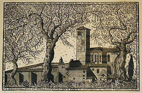
        Bruno da Osimo (Italy, 1888-1962) was active in wood block printmaking during the same period as Emil Nolde, of the previous post, and like Nolde he took as his last name the town of his birth.  Their styles, however, couldn’t be more different.  Osimo’s work is very controlled, and although he did a lot of stylized work depicting themes of Greek mythology, among others, most of his architectural scenes are very detailed and realistic.  However, one unusual element that he frequently includes is writing.  Carving lettering is not easy.  It’s very fiddly and time- consuming, and if you mess up a little it’s really noticeable.  (This is particularly on my mind right now as I’m designing a set of prints with a fair bit of writing, and I’m wondering how deeply I will end up regretting it!)
        The sheer amount of carving in the first piece is quite amazing.  First of all, there’s that writing, going all the way around the border.  Then there’s the little leaves filling half the block - and black leaves on white take a lot more carving than white leaves on black.  And finally the bricks.  Unfortunately I can’t make out sharp detail on these on-line photos, but it looks like white bricks and black mortar, which, again, is one of the hardest, most fiddly patterns to carve.
        The level of detail on the second piece is also pretty crazy, but perhaps the most interesting thing is Osimo’s choice to depict the building with the strong shadow falling right across it.  You’d think he might take a little artistic license and ignore the shadow in the interests of showing the building more clearly, particularly when it’s the sole focus of the piece rather than being part of a whole cityscape.  But whether he was working from a photograph or his own plein air sketches, he’s obviously chosen to depict this building with maximum realism.
        The third piece is my favorite.  The carving is beautiful, the composition is interesting, and the scene really captures my imagination.

        Somewhat to my surprise, I don’t seem to have any previously-featured artists that begin with the letter O.  That seems hard to believe, but there it is!

[Pictures: Convento di Santa Chiara, woodcut by Bruno da Osimo, 1925?;
Santa Maria della Piazza Ancona, woodcut by Osimo, 1925 (Images from ebay);
Agobbio, woodcut by Osimo, (Image from Gonnelli).]


A-Z Challenge, all posts for the letter O

April 21, 2017

Block Printmaker Nolde

        Emil Nolde (German/Danish, 1867-1956) was an expressionist painter known for his exploration of color.  So what’s he doing here in a blog called “Black and White”?  Well, he did woodcuts, too, in that rough expressionist style.  The first one here is the most famous, in which the haggard face looms up out of the rough wood with an expression of intense… I was going to say “anguish,” but maybe “disappointment” is more accurate, even if it doesn’t sound as dramatic.  The rough woodcarving works perfectly for the hollow eyes and gaunt features.
        This fishing boat is also “haggard,” if that adjective can be applied to something inanimate.  It’s interesting for the visible wood grain along the hull, implying the wood block Nolde used was a pretty rough plank, rather than the very fine plywood that’s often used by artists.  Also, notice how imperfect the inking is, especially around the bottom and edges.  I reject my own impressions that have inking like this, but it’s consistent with the expressionists’ emphasis on trying to convey emotion and immediate personal experience.  Generally I don’t much like Nolde’s people, with the exception of the prophet above, so it’s fun to discover his boats, which I do enjoy.
        On a biographical note, Nolde was a Nazi supporter, and even after his work was labelled “degenerate” and he was banned from painting, he continued to plead his loyalty and support of the regime, while painting watercolors in secret.  After World War II, the Nazi’s rejection of his art was taken as sufficient evidence for his rejection of the Nazis, and he was reinstated to much success and acclaim.  From a justice perspective this seems really weak, but I guess from an art perspective it’s good that he was able to create more work.  In any case, the pieces I have here today are all earlier.

        And here is the digest of previously-featured printmakers for the letter N:
Nydam, Anne (or, of course, all through this blog!  Search on “AEGN” in the sidebar, and you should end up with every post illustrated with one of my own pieces.)

[Pictures: Prophet, woodcut by Emil Nolde, 1912 (Image from MoMA);
Fischdampfer (Fishing Steamer), woodcut by Nolde, 1910 (Image from ArtStack);
Plate 66 from Schiefler Werkverzeichnis (directory of Nolde’s work), woodcut by Nolde, 1910 (Image from Christie’s).]


A-Z Challenge, all posts for the letter N

April 19, 2017

Block Printmaker Mbatha

        Azaria Mbatha (South Africa, 1941-) is considered a major figure in the development of modern South African printmaking, although he’s lived most of his adult life in Sweden.  His large linoleum block prints typically are narrative scenes, most frequently with Biblical themes, which he tries to depict in uniquely African ways.  His compositions often include a series of panels, like a page from a graphic novel.  They’re always busy, full of patterns, action, and rhythm.  I love the swooping lines of this first one, in which the crowds of people form the very hills.  There’s an interesting use of black and white in the face and hands of the speaker, and I like the contrast of the tree and plants adding a little organic relief to all that repetition.
        Here also is one of Mbatha’s pieces with separate panels, in this case, three tiers of action scrolling through various Old Testament stories.  His people are not distinctive; they’re clearly more symbolic than individualistic.  Their faces are mask-like.  I love how the entire background is full of leaves so that no space is left blank.
        And here’s also a simpler piece, entitled “No Room at the Inn.”  I like the upraised hands blocking each of the doorways in the background, and the row of black-doored houses framing the picture across the bottom, echoing the shapes of the more abstract border across the top.  I like how Mary actually looks really pregnant, and I like the chicken waiting in the barn behind.

        Here is the collection of M printmakers I’ve featured here before:


[Pictures: The Sermon on the Mount, or, The Speech, linoleum block print by Azaria Mbatha (Image from Mutual Art);
Scenes from the Old Testament, or Nebuchadnessear, lino block print by Mbatha (Image from Mutual Art);
No Room at the Inn, lino block print by Mbatha (Image from Artway).]


A-Z Challenge, all posts for the letter M

April 17, 2017

Block Printmaker Lankes

        Here are some really gorgeous pieces by J.J. Lankes (USA, 1884-1960).  In fact, I’ve had a hard time limiting myself to just a few.  Lankes has a very characteristic style, with lots of views of landscapes, trees, and old buildings, lots of clouds and skies, and the romance of a fading rural culture.  He has a trick of giving things a sort of reverse shadow, a glow of carved out white along them that contrasts with his skies, which are often quite dark with shading lines.  He also has lots of fine pattern and texture: grass, bricks, shingles, and stone.
        The first piece here is the most typical of Lankes’s work.  Nothing too exciting, you might think, but he takes a fairly unremarkable scene and gives it a quiet nobility.  He always seems to respect his subjects, and that’s exactly one of the things I like best about relief block printing: to make an image of something is to proclaim its value.
        The top of the sky in the first piece looks very like water, which is interesting.  In the third one the sky is pretty regular in the open spaces, but all mixed up in a scribbly way with the spaces between the tree branches.  I love the looser, less controlled carving there, contrasted with the very precise details of the building and wall.  The suggestion of the wrought iron railing is masterful; I am in awe of how Lankes decided where to make white lines, and where to leave black to get the effect so perfect.
        Lankes is another of those artists that I think deserves to be much better known.  You may be seeing more of him here in the future!
        
        I’ve featured lots of other L printmakers in previous posts:

[Pictures: Briarfield, wood block print by J.J. Lankes, 1930 (Image from John Steins);
Near the Paulaner Braueri, wood block print by Lankes, 1926;
Octagon House Garden, wood block print by Lankes, 1923 (Images from The Woodcut Art of J.J. Lankes by Welford Dunaway Taylor, 1999).]


A-Z Challenge, all posts for the letter L

April 14, 2017

Block Printmaker Kupka

        František Kupka (Czech, 1871-1957) was a painter during that wild and crazy artistic period when romantic realism was giving way to a roiling ferment of Art Nouveau, Futurism, Cubism, color theory, and a new art -ism every year.  He became one of the first of the European artists to produce purely abstract work, and I have for you today a couple examples of his abstract wood block prints.  Printmaking was an unusual medium for Kupka, but he chose it for a series of 26 pieces entitled “Four Stories in Black and White”  (or “Four Stories of White and Black,” depending on the translation.)  The “stories” are essentially visual themes and variations, in which Kupka developed his theories about abstraction.
        I really like the contrast of solid white, solid black, and pattern in the first one here, which is my favorite of the whole series, I think.  The second piece evokes something of dynamism, as if the triangles are flying around and ricocheting off the edges of the block.  I don’t expect ever to become a convert to the church of abstraction, but I do like some of Kupka’s work very much.

        And here’s the digest of previously-featured K printmakers:

[Pictures: Plate 16 from Four Stories in White and Black by František Kupka, 1926;
Plate 11 from Four Stories in White and Black by Kupka, 1926 (Images from  frantisekkupka.eu).]


A-Z Challenge, all posts for the letter K

April 12, 2017

Block Printmaker (Cortés) Juárez

        Erasto Cortés Juárez (Mexico, 1900-1972) like many of the Mexican printmakers of the twentieth century, did a lot of political art, including portraits of many of his political heroes.  This first piece is particularly polished and detailed.  It’s got an interesting composition in which scenes or symbols from the subject’s life blend with the landscape background.  I like the  beautiful shading of his face, and how the use of the multi-line engraving tool in the collar and lower right give a softer look than is usual in woodcuts.
        As always, however, I prefer pieces that are more universal than political art can be.  This portrait of the artist’s mother is unusual and interesting for showing her from the back so that we can’t see her face.  She seems to be watching the caged bird and isn’t doing anything else  but simply sitting quietly.
        I was especially pleased to find a collection of animals, always a favorite subject of mine.   Isn’t the monkey fun?
        Cortés Juárez was not only a printmaker himself, but was a teacher and collector of wood block prints, and was instrumental in promoting printmaking in Mexico as a “missionary of engraving.”  (A note: I think his name should really be alphabetized under C for Cortés Juárez, but I wasn’t in the mood for my other J options as much as him, so I’m stretching the point.  He has still got a J surname, after all.)

        Here are the few J printmakers previously featured in this blog:

        By the way, if you’re here through the A-Z Blog Challenge, this is the post where the bloggers following the proper schedule catch up with my modified schedule.  From here on my letters will fall behind the official A-Z Challenge calendar.  Don’t worry, I’ll still post every letter of my alphabet, and I’ll still link my posts to the correct letters; I’ll just be doing it a little late.  Please keep dropping by this blog to discover my remaining block print artists.

[Pictures: The Guerrilla Fighter Aureliano Rivera, wood engraving by Erasto Cortés Juárez, 1951 (Image from Cleveland Museum of Art);
Mi Madre (My Mother), wood engraving by Cortés Juárez, 1965 (Image from Colección Blaisten);
El Mono (The Monkey), wood block print by Cortés Juárez from Fisonomias de Animales, 1950 (Image from Museo de Arte Carrillo Gil).]

A-Z Challenge, all posts for the letter J

April 10, 2017

Block Printmaker Iwami

        Reika Iwami (Japan, 1927 - ) is an extremely rare creature: a successful woman in the male-dominated world of Japanese printmaking.  She was inspired by the sôsaku hanga movement (including Hiratsuka) in the 1950s, but she has a completely distinctive style of her own.  Her work is quite abstract, but evokes elements of water, mountains, moon, and other natural forms.  Although she works with wood blocks, she also combines it with techniques of collagraph.  She also uses metallic ink and embossing to add texture to her work.
        The first piece here is very typical of Iwami’s style, showing natural wood grain as well as carved shapes and lines, and the very limited color palette.  Also note the strong embossing in the gold area.  She’s done quite a few variations of this basic composition with the circle, the waves, the wood grain, the gold…
        The second piece is Iwami’s break-out hit, published in The Modern Japanese Print - An Appreciation compiled by James Michener in 1959.  This collection of prints was instrumental in bringing recognition and success to the ten artists it featured.
        I have to confess that I don’t particularly care for Iwami’s work, but variety is the spice of life and it’s fun to feature something different on occasion.  The relatively few printmakers beginning with the letter I makes a great opportunity to pick someone I wouldn’t otherwise have looked at.

        And speaking of the scarcity of I printmakers, it looks like I’ve featured only one before!

[Pictures: Autumn Waves, woodblock and collagraph by Reika Iwami, 1981 (Image from Smith Art Museum);
Winter Composition No. 2, wood block print by Iwami, 1959 (Image from the Lavenberg Collection of Japanese Prints).]


A-Z Challenge, all posts for the letter I

April 7, 2017

Block Printmaker Hiratsuka

        Un-ichi Hiratsuka (Japan, 1895-1997, long life!) was one of the leaders of the Japanese sôsaku hanga movement in the early twentieth century, in which artists draw, carve, and print their works themselves, instead of the traditional system in which each of these steps is done by different craftsmen.
        I like a lot of Hiratsuka’s work, but I particularly like the architectural pieces.  We’ll start with a traditional Japanese scene, with traditional Japanese architecture and lots of detail.  I love the geometry of the building contrasted with the freer carving of the natural features.  Then for variety I’ve also got one of Hiratsuka’s American scenes, with an interesting composition.  I absolutely love this one, with its combination of architectural geometry and organic branches, and its hand-carved roughness creating fine details.
        I also couldn’t resist including two little botanical pieces, one early and one later, with very different styles.  The first is very graphic and geometric, with a textured background filling the space.  The second is more delicate and realistic, with plenty of empty white.  Over such a long lifetime, it’s not surprising that Hiratsuka should have worked in a variety of styles.  I really like these both.


        Here are lots of H printmakers to revisit:


[Pictures: Early Summer in Ginkuji, wood block print by Un-ichi Hiratsuka, 1950 (Image from Invaluable);
Georgetown University Clock Tower, wood block print by Hiratsuka, 1967 (Image from Georgetown University Library);
Plum, wood block print by Hiratsuka, 1930 (Image from Wikiart); 
Butterfly and Jointweed, wood block print by Hiratsuka, 1966 (Image from UnichiHiratsuka.com).]

A-Z Challenge, all posts for the letter H

April 5, 2017

Block Printmaker Goltzius

        Technically I’ve already featured a piece by Hendrick Goltzius (Netherlands, 1558-1617).    But I’m trying to make sure this alphabet of printmakers covers a bit of diversity, and my other G options were all in those same early 20th or 21st century time frames.  So I’ll share them some other time, and today you get a bit more of an Old Master.
        Goltzius did more engravings than woodcuts, and was a trendsetter in the use of various shading techniques in engraving.  His woodcuts were often done in the chiaroscuro style (about which you can refresh your memory along with seeing the piece I’d posted previously), so you can see that Golzius was very much interested in tonal shading.  For today I’ve chosen one simple black block, printed on blue paper, which is quite unusual, and another block printed on the same blue paper but with some touches of white for highlights.  They both demonstrate the skill
with line for which Goltzius was famous - his lines look quite loose and natural, almost like brush and ink, but with just enough look of carving to keep me happy.
        One other trivia note about Goltzius: his right hand was deformed from a childhood accident, but it happened to be deformed in just the right way that it worked well for holding engraving tools.  I admire Goltzius for turning a negative circumstance into something that worked for him.

        Here are other previously-featured G printmakers:
[Pictures: Seascape with Two-Master, woodcut by Hendrick Goltzius;
Landscape with Waterfall, woodcut with white watercolor by Goltzius, 1597-1600 (Images from the Museum of Fine Arts, Boston).]

A-Z Challenge, all posts for the letter G

April 3, 2017

Block Printmaker Farquharson

        Let’s take a break from the first half of the twentieth century and visit the contemporary work of Linda M Farquharson (UK, 1963-).  These are linoleum block prints, with all the flat, smooth control  linoleum makes possible.  Farquharson does lots of flowers, birds, and animals, which I enjoy very much.  She also does both black and white and color designs, and I find her color choices very rich and beautiful.
        I especially like this tree of life, a symbol that’s always been meaningful for me.  I like the contrast between the very simple, stylized design of the tree, and all the exuberant details.  Notice the variety of leaves and fruits and flowers: grapes, acorns, lemons, peas, strawberries, pomegranates…  The birds, on the other hand, are all much more similar.  I like how the background space within the tree is filled with an even speckled pattern.
        And here’s a wonderfully vibrant color print.  It’s a reduction print, so it’s interesting to try to figure out Farquharson’s different levels of carving and ink.  Or on the other hand, if you’re not a printmaker yourself, don’t try to figure it out, just sit back and enjoy it.


        And here are some more printmakers for the letter F:


[Pictures: Tree of Life, linocut print by Linda M Farquharson;
Flower Power, reduction linocut print by Farquharson (Images from Linocut.co).]

A-Z Challenge, all posts for the letter F