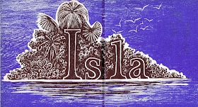
There’s something pretty funny about an alphabet book in another language, because the pictures don’t match up. After all, for me J is not for crab! Actually, it turns out that J isn’t really for crab in Spanish, either. However, the juey is the great land crab of Puerto Rico (and that’s its English name, too). Many of the words in this book turned out to be quite specific to Puerto Rico - which makes sense, of course, since it’s meant to be a Puerto Rican alphabet. At any rate, I particularly like the letters that work in English, too, although I’ve chosen my favorite images rather than my favorite words.
My favorite of all is the island - just what a tropical paradise ought to look like, and I enjoy the way the word is incorporated into the the picture. Actually, this entire book is as much about design and typography as it is about wood block prints.
I had to include the hammock - another fun use of the letter in the picture, and one that works equally well in English - and of course the juey. My final example is R for rolita, which is apparently a Puerto Rican dove. I really like the tower, but I was very tempted to crop off the child on the side, whom I don’t particularly like. In the end I reminded myself that I should be representing the artwork accurately, and restrained my censoring impulses. Full disclosure,
however: despite the integrated design of each page, I have eliminated all the extra words, which included Spanish poems as well as lists of other random words that begin with the same letter. After all, I wanted this to be about the pictures.
[Pictures: Isla;
Hamaca;
Juey;
Rolita, wood block prints by Antonio Martorell from Abc de Puerto Rico, 1968.]


No comments:
Post a Comment
I love to hear from you, but please no spam, ads, hateful language, or other abuse of this community.