Pages

May 30, 2014

Words of the Month - Joe and the Dog

        This month I have something a little different, because this week I visited four classes of sixth graders to talk about style and voice in writing - how as readers you can glean all kinds of information from an author’s stylistic choices, and how as writers we must craft every sentence with care for maximum storytelling impact.
        We spent some time talking about connotation, and how well-chosen words do double-duty.  For example, if we read about a big warrior, all we know is his (or her) size, but we know 
     a mighty warrior is big and strong, and probably heroic
     a hulking warrior is big and menacing
     a monstrous warrior is big and scary, and possibly deformed or only part-human…
        Next I showed the kids the following outline or bones of what could be a snippet of a scene in a story:
Joe walks along the street toward his house.  A dog runs out of his neighbor’s yard toward him, barking.  He greets the dog.
        Then three examples of how different stylistic choices can turn the same basic series of events into completely different scenes from completely different kinds of stories:

     Joe was strolling toward home, crunching a granola bar and thinking about Saturday, when his thoughts were interrupted by a frenzy of high-pitched yapping, and a small fluffy shape shot out of his neighbor’s porch.
     “Hi, Frou-Frou,” said Joe, holding the granola bar out of reach of the furball’s frantic leaps.  He noticed that today Frou-Frou wore a ruffled pink shirt with the slogan “I (heart) my Daddy.”
     He rolled his eyes and grinned.  “Nice outfit, Frou-Frou,” he told the little dog as he stepped around her and continued on his way.

     The wintry afternoon was already growing dark, and Joe’s breath came in short puffs as he hurried toward home.  But he was not fast enough.  A harsh barking froze him in place, then lowered to a deep, menacing growl.  Between Joe and the bright light of his front porch crouched the monstrous form of his neighbor’s half-wild dog.
     “Nice dog?” Joe tried tentatively, hardly daring to move.  The beast growled again, showing yellow teeth as big as a wolf’s.

     I’m not normally the kind of kid who kicks puppies.  Honestly.  I mean, no one would be surprised to hear that Sally Minderbule kicked a dog.  She’ll kick anything smaller than she is.  But me?  I was just on my way home from math club, minding my own business…

        And then it was time for the kids to try it themselves, and they each began to write their own scene using that same skeleton of events.  And wow, did we get some fun stuff!  Since this is supposed to be Words of the Month, after all, I’ll focus on vocabulary and list all the different words students came up with to describe Joe’s progression down the street:
     walk
     strut
     drag his feet
     rush
     sprint
     dash
     wander
     stumble
     footsteps echo down the alleyway
     bolt
     inch
     skip
     jog
     rampage
     fly
     charge
     speed
     creep

And now all the words used for the animal:
     dog
     blur of brown fur
     hound
     beast
     pug
     animal
     chihuahua
     menace
     unknown species
     creature
     shadow
     puppy
     a shape
     ball of fur
     pit bull
     wolf
     German shepherd
     beagle
     hellhound
     vicious mass of fur, skin, and bone
     golden retriever
     white fluffy cloud
     yippy demon
     wiener dog
     rottweiler
     tea-cup poodle
     English mastiff
     Yorkshire terrier
     bulldog
     doberman

As a bonus, a few more words that none of the kids happened to come up with, just to give an even broader look at all the incredible possibilities an author gets to choose from, each with its different connotations…
canine, pooch, cur, mongrel, mutt, jackal, and (just as well that none of the 6th graders went for this choice) bitch.

        The students came up with some pretty awesome words, eh?  But I also have to share with you a few longer excerpts I particularly enjoyed.  The thing about each of these sentences is that, like all good writing, they manage to include a lot of information, not just about the bare bones of the action, but about attitudes, moods, background details, connotations… and they manage to be a little bit surprising.
     Joe sprinted down the sidewalk, sidestepping fire hydrants and shooting past trash bins.
     Joe silently walked home from school, clutching his math test where he scored a 55%.
     Joe, the monstrous troll of winter, rampaged towards his frigid cave of ice, destroying the farms on the way and eating the livestock.
     Joe’s hair normally drooped over his stunning amber eyes, often getting stuck in his eyebrow piercing.
     As Joanne passed by her neighbor’s house, the one with the overflowing flower pots…
     Fredrick had always been scared by many things - birds, spiders, heights - but nothing scared his pants off more than Smallfoot.
     Jake gives me a face full of slobber.
     “Fluffy,” as Joe's neighbors had named him, should have been named “Menacing, Terrifying, Vicious, Flesh-rending Blue Chihuahua the Size of a Soccer Ball.”
     Tyrone knocked Joe’s ice cream over, but it didn’t matter.
     “Here, ride shotgun with me, little man.  I gotta get you to the shelter around the corner.”
     A pounce, and everything goes blank.
     As Joanne neared her house, she noted that the door was wide open, a yawning mouth of black.  She was too late.

        And finally, I’ll just whet your curiosity with a few of the zanier takes on the boy-meets-dog scenario.  We had zombie dogs, a walk to an unbuilt jail, a magic fire hydrant that allowed the dog to speak, a pink tutu at least 2 or 3 sizes too small, a wholly unexpected Komodo dragon, a poor innocent dog being chased down by a terrifying toddler, a dog that jumped over a house and did a backflip, a big scary squeaky toy, a dramatic police chase, and a singing and dancing dog in a pink fluffy house.  Not bad for a couple of mornings in sixth grade!

[Pictures: Old English Sheepdog, rubber block print by AEGN, 2013;
detail from The Enormous Turnip, rubber block print by AEGN, 2008;
detail from Dancing with Animals, wood block print by AEGN, 1999.]
Excerpts taken from the work of High Rock School sixth graders.

May 27, 2014

The Etcher's Studio

        Etching is not my thing (not that I’d mind trying it some time), and colored etchings are, on the whole, even less interesting to me.  However, I found a really cool book that I have to share.  Arthur Geisert is an author and illustrator of picture books for kids, and all of his illustrations are etchings.  (I mentioned him in the post on wordless picture books a couple weeks ago.)  In this book, he tells the story of how a boy helps his grandfather in an etching studio, and thereby explains how etchings are made.  With intricate pictures showing both the factual 
details of the process and the imagination of the art, Geisert makes a potentially dry non-fiction lesson into a fun and fascinating book.
        I love that this book illustrates the process of etching with story, with invitation to imagine, and with pictures 
that are themselves etchings and therefore further illustration of what this is all about.  I really wish there were a comparable book for relief block printing!  Unfortunately I don’t think I’m the person to do it, but I can picture Mary Azarian doing an awesome job. (Are you listening, Ms Azarian!?  We need you!)

[Pictures: “Coloring by hand,” pp 14-15 (cropped by the limits of my scanner);
“An Etcher’s Studio,” pp 28-29;
“How an Etching is Made,” pp 30-31, etchings by Arthur Geisert from The Etcher’s Studio, 1997.]

May 23, 2014

ABC de Puerto Rico

        My computer up and died last Saturday, and I had to find other things to do with myself until I got it back yesterday.  I had some serious withdrawal, but luckily there was gardening to be done, and reading, and carving on the block I began at Dedham Open Studios… so it isn’t as if I had nothing to do - I just couldn’t do all the things I wanted to.  But during that time another block printed alphabet book arrived through interlibrary loan: ABC de Puerto Rico, with woodcuts by Antonio Martorell.
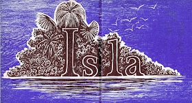
        There’s something pretty funny about an alphabet book in another language, because the pictures don’t match up.  After all, for me J is not for crab!  Actually, it turns out that J isn’t really for crab in Spanish, either.  However, the juey is the great land crab of Puerto Rico (and that’s its English name, too).  Many of the words in this book turned out to be quite specific to Puerto Rico - which makes sense, of course, since it’s meant to be a Puerto Rican alphabet.  At any rate, I particularly like the letters that work in English, too, although I’ve chosen my favorite images rather than my favorite words.
        My favorite of all is the island - just what a tropical paradise ought to look like, and I enjoy the way the word is incorporated into the the picture.  Actually, this entire book is as much about design and typography as it is about wood block prints.
        I had to include the hammock - another fun use of the letter in the picture, and one that works equally well in English - and of course the juey.  My final example is R for rolita, which is apparently a Puerto Rican dove.  I really like the tower, but I was very tempted to crop off the child on the side, whom I don’t particularly like.  In the end I reminded myself that I should be representing the artwork accurately, and restrained my censoring impulses.  Full disclosure, 
however: despite the integrated design of each page, I have eliminated all the extra words, which included Spanish poems as well as lists of other random words that begin with the same letter.  After all, I wanted this to be about the pictures.

[Pictures: Isla;
Hamaca;
Juey;
Rolita, wood block prints by Antonio Martorell from Abc de Puerto Rico, 1968.]

May 17, 2014

Ouroboros

        The ouroboros is a symbol  showing a serpent eating its own tail, and representing eternal cycles.  It isn’t really a mythical creature, because despite the prevalence of the image and concept in various cultures and philosophies (especially alchemy), it doesn’t appear that anyone thought it represented a real species or individual animal.  I, however, have been having fun imagining some of these symbolic creatures as if they were real (see the mushussu), and the chief thing that struck me about the ouroboros is how bored it must be, poor thing.  You can see in the traditional representations that it might be able to have fun 
rolling about like a hoop snake, but for the most part wouldn’t enjoy much variety in its life.  So, what if there was an ouroboros with the soul of an artist?  An ouroboros with imagination?  That’s how I came up with the idea of letting my ouroboros form, instead of a simple circle, a more interesting endless knot, also a symbol in cultures around the world, and also representing eternity.
        As for the carving of this piece, my original design had the body simply patterned with lines for the scales, as in this first state rough draft.  I decided to give it a little more interest by make a stripe of white scales run its length, so I carved some more.  Alas, I think that may have been a mistake.  I think the knot is clearer and the whole image cleaner-looking without the extra white, so perhaps I should have left well enough alone.  But you can’t know ’til you’ve tried!  So now, here he (or she) is: the ouroboros with the heart of a poet.

[Pictures: Ouroboros, wood block print from Abraham Eleazar's Uraltes Chymisches Werk, 1760;
The device of Barthélemy Aneau, wood block print from Picta poesis, 1552 (Image from Glasgow University);
First state test print by AEGN, 2014;
Ouroboros Makes a Poem, rubber block print by AEGN, 2014 (sold out).]


NOTICE:  Last Open Studio show before autumn: Dedham Open Studios, Sunday, May 18, 11:00-5:00.

May 13, 2014

Children's Book Week

        This week is the official Children’s Book Week, as put on and promoted by Every Child A Reader.  Of course, every day is a Children’s Book Day in our house, but we’re certainly happy to see the rest of the nation getting a week at it, too.  As one of the founders of Children’s Book Week said, “A great nation is a reading nation,” and I do believe that children who read become adults who read, and adults who read become (on the average) better informed, more open-minded, more thoughtful, happier, and all kinds of other good things.  (Of course, those aims may be better served by some books than others, and I was a little horrified to see a children’s book by Rush Limbaugh on the ballot for the Children’s Choice Book Awards.  Still, as the good little liberal that I am, I believe that we should raise our children to be aware of all their options, even those from venomously ranting lunatics, so that they learn how to make the best choices.)
        My favorite offering from Children’s Book Week, though, is the page of Story Starters.  Famous authors provide a few opening lines that hopefully will prompt children to imagine their own stories.  Some are so vague a kid would have to have an idea of her own already, but I get the biggest kick from the ones with all sorts of quirky details a young writer would be challenged to incorporate.  But whatever proves an inspiration, it’s all good!  You can find all the Story Starters here.  For sci-fi or fantasy flavor I recommend One Evening…, Tutu is a Funny Nickname for a Guy!, And Then…, and The Night Visitor, but of course any of these might end up going in any direction under the pen of an inspired child!  And that’s what we really hope to get out of all this: inspired children.
        So get a book into the hands of the nearest child right now, and while you’re at it, why not grab a children’s book to read for yourself this week, too.  Enjoy!

[Pictures: Bookmark and book quiz, paper collage by Steve Jenkins, 2014 (Image from bookweekonline.com);
Poster, watercolor by Jessie Wilcox Smith, 1921.]

May 9, 2014

A Couple of Experiments

        I finally got around to printing a block I began at a show back in December and finished a couple of months ago.  It got held up by the push to finish The Extraordinary Book of Doors, followed by the push to prepare multiple shows and school programs…  But it’s finally printed, and I can report on it.
        I was pretty pleased with my idea, which was to make a musical staff of telephone wires and place the birds as the notes, “spelling” out the famous Hallelujahs of Handel’s “Messiah.”  But the execution ended up involving a couple of experiments, which were only partially successful.  First, inspired by Peter Brown and traditional wood engraving styles, I wanted to try lightening up background details by carving a certain amount of white straight through the shapes.  So after carving all the bushes down below the telephone wires, I went ahead and cut right through the ones in the back.  The result?  Well, it works somewhat, but I think it looks too geometric.  I may experiment some more another time, but my inclination is to go back to making my white follow the shape or texture I’m carving.
        The second experiment came about because I messed up big time.  I had already carved out a fair bit of white around my largest shrub before I remembered that behind the shrub were more plants - black, not white.  Aargh!  You can see on the left side of the image where there’s too much white carved out around the shrub, but that, at least, could be a gap between bushes.  On the right side of the large shrub it really looked unacceptable.  I decided it was time to try filling in the hole.  It’s axiomatic in block printing that once you’ve carved something away, there’s no putting it back, but I had recently bought a tube of E6000 rubber cement and figured I had nothing to lose by seeing what I could do.  I filled in the largest offending hole with glue and let it dry.  After drying, the glue dipped down in the middle, so I added another layer… and another…  Finally I added so much that this time it was raised up above the level.  I tried shaving the top back off, but that simply wasn’t going to work.  The glue is far too stretchy to carve.  I ended up squishing it down as hard as I could, and pressing particularly hard on that spot during printing, and that way managed to get it to print as if it were just about level.  But first I also had to peel the glue back up off the edges, as well as trying to recarve some of the little white leaves that got somewhat filled in next to my construction site.  Again, this stuff really doesn’t work to carve!  So, the results of my experiment?  You can see the somewhat blobby looking black area to the right of the largest shrub.  To the extent that it looks a lot better than it did all carved out in white, I guess the experiment was a success.  But this really isn’t a very good solution - getting the glue to go everywhere it needs to and nowhere it doesn’t is next to impossible, and it certainly doesn’t end up looking or acting like it’s back to being a pristine, uncarved area.  Simply painting the offending area back in on the finished prints might have given a better result, and if I were really a perfectionist I would no doubt have scrapped the whole block and started again.
        But I’m not a perfectionist.  Because I wasn’t entirely happy with the result, I quit after a relatively small edition.  But I still think this has a certain happy charm even if it isn’t my most technically proficient work.  After all, if the Hallelujah Chorus of the roadside birds doesn’t cheer you up, there’s nothing I can do to help that!

[Picture: Hallelujah Chorus, rubber block print by AEGN, 2014 (sold out).]

May 6, 2014

Andrew Davidson's Fantastic Covers

        Some time ago I saw Andrew Davidson’s gorgeous wood engraving on the cover of Seraphina by Rachel Hartman, but I only this morning got around to looking him up and seeing what else he’s done.  Well, it turns out he’s done quite a few cover designs for speculative fiction books - and even a recurring theme of dragons over cities.  Oooh, I love it!  An awful lot of YA books (and some middle grade, though thankfully fewer) have covers featuring photos of modern-looking teen models posed in fantasy attire (and gazing intensely, of course.)  I have never found such covers at all appealing and much prefer ones with actual artwork.  And naturally I’m delighted whenever I see relief block printing - and relief block printing that hasn’t been colored in is even more delightful.  I confess to not having read Seraphina, but if any cover can make me judge a book positively, it’s this one!
        Then when I went looking up Andrew Davidson, I discovered some more incredible wood engravings.  First, the Iron Man, cover design for the book by Ted Hughes (on which 1999’s animated “The Iron Giant” was loosely based.)  Davidson’s portrait does a good job of being a little ambiguous - this robot is not clearly friendly or villainous.  You don’t get the luxury of any assumptions from this cover.  But I particularly like the junk heap in the background with its interesting scrap metal shapes.  He also illustrated Hughes’s sequel, The Iron Woman.  I can’t imagine how it might fit into the story, but this cool metamorphosis is an illustration from that book.
I love the way the fish look like they’re simply shedding human limbs along with the clothes.  They don’t look happy about it, though - it seems this change of form is an unwelcome shock.  (Don't forget to click on these little pictures to see a larger image.)
        Next, more books I’ve never read, the Temeraire series by Naomi Novik, once again featuring wonderfully detailed dragons flying over ships and buildings.  The covers range all around the world, along with the dragons, depicting a variety of
architectures and scenery beneath the dragons.  As with The Iron Man, some editions of the books have more color on their covers than others.  I wish I could find pictures of the actual wood engravings themselves before their transformation into cover designs.  For example, I don’t know whether the titles were part of the original prints or added later, but I do like the way the dragons’ tails integrate with the text.
        And finally, Davidson did a set of covers for an edition of the Harry Potter series to be marketed to adults.  Now, I don’t see why there should be a different edition for adults to read - any adult who’s embarrassed to be seen reading a kids’ book doesn’t deserve to partake of Harry Potter.  (Besides which, it isn’t as if people haven’t heard of Harry Potter.  Everyone knows exactly what you’re reading regardless of its cover.)  I also quite like the US cover designs by Mary GrandPré…  But I’m certainly not going to complain about a new set of gorgeous wood engraved illustrations of one of my favorite series.  These are really wonderful.  They capture less of the sense of whimsy (as befits the terribly mature, serious, adult readers at whom they’re aimed) but they do definitely evoke the sense of mystery, magic, and
marvels.  The details are incredible - note the distant dragon(?) on the outcropping as the train steams by, and the owls carrying parcels above the turrets of Hogwarts.  Alas, I believe that the actual finished book covers take these incredible images and deface them with overlays of garish colors and huge chunky fonts, but luckily I was able to find images of all the original artwork to look at.  I don’t have room to share them all here, but you can see the first four here, and the last three here.
        Davidson’s work is the kind I’d really like to get my face up close to with a magnifying glass, and unfortunately the on-line images just don’t allow me to see the level of detail I’d like.  Still, even without being able to examine the carving as closely as I’d wish, I really enjoy Davidson’s ability to express such wonderful fantasy images.


[Pictures: Cover design, wood engraving by Andrew Davidson from Seraphina by Hartman, 2012;
The Iron Man, wood engraving by Davidson, 1985 (Image from Lawfully Chic);
Metamorphosis, wood engraving by Davidson, 1993 (Image from Andrew Davidson);
Cover design, wood engraving by Davidson from Temeraire by Novik, 2006;
Cover design, wood engraving by Davidson from Victory of Eagles by Novik, 2008;
The Hogwarts Express, wood engraving by Davidson from Harry Potter and the Philosopher’s Stone by J.K. Rowling, 2013;
The Whomping Willow, wood engraving by Davidson from Harry Potter and the Chamber of Secrets, 2013;
Nagini, wood engraving by Davidson from Harry Potter and the Deathly Hallows, 2013 (Images from The Artworks).]

May 2, 2014

Styrofoam Animal Prints

        A month ago I visited some fourth grade art classes and got the children started on a relief printing project.  This week I took down the big show at the school where I had been the special guest artist, and while I was there to gather up all my work, I got a chance to see the finished prints the kids had made.  I really enjoyed them, and I think you will, too!
        I had shown the classes images of a lot of my animal prints, and pointed out how pictures in black and white (or only two colors) can’t rely on color for interest, but have to emphasize texture and pattern. We talked about different kinds of textures and patterns: fur, feathers, scales, spots, stripes, zigzags, realistic textures and more stylized patterns…  Then each student picked a New England creature and began to draw their design.  That’s as far as I 
got with them in one class period, and their art teacher is the one who gets the credit for helping them do such a great job on the project.  They eventually transferred their designs to styrofoam sheets, and then finally printed.
        You can see in the picture of part of the display wall that many of the kids experimented with different colors of ink and paper for different effects, as well as experimenting with some different textures and patterns.  Aren’t they cool?  I’m so glad I got the chance to join their classes.

        Yesterday I was with three other classes of fourth graders in another school, this time talking about writing.  I worked with them on several small writing exercises in addition to my presentation.  Unlike with the relief prints here, I don’t expect to get the chance to read any of their finished stories, but it was a blast to see some of those kids, at least, getting so fired up about writing!

        And today I’ll set up for Needham Open Studios, which is this weekend.  Come by and see me if you’re in the area.  (Go to the NOS web site for the map to find me at my great new location.  There will be 7 of us there, with lots of room for big, beautiful displays.)  So enough blogging - I need to get back to work on preparing for the show!


[Pictures: Fourth grade styrofoam prints at Tenacre School, 2014;
Bear;
Owl;
Deer;
Rabbit;
Flying Squirrel, 2014.]