Pages

July 29, 2016

Words of the Month - Ghost Words

        A ghost word is a word that makes it into a dictionary or authoritative work by mistake, and having once landed there is taken by everyone to be a real word.  The essence of a ghost word is that it had no meaning or usage at all before mistakenly being given a place in a position of authority.  Most ghost words are eventually unmasked and removed from dictionaries, but some stick around a surprisingly long time.  I’ve chosen this topic for this month’s Words because there’s a ghost word associated with one of my mythical X creatures.

hsigo - “flying monkey from Chinese mythology,” this word was apparently a mistake generated by optical character recognition software trying to read hsiao (which I featured under the alternate Romanization xiao, because x’s are always more exciting.)  Having once appeared in Wikipedia, the word can now be found all over the web, and although Wikipedia has been corrected, it’s probably too late - the hsigo has escaped from captivity and is naturalizing on the internet.

dord - “density,” added to Webster’s when the abbreviation D or d was mistakenly taken as a word in its own right.  It existed as a word in all the Webster’s editions from 1934 until 1947.

phantomnation - “multitude of spectres, illusion,” added to dictionaries in the eighteenth century when Alexander Pope’s “Phantome-nations of the dead” was copied without its hyphen and came to be reinterpreted as a single word.

morse - “to prime or foster,” first appeared in nineteenth century editions of Walter Scott’s novel The Monastery in the line “dost thou so soon morse thoughts of slaughter?”  A scholarly journal included articles giving etymologies of morse (from French amorce in priming a musket, or from Latin mordere in biting or gnawing).  In fact, however, it was simply a misprint of nurse, as eventually confirmed in Scott’s original manuscript.

ouphe - “imp, goblin, elf,” another of my mythical creatures, and probably simply a misspelling or misprint of oaph/oaf.  The word first appeared in Shakespeare, which is why its existence was considered authoritative.  (Alexander Pope and Walter Scott are not so widely popular these days, but they, too, were major bestsellers and trend-setters in their days.)

feamyng - “a group of ferrets,” appeared in several dictionaries including a 1949 crossword dictionary.  Although it looks like a most satisfactory Old English word, it is, apparently, merely the final result of a long string of errors gradually transforming busyness to feamyng.  The proper collective term for ferrets is therefore a “business.”

snalce - “one who schemes, connives, and uses sex appeal to further their own ends.”  Okay, this word doesn’t actually appear in any dictionaries, although it should.  It’s a word in usage among my friends and family, and it originated from my misreading of a friend’s handwriting when, in a high school note, she described a certain scheming classmate as a “snake.”  If snalce ever does get into the dictionary, of course, it will be a simple coinage rather than a mistake, but its origins are purely ghostly.

esquivalience - “the willful avoidance of one’s official responsibilities,” is not technically a ghost word because it was invented for The New Oxford American Dictionary deliberately in 2005, as a copyright trap.  Copyright traps are minor “mistakes” or falsehoods purposely included in reference works in order to provide evidence of plagiarism should they be copied.  However, like ghost words, they can potentially be taken as real words despite having no linguistic past.

        The term ghost word was coined by Walter William Skeat in 1886 in an address to the Philological Society , in which he praised OED editor James Murray for trying to eliminate such words from the dictionary.  Personally, however, I think they’re fun.  And chances are that a few of the words we use today might well have begun with a copyist's or editor's error that never was caught.

[Pictures: Midnight, linoleum block print by Lori Biwer-Stewart (Image from her Etsy shop);
Ferrets, linocut from Etsy shop Indrukwekkend (Image via Pinterest).]

July 26, 2016

Provincetown White-Line Technique

        You can review my previous post to brush up on the origins of Provincetown white-line printmaking.  Today I’m going to go into more depth about the step-by-step of the method.
         So, step one is to design an image like a coloring book picture - just the outlines of all the areas.  I actually made four or five different sketches trying to figure out the right level of detail for a first experiment in this style.  I kept making designs that I thought would be too complicated.  However, when all you carve is basic outlines, carving goes very quickly compared to the usual kind of blocks that I do!  The characteristic white outlines result when those lines are the only areas of the block that are actually carved away and can’t carry ink.
        Once all the outlines are carved, each outlined shape is then painted with ink, one at a time, and pressed individually.  To keep the registration, the paper is tacked onto the edge of the block, folded back while an area is painted, then folded down and pressed to print the ink.  This is repeated until all the colors are done for a single complete impression.
        As I mentioned before, in a traditional multi-block print, you print the entire edition’s worth of one color (one block), followed by the entire edition with the second color (second block), and so on.  In the Provincetown method, all the colors are done on one impression before the second impression of the edition is begun.  The Provincetown printers often worked on several blocks at a time so that they could do the yellow of three different blocks, then the light green of all three blocks, and so on.  I had two blocks to work on, but one was carved in wood and inked with watercolors, but the other was carved in rubber and inked with markers, so they didn’t share ink anyway.  (Watercolor doesn’t work with rubber blocks because it just beads up, and besides, the rubber block version is to be a possible project for my class this week, so I wanted a version that would be easy for kids.)
        At any rate, the effect of each impression being colored individually is that each impression can be done with its own individual color choices - any two impressions from the same block could have all the same colors, or minor variations, or a completely different palette.    For my wood block print I decided what colors I liked best and just stuck with them - no wildly original red dandelions or purple grass.  But I did make two versions of the child.  Although the design is based on a photograph I took of my son P many years ago, I love the photo because of its universality.  It might be my own son, but don’t all children love to pick flowers?  Don’t all children recognize the beauty in the flowers that adults tend to call weeds?  Don’t all children love dandelions or other “interactive” plants that can be blown, popped, scattered, or otherwise played with?  So I made the blond version that looks like P, and I also made a version with another child, who may be painted with different colors, but is exactly the same at heart.  Aesthetically I like the second child better because I think the dark colors have more interesting contrast with all the light and bright colors elsewhere.
        I tried more variations with my window box design, where I experimented with different colors of flowers, and different combinations of siding and window box paint.  Because I used markers, I couldn’t blend the perfect colors but was stuck with the plain colors that came in the set.  Mostly I would have liked some lighter colors for the house siding: a greyer blue, a paler yellow, maybe a beige…  But while they give less flexibility in color, the markers and the small size of the block do make it easier to experiment.
        I confess that this is not my favorite kind of relief block print.  I like prints better with more interesting carving, and I like the ink to emphasize the carving, rather than just its own color.  I don’t think I have any interest in doing more, or at least not at the moment.  Still, it was fun to try something new, and if my students come up with any masterpieces at the end of the week, I’ll be sure to share them.

[Discovering Dandelions, white-line wood block print in two color variations by AEGN, 2016;
Paper tacked to blocks for registration;
Paper tacked to wood block with several colors printed;
Paper tacked to rubber block with several colors printed, photos by AEGN, 2016;
Little Window Box, while-line rubber block print in three color variations by AEGN, 2016 (sold out);
Inked block by AEGN, 2016.]

July 22, 2016

Mythical X

        To no one’s surprise, I’m sure, mythical X creatures are few and far between.  This is where we can take a moment to be grateful that the English language is never as xenophobic as some of its speakers unfortunately are, so that we can welcome words from Chinese, Greek, and other x-otic languages.  And today I especially welcome their monsters.

xiezhi - Something like a lion with a single horn, but possibly with scales and possibly a type of cattle.  The special thing about the xiezhi is that it is instinctively just and knows good from evil.  If two people are arguing or in conflict, a xiezhi will ram the one who’s at fault.  (Asian)

xana - Another variety of nymph or water spirit, especially associated with fountains, rivers, and waterfalls.  They are extraordinarily beautiful, often with long, curly blonde hair, and alluring voices.  They frequently guard treasures, which they may occasionally offer to worthy travellers.  Because xanas cannot produce milk, when they give birth they often exchange their babies with human infants.  These xaninos grow up in less than a year.  (Spanish, specifically Asturian)

xiao - This one is rather confusing and I’d probably have left it out altogether if I didn’t need all the x’s I could get.  Is it an ape-like creature with very long striped or spotted arms and a penchant for hurling stuff?  Is it a flying monkey?  Or is it a bird with four wings, one eye, and a dog’s tail?  You’d think observers would be able to tell the difference.  The one thing that everyone seems to agree on is that it’s extremely raucous and noisy.  (Chinese)

xenoceratops - A giant monster with a body like a rhinoceros, a tail like a crocodile, and a beak like an eagle.  Its most notable feature is the horns all over and around its head: one sticking out of each cheek, two on its forehead, and a sort of collar or frill of spikes and knobs all around the back of its head, with two larger ones at the top.  No one knows what magical abilities this creature might have had, because in fact it’s known only from fossils.  Yes, this is actually a real dinosaur, but isn’t its description every bit as improbable as the monsters I’ve been featuring all year?  In fact, it isn’t even the weirdest-looking of the ceratopsians (the dinosaurs in the same group as triceratops).  I like to remember from time to time that nature has just as wild an imagination as any human.  (Canadian)

xog - A flying puppy, previously mentioned here.  (Modern)

[Pictures: Xie zhi, sculpture about which I have no information at all (Image from China.org);
Xenoceratops foremostensis, drawing by Danielle Dufault, 2012 (Image from livescience).]

July 19, 2016

Provincetown White-Line Prints

        Provincetown, Massachusetts has had a thriving artistic community since the end of the nineteenth century, and around 1915 a group of printmakers there devised a new style of wood block print.  Inspired by Japanese wood block prints with their full range of watercolor inks, the Provincetown group came up with their own way to make full-color prints using only a single block, instead of the traditional Japanese method with different blocks for each color.
        In the past couple of weeks I’ve finally gotten around to experimenting with this technique for the first time myself, so I’m going to break this topic into two posts.  Today I’ll show you a few of the original Provincetown white-line wood block prints.  Then in another post I’ll go into the method with my own samples.
        The first piece above is in fact a Provincetown scene, by Blanche Lazzell (USA, 1878-1936), probably the most famous of the white-line printmakers.  It illustrates a number of common characteristics of the Provincetown style - the cheerful colors; the everyday scenes; the flat, simplified shapes; the influence of modernist art styles that were in the air at the time.
        Next I have two pieces by  Mabel Hewit (USA, 1903-1987).  Her colors tend to be a little duller, and you can also see in her work a little more influence of cubism or the fracturing of planes.  You can see it in the way the tree and greenery are broken up into quite abstract geometric shapes in The Old House, while the lines of the rain in The Storm have a similar effect.  Because it’s hard to ink very large areas at a time, breaking up an image into smaller, simplified shapes makes the technique much easier, and I like the way Hewit takes advantage of this property of the medium, and uses it to add interest to her compositions.
        This piece below by Mary Mullineux (USA, 1875-1965) has a much more detailed look, with more realistic shapes, less geometrified (if that’s a word).  She also uses shading in her colors, instead of simply a single flat color for each area.  And in the water she’s made all kinds of different colored shapes without any carved guidelines at all.  All the ripples and reflections appear to be painted freehand on the single large area of water.  It does make the water look a little more watery than sharp outlines would allow.
        You can imagine that inking freehand would make for variations from each impression to the next, and in fact Provincetown white-line prints are known for being very varied.  For a traditional Japanese or multi-block print, you print the entire edition’s worth of one color, followed by the entire edition with the second color, and so on.  In the Provincetown method, all the colors are done on one impression before the second impression of the edition is begun.  This means that each impression can be done with its own color choices - any two impressions from the same block could have the same colors, or a completely different palette.
Here are two impressions of another piece by Lazzell, and you can see some variance between them.  The clearest difference is the roofs of the buildings, but the small triangle of grass in the lower right is completely unlike, and there are many other subtle differences.  The first of these two (actually the later of the two to be printed) is my absolute favorite of all these Provincetown white-line prints.  I love the colors and the curved composition, simple enough to be bright and bold, but with enough details to draw in my imagination.
        I’ve chosen to show you some of the originals, but this is not a dead technique.  There are plenty of artists using this style to great effect now.  As I said, stay tuned for a future post, where I’ll use my own efforts in white-line printmaking to illustrate more about the process.


[Pictures: Backyards, Provincetown, color woodcut by Blanche Lazzell, 1926-7 (Image from William P Carl Fine Prints);
The Old House, color woodcut by Mabel Hewit (Image from The Cleveland Museum of Art);
The Storm, color woodcut by Mabel Hewit, c 1935 (Image from AEQAI);
Anchored, color woodcut by Mary Mullineux, c 1925-35 (Image from Smithsonian American Art Museum);
The Monongahela, color woodcut by Lazzell, 1922? (Image from wickedlocal);
The Monongahela, color woodcut by Lazzell, 1919 (Image from The Met).]

July 15, 2016

Pokémon Go

        I wouldn’t be keeping up with current events if I didn’t mention the latest craze, which is, after all, fantasy.  So here’s the gist of the fantasy universe of Pokémon: The world is inhabited by a myriad of “pocket monsters” which can be captured in special little balls.  Then they can be trained to battle with each other.  (Don’t worry.  It’s non-lethal.)  Apparently in the entire universe there are 722 species and counting, although I’m not sure how many are available in Pokemon Go.  Many kinds of Pokemon can “evolve” into another species, making another way for collectors to get new varieties.  As a fantasy concept, this is pretty good stuff.  After all, what fantasy lover could be immune to the idea that there are myriad strange magical creatures all around, and that they can be caught and trained as pets?
        The previous iterations of Pokemon video and trading card games, and their spin-off cartoons and books never impressed me.  In fact, back when P was maybe 7 or 8 and had a mild interest in the cards, he checked a Pokemon story book out of the library.  I read it and was absolutely appalled by how awful it was - negligible plot, poorly written, minimally edited or proof-read, without any logic to the story progression…  I was frankly astonished that a major corporation would be willing to put its name on such a shoddy piece of junk.  It betrayed a profound lack of respect for their customers and, what's more, a lack of respect for their own product.  So I’ve rather scorned Pokemon.  And yet here I am, carrying my cell phone with me on my evening walks so I can “catch ‘em all.”  What’s the difference?

      Well, the first difference is that P and T were introduced to Pokemon Go at camp, where apparently their campmates (a truly international bunch) were literally counting down the minutes until the game’s release.  P especially has been quite swept up, and urged D and me to start the game so that we could join him on the Blue Team.  So, out of equal parts duty and curiosity, we did.  The second difference is that this “augmented reality” game uses the real world as its background.  If you want to get to a particular spot in the game, you actually have to go there in real life.  Pokéstops, where you can pick up Pokéballs and other supplies, are set on actual points of interest in the neighborhood.  And if you walk to get there, your steps are counted and help you hatch eggs.  (Theoretically, at least.  My phone doesn’t seem to count my steps at the same rate as D’s and when we go on our evening walk together, I get credit for maybe two thirds the distance he does, which is really frustrating!)  The Pokemon show up on the map of your neighborhood and appear on your familiar landmarks - or even in your house, superimposed over your desk or on your lap, which is pretty amusing.  The positive side of this is that it gets people away from their computers and walking around, perhaps noticing their local points of interest for the first time, sometimes even socializing as they share sheepish smiles with the other people who are also obviously trying to capture the local Pokemon.  (And we’ve seen an encouraging diversity of groups out playing, from quite little kids with their families, to groups of young teens, to other middle-aged couples.)  The negative side is that it gives people one more reason to interpose a screen between themselves and the real world, so that they can stupidly run into lampposts (on foot or in cars) and ignore the real world and the real creatures around them.
        I honestly can’t say I have any interest in Pokemon battles, but it has been amusing to try to collect all the species I happen to see.  (I have 41, as of now.  P has 72.)  I think it’s a wholly new and interesting twist to superimpose a fantasy world over the real world so that the mythical creatures appear to show up in my real environment.  So no matter how I may sneer at the Pokémon franchise as a whole, I have to give them credit for doing something genuinely new and interesting with this game.  Now we’ll see how long the interest lasts.

[Pictures: Me with an eevee, photo by PGN, 2016;
A venonat on my work table, photo by AEGN, 2016.]

July 12, 2016

Mythical W

        W has a nice variety of creatures, so without further ado, we’re off to see the wizard.  And on the way…

will-o-the-wisp - A ghostly light seen by travellers at night, especially over bogs and marshes.  It attempts to lure people into danger.  There are a wonderful array of names for these creatures, as well as different ideas of exactly what they are, including lost souls or ghosts, demons, fairies,  or fiery flying serpents.  On occasion they mark buried treasure, especially in Scandinavia and Mexico. A will-o-the-wisp called Peggiwick plays an important role in the Kate and Sam Adventures.  I particularly love how this wood engraving by Jakubowski captures the feel.  (Universal, except possibly in Africa)

werewolf - At its simplest, a person who transforms into a wolf - but there are many possible variations.  The transformation can be at will, or involuntary.  It can be permanent or temporary, one time or recurring.  The wolf-form can retain human sentience, or be wholly lupine, although either way its appetites become wholly bestial.  One can be born a werewolf as a particular species, or (more traditionally) become one through infection from another werewolf, or through curse or enchantment.  In wolf form it may look exactly like an ordinary wolf, or it may have no tail, or it may be especially large, or have human eyes.  You can recognize a werewolf in human form by traits such as a unibrow, claw-like nails, low-set ears, and bristles under the tongue.  (European, although similar creatures exist in other parts of the world involving, instead of wolves, such predators as tigers and jaguars.)

wendigo - An evil, cannibalistic supernatural being embodying insatiable greed and gluttony.  Emaciated, grey-skinned, and covered with sores, no matter how many humans they devour, they are always starving for more.  In some regions they’re normal human-sized, but in some regions they’re giants.  (Algonquian)

wyvern - A classic European dragon with two legs instead of four.  Wyverns are generally smaller and weaker than the four-legged varieties, and usually cannot breathe fire or speak.  There’s also a sea-wyvern with a fish tail.  (European)

weewilmekq - A water monster resembling a giant leech.  I don’t have much information, but its horns may have healing properties.  (Wabanaki)

witch, wizard, warlock - Why three words for magic users, all from different roots, begin with the same letter is a strange coincidence.  The warlock is the most evil, having begun right from the start as a traitor in league with the devil.  The wizard began as a wise man, and the witch has had the most varied history, as well as the most mysterious etymology.  Of course cultures all around the world have the concept of people with supernatural powers, but the way they’re viewed can vary widely.  Probably one constant is fear - even if the power is believed to be generally benign, supernatural abilities are always going to be unnerving.  (Universal)

welwa - A monster with a mane like a horse, antlers like a deer, face like a bear, eyes like a polecat, and a body that mixes them all.  It lives in woods, and travels in a wind and a fog, not seeming to touch the ground.  The welwa of the Golden Wood “flew with her feet, and walked with her wings; her head was in her back, and her tail was on top of her body; her eyes were in her neck, and her neck in her forehead.”  (Romanian)

wolpertinger - A rabbit with antlers, fangs, and wings.  Previously mentioned here.  (Bavarian)

[Pictures: Bldne ogniki (Ignis Fatuus), woodcut by Stanislaw Jakubowski, 1929 (Image from lamus-dworski);
Wyvern with wings displayed, illustration by Graham Johnston from A Complete Guide to Heraldry, 1909;
The Battle with the Welwa in the Copper Wood, illustration by Henry Justice Ford in The Violet Fairy Book edited by Andrew Lang, 1901.]

July 8, 2016

Trace Monotypes

        Unlike relief block prints, a monotype, as its name implies, is a one-off rather than a method of making multiples.  Generally it’s done just like any painting, only instead of painting onto your paper, you paint onto a smooth plate of some sort, then press paper onto the plate to transfer the design.  Generally I have little interest in this.  There is, however, one sort of monotype I occasionally make, and at the RISD art museum this past weekend I was tickled to see one and discover that it has a name: trace monotype.
        A quick word about names: monotype and monoprint used to be considered more or less synonymous, but recently people have begun to reserve monotype for the image printed from a smooth plate, and monoprint for varying images printed from a plate that may have some etching or carving on it.  I confess that I’ve been using them interchangeably, so I guess I’d better get more accurate in future!
        Anyway, a trace monotype is done by inking a plate, laying paper down on the ink, and then drawing a design on the back of the paper.  Wherever you draw, the paper is pressed more firmly and sharply against the ink, making a dark inked line on the front of the paper.  There’s often a shadowy look around the line as the pressure, and therefore the amount of ink, fades away from the line.  You can also see on this piece by Hedda Sterne (USA, 1910-2011) the smudgy appearance caused by random ink transfer, especially wherever the artist’s fingers happened to brush or press.
        I make monotypes in only one particular circumstance: when I’ve just finished printing a block and there’s still a fair amount of ink left on my plate.  Rather than waste it, I roll it out as evenly as I can, and use it for a monotype.  In addition to the tracing technique, I also play with several other methods to manipulate the way ink transfers to paper.  First, I remove ink from the plate in some places, for white highlights.  I can use the tip of a paintbrush handle for a sharp white line (as the outline of the chair), the bristles of the
paintbrush for a brushy-textured area (as the skunk’s stripe), or my fingertips for a wider line with smudgier edges.  Then I lay the paper onto the plate and work from the back, again tracing with the paintbrush handle tip (or just a pencil) for a sharp black line (as the tenrec’s lines), or pressing with my fingers with various amounts of pressure for various amounts of ink transfer (as the doodle below).  One other method I’ve used is to cut a stencil, lay it over the ink, and then press the paper over it.  The stencil blocks the ink from the paper (as the snowflake).
        Unlike an ordinary block print, monotyping gives not only black and white but potentially a whole range of greys.  However, it’s quite hard to control.  If the ink is too thick and wet on the plate, the whole monotype turns out a black blob.  If the ink’s too thin and dry, you get barely any image at all.  Still, I’ve had fun fooling around with it on occasion.
        Also, the kids in my classes love this.  At the end of each class, just before it’s time to clean up, one child takes each plate and tries a monotype.  I help by holding the clear acrylic plate up while they work so that it’s backlit and they can see a little bit more what effect they’re having.  All the other kids watch and cheer the artist on and applaud the results - or groan sympathetically if it doesn’t turn out.  There aren’t as many plates as students, but over the course of a couple of days everyone gets a chance.
        I don’t post my monotypes on my web site or bring them to shows.  (And unlike my block prints, I don’t keep track of when I make them, which is why I have no dates below.)  I’m not particularly proud of how they turn out, and I see them as mere doodles and experiments.  But that’s just because I haven’t been interested enough in them to work at figuring out how to make them better.  For me they’re an amusing little afterthought to the “real” printmaking, but obviously some artists, such as Sterne, have used this technique more seriously.

[Pictures: Untitled (Radar), trace monotype by Hedda Sterne, c 1949;
Untitled chair, monotype by AEGN;
Tenrec, monotype by AEGN;
Monoprint Skunk II, monotype by AEGN;
Untitled snowflake, monotype by AEGN;
Untitled doodle, monotype by AEGN.]

July 5, 2016

Mythical V

        V seems to be a fairly sinister letter for some reason.  Just about any of these creatures are apt to kill you if you don’t watch out.  But stay away from Eastern Europe, medieval France, and the planet Venus and you should be relatively safe.

vouivre - A serpentine dragonoid, sometimes with horns, a vouivre is extremely aggressive and attacks without provocation.  Oddly, however, when they see a naked human they blush and look away, thus giving an opportunity for escape.  Their exact complement of legs and wings (or none) is unclear.  Etymologically, another common spelling is guivre, but I chose vouivre because I needed more v’s, of course.  Both forms are related to wyrm, wyvern, and viper.  (medieval French)

vila - A sort of nymph, fairy, or spirit, vila have power over wind, often appear either naked or with a long, billowing cloak, and love to dance.  They can sometimes help humans, but are more likely to be dangerous, stealing young men’s breath, or dancing them to death.  (Slavic)

vodyanoy/vodník - When known as vodyanoy (East Slavic), this male fresh-water spirit somewhat resembles the creature of the black lagoon.  He has greenish beard and hair, black scales, webbed hands, burning red eyes, and a lot of algae and muck.  His primary hobby is drowning people.  When known as vodník (western Slavic), on the other hand, he has a more normal humanoid appearance, except for gills, webbed hands, greenish skin, and a predilection for patchy shirts and odd hats.  They like to smoke pipes and play cards, both of which I would expect to be difficult underwater, which is why they often hang out on the shore.  Only some vodníci are evil, but those collect the souls of their drowned victims in porcelain cups with lids.  (Slavic)

Velue - Also known as the Peluda, this beast terrorized a French village until it was defeated by having its tail cut off.  Its name means Hairy or Shaggy One, because it was covered with green quills or tentacles with poisonous tips.  As big as an ox, it had a scaly, snake-like head, neck, and tail, and big, stumpy feet like a tortoise.  Its breath was lethal, though whether because of fumes, fire, or acid is unclear, and it could shoot off its quills like arrows.  (medieval French)

Venusian - A creature from the planet Venus.  Although Venusians are not particularly popular now that we feel sure Venus has no native wildlife and wouldn’t even be a good choice for human habitation, in the early days of science fiction Venusians seemed as plausible as any other space aliens.  First Venus was generally understood to be tropical jungle and/or largely oceanic, then it was presumed to be harsh desert, in both cases with the appropriate fauna.  I haven’t read or seen any of these myself, but according to various sources the Venusians may include creatures that are a blend of elephants and horse-flies (Fred. T. Jane, 1897), spider-like shelks (Charles R. Tanner, 1930’s), serpent or lizard people (Lumley and Lovecraft, 1930’s), green humanoids (C.S. Lewis, 1940’s), giant frog-like amphibians (Captain Marvel, 1940’s), Aphrodite-worshipping fairies (Wonder Woman, 1942), grinning cones (“It Conquered the World” 1956), three-eyed chefs (“The Twilight Zone” 1961), animated plants (Arthur C. Clark, 1960’s), three-headed green Fearians (“Challenge of the Super Friends” 1978), horse-sized bees (Jacqueline Susann, 1979), snakes with sulfur blood (Ben Bova, 2000), or many other variations, especially of humanoids and dinosaurians.  It seems that a very high proportion of Venusians are either driven to extinction by humans, or do their darnedest to drive humans to extinction.  (modern, universal)

        And don’t forget the V creatures I’ve discussed before:
vegetable lamb - As it sounds, this is a sheep that grows on a stem from a plant, and is the only creature in today's list that’s probably safe to approach.  (Central Asian)

vampire - An undead spirit that sucks people’s blood and life force.  One of the more interesting features of the classic European vampire is its ability to transform into a bat.  (universal, but especially Eastern European)


[Pictures: Vouivre, woodcut, 1550 (Image from akg-images);
Velue, engraving by Peter Sís from The Book of Imaginary Beings by Jorge Luis Borges, 2005;
Dracula, wood engraving by Barry Moser from Dracula by Bram Stoker, 2000 (Image from Prensa Bruta).]

July 1, 2016

Shark Week

        I think I saw that it’s Shark Week again, so here are some relief block prints of these fascinating fish.  We’ll begin with the most scientific one, which is nevertheless not the most realistic.  In 1613, when Ulyssis Aldrovandi published his natural history works about fish, it can’t have been too easy to study sharks.  He was doing pretty well just to realize that there were a number of different species and to note some of their peculiarities.  This one, which Aldrovandi calls a fox shark, as far as I can make out (all sharks were commonly called dogfish in English at the time), certainly looks sharky enough about the head and gills.  Its fins are rather feathery, more like other fish than the flippery fins of sharks, and there’s definitely something odd about the tail.  Perhaps this is some sort of thresher shark?  I like the pattern on the tail, even though I’m not sure exactly what it’s meant to depict, and I like the fierce teeth.
        Perhaps the most realistic is this view of hammerhead sharks by Katherine Grey.  The beautiful background is watercolor over mulberry paper, which has wonderful fibers all through it.  The only time I was ever swimming with sharks, the water was actually only about chest deep, and the black-tipped reef sharks were relatively small.  (Not that they couldn’t take a nasty chunk out of you if they were so inclined, but they weren’t.)  The idea of having a school of sharks between me and the surface of the water, as in this piece, is considerably more unnerving.  Beautiful, but terrifying.
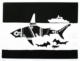
        Discovery Channel, the inventors of Shark Week, have been criticized (quite rightly) over the amount of shark fantasy that they’ve mixed with their shark science over the years, but I think it’s not inappropriate to include a bit of fantasy in this blog.  After all, I’m a fantasy blogger, not a science programmer!  So I’ve included this bold steampunk shark.  I like to think that the hammerheads have built this shark as a decoy or trap for the fishing boat above.  The artist of this piece donates her proceeds to conserve sharks and to work against the practice of killing sharks for their fin alone, an insanely wasteful trade.
        Finally, another piece with a touch of the fantastic, by Roger Peet.  He says it’s printed from three blocks, and I confess to being a little puzzled by that.  There’s a distinct outline along the edge of the darker blue; as it isn’t a separate block of its own, it must be the effect of a slight overlap between the green block and the dark blue block.  It’s very cool that the ink colors blend in that way.  Again, although it’s beautiful, it’s a bit unnerving, because it represents the effects of rising sea levels.
        I can’t say that I like sharks, or even that they’re one of the animals that particularly catches my imagination.  But in some ways that’s all the more reason to celebrate them.  After all, the creatures of this world, unlike the creatures of fantasy, exist for their own sakes, not merely for our interest.


[Pictures: Vulpecula alia, wood block print from De piscibus by Ulyssis Aldrovandi, 1613 (Image from AMS Historica);
Shiver of Hammerheads, linocut by Katherine Grey (Image from her Etsy shop TheGreyFoxStudio);
Moving Parts, linocut by Claire S. (Image from her Etsy shop TheGoodInk);
Drowned Apse, linocut by Roger Peet, 2015 (Image from his Etsy shop TooSphexy).]