Pages

June 28, 2014

Words of the Month - Location Location Location

        I’ve written about eponyms before: those words that derive from proper nouns.  Usually we think of the ones with etymologies from people’s names, but I also listed some that come from brand names.  Today I’ve got another list of eponyms, this time words that derive from the names of places.
        Not surprisingly, many words for products are named for their place of origin, especially textiles:
     denim - c.1690 from serge de Nimes, but as the modern type of coarse cotton cloth the word dates to c.1850
     buckram - early 13th c, from Old French (possibly by way of Italian), from Bukhara, Uzbekistan.  (At least, it may be - like so many etymologies, this is uncertain.)  Originally a delicate fabric, it’s now the coarse fabric used for bookbinding and millinery.
     madras - 1833, bright-colored muslin from the Indian state now called Chennai (In an interesting side note, the emphasis is generally on the first syllable for the fabric even though it’s on the second syllable for the place name.)
     shantung - 1882, coarse silk named for the Chinese province where it was made


There are also many articles of clothing with names derived from places.
     jeans - Originally a fabric from Genoa, Italy (or, as the French call it, Gênes), the word now usually refers to the particular style of trousers introduced by Levi Strauss and Jacob Davis in 1873.  Strauss didn’t start calling their product “jeans” until 1960.
     dungarees - Also originally a fabric (early 17th century) before it became a garment (c.1868) from the name of a village now part of Mumbai, India.
     bikini - 1948 from French, named for Bikini in the Marshall Islands, where the US tested the A-bomb.  The origin isn’t entirely clear, but it’s presumed to be because of the explosive impact of the bathing suit on viewers.
     cravat - 1650s, from French, from German, from Serbo-Croation Hrvat for “Croat”, the neckwear was copied from a scarf worn by Croation mercenaries in the French army.
     jodhpurs - 1899 as jodhpur breeches, from a former state in northwest India


Other products are also named for their city or place of manufacture, including some that are well-known, such as
     cologne - 1814 from the French name for Köln, Germany
And others that are more surprising, such as
     badminton - 1874 from the Gloucester estate of the Duke of Beaufort.  Here the game was first played in England (by British officers who had encountered it under the name poona in India).
     bayonet - 17th c, possibly from Bayonne, France, where the daggers may have been first made or first stuck on the ends of guns - but also possibly a diminutive of Old French bayon “crossbow bolt.”  You never know.

And finally, a bonus oddity
     magenta - The analine dye that introduced this color to the world as a specific hue was invented/discovered in 1859, and named for Magenta, Italy to commemorate the Battle of Magenta in which the French and Sardinians had just defeated the Austrians.

        What I find so delightful about discovering the eponymous origins of these words is the evidence of just how interconnected the world really was, even as far back as the thirteenth century.  But at the same time, I enjoy the reminder that even though products from faraway places might have been available, they were considered exotic and special, not ubiquitous and taken for granted.  The world may have been interconnected, but it wasn’t homogenized.  The fabric from Nimes wasn’t the same as fabric made elsewhere.  Cologne was made in Köln, not in factories anywhere and everywhere.  So what sort of special regional products do we enjoy today?  Foods, certainly, but keep your eyes open and see if you notice others.

[Pictures: Silk weaving, hand painted wood block cut by Zhu Gui from Imperially Commissioned Illustrations of Agriculture and Sericulture, 1696 (Image from The British Museum);
Genoa (Genua), woodcut from the Nuremberg Chronicle, 1493;
Köln (Colonia), woodcut from the Nuremberg Chronicle, 1493 (Images from Wikimedia Commons).]

June 24, 2014

Chiaroscuro

        Chiaroscuro (from Italian for “bright-dark”) is the use of strong light and shade in artwork.  In relief printing it is specifically the use of multiple blocks to achieve lighting or shading effects.  Probably invented early in the sixteenth century, these block prints were originally intended to reproduce the look of drawings done on midtone paper, with the artist working in both white and black ink.  The German style usually used a black key block, or line block, with a tone block in some midtone, while the Italian style usually did not have a line block, but used each block for flat areas of different tones.
        This “Scene of Witchcraft” by Hans Baldung looks quite similar to the effect you would get by drawing some white and some black on grey paper, but of course it was printed on white paper with a black block and a grey block.  It’s been carved so that black and white both appear as lots of lines, with relatively few areas of solid tones.  You can also see how Baldung was trying to use the shadows and highlights for drama, which is a characteristic of chiaroscuro art in general.
        The black in “Goddess of the Night” by Hendrick Goltzius is a more traditional key block, showing mostly outlines rather than areas of color.  There are two grey blocks, however, light and medium, to allow for more sense of shadow.  There are two things I particularly like about this one.  First, the bats pulling the wagon - although they’re small, so I feel that four is really not enough.  There should be at least a dozen!  I also like the white symbols arching over the wagon without any black accents, so that they seem to be symbols of light floating in the dark air.  I like the white highlights on the wheels, too.  In fact, I think this one is pretty cool altogether.
        For contrast in technique, Domenico Beccafumi’s image of “St Peter” shows the Italian style, with four blocks in four shades of brown, no black, and no outlines at all.  There’s relatively little paper showing through, making the white (or cream, technically) into a real highlight.  Peter’s face, hands, and feet are very intricately modelled - perhaps unneccesarily so.  Beccafumi may have been showing off a bit.  Impressive it is, 
though.  I was lucky enough to see these last two pieces in person at the MFA, and they are strikingly gorgeous.  Particularly on Peter, the laying on of successive layers of ink is very clear.  There’s slight thickening of the ink at edges of carved lines, slight variations of pressure, and an undeniable sense of skilled hands at work.
        To the extent that chiaroscuro wood block printing techniques were invented to mimic non-woodcut techniques, I always grumble about failing to appreciate the unique and wonderful properties of relief printing.  However, artists very quickly did take these ideas and techniques and begin to explore them in amazing and beautiful ways.

[Pictures: Scene of Witchcraft woodcut in two blocks by Hans Baldung, 1510 (Image from the Metropolitan Museum of Art);
Goddess of the Night, woodcut in three blocks by Hendrick Goltzius, c 1594 (Image from Museum of Fine Arts, Boston);
St Peter, woodcut in four blocks by Domenico Beccafumi, 
c 1525-1550 (Image from the Museum of Fine Arts).]

June 20, 2014

Little Red Riding Hood's Family Tree

        In a study published last November, anthropologist Jamshid Tehrani analyzed “Little Red Riding Hood” and similar folktales from around the world using the same phylogenetic methods used by biologists to study relationships between evolving species.  Tehrani’s study concludes that the “Little Red Riding Hood” tale branched off from the story of “The Wolf and the Kids,” which originated in Europe in the first century.  East Asian versions were later hybrids of the two stories.  But the interesting idea here isn’t where “Little Red Riding Hood” began - after all, folk tales are shared human property and they belong to all of us now.  What’s interesting is the idea that oral traditions evolve like biological organisms.  On the one hand, that seems obvious.  Of course stories evolve as they’re told over and over, moving through time and across geographical regions, from culture to culture.  But on the other hand, the mechanism is obviously different from that of biology, so it’s interesting to see whether the same methods of analysis apply to both.
        It’s also fun to see how a story changes, depending on who’s telling it, and to whom.  Naturally the wolf gets changed to a tiger when the story moves from wolf territory to tiger territory, but other changes may be less obvious to explain.  In some versions of the story the victim is rescued, while in others her consumption is The End.  In some versions the girl escapes on her own without having to be rescued by a woodsman or anyone else.  What’s going on in a culture when storytellers make the decision to reimagine the end of a story - to miraculously save the life of the victim after she’s been eaten, or to let the monster devour her when in the previous version she’d been able to escape?
        Tehrani says, “Folktales, more than any other type of story, embody our shared fantasies, fears and experiences.  Understanding which elements of them remain stable and which ones change as they get transmitted across generations and societies can therefore provide a unique window into universal and variable aspects of the human condition.”  What story elements do we embrace because of our time and place, and what story elements do we embrace because we’re human?  Of course, these broad questions imply that all people in a particular culture share the same taste, which is obviously nonsense - whatever “Little Red Riding Hood” version you pick, some people will like it, and others won’t.  It never hurts for us to remember that we’re all individuals, not faceless specks in our cultures’ cast of millions.
        As for me, “Little Red Riding Hood” was certainly never one of my favorite stories, but the one part of it I did (and do) like was the back-and-forth between the girl and the disguised wolf: “Grandma, what big eyes you have!  All the better to see you with, my dear…”  It shows evidence of thought and personality on the part of both characters, and also has the cadence of poetry - all things I enjoy.
        You can see Tehrani’s full article in the journal PLoS ONE, or read an article he wrote for the lay audience in The Atlantic.

[Pictures: Illustration from Household Stories from the Collection of the Brothers Grimm, wood block print by Walter Crane, 1882;
Illustration from Les Contes de Perault, dessins par Gustave Doré, wood block print by Gustave Doré, 1867 (Images from SurLaLune).]

June 17, 2014

Wood Block Prints by Xiang Silou

        Xiang Silou (Chinese, b. 1956) is a wood block artist doing absolutely amazing work.  He’s particularly known for large scale intricately detailed portraits of faces, especially of elderly people from ethnic minorities of China.  He gives the faces incredible detail, and incredible dignity, hinting at the innumerable stories of people’s lives.  In the words of one art director, “He carves each line with feeling; they represent people’s stories and emotions.  He is inviting [viewers] to try to read the story 
on their faces, and to care and love them.”
        Exact information on Xiang’s pieces is a little hard to come by on the internet, so that for any given piece I probably couldn’t find the actual dimensions, or the date, or even the title.  The first face shown here is 90 x 120cm, way bigger than anything I’ve ever done, but the only place I could find the title given was in Chinese, which is all Greek to me.  I’d love to be able to find more comprehensive information on these pieces - but what I’d really love is to see Xiang’s work in person, to feel the full impact, and then to get my eyes right up close and see the tiny details and the 
marks of carving and pressing.  (Xiang apparently presses by hand, presumably with a traditional baren.)  I wouldn’t even begin to know where to carve and where to leave black in order to get these effects of contours, softness, and expression.
        Xiang’s portraits have been compared to landscapes because of his attention to the contours created by age and weathering.  He also does actual landscapes, and they too are 
characterized by intricate detail, but also by looser, more stylized shapes, more reminiscent of traditional Chinese brush painting.  But much like his portraits, his landscapes also serve as invitations to consider what stories might be taking place here.  Despite all the detail, there’s always some mystery, too.  Here’s an artist with a unique and beautiful vision, and the ability to share it with the rest of us.


[Pictures: Mother(?), woodcut by Xiang Silou, 2011 (Image from UC Santa Cruz);
unknown, woodcut by Xiang, c. 2005 (Image from Ricefield centre);
Rooftops of home town, woodcut by Xiang;
unknown, woodcut by Xiang, 1999 (Images from Guanlan Prints);
Waverly Station, Edinburgh, woodcut by Xiang, 2006 (Image from Frames Gallery).]

Quotation from Lin Chau of the Ricefield Center, as reported in The Scotsman, March 26, 2008.

June 13, 2014

The Yeti

        Our most recent read-aloud was The Abominables, by Eva Ibbotson, about a family of eccentric yetis fleeing evil tourists and hunters.  I’m sorry to say that we weren’t that thrilled with it; I found its morality painfully heavy-handed, even when for the most part I share her judgments.  I didn’t appreciate being told so very explicitly what was good and what was wicked.  Ibbotson has this tendency in all her books, I think, but in some it's done in a rather charming way - or at least doesn't detract too much from the charm.  This one seemed worse than usual.  However, the book reminded me of this funny little poem about the yeti by John Gardner.

The Yeti is a manlike beast,
Unless, perchance, he doesn't exist.
He walks like a man and has hair on his face,
And rumors persist
That in forests and caves where no one goes,
Or high in the Himalayan snows,
He may still be living.  Nobody knows.
If you meet him and ask him,
     "Are you a Yeti?"
All he can say is, "Maybe."

        This reflects the irritating but amusing circumstance that every exploration into the yeti is always inconclusive.  Last October yetis were much in the news when alleged yeti DNA samples were matched to a prehistoric polar bear.  Might there be an unidentified species of bear lurking in the Himalayas?  That would be cool!  Might this bear explain the legends of the abominable snowman?  All we can say is, “Maybe,” but of course it’s all inconclusive!  Trust poetry to capture the essence of the whole situation.

[Pictures: Yeti stamp from a series with traditional depictions of yetis, from Bhutan, 1966;
Yeti stamp from a series illustrating folk tales, from Bhutan, 1996;  (Images from pibburns).]

Poem from A Child’s Bestiary by John Gardner, 1977.

June 10, 2014

Woodcuts by de Graag

        I recently came across some work by Julie de Graag (Netherlands, 1877-1924) that I found very pleasing.  De Graag was apparently not unknown in her own time and place, but seems to be quite obscure in mine.  Indeed, all the information I found about her is in Dutch, and while I think between my German and English I was able to glean the basics, I won’t be able to give you any deep insights into her oeuvre.  But then, there’s nothing wrong with letting the art speak for itself.
        I love this pair of owls.  They’re stylized, but still have plenty of personality; they’re a matching set but each an individual.  There’s no background, no tiny details or intricate textures, just a charming, bold, straight-forward design.
        This second example is even bolder and more stylized, and looks more like it might have been intended as graphic work more than “Fine Art."  It would bear repetition as a tile design or wallpaper border or a silk scarf.  I also found just a thumbnail of another flower with a similar look (though I particularly like 
the background of the nasturtiums).  I wonder how many other flower designs de Graag might have done in this style and color scheme.  I find them really attractive and love the use of color.
        I’m sorry I wasn’t able to find more about this artist, but I’m grateful that I found what I did - just remember that twenty years ago, without all the wonderful artwork posted on the internet, none of this would have been possible at all!


[Pictures: Twee uilen (Two Owls) woodcut by Julie de Graag, 1921;
Oost-Indische kers (Nasturtium) color woodcut by de Graag, 1919 (Images from Gemeente Museum den Haag);
Geranium, color woodcut by de Graag, 1918.]

June 6, 2014

Fantastic Progress?

        Here’s an interesting article by sci fi author David Brin on his definition of the difference between sci fi and fantasy.  You should probably take a few minutes and read it, because it’s obviously more detailed than my summary is going to be, but his basic gist is that fantasy stories are those in which society and the social orders remain essentially the same, whereas sci fi stories are those in which progress is possible.  According to Brin’s view, setting is irrelevant, stage sets are irrelevant, magic vs technology is irrelevant; it’s just about change - or the lack thereof.  So he would argue that a magical book, like those in Terry Pratchett’s Discworld series, is sci fi rather than fantasy if it involves progress.  I totally disagree with Brin’s use of the labels “sci fi” and “fantasy” for his two categories, primarily because these two labels have already been used to mean something quite different and it’s just confusing now to apply them in this new way.  That said, I think Brin has pointed out a real dichotomy between two camps of speculative fiction that had never come into focus for me before.  This is worth some serious consideration.
        First of all, it may be true that much traditional fantasy does tend to reinforce traditional social structures.  The bad usurping king must be replaced by the rightful king, the princess must be rescued from her life as a servant, and the will of the gods is inexorable fate against which mortals struggle in vain.  And perhaps sci fi has been more likely to show us progress, or the view that the future is in our hands.  But I don’t think that correlation is anything intrinsic or necessary to the two genres, but rather a side effect of fantasy’s long history and sci fi’s more recent invention as a genre during the same time that industrialization and social movements began turning people’s thoughts to progress.  Whatever the reason, I don’t think fantasy is necessarily upholding the status quo or sci fi necessarily advocating social change.  For my own definitions of the difference between sci fi and fantasy, you can read my blog post The Borders of Fantasy, but the summary is that I think sci fi explores the impact or implications of technology (so yes, the possibility if some kind of change is involved, but not necessarily change to the social order), while fantasy uses its magic as part of the framework of the world in which characters must act.  Both ask that vital question “What if?” but sci fi tends to ask it about questions of technology or specific changes to society brought about by inventions or discoveries, while fantasy tends to ask “What if” about more fundamental or personal issues such as good vs evil and the hero’s quest.  So I agree that Pratchett could be considered a sci fi writer, but that’s because in many of his books, such as his most recent Raising Steam, he deals quite specifically with issues of technological change.  But I’m getting back to a discussion of words and definitions again.  What I completely agree with in Brin’s article is that some fiction tends to give the moral lesson that the status quo must be defended or is so natural or preordained that it will always stand, while other fiction explores whether, 
why, or how we might change our universe.  I can see Brin’s point that we should be wary of those stories that tell us the status quo is sacred or inevitable.  A steady diet of that could well seep into our subconscious and become unhealthy just as a steady diet of violent “solutions” tends to make us believe that violence is a plausible solution in real life.  We certainly need to see examples of change, and that is indeed one of the important roles that speculative fiction needs to play if it’s going to make the world a better place.
        When I examine my own favorite stories I come to the conclusion that I tend to believe the author’s assurance of what our heroes’ goal should be.  If Tolkien tells me Aragorn should be king, I believe him, rather than wondering why the hobbits don’t start protesting for democracy.  Now, if Aragorn acted just like Sauron, I wouldn’t be able to take Tolkien’s word for it that he’s the Good Guy, which is why I found Philip Pullman’s “His Dark Materials” series unacceptable - I was being asked to take the goodness of the “Good Guys” on faith despite all evidence to the contrary.  But as long as the goal does indeed appear to be a noble one, I’m willing to accept it within the story, even if it doesn’t look like my view of what an actual modern society in the real world ought to look like.  This is because the part that interests me tends to be the How.  How do you solve the problem?  How do you implement the solution?  How do you find the courage, the strength, the  creativity to overcome the obstacles?  So I love many a story, including The Lord of the Rings, that David Brin would label “fantasy” and say is standing against the idea of human improvability.  I would argue that many stories in which the happy ending involves lack of fundamental social change may still be about human improvability and progress, because they explore an individual’s ability for personal change and progress.  However, I do think Brin’s point that some stories presume changelessness while others embrace change is an excellent one, and one that I hadn’t really considered before.  Think about the books you like.  Think about what underlying messages they might be offering.  Think about how your favorite stories might be helping to make the world a better place - or might be encouraging us to hold back from progress.

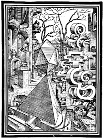
[Pictures: 2. Landscape with ruins, tetrahedron, and icosahedron
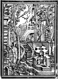
10. Landscape with ruins and cylinder segments, wood block prints from Geometria et Perspectiva by Lorenz Stör, 1567 (Images from TU.)]

June 3, 2014

The Vegetable Lambs are Back

        As I continue on my recent kick of mythical creatures, my thoughts turned to the vegetable lamb.  (If you’re not familiar with this one, you can read my previous post about the beast here.)  As usual, part of the challenge is to take something that artists have already depicted in the way that best shows off its unique characteristics, and try to come up with a different view, or a different twist.  After all, if I can’t push the imagination a little farther or make people think about the old myth in a new way, what’s the point?  And in this case, the idea I started thinking about was, what if a modern magical gardener grew vegetable lambs today?
        So I decided to grow my vegetable lambs on one of those wonderful fire escape gardens in a city — some of those gardens are already pretty magical, coaxing nature out of a potentially barren spot.  This sends my imagination off into lots of interesting directions: Do the neighbors even notice the magic in this garden, or do they all keep completely to themselves?  Does the landlord count vegetable lambs as plants or pets?  What other sorts of magical plants might a wizarding gardener grow?  (I gave her a pot of four-leafed clovers.)  The plant on the right, you may notice, is copied from the famous fourteenth century woodcut illustrating The Travels of Sir John Mandeville, as featured in my previous vegetable lamb blog post.  This is my nod to tradition, and shows the lambs as their pods are just beginning to open.  I’ve also shown two more lambs in more developed stages, the leftmost one being fully grown.
        As for the carving, this was a pretty ambitious block.  The hardest thing for me was to make the fire escape railings cut across all the details behind them.  Also, I would have liked slightly more contrast between the black brickwork and the black metal of the fire escape.  Still, on the whole I think the over-all darkness of the piece is a little different and interesting from other things I’ve done.  I wonder what people at shows will make of it - will they notice that the lambs are growing from stems?  Will they have ever heard of vegetable lambs to begin with?  Or will they just think it’s all sort of weird?  I look forward to some interesting conversations!

[Picture: Enchanted Garden, rubber block print by AEGN, 2014 (Sold Out).]