Pages

March 29, 2013

Word of the Month - Suspicious Character

        The word suspicious caught my attention this week, and it occurred to me how strange it is that the same word goes in both directions, applying to both sides of a relationship.  Think of it this way: if Arnold is watching Bert lurking and prowling about, both Arnold and Bert can be described as suspicious.  Arnold suspects Bert, and Bert's actions elicit suspicion, but both are suspicious.
        Wondering which meaning came first, "inclined to feel suspicion" or "deserving of or exciting suspicion," I looked it up… and discovered that both meanings date back to the end of the fourteenth century.  ("Deserving suspicion" is attested a bit earlier, but with words this old there isn't enough written data to conclude how long a word might have been in common use before any of the examples survived to come down to us.)  In other words, since the very earliest uses of this word in English we've had this funny ambiguity.
        As we discussed this word at the dinner table that evening, I jokingly used suspicable for the "open to being suspected" meaning, and suspishful for "feeling suspicion."  Later when I started looking things up I discovered that I'm far from the first to have come up with variations on the theme.  

        suspicable - c.1614 - open to being suspected 

        suspiciency - c. 1690 - suspicion

        suspicionable - c. 1692 - open to being suspected

        suspectable - c. 1748 - open to being suspected

        suspectful - Edgar Allan Poe, a man who certainly knew his suspicion, proposed suspectful to replace suspicious for one of the two meanings.  That sounded like a great idea to me… but which meaning to replace?  I think it sounds like it should be the "feeling suspicion" meaning, but it turns out that suspectful had the same ambiguity, having also been used in both senses since its origins around 1600.  Curses, foiled again!

        To complicate matters further, a number of variants of suspicious have been in use through the years, including suspectious, suspectuous, and suspicionous, now all obsolete.

        So it looks like we're stuck with this strangely ambiguous word, the sort of word that makes me think, "That's no way to run a language!"  It was the only word I could think of that had this particular issue (though synonyms dubious and doubtful can also be used to describe the actions on both sides of the coin, if perhaps not the actors)… Then P came up, looked over my shoulder and said, "Oh, it's just like smell."  Yep, when Arnold catches a whiff of Bert's cologne, both Arnold and Bert smell.  Sometimes I wonder how we manage to communicate at all!

[Picture: Jealousy from Six Masks, rubber block print by AEGN, 1999.]

March 26, 2013

Work in Progress - Reduction

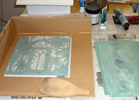
        In my continuing obsession with doors, I decided that my idea for a greenhouse door would be a suitable subject with which to try a reduction print.  This time I'm going wild and crazy and upping my number of inks to three.  So I got out my paper and pencil and sketched out my design.  I had to start thinking differently when I began to carve.  First decision: should the frame of the greenhouse be white or black?  White seems more realistically common, but I decided black would give a better graphic
contrast.  Next decision: what are all the things that would normally be white, but this time will be one of my other colors?  With a standard black-and-white block I need black to define white and white to define black.  I would have carved the outlines of the different leaves; I would have carved all the textures; I would have carved the sides of the frames, and all the other details.  This time instead of carving everything that should not be black; I'm carving only those areas that should be white.
        Next up, I made a registration frame to help my three printing runs line up properly on top of each other.  Then I began printing the first color: light greyish
green.  Right off the bat I'm a little disappointed by the printing, and I have a bad feeling that I'm not going to end up with a very big finished edition.  I had paper for 18 attempts, so even though the printing was less than perfect on an awful lot of them, I couldn't do any more.  (I could, of course, just stop the whole process until I get more paper, but I'm too impatient for that.)  Still, because everything this color will be plants, I hope it will look okay with some variability to it.  But I won't know until it's finished.
        After printing all 18 of the first run, I washed everything up, and set about carving the block further.  This is the essence of a reduction print: it's the same block that gets recarved for each successive color.  So once I carve the second round, I can never go back.  This time what I'm carving out is all those areas that should be the light green in the finished print.  This is a little scary, because suddenly I'm chopping out whole plants!  Eek!  I'm also carving in the textures and outlines that are to add detail to the darker green plants.  The thought process here is very similar to making batik fabric or Pysanky Easter eggs: for each round you put wax over just the parts that are to remain the most recent color.  Of course in this case, rather than putting on a layer of wax, I'm taking off a layer of rubber, but the way I think about the colors and the design is the same.
        This is as far as I've gotten for now.  Still to come is to finish the second round of carving, print the second color, and carve and print the third color.  I'll report back on the rest of the process when I finish.

[Pictures: Greenhouse block, ready to carve;
Block in the registration frame, inked;
Greenhouse block, first state;
Greenhouse block, carving the second stage of reduction;
Pysanky (wax resist) eggs by AEGN.
(All photos by AEGN)]

March 22, 2013

The Importance of Fantasy (II)

        While recently reading an essay on writing for children I ran once again into a common misconception: that children read fantasy because they're not yet mature enough to put away a primitive, ignorant view of the world.  (And of course this says nothing good about adults who read fantasy!  Clearly we are somehow in denial of reality, or merely looking wistfully backward, as this particular essayist opined.  There's definitely something wrong with such arrested development.)  The idea is that reading fantasy is shallow escapism, while presumably reading realistic fiction is all about engaging with the world in a mature and meaningful way.  I would argue that there's certainly an element of escapism in all recreational reading.  After all, even if you're reading biographies or scholarly history, for example, you're still immersing yourself in a different time or place, in lives and experiences other than your own.  And I honestly don't see why such escapism is always mentioned with a sneer, as though walking a mile in someone else's shoes, even if they're fictional shoes, is only for those infants and madmen with a dubious grasp on how Real and Earnest life actually is.
        But beyond that, I reject the very idea that speculative fiction is primarily about escapism at all, or that it's somehow fodder for the immature, just to amuse them until they grow out of it.  I think it's explained well by James Gurney, the author and illustrator of the Dinotopia books.

        If there is one age or time of life that embraces the book [Dinotopia] most heartily, it is the moment after the horizons open from childhood into youth, and before the limits are set by adulthood…  I've come to realize that this audience… [is] more logical, intelligent and vocal than their adult counterparts.  Utopian literature gives them a chance to inhabit the dreams that fuel their growth into independent life.  They read not exactly to escape their world, but rather to engage more fully with it, for only through fantasy can they try on an identity and live as actors in their own dreams.

        There are a few pieces of Gurney's statement that I especially want to emphasize.
        1.  Adulthood (and the Real and Earnest attitudes that go with it) tends to set limits.  It is fantasy that can give both children and adults a road map around those limits, into an attitude of greater possibility and greater creativity.  The ability to ask "What if" - that ability fostered by speculative fiction - is one that can only benefit us all individually, as well as humanity as a whole.  We need our creativity encouraged, not sneered at as immature, or dismissed as head-in-the-clouds escapism.
        2.  Speculative fiction, especially Utopian literature or stories depicting integrity and heroism, allows children to try on positive identities as they grapple with what kind of people they want to be.  Just as younger children may play house, doctor, firefighter, teacher, to try out and practice their ideas of what it's like to be an adult, so older children use reading to imagine themselves in different situations and with different ways of responding to life.  All fiction gives readers the opportunity to feel themselves in different identities, but fantasy has an additional edge over realistic fiction.  That is, it does not necessarily limit the responses to those that authors and editors feel are "realistic" - those that are likely, trendy, or have already happened.  With speculative fiction anything is possible… if…
        3.  This creativity and this practice in visualizing different ways of living life are not escapism.  They are, on the contrary, a way of engaging more fully with the world.  That's something that's healthy not only for children of all ages, but for adults, too.  And that's another reason why fantasy is so important!

[Picture: Steep Street, oil on board from Dinotopia: The World Beneath by James Gurney, 1996.]
(Quotation from James Gurney, "Terrible-Lizard-Happy-Dream Kingdom: The Origins of Dinotopia," Phi Beta Kappa Key Reporter, Fall 2010.)

March 19, 2013

When Black & White are Not Enough - Method 4

        And finally, one last way to get plenty of color into a relief block print:

Method 4.  Print your single block in black, then color the print like a coloring book.
        This seems to be a very popular method among children's book illustrators these days.  Because each print is colored in individually, this wouldn't be a method particularly well suited to turning out an edition of hundreds of near-identical pieces, but of course with modern book-printing technology, you need to make only one original and then digitize it.  However, this is also one of the earliest methods of making color illustrations in books.  Often a book would be available with the option of black and white or color.  If you bought the black and white version, you might color it in yourself.  If you bought the color version, someone else would have painted over the black and white block prints for you - sometimes with real artistry, but often quite crudely.
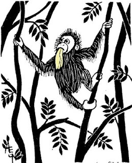
        Today's hand-colored block prints are anything but crude.  I've seen a few artists who use colored pencil, but most use watercolor.  I've used this method from time to time to highlight a detail of an otherwise uncolored block, as in the one tiny spot of green for the pea under the princess's stack of mattresses, or the single flash of red at the back of a downy woodpecker's head.  When I do it I have to paint very carefully, most definitely staying between the lines, because the vast majority of my blocks are printed with water-based ink, and if I painted right over the black ink, it would smudge and run into my watercolors.  Artists who use this technique more lavishly print with oil-based ink.  Once oil-based ink is dry you can paint over it all you like.

        So, there you have it: four basic methods for adding color to block prints whenever you're craving something bright.  But as for me, having spent two weeks here going through all different ways to make colored block prints, I come to the end ready to go back to where I began: I love color - bright, beautiful, vibrant, rich, infinitely variable color - but when it comes to block prints, I really just want my black and white!

[Pictures: Ready for Planting, hand painted wood block print by Mary Azarian;
Klewasser (Clover), hand colored woodcut, c. 1500 (Image from Davidson Galleries);
Tom's Orangutan - Bukit Lawang, rubber block print with yellow watercolor by AEGN, 2004.]

March 15, 2013

When Black & White are Not Enough - Method 3

        Ink is not the only way to add color to a block print.  Simply printing on colored paper is enough to give an image some brightness.  But sometimes one color of ink on one color of paper seems too plain.  (I know, I know.  It's hard to imagine that one color of ink and one color of paper could ever be insufficient!  But strangely enough sometimes people do want more color than that.)  This is the place for a technique called chine-collĂ©.

Method 3.
Lay colored paper with adhesive on the back of the inked block, then lay background or backing paper on top of that before pressing.
        By cutting or tearing the colored paper to size, it can highlight just a particular part of the print.  (Cutting, of course, is easier to control, but I think torn edges blend better with the background paper, so I prefer to tear the paper when I can.)  For example, to make this sunflower, I first inked my block, then carefully laid down the glued yellow circle just over the flower.  I then laid down the green paper over the whole block and pressed the whole thing as usual.  The pressure simultaneously transferred the ink to the paper and adhered the yellow paper onto the green paper.
        I've used the technique most often to cover an entire block almost completely, with the white paper as a sort of background border with just the edges of the ink touching it.  But there's no reason you couldn't use multiple scraps of colored paper on each block and have lots of different colors.
        The only difficulty I've had is in smearing the ink if the adhesive makes my paper too damp.  Also, it's a little difficult to juggle the timing of inking and gluing so that neither the ink nor the glue gets dried out while waiting for the other.
        This is a technique that works especially well with a serious press so that the multiple layers are embossed together.  It doesn't work quite as satisfyingly with hand pressing, alas.  It's still fun, though!

[Pictures: Sunflower, wood block print with chine-collé by AEGN, 1999 (sold out);
Weeping Willow, linoleum block print with chine-collé by AEGN, 1998.]

March 12, 2013

When Black & White are Not Enough - Method 2

        Sometimes a little touch of color just doesn't do the job.  Sometimes you want a full-color block print.  Then it's time for…

Method 2.  Ink and print separately for each color desired.
        This can be done with the same block or with different blocks for each color, but either way the biggest issue is registration: making sure all the separate printings line up.  At least, that's the biggest problem I've had when I've experimented with doing multi-color prints.  My solution was to make myself a cardboard frame (I'm sure most people use wood!) that will always hold the block and the corner of the paper in the same position relative to each other.  Even so, you end up rejecting a lot more prints.  Not only will a mistake in any one of the printings ruin it, but so will misalignment between any printings.  It's a pain in the neck, for sure!
        2A.  In traditional western block printing, the most common method is to carve a separate block for each color.  This allows the
image to be printed over and over with maximum accuracy.  I've tried this only once, and it was not a success.  (The colors didn't layer the way I expected them to.)  So I've posted an example above from someone generally considered a little more successful than me!
        Separate blocks are not the only option.
        2B.  In traditional Japanese printmaking, separate blocks are used, with a key block for the black including the outlines.   However, some blocks may be inked with more than one color, especially for the subtle gradations you see in many Japanese prints.  Multiple colors can be done all at once, or done using the same block in different print runs for the different colors.  Registration is aided by making the wood block larger than the paper, with a notch cut into it at the corner.  Then each time the block is printed, the paper must be lined up with the notch.


        2C.  In a reduction print the same block is used for all the colors, but recarved between each.  This blue jay is my very simple example.  First I carved away everything that was to be white and printed with blue ink.  Then I took the same block and carved out all the parts that were to remain blue, leaving only the parts to be printed with black.  The method can, of course, be used for lots more colors than a mere two.  The main disadvantage of this method is that you can never go back and print more, so you have to print lots and lots of extras of the first color to allow for attrition in each successive printing.  (I am fascinated by this method and plan to try more, so I'll be coming back to this in more detail in another post.)
        2D.  And finally there's the Provincetown or white line style of block printing.  This is another one I want to try myself, so I expect to post more about this later.  For now, I'll just explain that only one block is carved,
with white lines separating each differently colored area, almost like a coloring book.  It's then inked (with a brush instead of a brayer, for control) and printed one color area at a time.  Often the paper is pinned to the side of the block, folded back during inking, and folded down again to print.  Instead of printing an entire edition's worth of sheets in one color before going on to the next color, each print in an edition is printed in its entirety, one color after another, before the next piece of paper is begun.  Artists often experiment with many different color variations instead of making each print identical.

        Inking multiple colors separately is definitely more complicated than plain old black and white.  But what's up next?  Ink isn't the only thing that comes in different colors…

[Pictures: Portrait of a Woman after Lucas Cranach II, linoleum block print, 1958 (Image from The Metropolitan Museum of Art);
Massaki and the Suijin Grove by the Sumida River, wood block print by Hiroshige from One Hundred Famous Views of Edo, 1856-8 (Image from hiroshige.org);
Blue Jay, rubber block print by AEGN, 2010;
Provincetown Backyards, wood block print by Blanche Lazzell, 1926 (Image from Baren).]

March 9, 2013

When Black & White are Not Enough - Method 1

        People often ask me how to get color in block prints.  And of course despite my prejudice toward black and white, sometimes a little color is in order…  Or sometimes a lot of color.  Whether a lot or a little, I think there are four basic ways to make a color block print.  I'll cover each in a separate post so as to give myself room for plenty of pictures.

Method 1. Ink the block with multiple colors of ink all at once.
        1A.  The easiest way to do this is to roll one color of ink over the entire block as usual, and then use a dauber to pounce different colored ink on a few key areas.  I made myself a couple of daubers by wrapping flannel around a bit of synthetic stuffing and putting a rubber band around the top to hold it together and give myself something to hold onto.  I made a small one and a tiny one.  You wouldn't want to do this over a large area, and nor can you keep the ink confined very precisely, but it can work well when you want to highlight tips of things or allow a gradation at the edge of your highlight color.  On the chipmunk I rolled brown and dabbed black just along the stripe and eye, while on the fish I rolled green and then dabbed yellow along the stomach and blue all over the background water.
        1B.  The other way to get multiple colors onto one block  is to roll different areas with different colors.  The difficulty with this is that it's hard to roll with anything other than a straight, hard edge.  In "The Sun & the North Wind" I used a small brayer to ink the cream color first.  For the black and brown I made a gradation of ink on my rolling plate and then had the larger brayer inked in a gradation of color.  My attempts to roll in a curve were only partially successful.  For the phoenix I rolled orange over most of the block, then went back and rolled red over the edges of everything.  (The red egg and the yellow on the stomach were then added with the daubers as described above.)

        This is probably the most common method I use to add multiple colors to a block, although I think it's not nearly so common in the larger world of printmaking.  Tune in next week for the "normal" way to make a multi-color block print.

[Pictures:  Strange Fish II, rubber block print by AEGN, 1998;
Chipmunk, rubber block print by AEGN, 2008 (sold out);
The Sun & the North Wind, rubber block print by AEGN, 1998 (sold out);
Phoenix, rubber block print by AEGN, 2010 (sold out).]

March 6, 2013

World Read-Aloud Day - Nursery Rhymes

        Today is World Read-Aloud Day, a celebration, as LitWorld says, of "the joy and power of shared words, and literacy as a human right that belongs to all people."  Good and Important Stuff!  Today I'm thinking about one of the very first things many children hear read aloud: nursery rhymes.
        I really get a kick out of nursery rhymes.  Some are less appealing than others, of course, but many of them are wonderful little nuggets of fantasy, humor, and social commentary.  Yes, I know about the real political and historical origins of many of the classic nursery rhymes, and that's pretty interesting in its own right, but as I say on the back of my own selection of nursery rhymes, I'm not about to let those facts get in the way of such delightful stories.  My favorite nursery rhymes are the ones that tell just enough of a story to make me wonder why, or how, or what
might happen next.  Of course most of my favorites are the ones I collected when I started doing my own nursery rhyme illustrations (and by the way, I didn't start illustrating nursery rhymes when my children were born.  I had done a number of them before, just for my own sake.)
        But for reading aloud, the value of nursery rhymes goes even deeper.  The right combination of catchy rhythm and rhyme plus quirky scenario can stick in a child's mind like nothing else, making nursery rhymes terrific building blocks for literacy.  And they really need to be spoken aloud, making them best when shared between people and between generations in exactly the sort of interaction that fosters love of language.  Finally, those fantastical situations - cows jumping over the moon, wise men trying to use a bowl as a boat, families living in shoes - invite children to think "counterfactually," which is fundamental to how children learn.  (My blog post about that is here.)
        There are about a zillion nursery rhyme books out there, from huge compendiums with scholarly notes, to little board books with a single rhyme.  There are efforts by famous illustrators like Helen Oxenbury, tie-ins with popular characters like Blue's Clues, and then no-names like me.  Illustrations range from crude cartoons to beautiful paintings (and check out A Stitch in Rhyme by Belinda Downes with very cool illustrations done with applique and embroidery).  As a child I always favored the ones where the girls had beautiful old-fashioned dresses and the backgrounds had lots of scenic details.  I'm afraid there aren't a lot of pretty dresses in my book, Hey, Diddle Diddle! and Other Rhymes, but I did try to include extra details for those who like to spend time looking at the pictures.
        Every household should own a nursery rhyme book, but it's also worth going to the library and browsing through all the options to find something you'll enjoy looking at over and over and over… and over.  (Nursery rhymes are usually shelved at 398.8, but some libraries put them with picture books under illustrator's last name, or even in a separate section of their own.  They can sometimes be hard to find and often get overlooked by the average person browsing for picture books.)
        For an entire series of posts about nursery rhymes, click "A-Z Challenge '20" under the Labels list in the sidebar.
        But whether it's nursery rhymes, an article from the newspaper, a couple of paragraphs from a novel, or the back of the cereal box, share the joy of the written word and read aloud with someone today!


[Pictures: The Family who Lived in a Shoe, rubber block print by AEGN, 2003;
Hey, Diddle Diddle, rubber block print by AEGN, 2001 (sold out);
Wise Men of Gotham, rubber block print by AEGN, 1998;
all illustrations from Hey, Diddle Diddle! and Other Rhymes by AEGN.]

March 1, 2013

Grace Albee's Relief Prints

        Grace Albee (1890-1985) lived in France and the U.S., in cities and rural areas, and her relief prints always have a strong sense of place.  She did mostly wood engravings, but also some wood and linoleum block prints, and her subjects were mostly what I think of as landscape vignettes.  Like me, she had an eye for the beauty in derelict places and abandoned things.  For example, she has several cool portraits of broken-down carriages and wagons - but I didn't have room to post everything here, so do look up more of her work!
        Among the images I could find on the web, I've mostly gravitated toward architectural scenes, ranging from the romantic French town of Dinan with its medieval bridge and cottages, to the Manhattan eyesore with its broken and shuttered windows.  These are both wood engravings and therefore quite small and detailed, but you can see that the carving of the former is a little more stylized, especially in the sky, while the latter has texture as fine and nuanced as any pen drawing.
        I include Fisherman's Village as a representative linocut.  Although it's still wonderfully detailed, I love the larger areas of untextured black.  Also, see how the sky has a fuzziness to the inking where the shallow u-gouge has left the level of the block on a gradual slope?  That's such a wonderfully distinctive hand-carved block print look.
        Albee had a long and successful career, balanced with a long and successful marriage and family (five sons!)  I admire her ability to handle both without, it seems, too many compromises.  Here she is at work on an engraving.  There's no date given for the photo, although she's clearly somewhat older here.  She appears to be working at an ordinary
household desk in a corner of an ordinary room.  I can't help liking that, like me, she's not in some fancy studio.  One of the reasons I got started with block prints in the first place was that it's a medium that fits well into an ordinary house or apartment, integrated into an ordinary schedule that includes family and other work.  I like seeing that connection between us.  It's fun to look at Albee's work and think, "Here was another woman, another artist, who would have been noticing and being drawn to many of the same scenes I would be; who would have been thinking of those scenes, like me, in terms of a translation to black and white, uncarved and carved; and who, like me, would have been finding the time to try to coax that vision out of wood and ink and paper while living a whole and rounded life."


[Pictures: Dinan, wood engraving by Grace Albee, 1931 (Image from Georgetown University Library);
Manhattan Backwash, wood engraving by Albee, 1938 (Image from National Museum of Women in the Arts);
Fishermen's Village (Rockport, Massachusetts), linocut by Albee, 1927 (Image from the Metropolitan Museum of Art);
Grace Albee at work, photograph by Peter A. Juley & Son, (Image from Smithsonian);
Villefranche sur Mer, wood engraving by Albee, 1929 (Image from Georgetown University Library).]