Pages

January 29, 2013

Words of the Month - Have a Heart

        In Western Culture the heart, as a million retail establishments are even now reminding us, is the seat and symbol of love.  But it's much more complicated than that.  I think it's quite amazing how many, and how varied, are the English words that derive from the heart.  To get you in the proper Valentine's mood, here are a few.

heart - In addition to referring to the organ, heart also means the center of something.  And when it appears in idioms it goes off in many directions.
     learn by heart - involves the memory
     heart to heart - involves emotional honesty
     have a heart - involves sympathy
        but when you don't have the heart to do something it's a double negative and means you weren't unkind enough to do it
     your heart isn't in it - involves enthusiasm
     lose heart and take heart - involve losing and gaining hope and bravery
        but lose your heart - involves falling in love
        and take something to your heart - involves affection and loyalty
        while taking something to heart - involves either serious consideration or serious grieving

hearty - sincere, vigorous, strong, abundant… the word that should simply mean "like a heart" is an emotional intensifier that can be applied to welcomes, meals, dislike, support, laughter, and people in good health.

        That's a lot of work for one organ that also has to get the blood circulated!  (By the way, our medical terms related to the heart, such as cardiac, come from Greek, by way of Latin and in some cases French.)  But the heart's work is far from done, because English also includes many more words that came to us from the same Indo-European root, but by way of other  languages.

core - the center, or heart (from French)

cordial - hearty or heartfelt (from Latin)
     also the medicine or drink that stimulates the heart

accord - when hearts are together (from French, from Latin)
     also concord; and discord - when hearts are apart

quarry - something hunted, from the practice of giving the hounds the entrails of the deer (including the heart) as their reward (from French)

creed - something you believe, i.e. keep in your heart (from Latin)
     also credulous and credible

miscreant - originally a heretic or unbeliever, i.e. one who doesn't have the right things in his heart (from French)

grant - to allow or consent, from a French word for "guarantee, promise," ultimately from the same Latin word for "believe, trust," which came from the root for heart (from French, from Latin)

record - originally to recite or learn by heart, before it meant to write down or keep in some other form (from French, from Latin)

courage - bravery, as in taking heart (from French, from Latin)
     also encourage and discourage, as in hearten and dishearten

dim sum - appetizer, apparently from the literal meaning "touch the heart" (from Cantonese)

        So in the next two weeks, while you're drowning in the trite pink and red hearts that are everywhere, take heart from the richness of symbolism as reflected in all these wonderful heart words!

[Picture: A Pair of Quails, rubber block print with watercolor by AEGN, 2010.]

January 25, 2013

Ad Completorium

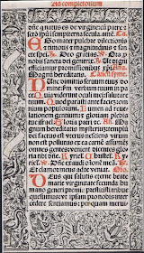
        Today I share with you a woodcut from my own [small] collection of relief prints.  I bought this piece about fifteen years ago in a small shop in Boston's Beacon Hill, where it was labelled simply as "17th c woodcut."  You can see, obviously, that it's a page from a book.  My Vulgate Latin is not exactly fluent, but I can make out the "Nunc dimittis" and some "Kyriel"s.  A little googling reveals that I've also got the hymn "Loving Mother of our Savior."  So I believe that what I have here is a page from the compline section of a breviary or book of hours.  Without taking it to an expert, I don't know its date any more exactly, nor its country of origin.
        This is no medieval illuminated manuscript - I imagine that it's not a particularly high-end production - but I think it's attractive in its own right.  I particularly like the wonderfully detailed border, with its plants and animals.  There's a marvelous rabbit at the lower right, a nice selection of birds, and the very odd wyvern with a face in its chest in the center of the bottom.  Many of the plants are detailed enough to be distinctly identifiable: strawberries, rose, columbine, violas…  I think they're absolutely lovely.
        Another thing I find really interesting about this piece is its construction.  If you look closely, you can see that each border is printed from a separate strip of wood.
The reverse of the page is printed with four more separate borders.  I don't know how many different borders there were, but I imagine that throughout the entire book borders were reused in various combinations to make each page look unique without having to design an entirely new border.  As for the text, I am not an expert to be able to recognize whether it was printed with a wood block or movable metal type, although I assume the latter.  Certainly you can see the offsetting where the page was printed a second time with the red ink.
        All in all, I love both the graphic look of the text and the contrast with the organic forms of the border.  I find this small piece very pleasing - I might even say calming and contemplative, which is entirely appropriate for the office of compline.

[Pictures: Compline page from book of hours, woodcut, 17th century (two sides of the page).]

January 22, 2013

Report on Arisia Con Costumes

        D and I spent the weekend at the Arisia sci-fi/fantasy/geek culture convention.  I was really there because I was in the art show, but of course that makes a good excuse to check out the fabulous scene.  The most noticeable part of the scene is the costumes.  D and I don't wear costumes (although I do like to plan imaginary costumes that I could put together from the items I own, and I confess that I finally broke down and bought an inexpensive pair of steampunkable goggles!)  We aren't enough of exhibitionists to want to parade in the spotlight, but we certainly do enjoy sitting on the sidelines and admiring (or raising eyebrows at) the costumes that others so boldly display.  So, what did we notice this year as opposed to two years ago when we were at Arisia before?  Extreme high heels seemed less popular, much to my satisfaction, and I was surprised, but not sorry, at the absence of zombie hordes.  Steampunk is still definitely hot, but not as dominant as before.  My favorites in this genre were two women with steampunk fairy wings.  One set was sharp-edged panels, three on each side, that could
be fanned out by pulling a cord or something.  The other was constructed of copper tubing outlining a butterfly-wing shape.  They flapped when someone turned a crank on her back.
        There was more Star Trek this year, including some fun twists on the classics.  For example, we were amused by a red-shirted "Ensign Lucky," and by a Vulcan in a classic Star Trek uniform shirt, plus leather corset and black gauze tutu.  Not the regulation Starfleet uniform!…  There were plenty of Hogwarts outfits, a few Jedi, and a couple of excellent Hobbits… I saw two fans dressed as Merida from "Brave," two Sallys from "The Nightmare Before Christmas," and two Korras from "Legend of Korra."  (There was also an excellent firebender, though I'm not sure if she was Firelord Ozai or someone else.)…  There were a lot of superheroes, including an all-female band of Avengers…  and of course lots of Anime characters, none of whom I recognize…
        But the real surge this year was "Doctor Who."  (One of the vendors was even selling a series of tea blends inspired by the different Doctors.  I didn't buy any, but they smelled nice.)  Wandering the lobby there was at least one Fourth Doctor (the Tom Baker version with the long scarf) and a number of Eleventh Doctors (the current one, usually sporting a fez).  There was an Amy Pond and several daleks.  There was a most excellent remote-controlled K-9 being surreptitiously driven by a companion Leela.  And finally there were at least three Tardises all in blue.  The most elaborate was called "The Princess Tardis" and had a royal blue ball gown with a front panel that opened up to reveal a hand painted scene of the Tardis's interior -- Larger on the inside!
        All in all, we had a grand time and my sales were decent, so I'm sure we'll be going again another year!

[Pictures: The Doctor, K-9, and Leela, photo by DLN, 2013;
Green Fairy with a Twist, photo from batwrangler, 2013;
The Princess Tardis, photo from KarkatLaw, 2013.]

January 18, 2013

Hannah Höch's Linocuts

        Hannah Höch (1889-1978) was a member of the Dada movement in Berlin, where she was one of the originators of the photomontage art form.  She also worked as a graphic designer of textile and embroidery patterns.  But of course we're not here for photomontage or textile design, which is why I have a few examples of her linoleum block prints to share.
        I don't think that much of her work was wholly abstract, but this piece, "Circulation," seems to be.  I like its balance and movement, although I think I get more of an "explosion" vibe than "circulation."  It looks carefully carved and bright in mood.


        By contrast, this "Street in Berlin" looks rather stormy and ominous.  I admire the way Höch has sketched it with such few, simple cuts, because that's so different from the way I carve my blocks.  The sky looks like she practically attacked it.  Also, I can't help but see the shadow of a swastika in the lines on the street, even though this piece was made in 1912.  It just goes to show that viewers bring their own emotions to art, regardless of what the artist intends.
       Having worked for women's magazines and as the only woman in the Berlin Dada group, Höch was all-too aware of the sexism of her era.  She saw herself as a part of the women's movement, criticizing the treatment of women as lesser people without full control over their lives.  These ideas showed up frequently in her work.  There is no overt political statement in the piece "Two Girls" (or "Two Young Women"), but I think one could easily read something into it.  The young women look fierce, and stubborn, and dissatisfied.  I think the piece has an interesting mix of line and pattern that looks like doodling or experimenting, and I love the way the faces have been formed from light and shadow, especially the one on the right.


[Pictures: Zirkulation, linocut by Hannah Höch, 1916;
Street in Berlin, linocut by Höch, 1912;
Zwei Mädchen, linocut by Höch, 1970 (All images from Spaightwood Galleries).]

January 15, 2013

Olaus Magnus and Nordic Magic

        Olaus Magnus (1490-1557) was a Swedish Catholic who was involved with scholarship, diplomacy, and the church.  His first major work was the Carta marina map of Scandinavia, which I've mentioned before.  It is inhabited by a number of excellent monsters of both land and sea.  But Magnus's most famous work is Historia de Gentibus Septentrionalibus, (History of the Northern Peoples), of 1555.  Written in Latin, this work was considered the ultimate authority on Swedish matters in the rest of Europe, but wasn't translated into Swedish until 1909.  Like most books of its day, it was illustrated with wood block prints drawn by anonymous artists and carved and printed by anonymous craftsmen.  As usual, I'm sorry not to be able to give credit where credit is due, because among the many many woodcuts in Magnus's work are quite a few dealing with magical and mythical themes close to my heart.
        This first one shows the secret chamber of a Swedish wizard.  He has made a magic snake and a toad of copper, but all this sorcerous work has sent him into a trance, so his wife has to guard him.  I'm not sure whether the dragon is of the wizard's creation or whether it's one of the things the wizard's wife has to protect him from.
       Here's another strong woman, this one a wicked witch.  By pouring a magic potion from her cauldron into the sea (you can see her holding the pot upside-down with the potion falling out) she's brewed up a storm to wreck the ship on the left side.  I love her wild hair and dress swirling about in the wind of her own storm, but her assistant, holding the staff below, looks rather stupidly delighted by the drama.
        The faun-like woodland fairies in this piece are called in the title "ghosts," which I take to be a translation issue.  Whatever they are, they've got a bagpipe and a banjo, as well as a flower and a snake, so you know it's got to be a good party!
        The word "ghosts" is used again in this one illustrating the uses to which magical creatures can be put.  Perhaps the word translated as "ghost" means something more along the lines of "summoned spirit."  In any case, there are lots of interesting magical things going on in this one.  You've got (counter-clockwise from top right) a coach driving without a
horse, a witch riding a dragon, a gnome quarrying stone, some other critter sweeping a stable, and my favorite, a wind troll sailing a boat without any sails.  Unlike the other magical beings in this illustration, the wind troll looks quite pleased with his task.  Presumably it's because he gets to revel in the use of his natural talents.
        And finally, here is a soothsayer prophesying for a king.  You can see some of the portents he's interpreting, including stars, mountain sounds or echoes, and the behavior of fish.
        In all these woodcuts, I love the format with the lovely fancy decorations to the sides of each panel.  Though the images may be fairly rough and crude, those extra details show that Magnus wanted this to be a book of beauty and artistry.  But there are so many fun and interesting woodcuts in Magnus's work that I'd better stop now and save some of the others for another time!

[Pictures: On Magic Utensils in Bothnia, woodcut from Book 3, Chapter 17 of Historia de Gentibus Septentrionalibus by Olaus Magnus, 1555;
On Women Skilled in Magic, woodcut from Book 3, Chapter 15;
On Nocturnal Dance of Fairies, in Other Words Ghosts, woodcut from Book 3, Chapter 11;
On the Service of Ghosts, woodcut from Book 3, Chapter 21;
On the Art of Prophecy, woodcut from Book 3, Chapter 13 (All images from Lars Henriksson.  Thanks for the great resource!).]

January 11, 2013

Bo, Boll, Bill, Bole

        One of our recent read-alouds was Once on a Time by A.A. Milne, and I was especially pleased that P and T enjoyed it.  Partly I was pleased because of course I always want our read-alouds to be enjoyable.  But I was especially pleased because I had tried this book with them a number of years ago and found then that they were clearly not ready for it yet, not getting the humor - but this time they were laughing with me all the way.  What wonderful evidence of progress and development!
        Once on a Time has several short poems in it, and while, strictly speaking, the poems themselves include no overt fantasy, they are deeply entwined in the plot of this fairy tale, and two of the poems are themselves magical.  I'll include them along with Milne's context.
        "I adore poetry," said the King, who had himself written a rhymed couplet which could be said either forward or backward, and in the latter position was useful for removing enchantments.  According to the eminent historian Roger Scurvilegs, it had some vogue in Euralia and went like this:
        "Bo, boll, bill, bole.
        Wo, woll, will, wole."
A pleasing idea, temperately expressed.

        The second poetical excerpt I want to share is also supposed to be excellent for magical emergencies.  It is in just such an emergency that Prince Udo recites it.  Sort of.
        "Now then, how did that bit of Sacharino's go?"  [Udo] beat time with a paw.  "'Blood for something, something, something.  He who something, something, some…'  Something like that.  'Blood for - er- blood for - er…'  No, it's gone again.  I know there was a bit of blood in it. [… ]  I shall get it all right.  Some of the words have escaped me for the moment, that's all.  'Blood - er - blood.'  You must have heard of it, Princess: it's about blood for he who something; you must know the one I mean."

        I mention Milne's book because of the excellent fantasy poetry, but also because of some of his comments regarding his book.  He makes one of the clearest explanations I've seen of the way I feel about much of my own writing.
        For whom, then, is the book intended?  That is the trouble.  Unless I can say, "For those, young or old, who like the things which I like," I find it difficult to answer.  Is it a children's book?  Well, what do we mean by that? … [There] are masterpieces which we read with pleasure as children, but with how much more pleasure when we are grown-up.  …  And is a book "suitable for a boy of twelve" any more likely to please a boy of twelve than a modern novel is likely to please a man of thirty-seven; even if the novel be described truly as "suitable for a man of thirty-seven"?  I confess that I cannot grapple with these difficult problems.  But I am very sure of this: that no one can write a book which children will like, unless he write it for himself first.
   …   But as you can see, I am still finding it difficult to explain just what sort of book it is.  Perhaps no explanation is necessary.  Read in it what you like; read it to whomever you like; it can only fall into one of the two classes.  Either you will enjoy it, or you won't.
        It is that sort of book.

[Pictures: Countess Belvane writing, pen and ink by Susan Perl, 1962, from Once on a Time by A.A. Milne, 1971 edition.]
Quotations from A.A. Milne, Once on a Time, 1917, and from a preface for an edition published some time in the 1920s.

January 8, 2013

Winter Landscapes

        Here are two more woodcut winter landscapes before we all get tired of the snow.  I've chosen these two because I like the contrast between the angles of the one and the curves of the other.  Sometimes snow seems spiky and crisp, and other times more like a floppy pillow.
        The artist of the first scene is Konrad Zuse.  It turns out that Zuse is famous as a pioneer in the invention of computers.  I always like seeing all the people for whom art is just one facet of their personality, since one of my beliefs I'm always on about is that we shouldn't view the world as being divided into artists and non-artists.  There's no reason why a computer engineer can't be an artist.  In any case, in this particular piece I like the use of lines for the sky and sharp gouge-y shapes in the trees.
        By contrast, Peter Behrens's image, also a church-like building in the snow, has a very different look, all smooth curvy cuts.  Behrens, though also German, was a generation earlier.  It looks like Zuse used a v-gouge while Behrens used a u-gouge (at least in the foreground.)  I don't think the curvy lines up in the trees are as effective for the snow, but I do like the way it looks on the ground and the lower bushes.  The arches in the background are also appealingly mysterious.

[Pictures: Kirche im Winter (Church in Winter), woodcut by Konrad Zuse, 1945 (Image from Konrad Zuse Archive);
Winterlandschaft (Winter Landscape), woodcut by Peter Behrens, c. 1898 (Image from Spaightwood Galleries).]

January 4, 2013

"The Hobbit" Movie Part I

        We went to the movie of the first part of "The Hobbit" a couple of weeks ago, but yesterday was J.R.R. Tolkien's birthday, so the time is clearly right for me to post my review now.  (Beware, if there's anyone reading this who doesn't know how the book or movie goes, there may be Spoilers…)
        I have to begin by saying that on first hearing that director Peter Jackson was going to milk out The Hobbit into three long movies, the same length as the entire Lord of the Rings trilogy, my initial reaction was disgust.  I still think it reeks of self-indulgence and greed.  But that said, our whole family did absolutely enjoy watching "The Hobbit Part I," so while I would have preferred that Jackson had made some different decisions, he certainly did a good job over-all.
        I would divide Jackson's changes from Tolkien into two main categories: those intended to tie "The Hobbit" more to "The Lord of the Rings" movies that are already made, and those intended to be more cinematic in some way.  In the first category are the representation of Gollum's split personality and the blurred effect Bilbo sees when he puts on the ring.  Neither of these is present at all in Tolkien's descriptions in the book, but they make sense for consistency with The Lord of the Rings.  I also rather like the idea of including some of the stuff that never appears in the book, but which we know is happening off-stage during that same time, such as the conversations among the wizards and elves.  ('Though all the rigamarole with Radagast was eons longer than it should have been in a movie that claimed to need so much extra time.  And the slapsticky eye-crossing schtick was just stupid.  Also, I don't think quite so much time need have been lavished on past battles.)  However, on the whole, I did not object to this category of changes, even though they rather altered the tone of the movie.
        The thing is, The Hobbit is a children's book, drawing heavily on folk tales, humor, and whimsy.  It has a very different tone from The Lord of the Rings, which draws on the more epic mythology, legends, and histories intended for adults.  Of course, The Hobbit itself changes tone somewhat over the course of its own length, starting with the rather self-consciously childish description of the Hobbit hole and ending with epic battle, betrayal, and redemption that looks a lot more like Lord of the Rings -- so getting the right tone was going to be a tough balancing act for anyone trying to film it.  But there's no doubt that Jackson has chosen to make "The Hobbit" into a serious chapter in a serious epic rather than a cute children's adventure, so anyone considering taking young children to this movie should definitely reconsider.
        I was a lot less happy with the decisions Jackson made merely to make filming easier or to conform to box office fashions.  For example, take the battle of the stone giants in the Misty Mountains.  Tolkien wrote four sentences mentioning this (and it wasn't even a battle but a game between the giants).  It was not, in his story, a major action sequence.  His party of travelers was not riding the giants, who did not look like shaley Transformers, there were no screaming dwarves being swung all over having hairsbreadth escapes, with crashes and smashes that defied all survival odds, and major percentages of the landscape being hurled into abysses so that the entire mountain range would have to be redrawn on all the maps…  But Jackson spent at least ten minutes on all these shenanigans, in a movie that could easily have been ten minutes shorter.  Clearly this whole sequence was a kiss-up to demands for more action sequences.   And then the entire goblins' kingdom was wrong wrong wrong!  Tolkien's goblins live in tunnels hewn through rock: dark, twisty, low tunnels.  They do not live in an airy filigree of rope bridges and wooden platforms suspended in a cavern that hollows the entire interior of the mountain.  Now, I do understand that logistically it's difficult to film much of anything in dark, low tunnels, and especially difficult to film chases, fights, and lots of action.  But I don't care!  If you're such a genius director then figure it out!  Goblins live in tunnels, darn it!
        One last complaint: in Jackson's version we see the Ring fall from Gollum's finger, and Bilbo picks it up immediately after.  I'm not quite sure whether or not we're supposed to think that Bilbo saw the Ring fall and knew that Gollum was its owner, but even the slightest shade of ambiguity on this point changes the story radically.  One of the main reasons the Ring had so little ability to corrupt Bilbo over the years he held it was that he had not stolen or killed for it as so many others had before him.  But if you see someone drop a valuable and you deliberately pick it up and keep it for yourself, that's simply stealing, which is wholly contrary to the spirit of Bilbo's relationship with the Ring and with Gollum.
        Those are my main complaints (T complained that the dwarves didn't enter each with their differently colored hooded cloak, but that's probably only because she'd just reread the beginning and it was fresh in her mind.)  Let me end with some praise.  As with the other "Lord of the Rings" movies, "The Hobbit" is absolutely beautiful.  From the landscapes to the props, everything has been meticulously designed and filmed.  The acting was excellent (with the exception of Radagast).  Thorin is younger and handsomer than I always imagined, but he has a palpable enough charisma that you can really understand the loyalty and love he inspires, which I always found a little weak in the book.  But most importantly, the movie successfully evokes that thrill of adventure, that curiosity for the stories of interesting characters in an epic world, and that awe at the beauty and peril of fantasy, that The Hobbit has ignited in so many readers.  And for that, despite my disagreements with some of Jackson's choices, it's a wonderful movie.

[Pictures: Chapter heading (An Unexpected Party), pen and ink by David Wyatt from The Hobbit by J.R.R. Tolkien, Collins Modern Classics edition, 1998 (Image from H.O.B.B.I.T.I.S.H.);
Over Hill and Under Hill, pen and ink by Eric Fraser from The Hobbit, Folio Society edition, 2001 (Image from Babel Hobbits).]

January 1, 2013

Birds in Snow

        Happy New Year!
        Well, we have snow here now, so I thought it was a good time to feature the work of prominent Chinese woodcut artist Song Yuanwen (1933- ).  He's done lots of work on a variety of subjects, but I particularly like the pattern and texture of this snowy one.  Interestingly, although most sources call the piece straightforwardly "Birds in Snow," one of the places where I found it posted called it "Harmony," which is not really the emotion I find evoked.  I think more of hunkering down.  In any case, I like the detailed geometry of the stacked logs against the solid white and solid black of the snow and the birds.  (And it's reminding me that I need to refill my bird feeders!)

        And for a bonus, here's another snow scene by the same artist.  Unfortunately I can't find title or date for it, but its one of the works in an exhibition of his work in 2010.  Again, I like his balance of black and white, solid and pattern.
        I wish you joy in 2013!

[Pictures: Birds in Snow, woodcut by Song Yuanwen, 2005 (Image from China Print Art);
unknown title, woodcut by Song Yuanwen (Image from China Guanlan Original Printmaking Base).]