Pages

July 30, 2010

Words of the Month - These Are a Few of My Favorite Words

Perhaps the Family Who Lived in the Shoe were enjoying
a little juvenile fantasy - with lots of their favorite words.
        In college I majored in linguistics, so it comes as no surprise to anyone that I cherish tender feelings towards many a wonderful word.  Perhaps Most Excellent Vocabulary isn't strictly on the topic of juvenile fantasy, let alone block printing, but surely more than a few readers and writers of juvenile fantasy share with me a love of words that goes beyond the mere necessity of stringing together a basic sentence or two.  I've decided, therefore, to begin featuring some of these gems each month.  In upcoming months I plan to celebrate words according to specific themes or topics, but to start things off this month I thought I'd just present you with a selection of some words that have given me particular delight, and will hopefully please you, too.

floccinaucinihilipilification, n - the act of treating something as if it is of no importance.
        Any list of my favorite words has to begin here.  When I was eight or nine my mother was given a T-shirt with this word printed on it, and floccinaucinihilipilification has been a friend of the family ever since.  When I was teaching middle school I used to amuse my students (during free time, of course) by trying to teach them how to say the word.  Much hilarity invariably ensued.  (One of my students once said to me with grave respect, "Ms Nydam, you are a person of big words.")  This inspired me to let floccinaucinihilipilification take part in a bit more mild hilarity by playing a role in my book The Bad Advice of Grandma Hasenfuss.  If it seems implausible to you that knowledge of large, obscure words can help solve an ordinary boy's problems with middle school bullies, then all I can say is that you must never underestimate the magnificent English language.  (And maybe you should read the book, too!)

moreover, adv - furthermore, besides.
        Of course you know what moreover means.  The question is, how often do you use it in conversation?  If the answer is "seldom," you really need to give it a little more air time.  It is a splendid word, useful in myriad situations.  Moreover, it rolls comfortably off the tongue.  Try it out today.

divagate, v - to stray off course, to digress, to wander aimlessly.
        We all know that sense of listening to a story that goes on longer and longer, wandering off into trackless thickets, circling back in vain attempts to find its path, and eventually giving up in exhaustion far from its original course.  I find when listening to such speech it is some small measure of comfort to have a name for it so that I can cry (even if perhaps not aloud), "Will this divagation never end?"  But it isn't always bad to divagate.  After all, sometimes wonderful adventures await beyond the prescribed track, and, as long as you've packed a decent lunch, great treasure can be found by letting the divagation have its way.

clarity, n - clearness in appearance or thought, lucidity.
        I have long considered this word to be one of the most beautiful in the English language.  I'm perfectly happy to admit that this judgement is supremely subjective, but to me clarity has a lovely ring of clear consonants and sweet vowels.  Moreover, it seems to be just the right sound for its meaning: precise, pure, no muddiness or muddle…  I was tempted to name my daughter Clarity, but I didn't think I could talk D into it.  (We named her T instead, and of course now it's impossible to imagine her as anything else.)

embrangled, adj (past tense of v) - tangled up, embroiled, ensnarled.
        I suppose it's a sad comment on my life that I find such frequent use for this word.  I witness committees getting themselves embrangled in disagreements, schedules getting embrangled with too many commitments, children getting embrangled in inside-out sweatshirts, and story ideas getting embrangled as I try to work out plots.  I love the way the sound of the word brings to mind something combining a huge snarl of yarn with an avalanche of pots and pans.  I also love the connotation of bringing it on myself with my own clumsiness - I imagine tripping over something, reaching out to catch myself and bringing down a shelf-full of teakettles, perhaps, and in my desperate flailing managing to get entirely tangled up in the tea towels before I finally fall over, exhausted, and realize that I am completely embrangled.  That's why I almost always use it reflexively: Oh dear.  We've gotten ourselves embrangled again.

        Obviously five words can't even begin to represent the richness of our language's offerings, but I do hope this short list gets you thinking about the pleasure that words can bring - funny, fancy words and simple, perfect words, alike.
        [Picture: The Family Who Lived in a Shoe, rubber block print by AEGN, 2003.]

July 27, 2010

Woodcuts in the "Nuremberg Chronicle"

        The “Nuremberg Chronicle” is a history of the world from Creation to the publishing of the book in 1493.  It was printed in Nuremberg, Germany (hence its common English name, which is not what the book was actually titled).  It was a popular book and many copies have survived, making it one of the most-studied early incunabula (printed, not hand-written books.)  I imagine the histories of the various countries and cities must be pretty interesting, but what I’m enjoying are the illustrations of medieval cities, which I find particularly charming.
        Early block printed illustrations have certain characteristics that make them a little different from modern ideas about illustration and art.  For one thing, they were not the work of individual artists.  The Nuremberg Chronicle’s illustrations were done in the workshop of Michael Wolgemut, and were group endeavors involving people with several different specific skills.
        First there were people who drew the designs, both original and by adapting existing pictures.  They had no qualms about borrowing or stealing from any source that seemed useful, and they never worried themselves about things like permissions or citations.  Of course, they also never got credit for whatever creative and technical genius of their own they brought to their designs.  Most of these people are anonymous, although it is known that Wolgemut himself drew some of the designs and that Albrecht Dürer was apprenticed in Wolgemut’s workshop during some of the time that the Nuremburg Chronicle was under construction.  However, which designs Dürer might have been involved with is unknown.
        When the drawings were completed they were used as guides by another set of craftsmen who actually carved the wooden blocks.  These printing block carvers (called Formschneider) were not really considered artists, and they, too, were anonymous.  Because they were reproducing drawings, the woodcuts almost always consist of black lines on white backgrounds, just as drawings do.  The carvers had to stick with a design they were given and couldn’t get creative and take advantage of the range of possibilities of the relief print medium as more recent artists did and do.
        Finally, after the carvers did their work, the final set of craftsmen involved in making these prints were the printers who actually got the images onto paper.


        Usually I’m attracted to block prints that have more of a balance of black and white, but nevertheless I do like these.  (Some copies of the illustrations were colored in later with watercolor, but I much prefer the plain black and white versions.)  I like the lack of proper perspective, but notice that buildings in the far distance are smaller.  I like the crowded, jumbled look, but apparently these views are quite accurate when compared with the skylines of cities that still have a number of their medieval buildings.  I like the hints of reflections in the water.  I like the intricate details of texture in the roofs and towers.  I like the trees and stylized landscapes.  These are exactly what fairy tale cities ought to look like.

[Pictures: Bresslau, Frankreich, Bonpolnishemland, Genua, from the Nuremberg Chronicle, 1493.     Thanks to Liondancer and Aristeas at Wikimedia Commons for making these great scans available.]

July 23, 2010

What's So Funny?

       Everybody likes a good joke; everybody lists “sense of humor” as one of their most-valued traits.  Some people will admit that they aren’t any good at telling jokes, but still we all think we have a great sense of humor.  And yet we generally think that plenty of other people don’t.  How often do you hear someone complain, “He has no sense of humor,” or condemn someone else’s  joke with “That isn’t funny.”  I read an article about humor once – I thought it was in Smithsonian magazine, where I learn all kinds of nifty random stuff, but unfortunately I couldn’t find it in their index.  At any rate, one thing that really struck me in this article was the author’s point that it’s meaningless to say someone else’s joke “isn’t funny.”  After all, it clearly is funny to them, or they wouldn’t have told it.  However inappropriate or racist or sexist the joke is, however offensive or hurtful it is to some hearers, it is undeniably equally true that to other hearers the joke is, in fact, funny.  So, why does this matter?  Well, I’m not advocating that people tell offensive jokes, but I am reminded of what should be obvious yet seems to be so often forgotten: that humor is not an absolute.  Humor is a matter of personal taste.
        Just like art, just like literature, not everyone likes the same thing.  There may be some objective measures of quality, but ultimately it’s all a matter of personal preference.  Some people honestly and genuinely love the work of Thomas Kinkade, and some people honestly and genuinely love the work of Cy Twombley.  There may even be some people who love them both (the mind fairly boggles!)  Certainly I can stand up as a representative of the set of people who find the work of both to be empty, ugly, and insincere.  Yet, hard as it is for me to admit or for others to hear, not one of those points of view is intrinsically wrong.  Really.  (But please just don’t make me to listen to anyone defend Thomas Kinkade.  Ack.)
       But back to humor.  The point here is that not everyone finds the same stuff funny.  How well I remember the dark October morning when my 7-year-old son P woke me up early to tell me the splendid new joke he’d invented, which he simply could not wait any longer to share.
Grandma Hasenfuss snares a
charging rhino with Auntie
Jane's Technofloss (TM).
         Knock knock.  (Who's there?)
         Who.  (Who who?)
         Who who will make the Mackinstosh stew?
See what I mean about different people finding different things amusing?


        Since I’m not trying to be a professional comedienne, I have the luxury of shrugging and saying I don’t have to cater to anyone’s sense of humor but my own.  I won’t claim that a piece of my art is humorous, then if others see the same amusing quirks that I do, that’s great.  If they don’t, nothing lost.  Writing can be a little more dangerous because it’s generally pretty obvious when a writer is trying to be funny.  My book The Bad Advice of Grandma Hasenfuss is supposed to be funny, but more specifically, it’s supposed to be funny to 8-12 year olds.  All I can really be sure of for myself is whether or not it’s funny to me.  (It is.)  Anything else I can only infer from feedback I get from readers.

Kindness to animals is always a virtue,
even if the tiger needn't have hollered quite so loudly
over such a very small injury.
       Some people are under the impression that fantasy is all high-faluting Nobleness and Dire Battles with Evil, but there is a fine long tradition of funny fantasy, and juvenile fantasy is probably even richer in humor than the adult variety.  Do you want pure absurdity and parody as in Gail Carson Levine’s Princess Tales?  Or do you like your absurdity and parody to set the stage for more-or-less serious adventures, as in Patricia Wrede’s Enchanted Forest Chronicles and many of Eva Ibbotson’s books, including Dial-A-Ghost?  Do you like wry narration and occasional funny episodes to lighten the serious epic, as in J.K. Rowling’s Harry Potter series?  How do you feel about sustained light silliness and hilarious (at least to readers of a certain tender age) gross factor, as in many of the recent crop of early chapter books such as the Franny K. Stein books by Jim Benton and the Hot Dog and Bob books by L. Bob Rovetch?  (Those are really more sci-fi than fantasy, if you want to draw your genres finer.)  Or is general madcappery more to your taste, as in The Mad Misadventures of Emmaline and Rubberbones by Howard Whitehouse?  Whatever your taste in humor, juvenile fantasy can serve it up like magic.  Just remember that, whatever your taste in humor, it is just that: your taste.
       This brings us to the funniest joke in the world.  Actually, to be accurate, this is the joke that is most universally found to be at least somewhat funny, although not necessarily the funniest joke to anyone.  It was research conducted by Professor Richard Wiseman in 2001-2002 that found “the world’s funniest joke,” so you may well have heard this one before.  (You can see some background info on the project here, as well as linking to Wiseman’s web site with his more recent research.)  If you feel that this one’s got whiskers and you want to up the funny factor a notch, just imagine that one of the men in the joke is wearing a chicken suit – or, according to Wiseman, a duck suit, because ducks are the scientifically proven funniest animals of all.  Either way:
        Two hunters are out in the woods when one of them collapses. He doesn't seem to be breathing and his eyes are glazed.  The other guy whips out his phone and calls the emergency services.  He gasps, "My friend is dead! What can I do?"  The operator says, "Calm down. I can help. First, let's make sure he's dead."  There is a silence, then a shot is heard.  Back on the phone, the guy says, "OK, now what?"
       No, it isn’t the very funniest joke I’ve ever heard, either, but at least it’s scientifically guaranteed to get a smile from just about any audience (with the possible exception of buddies of Dick Cheney).  As for my humor, in both art and writing, well, that’s just a matter of personal preference.


        [Pictures: Catch Me!, rubber block print by AEGN, 2007 (sold out);
Grandma Hasenfuss snares a rhino, photoshopped pen on paper by AEGN, 2009;
Eeenie Meenie Miny Moe, rubber block print by AEGN, 2004;
Cat Attack, rubber block print by AEGN, 1999.]

July 20, 2010

Evolution of the Elusive Phoenix

  This block began not with just one idea, but with three.  The first was a continuation of my recent experiments trying to get more variations of shade by carving different textures.  Escher's amazing control over gradations of tone is so far out of my league that I can't say I aimed to emulate it, but I did want to see whether I could stretch myself a little.  The second idea was provided by my son P, who suggested that I needed to do a phoenix, a mythological creature of which he's very fond.  (His favorite mythological beast of all is the classical chimera, a creature I've always found unconvincing at best and which I have no intention of carving.  So the phoenix was an idea we could both get excited about.)  Finally, the third idea was something I'd been wanting to experiment with for a while: printing with light ink on black paper.  The phoenix seemed a perfect fit for that idea, so there I was: all set with a plan.

  The next step was to draw the design.  I sketched out some basic outlines, and embellished with all the fun swirly flame patterns.  Since this isn't a real animal, I didn't work from photos or any sort of reference materials, but just doodled it all out of my imagination.  This is where it's so nice to be able to draw the design on paper: I did plenty of erasing, and also taped extra paper to the edges to make more room when I decided that the wings needed to be longer.  I thought I'd aim for about five different tones ranging from solid yellow ink to solid black paper, and I made notes on my design to remind myself which areas were to be which.  I was definitely hoping that I was keeping my head straight as I thought about the design, because carving the lines that are to be black and leaving behind the areas that are to be lighter colored is the reverse of how block prints usually work.


  I began carving on July 12, where I brought the block along for a demonstration at an Artist Talk I was giving in the evening.  I carved only a little bit there, since I was mostly answering questions and talking with people, but I did get some of the main outline done.
I finished the first round of carving over the next three days, carving for an hour or two each day, split up into several shorter sittings.  When I had everything carved, I used an ink pad to print a quick draft to get a sense for what the thing looked like.  Of course, in the stamp pad version the light and dark were reversed from how I intended.  At any rate, I thought the fourth tone in my range needed to show more paper, so I recarved all those areas, adding lots more little lines.  I'm not sure my different tones really came out as I'd hoped (so much for Escher), but eventually I was satisfied enough with the over-all look, and I declared victory.  Then I washed the entire block.  It has to be clean for printing, but I also scrubbed a lot with a toothbrush to try to make sure that all the tiny rubber shavings were out.  The rubber tends to stay attached in all the little gouges, and any little bit of rubber on the block (or dust, or cat hair…) will make a flaw in the printing.  Once clean, the block just needs to dry thoroughly and it's ready to print.
  That's where things screeched to a temporary halt.  1. I was waiting for the arrival of the yellow ink I ordered.  2. I wasn't sure I had enough black paper.  (I'm tickled, by the way, that the paper color is called "stygian black.")  I had thought I'd be able to cut 16 pieces from the sheets I bought, but then I realized they weren't quite big enough for that.  So the printing had to wait for the procurement of more supplies.
  On the 19th I was ready to print.  My ambitious plan was to roll the block with yellow, then use daubers to apply orange and red in selected areas.  It was gorgeous… except for one little problem.  The yellow ink simply wasn't sufficiently opaque.  It didn't look too bad when I first pulled the paper off the block, but as the ink dried, more and more black paper showed through.


After eight attempts I was forced to conclude that nothing was going to make this dank, greenish bird into the vibrant, dramatic phoenix I had envisioned.  I declared defeat and turned to Plan B.  In other words, I washed up everything, and settled back to wait for the block to dry thoroughly once again.  By then the ravenous hordes (ie P & T) were clamoring for afternoon snack anyway.
  A couple of hours later I was back, trying again with gold ink on the black paper.  Definitely better; useable in fact, but still not as bright as I had hoped.  I mean, this is supposed to be a phoenix, for goodness sake.  I decided to try Plan C.  But first, everything needed to be washed up again, and I had to wait for the block to dry thoroughly… again…
  And this morning I tried once more, printing a few with the orange and red inks on white paper, and painting in the eyes and yellow flames individually.  Not too bad, but definitely not what I'd envisioned, either.

  So, here are the results of my grand experiment.
Hypothesis 1: yellow ink on black paper will look fiery.
  Result: negative.  Light ink is not opaque enough to work on dark paper.
Hypothesis 2: gold ink on black paper will look rich and dramatic.
  Result: somewhat negative.  The print shows clearly, but the gold is far from gleaming.
Hypothesis 3: designing a block for use on dark paper will be a cool variation.
  Result: well, it might have been if the ink had shown up.  But now I'm ending up printing on white paper with a block that was designed to be the opposite.  And anyway, by now I'm tired of the whole darn thing.
  Ah well.  That's the way things go in the lab… I mean studio.  But the final analysis?  P the phoenix fanatic says this is my best block ever and he's thrilled that I'll frame one for his bedroom.  So I guess it wasn't a complete failure after all.

[Pictures: Golden Phoenix, rubber block print by AEGN, 2010 (sold out);
process photos by AEGN, and PGNydam;
Phoenix, rubber block print by AEGN, 2010 (sold out).]

July 16, 2010

In Defense of Purple Prose

        The term “Purple Prose” apparently derives from a poem by Horace in which the Roman author refers to writing that contains excessive and irrelevant description.  Horace compares such literary passages to the practice in Rome at the time of sewing patches of expensive purple cloth onto cheaper garments in the hope of being thought richer and more elegant than you really are.  Nowadays the term “purple prose” generally disparages any rather lush, descriptive writing style, and every time I see a list of Advice for Good Writing, it always seems to include the rule that one must avoid adjectives and adverbs.  But while Horace criticizes inappropriate “purple patches,” I’d bet he never said there was anything wrong with an entire toga of pure, beautiful, luxurious purple.
        All around I see “spare” writing praised and poetic writing spurned, and students told to slash all adjectives and adverbs from their work – whether excessive and irrelevant or not.  Then I, unrepentant logophile that I am, become irate and pledge once more my undying devotion to descriptive words of all persuasions.  I love every vivid, penetrating, perfect adjective.  I love adverbs passionately.  Yes, yes, I know that an overabundance of careless adverbs can make for lousy writing, but even chocolate is nauseating in excess.  The antidote to bad writing is not to eschew adverbs and adjectives, but to learn to use them well.  In short, abstinence-only writing education is both misguided and ineffectual.  That’s why I want to share the joyous news that descriptive, poetic, exuberant writing can be excellent writing - and a lot of fun, too.
        Find a passage of lush description and/or exciting action from your favorite work.  Now try rewriting it leaving out all adjectives or adverbs.  While you’re at it, leave out all those similes and descriptive dependent clauses, too.  What’s left should still include some excellent nouns and verbs, of course, and goodness knows I love nouns and verbs every bit as much as adverbs and adjectives.  (And I even love conjunctions.)  Nevertheless, I’m guessing that your beautifully written passage isn’t quite the same any more.  And if you go further and replace those verbs that seem a bit, well, purple, and strike out any nouns that aren’t really straight to the point… By now all that remains will be the white bones of a story in the cold, dry ashes of a world.
        Purple patches – the inappropriate kind, those sewn onto cheap prose in the hope that it will seem richer and more elegant than it really is – do not come from too much love of words.  Rather they are a symptom of laziness and careless profligacy.  By contrast, a true love of language, and a true love of all the evocative power and searing precision words wield, will lead to a prose of truly imperial purple.

        [Picture: Romance, rubber block print by AEGN, 2009.  Commissioned for Penelope’s Romance Reviews.]

July 12, 2010

Printsy Interview

        Back at the end of February I started up an Etsy shop (NydamPrints.)  I’m afraid I really haven’t done much with it, but a couple of months later I came across the Printsy team on Etsy, and signed up.  See, I find being an artist to be a pretty solitary occupation, and working in block prints seems to be doubly so.  The only time I get to mingle much with other artists is during receptions for Open Studio shows.  (During the shows themselves I’m manning my space, and all the other artists are manning theirs.)  Moreover, I’m almost always the only artist doing relief prints.  Even in Open Studio shows with large numbers of participating artists I’m still usually the only one doing block prints.  So it was pretty cool to find a whole group of printmakers whose work I could check out at the click of a button.  Of course, the printmakers of Printsy are quite a diverse group, but there are still a lot doing relief block prints of various sorts, and it’s an education and inspiration to see what they’ve done.
        The Printsy team has a blog in which they’ve been running a series of interviews with members, giving us a chance to learn even more about the different techniques and inspirations of this group of artists.  I’m delighted to be the printmaker featured this week.
        Please go to the Printsy blog to read my interview here.
        (Many thanks to Amie Roman of Burnishings for organizing the series of interviews, and to Diane Podolsky of AnniePod Pressworks for taking over.)
        As for Etsy, I admit I still have yet to make a sale there.  I’m not sure I’m up to the sort of marketing that seems to be required to get noticed on Etsy!  But so far it’s been an interesting experiment, so we’ll see what happens.  In the meantime, I’m pleased to be listed among the printmakers of Printsy.

[Picture: Still Life II, rubber block print by AEGN, 2009 (sold out).]

July 9, 2010

Fabulous Hobbit Illustrations by Mikhail Belomlinsky

            My husband D found these illustrations featured on “boingboing” and called me over right away.  For those who have already seen them, I know you won’t mind enjoying them again, and they’re worth passing on for any who haven’t encountered them yet.
             Apparently, illustrating the Russian translation of The Hobbit (published in 1976) was young artist Mikhail Belomlinsky’s first big job out of art school.  These illustrations, while they have much in common with the look of relief prints, were actually done with scratchboard.  The only time I’ve ever tried working with scratchboard was when I did a Greek vase project with my seventh grade students.  School art budgets being what they are, we had the cheapest scratch paper I could find.  The project was fun, but it was next to impossible to get a clean white without scratching right through the paper.  I’d love to try some high quality scratchboard some time, and see how it compares with carving relief blocks.  Both techniques make white marks on black background, and both have an emphasis on strong areas of black against white and white against black, with no grey.  You can see the use of black and white beautifully demonstrated in one of my favorites: this image of Laketown burning.  I love the way the layers of dark and light provide backgrounds for each other.

            For sheer Hobbit-fan delight, though, it’s hard to beat this funky vision of Gollum.  Enjoy!

            Check out all(?) the illustrations in the book at English Russia.”
            You can visit the artist Mikhail Belomlinsky’s own web site here.

        And finally, thanks to “boingboing” for bringing this treasure to my attention.
            (Thanks to D, too!)


[Pictures: Laketown burning and Gollum, scratchboard by Mikhail Belomlinsky, from The Hobbit, 1976.]

July 6, 2010

M.C. Escher's Wood Block Prints

        M.C. Escher is one of the world’s most famous artists, especially if you judge by the number of posters sold to college students. Most of the really popular images are lithographs – you know the ones, with the cool optical illusions and surreal transformations. However, a lot of Escher’s prints are woodcuts and wood engravings, some with multiple blocks, and all with the same level of precision and complexity for which he’s so justly famous. A wood engraving, by the way, is just another kind of relief print, except that it’s usually done on the hard end grain of the wood and worked with engraving tools for extremely fine, sharp lines. Wood engravings, therefore, are not affected by the direction of the wood’s grain like the prints that are generally called woodcuts or wood block prints.
        Here are some of Escher’s block prints that I find especially noteworthy. (If you can find a book with good reproductions, it’s worth looking at them. The incredible precision of Escher’s work just can’t be appreciated in these poor small scans on a computer screen.)
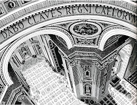
        St. Peter, Rome is a wood engraving done in 1935. No tricks, just insanely beautiful carving. Look at the angled sides of the pier in the center bottom of the piece. Notice how the slightest adjustment of width in the carved lines and the spaces between the carved lines creates the shading that defines the architecture. Dang, I want to carve like that! And if when you look at an engraving you can’t always tell whether you’re looking at a relief wood engraving or an intaglio copper engraving, here’s the clue. Notice that the grey of the floor has white lines criss-crossing over black. That tells you that the ink was printed by the uncarved part of the block. In an intaglio engraving you’ll see black lines criss-crossing white, because the ink prints from the incised lines.
        Escher made the wood engraving Dragon in 1952. He said of it, “However much this dragon tries to be spatial, he remains completely flat… But this dragon is an obstinate beast, and in spite of his two dimensions he persists in assuming that he has three…” One of the things I find amazing about this piece is that the dragon really has no outline. This is especially noticeable along the bottom of his tail and stomach and the back of his leg. Escher has managed to make the creature’s outlines perfectly clear without ever actually carving them.
        Development I is a woodcut from 1937. As a piece I don’t much like it, but as a sample of carving I find it utterly mind-boggling. Escher has made about ten different shades in a complete gradient from black to white, perfectly controlled, and all using only black and white, ink or no ink. (I know, unfortunately there are grayish areas in this scan. But that’s my fault, not Escher’s.)
        Here’s another neat woodcut, from 1928. It’s called Tower of Babel, and once again demonstrates Escher’s mastery of the wood block. The level of detail just blows away anything I’ve ever accomplished. (It’s about 25 inches tall, bigger than any block I’ve ever attempted, too.)
        For a few more of the many examples of Escher’s wood blocks, try googling “Dream,” “Sky and Water I,” “Stars,” “Butterflies,” “Double Planetoid” (a wood engraving printed from four blocks), or “Rippled Surface,” (a linoleum cut printed from two blocks.)
        Finally I want to include Palm, from 1933. It’s a wood engraving made from two blocks. You can see most clearly how the grey block differs from the black block by looking at the downfolded leaf at the bottom left corner. I just love this one.

[Pictures: St. Peter, Rome, wood engraving by M.C. Escher, 1935;
Dragon, wood engraving by M.C. Escher, 1952;
Development I, woodcut by M.C. Escher, 1937;
Tower of Babel, woodcut by M.C. Escher, 1928;
Palm, wood engraving by M.C. Escher, 1933.
        I scanned these pieces from M.C. Escher: The Graphic Work, Introduced and explained by the artist, Benedikt Taschen Verlag, 1992. (The reproductions in the book are copyright 1989.) My quotation from Escher also comes from this book, p 15. Many thanks to the publishers of this beautiful book!]